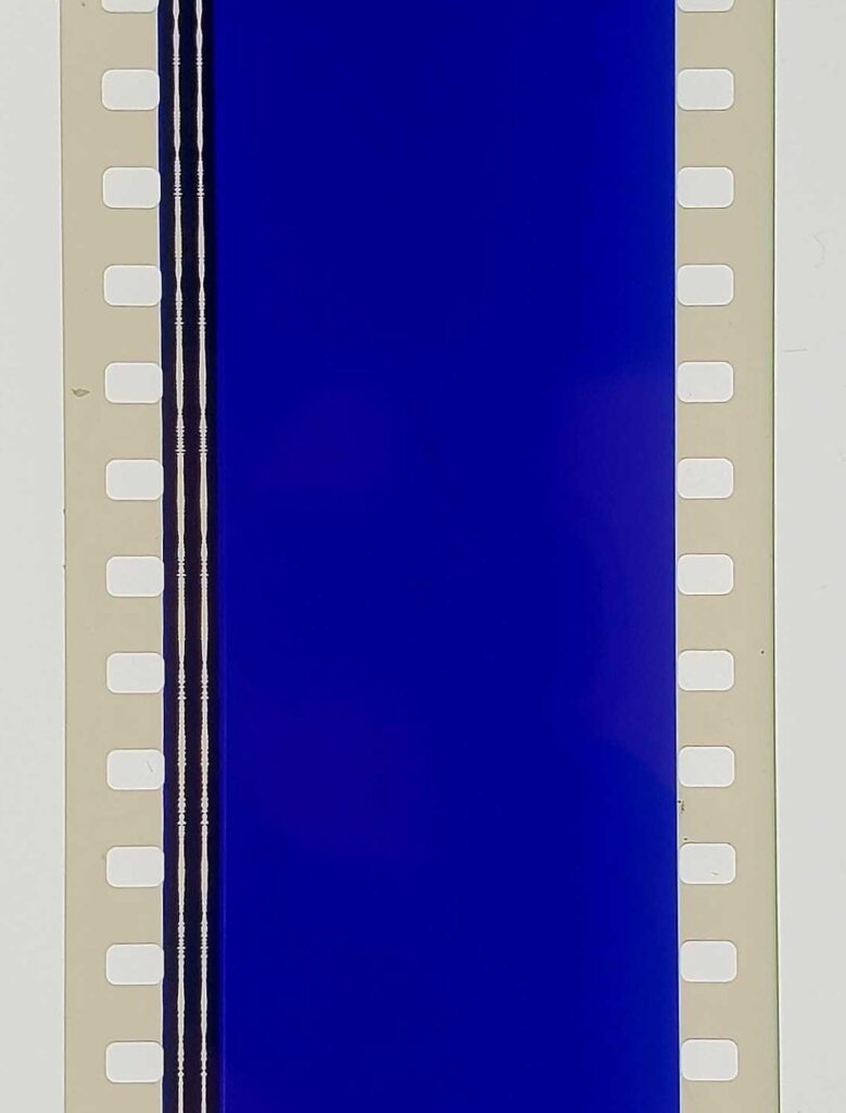
2013 was my last exercise to understand how Jarman made Blue blue. Early live performances used a filmed loop of an Yves Klein painting. That was replaced by a blue gel. Rowland Wymer’s 2006 book said the blue was “electronically produced,” which, if the image above is to be accepted, means it was not filmed in camera, but on the film stock itself.
Perhaps it is far past time to make some actual inquiries instead of just poking around in books.
[a little later update: In 2014, Mason Yeaver-Lap wrote about Blue, “a film without film,” and how the Walker Art Center exhibited it on a loop in a gallery. Though the museum has a 35mm print, for conservation reasons, they went with, “a flickering projector (aided by a piece of kit called T’he Flicker-O-Meter,’ whose manual can be found in the Walker archives) [which] would beam through a projection window coated with a blue gel. This filmless projector would thus throw a perfectly IKB shade, accompanied by a CD dub of the soundtrack. Again, Blue was a film without film.”
FWIW, this blog post will be the second mention on the internet of the “Flicker-O-Meter. We’re gonna need to see that manual.
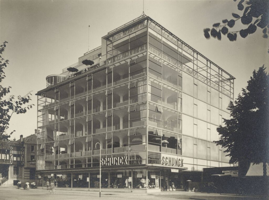
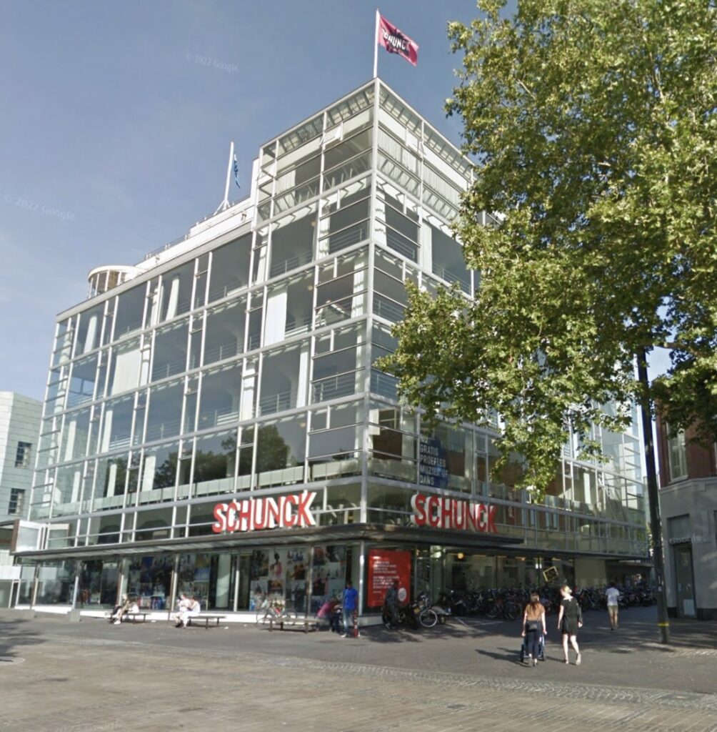
Werner Mantz, photo of Schunck’s Glass Palace, Heerlen, NL, 1935-6, 169 x 227 mm, gelatin silver print, selling 15 Dec 2024 at Grisebach
Before seeing Werner Mantz’s photo of it, I had never heard of Shunck department store, which sits at the center of Heerlen, a coal mining town in the southern tail of the Netherlands near Maastricht (actually, it’s closer to Aachen, Germany). Commissioned in 1932 from unorthodox modernist Fritz Peutz, it has an extraordinary glass curtain wall separate from but surrounding its 8-story, beamless reinforced concrete structure, on three sides.
Deparment store owner Peter Schunck and Peutz were apparently inspired by the Van Nelle Factory (1925-31) near Rotterdam, which has a pioneering but less ambitious glass curtain wall. I’m not going to get into the dispute of who designed that one.
Anyway, the building quickly became known as the Glaspaleis, and it was rescued from destruction in the 1990s, beautifully restored, and now functions as the town’s cultural center. The spot where Mantz was standing is now a McDonald’s. Nice work, everybody.
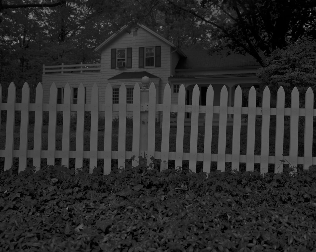
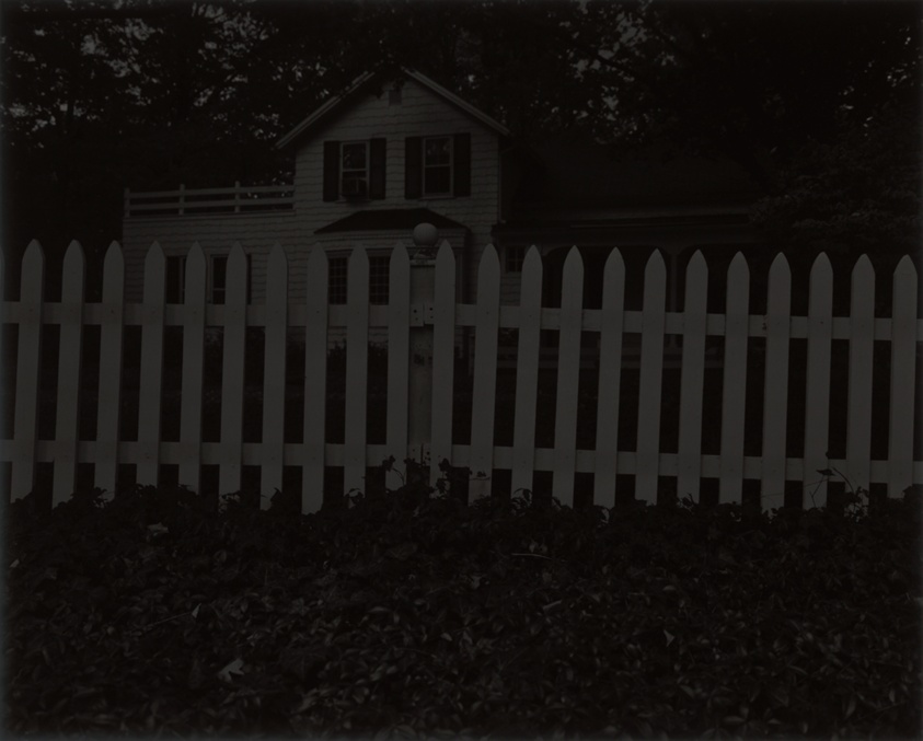
Dawoud Bey, Night Coming Tenderly, Black, Untitled #1 (Picket Fence and Farmhouse), 2017, digital dissemination image, via Art Institute of Chicago
How I missed Night Coming Tenderly, Black, Dawoud Bey’s extraordinary series of photos about the Underground Railroad is completely beyond me. Maybe Colson Whitehead had me looking one way, and Bey was right in front of me with portraits. Still, I have no excuse. So thank you, Michael Lobel for putting this 2017 project in my timeline.
Night takes its title from two lines by Langston Hughes, and its deep, dark tones and printing from Roy deCarava, but the evocation of place, history, memory, and the at-once embracing and ominous atmosphere of these nighttime spaces is entirely Bey. The series, 25 images, printed large, was commissioned by FRONT International: the Cleveland Biennial curated in 2018 by Michele Grabner. It was installed in St John’s Episcopal Church, the oldest church in Cleveland, and one of the last stops on the Underground Railroad for enslaved people before crossing Lake Eerie to freedom in Canada. In 2019 the series was exhibited at the Art Institute of Chicago.
Dawoud Bey, Night Coming Tenderly, Black: Untitled #1 (Picket Fence and Farmhouse), 2017, 44 x 55 in. silver gelatin print, printed in 2019, as reproduced in the Collection record of the Art Institute of Chicago
What absolutely blows my mind is that Bey printed these giant, 44 by 55 inch gelatin prints, manipulating the details of tone in the darkroom, and resulted in prints you can really only see in person:
By printing large, he makes room for the viewer’s body, and by printing so darkly, he effectively renders the viewer’s knowledge partial as well. The works demand time. We must stand before them and wait until details become clearer, then change our position to overcome additional interruptions from reflections or glare.
The prints, moreover, do not reproduce well. All illustrations of the works (including in these pages) are made from image files that Bey lightened with dissemination in mind. The originals would be hard to decipher in print, and they are also difficult to transmit via smartphone—they come through as black rectangles. The nighttime passage may thus be grasped only in person; it cannot readily be “shared” or “liked” and the version made available to a broad audience is a deliberate compromise.
Even between the image circulated by the museum for the show [top] and the image used to record the Night print the museum acquired, the difference is dramatic.
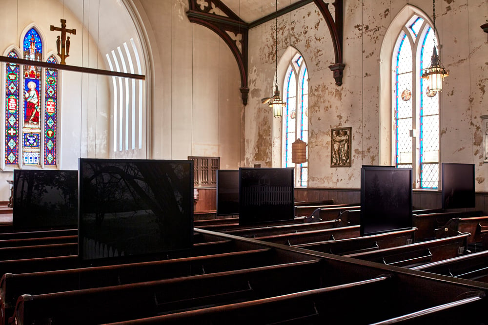
Dawoud Bey, Night Coming Tenderly, Black, 2017 installation view at St John’s Episcopal Church, Cleveland, for FRONT International, via archpaper
But from the installation view in St John’s Church, it is only partly accurate. The prints look like monochrome slabs that only reveal their image over time, to someone sitting in front of them in the pew.
Bey’s project turns out to not to be an illustration of the secret network which was only possible because of its invisibility, but an incarnation of that invisibility itself. And of the difficulty we in the present face as we try to look back into the past.
In 2010 the National Gallery of Art acquired hundreds and hundreds of trial proofs from Jasper Johns. They document, if not easily reveal, the intricate process of making Johns’ prints, a process Johns has brought into the center of his practice from almost the beginning.
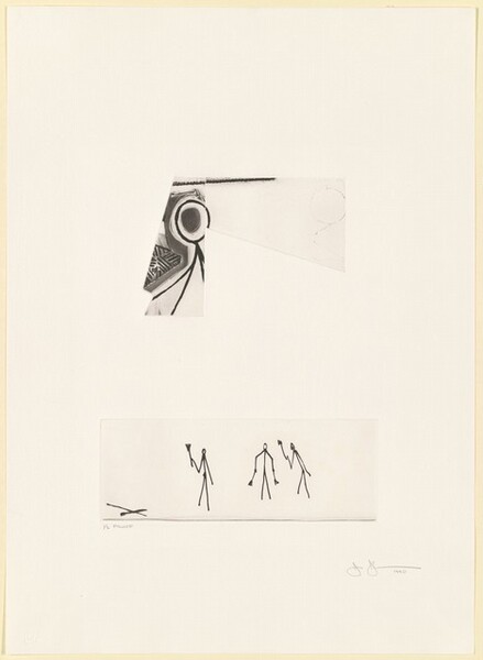
Searching through proofs on the NGA’s website is a bit of a slog, but when this sketch for Leo Castelli’s Little Guys print turned up, I thought I’d better go through the stacks.
Jasper Johns, The Seasons (Trial Proof), 1990, etching & aquatint, three plates on a 29 3/8 x 21 1/4 in sheet, collection National Gallery of Art
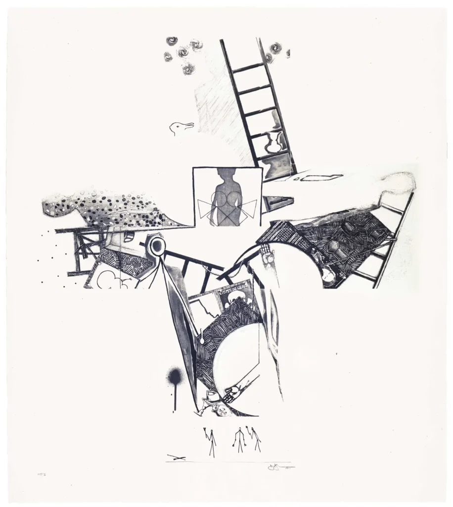
And so I found this trial proof for The Seasons, a 1990 ULAE print that is one of the earliest print appearances of the trio of stick figures. And it looks like they travel by themselves. The proof is actually three separate plates from what would be a much larger composition. Coincidentally or not, the other plates contain part of the other stick figure Johns uses, from the UNESCO Picasso.
Jasper Johns, The Seasons (ULAE 0249), 1990, intaglio, 50 1/4 x 44 1/2 in., ed. 50, via ULAE
Whether all prints, or all Johns’ prints, are made this way, I have no idea. But now that you mention it, this print in particular feels very much like that: composed by assembling and setting multiple, prepared plates together like an old timey newspaper publisher. That certainly takes away much of the stress of working images into a 50-inch plate without error or change, I guess.
In any case, the plate with the Little Guys is 4 1/2 x 12 1/2 inches, and notably includes another element, an X marking the spot over to the left, and a line defining their ground.
The Picasso stick figure is embedded in the center of the composition, and all the other figures—the child silhouette, the shadows and inverted shadows from the Seasons paintings read as Johns himself, the Duchamp profile, even the snowman—are integrated as well. But these three stick figures at the bottom seem to still be set apart and doing their own thing, in their own space, even with their own ground to stand on—while still a part of the entire image.
In 2021, on the occasion of the sale of the most significant artwork documenta IX curator and SMAK Ghent founder Jan Hoet received from David Hammons, his daughter Marianne Hoet, Head of Business Development and Deputy Chairwoman, Phillips Europe, reflected on accompanying her father to the artist’s studio in the late 1980s:
At the studio, we were able to touch objects and works, without being sure if it was an object or already an artwork. At that time, David always gathered objects and found inspiration in the streets. As an outsider in the contemporary scene, he was able to transform material into experience, which also alludes to an African-American tradition of creating art from found objects … Most important was to understand and feel the deep friendship between David and my father. It was a friendship as we remember from our childhood, soulmates as outsiders.
It echoed the uncredited lot description for the sale in 2018 of the most significant artwork Jan Hoet got from David Hammons that his family still owned:
Hammons’ oeuvre is a masterful narrative on the experience of the African American community in American society, introducing his own physicality into his work as well as the debris surrounding him. Through a deft reworking of found-objects, Hammons’ sculptures assume a quasi-mystical status; soldered, glued and nailed, these extracted materials are composed into beautifully rendered structures of detritus, utilising quotidian objects which are often loaded with associative connotations. The present work thus forms a crucial part of Hammons’ highly original artistic approach and, at the same time, symbolises a pivotal relationship between innovative artist and curator, both unified in their shared motivations.
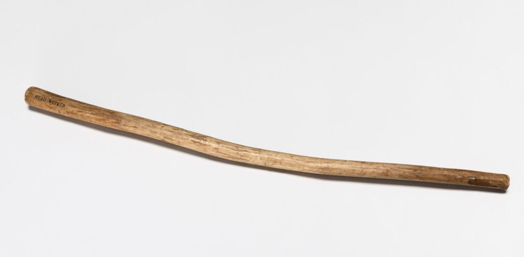
And Marianne’s comment was considered worth repeating to sell in 2023 what is…what is a productive way to describe this…the most conceptual? most austere? most elemental? artwork Hoet got from Hammons, which is this stick.
David Hammons, Head Warmer, 1998, 99 x 4 x 4 cm, wood, img from a 2023 PhillipsX pop-up collab with AQUALEX a provider of fine drinking water systems in Knokke-Heist, the Hamptons of Belgium
In each case Hoet’s relationship to Hammons is considered an inextricable element of the work’s significance in ways that surpass mere provenance. This may explain why this stick, on which this phrase Head Warmer is carefully lettered, and which is is also signed, was made available first to the Belgian collecting world who also knew Hoet—or Hoets at this point—via a pop-up sale at the beach in August.
Well, Belgium passed, and now the stick is at Christie’s. And what does Christie’s have to say about Head Warmer? Just that it “is emblematic not only of Hammons’ ability to transform found materials into art but also of the close relationship that Hoet and Hammons shared.”
The Hoets’ claim for this work/these works as somehow manifestations of Jan’s relationship with Hammons exceeds but is inextricable from their view of Hammons as a quasi-mystical shaman of the Black Found Object Arts. For a curator who put himself on the cover of his documenta catalogue while writing off Africa as irrelevant, I guess we should expect nothing less. Me, I’d just be happy to have gotten three free Hammonses.
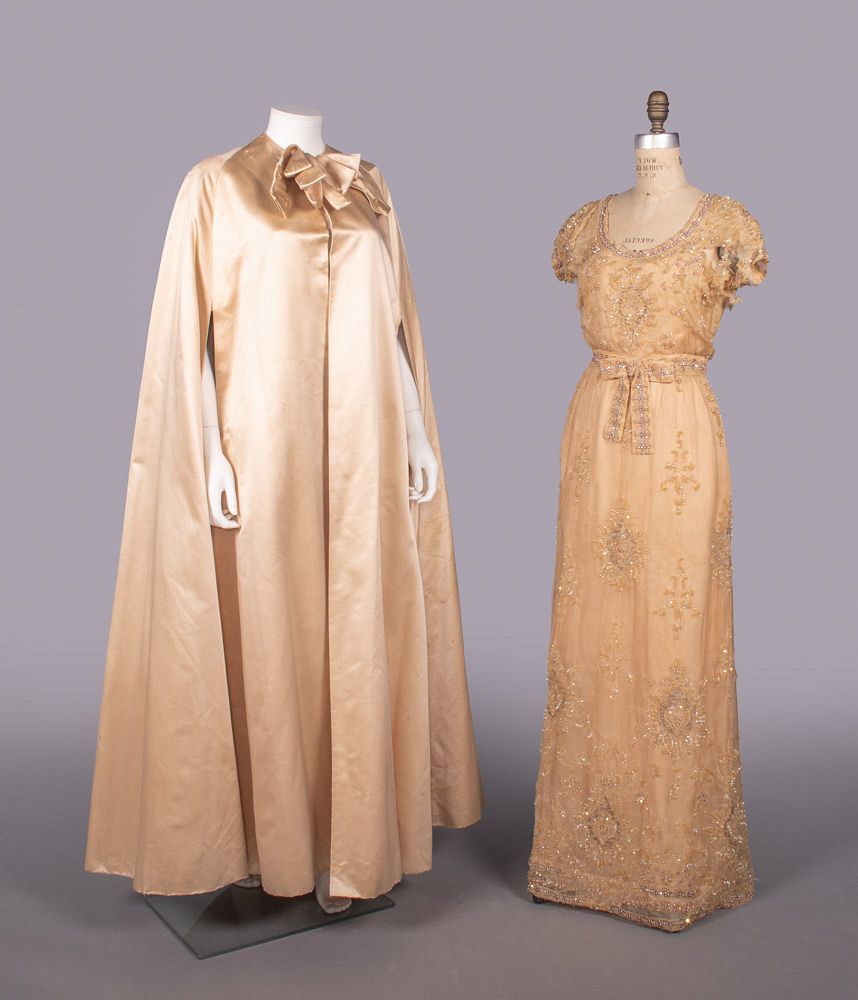
This couture cape in peach paduasoy and the sequin and crystal embroidered chiffon gown are both from Jeanne Lanvin, circa 1961. The cape, at least, is attributed to Oscar Renta Fiallo, who that year left his apprenticeship with Cristóbal Balenciaga to work with Antonio del Castillo, the Spanish designer brought to Paris to revive Lanvin. Both garments belonged to Baroness Aino de Bodisco.
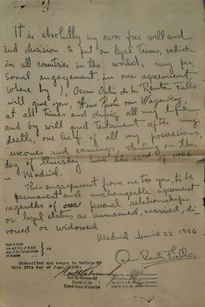
I had to look up paduasoy, which is maybe a Spanish term for peau de soie, a variant of silk satin. Which is absolutely the least important thing in this situation. Because the auction listing of these two items also includes a copy of the mindboggling, handwritten pledge the 24-year-old man who would become known as Oscar de la Renta made to Bodisco in June 1956.
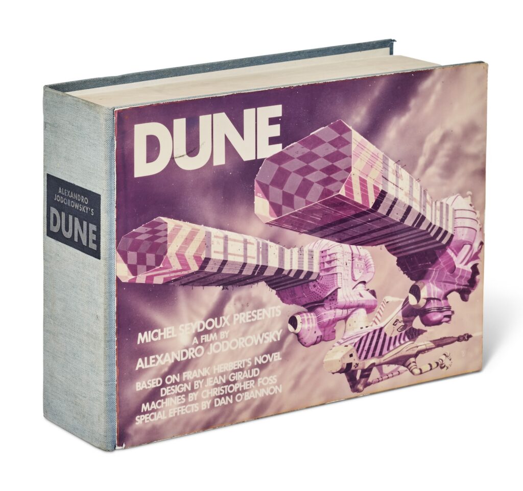
Copy Number 4 of Alexandro Jodorowsky’s Dune Bible, printed in 1975, for sale at Christie’s Dec 2024
Nothing quite captured the hopes, dreams, ambition, and stupidity of the crypto moment like the 2021 acquisition by Dune DAO [aka Spice DAO] of Jodorowsky’s Dune Bible for EUR 2.67 million, more than 100x its estimate.
The Spice DAO epic involved Copy Number 5 of the Dune Bible, a nearly 300-page art and concept octavo, privately published in 1975. When it was sold in November 2021, Christie’s Paris surmised that there were likely only 10 to 20 copies produced, and only a fraction survived. Given its rarity, it was expected to sell for EUR25-35,000.
Now Copy Number 4 has appeared in an online auction at Christie’s London, with an estimate of GBP250-350,000. The way this price is at once a 90% discount and a 1000% markup really captures the lost surrealist magnificence of the Jodorowsky Dune vision. But the true magnificence comes from noting how Christie’s both copies large chunks of the 2021 lot essay, while assiduously not mentioning the previous sale, or indeed the production or existence of any other copies of the book.