Lowe’s Balloon Gas Generators: The Making Of

tsc_lowe_gasgenerators_si.jpg
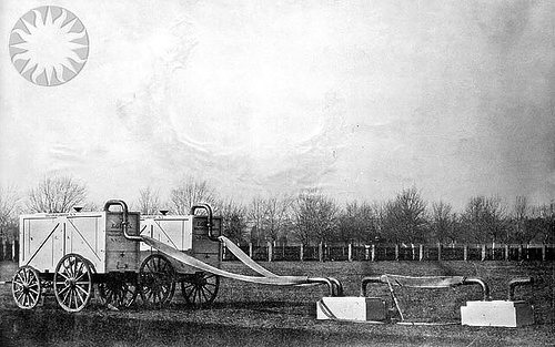
About this time last year, while pondering the ur-satelloons that were Prof. T.S.C. Lowe’s Civil War-era aerial reconnaissance balloons operated for the Union Army, I was struck by the idea of re-creating the rather awesome-sounding and -looking portable hydrogen gas generators [above] Lowe designed and had built at the Washington Navy Yard in the fall of 1861.
I’m glad to report that the research for that project is moving ahead, thanks to the accidental discovery of the apparently definitive history of their making in Frederick Stansbury Haydon’s 1940 tragically unfinished classic, Aeronautics in the Union and Confederate Armies: With a Survey of Military Aeronautics Prior To 1861. As NASM Senior Curator Tom Crouch put it in his foreword to the 2000 reissue of the book, retitled as Military Ballooning During the Early Civil War,

Aeronautics in the Union and Confederate Armies remains not only the basic account of the creation and early history of the Federal Balloon Corps, it is recognized as something of a minor classic of historical scholarship. While reviewer Paul Angle feared that readers would find the level of detail and sheer bulk of the documentation daunting, he also recognized it was “a study quite likely to be definitive.”
In fact it is Haydon’s uncompromising scholarly rigor and his attention to the smallest detail that gives the book its extraordinary power. The author tells us how much fabric was used to manufacture every balloon that saw federal service, and he provides the formula for the varnish used to seal the envelopes. He explains the technical details of the mobile gas generators that Lowe designed to inflate his balloons in the field and provides the precise cost of the rubber hose used in their construction. And what color were those generators? Light blue. Haydon found the receipt for the paint.

“Pale blue,” we read, “with bold black lettering bearing the legend, ‘Lowe’s Balloon Gas Generator,’ and a serial number.” Twelve were built and put into service.
Since he consulted a great number of historical artifacts without mentioning one, I must assume that no generator survived for Haydon to inspect.

‘It Is Now Possible To Detail Each Stone In CAD’

It’s hard to explain how irrationally exuberant I am over the discovery of New World Stoneworks, which, well:

If you have ever walked along a rocky coastline or riverbed, you’ve seen how nature can sculpt stone with flowing water to expose its inner character. The New World Stoneworks process harnesses this force and channels that creative power into the hands of the architect or designer. Like every other material in a modern construction plan, it is now possible to detail each stone in CAD and achieve the artisan details of the past.

New World uses CAD, computer-controlled waterjet cutting, hand chiseled finishing, and just-in-time palletizing to transform stoneworking for the 21st century.
They repeatedly mention not just how fast it is to install their precision-fitted stone, but now it eliminates noise, dust, and jobsite waste. I guess it has its practical benefits, but it also sounds a little neat-freaky, frankly.
newworld_stoneworks_vid.jpg
Anyway, when I watch them build a granite doghouse [!] in two hours, and when when I read things like this:

If you have a photograph of a stonework style or historic work you want to match, we simply scan the photo and replicate the look. We can even control the degree of surface weathering.

I start wondering about the artistic possibilities of New World’s technique.
Something about the ironic intersection of randomness and intention, like Rauschenberg’s identically painted drips in Factum I and Factum II. Or the Japanese construction workers demanding a precise, randomly generated placement guide for the faceted platinum Olafur Eliasson tiles going into their boss’s Tadao Ando house. Or Dan Colen’s brick wall, frankly. The mental jobsite still has some clutter, I guess.
New World Stoneworks [via nxtform, thanks paddy]
Previously: “The most believable stone veneers in the world”

Barcelona Pavilion Photomural

rudolph_familyofman.jpg
I’ve never done an actual, in-depth search for any, but I’ve always wondered what became of the giant photomurals architect Paul Rudolph used for the exhibition design of Edward Steichen’s landmark 1955 MoMA show, Family of Man. [vintage scan above, from kelviin’s flickr set [correction: Olivier Lugon points out this image is actually from George Kidder Smith’s installation of another Steichen show at MoMA, Power In The Pacific, in 1945.]] I mean, part of me doesn’t want to find out they got tossed into the dumpster.
That was definitely on my mind this summer when a huge, wall-sized Ansel Adams photo sold for $518,000 at the Polaroid bankruptcy auction.
But at least someone was saving some of these things. Like this giant, three-panel photomural of Mies van der Rohe’s Barcelona Pavilion, which is coming up at auction in LA in a couple of weeks.
mies_mural_ellwood_lama.jpg
The mural was made for a 1969 Mies exhibition organized by LA architect Craig Ellwood [below is an image, from Ellwood’s monograph, of the show installed at LACMA.] Since the Barcelona Pavilion wasn’t rebuilt until the 1980s, the photo itself has to be from 1929-30. It’s from Mies’ own archive, but I’m not seeing who took it. Ellwood was a huge Mies fan, though, and this mural was in his collection until he passed away.
ellwood_mies_lacma69.jpg
At $2,000-3,000, it’s priced more as an exhibition artifact than as a print. But that’s a thing about artifacts; these photomurals and giant prints seem to anticipate the wall-filling, painting-engaging future of contemporary photography, like how Cycladic art suddenly looks modern after Brancusi.
When/if any Family of Man pictures turn up, I think they should really be treated as deadweight which I’ll glady take off your hands for the cost of shipping.
update: which is pretty much what the mural sold for: just $1700.

Rodeo, Cowboy

ernst_haas_rodeo57.jpg
Now I love me some rodeo, but primarily bull riding. It pains me to think how many rodeos I’ve missed at Madison Square Garden.
So seeing legendary Magnum photographer [wait, is there any other kind?] Ernst Haas’ 1957 photo of a bronc rider in MSG turn up at Phillips de Pury’s photo auction this week was a nice treat.
Of course, it’s an estate print, and I can’t quite tell why the estimate seems higher than most every size and edition option available for retail here.
prince_joke_gf_cowboy01.jpg
It almost makes me want to see what a thumbnail edition looks like; why should Richard Prince provide all the fun, right? And no sooner do I say that, than a Prince triptych pops up in the auction catalogue: Untitled (Joke, Girlfriend, Cowboy), 2001 actually includes a motion-blurred image of a Marlboro Man riding his horse through the snow.
Of course, that edition, published by Hatje Cantz, looks like it’s still available in the primary market, too. And at a quarter the price. And the auction site even grabbed their jpeg from the publisher. I guess Phillips’ operating premise is that there’s still money to be made selling art to the Google-less. Good luck.

Robert Rauschenberg, Piece For Tropic, 1979, Edition Of 650,000

rauschenberg_tropic_color2.jpg
While pursuing his MFA at the University of Miami in 1976, artist Leo Rosenblatt created a printmaking process called Stat Art, “a technique incorporating drawing and mixed media on large sheets of commercial copy film in conjunction with light sensitive newspaper printing plates.
“Stat Art allowed unusually large runs of original lithographic art to be printed on large commercial newspaper presses with no image deterioration.”
Rosenblatt began working as the art director for Tropic Magazine, published on Sundays by the Miami Herald, where he continued his experiments with Stat Art, culminating in what he calls “the world’s largest edition of an original lithograph,” by the well-known Florida resident and prolific printmaker, Robert Rauschenberg. People Magazine was on the story:

On Dec. 30, 1979 the Miami Herald printed 650,000 Rauschenbergs as the cover of its Sunday magazine, Tropic. In essence an original lithograph, it showed images of south Florida. The artist went to the Herald pressroom and signed 150 of them, thus enhancing their value–and the jubilation of readers fortunate enough to find one on their doorstep.

650,000? Why, that’s almost as many prints as the rest of Rauschenberg’s editions combined!
Piece For Tropic was a full 13×21.5 sheet, wrapped around the magazine. Rosenblatt wrote an accompanying article introducing the lithograph and its concept.
rauschenberg_tropic_blk.jpg
Above, via Rosenblatt’s site, is Rauschenberg’s original black and white artwork for Piece For Tropic. Up top is an unsigned copy, framed in Lucite, and accompanied by Rosenblatt’s article, on eBay for $750. Even after 31 years, that seems ambitious for an edition of 650,000. Here’s one for $975 from a gallery.
The 150 subscribers who received a signed copy were selected at random from the Herald’s database; I haven’t found any mention of any signed examples from the edition appearing on the market. If your grandmother was a hoarder, though, you may be in luck.

What I Heard: Paul Richard

I just got back from hearing longtime Washington Post art critic Paul Richard speak at the National Gallery of Art. Richard is an excellent speaker and an alluring storyteller. His lecture, titled “What I Saw,” began with his move from scrappy beat reporter to dread-filled art critic in 1967.
Richard did an admirable job of illustrating his talk largely with artworks either from DC, or which had been shown in DC. A central, and astute, premise, which Richard used to pivot from his own inexperience to the non-academic, non-specialist enthusiasts who were his readers, to the four-decades-long wave of new museums and blockbuster exhibitions in DC was basically, “If you haven’t seen it, it’s new to you.”
And he’s right. Museums–like the one he was speaking in, of course, the alternative title of his lecture could have been, “What Museums Showed Me”–brought revelatory shows to Washington: Chinese Treasures and British Treasure House treasures, DaVinci treasures, tons and tons of treasures.
And Richard paid homage to Washington’s most cutting edge curator ever, Walter Hopps.
And yet. He wove his argument for universal “rhymes” and echoes in art across cultures and millennia, from IM Pei’s triangles to the Washington Monument’s capstone to prehistoric ochre carvings. He spoke reverently and fondly about Hopps, and the artists he met through Hopps, like Duchamp, Warhol, Kienholz, and Tony Smith. Which got us to about 1968.
But Richard showed exactly two works–Rachel Whiteread’s Ghost (1990) and Beverly Semmes’ Kimberly (1994), that were made after he became an art critic.
Which I guess is as accurate an account of the history of DC’s fraught, distant, marginalized relationship with contemporary art as anything else. Or at least of its newspaper and its museums.

Master Yoga Chart of 908 Postures by Dharma Mittra

dharma_mittra_908.jpg
From the website of Sri Dharma Mittra, the Asana Yoga pioneer of Gramercy Park, and the Bernd & Hilla Becher of yogic typologies:

In 1984 Dharma completed the Master Yoga Chart of 908 Postures, as an offering to his Guru, and for all Yoga aspirants. This original masterpiece was meticulously assembled from over 1,350 photographs of posture variations he took of himself, all hand done before the computer age. Over 300 of these postures that are very popular today are created by Sri Dharma (of which he will only say “came through” Divine intuition). It has been an invaluable teaching tool over the past decades. You will find it in just about every yoga school and Ashram worldwide including India.

And in Washington, DC, in Cleveland Park’s neighborhood framing shop, Frame Mart Gallery, where I just discovered this Ben-Day dotted, photocollaged masterpiece of the genre.
It’s the only one I’ve ever seen, but I still feel confident in declaring Dharma Mitra’s chart the most magnificent work of contemporary yogic collage art in the Western Hemisphere.
Master Yoga Chart of 908 Postures by Dharma Mittra
You can still purchase the Master Yoga Chart in three different sizes–though why anyone would get any size other than the gargantuan 43×60 inch version is beyond my understanding. If it turns out to be silkscreened, I might suggest the Master Yoga Chart sarong/wall textile as a perfect complement to, and not a replacement for, the printed poster.
Master Yoga Chart of 908 Postures by Dharma Mittra
Of course, Frame Art Gallery has a 43×60-in. version beautifully mounted and framed and ready to go, for an exceedingly reasonable price. They purchased a small number of them way back in the day, and this one remalns. For you, perhaps.

Ahnighito

inuit_metal_britmuseum.jpg
I don’t know why, exactly, but as I was looking online for Zakaeuses this morning, the description of this early 18th century Inuit knife from the British Museum caught me off guard:

This type of knife was made and used by the Inughuit (Polar Inuit or Eskimo (uhh, sic)) of north-west Greenland. Similar pieces of iron were used to make all-purpose knives for butchering animals, preparing meat, eating and making tools.
This example was collected in 1818 during the search for the Northwest Passage by the explorer Sir John Ross (1777-1856). The Inuit told the expedition, through the Greenlandic interpreter and expedition artist Hans Zakaeus, that they believed that they lived alone in the world and thought Europeans were gods. [emphasis added]

Greenland’s Inuit used ivory and bone instead of wood, and they got all their metal from meteorites. The Cape York Meteorites, to be precise, which crashed into the earth around 10,000 years ago.
ahnighito_meteorite.jpg
Explorer Robert Peary and his Inuit guide found three large fragments near Melville Bay: Ahnighito, or The Tent [above], weighs 31 metric tons, and was found on Disko Island. [Seriously.] Woman (3 tons) and Dog (400kg) were a few kilometers away on the mainland. Woman and Dog, especially, showed signs of being the primary source for Inuit iron for centuries. They were surrounded with more than 10,000 hammerstones, brought from hundreds of miles away, which were used to cut, chip, and drill off pieces of iron, which were then flattened into blades for knives, spears, and scrapers.
snow_baby_peary_cover.jpg
Peary had his wife with him during the expedition. When their daughter Marie Ahnighito Peary was born in Greenland in 1893, Inuit apparently traveled from all over to see the pink & blonde child, who they nicknamed The Snow Baby. In the midst of ongoing media buzz and snow baby merchandising craze, her mother Josephine Peary to publish a picture book, The Snow Baby in 1901.
ahnighito_flag.jpg
I haven’t seen any mention of his asking permission, but after several years of effort, Peary moved the three meteorites to New York, and eventually sold them to the American Museum of Natural History. The pylons supporting Ahnighito run through the foundation of the building into the bedrock of Manhattan. Which, given the Upper West Side’s geography, is probably right there, but still. It’s basically as heavy as a decent Richard Serra Torqued Ellipse.
Lance with a blade made from meteoric iron [britishmuseum.org]
Greenland’s Meteorites [amnh.org]
Cape York Meteorites [wikipedia]
Account Of The Discovery And Bringing Home Of The “Saviksue” or Great Cape York Meteorites [niger-meteorite-recon.de]

When Copyright Pandas Attack

Day 276: When Silent Pandas Attack!
Hahahahahahawesome. Threadless pandaterrorists used facebook to plot a silent but hilarious panda-in at Gavin Brown yesterday to protest Rob Pruitt’s “alleged misappropriation [to put it mildly]” of a panda t-shirt design by Jimiyo and AJ Dimarucot.
Never mind that Rob “obviously appropriated” the design and transformed it significantly, this is exactly the sweetest response all the artists involved deserve. [via @analogc]

AP

prince_untitled_cowboy2003_ap.jpg
It’s taken a while, mostly because I’ve been slack about following up on them, but the artist proofs from the 20×200.com edition of my print, Untitled (300×404), are in the mail and should be here very soon. I’ve seen the smaller sizes–they looked sweet enough for me to go ahead with the 20×200 edition–but it’s the largest sizes I’m most eager to see, especially the 30×40-inch print, which is the same size as Richard Prince’s Untitled (Cowboy), 2003. The next project will be to get the two works together, Untitled (300×404) and Untitled (Cowboy), and see them side by side. Which means tracking down the Princes in their natural habitats.
Untitled (Cowboy), 2003, is an edition of 2, with one AP. It’s Ektacolor [Ektacolor being a more marketable way of saying C-print] on board. I know the owner of one of the two editions. As it happens, Prince donated his AP to Tibet House, which auctioned it at Christie’s in 2004. [It was purchased for $298,700 by Michael Crichton, who died in 2008. It was sold again last May for $602,500.]
At first, I assumed that Prince’s work had been donated for a typical charity auction; in reality, that was the only piece in Christie’s contemporary evening sale to benefit Tibet House. Apparently, it was arranged by Tibet House’s art advisor, the independent curator/advisor Diego Cortez [the pseudonym of James Curtis], who is something of an artwork donation impresario. He also arranged for Prince to donate artwork to The Wooster Group, and he got Prince to design the poster for TWG’s production of Hamlet.
prince_hamlet_wooster.jpg

Ditto That

ditto_300x404.jpg
Huh, I didn’t notice that, but maybe I liked Ditto’s limited edition Why Shapes What? book so much because of its gorgeously saturated palette?
I wonder what Untitled (300×404) would look like stencil-printed on a Riso V8000? How would that even work? I will investigate.
Meanwhile, I hear from attendees that the known-to-be-beautiful 20×200.com prints of Untitled (300×404) do, in fact, look good at the Affordable Art Fair this weekend. As an added bonus: it’s being held indoors.

How To Make 4-Color Halftones

So after posting about Four-Color Process, I was looking around to see who is working to preserve this masterful, cheap, laborious-looking halftone printing process. I mean, we brought letterpress back, right?
Well. So far, on the printing front, I’m not quite seeing it; if there are artisanal small-press folks keeping true to the art and technique of old school, cheap, slightly sloppy, pulpy, CYMK, halftone/Ben-Day printing, I haven’t found them.
But it looks like there are book artists–some say illustrators, others hate the term graphic novels, and anyway, they’re not making comic books–who do use halftone techniques. [The only thing they have in common is a love of old dots and a bitterness toward Roy Lichtenstein.]
fies_halftone_howto.jpg
Just last month, in fact, artist Brian Fies published two lengthy tutorials on using Photoshop for creating halftone images. Having come up using halftone dots, and after skilfully deploying the consciously retro technique in his award-winning book, Whatever Happened to the World of Tomorrow, Fies is able to provide good historical info on how comic illustrations used to be created, and to show how he approximates the original feel using digital tools.
Fies’ technique successfully recreates the halftone style of vintage comics, but only up to the point of printing. One characteristic of crappy 4-color printing is the slight bleed or misalignment of color fields; with his digital perfection, Fies always 4-colors inside the lines.
eddie_campbell_zipatone.jpg
The other veteran artist, Eddie Campbell, uses halftone sheets very expressively the way they were originally designed, within his analog drawing process. While the results still print up perfectly, Campbell’s conscious, persistent exploration of a seemingly obsolete medium is pretty sweet.
UPDATE: Here’s where I confess my “search” for 4cp didn’t yet actually involve asking any people who I thought might actually know about it. To wit, Andy from Reference Library informs me that the 15th issue of Dot Dot Dot, whose uncracked spine is looking at me right now from my shelf over there, even, apparently set off a bit of a print-on-demand lovewave towards the Risograph V8000 stencil printing machine, which “gives tumblr kids a way to experience registration, moiré, and the good old dot pattern.”
Also, Rollo Press and Ditto both do great Riso work. Below, a beautiful Riso spread from Ditto’s Why Shapes What, with artwork by Vanessa Billy.
ditto_why_shapes_what.jpg
Dots, Part 1; Dots, Part 2 [brianfies]
Zipatone-related posts from Eddie Campbell [eddiecampbell]

Some Nude Paik

UbuWeb’s tweet about Nam June Paik’s music reminds me it’s long past time to post this hilarious story of Paik’s 1965 Fluxus-style performance in Reykjavik, where he and Charlotte Moorman nearly capsized Iceland’s nascent new music movement. Artnews.is quotes a morning-after review of the scandalous concert:

“The Korean played the piano with a pacifier in his mouth, smeared himself in foam, splashed around in a washtub full of water and drank water from his shoe … The woman played the cello and then climbed up into an barrel and disappeared into it. A while later she came out of the barrel, soaking wet, and started playing the piano again. At that point the Korean dropped his pants on stage…

And then things really got out of hand.
Nam June Paik Shocks Icelandic Audience in 1965 [artnews.is]

Richard Prints At 20×200’s Booth At The Affordable Art Fair

untitled_300x404.jpg
Sure, you can get it for free right here, in all its original jpeg glory, but if you want to see the velvety printed goodness of Untitled (300×404) in person, you should head to 20×200’s booth at the Affordable Art Fair, which opens in Manhattan tonight through the weekend.
Jen Bekman’s got a couple of print and collecting discussions scheduled, and there’s a framing primer–and a few spots left to reserve in the 20×200.com pop-up framing shop. Check the 20×200 blog for all the details.
Visit 20×200 THIS Weekend at the Affordable Art Fair in NYC! [20×200.com]
Previously: Untitled (300×404) the making of
300×404 @ 20×200!

The Palomar Sky Survey-I, The Makers Of

As longer-term readers of greg.org know, I am slowly trying to locate an original copy of the National Geographic Society-Palomar Observatory Sky Survey, an 1870-plate portrait/catalogue of the visible universe [or the universe visible from the Palomar Observatory, anyway] taken at Caltech in the early 1950s. Then I will also print one. There are also loose vintage prints to be found.
Anyway, in the process, I’ve been documenting bits of the history of the making of the NGS-POSS I. [A second sky survey, the POSS-II, was made beginning in the late 1980s.] It’s almost embarrassing that it’s taken me this long to look into who actually made it, took the pictures, checked them, made the prints.
After the jump, then, a brief history of the making of POSS-I, as presented by Neill Reid and S. Djorgovski in the proceedings of the Astronomical Society of the Pacific’s 1992 conference, Sky Surveys, Protostars to Protogalaxies:

Continue reading “The Palomar Sky Survey-I, The Makers Of”