
Worlds Fairs turned out to be the perfect venue for photomurals–they were catchy, usually didactic, packed a visual punch, and got the point across to the shuffling masses. And at least in the 1930s, they looked like the future.
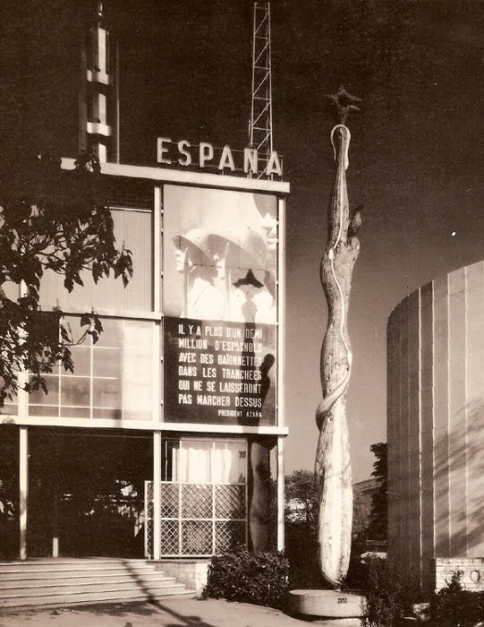
So to a government whose future was being immediately threatened, like the Spanish Republic under siege by Franco and his fascist army, a publicity- and sympathy-generating pavilion at the 1937 Paris Expo literally seemed like a matter of survival.
José Luis Sert and Luis Lacasa designed the small, simple pavilion, which didn’t get completed in time for the opening, and which anyway, ended up being overshadowed by the bombastic, dueling pavilions of Nazi Germany and Stalinist Russia.
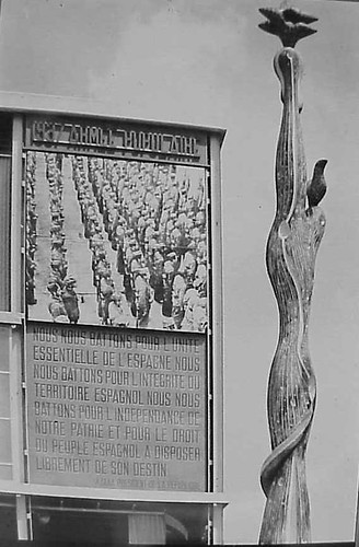
So to get attention, a huge photomural/banner of Republican loyalists was hung over the entrance. [Intriguingly, in two of the three most widely circulated photos from the Expo, including the Le Monde photo announcing the opening, the mural is cropped out or coincidentally obscured by a tree branch.] As kk_redax’s photo on flickr shows, the photomural was changed periodically:
Like breakdancing was to gangs, world’s fairs were designed as a non-violent means for competitive, conflicting nation states to jockey for supremacy. But the Spanish Civil War pushed the Republican government to a new, urgent level of pavilion-building. The war, which was fought on the ground through media, posters, photos and newspapers [and also guns and bombs], also gave birth to modern photojournalism. And the Paris Expo was the site of Spain’s immediate experiement in architecture as military polemic. And then there’s the art.
The Republican government sought to garner international support by assembling modern works by sympathetic artists that express powerful and overt political outrage, including a large painting of an upraised fist by Joan Miro . And unveiled on the ground floor was Picasso’s Guernica.
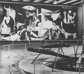
Painted in 24 days in his new Left Bank studio in the spring of 1937, Guernica‘s duotone palette reflects how Picasso and the rest of the world learned of the Nazis’ devastating saturation bombing foray: via newspaper photos and newsreels. Photography had an even more direct impact on the making of Guernica: Picasso asked his companion Dora Maar to document the painting process, and there’s a scholarly case that “the tonal variations Picasso observed in Dora’s photographs appear to have influenced the development of those in the middle stages of the painting.” Though it sets the bar pretty high for the rest, it’s not much of a stretch to call Guernica the greatest photomural of the 20th century.
But wait, that’s not all! In the Pavilion Guernica was installed next to Mercury Fountain, an abstract, kinetic sculptural tribute to the Almaden region of Spain, which at the time produced the lion’s share of the world’s mercury. Oh, the fountain was by Alexander Calder. While Guernica‘s world travels are well known, Mercury Fountain is a Calder whose relocation was both successful and imperative. It currently sits at the Fondacion Miro in Barcelona, sealed behind glass, in order to contain its toxic vapors.
Guernica, meanwhile, is now encased in glass for its own protection.
…The Spanish Pavilion [pbs.org]
A comprehensive post about El Pabellon Espanol, in Spanish [stepienybarno.es]
The Mexican Suitcase, rediscovered Spanish Civil War negatives by Capa, Chim, and Taro [icp.org]
Author: greg
Les Immiserables
It’s hard to do bad interview with Errol Morris. But this exchange with Amanda Katz for the Boston Globe is particularly awesome:
We have this idea that reading leads to self-betterment. But reading can, properly considered, lead to self-immiserization!
Did you say immiserization?
I did indeed!
Like self-immolation, but into misery instead of fire.
Yeah, self-immolation is slightly different. That’s for Brunhilde. Anyway, I picked up the Dreiser story…
related: a Morris-length rumination on immiseration by geopolicratus.
The Enlarged Pictures Generation: Alvar Aalto’s 1939 Finnish Pavilion
image: vintage silver gelatin print, signed, Ezra Stoller, 1939, via morehousegallery
Do turning back another chapter or two in the history of enlarged pictures, photomurals, and photomontages, where do they turn up the most [besides/before the Museum of Modern Art]? Expos and World’s Fairs. Even more than dioramas, and like the grand cyclorama paintings of earlier eras, giant photos were used by architects–in the service of governments and companies–as modernist, machine age, marketing, mass communication, and propaganda. They were basically highly credible-looking billboards.
None of which is necessarily a bad thing in itself, of course. It’s interesting to note, though, who was creating and using them, because for the most part, it was not artists.
Alvar Aalto’s Finnish Pavilion at the 1939 World’s Fair in New York turns out to have been a stunning and especially instructive example of enlarged photos integrated with modernist architecture. That’s it up top in a photo by –let’s just say I could just as easily title this whole series, “Everything I Know About Photomurals, I Learned From Ezra Stoller.”
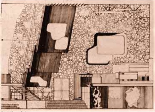
In a plain, rectangular building, Aalto wrapped a second floor exhibition space with an undulating wood-slatted wall, inset with three rows of giant photos [Aalto’s section plan above, via domus, I think] to create a dramatic, infotaining, 52-foot high atrium. A mezzanine restaurant [below] allowed for closer viewing of the photos, which showed, from top down, “Country,” “People,” and “Work,” which culminated, naturally, in the bazaar of real Finnish products underneath.
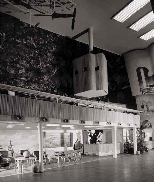
And what’s that box up there hanging dramatically off the wall, besides the key to the photomurals’ media context and appeal? It’s a projection booth. Films, presumably on the subject of Finland’s awesomeness, were projected onto the atrium wall above the exit. I can’t help but see the effectiveness and popularity of large-scale photos as inextricably driven by architects’ attempt to harness the modern media magic of the cinematic experience. And as antecedents for the now-ubiquitous, immersive projection and installation art works. Like steampunk Pipilotti Rist.
1939 Finnish Pavilion info [designboom]
The Family Of The Family Of Man: Steichen, Miller, Rudolph, Stoller…
I’m on a bit of a photomural binge at the moment. In email, Dr. Olivier Lugon, he of the awesome article about Stephen Shore’s Signs of Life photomurals, points out two things about Edward Steichen [and, let’s give the man credit, since he’s all over and in that show, Wayne Miller, though with these brackets, where do I put the apostrophe s?] ‘s 1955 show, The Family of Man.
First the good news: The sole [?] remaining copy of the traveling version of The Family of Man was donated to Luxembourg, the country of Steichen’s birth, and it is on permanent display at Chateau Clerveaux. Except that it just closed two weeks ago for two years, for renovation and conservation. So, book your post-Maastricht2012 roadtrips to Luxembourg now!
Now the bad news, which is also good news: The installation photo I linked to purporting to be from The Family Of Man is, in fact, not. It is from a 1945 exhibition Steichen did at MoMA titled Power In The Pacific, which was designed by George Kidder Smith.
I say good news, though, because it pushes the photomural story back a decade, and it helps flesh out the context and function of enlarged photography as a mass communications, i.e., propaganda tool. Power In The Pacific was comprised of photographs taken by the Naval Aviation Photographic Unit, which was under the command of Capt. Edward Steichen, and which included Lt. Wayne Miller. Ansel Adams would have been in there, too, but he wanted to delay enlisting for a couple of months, and Steichen wouldn’t have it. Adams went on to photograph the Manzanar Japanese-American internment camp, photos of which were exhibited at MoMA in 1944. [Now those are some photomurals I’d love to see. Except, well, let’s put that in another post.]
Power in the Pacific opened in January, while Steichen was still on active duty, and traveled around the country. [I did not realize this until just now, but Steichen reported to the head of the Navy’s Bureau of Aeronautics, Rear Admiral John S. McCain, Sr. Small world.] Many of the Naval Unit photographers’ work was included in Family of Man.
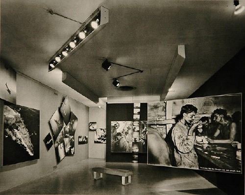
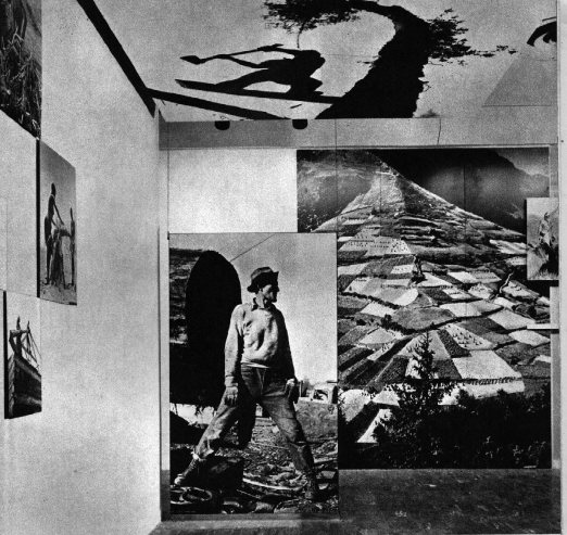
Which, I just couldn’t resist scanning in a couple of Ezra Stoller’s magnificent photos of Paul Rudolph’s installation from the original Family of Man catalogue.
photos by Homer Page, Brassai, George Silk (on ceiling)
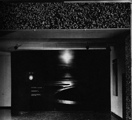
photo by Pat English used as wallpaper framing an unknown landscape.
As seen in Stoller’s photos, Rudolph’s show is an apotheosis of the enlarged photo and mural as an architectural element, a maker of spatial experience. It’s easy to say that photomurals and photomontages are architecture, or marketing, or propaganda, and not art, and it’d be true. But it’s also true that photography itself was not art at the time, either. As for photomurals and giant, painting-sized photos, they were merely the things exhibited in the Museum of Modern Art.
Stephen Shore’s Photomurals, I Mean, ‘Architectural Paintings’
that sidewalk, that exit sign, that door. installation image of Stephen Shore’s images, 1976
So yes, I’ve got a million other things to do, but thanks to this Mies thing being auctioned, and Michael Lobel’s article on photography and scale–and by implication, photography and painting, pace Chevrier’s forme tableau–I’m become slightly obsessed with the history of photomurals.
From what I can tell so far, I have the field largely [sic] to myself, but there is definitely some interesting work out there–and some interesting writing about it. And who should turn up as one of the innovators of these scale-blasting photomurals, but the master of the snapshot himself, Stephen Shore?
Just this past May, Swiss art historian Olivier Lugon published an article in Études photographiques titled, “Before the Tableau Form: Large Photographic Formats in the Exhibition Signs of Life, 1976.”
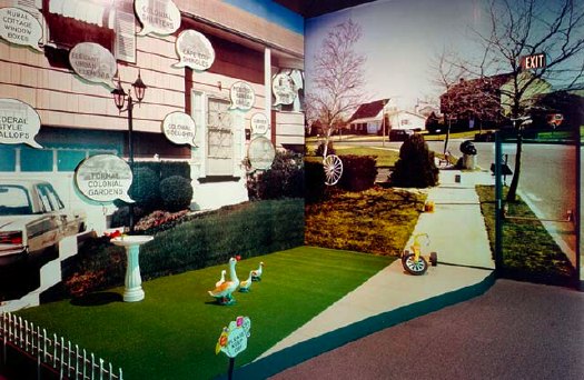
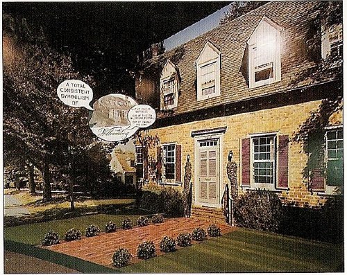
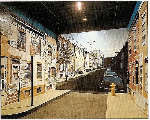
Signs of Life: Symbols In the American City was a groundbreaking and somewhat controversial show held at the Smithsonian’s Renwick Gallery as part of the US Bicentennial celebrations. Conceived in 1974 on the heels of the publication of Learning From Las Vegas by Robert Venturi, Denise Scott Brown and Steven Izenour, it was, depending on who you asked, an exultation, an examination, or an elitist excoriation of commercial and populist vernacular architecture and design. They filled the gallery with iconic roadside signs, and they created dioramas of archetypal American living rooms to give all Our Stuff the museological treatment.
And to photograph it all–and to create giant, deadpan photomurals of the American residential streetscape–Izenour selected a young photographer whose seemingly unstudied roadtrip snapshots had just been shown at the Met, Stephen Shore.
Lugon quotes Venturi & Scott Brown’s explanation of the show [I’m translating back here from French, so it’s probably off a bit]:
“The idea was to cross the model of the billboard, this image made for distant, fugitive, distracted perception of the driver, with that of the newspaper, which is a density swarming with information.” The art museum is thus invaded by two different but interdependent media regimes: the advertising billboard’s principle of rapid distraction, and the extreme informational concentration of the newspaper, two opposing models for aesthetic contemplation, where the distance of the viewer from the image is either too far or too close.
Despite working at like 100x his previous [and, for the most part, subsequent] scale, Shore’s illusionistic photo backdrops manage to capture the banality he loves. Banality in a good way, of course. I think this street is my favorite:
Maybe because he wasn’t a fetishy print guy–Shore rather famously sent all his film to Kodak to be developed, just like civilians–he readily embraced the print quality of the photomurals. Which–I love this–turned out to be paintings.
Lugon explains that the Signs Of Life photomurals were made with an expensive, state-of-the-1976-art, 4-color airbrush-like printing system from the Nippon Enlarging Color Company, which had been licensed for the US by 3M. Who marketed it to trade fairs and restaurants as Architectural Painting. With the public and art world attention from Signs of Life, 3M brought Izenour on to promote the new medium for use by artists and museums.
In 1977, Popular Science ran an article explaining how Architectural Painting technology worked. A specially prepared color negative was scanned and split into CMYK, and the quick-drying paint was applied in overlapping strips, inkjet-style, by a computer controlled, scanning sprayer. 3M technicians then touched up the finished print by hand. All in, it cost $10-25/sf.
Expensive enough to be the second largest line item on Signs of Life‘s budget, and sexy enough that Venturi et al. used it again almost immediately. For their controversial [i.e., steaming hot mess, according to Robert Hughes, who I’ll happily believe just this once] exhibition design for the Whitney’s Bicentennial blockbuster, 200 Years of American Sculpture, the architects installed a 27-foot-tall cutout photo by Shore of Hiram Powers’ iconic marble, Greek Slave, on the canopy of the museum. Ezra Stoller says it was “inspired by Caesar’s Palace,” which I’m sure was a compliment:
Once again, I start programming a bonus DVD for “The Original Copy,” Roxana Marcoci’s current show at MoMA on photography and sculpture. But I think the real story here is painting and photography.
Jean Francois Chevrier gets credit for the term forme tableau, which he used to describe the large-format photographs which began to assert a place on the wall and in the discourse that had previously been reserved for painting in the 1980s [and since]. Then Lugon mentions how Sherman, Prince, Kruger, etc. had appropriated the photography of commercialism–advertising and movies [Untitled Film Stills began in 1977]. And now here’s Shore, right there in the thick of things, making giant photos with his new-fangled, trade show backdrop printing techniques–which turn out in the end to actually be paintings. [And sculpture. And architecture.]
The kicker, though, is one of the complicating factors for why I’m finding photomurals so interesting right now. And I write this as a guy who has two of Felix Gonzalez-Torres’ Parkett billboard/photomurals because, once you install one, it’s up, it’s done, it’s gone: they managed to thwart the market. Here’s Lugon:
The photomural reveals itself to be extremely vulnerable. Its own installation, its dependence on conditions of fixation and lamination make it enormously fragil: with rare exceptions, it does not survive its exposition. It’s one of the fundamental points that distinguishes it from painting: its incapacity to become an object of collection.
When it was developed in the 19th century, photography constituted precisely a pure image for collecting: one acquired it to conserve, because it was capable of bringing all objects in the world together into a system of thesaurisation and generalized comparison, but it’s difficult to show. Small and grey, taking poorly to the wall, and with a surface that deteriorates in the light the more one views it. The grand format photos of the interwar years reversed this logic: photography became the image of exposition, but it renders it improper for collecting.
Only the forme tableau would succeed in crossing these two qualities, to make of photography an image at once for exhibiting and collecting–two criteria indispensable for accessing fine art’s economic system.
I guess I’ve gotta call Stephen Shore now and see if that’s really true, about his photomurals, I mean.
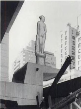
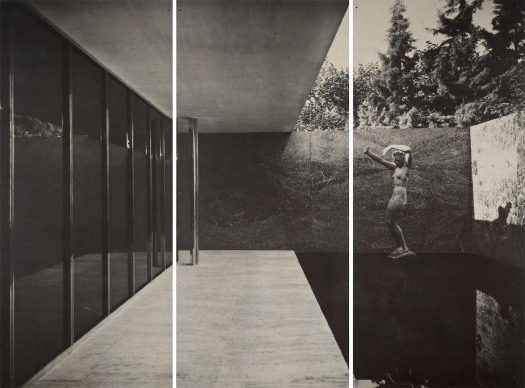
Other Barcelona Pavilion Photomural
Hah, it didn’t occur to me until I started looking into the history of photomurals, and–thanks to Michael Lobel’s great exploration of contemporary photography and scale in the new Artforum–I sucked it up and started reading Michael Fried’s new book about the new forme tableau photographic hotness, but this thing looks like that thing:
Lot 360 Mies van der Rohe, Barcelona Pavilion 1929 photomural, printed 1966, 2m x 3.5m [greg.org via lamodern]
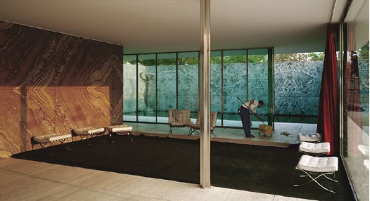
Jeff Wall, Morning Cleaning, Mies van der Rohe Foundation, Barcelona, 1999, 1.8m x 3.5m [image via tate.org.uk]
The photomural, printed by architect/curator Craig Ellwood for LACMA’s 1966 Mies van der Rohe retrospective, is, of course, of the original pavilion. Wall’s 1999 image is of the re-creation.
Imagine There’s No Made In Heaven
Christian Viveros-Faune’s ruthless smackdown of the Luxembourg & Dayan show of Jeff Koons’ porny 1990 Made In Heaven series is an acid, but necessary reminder of how economically and critically disastrous the early 1990s were for the artist. [Though I’m sure there’s a schadenfreude set who hug those Dinkins-era memories close.]
It also reminds me of a 1999 panel discussion Koons did with Rob Storr at MoMA. The occasion was the 25th anniversary of Artists Space. When asked why he had not mentioned Made in Heaven during his otherwise comprehensive conversation, Koons had said that he had repudiated the work, and that he would henceforth no longer associate himself with it. That’s always stuck with me.
He also mentioned being in a difficult and highly distressing custody battle at the time with his Italian ex-wife. So maybe the repudiation had a strategic element to it, and now that his son has moved and grown up, it’s time for takebacks.
If anyone goes to MoMA and tracks down that recording [which is not currently online], I hope they’ll tell me if I’m remembering it wrong.
UPDATE: And I may be. greg.org reader Dan emails to say that he listened to the tape yesterday at MoMA’s archive, and unless it was in part of the audience Q&A he missed, then this exchange wasn’t in it. I’ve had a distinct memory of hearing it, though, so I’ll have to figure out where that might have been. I’ve spoken with Koons several times–we used to live across the street from each other–but this series of work was not a topic I brought up with him.
Jeff Koons, Commodities Broker
So I think I had a breakthrough in figuring out the details of Jeff Koons’ Wall Street Era.
I just wrote a post about it. It is so long. So I put it below.
What I Didn’t See
The other weekend, I pigeonholed former Washington Post art critic Paul Richard after his talk, titled “What I Saw,” at the National Gallery of Art. I said that I’d been interested to hear his take on public art over his 40-year career, and he answered back, “What public art?” “I guess that was my real question,” I said.
Richard then made a quick and familiar explanation that public art is outdoor art, outdoor art is sculpture, museums in town focus on painting, and so sculpture generally and outdoor sculpture specifically is marginal[ized].
I had this exchange in my mind when I watched the Post’s current art critic Blake Gopnik effuse over his “favorite new discovery,” a massive Alexander Calder sculpture that has been sitting on one of downtown Washington’s busiest intersections for almost 30 years.
Gopnik said that in a series of Post web videos called, “The Wonders Around Us.” He opens another, featuring the chair-shaped granite sculptures of the late Scott Burton, thus: “I’m at the Sculpture Garden of the National Gallery, looking at works I don’t often look at–the ones they keep outside.”
In another video, discussing Richard Lippold’s 100-foot-tall steel starburst sculpture Ad Astra, in front of the National Air and Space Museum, he ends on what he imagines is a poignant and/or ironic note:
Amazing how you look at this thing, and you realize that almost no one but you is looking at it. Not a single head turned up to look at poor Richard Lippold’s magnum opus.
[Let’s ignore the fact that if Lippold has a magnum opus, it’s probably Orpheus and Apollo, which glitters across the atrium lobby of Avery Fisher Hall. Gopnik was going for pathos, and couldn’t very well call Ad Astra a “masterpiece” so soon after calling it a TV antenna.]
Days later, Gopnik was writing about Hirshhorn director Richard Koshalek’s proposal to renovate the museum’s sculpture garden on the Mall and add indoor exhibition space to/under it, since the current sculpture setup is “dormant,” rather than “lively,” and [anecdotally, at least] is always empty.
Which may be true, but that’s not [quite] the point. And [for once or twice] I don’t want to pick on Gopnik; in this case, I think his forthright ignoring of outdoor sculpture is probably in sync with the general population of DC. The city is stratified and carved up into ghettos for tourists and locals alike. Commuters, whether in cars or trains, on bike or on foot, rarely venture off their routes.
Outdoors, art, or sculpture in a drive-by situation quickly becomes invisible, receding into the landscape passing outside the window. But is that actually just a DC thing? I don’t think so. Is it even just a city thing? Is it even just an art thing? How quickly does something become invisible, and why? What happens to art in such a context? Has someone written about this with intelligence or insight?
Is it even just outside? We like to think that art rewards close or considered looking. But how long do most people look at most artworks in most museums? [answer: for less time than it takes to read the label next to it.] Do professional art lookers sit through every blackbox video installation they enter, or do they only watch long enough to “get it”?
When I started, I thought I was writing this about DC, its critics, its particular context, sculpture, outdoor art. See how the circle keeps expanding to include everything? Now I’m a little bummed out.
A Small Collection Of Awesome Browser Tabs
Here are some things I find I have kept open for several days or weeks, which I guess is one measure of how they are sticking with me:
Andrew Russeth’s look into the market and objects of Marcel Duchamp is pretty great. I’ve been keeping Duchamp’s practice on a low burn for several months now. One thing Andrew reminded me of, is looking through the chronology in the MoMA/PMA Duchamp retrospective catalogue. For a guy who supposedly stopped making art in like 1915 or whatever, Duchamp sure spent a lot of time over the years making, picking & packing Boites en Valises.
Oh, another thing Andrew reminds me of: how great dealer Francis Naumann’s book about Duchamp’s objects, Marcel Duchamp: The Art of Making Art in the Age of Mechanical Reproduction is.
Dan Hill’s been really busy of late, and so the time lapse has grown between the classically long, thoughtful posts on City of Sound. Which makes it even more imperative to read his recent contemplation of the ever-so-slightly undulating grid of Carrara marble on the facade of Alvar Aalto’s Finlandia concert hall in Helsinki. That guy knows how to see and think. Hil, that is. Aalto’s no slouch, either, but you know what I mean.
Perhaps in unconscious preparation for a long-overdue Terry O’Shea retrospective, Grace took a photo of the biggest La Brea tar pit from the second floor of LACMA in 2007.
Here is how the books in three galleries in a row looked Saturday. This one happens to be from Pruitt’s show Maccarone:
Which, by the way, I know I love the Monsters, but I was not ready for the Ikea paintings. They were rather engrossing. He paints over the Ikea knockoffs-on-canvas using a phenomenal amount of paint. The first one in the doorway, on the left, is full of flesh tones, and has this incredible surface, caused in part by Pruitt’s use of Saranwrap or something to smooth down the thick, undulating surface. Of course, when he removed the plastic, the paint came up in spots, forming little peaks. In other places, gaps in the paint exposed the Ikea image below, and in still others, the creases of the plastic remained. If I’m the first, I should not be the last to consider Pruitt’s Ikea paintings alongside the overpainted photographs of Gerhard Richter. Yes, that’s right. At the very least, it’s an interesting and unexpected reference.
Distinctively unawesome: UbuWeb has been knocked offline. [via eyeteeth]
Consider The Artist
Karen Green has a show of her most recent art work at the Space Art Gallery in South Pasadena. Thematically, it is similar to her show last year:
The work of making the pieces in “Latent Learning Experiments,” Ms. Green said, held her together in the year after her husband’s death. “I kept making art because I didn’t know what else to do, and that’s what I’ve always done,” she said.
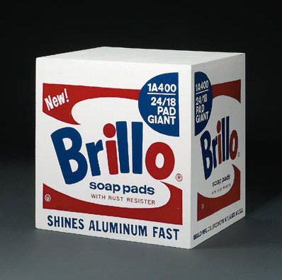
Oh, The Places You Go, Little Brillo Box
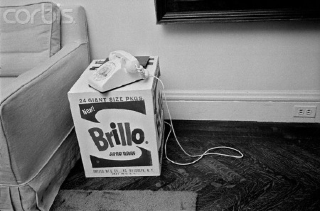
Bob Adelman, Castelli’s house, 1965, fairly ganked and shrunk via corbis]
Now that they’re selling for a million dollars or whatever, it’s hard to imagine how Warhol’s Brillo Box sculptures were perceived at the time they were made.
When they were lowly $300 sculptures, mechanically produced in seemingly endless supply, they were treated like furniture, traded and given away like party favors or the curatorial equivalent of hostess gifts. They were a medium of social, not economic currency. [At least not direct economic currency. Even from his early days as an illustrator, Warhol was already familiar with the art gift’s ingratiating self-promotion.]
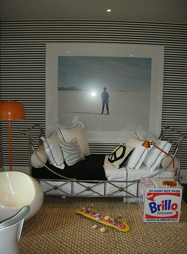
The most common exhibition strategy for a Brillo Box was as a table. Two of the three Boxes I’ve seen in private collections were encased in Lucite and placed next to chairs. One had a lamp on it. The photo above [from janee’s flickr] shows what looks like a Stable Gallery box being used as a kid’s table in a San Francisco decorator showhouse. In 1988, Leo Castelli told New York Magazine he used two encased Brillo Boxes as side tables, but in 1965 when Factory photographer Bob Adelman snapped this picture at Castelli’s house, it was just the box and the phone. [See the full-size image at Corbis.]
Irving Sandler’s original Brillo Box, signed by its designer, Jim Harvey, image via]
The Warhol Authentication Board’s report on the Pontus Hulten affair captures both the gift and furniture aspects of the dozen or so Boxes made in 1968:
Of the six Stockholm type boxes known to exist, three were given to [curator and later museum director Ollie] Granath as “souvenirs” for having helped Hulten with the Moderna Museet exhibition. Hulten kept the other three for his own use; two served as bedside tables for his children. [pp.9-10]
…
Of the three that Hulten kept, one was later given to the silkscreener who made the Malmo type boxes. [p. 10]
[Hmm, I wonder if Castelli’s 1988 sale of his end table “to European collector” for $50,000 motivated Hulten to trade one of his own Stockholm type table/”souvenirs” in order to, uh, complete his edition?]
 The report also mentions the 100 Pasadena type boxes, plus “as many as 16” additional Boxes identified in the CR that were “given as gifts or sold.” Two of those 16 are the Oberlin Brillo Boxes, [right] which Warhol gave to Pasadena Art Museum curator John Coplans, who later donated them to the college’s Allen Museum.
All this gifty goodness and casual domestic use leads me to speculate that LACMA’s “missing” Kellogg’s Corn Flakes boxes–10 known, plus at least 33 and maybe more, if they produced as many as Pasadena did–were treated as thank-you gifts to donors who paid for their fabrication, or were sold to “friends and family” of the museum. So keep your eye out.
Facture-Checking Warhol’s Brillo Boxes
The Brillo Box formerly known as Stockholm type, and formerly known as being by Andy Warhol, sold at Christie’s in 1998.
So awesome. The Beverly Hills art dealer Robert Shapazian’s bequest to the Huntingon Museum of 10 Brillo Boxes by Andy Warhol has brought the whole tangled Brillo Box versioning and authenticity debate back into the news. As the LA Times’ Christopher Knight reports, Shapazian’s Brillo Boxes include one 1964 Stable Gallery box–and nine Pontus Hulten Boxes, made by the legendary founding director of the Moderna Museet. And the Pompidou. And MoCA.
Until this summer, those nine would have been called Stockholm Type. But following the completion of the Warhol Authentication Board’s 2+year investigation and the release of their 27-page report [Jul 19, 2010 pdf via LA Times], the 105-120 or so Stockholm Types have been split into Stockholm Types and Malmo Types.
Hulten had somewhere between 10 and 12, but not more than 15, boxes made after his 1968 Warhol exhibition at the Moderna Museet closed. He did this, he said, because Warhol told him to “make them over there.” Hulten apparently pocketed that date and authorization. When, in 1990, he had 105 Boxes fabricated in Malmo for a series of exhibitions, he referred to an “old authorization.” The only thing missing, it seems, was documentary evidence of this readymaking on Warhol’s side.
There was extensive context provided to show that fabricating works was part of Hulten’s standard practice–he had replica Tatlins and replica Duchamps made, including, even, a Large Glass, which Duchamp later signed [as a “copie conforme”]. Hulten’s texts and statements show he considered Duchamp and Warhol as readymade brothers.
Following the logic of Duchamp and taking it to another power, Hulten interpreted Warhol’s 1964 Stable Gallery box sculptures not as factured works of art, but as repeatable, ready-made objects, that were interchangeable with real Brillo Soap Pads cartons or replicas.
And then the Board does what authentication boards do: it examines the physical details of each type of box, distinguishing Warhols based on the traditional notion of the character of their painted surface, or facture. Stockholm types were “painted and sanded multiple times to achieve a high degree of finish before they were printed,” but Malmo types “appear to have been painted with a roller.” Stockholm types have mitered corners, but Malmo types [and Stable Gallery types, for that matter] have abutted joints. Malmo types are made with a nail gun, Stockholm types were nailed by hand. And so on.
The conceptual difference between these two approaches to Warhol’s work is fascinating, and Hulten clearly felt justified and correct in the way he had his Brillo Boxes made. The fact that Hulten’s 1968 boxes were made in 1990 seems to have been more broadly known and accepted within the Scandinavian museum and art community. But he also did not have any problem “misrepresent[ing] the works and falsif[ying] their history” to the Estate, the Board, and the Catalogue Raisonne.
And so, the Board has reclassified all Hulten boxes as “exhibition related copies” [Stockholm] and “exhibition copies” [Malmo]. Any questions?
After 26 Years, The Smithsonian Will Put Alexander Calder’s Gwenfritz Back Where It Belongs.
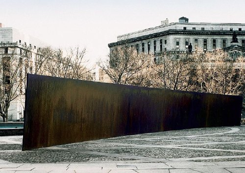
What if they decided to put Tilted Arc back? What if the General Services Administration, and the Jacob Javits Federal Building folks called up Richard Serra and said, “You know what this Federal Plaza needs after all is a nice, long, angled slab of Cor-Ten steel”?
Would that be a shock? Would that be a story? A new day of some kind dawning? Because that’s what’s happening. Only it’s not New York, it’s Washington, DC. And it’s not Richard Serra, it’s Alexander Calder. And it’s not Tilted Arc, it’s Gwenfritz.
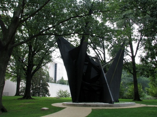
Gwenfritz displaced, image via si.edu’s Mitch Toda
In 1965, Mrs. Gwendolyn Cafritz convinced the Smithsonian’s S. Dillon Ripley that the first modern building going up on the National Mall–the Museum of History and Technology, now known as the National Museum of American History–needed some modern art to go with it. She offered her family’s support for a large, abstract fountain by Alexander Calder. After site visits and negotiations, the artist settled on a fountain jets-inspired sculpture in a reflecting pond. The Cafritz Foundation donated the $400,000 needed for a 40-foot high, black steel stabile [and its landscaping] on the west end of the museum.
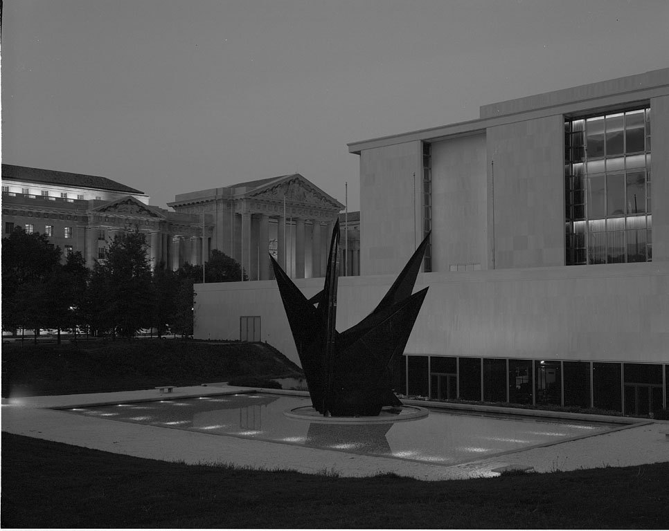
Gwenfritz, c.1969, in the site Calder designed it for, via si.edu
At the dedication ceremony in June of 1969 [below], the Washington Post reported that Calder unexpectedly announced the name of the sculpture would be, The Caftolin. When her turn came to speak, Mrs Cafritz said no way, they were sticking with the first choice, The Gwenfritz, and that’s that. Obviously, no one objected.
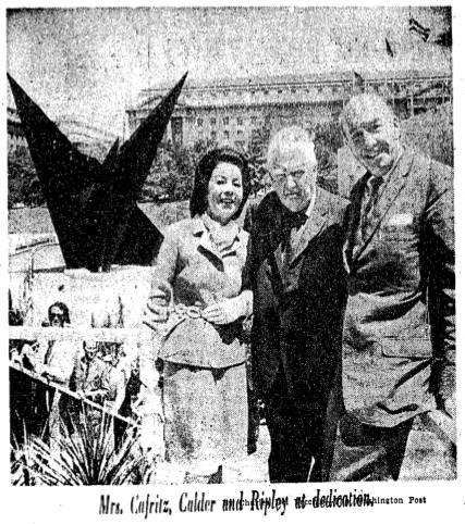
via Washington Post, June 4, 1969
The Gwenfritz [not sure when the The disappeared] was Calder’s first major commission in Washington, one of his most important stabiles, and Washington’s first major modern and first major abstract public sculpture.
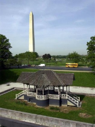 None of which seemed to slow down the Smithsonian which decided in 1983 to move the site-specific sculpture and replace it with a Victorian-era bandstand from the grounds of a Jacksonville, Illinois mental hospital. Or the Washington Fine Arts Commission which approved the move over the objections of–well, of almost no one, since Calder himself had died in 1976. The Washington Post did run an angry column by Robert Hilton Simmons, though, criticizing the trouncing of the artist’s intentions and the Museum’s claim that the sculpture’s new site, in a grove of trees on the corner of Constitution Ave & 14th Street, would “allow it to serve more fully as a focal point.”
The frictionless violation of Calder’s intentions was cited by public art experts as a direct precursor to the government’s accelerated actions in the Tilted Arc controversy beginning in 1984-5. And yet, in the absence of an outspoken artist, Gwenfritz has sat in its altered, degraded, and supposedly more “focal” site for 26 years and counting.
All of which makes Washington Post art critic Blake Gopnik’s new video visit to Gwenfritz even more jawdropping than normal:
This is actually one of my favorite new discoveries in Washington. It’s by Alexander Calder. He made it in 1968, and it’s called Gwenfritz. Terrible name for a really amazing, magical work of art.
Rather than ask what it means that the Post’s art critic calls a 40-foot-tall Calder located at one of DC’s busiest intersections–across the street from both the White House and the Washington Monument– a “new discovery,” why don’t we just say it proves the paper’s 1984 argument about the invisibility of Gwenfritz‘s displaced site. [Or maybe Gopnik, like many, many Washingtonians, is essentially inured to monuments and outdoor sculpture. A fascinating theory, perhaps, for another post.]
And rather than mock, I’ll just note Gopnik’s proudly uninformed self-reflexivity, and his free-associative interpretations based on the sculpture’s maintenance issues. [“This seems so much a part of the period in which it was made, the tail end of American industry. You could call this a ‘Rust Belt Sculpture.'” Actually, it was born when Modernism was still the official symbol of America’s free and glorious future, and that its ex-pat creator had it made in France.] And his praise for the idyllic site and its relationship to the surrounding trees.
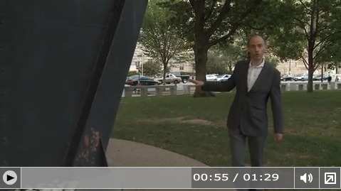
And his complete ignorance of the work’s context, history, or implications when he mentions in passing, “I think the Museum’s going to move this to a better site soon. That’s what I’ve heard.”
Oh?
Yes.
I called the press office today and confirmed that it is the Museum’s as-yet unannounced intention to return Gwenfritz to its original site. In August, the bandstand was dismantled in preparation for its triumphant return to Jacksonville. The date for Gwenfritz‘s return has not been set, but it will mostly likely take place after the Museum’s renovation of the west wing, or sometime between 2012 and 2014.
Or just in time for the 30th anniversary of its uprooting. You heard it here fir–let’s just say that’s what I heard.
Industrial Remnants [washingtonpost.com]
Going Long On Terry O’Shea
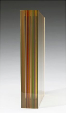
Terrance O’Shea, late 1960s, 11x11x2 slab of laminated plexiglass
This summer while poking around into the conflicted treatment of the Pasadena Art Museum’s Warhol Brillo Boxes, I found a tangential mystery: 10 or 30 or 40 or more Kellogg’s Corn Flake Boxes Warhol authorized for the LA County Museum of Art seem to be unaccounted for. Warhol “donated” 100 boxes in 1971; the donor/collectors on LACMA’s influential Contemporary Arts Council paid for the fabrication; but now the museum only has 57 in their collection, and at least ten have turned up in private collections and/or at auction.
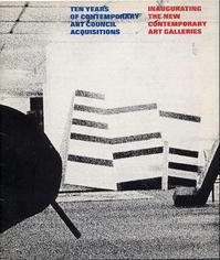 Still haven’t figured that out. But one thing leads to another, and so I’m looking at the catalogue for the last known appearance of “all” the Warhol boxes, a 1973 show organized by Maurice Tuchman titled, Ten years of contemporary art council acquisitions, inaugurating the new contemporary art galleries, [left] and I see this title, how can I not?
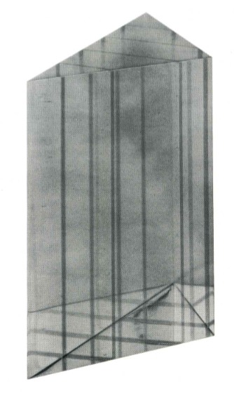
Documentation of the Artist’s Act of Placing One of His Sculptures in the La Brea Tar Pit, 1971, by Terrance O’Shea.
And the work consists of a photograph–a 4×5 transparency, actually, and a notarized letter/certificate. And the sculpture is a Lucite-looking prism or wedge, and there’s no letter, and the LACMA website only has a thumbnail image of the letter, no text.
And the web searches for Terrance O’Shea are incredibly meager-to-nonexistent. Even though he was apparently the first LA plastics artist to win the museum’s [CAC-funded, btw] New Talent Purchase Award–in 1966.
But I turn out not to be the only guy looking at Terry O’Shea in 2010. The folks at Cardwell Jimmerson in Culver City had just restaged a pivotal 1971-2 CalArts exhibition titled, “The Last Plastics Show,” which had included O’Shea’s work. Both times. Here’s how their press release set it up:
By then [1972] the subject of plastic, resin and arious automobile-body technologies as expressed in California art had been thoroughly explored in multiple exhibitions up and down the west coast and extending east to Detroit and the Jewish Museum in New York. Moreover, the sunny technological optimism associated with California in the nineteen sixties had suddenly darkened; the hostile reception greeting LACMA’s 1971 blockbuster “Art and Technology” exhibition being a case in point. This was indeed the end of an era, as older art practices and institutions (plastics and Chouinard Art Institute, for instance) gave way to the new (Conceptualism and CalArts). It was in this historical context that the artist/curators Judy Chicago, Doug Edge, adn DeWain valentine gave the exhibition its decidedly self-mocking and surprisingly poignant title: “The Last Plastics Show.”
So I spoke with Tom Jimmerson, who gave me a brief sketch of O’Shea’s work and life. He was sort of an artist’s artist’s artist, it seems, difficult to work with, and yet friend to many. Apparently holding artspeak and underwear in equal disdain, O’Shea was known to suck in his gut and let his pants fall to the ground at openings when the conversation got too hi-falutin’.
Runes, 1968, Terry O’Shea
He made impossibly tiny works out of the shards of plastic he’d salvage from his buddies’ castings: intricate capsules, spheres, eventually some book-sized slabs, which he’d keep in black velvet bags and present with a magician’s flourish for the viewer to hold and manipulate. The gallery is working on an O’Shea show for 2011, Tom said, and it sounds fascinating.
But Tom didn’t know the details of the LACMA piece, or the story behind it. So he put me in touch with Doug Edge, one of O’Shea’s best friends [O’Shea himself died from complications associated with a life of heavy living], he’d know. And so he did. I just spoke with Edge the other day. Here’s how it went down:
In 1966, Terry went to see Maurice Tuchman and showed him his work, which he pulled out from one pocket after another. O’Shea was soon awarded the New Talent Award, which meant the museum would purchase a work for the collection. Only Tuchman or whoever never really followed up. Perhaps there was some ambiguity about the artist’s responsibility to produce or present options for the curator [or the collector’s committee] to choose from. Or maybe the museum was supposed to approach the artist, visit his studio. Either way, though there was, in fact, a sculpture–it was a clear, polished wedge with channels carefully routed out and filled in with colored resin, like all O’Shea’s sculptures, it was laboriously fabricated and detailed–the acquisition hung in the air until 1970.
On May 28 1970, O’Shea and two friends–Edge didn’t name names, but would only say that one was “a real big guy–went to the museum at about 2AM, and using the fence surrounding it in some sort of catapulting maneuver, Terry had his big friend heave the little wedge into the tar pit next to the museum.
Not that LACMA knew, of course. It wasn’t until many months later, perhaps precipitated by an administrator at the museum following up on an unfulfilled pledge of work, that O’Shea informed the museum that he had, in fact, delivered their work, and they were already, in fact, in possession of it.
He created a sculpture and then he–he didn’t destroy it, exactly; he “placed” it in a way that it can now only be experienced as a photograph.
This work lingered in my mind for a few months. But after seeing “The Original Copy,” Roxana Marcoci’s show of photography and sculpture at MoMA, I really picked up the pace on tracking down O’Shea’s LACMA work. Which seems almost entirely undiscussed in the art and art historical world. And yet, not only does Documentation of the Artist’s Act… fit Marcoci’s premise like a glove, but O’Shea himself was operating at a critical juncture in LA’s artistic history, a singular link between plastics and finish fetish–which he deployed toward his own, idiosyncratic ends–and the Conceptualist irreverence of, say a Nauman or an Oppenheim, or a Ruscha, who also happened to make a work involving LACMA and fiery destruction.
But anyway, keep that all in mind while reading O’Shea’s letter, which Edge graciously read to me over the phone. It’s after the jump, because even though I’ve found some other of O’Shea’s work that shows this LACMA piece was not just a one-off joke, it’s hard to imagine this post going even longer that it already has.