
No one rips off quicker than window dressers. They take next week’s ideas from last week’s paper, or they stop by the magazine stand on the way to Home Depot.
One Monday morning, I passed by Bergdorf’s on my way to work just as they were unveiling the new windows. I stopped dead in my tracks as, unbelievably, two artist friends’ works were ripped off at once: the backdrops were Stephen Hendee’s crystalline architectural forms made of foamcore and black tape, and the designers’ names were printed in the perspectival receding typeface of Ricci Albenda’s paintings. By no coincidence, both artists had been featured in a cover story in art/text magazine that had hit the stands just days before. I called both artists and their dealers that morning, and the whole shebang was gone by the next day.
So I’m a little less shocked, shocked, than Todd is to find out Saks Fifth Avenue windows are decorated with “Dan Flavin” fluorescent lights. I’m also sure that Flavin’d be rolling over in his grave, if only the last work he completed before he died wasn’t a Christmas light installation in the windows of the then-new Calvin Klein boutique on Madison.
Flavin on Fifth Avenue [fromthefloor]
Weird. Why have I written almost the exact phrase three times now? [google: “dan flavin” “calvin klein”]
Category: art
Watch Regarding Clementine Close Tonight
The exhibition that Choire Sicha curated which inexplicably included me, Regarding Clementine, is closing this evening.
There’s a swanky beer bust [sic] from 6-8, a closing party, to which the less stalker-ish among you are definitely invited.
Clementine Gallery
526 W 26th St, Chelsea Arts Bldg, 2nd Floor
[note: For the more stalkerish, the address is 526 East 26th st, and it starts at midnight.]
Look At Me, I’m At Art Rotterdam 2005 Feb. 24 & 25
Assuming they don’t close down all discussions of art, film, and culture before I get there, I’ll be in Rotterdam, participating in a couple of panel discussions around the upcoming Art Rotterdam fair.
In one debate on Feb. 25, Saskia Bos, director of De Appel in Amsterdam, will moderate as we discuss private and public funding for the arts, particularly for museums. [I’m there to discuss my work at MoMA with the Junior Associates.]
Also on the panel:
Claudia Rech, Head of development Guggenheim Collection, Venice, Italy
Rainald Schumacher, Director Goetz Collection, Munich, Germany
Kees van Twist, Director Groninger Museum, Groningen, NL
Frank Lubbers, Vice-Director Van Abbemuseum, Eindhoven, NL
The other one is still gelling, but I hope it doesn’t involve Islamic fundamentalists. More details soon.
Art Rotterdam 2005
Regard me at Regarding Clementine
I’m gonna be working at the Clementine Gallery as part of Choire’s show again today. If you’re in Chelsea, stop by and say hi.
Clementine Gallery, 526 W 26th st, Suite 211
Previously: Regarding greg.org at Regarding Clementine
On Smithson, Space & Time
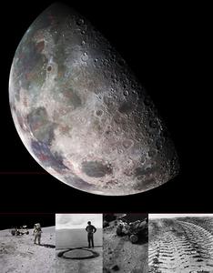
Another cover from Life“the lunar surface photographed by the Apollo astronauts in 1969” yields a comparison to Smithson’s cover for Artforum published just a month later: a distribution of mirrors across a square of parched earth, one of a number of illustrations from his “Incidents of Mirror-Travel in the Yucatan.” Placing these images together, which speaks to an argument about travel as a form of cultural repetition that suspends an experience of the present, demands a great deal of archival legwork on Reynolds’s part.
-Pamela M. Lee writing about new books about Robert Smithson in “The Cowboy in the Library,” published in the Dec/Jan 2005 Bookforum. She’s referring to Ann Reynold’s 2003 book, Robert Smithson: Learning from New Jersey and Elsewhere, which draws intensively and creatively on Smithson’s archives at…the Smithsonian.
The image above is Moonworks, artist Craig Kalpakjian’s 2003 proposal for creating earthworks on the moon. Read about it in Issue Magazine. Craig’s got a show up through Saturday at Galerie Edward Mitterand in Geneva.
Lee continues:
In one of the most striking passages of art history I’ve read in a while, Roberts connects a Mannerist altarpiece Smithson studied at length with the abstract sculpture he began making in the mid-’60s, by bridging a discussion of Jacopo Pontormo’s Descent from the Cross, 1525-�28, a deposition image composed around the rotational forms of its sacral actors, to the spiraling forms and crystalline structures of works such as Gyrostasis, 1968. What connects them in Smithson’s oeuvre, Roberts argues, is their attitude toward the deposition of time: Pontormo’s languorous Christ now exhibits a “depositional temporality,” whereas the growth process of a crystal is itself called a “deposition.” It says something about Roberts’ gifts as a polemicist that she can make this leap wholly convincing for the reader. More art history should be written with the kind of imagination and verve displayed here.
Roberts is Jennifer Roberts, who wrote Mirror-Travels: Robert Smithson and History. Smithson’s sculpture Gyrostasis was recently on view at the Hirshhorn.
On Math & Art In France
Although Gustav Eiffel didn’t explicitly use one himself, an American engineering professor has come up with a mathematical expression for the shape of the Eiffel Tower, based on its creator’s own studies of wind resistance, torquing, and load transfer.
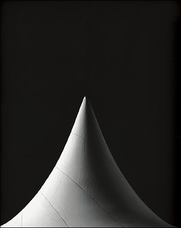
Which reminds me of the photos by Hiroshi Sugimoto at the Fondation Cartier, Mathematical Forms. They are monumental images of beautiful, little plaster stereometric models, which were created in 19th and early 20th c. Germany to illustrate complex trigonometric formulas. Several were published in the NY Times Magazine last month.
Elegant shape of Eiffel Tower solved mathematically [PhysOrg.com, via archinect]
Etant Donne: Le Grande Verre by Hiroshi Sugimoto through Feb. 27 at the Fondation Cartier
Hiroshi Sugimoto’s Mathematical Forms [NYT Mag]
From Anne Truitt’s Journal, ‘Prospect’
I just read this Friday night on the train. Seemed apt:
Brenda Richardson, deputy director of the Baltimore Museum, installed the exhibition there. We had agreed that she would install alone so when I walked into the rooms filled with work dating from First, 1961 to 1991, I had the delight of seeing it from an entirely fresh point of view. One of the trepidations I feel when my sculptures are exhibited is that they may be harmed: people like to touch their surfaces, they mar them without intending to. Brenda forfended this possibility by isolating groups of sculptures inside a designated pathway: they stood aloof from touch save by imagination. I had the happy feeling that the work was safe. [p. 146]
…
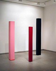
Some time ago a friend who had flown from his home in Boston down to Richmond wrote me a postcard to say that he had seen in a bank there a sculpture he instantly recognized as mine. Recently a little girl saw that same sculpture, Signal. It is a small column, 59 inches tall x 5 1/2 inches x 4 inches, painted in clear yellow, white and blue horizontal planes. It must have looked like a Maypole to this enthusiastic child: she ran to it, hugged it, swung around it–and scuffed it. I do so like her reaction, which mitigated the automatic spasm of anger I always feel when one of my pieces is damaged. The bank has sent me the sculpture for restoration. I am working on Signal now, with the good feeling that I can return it in pristine condition to a place where it apparently encounters appreciation.
Not all damage is that minor. A columnar structure running on a line of gravity from earth to sky is as intrinsically precarious as a human body; no matter how carefully weighted and how strongly constructed, it can be struck down. Knot, a column 81 inches x 8 inches x 8 inches, was recently so toppled. This sculpture had survived the Persian Gulf War in the basement of the American embassy in Tel Aviv, but last month a photographer backed into it and knocked it over. A representative of the U.S. State Department Art in Embassies program, under whose aegis Knot had been placed in Israel, was present the other day in the studio when I uncrated it. As I raised it to its full height over our heads, we heard loud cracks. The material wedged into a solid cradle at its base, ballast to prevent its tipping, must have been shattered by the force of its fall. To judge from the scars denting its pure yellow, white and black encircling colors, it probably dropped at so tipped an angle that it hit the floor twice. The Art in Embassies representative remarked that the Tel Aviv embassy has a marble floor. In any case, the internal damage is, for a variety of structural reasons, irreparable.
I have never been able to detach myself sufficiently to prevent a feeling of having been hurt myself when my work is damaged. I use the money I receive for restoration to make new work, but I never stop rather anxiously holding all my own work intact in my mind, hoping for its safety. In Knot‘s case, this attachment was augmented by the fact that it had traveled in a foam-lined bed inside a wooden crate beautifully made by an old friend. He had for many years packed my work. Last December, he was killed, senselessly gunned down in the street, instantly bereft of both dignity and life in yet another of the wanton murders that now characterize our urban area. His crate was perfect; it stands in my studio reminding me of him, and of Knot as it will never be again. [pp. 159-60]
Excerpts from Prospect: The Journey of An Artist, by Anne Truitt, whose sculpture, Catawba, was recently damaged at MoMA.
Combined With Archie Bunker’s Chair, They Cover The Full Spectrum
The Smithsonian, specifically the National Museum of The American Indian, accepted a gold record for “Y.M.C.A” from the Indian guy in the Village People. For all the disco celebration in the rotunda during the handover ceremony, it pales in comparison to the Washington Post writer’s own campiness.
Celebrity Artifact [WaPo, via Towleroad]
Marinetti, I know, but who’s Mussolini?
Jonathan Jones gives a brilliantly outraged review of a show of ‘Italian Aeropaintings,’ a Futurist subgenre which flourished in the 1930’s. The curators at the Estorick Collection say this work demonstrates “a passion for the new perspectives and vertiginous excitements of aviation – an innocent wonder we have lost in our age of routine civilian flight.”
What they don’t say, and what gets Jones so rightly worked up: ’30s Italy was ruled by fascists; the planes in the paintings are bombers; the Futurists–especially Marinetti–were friendly suck-up loyalists to Il Duce–who loved to fly and was photographed in his flight suit climbing out of a biplane. One 1937 painting, Aerial Mission, Jones deduces, may even refer to the bomber’s-eye view of the Luftwaffe’s Guernica carpetbombing experiment itself.
Yeah, funny how they forgot to mention all that. The Italian government is thanked for its deep and stalwart support of the show.
Birds of Prey [Guardian]
Fascism? What Fascism? [Estorick Collection]
Re-inventing the Lightbulb, 2/2: Stephen Flavin
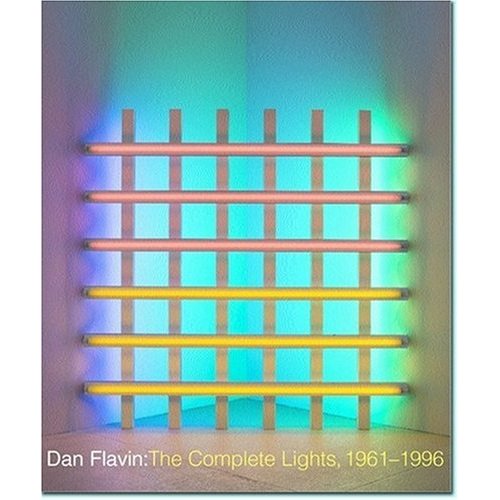
img: Dan Flavin: The Complete Lights, 1961-1996
Stephen Flavin is the only child of Dan Flavin and his first wife, Sonja Severdija. Trained as a filmmaker, Stephen, who lived apart from his father since his parents divorce, began assisting his father’s company, Dan Flavin, Ltd, in 1992. His first efforts–producing the artist’s all-important certificates by computer (previously, they had been variously handwritten or typed) and converting the elaborate and disparate index-card-based inventory of works, which was split among several galleries, to an electronic database–have helped in efforts since his father’s death in 1996 to create a catalogue raisonne of the artist’s work.
Stephen Flavin has overseen the activities of his father’s estate since 1997. He is private and is generally satisfied to have others–such as Steve Morse, the estate’s studio director, or Dia experts such as Michael Govan or Tiffany Bell–speak publicly about Dan Flavin’s work. While my several attempts to contact Stephen before the article’s deadline were unsuccessful, he did call me shortly thereafter and graciously agreed to discuss his experience with the estate, his father’s work, and Dia:
Continue reading “Re-inventing the Lightbulb, 2/2: Stephen Flavin”
Re-inventing the Light Bulb, 1/2: Emily Rauh Pulitzer
Although they happened too late to make the article, I had some enlightening conversations with Emily Rauh Pulitzer, a collector and curator of Flavin’s work, and with the artist’s son, Stephen Flavin, who manages his father’s estate. They’re worth sharing here for the additional light they shed [sic] on Flavin’s legacy and the complexities and contradictions inherent in his deceptively simple work. I’ll post them separately, first Pulitzer.
Continue reading “Re-inventing the Light Bulb, 1/2: Emily Rauh Pulitzer”
Did Someone Say Art Market Bubble?
 Richard Polsky does a round-up of the 2004 art market on Artnet and makes some predictions for 2005, and guess what? Of the dozens of artists he looks at, only four–Takashi Murakami, Yoshitomo Nara, Felix Gonzalez-Torres (??) and Ross Bleckner–are anticipated to go down next year. Most are going up, or are predicted to be “status quo,” which I take to mean either “they’ll go up, but I don’t know why” or “they’ll go down, but I don’t want to piss off my dealer/artist/collector friends by saying so.”
Murakami and Nara are cheap/easy shots: their auction prices have been wild for a while. Bleckner’s market has been sort of sleepy for a while, so no one’s shocked by that. And Felix, he’s just wrong on that one: the work that came up this year was either atypical, or sold very well. Soon enough, people looking for good Felix’s will find there aren’t that many left. I think Polsky’s just being pissy.
In any case, his analysis reminds me of the i-banks’ stock recommendations during the bubble: all buys, no sells, with all arrows pointing up. And we know how that turned out.
Art Market Guide 2004 [artnet]
Rereading Anne Truitt
James Meyer: You turned eighty last year. Has age, in some way, affected your work?
Anne Truitt: I don’t think age makes any difference except that it endows a person with freedom. Age cuts you off, untethers you. It’s a great feeling. The other thing is, when you get to be eighty, you’re looking back and down, out from a peak. I can look down and see my life from my own little hill; I see this plain, all the years of experience.
JM: Does that mean making the work is somehow easier?
AT: No, it’s harder. It costs me much more; I have all those years that I have to face and it takes a certain amount of courage. It’s not a light and foolish thing. Color is getting more complex and harder and harder to mix. There are more complexities in it because my own experience is much more complex.
JM: Is it physically more difficult to work?
AT: It’s not more difficult to be faithful, but I have to be faithful to more and more. And I have less psychic energy as I get older. Heaven knows I have less physical energy!
JM: But it has not changed the fundamental process or ambition of the work. If anything, the ambition has increased.
AT: Yes, I would say, by leaps and bounds.
-excerpt from “Grand Allusion,” James Meyer’s interview with Anne Truitt, published in the May 2002 issue of Artforum.
The People In Your Neighborhood
It took us a few months to realize it, but one summer evening, the street we were walking along grew increasingly familiar. We’d driven on this street, I told my wife, this is where we parked to go meet Anne Truitt. Sure enough, around the corner was the house she’d invited us to over a year and a half earlier, after I’d asked a curator and mutual friend had introduce us.
 We had a wonderful time; she was very gracious, very engaged, talked at length about NASA and science with my wife; she’d just emptied her studio for a show, so there wasn’t much to see, but we’d see it when we came again, she promised.
Once we realized we’d moved into Anne Truitt’s neighborhood, we decided we should invite her over. The heat of the Washington summer made me doubt whether she would see a visit to our seemingly under-air-conditioned apartment as a fair return for her hospitality, so I waited until September to write her. We’d had a baby, &c., moved into the District, &c., realized you were nearby, &c.
Within a week, she wrote back, and I spent October planning the best occasion to have her over. We’d have her for tea [note to self: buy tea], or maybe even dinner [note to self: finally light stove]. We’d invite some younger artists, friends who had been inspired by her work and success in an art world that was still–in the minimalist 60’s and 70’s, especially–a hard-edged boy’s club. We’d invite some collector friends, who’d in turn thank us for introducing them to such an important artist. But mostly, we’d probably talk about our daughter–it’s all we ever do these days, anyway–who Mrs. Truitt had congratulated us on, and who she said she was eager to meet. And we’d trade stories about kids–and grandkids–and just enjoy her company.
Then in November, I saw one of her early, pioneering minimalist sculptures in the newly reinstalled MoMA. How’s that feel, I’d ask her. Have you seen the installation yet? No? Don’t worry, the pink Flavin in the far corner doesn’t reach your piece. Ryman’s, on the other hand… We’d share an insiders’ laugh, quietly acknowledging that the recent appreciation of Truitt’s work was the flipside of many years where her contributions and accomplishments were written off or unknown by many in the art world. History was written by the victors, they’d say, and she was Clement Greenberg’s girl… No doubt Truitt would bristle at the condescension behind the word, then she’d get back to work.
Last week I went to Baltimore for an upcoming screening, and I stopped at the Baltimore Museum of Art, which has some of the best holdings of Truitt’s work. Kind of a screwy museum, but it was nearly empty on a Wednesday morning, so I had the two Truitts and the neighboring (Ellsworth) Kellys and the McCracken to myself. I’d tell her about the visit, how her works seemed so evocative, minimalist in form, but imbued with some human aspect, made by a person, an idea that artists like Judd tried to omit from their work. And how still, I had to admit, the Judd plywood box nearby had a marvelous grain.
In the bookstore, I looked in vain for a nice edition of Truitt’s published diaries–the entry point into her work for many students and artists who came of age when Truitt’s work was in the critical backseat–that I would ask her to sign for me. With Christmas coming, it might not be proper to intrude on family time, I thought, but wouldn’t it also be a good season to let her know we were thinking of her?
Now I learn she’s gone, and I look back on all the chances I missed to speak with, and listen to an artist I admired very much, and it makes me quite sad.
Previously: Anne Truitt on greg.org
Related: Modern Art Notes links. [don’t work -ed.]
The Anti-Artforum Diary
From Steven Kaplan’s accounts of Art Basel Miami Beach, a report from the Rosa de la Cruz party:
Before discussing the highlights of the collection, I need to address some unseemly carping that emanated from other coverage of the evening. Regarding the traffic jam — countless limos, cars, buses and taxis — surrounding chez [how about casa, Steven? -g.] de la Cruz, which required certain august personages to walk a couple of blocks just to reach the house (the horror!)…Dispatch from ABMB No. 3
And concerning the Rubell Family Collection expansion:
Apparently the adjoining house, which is not quite ready for occupancy, already has its own installation of art, supervised by Alison Gingeras, who was in town. As I was not invited to the event that inaugurated the house, I cannot report further.
ABMB Dispatch Nos. 1
So what’s this about?
A tedious fifty-minute taxi ride from Miami Beach got us to the de la Cruz’s block just after midnight. Block, not house, because as we turned onto Bay Drive, we were greeted by a gridlock of limos, yellow taxis, Mercedes sedans (with drivers), and chartered buses that provoked even the relatively patient to hoof the home stretch.
Open Casa, by Alison Gingeras [artforum diary]