In 1999, I conceived and contrived to make a piece of art. It began as an idea for a commission for the artist Olafur Eliasson, but my idea was so embarassingly specific and complete, there’s no way I could bring myself to ask him to do it. Even though I cannot imagine myself as an artist, or a maker of art, I had to admit that this was not an Eliasson, it was Eliasson-esque, at best.
The piece is a sort of reverse sundial.*
Our apartment in NYC faces north, and so receives no direct sunlight. At various times in the day, the sun would reflect off of windows across the street, creating sharply angled patches of bright light, which would move across the wall or floor, marking a specific moment in the day.
I devised to place a mirror on the roof of the recluse’s townhouse across the street, which would reflect sunlight directly into our apartment. It would have a motor which would track the movement of the sun, thereby maintaining the reflecting angle throughout the day. [Constructing this motorized mirror was a great obstacle. Last year, when I finally told Olafur about this piece, he said a German company made such a mirror, called a heliostat, which was exhibited at the Hanover 2000 Expo.]
Rather than the naturally changing light of a normal day, the apartment would receive constant, consistent, direct light. The light wouldn’t shift, the shadows wouldn’t lengthen, then contract. At first, the brt lt praised by realtors and sought after by apartment hunters would be welcome, but I expected that, after a while, it would become unnerving, even maddening.
[2007 update: soon after posting this, I told this story to a couple of Olafur’s dealers, who, instead of laughing with/at me, said I really should have proposed it to Olafur, because he would have loved doing it. Which is a huge bummer, because then I could have paid 1999 Olafur prices for the piece. Oh well, it’s mine now.]
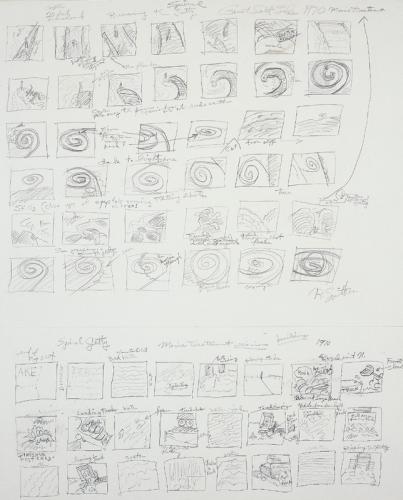
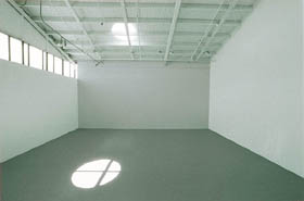
* Olafur actually made a sundial-like piece in 1997 by cutting a round hole in the roof of the Marc Foxx gallery in Los Angeles. The circle of light tracked beautifully across the empty gallery space. The piece was titled, Your Sun Machine. I never dreamed to call my piece My Sun Machine, though.


 Ouch. a 10,000sf warehouse of Momart, the leading art handler/storage company in the UK, burned to the ground yesterday, taking an as-yet unknown number of major Brit Art works with it. The Guardian has
  Umm… I was excited for the launch of
 In helpful, 2×2 grid format: