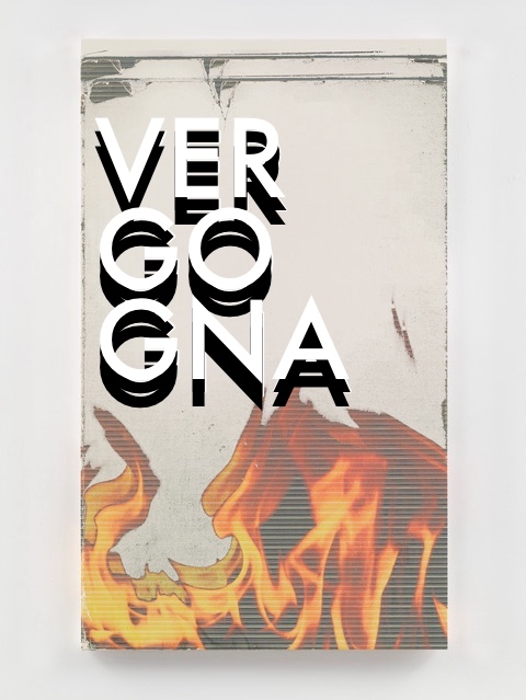
This is the Louise Lawler Democrats want: Three Flags (swiped and moving), 2022, dye sublimation print on museum box, 48 x 85 5/16 in., ed. 4/5+1AP
So far 105 artworks donated to the Artists for Kamala fundraising campaign have been sold. The remaining 67 works will remain available through October 18th. Because the purchases are subject to campaign donation laws, buyers must file donor statements. Also, they can’t be foreign nationals or lobbyists.
Also they may not want to be Republicans. 100% of the proceeds goes to the Harris Victory Fund, which allocates it to Harris for President, the DNC, and the state Democratic parties.
Dianne Feinstein’s incapacitated inaction at a critical moment in US history and her to retire from the Senate long after she lost the mental and physical capacity to function is a stain on her legacy.
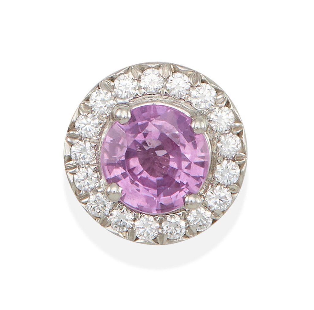
If there’s anything to be noted about the sale of her personal collection of mid jewelry, maybe it’s the single Tiffany sapphire and diamond earring whose companion one could imagine was lost in a demented haze, or maybe even stolen by a careerist hanger-on in her waning days. Yes, buy this orphaned earring today, which is small enough to sew into the hem of your clothes if you find yourself fleeing across a border anytime soon.
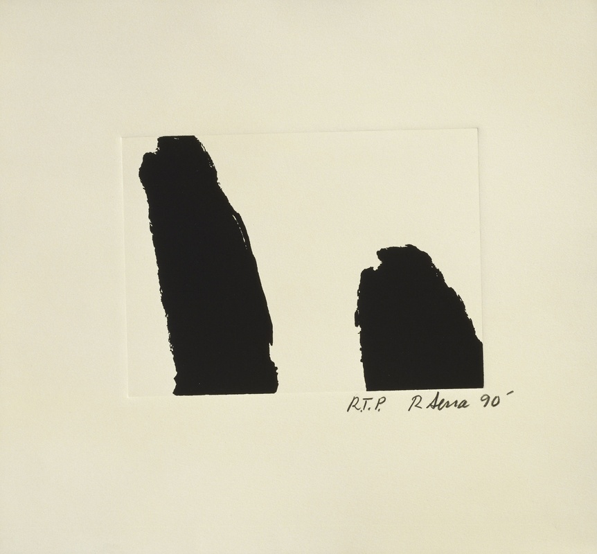
Richard Serra, F*** Helms, 1990, 14×15 in. sheet, via NGA/Gemini
Election season, when a man’s heart turns to thoughts of Gemini G.E.L. fundraising print portfolios. Or at least it used to.
Fortunately, longtime greg.org hero/reader Terry Wilfong emailed a keen observation about Richard Serra’s Afangar Viðey series prints that momentarily distracts from the genocidal, climate, and fascistic calamities afoot. Like me, Terry missed out on getting any little Viðey etchings, and was drawn to the print Serra made at the same moment for the Harvey Gantt Portfolio. [Gantt was the Black opponent to one of the Reagan era GOP’s biggest bigots, Senator Jesse Helms of North Carolina.]
Terry noted that this print, titled F*** Helms, looked similar to the Viðey etchings, but it was a screenprint. It was not an etching, yet it had an embossed plate mark like an etching. What was going on there?
OK, I have not listened to it myself, but I can already tell from the links included in their post that they left in the part where I cried.
Aaand maybe where I said I quietly boycotted the Hirshhorn while it was wrapped in that Nicholas Party scrim. Love you guys!
[AFTER HEARING IT UPDATE: I llol’d that the Rabkin folks actually used the Hirshhorn clip to announce the interview on their Instagram. Love it. And I forgot that while I did acknowledge my pettiness, I also point out, I’m not wrong. Overall though, I think my favorite quote will be, “Again, with the Manet.” It feels undeniably weird to say, “listen to me!” but it actually turned out OK.]
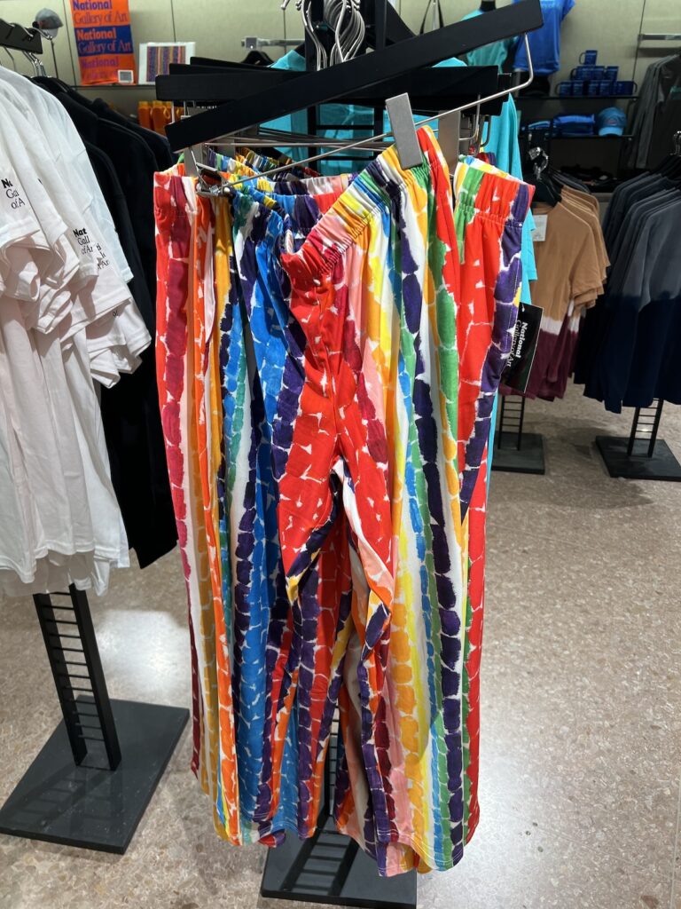
I went to the National Gallery of Art library wanting to know more about Bunny Mellon’s Rothkos and Jasper Johns’s little guys. But I left caring about nothing except this rack of Alma Thomas Pajama Pants.
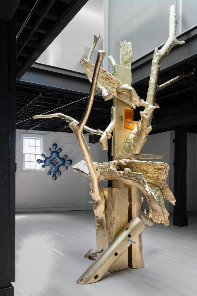
Donald Moffett’s Lot 030323 (the golden bough), 2023 installation view at von ammon co
Last fall I was caught off guard by Donald Moffett’s Lot 030323 (the golden bough), which was installed in NATURE CULT: TREMOR, a two-artist exhibition with Shaun Krupa at von ammon co in Washington DC. It stood out, literally, among new, biomorphically baroque iterations of Moffett’s more familiar paint-on-panel works. But even as I type this, I realize it was made of the same materials.
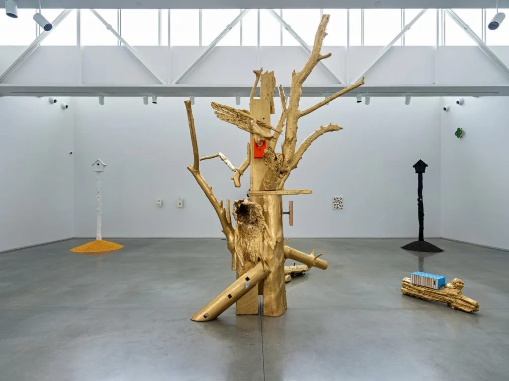
Donald Moffett NATURE CULT, SEEDED installation view of Lot 030323 (the golden bough), 2023/24 at Center for Maine Contemporary Art, 2024, image CMCA via Brooklyn Rail
Pieces of salvaged lumber and driftwood were painted gold and bolted together in a totemic simulacrum of a tree, with an art book and two of Moffett’s [other?] paintings perched among its branches. The gesture felt akin to a Rachel Harrison sculpture, but in inverse, with the found objects serving as an armature for the made ones. It also reminded me of some past works of Robert Gober, Moffett’s partner, who made plinths of painted bronze cast from styrofoam blocks collected from the North Shore of Long Island.
Lot 030323 (the golden bough), 2023/24, will be on view, with some variations and an expanded date, for one more week in Rockland, Maine, where it anchors Moffett’s show, NATURE CULT, SEEDED, at the Center for Maine Contemporary Art. The work in Maine now supports at least one different painting by Moffett—a throat-like orifice replaced by a perch-like birdhouse—and a different book, trading the 18th century botanical illustrations of Mark Catesby for the 19th century bespoke bovine portraits of Thomas Hewes Hinckley. The most substantive difference is the addition of what Brooklyn Rail reviewer Chris Crosman calls “a section” of the golden baugh: a driftwood limb that holds thirteen ex-libris copies of Jeff Goodell’s 2017 book, The Water Will Come: Rising Seas, Sinking Cities, and the Remaking of the Civilized World.
While I was trying to find Kenneth Noland’s big Olitski painting, the horribly lit one he hung behind his sectional sofa, I surfed across some other works from his collection. [update: Thanks to art historian Alex Grimley, who identifies this Olitski—one of several Noland owned—as Lavender Liner (1967).]
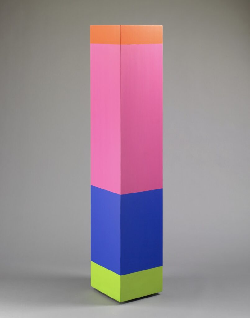
Anne Truitt, Morning Moon, 26 June 1969, around 97 x 20 x 20 in., acrylic on wood, formerly in the collection of Kenneth Noland, and sold by Bennington at Christie’s in 2019
One was Morning Moon (1969), a delicately colored column sculpture by Anne Truitt. Truitt and Noland were close friends in DC earlier in the 1950s and 1960s. She’d taken a life drawing class from him in the 50s, and when Noland left town in 1962 Truitt took over his studio, where she made much of her earliest breakthrough work. I don’t know what their relationship was like in 1969, though, or if it’s relevant that Noland appears to have bought Morning Moon, new, from Andre Emmerich, Truitt’s NY dealer. [Truitt had separated from her husband, and bought a house in which to raise her three kids, so maybe in 1969 she was not in a position to be giving large sculptures away.]
In 2001, just as Truitt’s importance in the history of 1960s art and Minimalism was gaining renewed attention, Noland donated Morning Moon to Bennington, where he (and Olitski, for that matter) long taught. Bennington didn’t seem to show it, though, until long after Truitt’s significance was fixed; and then they promptly sold it and a bunch of other art to fund some arts programming.
Kenneth Noland, Untitled, 1965, 64 in. square, acrylic on canvas, long in the artist’s family, and sold in 2019 at Christie’s
That same 2019 sale at Christie’s happened to include another work from Noland’s collection: his own. Noland left this popping 1965 painting to his last wife, Paige Rense, the editor of Architectural Digest. I can’t help but imagine an intense but balanced color combination like this appearing on a Truitt column.
Anne Truitt, Morning Choice, 1968, 72x14x14 in., acrylic on wood, collection: St Louis Art Museum
Morning Choice, from 1968, was one of the first column works Truitt made after returning to DC from Japan. Maybe the 60s really did just look like that, but these artists who’d worked alongside each other earlier seemed to still make work later in a way that still resonated. If we can ever unlock the Mary Pinchot Meyer vaults, it feels like between her, Truitt, and Noland, there’s a whole other Washington Color School story to be told.
Diehl also noted to Røhling that the Charlotte Posenenske sculpture and the Claes Oldenburg bacon soft sculpture included in the Noland show were very World Trade Center Twin Towers-coded. Also not to be a conspiracist or anything, but a Noland sculpture was also included in Peter Eleey’s September 11 show at MoMA PS1 in 2011.
Which led me to go searching for which Noland it was, and it of course, was the stanchion work, The American Trip (1988), which is more ambiguously political than MoMA’s other significant Noland, Tanya as Bandit (1989).
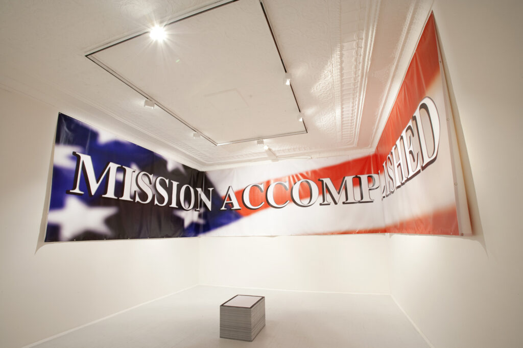
“September 11” installation view at MoMA PS1, 2011-12, by Matthew Septimus via MoMA
And that banner. 90 x 600 inches, it was obviously a full-scale recreation of Bush White House image maker Scott Sforza’s hubristic aircraft carrier banner from 2003.
But I never made the connection to its title or date: Unrealized Project for the Exterior of the Carnegie Museum, 2004-2011. So Deller wanted to hang this banner on the outside of the museum as part of Laura Hoptman’s Carnegie International, which opened in October 2004, just before the presidential election. How far along did this proposal get, I wonder? [Deller ended up showing war re-enactors on tiny televisions inserted into the Carnegie’s dollhouse dioramas, the diametric opposite, attention-wise, from a 50-foot banner.]
On the metro in DC this afternoon, a woman was eating Caesar’s Salad out of a clamshell container with her fingers, her high-contrast makeup turning every chew into a kabuki-like gesture of meaning.
Then she got up, with her salad, and walked over to study the map. She then lost her balance, and dumped her salad all over the guy sitting next to the map. And then she fell down. Except for all this, she was fine. It was at once the wildest, most predictable, and most avoidable scene imaginable.
Then on the way back, a woman kept losing the lid to her beverage container, which rolled along the floor in whichever direction the train’s momentum dictated, causing bystanders to spring into action to capture it.
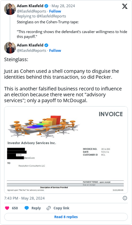
Screenshot of Adam Klasfeld’s live coverage of the Trump election fraud trial, showing a routinely falsified invoice created to hide hush money payoffs, from Philip Bump’s WP newsletter
New York prosecutor Joshua Steinglass presented as evidence of Trump’s routine coverup and document fraud a falsified invoice for a shell company created to hide a different $125,000 hush money payment as an “Agreed upon ‘flat fee’ for advisory services.”
Scott Maxwell/LuMaxArt, 3-D Bar Graph Meeting, 2007, digital image, via flickr
I post it here for the same reason Bump posted it at the Post: to praise Michael Cohen’s choice of clip art. It is a distorted rendition of 3-D Bar Graph Meeting, a stock image created by Scott Maxwell of Lumaxart. A version of it created on Christmas Day 2007 was uploaded the next day to flickr.
Though he’s moved his operation to Shutterstock, one of Maxwell’s last updates to his blogpost blog, The Gold Guys, was from 2017: a unified quorum of rainbow stick figures expelling a gold-plated wannabe king, and the word IMPEACH.
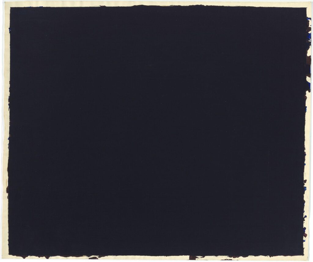
Shoutout to @dailyrothko for bringing this darkest of all Rothkos to light.
Ink on paper, 42 x 50 inches, not titled, dated, or signed, but from 1969, referred to as 1969, and annotated on the back, “no number/ black/ no. 1” in two different corners. In the National Gallery’s collection since the Rothko kids’ gift in 1986, but I’m not sure it’s been shown. I, for one, would love to see it.
The Embassy Scroll by Lunt Silversmiths was the official silver pattern for U.S. embassies and consulates around the world.
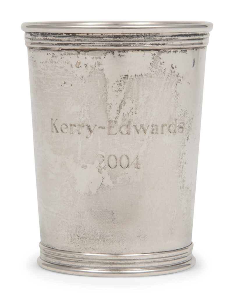
A Kerry Edwards 2004 Commemorative Mint Julep Cup in silver by Lunt Silversmiths, 3 3/8 in. tall
Lunt also made commemorative mint julep cups, a form of gift that evolved in Kentuckian horse racing society.
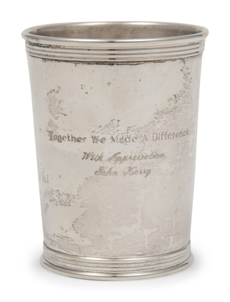
This sterling silver commemorative mint julep cup was made by the Kerry Edwards 2004 campaign for the U.S. Presidency. “Together we made a difference/ With Appreciation/ John Kerry” is engraved on the verso.
If there was a difference made in the 2004 presidential election, it was the failure of a decorated war hero turned opponent to fend off the attacks of a draft dodger turned war criminal in the middle of an historically unpopular and unjust war.
John Edwards’ 2008 campaign for president was derailed by the revelation that he had a child with a webvideo documentarian after his wife was diagnosed with breast cancer. Edwards also seduced Bunny Mellon to give him over seven hundred thousand dollars during his presidential race, but not as a campaign contribution. He used the money to cover up his affair. Lunt Silversmiths, a family business founded in 1902, sold its trademark to Reed & Barton in 2009 and was dissolved in bankruptcy. John Kerry became Secretary of State during Barack Obama’s second term. Albright died in 2022.