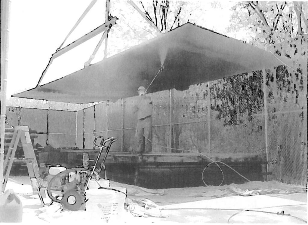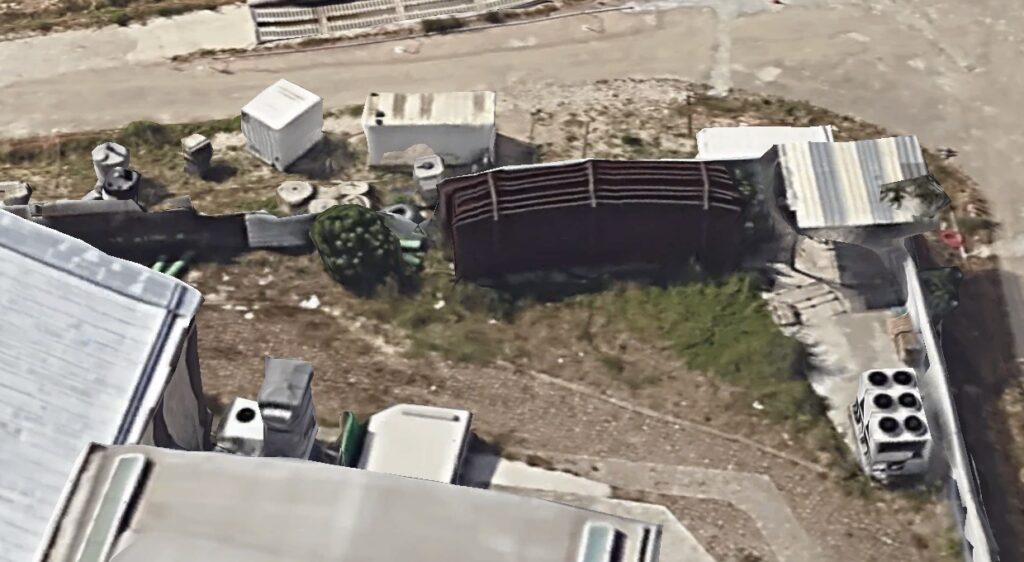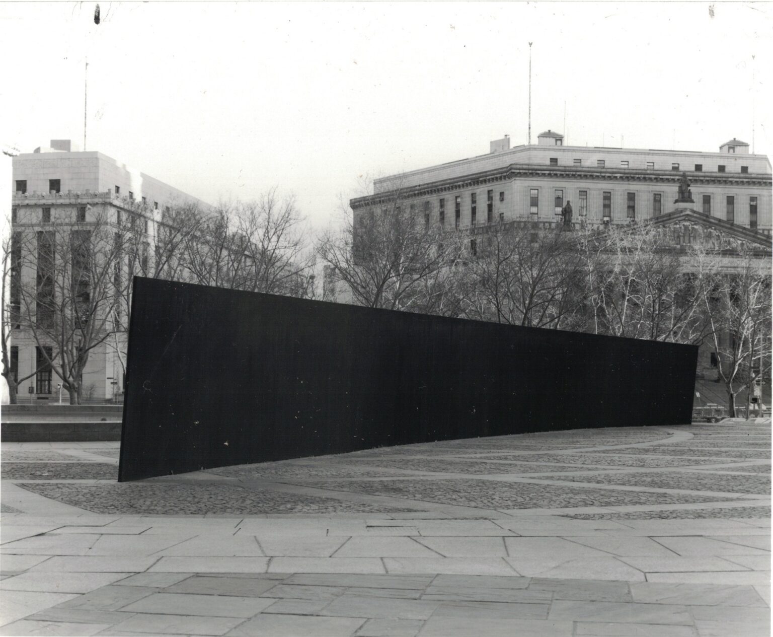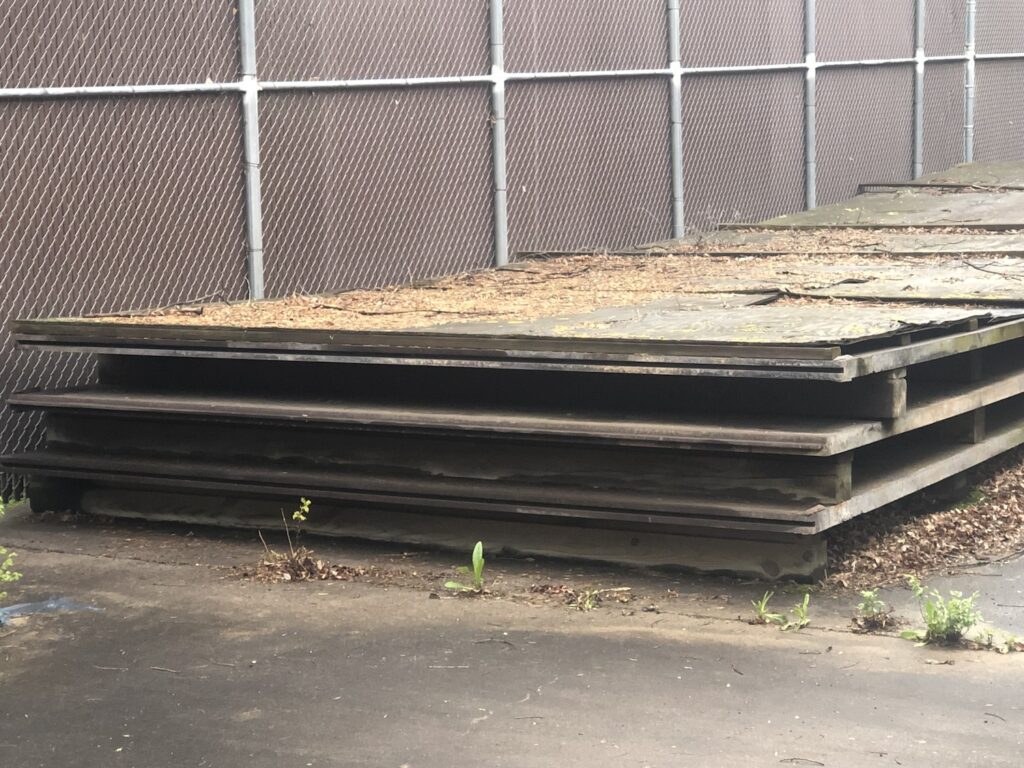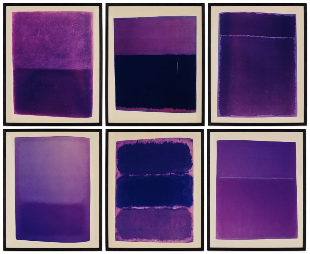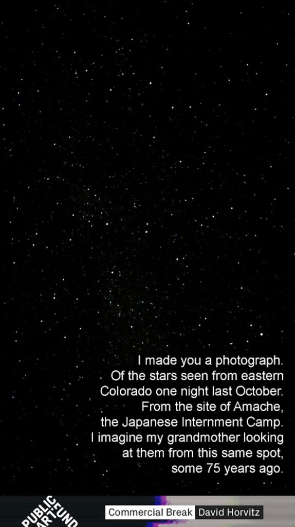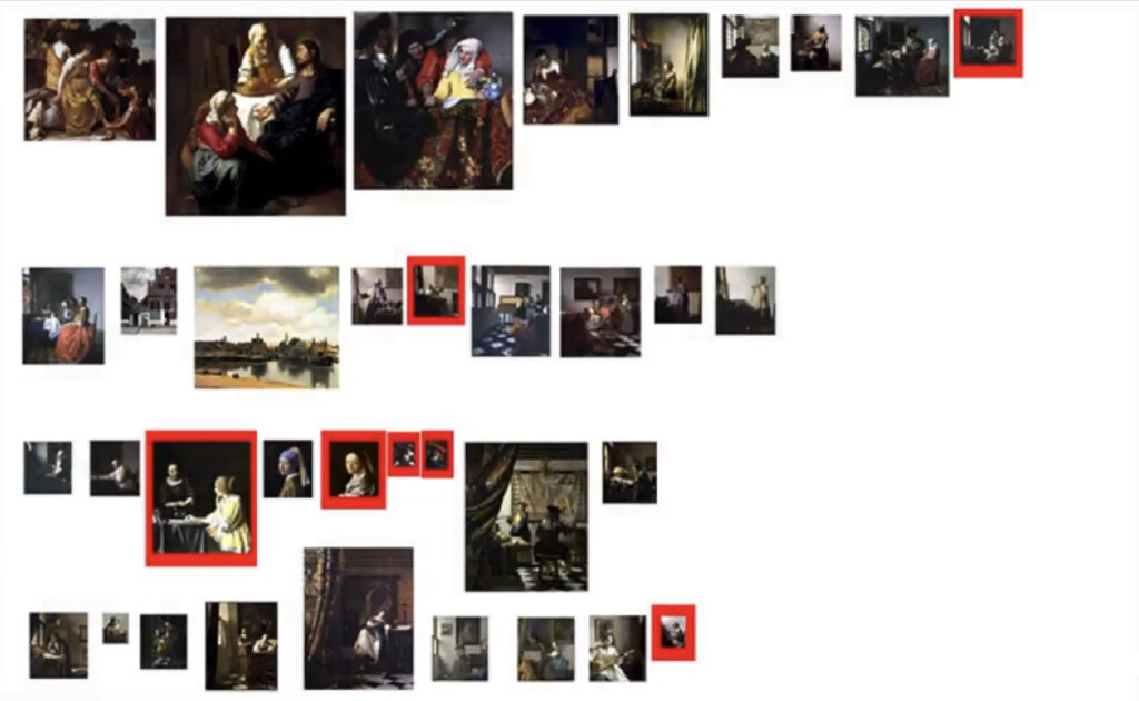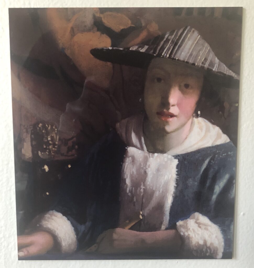
People really are bringing the 90s back, even the bigotry. I srsly thought this would be an historic relic by now, not a headline again and again and again.
I guess it’s unsurprising that none of these are in museums in Washington, DC.
This pairing of two of Harvard men came to mind when I heard today of Ted Kaczynski’s death at the end of HK100. It’s a quote from Travis Diehl’s X-TRA review of Danh Vo’s 2018 Guggenheim show, Take My Breath Away.
It was part of Diehl’s discussion of an untitled Vo work from 2008 that comprises 14 schmoozy notes on White House stationery from Henry Kissinger to NY Post columnist Leonard Lyons. Most were about getting tickets to shows in New York: “You must be some kind of fiend. I would choose your ballets over contemplation of Cambodia any day—if only I were given the choice. Keep tempting me; one day perhaps I will succumb.”
Vo, of course, also bought Kaczynski’s typewriter, which he turned into the 2011 work, Theodore Kaczynski’s Smith Corona Portable Typewriter, but only after using it to type invitation cards to his 2011 show at the Fredericianum in Kassel. The index cards, bearing the title of the show and the birthdate of the United States, “JULY, IV, MDCCLXXVI,” were also included in an edition, Seasons Greetings, along with copies of Alston Chase’s book, Harvard and The Unabomber, distribution of which the university successfully thwarted.
[A few unsettling days later UPDATE: That Benning book, and especially Ault’s essay, reminded me of John Semley and Edward Millar’s 2021 essay on “Ted-pilled” Unabomber stans. They’re not only on TikTok. The blithe de-emphasis on Kaczynski’s calculatedly indiscriminate violence and murder in order “ya gotta hand it to him,” by both Benning AND Ault, is gross. Especially in the conflation of Kaczynski’s terrorism and Thoreau’s John Brown-ian anti-abolitionism. I guess we’ll find out how gross it all is if eco-terrorism joins fascist terrorism in our bright civilized future.]
Michael Lobel posted this cursed image on social media the other day.
While he was visiting Washington DC in 1976, Andy Warhol photographed Henry Kissinger accosting actress-turned-icon-turned-DC wife Elizabeth Taylor Warner, who was then married to Virginia Republican senator John Warner.
In 1976 Kissinger was Gerald Ford’s Secretary of State.
Like Arthur Jafa’s Love is the message, the message is death, which opened a few days later, this amazing painting of a sad clown by eventual Abstract Expressionist Franz Kline is fused in my memory to the moment in history when it failed to sell at auction, in November 2016. I find myself searching for it every few months, and today, on the 113th anniversary of Kline’s birth, I figured I’d make it easier for me to find it again.
5 Nov 2016, Lot 577, Franz Kline, Buffoon, 1930, oil on canvasboard, 16×12 inches, est. $10-15k [ragoarts]
We went to Glenstone to see the Ellsworth Kelly exhibition last week, which is wonderful. The show is an overwhelming physical experience the likes of which I don’t recall having with Kelly’s work, even at the Guggenheim. So that’s interesting. The loans were tremendous; the Fondation Louis Vuitton’s roomful of later paintings makes sense, as they’re taking the show. It also felt interesting that some major collectors of Kelly’s work weren’t involved. It didn’t diminish the show, though.
There were spiderwebs on the torqued ellipse, both across the sunnier surfaces inside, where they were like glitter, and also in a few of the gaps up high. The Koons was still unplanted, I guess I’m glad they didn’t feel the need to rush it for the Kelly opening.
The floor work was incredible. After all this, I didn’t realize it was considered by the artist to be a new work, not just a reinstallation of the original 1990 piece at Portikus. It felt like a Turrell, or a Doug Wheeler. There’s something extraordinary, though, about the Rales’s capacity to recreate an architectural space of a specific, historic dimension, to accommodate an artist’s work. It’s here with the Gober room, and with the Kelly. In the Kelly’s case, there is also a fascinating vitrine outside with documentation of the work, and Kelly’s involvement in realizing it at Glenstone, including the specs for the support and the recipe for the color. Let a thousand bootleg Kelly floor pieces bloom.
We took these cookies home to plant them, in hopes that they’ll grow to fill the room. Stay tuned.
I was sure that the smaller Color Panels for a Large Wall, Kelly made for himself, which were at Marks in 2019, was in Glenstone’s collection, but it doesn’t show up on the list rn. It is so great up close. So here is a picture of it from far away.
I was going to write about how the only problem with the Kelly show was the difficulty of getting reservations to see it again, but then I checked, and there was an opening today, so I rearranged my schedule, and am heading back.
A few hours later update: The way the Glenstone pieces are grouped together is interesting, like concentrated emphases on Kelly’s practice. It feels more seriously engaged than, say, the Vuitton Fondation buying four works from a late show.
The loans, meanwhile, are mostly from museums and private collections arranged by Matthew Marks. It reminded me of Emily Rales’ conversation with Charlotte Burns last month on The Art World: What if…? podcast, where Rales talked about being a little surprised that Glenstone agreeing to almost every loan request was definitely not standard exhibition procedure. I pictured an inordinate amount of goodwill, more fungible than the niceties of donor development museums are prone to.
For that matter, Rales also talked about Glenstone eventually building a board, and thinking through the question of what a board looks like that is not beholden to fundraising. Though they are surely respectful and perhaps even friendly—as well as competitive—toward other collectors, Glenstone is not beholden to them. And Glenstone’s relationship with other collectors will not necessarily follow the paradigms other museums have created.
And for that other matter, taking more time to study the documents for Kelly’s Portikus floor work felt of a piece. Portikus’ Yellow Curve and the other floor panels were all created in relation to a specific, existing space. When Glenstone acquired their Kelly, in 2015, they created a space in their original Charles Gwathmey building [now called The Gallery], to fit the Portikus work. And then Kelly made it [again.] That realization, during the construction of the new building, was never publicly shown, just an extraordinary treat for the collectors, made possible by an extraordinary deference to the artist.
Beginning the Spring of 2016 and running through the Fall, I put out Untitled (Free As In America), a series of Cady Noland sculptures replicated with the America beer cans that Anheuser-Busch InBev replaced Budweiser with in the run-up to the US presidential election. The concept was to remake any sculpture for only the cost of the raw materials it required.
Exactly none of these sculptures were realized in the window in which Budweiser’s America cans were available.
Now the window has reopened. As the right wing is consumed by its own flames of hate and violence, it seeks to transform that hate into consumption. Recognizing the futility of icing out the giant, international beer conglomerate for paying a trans woman to promote one of their products on her own social media channel, some grifter created an alternative: right-wing beer.
As long as this beer is actually for sale, then, I will make Untitled (Free As In America) sculptures available again. I will replicate any Cady Noland sculpture, replacing the Budweiser cans with perfect replicas of—when I started this post, it was going to be replicas of the grift beer. But no, it will be replicas of the 2016 America cans, made by the finest trans metallurgists and artists in the world. All proceeds beyond the production costs will be used to fund trans legal defense, health care, and emergency support services. Prices run from $100 million for a basket to $1 billion for a room-sized installation.
ONE DAY LATER UNBELIEVABLE UPDATE: In a statement literally titled, Our Responsibility To America, Anheuser-Busch InBev caves to trolls attacking their product and threatening humans with baseball bats. To update Cady Noland, “Violence has always been around. The seeming [systematization] of it now actually indicates the [work] of political organization representing different interests. ‘Inalienable rights’ become something so inane that they break down into men believing that they have the right to be superior to women (there’s someone lower on the ladder than they) so if a woman won’t date them any more they have a right to murder them.”
A FEW DAYS LATER UPDATE: I joked about it, but now other people investigating the grifter’s sourcing are saying it is actually likely the case that the rightwing grifterbeer is made in an Anheuser-Busch plant. It’s America all the way down.
The Washingtonian notes that in addition to Supreme Court justices, Harlan Crow also collects Hitler paraphernalia. And yet Hitler manages to be only the second most shocking painter in this billionaire’s group show:
“I still can’t get over the collection of Nazi memorabilia,” says one person who attended an event at [Clarence Thomas’s billionaire Harlan] Crow’s home a few years ago and asked to remain anonymous. “It would have been helpful to have someone explain the significance of all the items. Without that context, you sort of just gasp when you walk into the room.” One memorable aspect was the paintings: “something done by George W. Bush next to a Norman Rockwell next to one by Hitler.”
Previously: “Our Guernica, After Our Picasso” “As he explained to Jay Leno, the idea of taking up painting comes from Bush’s fantasy of being, or being compared to, Winston Churchill. Churchill painted. Of course, Hitler also painted. If painting makes Bush like Churchill, does it make him like Hitler, too? Is either association, when based on painting, more or less outrageous than the other?”
It’s been almost ten years since I found the Internet Archive scan of the Guggenheim’s 1966 catalogue for the debut exhibition of Barnett Newman’s Stations of The Cross had not one, but two alternating glitches in it.
And ten years and five minutes since I decided they should be made into paintings.
And ten years, five minutes and a day since I last thought about me actually painting them myself. I guess these things just take time. I was about to buy an old catalogue of Barnett Newman prints when I realized I already had two. And that memory of Newman’s interest in the borders around prints, intrinsic to the medium, and his treating lithograph stones as an instrument to be played, reminded me of these pages. And though my previous comparison this instrument metaphor to Richard Prince’s description of playing a camera didn’t help me make the connection at the time, I now see that a scanner can be an instrument as well, with what Newman called its repertoire of “instrumental licks.” [Which, now that I type it, reminds me of Sigmar Polke’s hyperexpressive use of a Xerox machine to make his artist’s book, Daphne. But if the artist introduces them himself, are they even glitches?]
Still not sure what form(s) these should take—whether books, or prints, or paintings, or paintings of paintings—but I am glad to be thinking about it again.
Thanks to apexart’s expansive invitation, the show helped me recognize a significant connection between the two main visual and photographic subjects: the Palomar Observatory Sky Survey, the first and last photograph of the visible universe before the space age; and Project Echo, the 100-foot diameter mirrored satelloon that was the first manmade object in space visible to the naked eye.
In June 2013, I was invited to talk about the show at the National Academies of Science, which was awesome, and I brought the 10-foot satelloon modeled after the one presented at the US Capitol. It was a great evening, but I remember the webcast being a little complicated, and so assumed it was one of those ‘you had to be there’ moments lost to time.
In fact, it’s been on the Youtube channel of CPNAS, the Cultural Programs for the National Academies of Science, all this time. Go pump up those views!
So yesterday’s Artle quiz at the National Gallery started with the top painting, which was a *copy* of a section of a van Dyck, above, that’s at the Detroit Institute of Arts.
“It is possible that the owners of Van Dyck’s original group portrait commissioned the copy for a family member or close relative,” explains the NGA.
Well, we do know from the DIA site, that some of the owners liked to have things painted: “Inscribed, upper left: Family of Oliver St. John | Earl of Bolingbroke [added later; now thought to be a portrait group of a Flemish family] Inscribed, upper right: Vandyke/pinxit [added later].”
As Peter Huestis notes, the paintings match closely enough that the copy must have been made in the presence of the original. But who, when, and where?
Of the 18,000+ watercolors in the American Index of Design, some of the most amazing are of textiles and, in this case, embroidery. Index artist Elizabeth Moutal painted stitches and the tacked and fraying hem of what looks like it used to be the upholstered cushion of a little stool or something. Or maybe it’s just where it was pinned down in the making. Beautiful.
With his deadpan, mechanically produced, offset printed, unsigned artist book, Every Building on the Sunset Strip, Ed Ruscha upended the art of photography. More recently he upended the art of photographing art. Museums are out there trying every way to depict the 7 inch-by-25-foot accordion-style book accurately on their little websites.
MoMA shows just the cover, blank with the words The Sunset Strip at the top. The Getty shows the title page, plus a single, 14-inch spread, very manageable. The Harvard Art Museums treats it like a rare book, publishing images of the whole thing, in a gallery of 22 3-fold spreads. The Met, which never met a copyright it didn’t maximize, gives absolutely nothing, just the text description.
Last year, the Getty, which holds Ruscha’s archives, went several extra miles by digitizing 60,000 of the over half million photos the artist and his collaborators have taken of the Sunset Strip since 1965. Turns out the book we know was just the first of at least 12 Sunsets spanning fifty years (so far), all of which are available online, for virtual driving.
And then there is the single greatest photo in museum collection digitizing history, and I am 100% unironically serious when I say I hope the National Gallery of Art never replaces it, but uses it forever, in every medium, known or unknown, until the end of time.
The National Gallery of Art acquired Every Building on the Sunset Strip in 2015, when it subsumed the Corcoran. Every institution’s online collection presentation is shaped as much by its choices of software as by its information design and priorities, and the NGA’s even more so. The URL for the image above indicates it is generated to fit within a frame of a certain dimension, in this case 600 x 600 pixels.
Clicking on the image doesn’t just zoom, it ZOOMS, taking the visitor to what may be the largest image of Every Building ever made, a near infinite scroll of more than 5,000 256px square jpeg tiles. Each tile is about 1/2 square inch of the original book, close in enough to see the halftone dot matrix used to render Ruscha’s photos on the offset lithographed page.
I am now trying to figure out how to extract these tiles, which are now the second-to-5000th best images of Every Building on the Sunset Strip ever made. Who knows, I might try to put them in a book.
A few months ago the editors at Art in America asked if I’d like to write about Mormon architecture for a religion-themed issue. I was like, “Do you want the spectacular space-age temples; the scrappy DIY pioneer rusticity; the mass-produced, suburban Mormcore cringe; or the unprecedented grappling with historical preservation?” And they said, “Yes, absolutely.”
The article is now online. “Building Mormonism: The Fascinating History of LDS Architecture.” Honestly, it feels like it could be three articles, and three more would come out of it. The more I dug and looked, the more interesting and revelatory stuff I found about the way the Church has approached its physical spaces and structures over its almost 200-year history. There’s probably a dissertation to be written on the early 20th century mandate to include a basketball court in every new meetinghouse. Or on the building missionary program that tried to optimize expertise and volunteer labor when demand for churches outstripped the local members’ construction skills. Or the impact on the built sacred environment of having a trans woman lead one of the most ambitious architectural eras in the Church’s history. [I think she’s already writing that last one herself.]
I’ll add links to resources I found especially useful, and images of the buildings mentioned in the piece, so check back. In the mean time, I would have been lost without two blogs and one book: Historic LDS Architecture, where Bridger Talbot has been posting original research, photography, and travelogues since 2014 ldsarchitecture.wordpress.com went dormant in 2012, but is still full of photos and accounts of visits to architecturally notable church buildings. Places of Worship: 150 Years of Latter-day Saint Architecture is Richard W. Jackson’s 2003 historical survey of all the worship places of the LDS Church, and an institutional history of the Church’s Architecture Department, where he worked for many years. scottcsorensen.templephotos on Instagram provided a steady drip of inspo, and also a sense of perspective, that there was someone else spending even more time thinking about Church architecture than I was. And of course, whether that is comforting or Content Warning @TexturesofMormonism is the go-to source for recognition of the Church’s 70s and 80s homogeneous aesthetic.
The first work on the National Gallery of Art’s Artle quiz yesterday this Berthe Morisot painting of a vase of peonies, which, you have to admit, looks rather Manet-ish. I figured it wasn’t Manet, because if it was, I’d have already seen it–unlike the dogs, which–we’ve been over this–are occasionally incredible, basically every [late] Manet painting of a little arrangement of flowers is, as far as I’m concerned, a masterpiece, and I can’t imagine the National Gallery holding out on me by never showing this masterpiece. But I guessed Manet anyway, as a compliment.
Not that this is a masterpiece, ofc. Obviously, it’s a bit of a mess, with some moments of greatness. And some meaningful echoes of Manet, who Morisot met in 1868. Morisot’s family became close to Manet’s, and she modeled and sat for him. And let him rework her paintings. And married his brother.
So Morisot would have known the peonies Manet liked to grow–and paint. Some of the half dozen paintings of peonies Manet made around 1864 had been shown repeatedly by the time the Morisots came to call.
What’s more amazing about this Morisot, though, is that it was unknown until 1980, when it was discovered underneath another painting, Un percher des blanchisseuses, from 1875. The title translates as a perch of laundresses, but the apparent English title is Hanging The Laundry Out To Dry. The combination of picturesque rural life and factory smokestacks encroaching on the horizon make the likely site of this painting Gennevilliers, a village outside Paris where the Manets owned property.
Morisot included the laundry scene in the second Impressionist exhibition in 1875, where it was one of at least four works by the artist purchased by Dr. Georges De Bellio. It passed through various heirs and dealers until Paul Mellon bought it in 1950. Given that timeline, it seems the most likely explanation is Morisot stretched a new canvas over the existing painting.
As a work from a historically important show, blanchisseuses was exhibited often over the years, and obviously included in the Wildensteins’ 1961 Morisot catalogue raisonné. But it was only thirty years later, when the Mellons were getting ready to donate it to the National Gallery that the peonies painting was discovered underneath it.
The Mellons ended up donating Morisot’s Hanging out the laundry in 1985. But they kept Peonies until 1994, which, wouldn’t you? For all this, I’d expected more study of this double painting, and how it came to be. Despite decades of Morisot and Impressionist popularity, Peonies has never been exhibited outside the National Gallery.
I see at least five other paintings from the period, mostly around 1875, of the same dimensions, including two other Gennevilliers landscapes. Were these pre-stretched canvasses from the art supply store? It’s now been 40 years; has anyone checked under them?