I missed this when it streamed live, so I was psyched to get the heads up from Gladstone Gallery that Diamond Stingily & Matthew Barney’s conversation from October 5, 2024, has been uploaded to YouTube.
I listened to it in the car and had expected to hear a lot of effusive praise for Carrie Mae Weems, in whose show the event was staged; for Precious Okoyomon, who organized the event; and for Bottega Veneta, which sponsored something. [Weems rather amazingly recreated some of her most iconic photos as Bottega ads, which, I’ve never wanted someone to get a bag more.]
Anyway, no, it has one of the coldest opens of any artist talk I’ve ever heard. A lesson to everyone. Also, Matthew Barney cut Barbara Gladstone’s hair, more than once.
If you need me, I’ll be filling up my reading list, starting with Jupiter Magazine, one of the art publications Miter namechecked. The theme of Jupiter’s latest issue, The Theater of Refusal, revisits and renews Charles Gaines’ foundational 1993 exhibition of contemporary Black art and its critical context. Its form was a series of readings and screenings throughout the summer, which I will now try to approximate in my head.
It has turned out to be an enlightening pleasure to listen to the interviews with the recipients of this year’s Rabkin Foundation awards, and none moreso than the conversation with Emily Watlington.
With Mary Louise Schumacher, she talks about some of the nuances and challenges of writing about art and disability. They also talk about Watlington’s attuned sensibilities brought to bear on the Venice Biennale, which purported to bring attention and critical consideration to many historically marginalized artists. Watlington’s diaries and in-depth review reveals that it often did just the opposite.
Cotter talked about growing up free range in the Boston Museum of Fine Arts, and picked the Met for his workplace photo. Which after so many years at the Times, is probably the place he’s written about the most.
Cotter and Schumacher did not talk about his donation of the prize money to the the International Association of Art Critics and the Forge Project, to support emerging and Native American arts writing and fellowships, for which mad respect. [As ARTnews notes, the NY Times prohibits its full-time employees from accepting cash awards, and these days a full-time arts writing job is rarer than even the most generous awards.]
In addition to her own work and career, Givhan spoke to Mary Louise Schumacher about visiting the Equal Justice Institute’s Freedom Monument Sculpture Park in Birmingham, Alabama; and the same searing kicker in Hilton Als’ profile of André Leon Talley that has stuck with me for 25 years, too.
And here I thought I could be chill and grateful and just acknowledge the congratulations as they came in, while I processed the shock of being included by the Rabkin Foundation among an inspiring but frankly daunting group of writers, but I guess not.
A couple of weeks ago artist Tom Burr sp0ke at Dia about his and Felix Gonzalez-Torres’ work. Now that conversation is online.
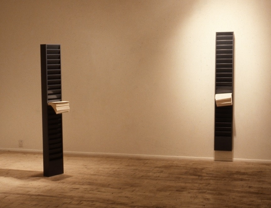
Burr was in a 1989 group show with Gonzalez-Torres, Michael Jenkins and John Lindell at Paula Allen Gallery (no relation). One piece Burr showed, Jones Beach State Park, was from a series of bulletin boards outfitted with the texts, flyers, and notices from a specific public place.
installation view of Felix Gonzalez-Torres’ [non-work and] work installed at Paula Allen Gallery, 1989. Left is White Legal; right is “Untitled” (White Legal). photo via FG-TFoundation
A few years later in his catalogue raisonné, Gonzalez-Torres adminstered a dropkick to one of his magazine racks. The one mounted on the wall, “Untitled” (White Legal), remained a work, while the freestanding rack, then known as just “White Legal,” was demoted to “non-work.”
None of this is in the talk, btw; it’s just me nerding out. And it’s my way of resisting the urge to just type out the entire conversation about Burr’s Deep Purple, whose form is a 2/3-scale reference to Tilted Arc. Choice stuff.
On L.A. artists Lauren Halsey and Ed Ruscha: “You wouldn’t necessarily think of those two artists together until you sort of—’There’s an Ed in the booth and a Lauren in the booth’—and I use a booth because that’s where all of our artists often meet.”
“…Those are the sorts of things that become really interesting to me, where the collector has the Lauren and the Ed, or the Rick [Lowe] and the Brice [Marden],” Sargent continues, “…and they might send a picture and show it installed, and you can send that to the artist, and you can have that moment.”
I think I flagged these two mentions from an hour-plus insightful discussion because they recognize two sites of art interaction—a fair, a collector’s home—that typically don’t get consideration, at least in public discourse. One of Antwaun’s superpowers is his sensitivity to an artist’s experience, and that artworks travel to places that artists often do not.
Josh Slater-Williams has an interview for Mubi with a very thoughtful Kevin Macdonald about the implications of making High & Low — John Galliano, a documentary that about the designer’s career, his conviction for his vile anti-semitic outburst in Paris, and his not-uncontroversial return to fashion afterward.
Coming from outside of the fashion industry and its norms is probably Macdonald’s greatest superpower here; he’s able to recognize the self-delusions that haunt the field and its most intense and talented figures, and to put them on view. What I didn’t expect was to hear how Galliano handled his own role in a situation where he ceded all editorial and creative control:
He wanted to achieve various conscious things, but I think also this is part of his therapy, I suppose. It’s part of his trying to figure things out for himself. That was really apparent to me when I went to the Margiela show that we filmed, that begins and ends the film. I realized as we were watching it: my God, this show is about having a documentary made about your life. It’s about his life filtered through film, because he made a fashion show that is a film at the same time.
I don’t think Matt Zoller Seitz even knows how to do a bad interview, but his discussion with Ken Loach on the occasion of the release of The Old Oak, which Loach, 87, has decided will be his last film, is really excellent. Part of that is their discussion of the experience of filmmaking, Loach’s process, and style, something the famously naturalistic, un-stylish [sic] filmmaker apparently never gets to talk about:
If you were to distill “How to make films the Ken Loach way,” what would be the most important rules? Camera at eye level. Natural light. Lens like a human eye. No great wide-angle lens and no extreme telephoto effects. Don’t intervene in an actor’s space, you know? Respect their space. Within those parameters, light is critical because it can tell viewers whether you’re gonna treat somebody like a suspect in a hostile interview or whether you’re gonna engage with someone sympathetically. I’ve learned a lot just looking at old paintings. First thing when you look for a location is “Where’s the light?” It isn’t about the place. If the light doesn’t work, we needn’t see any more of the scene. It’s not only useful for lighting performers, it’s just immensely beautiful for shots. And then you consider the balance of people in the frame, the balance of architecture, the rhythm of cutting. Bad cutting can destroy a sense of reality.
What is bad cutting?
I wish him a long and healthy life, but can we get more interviews on process with him quick, please?
Paul Klee, Angelus Novus, 1920, oil transfer on Japan paper mounted on engraving on cardboard, 31.8 x 24.2 cm, though Quaytman points out the Israel Museum’s given dimensions only relate to the top layer, so the engraving had not been considered as part of the work. photo: Elie Posner
At Little White Lies, Lillian Crawford has a Q&A with Hirokazu Kore-eda about working with Ryuichi Sakamoto on what would be the composer’s final film project, Monster [Kaibutsu]. Sakamoto ended up composing a couple of pieces for the soundtrack, and Kore-eda used some existing compositions, which are all so integral to the film, perhaps because he edited to them. The sonic experience of Monster is subtle and compelling, a mix of piano, diagetic musical instruments, and ambient/natural sounds. It really works as part of the whole.
I’ve been trying to figure out what to say about Monster, which is an exquisite, precise, and wrenching film. When early reviews compared its multiple narrative views to Rashomon, I went back to rewatch, and it absolutely is not that.
As Kore-eda explains to Crawford, “One thing that’s consistent throughout this film is how hard it is to understand other people.” And that is in there. But I think Monster lays out the roots of that problem, by showing how trapped everyone is by their own subjective circumstances. Rashomon reveals the contradictions and lies people weave to suit their own selfish interest.
Monster shows how even a slightly different perspective, slightly different timing, can totally change the story. Some people have compared Monster to Kore-eda’s 2018 film, Shoplifters, for its emotional tenor—and overlaps in casting. It has made me think back to After Life (1998), in that both are enacted metaphors of filmmaking. Monster‘s events unfold unchanged each time, except for the position of the camera, or the timing of the cut, which changes the emotional impact and insight.
And the sonic texture of the film ends up being both an anchor and an amplifier as we—and the characters— try to piece things together.
A rancid and myopic review of a new exhibition at Tate Britain of fashion and John Singer Sargent was making the rounds this week. The dismissal of fashion as an unworthy nuisance to the proper appreciation of Sargent’s great painting was so caustic, you didn’t have to see the show to know he was wrong.
And as if to prove the point, Jessica Lynne dropped a two sentence intro to the latest episode of her podcast, Harlem Is Everywhere, produced as a companion to the Met’s new exhibition, The Harlem Renaissance and Transatlantic Modernism, that also perfectly accounts for the Sargent show: “Portraiture has to do with how an artist sees a person. Fashion has to do with how we want others to see us.”
The people in portraits in early 20th century Harlem used fashion to communicate sophistication, respectability, and social credibility to a larger world that regularly ignored, doubted, rejected, or oppressed them. And making portraits was itself a highly symbolic social act, on the part of the artist as well as the subject.
Though they were deeper in the WASP-y heart of the white supremacist class structure, the subjects of Sargent’s paintings, often some combination of American, Jewish, or nouveau riche, could be seen making the same assertions in the face of the same forces.
Listening backward, the first episode of Harlem Is Everywhere sets the Harlem Renaissance in the context of the work of W.E.B. Du Bois [HBD, btw] and Alain Locke, and The New Negro anthology, and the movement’s relationship to nascent Modernism.
[update: OK, the Once Again trailer from the Barnes Collection page is itself pretty spectacular]
It feels like worlds ago, and world ago all the way down. And also just yesterday.
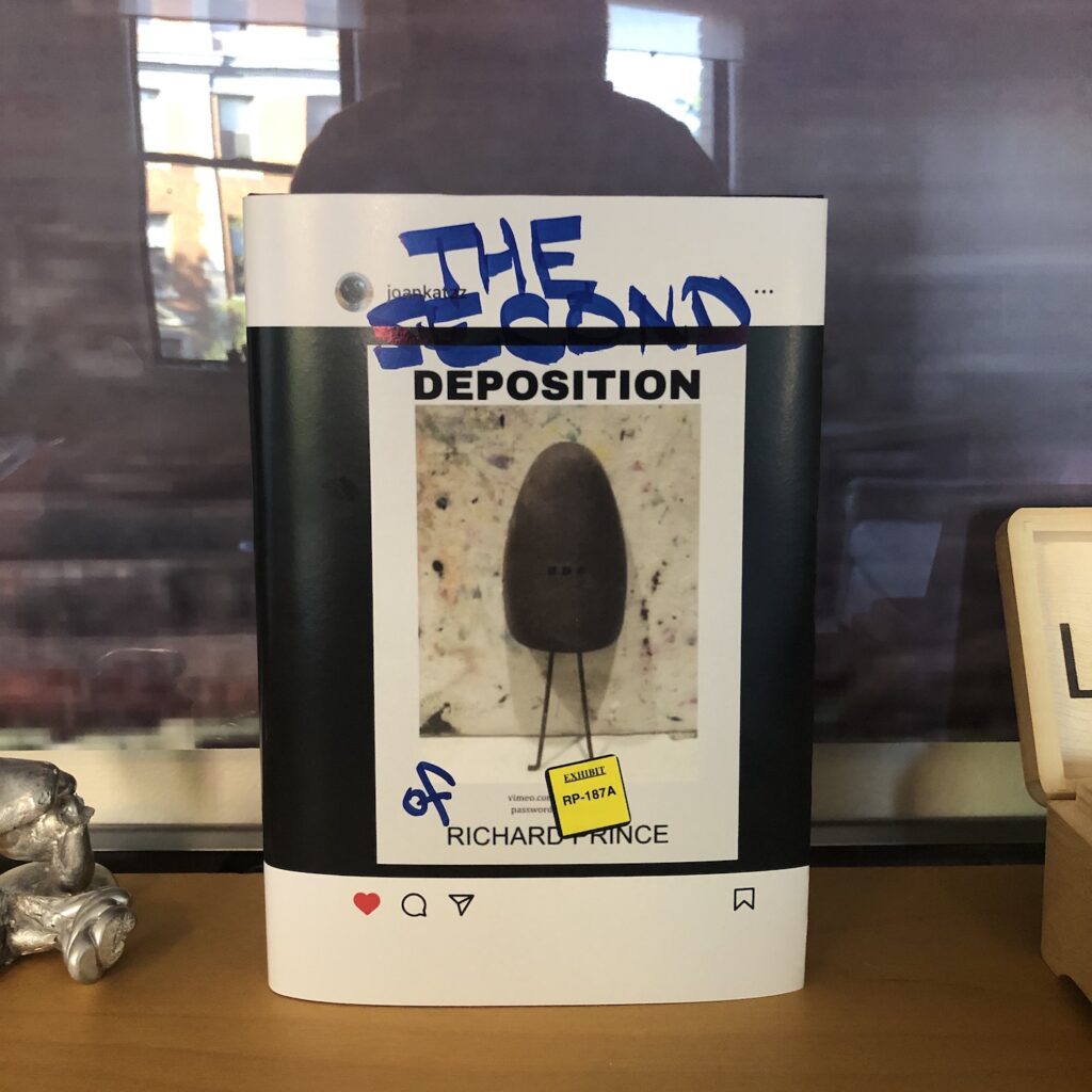
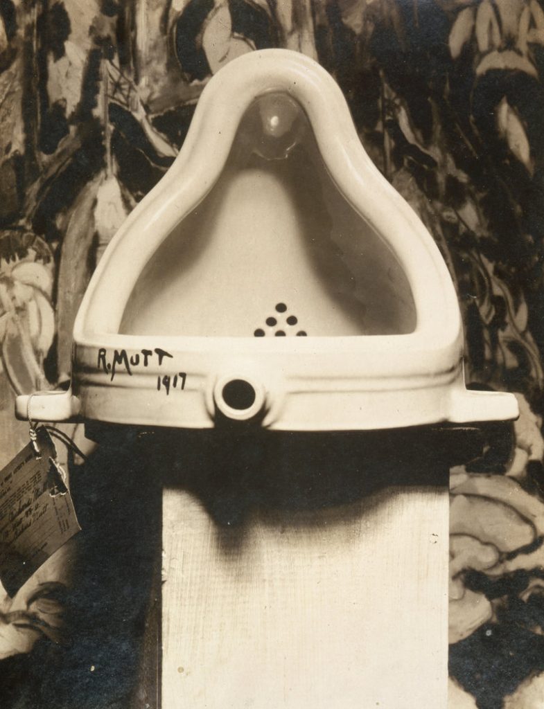
For a few hours in the Summer of 2023, an Instagram account that tracks the work of artist Richard Prince posted a picture of a rusty shoe tree, standing in front of an abstract painting. It echoed the original image of Marcel Duchamp’s Fountain, which Alfred Stieglitz photographed in front of a Marsden Hartley painting in 1917.
Marcel Duchamp’s Fountain, photographed in front of Marsden Hartley’s The Warriors on April 19, 1917 by Alfred Stieglitz
The Instagram image included text elements: DEPOSITION above and RICHARD PRINCE below, with a url and password to an unlisted video file. The video, more than six hours long, appeared to be a recording of Richard Prince’s deposition in a pair of conjoined lawsuits filed by photographers Donald Graham and Eric McNatt, in 2015 and 2016, respectively. Both men objected to photos they took, posted to Instagram by others, which appeared in Prince’s 2014 New Portraits series.
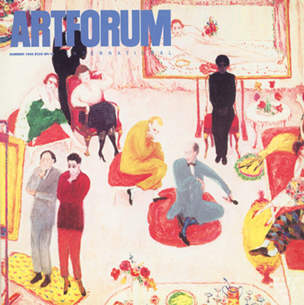
Which turns out to be just one example of how time moved back then. The cover—for which there was no hook except art world vibes—was none other than Florine Stettheimer’s Studio Party (or Soirée). Don’t expect ME to demand an excuse to love Florine Stettheimer!
And then there were dueling reviews of a big Yves Klein retrospective, from Nan Rosenthal and Benjamin Buchloh, who—spoiler alert—may have disagreed on Klein, but they both disliked the show. And while neither of them answered the highly specific Yves Klein-related question that led me to this issue in the first place, I can’t complain.