Actual Size

heizer_actual_size_munich_rotary_whitney_sm.jpg
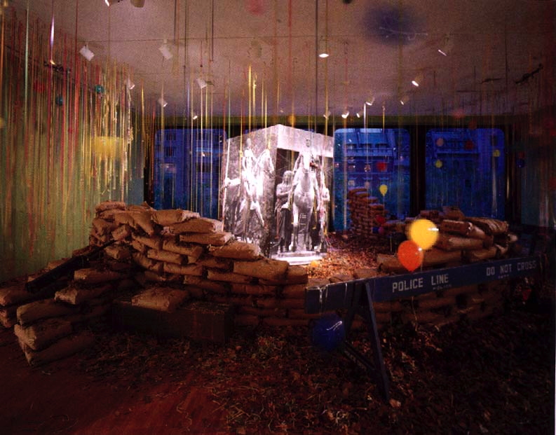
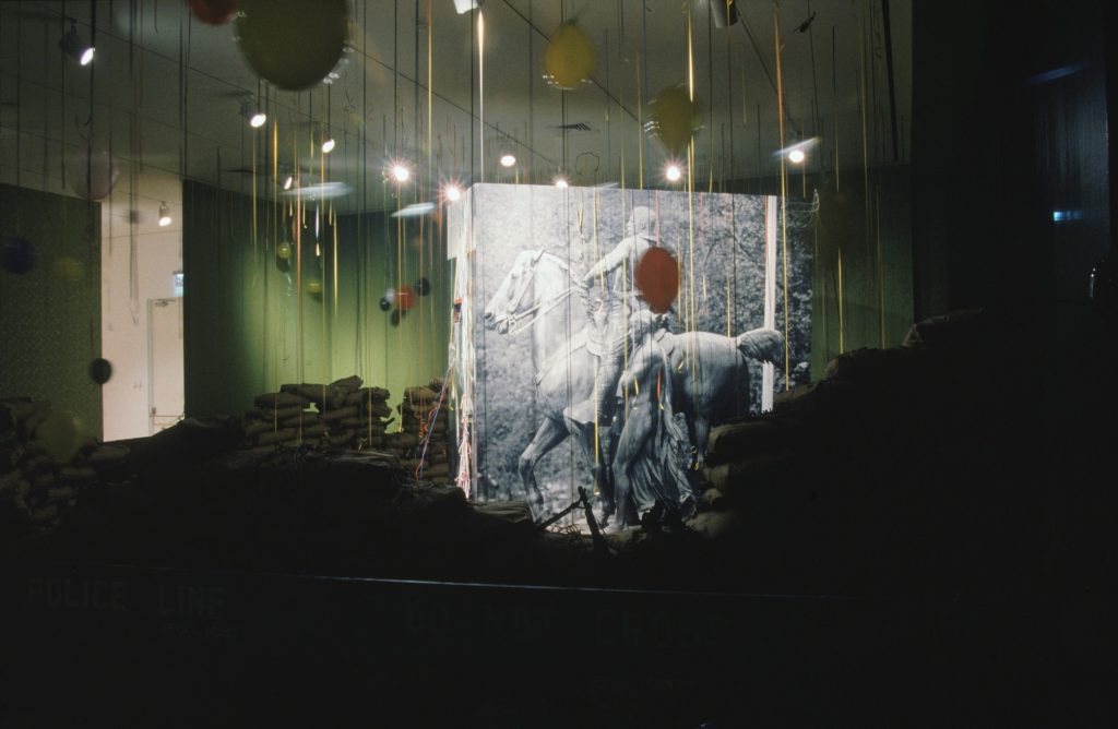
Michael Heizer, Munich Rotary, 1970, transparencies and projectors, installed here at LACMA in 2012, but on view at the Whitney through Apr. 10, 2016
Michael Heizer talked about Munich Depression (1969) and Munich Rotary (1970) with Heiner Friedrich and the Whitney folks, and Interview Magazine is ON it.

HEIZER: I have a genius friend named Maris Ambats, whom I talked to about making a projector to project an image at the actual size. The deal was to let the camera be a translator between reality and a replicated reality, which means making the photograph as big as the thing itself. So here it is. It gets squeezed down through the camera, and then it’s blown back up to the same size.
…MANCUSI-UNGARO: And the first time you showed Munich Rotary was in 1971 in Detroit…
HEIZER: Sam Wagstaff [who was then the curator of contemporary art at the Detroit Institute of Arts] introduced photography to the modern-art market. He liked photography so much he wanted to show it in the grand hall in this classical museum. It’s a big, big classical building–it’s like the Louvre inside with huge rooms. He put my piece in this huge 200-foot room. It was really good, and it was intended to be a photographic offering, a photographic artwork. Wagstaff had the nerve to do that. The trustees wanted him to remove that sculpture of mine he exhibited, too, and he resigned because of it. But he had the nerve, and he believed in it. He was right. It’s become so insidious. Photography is everywhere now. Back then, it wasn’t an art-world technique. But, the thing is, you can’t separate the film derivation from the real thing. Munich Depression and Munich Rotary are different works of art, but they come from the real thing. So you can’t escape it.
DE SALVO: You can’t uncouple them.
HEIZER: No point in trying to.

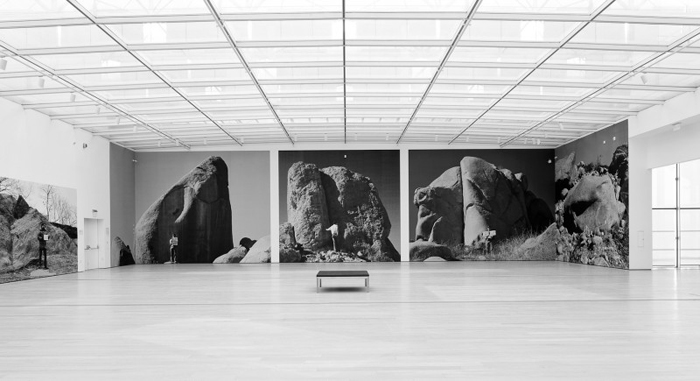
This hits a lot of buttons for me, first because of what’s not really discussed: the full-scale photomurals of boulders Heizer showed alongside Munich Rotary at LACMA in 2012, in a show called “Actual Size.” [Actually, Munich Rotary is or has been called Actual Size: Munich Rotary, too.] This felt like a photo representational rebuke of MOCA’s 2012 Land Art show, which Heizer refused to participate in.
But it really all makes me rethink how photography operated in this era as both a mode of art production, and as a means of circulation. The difference between the image and what it depicts, photography’s built-in distortions of “the scale of the world,” as Sontag put it.
Thumbnail image for destroyed_richter_013_family_chopshop_install.jpg
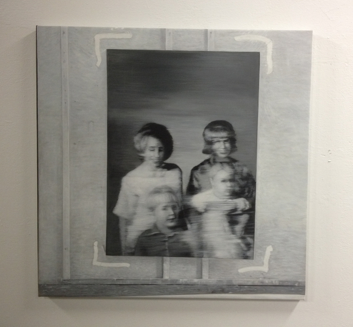
Destroyed Richter Painting No. 013, 2016, installation shot
The double distortion by photography and the market is what drove me to make the Destroyed Richter Paintings. I want to experience the difference (or the similarities) between a photo of a painting (or a jpg of a 4×5 slide) and an actual size reproduction of that (image of that) painting. Some have size info attached, but at first all the Destroyed Richter Paintings dimensions were extrapolated from the painting in them, and the studio space they inhabited. While figuring this out, I definitely considered conceptualist folks like Joseph Kosuth or Mel Bochner when I looked back at these issues, but Heizer and his photos were unknown to me. I sure look at them now, though.
And apparently I need to look at Audubon, too, who insisted on illustrating his birds life-size, and letting the printing people just deal. William S. Smith discusses Audubon and Actual Size in Art in America, and looks at scale and representation as analogs for control:

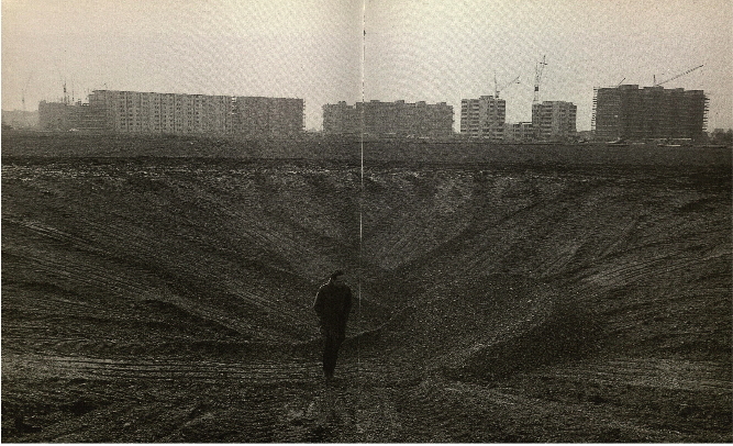
Heizer’s actual-size photographs of Munich Depression establish control over the context in which they are viewed–a control he could never assert over the site on which it was made. Photographs of variable scale can be reprinted, republished, circulated and annotated in popular magazines. But the actual-size works have to be seen in person in a setting where the placement of the projectors can be tightly controlled. They are photographic oddities, resistant to reproduction and circulation. This resistance, too, comes at a cost, because it makes the work, conceived supposedly in innocence of “commercial and utilitarian concerns,” entirely dependent on institutions with the resources and space that Heizer requires.

heizer_actual_size_lacma_x-traonline.jpg
Huh, this installation view of Michael Heizer’s “Actual Size” show at LACMA in 2012 is really about the museum. Broad wins again. via x-traonline.org
This is not to just hitch my wagon to whatever 60s star is riding through town. I am actually in the middle of sending out photos of the Destroyed Richters, and unless it’s a flagrant installation shot, the works keep ending up looking like the photos. I find myself stuck in this same representational gap, in a hole, I have dug for myself. But at least I am not alone. While looking around for photos of Heizer’s “Actual Size” show, I realized they are really all about LACMA, and their giant pavilion. And though all those megaliths are presumably still where Heizer photographed them 46 years ago, the work that’s inextricably coupled with Munich Rotary, Munich Depression, created on an active suburban building site, was destroyed within months of its completion.
michael_heizer_munich_depression_perlach.jpg
Michael Heizer’s Munich Depression, May 1969, Perlach, Munich, Germany
Michael Heizer by Heiner Friedrich [interviewmagazine]
One to One [artinamericamagazine]

On Listening To Phyllida Barlow

Now that I’m on the other side of it, I’m kind of amazed at how much the ideas that led me to Chop Shop resonated with the discussion Phyllida Barlow had at the Nasher Sculpture Center with Tyler Green. The live conversation was on MANPodcast in July 2015.
phyllida_barlow_nasher_2015.jpg
Phyllida Barlow, tryst, 2015, installation at Nasher Sculpture Center, Dallas [image: manpodcast.com]
I was listening to it again tonight on the way home and pulled some highlights: like this idea of fragments:

It always seems to me extraordinary that our lineage of Western art is dependent on broken fragments of things for which we have no proper-I mean, we look at torsos that don’t have limbs, that come from Hellenic times…and they’re iconic. ‘This is great.’ and Western art runs out of that greatness. And there doesn’t seem to be an issue that the arms are missing, or the legs are missing.
So the fragment and the half-finished has for everybody-it does for me-a certain beauty. it’s sublime. [9m00s]

This notion of the fate of art:

Really a question that emerged very early on, which is, ‘Where does art end up?’…Do you, as in my case, enjoy it, or as I was doing in the 80s and 90s and just putting it on the roof of our car, and taking it somewhere and just putting it on the street corner? And abandoning these things, and finally, after a few years of doing that, one night at 3 o’clock in the morning, I took them all to Blackfriars Bridge and chucked them in the Thames. [Laughing] Such is the way of artists, you know. It was one of the most liberating things I’d done. [13m15s]

Barlow talks about touch, and how the anticipation of touch is more powerful than touch itself:

I think this issue of touch is, for me, problematic. I think touch is a language, a non-verbal language, and how you imagine touching something seems to me to be more important than actually reaching out and touching it, where the minute you’ve touched it, the mystery, or the imaginative process, gets solved. You know, that’s closure on it.
I think there are…numerous art objects where there is a longing to touch, or an interest in what this thing is. But I think that it’s up to us to work out, what we then imagine what this might be? Is it hot or cold? There are artists who very much play that; Pierre Huyghe made a sculpture that is very much hot when you touch it. I think that’s a sort of fascinating game. I found that work, for me, you know, the minute you’d done that action, I didn’t know quite what else there was to discover about it. [51m00]

Just now I listened to this and the action I thought of was cutting the Barnett Newman painting and the Gursky Rhine. The thought of cutting, and the process of composition, the decisionmaking, the weighing, these all feel vital, and different from the actual chops.
chop_shop_newman_no_2_install.jpg
Chop Shop Newman Painting No. 1 [destroyed] and No. 2, both 2016
That experience is reserved for whoever buys it; by design it is not the same experience as the regular viewer. Taking Barlow’s perspective on touch would mean that considering the potential is more interesting. But I think what actually happens is that the decision to cut, crop, compose and define shifts a collector away from just seeing and toward creating. From the audience to the artist.

Indifference, Fence-Sitting, Keeping Quiet, & Despair

malekis_abstraktes_bild_20707.jpg
A Gerhard Richter squeegee painting is coming up for auction in February. It is CR:725-4 fourth in a series of five large paintings [225×200 cm] made in 1990, a very busy squeegee year. From The Art Newspaper:

“The years 1989 and 1990 are the most sought-after in Richter’s works,” says Isabelle Paagman, Sotheby’s senior specialist, contemporary art. “During this time he really embraces the squeegee technique in his abstract paintings. More than half of Richter’s works from that period are in museums.”
Paagman says his use of grey in Abstraktes Bild also makes it highly sought after. Grey is of particular importance for Richter; in a 2004 interview he described it as “the ideal colour for indifference, fence-sitting, keeping quiet, despair”.

I’ve been looking at these late 80s and early 90s squeegee paintings a lot lately and am intrigued by this kind of financial sifting. Equally interesting is the use of indifference, fence-sitting, keeping quiet, and despair as record-breaking selling points. I hope it sells for £100 million.
Abstraktes Bild CR:725-4, 1990, 225x200cm [gerhard-richter.com]
Gerhard Richter painting being auctioned by Malekis could topple record [theartnewspaper.com]
A 2004 interview with Jan Thorn-Prikker that doesn’t include this quote was published in the NYT. [nyt]

Robert Rauschenberg, Dad

I’ve been reading the transcript from Susan Weil’s interviews for the Robert Rauschenberg Foundation Oral History Project. It’s four sittings over several months, so stories are retold with slight variations depending on who’s there, more Thanksgiving chestnut than Rashomon, but still interesting.
One example, in her first interview session, Weil talked about the collapse of her marriage to Rauschenberg in the Summer of 1951, just as Christopher was being born, and of the aftermath, raising him as a single parent. [Bob was at Black Mountain College during the birth, then soon took up with Cy Twombly and headed to Europe for 17 months. By 1953-4, Rauschenberg was back in New York, way downtown, and in a relationship with Jasper Johns.]:

And was Bob able to see him from time to time?
WEIL: Yes. Particularly when he was in New York, that worked out. He would see him from time to time. But Christopher, he always–they’d try to do things together, and of course at that time, Bob was really into making his art life bigger and broader. So he’d often cancel meetings with Chris, because he would have a meeting with a museum person or something.
And so Bob was supposed to take Chris to the circus, and he said, “Well, Mom, he probably won’t be able to come, because he’ll have something more important.” And I felt so terrible. And of course he did come, but Christopher had it all in his head that he was not at the top of the list.

Ouch.
rauschenberg_chris_letter_det.jpg
The circus reminded me of this letter, which is collaged to the face of one of Rauschenberg’s earliest combines, Untitled (1954) [above], and which was mentioned in two essays in Paul Schimmel’s 2005 Combines exhibition catalogue:
“I hope that you still like me Bob cause I still love you. Please wright me back love LOVE Christopher.” And there’s a circus clown in the corner. Same circus? Who can say? What’s notable is not whether Rauschenberg was a good dad, but that he incorporated the letter in his artwork, and how.
rauschenberg_plymouth_rock.jpg
Untitled (1954-58), also called Untitled (Man with White Shoes) and Plymouth Rock, collection: MOCA, image: RRF
The letter is just below and to the left of an overexposed headshot of a toddler Christopher, but the handwriting is not that of a 3-year-old. Though it’s dated 1954, Rauschenberg clearly kept working on Untitled for several years. This photo of the artist’s studio shows that Christopher’s letter and photo were on there by 1958, though, the year of his (and Johns’) breakout shows at Castelli.
rauschenberg-front-st-1958-rrf.jpg
Rauschenberg in his Front St. studio in 1958, with various combines behind him. photo: Kay Harris via RRF
In reviewing Schimmel’s show and catalogue, Yve Alain-Bois mocked the idea of seeking insights into Rauschenberg’s combines from close readings of their collaged elements, even as he pointed out the photo of Johns and the Twombly sketch on Untitled.
When I first connected Weil’s story with Christopher’s letter, it was tragic and infuriating. Rauschenberg wasn’t busy meeting any museum people between 1954-58, he was just not seeing his son. But in Weil’s later tellings, with her son sitting alongside her, a much more sanguine version emerges; as he got a little older Christopher recalled hanging out at his dad’s and helping him make work. He was a teenage studio assistant on screenprinting, rollerskated inside, and helped unleash the turtles at E.A.T.’s 9 Evenings. In short, it got better. And in retrospect, putting his son’s letter and photo on a sculpture meant he saw it every day; Rauschenberg used his combine as the studio equivalent of the refrigerator door, sitting right in that gap between art and life.
Robert Rauschenberg Oral History Project [rauschenbergfoundation.org]
Robert Rauschenberg: Combines, the catalogue from Paul Schimmel’s 2005 exhibition, is great [amazon]
Previously: The Orgies of Art History

Just Compensation Image

rothko_harvard_murals_off.jpg also copyright maximalism smh
I’m slow to take a closer look at the conservation project to restore the coloration to Mark Rothko’s badly faded Harvard Murals (1963) using computer-calibrated light projections. The project has been going for several years, but the last winter the lit paintings went on view for the first time in decades, and remain up until July 24th. Which was the trigger for the roundtable discussion in Artforum that piqued my interest. It’s fascinating all around, but I really liked that it included artists Rebecca Quaytman, David Reed, and Ken Okiishi, who ended discussing the fate of paintings and the use of projection on painting as a creative medium in itself.
rothko_harvard_murals_on.jpg copyright maximalism ars please just
Even before the conservator Carol Mancusi-Ungaro explained that the projection was tuned pixel by pixel to approximate Rothko’s intended colors, I found myself jonesing to get my hands on the image, and turn it into a work of its own. Called a compensation image, it’s made by calculating the chromatic differences between the paintings’ current state and the target state. It’s a map of everything the painting has lost, an accounting of how far it’s fallen from its (hypothetical) historical potential.
It’s the color that might have been. In the case of Rothko’s Harvard Murals, Mancusi-Ungaro explained that they weren’t seeking to return the paintings’ appearance to a new, “original” state, but simply to erase the damage caused by Harvard leaving the works to bake in the sun for 15 years. The target state was determined using color-corrected Ektachrome slides from 1964 and a sixth painting, excluded from the set, which has been in dark storage in the Rothko estate.
The images above showing three of the paintings with and without the corrective projection come from a TEDx talk given by Harvard conservator Narayan Khandekar. The dramatic reveal, when the museum turns off the projection, happens every day at 4 o’clock, and is by all accounts dramatic.
rothko_harvard_murals_khandekar_demo.jpg
What is not shown is the compensation image itself. Here is a photo of part of it, when Khandekar holds some foamcore in front of the painting. I would like to see and use the entire thing. There may be a way.
In 2011 other Harvard conservator Jens Stenger published a report on the project at the International Committee of Museums triennial in Lisbon, which is circulating as an ICOM-CC newsletter pdf. In it, Stenger discloses that the team confected a small scale test of the light correction process by using identical materials (egg and pigment) to paint another Rothko and superfade and correct it.1, 2
rothko_mockup_compensation_image_icom-cc.jpg
A is the Conservators’ Rothko. B is the painting after a few weeks under some tungsten lamps. C is the interpolated compensation image (A – B). D is the lit painting (A + C).
In an incisive essay last April, John Pyper likened the compensation image’s duplicative relationship to the painting as a similar to a print and a plate. Seeing it now makes me think of a color photo negative.
Which makes me think of Alma Thomas, who painted Watusi (Hard Edge) in 1963 [!] using the form from Matisse’s giant cutout, L’Escargot, but in the inverse colors. For Thomas the colors signaled a reversal of direction for cultural appropriation. What does the color of a compensation image represent? Here it is loss, a loss caused, let’s face it, by Harvard’s years of neglect, mishandling, and occasional abuse. [Actually, the projector project does not address the physical damage, dents, scratches and graffiti the paintings received in what was, after all, a campus dining room.] At least in this case, compensation feels too diplomatic; maybe we should call it a restitution image, or a reparations image.
niepce_positive_print_uta.jpg
Now that I look at it a bit, the particular colors of the Rothko compensation image remind me of not just any photo negative, but the first photo/negative, made by Joseph-Nicéphore Niépce in 1826. And just because a projection is used to index and compensate for loss or aging now doesn’t mean that’s all it’s capable of. It turns out photography could do more than capture a view out a window.
1 I don’t think it’s a spoiler to say this outcome is literally the kicker from the Artforum discussion.
2 This is the second instance I’ve heard of conservators making post-war painting simulacra, and now I want some.
Stenger, J. et al., “Non-invasive Color Restoration of Faded Paintings Using Light from a Digital Projector” [icom-cc.org, pdf]
After Mark Rothko, American [printeresting.org]
Previously, and very much related: On Peter Coffin at the Hirshhorn, also Donald Moffett
other early Donald Moffett projections on paintings

A Statement-As-Question From A Panel on Painting

No one’s really sending them to me, and so these are still not easy to collect. And this statement-as-question by Phong Bui at Hunter College’s recent panel on painting maybe doesn’t count, because The Brooklyn Rail co-sponsored the panel.
But it’s still good. And the two tall uncomfortable guys asking questions after Bui are interesting to listen to, too, the latter mostly for his strained, uncomfortable language, but both kind of get shut down by Amei Wallach, who I ended up finding pretty disagreeable. Anyway, Bui starts around 1:04:00. As previously, line breaks in the transcriptions map to pauses by the speaker.
You know what the best show at MoMA recently?
that we tend to forget?
Is the Robert Gober retrospective.
That is–
And why do I say this?
Because years ago, I think it must have been in
early September
2007
-6, actually,
Rob Storr and I came to interview Elizabeth Murray
for her retrospective there.
In the course of talking to Elizabeth
about the way in which she created her structure
and she emphatically said that it came from Ron Gorchov’s
early
paintings
that she had, you know–
exposed to
in the early 70s when she first came to New York
Travel back to Bob Gober’s show
He used to work for Elizabeth
building those structures but that’s not the point the point is
that show was so great partly because he
featured
artists
who influenced him
who he admired
and I don’t remember–
do you remember
not long ago
the previous Whitney
where the whole
room
was dedicated to Forrest Bess?
That was an amazing significant event
Why?
Because it brings back to the way why MoMA
have forgotten
since
I think the last show they ever
allowed to happen was Morris Hirshfield
Irving, could you correct me on the date?
’47, maybe?
Irving Sandler, everyone.
You’re very close.
I was close. Well, alright. That was Alfred Barr, essentially being fired.
They fired him because of that
Yes, but, Outsider Art, or what you call Self-Taught Art
has been the essential
synthesis
integrated with
Early Modernism
and you go back to Barr’s chronology? It’s all there
and you go back to Rousseau and other early Modernists like Kandinsky, Klee they collected children’s art
mentally ill patients’ art all kind of Outsider Art was being embraced
and integrated into their pictorial thinking
To mediate from the constraints of Western
you know
pictorial history I think that’s exactly what it’s about. Going further back about reproduction
I have a question about that. Well
maybe you provided an answer to?
On top of it?
It was uh
Francis Bacon
actually
who
first saw the reproduction of
Velasquez’s Pope Innocent
and he’d been
obsessed with that image
painted over
a series of several paintings
until
this is my humorous
sensibility came to play here
He finally came to the Prado
for the first time
he never saw the painting and you know
he died in Spain
He died soon after seeing the real Velasquez.
So reproduction has a certain resistance toward a certain romance it’s like going to a date, someone you met two weeks ago
in a party
that you were delighted to have a great time talking and you go to a dinner
a kind of a
romance
you take them out to a very fancy restaurant
and you start talking a while
and you realize not going anywhere.
So you go to the bathroom
and you
you don’t want to come out.
Why? Because that person looks at you very seriously and, “I love you.”
And I think that kind of romance can kill you.
OK.
A Panel on Painting: Presented by the Brooklyn Rail and Hunter College [vimeo, though @davidsurman also nicely loaded it onto ]
youtube]
Previously:A Statement-As-Question From Fractures Of The Civilization
‘I’m Going To Fail’, or Protocols of Participation

In The Beginning

els_von_freytag_god_schamberg_met.jpg
God, Elsa Baroness von Freytag-Loringhoven, photo: Morton Schamberg, 1917, collection: metmuseum.org

The claim that Duchamp “stole” Fountain from Elsa Baroness von Freytag-Loringhoven was brought to the fore recently. The ostensible hook was a criticism of the reissue of Calvin Tomkins’ Duchamp bio, which doesn’t credit Freytag-Loringhoven. But authors Julian Spalding and Glyn Thompson’s real goal is the delegitimization of Duchamp, and with him, the entire post-war art and theory that flowed out of Fountain. It’s the reactionary art historian’s equivalent of traveling back in time to kill teen Hitler. Here is Dr. Thompson trolling his commenters at The Art Newspaper:

Any of the global curatorial elite contemplating changing a label also have the problem of what to attach labels to, because the problem for a work art that draws its legitimacy from the acceptance by Duchamp of the attribution of Mutt’s urinal is that it is now required to obtain it’s legitimacy from somewhere else. Had Duchamp merely exhibited a urinal at the Janis Gallery in 1950 and explained it as homage to Elsa, whose urinal had been rejected by the Independents in 1917, there would be no problem, but there is, because the replica of 1950, attributed to Duchamp, and signed R Mutt, drew its authenticity from the attribution of Mutt’s original to Duchamp, a process which had begun with no complaints from Duchamp in 1935.The implications of this conundrum for the future of avant-garde art must now be addressed…

“Duchamp’s mean and meaningless urinal has acted as a canker in the heart of visual creativity,” they kicked, “Elsa’s puts visual insight back on to the throne of art,” as if they would for a minute support the artistic reign of Queen Elsa, whose outrages and transgressions troubled even the Dada-est of her contemporaries.

stieglitz_mutt_fountain_blindman_2.jpg
Fountain, 1917 assisted readymade by R. Mutt, apparently photographed by Alfred Stieglitz, as it was first seen and known via its publication in The Blind Man 2, May 1917

Which doesn’t mean they’re wrong. Their claims are not based on their own work, but on many years of carefully researched and argued publications of scholars like William Camfield, Irene Gammel, Amelia Jones, and Francis Naumann. Among the evidence: a letter Duchamp wrote to his sister in April 1917, just days after Fountain was rejected, attributing it to “one of my female friends,” which was only discovered and published in 1983. Also bolstering the case: the similarity of Fountain to God, top, Freytag-Loringhoven’s plumbing fixture-based sculpture of the same period. No brainer, right?
elsa_von_freytag_duchamp_portr_sheeler.jpg
Portrait of Marcel Duchamp, c. 1920, Elsa von Freytag-Loringhoven, photo: Charles Sheeler, via francisnaumann

Except that for decades God was considered to be the work of Dada/precisionist painter Morton Schamberg. Schamberg was a close friend of decidedly un-Dada Charles Sheeler. Both Schamberg and Sheeler photographed artworks for money. Freytag-Loringhoven’s found object assemblage Portrait of Marcel Duchamp exists only in Sheeler’s photo of it, above, which was only discovered in the 1990s. They have separate billing. Naumann, who has written several of The Books On Duchamp, re-attributed God to Elsa in the mid-00’s, but so far she gets, at best, shared credit. One of the photos Schamberg took of God includes his own machine-inspired painting in the background, but two do not. This is the only sculpture associated with Schamberg, who died in the 1918 flu pandemic.

god_schamberg_christies_baroness.jpg
Morton Schamberg photo of God, image via christies

This Schamberg-less Schamberg photo of God sold at Christie’s in 2011. The estimate of $5-7,000 was in line with his market history; the result, $390,000, makes me think that the Baroness’s history was a factor and that someone out there believes in her God.

This God talk was weighing on my mind for a couple of months when I stumbled across a 200+ page oral history from UCLA of the pioneering West Coast abstractionist Lorser Feitelson, whose career began in New York in the 1910s and 20s:

[Freytag-Loringhoven] would come up to visit us, …and she’d bring up all kinds of –I think I told you this–a cluster of pipes that she picked up right around the corner (they had razed one of those buildings), dragging this thing up the stairs. [It sounded like] somebody was busting the building. And she said, “Isn’t this a grand sculpture?” And she wasn’t kidding. Accident made this thing. What the hell difference does it make if the guy intended it or not? It wasn’t difficult to convince us.

The awesomely gossipy Feitelson tells the Baroness’s endless demands for sexual services from men and women alike, and of her many arrests for indecent exposure for “the way she dressed, in batik, with an opening there and dyed pubic hair, walking down Fifth Avenue.” And of how taking his young nieces to Elsa’s studio turned out to be “the worst mistake I ever made in my life,” when she identified the glittery pink nebula painting they were looking at as a belfie.

For all this, though, Feitelson’s most interesting story is of his first, daunting encounter with Freytag-Loringhoven, who picked up the young student at a live modeling session in Gertrude Whitney’s Studio Club and took him home.

Geez, I mean, what the hell kind of a gal is this? And here on the walls were shovels and all kinds of things. I said, “Marcel Duchamp.”* She said, “Yes, I know him very well.” I don’t mean to say that she took it from him–and I’m not sure. She was playing around with “found discoveries.” She would take the shovel and put it up against a background of some kind of a colored paper or materials. She had many such things, and they were wonderful.

morton-schamberg-god-sculpture_1.jpg
God, cast iron plumbing trap on miter box, 1917, attr. to Schamberg & von Freytag-Loringhoven, collection: philamuseum

In a deal engineered by Duchamp, God was acquired in 1950, along with many major Duchamp works, by the Philadelphia Museum.. The Large Glass joined the museum two years later. God is currently credited to both Schamberg and Freytag-Loringhoven.

What if Elsa took the original In Advance of A Broken Arm? What if she helped make it? What if she and Duchamp conspired to create R. Mutt’s Fountain–which, remember, was identified almost immediately as a Buddha–and submit it to the Independents? Feitelson wrapped up his discussion of the Baroness with a segue to Duchamp: “[s]he had to have this terrific conceit and faith in her convictions. And I still say you cannot talk about Marcel Duchamp detached from other people.” In its own fitful way, the art world’s conversation is starting to shift.

* OK, I’ve wondered about this for a while, and now it’s a year later, and I am still wondering. I have a hard time figuring out how Feitelson would see a shovel hanging in a stranger’s studio and immediately associate it with Duchamp.

Feitelson actually said this drawing studio was before Whitney started her Studio Club, but that was 1914. And Duchamp only hung In Advance Of A Broken Arm in the studio he shared with Jean Crotti in November 1915. So no.
Feitelson said he was in NYC “during the war,” which would be 1918-19 from the US view of things. Whitney Studio Club was on W 4th St, and moved to W 8th in 1923. So that’s a possibility. But again, Duchamp had his shovel in his studio, and Feitelson never seems to have gone there. He never mentioned Crotti. He never mentioned the Arensbergs, the center of Duchamp’s circle, and exactly the kind of folks a namedropper like Feitelson would go on about. Did people talk about Duchamp’s studio objects? Because I don’t think he showed them publicly. Instead, I suspect this Elsa memory is a retrofit, Feitelson trying to make it sound like he knew what was going on in Elsa’s studio. There may have been a shovel, which would be interesting, very interesting! But I highly doubt if he saw it, Lorser Feitelson connected it at the time to Duchamp.

Uber, But For Artists

Monochromes. Why’s it always gotta be monochromes?
In his recent NYT Magazine profile of Stefan Simchowitz Christopher Glazek writes about the emerging artist Kour Pour that “several artists I spoke with had initially assumed that Pour did not in fact exist — that he was a computer-generated figment of Simchowitz’s prodigious imagination.” One reason Glazek gives is that Simcho’s email was the contact link on Pour’s website. Another, he infers, is because Pour’s digital image tapestry paintings seem so perfectly suited to Simcho’s Instagram- and minor tech billionaire collector-centric art dealing operation.
But Glazek saves the biggest reveal for his annotation of his own article on genius.com: he’d heard that Simcho had already fabricated an artist, and had put his work up for show and sale in 2011. That artist’s market-optimized multi-culti name was Chen Obogado.

An artist told me Simchowitz had approached him to make paintings under a false name, though it seems possible that Simchowitz actually painted them himself. I’m not sure if money ever exchanged hands for the paintings. It may have been more of a prank than a scheme, and the art world is forgiving of pranks.

chen_obogado_china_art_obj_inst.jpg
China Art Objects, Mind Games, installation view with Chen Obogado [L] and actual artist Evi Vingerling [R], Jul/Aug 2011
Let’s review Obogado’s known body of work and brief exhibition history. It won’t take long. As far as I can tell, Chen Obogado made his debut in a summer group show at China Art Objects called, appropriately enough, “Mind Games.”
Chen_Obogado_MS6_01_chinaartobj.jpg
Chen Obogado, MS6 01, 2011, resin, pigment, aluminum, image: caog.la
Like many actual artists at the time, simulated artist Chen Obogado [SimChO?]’s practice interrogated chemical process-based abstraction; two works are pigmented resin slabs, possibly on aluminum panels, but definitely in tray-like aluminum frames. They retain the traces of their skll-less pour [!]: bubbles, pour lines, and pigment mixed unevenly within each batch. I guess this is supposed to be works’ content. If I were trying to sell them, I’d reference the foam scenes from Fischli & Weiss’sThe Way Things Go and let the zombie abstraction momentum do the rest.
Chen_Obogado_MS001PB001_chinaartobj.jpg
Chen Obogado, MS001PB001, 2011, polyurethane, aluminum, image: caog.la
The third, smaller work is made of polyurethane in aluminum. It is glacial, sculptural and reductive, and appears to be a piece of Stingel-ian insulation board that’s been scraped with a solvent-dipped spackling knife. They have inconsistently formulated serial numbers for titles. Their irrelevance is a standout, even among the forgettable flotsam that seems to have washed up in Culver City that summer. [Like car crash videos in drivers ed, anyone starting a new painting series should be forced to surf 3-yr-old group show installation shots.]
Chen_Obogado_CO_MSM_001_S1_laxart.jpeg
Chen Obogado, CO MSM 001 S1, 2011, resin, platinum powder, aluminum, est. $3,000, opening bid: $1,500. image: laxart
Which wasn’t enough to actually forget them. The fourth and last Obogado to make a documented public appearance was in November, at the LAXART benefit auction. This work was made of resin and platinum powder on/in aluminum. Which sounds like it might be kind of metallic and shiny, a poor, stupid, unconnected man’s Jacob Kassay.
It was listed as a “donation of the artist and an anonymous donor,” which makes little sense in the benefit auction context, and even less if he actually didn’t exist. But it does seem like the credit line of an artist who didn’t exist who wasn’t buying his own materials. Last summer Simcho told Artspace, “I help dealers decide which artists to represent, how to represent them.” Was SimChO presented to CAO and LAXART as a Simcho joint? Was he pitching the glorious future where artists-as-brands soared free of the foibles and frailties of actual artists? The next step in the end of authorship? That would be more than a scheme OR a prank.
The Kassay mention above is interesting because Summer 2011 was when Kassay had his first show in LA, and L&M. And Henry Codax had his first show in New York. Is it too late to organize an east coast/west coast monochrome show of these two non-existent artists? Please say no. #Sumer2015
Though rumors of Kassay and Olivier Mosset’s involvement in Codax’s work were reported at the time, I’ve come to think that Codax must be a gallerist’s dream: all that margin without all those hassles. Assuming it sold, of course, and you could keep it moving. And maybe that’s what doomed SimChO’s work: Simcho couldn’t keep up the act well enough to sell it, or maybe it sucked so bad even his buy-it-now yesmen network didn’t click, and so Simcho decided to eat the cost of two buckets of resin and call it a day?
It’s worth considering Chen Obogado in the Simcho’s own preferred, network/platform/disruptor context [My favorite quote, from another of Glazek’s annotations: “All he demanded was a minimum level of respect. ‘You can’t say I’m bad–I created the post-internet movement!'”] Stories of artists feeling exploited by Simcho remind me of reports last year of the drivers who were the pawns in Uber’s anti-competitive attacks against Lyft. Which LOLjobsWTF when Uber’s CEO talked about how psyched he was to replace all the drivers with robot cars. If Chen Obogado’s any indication, Simchowitz may feel the same way about artists.
Christopher Glazek annotates himself [genius.com]
When he has a fawning audience Simchowitz really lets the vision flow. Must read. [artspace]

Better Read: A Lively Interview With Ray Johnson, c.1968

The_Paper_Snake_Ray_Johnson.jpg
Ray Johnson, The Paper Snake, 1965, published by Dick Higgins, image: rayjohnsonestate
I’ve been thinking of various audio projects, something this side of an actual podcast, perhaps. But unlike a podcast, it’d be useful and interesting and not something being done already by everyone else.
And so I’m experimenting with a series I’m calling Better Read, art-related texts transformed into audio. While I’m working, I’ll often use text-to-speech to listen to papers, interviews, essays, and other various longform writings. It’s imperfect, but also an improvement. In the car, we’ve been listening to Moby Dick | Big Read, in which each chapter is read by a different person. It generally works.
So for Better Read, I am envisioning a mix of live and computer readers. Sometimes I’ll get the author herself; other times, someone can read from a text they really like. I might read a few myself, but to be honest, I really don’t like listening to me. Maybe you do? We may find out!
That W.H. Auden poem I posted the other day may become Better Read #1, and once I figure out the frequency, &c., I’ll set up a dedicated URL
But for now, please enjoy this 1968 interview with Ray Johnson, recorded for the Archives of American Art’s Oral History project. It really is a standout among an invaluable collection. And I especially like the idea of using a transcription of a recording as a script for another recording; fine tuning this process will be useful before I tackle any large, intense deposition transcripts [*cough* Canal Zone/Yes Rasta]
So definitely let me know your thoughts, advice, feedback, suggestions, requests, &c., and we’ll see how this thing shapes up.
Better Read: An Interview with Ray Johnson [45min, 22mb, dropbox greg.org]

Two Hands

serra_hand_catching_lead_still.jpg
It hadn’t occurred to me at all until yesterday, but a still of Richard Serra’s first film, Hand Catching Lead (1968) suddenly reminded me of Felix Gonzalez-Torres’ 1992 billboard, “Untitled” (for Jeff). [the installation below in a Frankfurt U-bahn station was for MMK’s 2011 show of G-T’s work. (what is up with your impermanent links, MMK?)]
Untitled_For-Jeff_1992_mmk2011.jpg
As if the association couldn’t be any more un-Serra, the title of that show, “Specific Objects without Specific Form,” was co-curated in Frankfurt by Tino Sehgal.
But in a 1973 interview with Liza Bear originally published in Avalanche, Serra dismissed intention and emphasized experience:

The focus of art for me is the experience of living through the pieces, and that experience may have very little to do with the physical facts…Art’s a state of being, and it’s continuous. You’re not just an artist when you’re making art.

And in his talk at the Hirshhorn in 1994, Felix recounted how, regardless of whatever his intention for the image, the reactions to a billboard with an open hand varied dramatically depending on the culture and context in which it was shown.
Normally this is the point in a blog post where I make a profound or definitive conclusion, or at least a witty wrapup. But I put all my effort into the title, and so I have none.

From The Audio Files Of Mr. Felix G-Torres

The Smithsonian has added the Hirshhorn Museum’s audio archive to their digital library collection, and it’s great. Too often in the art world, what happens in Washington not only stays in Washington, it’s forgotten in Washington. So it’s unsurprising that the Nation’s Attic has interesting, even important stuff in it that really should be dusted off.

One of the first recordings I headed to this weekend was a lecture by Felix Gonzalez-Torres, in association with his Summer 1994 retrospective. I hadn’t heard Felix’s voice in almost 20 years, and I’d never heard him talk at length about his work. I was not prepared, either, to hear him say he was getting tired about an hour into the recording. After that, I couldn’t not hear his exertion to complete what was clearly a difficult, but imperative task.
It turns out I was also not prepared for how unfamiliar his work sounded in his own words. And how different his practice was from the received, sort of calcified, canonical understanding of it. The things he emphasized vs the things we saw or now see as being elemental.

Felix read part of his 1993 interview with Tim Rollins, which we know. But he also talked along to a selection of slides, which I tried to follow along in my books. Easily half the works he discussed were not included in ostensibly definitive catalogues and anthologies. Many had different titles. Some weren’t illustrated.
All of this is of a piece with Felix’s work, though. He would change the titles of pieces. Works he showed and sold were, near the end of his life, recategorized as “additional materials” and “non-works.” But some things, installations and site-specific projects in particular, seem to have been sorted out of his canon completely and/or ignored by critics.
We work with what we have, but we too often don’t see what else there is. And when we find out we’ve been using incomplete or inaccurate info, we’re slow to adapt.
So here’s a single example. It’s a piece Felix started his Hirshhorn talk with, and which he said “is a key to a lot of my work, and also the way I am.” And it’s piece I’d never heard of or seen, whose bare, incomplete, and contradictory references in the record so far I have completely overlooked. The artist called it “Untitled” (Quatrenium).

Here’s what he had to say:

Continue reading “From The Audio Files Of Mr. Felix G-Torres”

A Statement-As-Question From Fractures Of The Civilization

It’s taking longer to gather these things together, but I just found another fascinating statement-as-question from the Q&A session of a panel discussion. This time, it’s “Fractures of the Civilization,” a discussion by composer/philosophers C.C. Hennix and Henry Flynt, along with John Berndt, held in June 2013 at the Goethe Institut in NYC. The talk was organized in conjunction with a realization of Hennix & Flynt’s ‘The Illuminatory Sound Environment” at ISSUE Project Room.
I’ve been a fan of Flynt’s music for quite a while, but in the last couple of years I’ve also tried to step up my engagement with his writings, his talks, his ideas. I must say, it’s exasperating; there’s real genius and groundbreaking thought, action and insight there, but Flynt’s a maddening interviewee, and even more frustrating on a panel. My operating theory is that he’s been not listened to for so long, he can’t but vent. And his views often have that determined, hermetic brittleness of someone who’s had to figure out the world and what’s wrong with it by himself. His far-ranging intellect and the rapid vigor with which he makes leaps and pronouncements makes it basically impossible for anyone to ask a follow-up question, or to challenge or probe something further.
My hope is that someone smart enough and well-versed enough will go deep with him on the art and music where his contributions are still only feebly understood. Anyway.
ISSUE Project Room’s video of the talk is here; the question comes at around 1:19:00:
There’s like this thing that I think about sometimes–
oh, thanks [gets mic]
There’s this thing that we–about the Cold War, Progress science in the 20th century, there’s this fight between the superpowers in order to get to some,
you know, higher place
to prove some sort of animalistic thought
When that fell apart with the end of Communism,
with this idea that,
you know, Capitalism,
Neo-liberalism’s gonna go all through the world
people don’t have this thing to fight against, as far as this race,
we’ve kind of–
the science that we have–
the futurism that we’ve come to
it’s very social and helpful,
but it’s not the futurism that we had in the 60s and 70s that idea of what we’d be like
now.
So there’s this need
or something
for these
you know people,
Futurist Transhumanists,
to fill in this blank area, that’s sort of this faith area that I think you’re talking about
where,
you know
they’re taking this place of–
basically we work more, as humans now
at some point they thought
robots were gonna
DO most of the work
And people were actually worried
what the lower classes are going to do with all their free time.
But apparently, we work more
than we did in the 60s and 70s,
at least in this country.
So there’s this, like,
WANT
for
something to happen with futurism,
this futurism that might be based on a science fiction or something, but
essentially these people are running away with it
and it captures people like a relgious-type
experience.
So I just wanted to say
what do you have to say about that?
Previously: ‘I’m going to fail,’ or Protocols of Participation

Maybe I Should Paint Them

One of the quotes that sticks with me from Richard Prince’s deposition in Cariou v. Prince:

Q. All right. Now, you say you picked up a book on them?
RP: In — literally, yes, I picked up a book.
Q. Okay. And that’s the Yes Rasta book —
RP: Yes.
Q. — that we’ve been talking about, that’s in front of you? okay. now, down a few lines you said, But I love the look, comma, and I love the dreads. What did you mean by that?
RP: What do you mean what do I mean by that? I just said it. I love the look and I love the dreads.
Q. What did you love about the look?
RP: I love the way they looked.
Q. How so?
RP: I don’t know how to answer that question, how so. I love the way they looked. I mean that’s usually I get — that’s how I respond to images.
I think maybe I liked the way that they were so different.
Q. Than what?
RP: Than myself. I don’t have dreads. I wish I could. I mean I think that was some of the thinking or some of the — perhaps it goes back to the girlfriends.The reason why I took the girlfriends is I wanted to be a girlfriend.
I think some of the attraction that I had to some of these people who looked like Rastas in St. Barth, hanging out at the bars, I said to myself, Gee, I wish I could look like that some day.
So if I can’t tweet like that maybe I should paint them. Maybe that’s a way to substitute that desire. I mean that’s the only way I can answer that love question.

Then he goes on to talk about his stepson turning him onto the reggae cover band Radiodread. It’s really awesome.

Colored

gordon-parks-untitled_shady-grove_alabama_1956_arg.jpg
Gordon Parks, Untitled, Shady Grove, Alabama, 1956, image via arthurrogergallery
Hilarie M. Sheets’ recent Artnews article on black artists and abstraction includes Howardena Pindell, whose intensive work making paintings by punching out tiny circles in the 1970s triggered this childhood memory:

On a car ride through Kentucky in the 1950s, she and her father, who lived in Philadelphia, stopped at a root-beer stand and were served mugs with red circles on the bottom.
“I asked my father, ‘What is this red circle?'” she recalls. “He said, ‘That’s because we’re black and we cannot use the same utensils as the whites.’ I realized that’s really the origin of my being driven to try to change the circle in my mind, trying to take the sting out of that.”

And I realize I’ve never heard of this. Even though it makes sense within the perverse, racist logic of the segregated South. That discrimination would be manifest not just in signs over drinking fountains and bathroom doors, but that it would be in products, too, woven right the fabric of the material world.
flw_noritake_teacup.jpg
I looked around for examples of such discriminatory dishware, and I haven’t found any yet. I wonder what they looked like. The only red dot image I can muster is of Frank Lloyd Wright’s Imperial Hotel tea cups, which were supposedly designed to mask ladies’ lipstick marks on the rim. I’m going to assume this was not like that.
Were the dishes sold with red circles on them, or did each diner paint them themselves? Is there a folk taxonomy of segregated china and utensils, the racist equivalent of the coded language of hobos? Were they on the bottom, only visible to the waitress, on the side, where everyone could see, or legible only to those who knew? Are they hidden in plain sight in photos of the era?
Do people collect these artifacts, or is it too fraught? Is taking too great an interest suspect, like collecting Nazi dishes or mammy cookie jars? Are these things buried in attics like Japanese-American internment camp objects, too painful to unearth or discuss? Am I just looking without knowing the proper ebay keywords?
blue_pullman_blanket.jpg
While searching, I did come across this: a Pullman Porter’s Blanket, at the National Museum of American History.

The standard Pullman blanket in the 20th century was dyed a salmon color, which became almost a trademark of the company. When a blanket became worn or damaged in service, it was assigned to those blankets reserved for porters’ use.
This wool blanket in use between the 1930s and the 1950s, was used by African American railroad porters. According to Pullman service rules, a porter’s blanket was never to be given to a passenger. Ostensibly to avoid mixing these with the passengers’ blankets, the porters’ blankets were dyed blue. This was to comply with statutes in the South that dealt with the segregation of blacks and whites.

og_pullman_blanket_collwk.jpg
Here’s a salmon-colored Pullman blanket [via collectorsweekly]. I can’t see how you could dye this to make the blanket up top. Which means these were dyed at the factory. Am I wrong, textile people?
The Changing Complex Profile of Black Abstract Painters [artnews]
Related: “Segregation,” an exhibition of Gordon Parks’ photos of the 1950s South, is at Arthur Roger Gallery through Sept. 20 [arthurrogergallery]

The Artist And The Frame

arthur_dove_snow_thaw_phillips.jpg
Arthur Dove, Snow Thaw, 1930, phillipscollection.org
In this interview with Hans Ulrich Obrist, Franz Erhard Walther talks about becoming interested in the early 1960s in frames:

The original idea was to have a frame with nothing in it. It asked the spectator to project his or her idea, image, object, whatever. So, a projection field. Through the decades, it’s a main theme for me, working with a frame, and the idea of projection, filling the frame by imagination.

Which I find particularly interesting because I’ve been looking at just the opposite: artists who paint frames around their work.
stuart_davis_blue_cafe_phillips.jpg
Stuart Davis, Blue Cafe, 1928, phillipscollection.org
Folks like Seurat painted his frames and considered them as integral elements of his works, of course. But at the Phillips Collection a few weeks ago, I noticed that American modernist painters like Stuart Davis and Arthur Dove were painting frames, and painting borders around their paintings. It gives the paintings a sense of self-containment, completion, wholeness, but it also sets them apart. With aluminum strips on each side Dove gave one later collage a window effect. ANd Davis did some kind of frame treatment on nearly every painting in the Phillips. [And on prints, the border of the paper beyond the stone serves the same formal function.]
I imagine it was something early modernists had to take on themselves because they didn’t want some collector or dealer slapping a pie-crusty traditional frame on there. It was a control thing. But also a gesture of breaking with the norms of the established painting and art world of their day.
In either case, frames were still the place where the terms on which the artist’s work met the world were set.
Also, I just love this Dove painting, even more than the many great Doves in the Phillips collection.