Pentagon Memorial: S.N.A.F.U.

Peter Max, who presumably made art protesting the Vietnam war during his cosmic 60’s hippy days, clearly found alternate paths to self-actualization, paths which lead to becoming The Official Artist for any and every sense-free bureaucracy he could find.
Peter Max's treacly WTC fundraising poster, image: petermax.com
With all the service he’s given the Federal Government–including the INS and the Federal Energy Regulatory Commission–perhaps he was under the impression that he didn’t need to pay income taxes on that $1.1 million. [And when you realize Max’s sentence was teaching art to schoolchildren, you wonder who really paid for his crimes: the artist or the kids?]
Anyway, now that that pesky expert jury has disbanded, the talent-blind administrators of the Pentagon Memorial project got back to business as usual, namely, commissioning an Official Piece Of Crap from Peter Max. According to the WashPost, the Peter Max Pentagon Memorial Fundraising Poster will be available for sale at http://www.att.com/mil [Q: Isn’t that page’s title, “AT&T Military Headquarters,” exactly what Ike warned us about?], which is unusual, since Max’s most widely distributed recent work was the cover of a Verizon phone book.
The most annoying thing: At one time, the Military Industrial Complex did produce some amazing art.
[thanks, Tyler, for just ruining my day]

Lessons from Pearl Harbor; Designing the Pentagon Memorial

USS Arizona Memorial, image: nps.gov

In today’s NYTimes, Sam Roberts looks for Lessons for the World Trade Center Memorial” in the USS Arizona Memorial at Pearl Harbor. I don’t know what he finds, though. Opened on Memorial Day, 1962, four years after Eisenhower authorized a memorial at the site, and more than 20 years after the actual attack, the Arizona Memorial is more the product of inertia and circumstance than of design. The Arizona remained in place partly out of respect, but also because technology didn’t exist to raise her. Honolulu architect Alfred Preis’ design was selected from among 96 submissions in a public competition.
Over 6,000 people have registered for the WTC Memorial competition, Roberts reports.
And on the front page of the Washington Post, Timothy Dwyer profiles Julie Beckman and Keith Kaseman, the young NY architects who won last year’s Pentagon Memorial competition [see related posts and links here.]

On Memorials Near The Pentagon

Air Force Memorial, James Ingo Freed, image:af.mil

Earlier this month, the Air Force unveiled James Ingo Freed’s design for the Air Force Memorial, which will be located on a ridge overlooking the Pentagon and the Pentagon’s own recently announced September 11th Memorial. The design is inspired by fighter jet contrails, which I can’t complain about, since my disappointment with the 9/11 memorial competition drove me to a similar–but more jarring, and far less elegant–concept for the Pentagon Memorial.
What I objected to was the many designs’ near-total emphasis on the individuals who died, to the exclusion of the greater import of the event. What turned out to be the winning design, in fact, was the apotheosis of this trend; it features 184 “memorial units,” aka benches, with individually lighted reflecting pools. I blame a bathetic misreading and misapplication of Maya Lin’s minimalist memorial language. But I’ve written a lot of this before.
What’s new, though, is Bradford McKee’s piece in Slate, where he points out an other, more fundamental flaw in the Memorial plan: no one will be able to actually visit. The Pentagon’s chosen site is essentially inaccessible, for both logistical and security reasons. Oh, and it’s right next to a noisy highway.
To imagine the resulting memorial’s best case scenario, just look at the completely unvisited Navy and Marine Memorial, which is located on the Potomac in the Ladybird Johnson Memorial Park, part of the Lyndon Baines Johnson Memorial Grove, aka the landscaping along the highway.

Design Selected For Pentagon Memorial

model for Kaseman Beckman Pentagon Memorial design, image: defenselink.mil

And the winner is: A proposal by Keith Kaseman and Julie Beckman, two recent Columbia grads, to build 184 “memorial units” in a grove of maple trees. Interesting details: All benches are aligned with the flight path of AA77. Memorial units for those who died on the plane cantilever away from the building, while units for those who died in the Pentagon cantilever away toward it.
Read the Wash. Post article, including comments by the designers and jury chief/MoMA architecture curator Terence Riley. Read Post critic Benjamin Forgey’s generally positive review. Read my greg.org posts about my frustration with the hyper-individualization of memorials, follow competition links, and see my rash design response.

Irish Hunger Memorial, also at the World Financial Center


Irish Hunger Monument, by David F. Gallagher, lightningfield.com

On his photo weblog lightningfield, David Gallagher published some photos and reviews of the Irish Hunger Monument which opened this summer in Battery Park City. The Monument is designed by artist Brian Tolle, whose idea was to create a 1/4 acre plot of Irish farmland in Manhattan. This patently artificial landscape recalls the British land policies which exacerbated the Irish potato famine of the 1840’s. Critical response to the monument has been mixed, but I have to appreciate the work’s solid conceptual basis. There’s a cautionary tale here, though, about how to deal with constituent and political exigencies; according to one reporter’s account, Tolle argued against several elements which have come under criticism. (When a monument brags about having “nearly two miles of text,” feel free to worry.)

Pentagon Memorial Response — Update

Pentagon Memorial Ramp, a response by Greg Allen
Proposed Pentagon Memorial Ramp, Greg Allen

Thanks to a very talented friend–no stranger to the question of memorials–who can sketch in 3-D modelling programs the way I can…crank out a Powerpoint deck or a term sheet, I guess, I have some new depictions of the Pentagon Memorial design I created as a response to the finalists chosen by the Army Corps of Engineers and the Competition Jury. See all the greg.org entries about memorials here. It’s a subject that interests me so much, I made a movie about it.

On greg.org on Memorials

After posting my review and response to the Pentagon Memorial Competition, I realized that in addition to writing “about making films, about art,” I have written quite a bit about memorials. So I collected those weblog entries in one spot. Click here to read them. The entries include:

  • discussions of efforts to rebuild the WTC and downtown Manhattan
  • WTC memorials, including the Tribute in Light
  • other memorials, such as the Vietnam Memorial and the Iwo Jima Memorial
  • stories from shooting Souvenir (November 2001), my movie about WWI memorials, and
  • the experiences that inspired the film.
    Please gregPosted on Categories memorials
  • On The Competition for The Pentagon Memorial

    pentagon pre-9/11 aerial view, with memorial site marked by a red star

    In the 45 minutes between reading about it in the Washington Post and seeing the competition exhibition itself at the National Building Museum, I had designed a memorial for the Pentagon in my head. In fact, I debated going home to document it before seeing the 70+ designs–6 finalists and 60-something “semi-finalists” from both amateurs and professionals–submitted to the competition sponsor, the US Army Corps of Engineers. (See submissions of the six finalists at the competition website.) After making a movie that uses precisely this subject to explore how people–and places–deal with horrible events, I felt compelled. I still feel compelled, but for different reasons.
    In the Post article, Benjamin Forgey laments that while (Vietnam Memorial designer) Maya Lin’s influence is “mightily felt here” in the competitors’ attempts at “direct, highly charged personal encounter that Lin made possible with her dark, reflective wall,” “there were no Maya Lins in the competition. I found just the opposite: there were far too many Lins. The Vietnam Memorial’s combination of heavily programmed “experience” and minimalist form has become the default setting for memorials, at least in the US.
    Among these best designs, the vocabulary of contemporary art is widely used without hesitation or fear of high-brow backlash. One semi-finalist Rogers Marvel, rather beautifully and ingeniously uses the form of James Turrell’s Roden Crater, incorporating the Pentagon’s cornice and planes flying overhead en route to National Airport in ways that subvert the artist’s sought-after serene sublimity. Other semi-finalists quote or Tadao Ando’s churches with remarkable literalism. Lin’s memorial itself is mimicked as well, with names or photos carved on highly polished or translucent panels.
    The Post article didn’t prepare me for the large number of entries that marked the approximate flight path of AA77 and oriented themselves to the “point of impact.” My own memorial design was to address this overlooked (I thought) but crucial element of the attack. But while no design incorporated it like I would (i.e., “meaningfully”), I soon found out why it featured so obviously in so many entries; the path and the point of impact are marked prominently and clearly on the location plan that was part of the competition materials. While supposedly claiming no specific program, the Pentagon’s own documents actually “told” many people what to include in their design.
    A final observation on the competition finalists: The program for remembering every person killed has clearly reached some kind of conceptual endgame, to the overall detriment of the resulting memorial. Terry Riley, MoMA’s curator of architecture and one of eleven jurors in this competition, once said that the Thiepval Memorial to The Missing–a monumental arch with 75,000 names on its surfaces– was the first major example of a memorial to individuals lost in battle. Before that, memorials were to generals or battles, but not lowly soldiers. Inspired by this Memorial, Lin brought this powerfully inclusive idea into her design. But at least since Oklahoma City, memorializing each individual individually has become the norm. An overwhelming percentage of the designs called for 184 somethings: benches, pools, stone markers, glowing human-height columns, wind-chime-like reeds, trees. One finalist includes 184 “life recorders,” individual “black boxes”; another proposes 184 “memorial units.” Indeed, without dismissing the losses of these people and their families, such individually totemic shrines have become the devalued currency of tragedy, drowning out the significance of an event which means much more than the sum of the lives lost, and limiting the memorial’s audience unnecessarily.
    I’m going to go ahead and make some sketches anyway.

    My Response to the Pentagon Memorial Proposal Competition

    I spent a couple of hours this morning thinking about the Pentagon Memorial, and I made a design in response to those selected by the jury for the Army Corps or Engineers Competition. Click here to see it.
    To be honest, my original idea embodied the somewhat escapist idea that we could go back to the time before the attacks, that we could undo what had happened. I wondered, “What if, somehow, Flight 77 veered at the last minute and resumed its original course, heading uneventfully toward Los Angeles?” I found that, instead of escapism, my response had to painfully acknowledge that, while briefly entertaining such thoughts is a natural human response, we must inevitably confront what happened and deal with the losses and changes in our world.
    To some degree, my design is also a response to Benjamin Forgey’s wistful comment in the Post: “Still, I’d like to recognize the Pentagon memorial at a distance, to reflect on it as an identifiable part of Washintgon’s symbolic landscape.” It’s a comment I can understand well.
    The memorial in Thiepval was designed to dominate the surrounding landscape, built as it is on a promontory with key strategic value to both sides in the Battle of the Somme. Also, Forgey understands Washington well; this place is nothing if not a symbolic landscape, and for every tourist who pulls up to a memorial, thousands of people drive right on by. A memorial that doesn’t take them–or the millions of others who experienced the attacks on television–into account drastically limits its own impact.
    Click here to read a compilation of my weblog entries about of memorials.

    On Reading (Between) the Lines

    my-street-in-nyc.jpg
    Thinking about Koolhaas’ Delirious New York again. This 1978 book, billed as a “retroactive manifesto,” tells the story of Simeon deWitt, Governeur Morris and John Rutherford, who boldly mapped out the Manhattan Grid in 1811. “…Each block is now alone like an island, fundamentally on its own. Manhattan turns into a dry archipelago of blocks.” The grid set the terms for Manhattan’s future and foreordained–according to Koolhaas–NYC’s vertical development (ie., the skyscraper). Apex Art had an interesting exhibit in 2000, “Block,” which featured Austrian architecture students’ responses to what Koolhaas called “Manhattanism.”
    My street was barely a twinkle in deWitt & Co’s eyes then. In fact, the two buildings above both date from the 1920’s, when Park Avenue got its first real upgrade (from putting the NY Central railroad below grade. It’s the train to New Haven, you know). But like the rest of Manhattan, it’s character is inexorably derived to the grid. But not in the way Koolhaas thought. It’s the street, not the block, that’s really wonderful. On approach my street’s most interesting feature is the forest-dense trees that fill the space between the blocks.
    John Cage was interested in the spaces between, whether between sounds or between notes or text on a page. It’s one of the reasons I wanted to use Cage’s music in Souvenir (November 2001). And Gustavo Bonevardi, a creator of Towers of Light (a project which played a role in my writing Souvenir and which has an indirect reference in the movie) said of it: “…in effect, we’re not rebuilding the towers themselves, but the void between them.”

    On Arches, Now and Then

    renzo_piano_padre_pio.jpg
    Padre Pio Pilgrimage Church, Renzo Piano, 1991-2004 [image via]

    The architect Renzo Piano is conspicuously absent from both the discussion and the process of rebuilding New York City. Conspicuous because he has already designed Manhattan’s next important skyscraper, the headquarters for the NY Times [see the model]. Conspicuous because he is clearly one of The Times’ critic Herbert Muschamp’s favored architects (“Piano is a humanist, perhaps the leading exemplar of that tradition in our time.”) Conspicuous because he developed the master plan for what is the only recent urban undertaking of comparable scale, Berlin’s Potsdamer Platz. Conspicuous because his innovative, forward thinking design for extremely conservative clients (the followers or the controversial saint, Padre Pio) is being hailed as a miraculous masterpiece by the Guardian before it’s even completed. (That Muschamp link above praises it, too. While I like Kansai Airport, my favorite Piano work is still the Menil Collection in Houston. It’s subtly but completely transformative.)
    For this massive (6,000-person) pilgrimage chapel, Piano reinvented and reinvigorated the use of the arch–specifically the stone compression arch–a technique with a 2,000-year old legacy. Another interesting characteristic is the building’s discrete siting; “In fact,” Piano says, “it will not be visible until visitors are very close.” These remind me of another “pilgrimage site.”

    lutyens_somme_mem.jpg
    Memorial to the Missing, Sir Edwin Lutyens, 1932

    Lutyens’ Memorial to the Missing at Thiepval has been called the “most imaginative and daring use of the arch form.” According to Alan Borg’s War Memorials, the venerable Lutyens took a thoroughly modern approach to an ancient form, infusing the Roman triumphal arch with the essence of even more ancient burial mound architecture. And like Piano’s chapel, the Thiepval memorial is meant to reveal itself (and its lesson on the wages of war) only gradually.
    Last December, according to Muschamp, Piano said the architects who could design well for Ground Zero are now only 4 or 5 years old. I don’t think that’s right. Piano also said, (rightly) “Whatever is built, there should first be a great deal of thought and reflection. It’s not only an economic issue but a cultural one. What is at stake is saving the soul of a city, its spirit.”
    Lutyens completed Thiepval nearly 14 years after the war ended; he was in his sixties. Considering it’s the exact opposite idea I had when I decided to make a movie about Thiepval, I surprise myself. I wonder if what Manhattan needs is a Lutyens, and if Renzo Piano is it. I hope I’m wrong, because he’s nowhere near the place.

    think about what you’re remembering

    Martin Filler would have been better off writing for a weblog. The too-long lead time/publication date on his New Republic article about the inherently dismal, unworkable rebuilding “process” forced him to write in a no-man’s-land, timing-wise. Writing ahead of its release, he can only hint snidely and dismissively at last week’s NY Times Magazine project that challenges the rules of what should/could be done downtown. And his thrashing of the first six stillborn proposals is right, but late. Still, he writes passionately about the “redevelopment debacle” unfolding before our eyes and correctly fingers George Pataki as the one individual who holds near-total control over the site and whatever is done downtown. Pataki’s deafening silence on the subject is utterly intentional; right now, all he has to do is keep quiet to coast to re-election. Only then will his utter lack of inspiration as the primary client of Manhattan’s downtown redevelopment bear its bland fruit.

    Leon Wieseltier, in the same issue, hits the contradictions and problems with “September 11,” as he calls it, dead on. The thirty minutes of CNN drivel I saw had Paula Zahn and Aaron Brown and Wolf Blitzer out-emoting each other and blatantly casting as wide a tragedy-net as possible, egging everyone into sanctioned grief. Wieseltier castigates Tom Brokaw et al, both for promising “an emotional bath” and for delivering it.
    Above all, he protests “the transformation of September 11 into ‘September 11,’ which was in large part a dissociation of the event’s political and strategic aspects from the event’s social and emotional aspects, so that what remained was a holy day and a homily about heroism. This concentrated the American spirit, but it dispersed the American will. What we will be commemorating on September 11, after all, is the beginning of a war.”
    The memorial sought by the protagonist in Souvenir November 2001 wasn’t begun until 1928, ten years after WWI ended. While it has the shape of a triumphal arch, its actual program was just the opposite: only after a long, unprotected approach across empty land once the site of a peaceful village (and three years of horrific trench warfare) does the smooth-seeming surface of the arch reveal its tens of thousands of names, and only after climbing the plateau of the arch does the march’s “reward”–a cemetery– come into view. It’s a didactic yet undeniably powerful experience, but it was one that arose out of a devastated and shell-shocked country (England) and battlefield (the Somme).
    In the same way, “What rises from the abyss of Ground Zero will become the most revealing American urban expression of our times.” Frankly, with the country’s fingers getting all pruny from emotional bathing, and with significant numbers of our leadership needing a time-out, this is probably not the best time to build our memories around.

    On not knowing what’s in it when you open something

    This witty, informative page [via Anil Dash] about the miracle of 40-foot shipping containers reminded me of this great piece by Darren Almond in September 2000 at Matthew Marks, a shipping container with a giant digital clock in its side, synched to GMT via GPS. I remember the opening, on the 15th; the container had barely arrived, and the link wasn’t working, so time (or the clock, anyway) stood still. And it was swelteringly hot; people would dart into the steamy gallery to check out the piece, then return to the ersatz street party, hoping for the slightest breeze.
    The irreverent science fair tone of Cockeyed.com was endearing (a guy named Rob seem to be the main author), and after several long flights (where I cemented my disdain for rolling luggage, especially for kids, where it seems insidious), I blithely clicked on “Carry-on luggage,” half expecting to find out who invented the offending suitcase. Instead, I found two lists, with photos: items the author felt should be banned from carry-on luggage, and items he felt should be permitted. He compiled them just two days shy of the anniversary of Darren’s opening. Rob’s concludes his analysis like this:

    In addition to the items I recommend leaving in your checked luggage, I also recommend reacting violently to hijackers. Attack before the second sentence leaves the terrorist’s mouth. Do not wait. Do not wait for people to be herded into a corner. Attack. Climb on top of the seats. Do not allow yourself to be penned in. Women and men should attack. Kids should attack.
    Your acts may get you killed, in fact the entire aircraft may plummet to the earth, killing everyone on board. This is better than allowing the plane to slip into a madman’s hands.
    Things have changed.

    I… This Artbyte article talks about Almond’s show, and his work’s allusions to stellar navigation during the voyage from London to New York. Then this sentence grabbed my eye: “Stih and Schnock are known for antimemorials, or nonmonuments, an idea which latches on to the inevitable change of time and context as our most fundamental reality.” Wary of grand architectural gestures, Renata Stih and Frieder Schnock proposed a “Memorial to the Murdered Jews of Europe” for Berlin where visitors at the Brandenburg Gate climbed onto buses marked Auschwitz, Buchenwald, Bergen-Belsen, thereby recapitulating the first leg of the death camp victims’ journey. “The traditional concept of a monument only encourages people to contemplate a hulking stone building and an abstracted past; nonmonuments instead create the memorial as process. Rather than distance the viewer, Bus Stop invites participation in that process…” I’ll revisit this, obviously.
    2009 update: seems that Artbyte’s site has disappeared. I’m reproducing the article, “Voyeurschism” by Carly Berwick, from the Mar/Apr 2001 issue, below [via e-Xplo]:

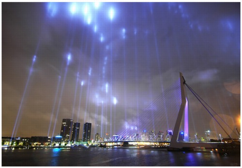
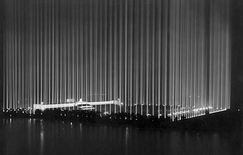
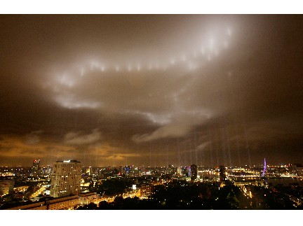
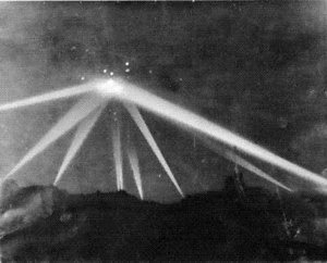
    The bus moves slowly east, away from the galleries, cafés, and shops that have sprung up along the streets of Williamsburg’s north side, now a trendy artist and working-class enclave. Ten minutes into the quiet trip–there is no narration–a symphony of groans, clangs, and syncopated twitters, mixed live by two sound artists, issues from the back of the vehicle. The tour meanders past car-part lots, warehouses, and 24-hour delis to its promised land: blocks and blocks of waste-management treatment facilities serving New York City.
    For four weekends this winter, the Dencity Bus Tour made its pilgrimages through the city’s trash and raw sewage. The ride, says Rene Gabri, one of the three artists who conceived and produced the tour, was meant “to interrogate the format of the tour itself, which relies on verbal information that is often incorrect anyway.” His collaborators, Erin McGonigle and Heimo Lattner, produced the live soundtrack, largely made up of samples taken from the industrial area itself.
    According to Gabri, the tour evokes what wireless gadgetry promises to provide: “Moving through space, yet having a constant stream of information.” But all tours do that, or at least they try. Unique to Dencity is the detachment and illusory sense of privacy encouraged by the atmospheric music and darkness. On the bus that night, one couple made out, another gossiped, while others stared out the windows. Without the unifying element of a tour guide to produce a sense of community, Dencity has hit on, perhaps accidentally, a lonely vision of a supposedly hyperconnected world where each person has electronic access to all varieties of data, anytime, anywhere.
    The Dencity bus tour and several other art expeditions have recently been making the metaphor of mobility material. Mobility as lifestyle has become ever more common in the past half-dozen years as portable electronic inventions allow us to roam further, with greater frequency, for both work and play. At the same time, global tourism has taken hold as a major wage-earning sector for some and a regular pastime for others. Nomad-themed art plays with these two dominants of contemporary life: the international, wireless culture of businesspersons, artists, entrepreneurs, and writers shuttling between Los Angeles, London, and Lagos; and the booming tourist culture that at times seems infected with a case of “scopophilia,” as Gabri puts it‹pleasure in looking, particularly at others.
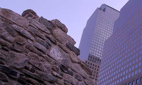
    The Center for Land Use Interpretation (CLUI) in Culver City, CA, has also offered a series of on-the-road looks at waste-related scenery. The combination artists’ collective/rock-collecting club launched a self-guided tour in 1995 with their project “Suggested Photo Spot.” The “picture spot” was invented by Kodak, says CLUI director Matt Coolidge, “in order to put their logo up in national parks.” CLUI’s minimalist signs suggest tourists stop and notice more than the area’s inherent beauty.
    The project planted 50 signs across the country, from the Trojan Recreation Area and Nuclear Power Plant in St. Helens, Oregon, to the Kodak Waste Water Treatment Plant in Rochester, New York, where CLUI’s sign informs visitors that “Kodak’s industrial waste water is treated at this plant in the beautiful Genesee River” and that “local lore has it that film can be developed in this water.” The satire offers pointed instructions to look beyond the “beautiful river” into its history within the landscape, both corporate and natural. Like many of CLUI’s projects, “Suggested Photo Spot” transcends the limits of representational art to bring viewers to the actual site of confrontation, where myths of business and government neutrality, even beneficence, toward the environment are readily exposed.
    Most recently, CLUI contributed to the Museum of Contemporary Art in Los Angeles’ Flight Patterns show, taking museum visitors on a bus two hours inland to their Desert Research Station. The Flight Patterns tours involved an official guide (although visitors could drive to the staffed station on their own), who pointed out land uses of the region, from the freeway to Fontana’s steel industry. “We’re talking about erosion, flood control, industrial development,” says Coolidge. “Heading out into the desert, we try to read the physical vestiges of contemporary history on the landscape.” CLUI’s bus ride was more didactic than Dencity’s, but, says Coolidge, they didn’t “spoon feed” people. “It’s important to initiate an interpretative process,” he says. Additional CLUI tours have been “taken to ridiculous extremes,” says Coolidge. “We’ve taken tours that cover over 500 miles in a day and kind of wear people out. It’s kind of an adventure, an odyssey.”
    The voyeurism of the tourist on these buses, traveling past unglamorous, often desolate areas, can turn self-reflective. As the Dencity bus passes through neighborhoods where nearly as many people live as tons of waste are transferred on a daily basis, “you feel suddenly uninvited,” says Erin McGonigle, the sound artist who recorded most of the samples for the electronic mix. “We were cautious about fetishizing the spaces,” says Gabri. “There’s a lot of power being able to be in this bus. Mobility is a privilege, people pay for it.”
    Of course, the inverse of the empowered, self-propelled tourist is the refugee, the person involuntarily displaced. Gabri himself is originally from Iran; his family fled the country during the 1979 revolution.
    A bus project directly addressing the difference between choosing to move and having to move was proposed by artists Renata Stih and Frieder Schnock in 1995 for Berlin’s Holocaust Memorial Competition. Bus Stop: The Non-Monument engendered controversy even though it was never produced. In the proposal, buses would pull up to the vast, empty space under the Brandenburg Gate in the center of Berlin. There, a waiting hall would offer digitally displayed histories of the destinations, the names of which would also flicker across the buses: Auschwitz, Buchenwald, Bergen-Belsen, the death camps of Nazi Germany. A requirement for the competition was the inclusion of the official project name, which was “The Memorial to the Murdered Jews of Europe.” As Schnock has pointed out, placing this phrase on the buses would make it a memorial in perpetual motion. In effect, tourists would replicate the constant state of transit that the Jews endured during the Holocaust, as they either fled the Nazis or were shipped to camps. Although their proposal placed 11th out of 528 in the memorial competition (with Peter Eisenman’s “real” monument chosen for construction), it was a public favorite. In 1996, the artists published a 128-page bus timetable that listed the sites that could be reached on current public transportation.
    Stih and Schnock are known for antimemorials, or nonmonuments, an idea which latches on to the inevitable change of time and context as our most fundamental reality. Many have argued these structures don’t remember events but bury them in myth. Writers and artists in Germany, still sensitive to the memory of Albert Speer and the Nazi fixation with grand gestures, are particularly aware of the loaded meaning colossal monuments can contain. The traditional concept of a monument only encourages people to contemplate a hulking stone building and an abstracted past; nonmonuments instead create the memorial as process. Rather than distance the viewer, Bus Stop invites participation in that process which, like the Dencity bus tour or CLUI’s ride to the desert, makes travel and the passage of time essential to the art. Tracking the hours, minutes, and seconds in a world where the pace of change seems to compress time itself is the theme of Darren Almond’s Mean Time (2000), a shipping container with a digital display continually ticking off Greenwich Mean Time. The artist rode with the container, linked to a Global Tracking Satellite, from London to New York for his show at Matthew Marks Gallery last fall, documenting the journey with photographs, as well as drawings of the night sky. Almond’s drawings allude to an older tradition of triangulating distance at sea by observing the sun and stars; after the 18th century, longitude was determined by calculating the time difference relative to Greenwich. Only in the past few years have mariners been able to rely on GPS. While Almond’s outsized clock mechanically ticked off the time in England, he was honoring an ancient system of navigation, by taking notations on the sky.
    Also journeying to New York City in a freight container was the art collective etoy, best known for the “Toy War” waged when an American online toy store tried to take the European art group’s domain name. The etoy.TANK, one of four bright orange containers sent for a spring show at Postmasters Gallery, is “the office, studio, hotel, storage, and webserver at the same time,” according to the group’s Agent Zai. Members of the group, spread across Switzerland, Germany, and California, reside in these “walk-in webservers” when participating in exhibitions. While the tank provides a physical manifestation of the group’s nomadic nature, the website hosts etoy. TIMEZONE, an online Twilight Zone where minutes count 100 UNIX seconds and a midday time embargo halts the clock for an etoy hour. “TIMEZONE,” writes the group, “is the solution to the insanity of the continuous physical travelling through international time zones, for time shifts in international markets and to the problem of getting older.” Through the eyes of artists like etoy, Dencity, CLUI, and Almond, nomadism today is as much about keeping up with a vision of ourselves and the time we’re constantly losing as it once was about tracking basic things‹food, weather, water‹across the land.
    One need not be a member of etoy, however, to travel with attention to one’s creature comforts. With the global traveler in mind, New York’s OPENOFFICE and Denmark’s cOPENhagenOFFICE / Tanja Jordan created the NorthousEastWest (NhEW). The NhEW is a portable dwelling unit, custom-designed for around $7,000, that makes almost as much sense in crowded Manhattan as on the cold expanses of Greenland, where it got its inspiration from Inuit dwellings. Made of an aluminum frame, wood base, aluminum and plastic paneling, with a sealskin rug optional, the entire house can be packed up quickly into a crate. Inside her NhEW, the mobile citizen is at home in the world, no longer a tourist moving through someone else’s garbage-strewn, contaminated community.

    On Maya Lin’s ninja-like approach to the WTC Memorial

    There’s an interesting article by Louis Menand in this week’s New Yorker about Maya Lin called “The Reluctant Memorialist.” He talks about her early rejection of any WTC Memorial-related requests and about her recent informal advisory work for the decisionmakers (as someone who’s “been through the process.”) In talking about Lin’s reticence and justifiable anger at the Viet Nam memorial process (which sounds horrific, frankly, and doesn’t give me too much hope for New York City’s efforts), it’s strange that Menand doesn’t quote from or even mention Lin’s own essay, written in 1982 but only published in 2000. [It was in the NY Review of Books and in Boundaries, a book published by Lin about her work.]
    As you may know (if you’ve seen Souvenir or read the script), Lin figures into the story as an plot point and motivation; also, the Sir Edwin Lutyens memorial in the movie was cited by Lin and her teachers at Yale as a source for her VN design. That connection is also oddly absent from Menand’s article, whereas Richard Serra does get a mention, even though Lin professed to having never seen Serra’s work before designing the memorial.