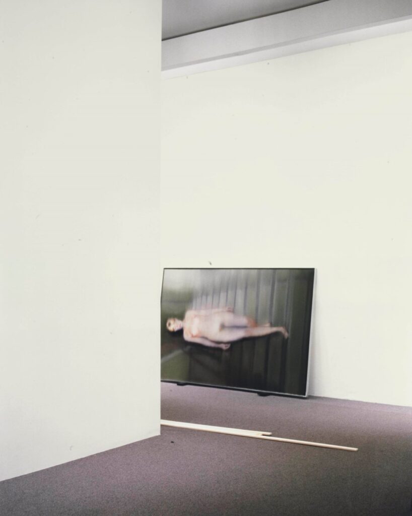
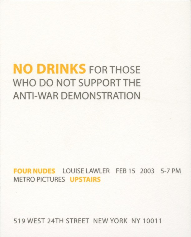
This is one of the Four Nudes Louise Lawler showed at Metro Pictures, beginning on 15 Febrary 2003, the date of a worldwide protest march in which millions and millions of people protested the fraudulent escalation toward the US-led war in Iraq.
the making of, by greg allen

This is one of the Four Nudes Louise Lawler showed at Metro Pictures, beginning on 15 Febrary 2003, the date of a worldwide protest march in which millions and millions of people protested the fraudulent escalation toward the US-led war in Iraq.
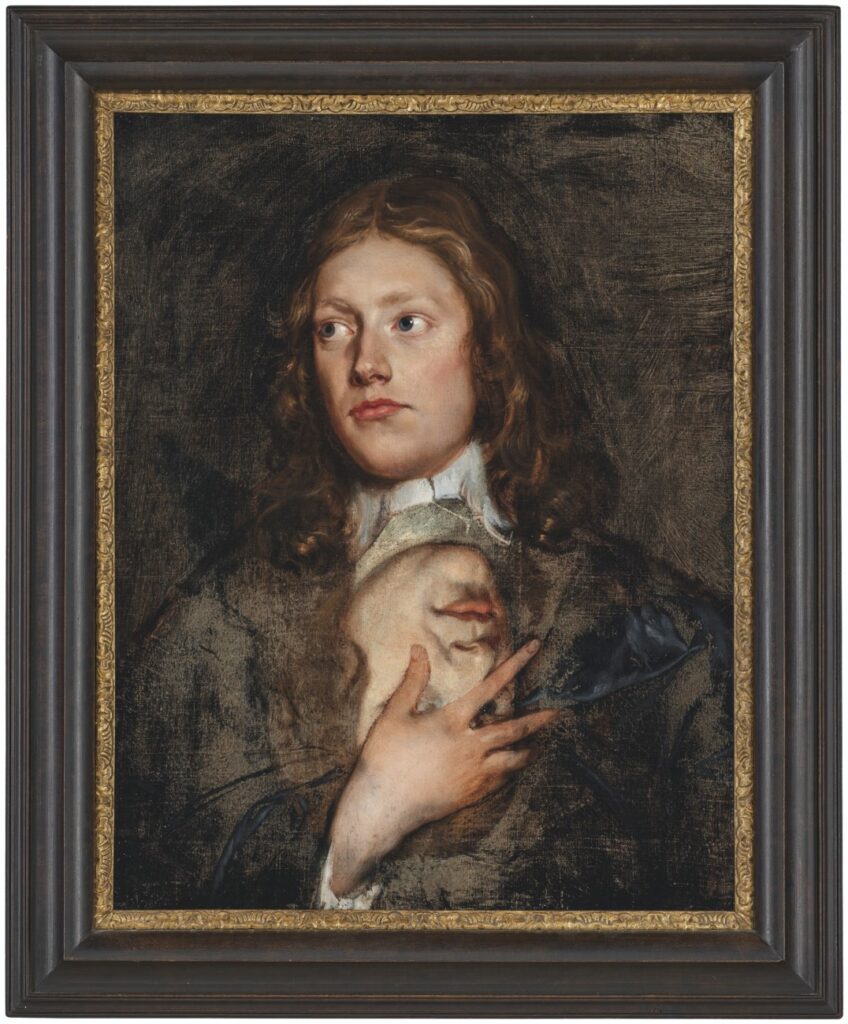
I don’t know anything about 17th century English painter Isaac Fuller, except that he has a dozen paintings attributed to him at the National Portrait Gallery. And, according to the brief text accompanying this painting at Christie’s in 2021, he was a “flamboyant painter,” and a “notorious drunkard” with a “bohemian lifestyle” whose fresco in All Souls at Oxford was “too full of nakeds” to last, and whose last series of works consisted of “decorative schemes” for a string of taverns he frequented.
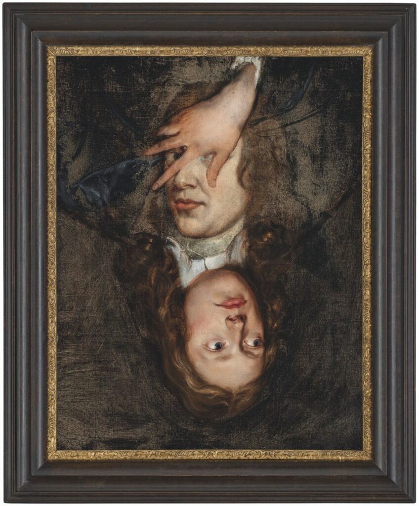
None of that is quite as interesting as this picture, two pictures, really, one on top of and around the other. The portrait underneath, which is now upside down, was uncovered in a recent restoration, says Christie’s. The way it’s been uncovered to keep as much of each portrait intact does make it feel like a deliberate composition, not just an overpainting. Like that extraordinary Ludolf Backhuysen seascape painted around that Isaack Luttichuys portrait that Simon Dickinson brought to TEFAF this year.
What was up in the late 17th century that painters were piling paintings on top of each other, though?

Unless you pay this man $399 so he can surveil you and everything and everyone you see, he’ll never be able to afford Jonas Wood paintings, and will have to keep buying large edition benefit prints.
Speaking of go-go dancing platforms and light strings, I cannot get out of my head the confluence of Jack Pierson showing Silver Jackie at Pat Hearn less than a month after Felix Gonzalez-Torres showed “Untitled” (Go-Go Dancing Platform) at Andrea Rosen.
Pierson’s show was called Diamond Life, and it was the 30-yo artist’s nostalgic lament for the squalid glory of his lost youth. In the main gallery of Hearn’s third-floor Wooster St walkup, Pierson staged a recreation of his apartment from his early 20s Miami beach bum era. And in the back was this tiny, abject, artificially aged stage—Pierson’s always called it a stage, I think—which called out his punk and performance art days in Boston.
The Aspen Art Museum re-staged Pierson’s first five shows in 2016. David Rimanelli wrote most generously about Silver Jackie in 2021, when it was on the cover of Artforum. Rather than influence or interaction, or two nearly simultaneous critiques of Michael Fried’s Minimalist theatricality (derogatory), the more I look at these two ostensibly similar works, the more I think they were two artists who happened to be dancing at the same time, but to their own tunes.

In our timeline, in October 1949, Ellsworth Kelly, a young former soldier studying painting on the GI Bill, saw the windows of the Museum of Modern Art in Paris in a new way, as a composition, one that could become a painting/object just as it was, and in fact, the whole world was like that, full of subjects he could spend his whole life discovering and transforming into paintings.

In another timeline, a young Ellsworth Kelly saw these two off-the-shelf prairie mullion windows kludged together to look like one tall, misaligned, window on a house in the middle of a gravel field in North Carolina that was just posted on McMansion Hell, and drove straight to the army to re-enlist as a requisitions compliance auditor, eventually retiring from a job at a cubicle in Ring C of the Pentagon. His little yard is full of old stoves, which he salvages from apartment turnovers, repairs, and sells on Facebook.
Window, Museum of Modern Art, Paris, 1949 [ellsworthkelly.org]
glam metal modern but also your contractor is going to jail dawg [mcmansionhell]
So “Untitled” (Go-Go Dancing Platform), 1991, is unique, but it is not the only one. Now that it has sold “a serious hold” and a $US16m asking price, let’s take a look at the six [!] related works Felix Gonzalez-Torres made. And then decided were not works after all. What are they, where are they, and what is to be done with them?
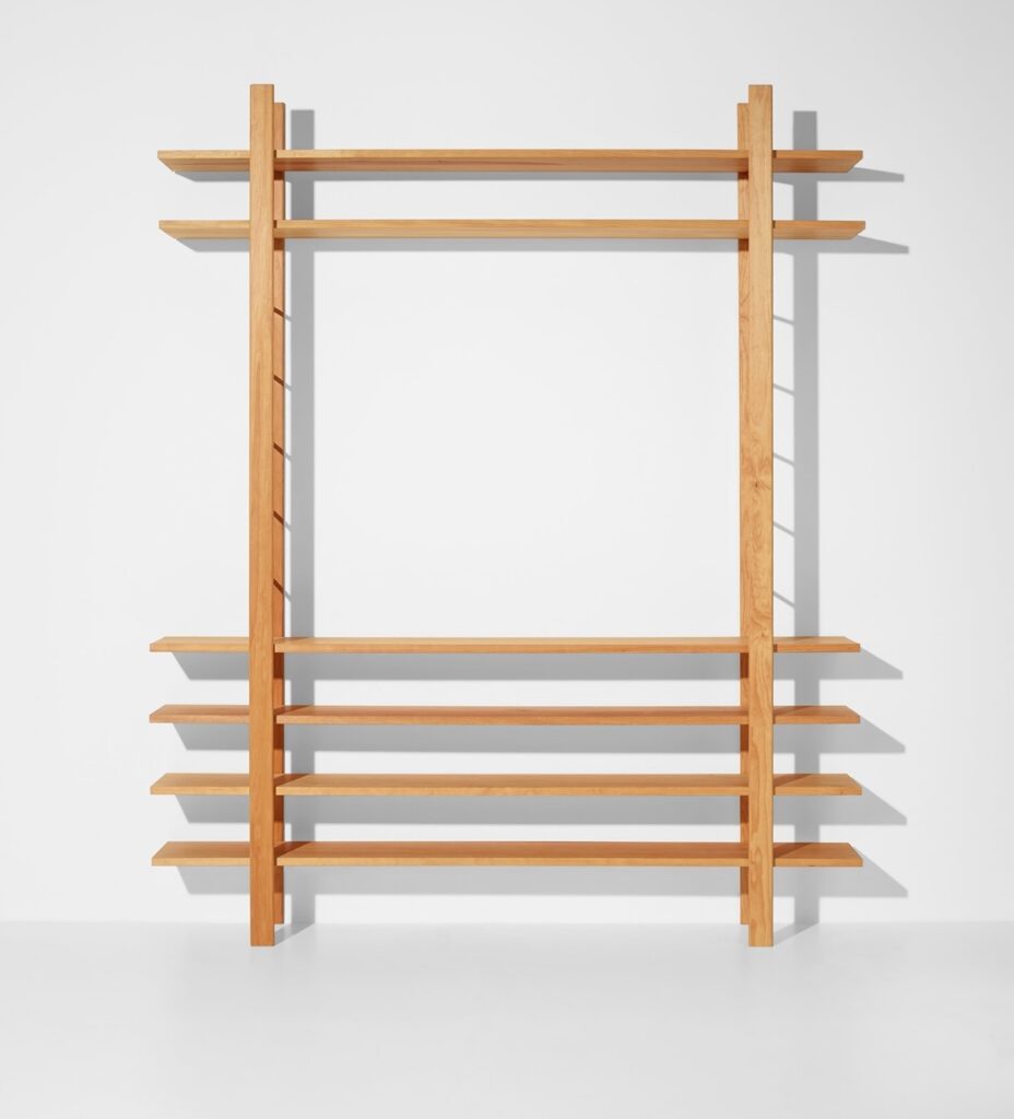
After working with Joseph Beuys on his multiples for many years, Jörg Schellmann made small editions of four pieces of Beuys-designed furniture in 2008, 22 years after the artist’s death.
Schellmann Art’s description says all these pieces—three tables and a bookshelf, no vitrines, no felt—were originally made in 1953 for an unidentified collector in Dusseldorf. I’m not sure why they’re being so cagey. In 1953 Beuys’s two major collectors were brothers: Hans and Franz Josef van der Grinten. Besides collecting his work, the van der Grintens gave Beuys his first show, in their house, let him move in with them, and represented him in their gallery. Was it somehow not them?
The original table Beuys made was later incorporated into an artwork, and then into Block Beuys, the seven-room gesamtkunstinstallationwerk at the Hessisches Landesmuseum in Darmstadt. A controversial renovation and conservation project, including a March 2008 symposium on what to do with the original jute wallcoverings and carpets, was the immediate context, if not the specific impetus, for the collection. [spoiler alert: they’re still gone.]
Anyhow, I like this shelf more than I expected. And I like how the lighting in this example, which sold for much less than retail at Phillips in April 2020, right in the mouth of the pandemic, shows the ladder-like structure.

If you can’t wait for another to turn up, the form could be replicated in Ikea IVAR components, but not its details. Though the shelves look to be straight up lumber. And built up? The verticals are pinned to the wall, and are rounded, but and the shelves are neither. The desks all have extensive joinery, so though the carpentry details that will keep the whole thing from wobbling itself to death in actual use are not apparent, there must be something. Right?
Joseph Beuys, Royal Pitch Pine, 1953/2008 [schellmannart]
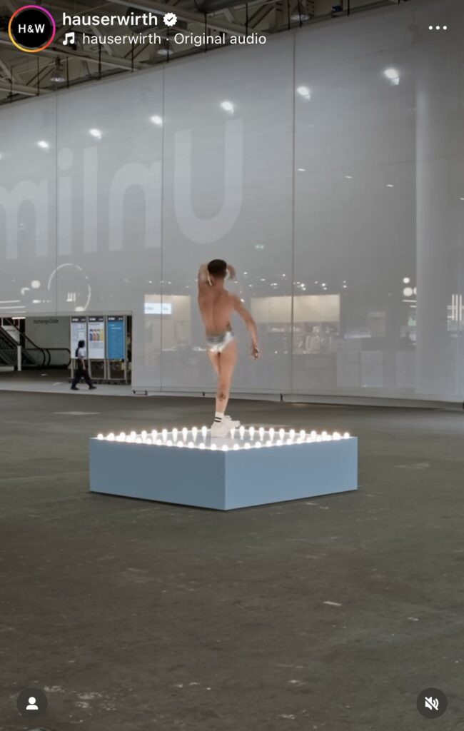
Hauser & Wirth showing Felix Gonzalez-Torres’ “Untitled” (Go-Go Dancing Platform) at Art Basel Unlimited this week. Seeing a video on H&W’s insta of the dancer hopping off the platform and heading out of the halle, accompanied, like a Disneyland character, by a handler, reminds me of artist Pierre Bal-Blanc’s 1992 video work, Employment Contract.
Bal-Blanc was a go-go dancer for the 1992 installation of Felix’s work at the Kunstverein Hamburg, for a show called “Ethics and Aesthetics in times of AIDS.” Employment Contract is a wordless slice of Bal-Blanc’s life that happens to have a brief go-go dancing stint in the middle of it.
One of the tenets of “Untitled” (Go-Go Dancing Platform), reaffirmed just a couple of weeks ago when the Felix Gonzalez-Torres Foundation published an in-process version of core tenets for the work, is that the dancer’s schedule is their own, and it is undisclosed. The dancer chooses whether to share their schedule with the exhibitor, and the exhibitor is to take care not to disclose it, and to provide adequate accomodations for the dancer to go about their business. From the viewing, and even the exhibiting standpoint, this work of Felix’s entails a high degree of uncertainty, and a very low probability at any one moment of there being a dancer dancing.
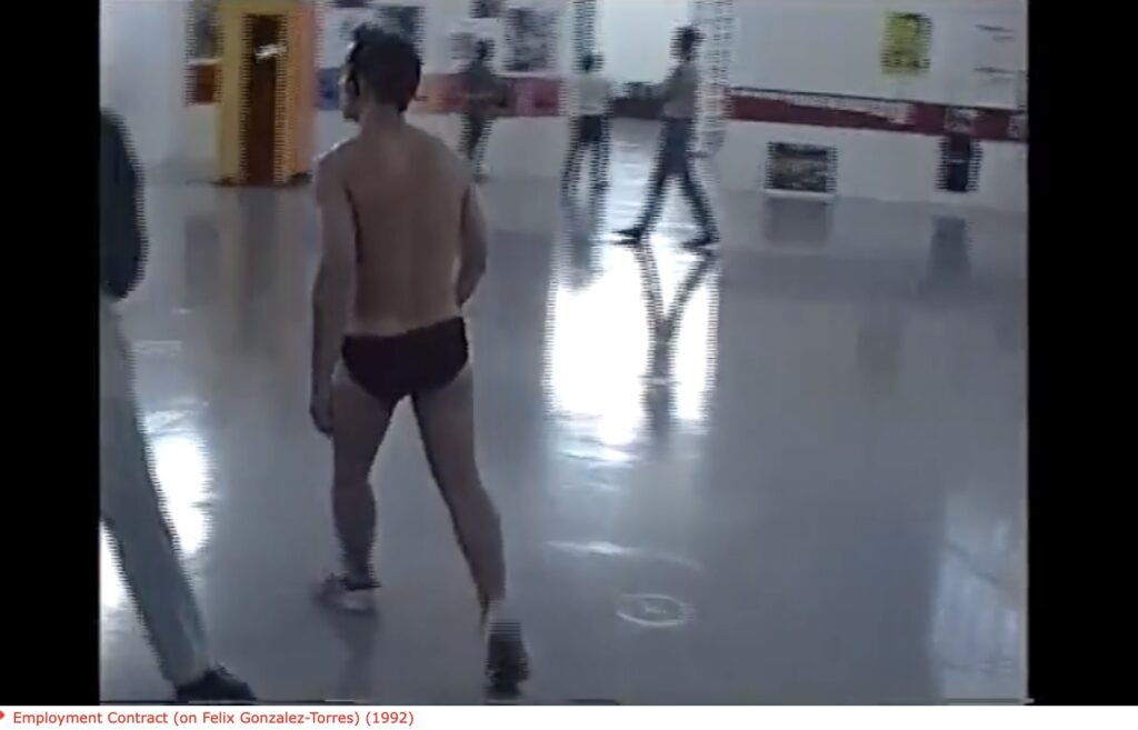
Bal-Blanc turns this sense of expectation entirely inside out. The video camera tracking him as he jogs through the streets of Hamburg gives no hint at all of what is to come; he’s just a guy, jogging, in jorts. The surreal absurdity of him walking into a museum, unlocking a supply closet, stripping down [to silver and black briefs, a kludgey two-tone outfit that would not pass muster with the Core Tenets crowd], and grooving in an empty gallery for several minutes, defies narrative logic. And yet he goes right on with it, and back out of the museum. All in a day’s work.
This question of context and expectation is one of the perennial sources of power for Felix’s work, especially this one. Encountering a go-go dancer in a museum might feel as disorienting as a pile of candy you can eat from. More than 30 years on, Hauser & Wirth’s instagram comments are somehow still full of people still confused or contemptuous of this work as art. And while art world folks have certainly consumed and processed Felix’s work fully, seeing this piece, from this gallery, at an art fair, the least wild thing about it is the dancer.
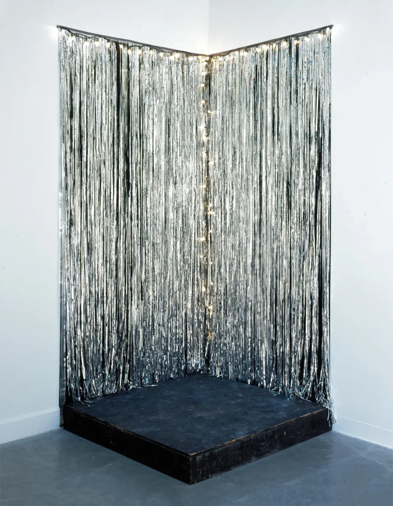
[next day update]: indeed, it looks like the Core Tenets got updated just in time, because the work that had been on “permanent loan” to the Museum St. Gallen is for sale by the Swiss collectors who’ve owned it all along. Donald Judd would not be surprised. It does make me want to take a new look at the five go-dancing platforms and lighted pedestals listed in the “non-works” section of the CR.
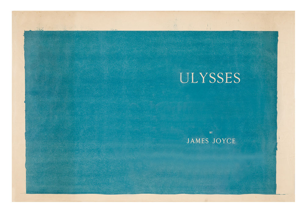
I knew the story about Joyce wanting the cover for Ulysses to be the blue of the Greek flag. But I did not know that he ended up giving the little Greek flag hanging in Shakespeare & Co. to his artist friend, Myron Chester Nutting, to match the color.
I learned this from The Morgan Library’s online exhibition celebrating Ulysses‘ centenary, which includes the extraordinary lithograph above, the final proof for Joyce’s Ulysses cover, prepared by the Dijon printer Maurice Darantiere.
At first the bleed around the edge and the brushmarks made me wonder if there was an ur-monochrome painting, a Nutting original, but I think not. The stone or the plate was painted with a solid field, which Darantiere printed using ink prepared to Nutting’s specification. The title seems to be set in negative, masked so the unprinted paper shows through.
Maybe I must now make the entire cover, as printed, not just the front. I feel like it should match the dimensions of the book, and the page inside, but those bleeding edges do call to me. Either way, I obviously must make it like this now.
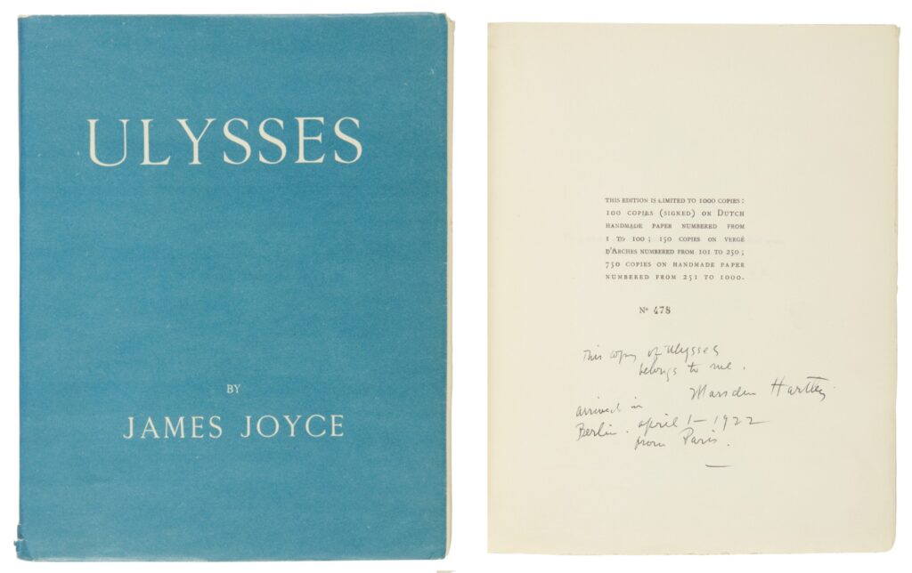
And I have to get the color right. Is it best to match the modern color of Marsden Hartley’s copy? Is it even possible to match the original, given that they’re all 100 years old, too? Do I try to match the proof? Is it a Ulysses conservation standardbearer? Nutting apparently warned Joyce that the blue would fade, and it did?
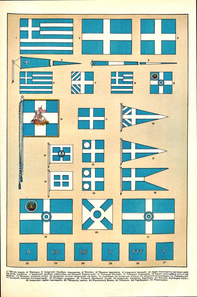
I’ve seen discussion of Joyce’s Greek flag blue not actually matching the Greek flag’s blue, that perhaps the Shakespeare & Co. flag had faded, as well as the books. But Ulysses matches the color of the Greek flags reproduced in this 1934 encyclopedia plate. Honestly, I can see the appeal.
Getting the Right Blue on the Cover [themorgan.org via @mclees-fiona via @joshuajfriedman]
Previously, related: Untitled (Joyce Hartley), 2025
At least Luigi Lucioni got his copy of Ulysses back
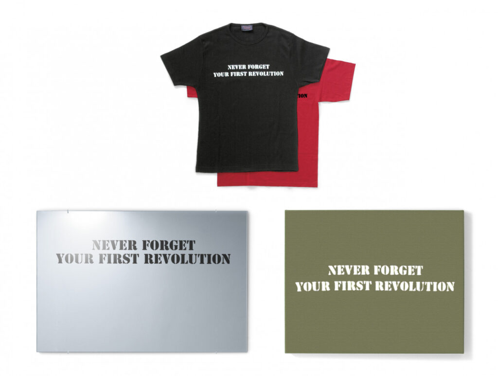
Coming in 2005, smack in the middle of the Global War On Terror™, the 51st Venice Biennale may have been #toosoon for Tania Bruguera to drop two editions named Terror Chic. Twenty years and a few revolutions in, let’s see how it’s going.
One edition is what we might now call the Terror Chic Capsule Collection: a group of fifty objects—mirrors, messenger bags, t-shirts, stretched canvases—each printed with what Edition Schellmann calls Bruguera’s “thought-provoking slogan, ‘NEVER FORGET YOUR FIRST REVOLUTION.'”
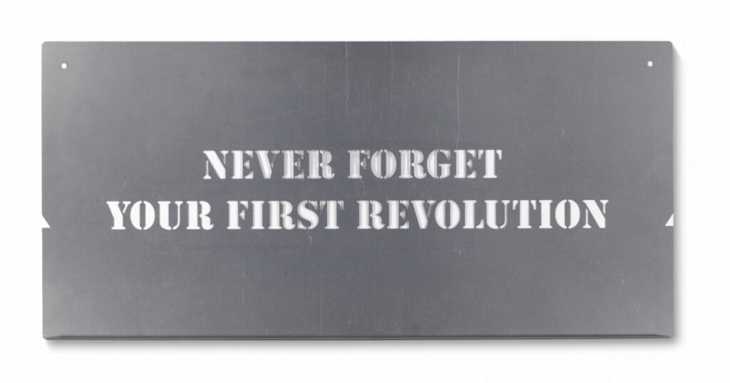
The other is more interesting: a Terror Chic metal stencil in an edition of 200, “to be used to print slogan on T-shirt, bag, wall, car, or any other object.” Now we’re talking. Bruguera’s stencil hasn’t even sold out yet, but it’s efficiency and durability have surely already spawned several revolutions, as well as a whole trend of fundraising edition stencils.
Meanwhile, if you’re in the market, never forget to shop around. The revolution can be had with a vip discount.
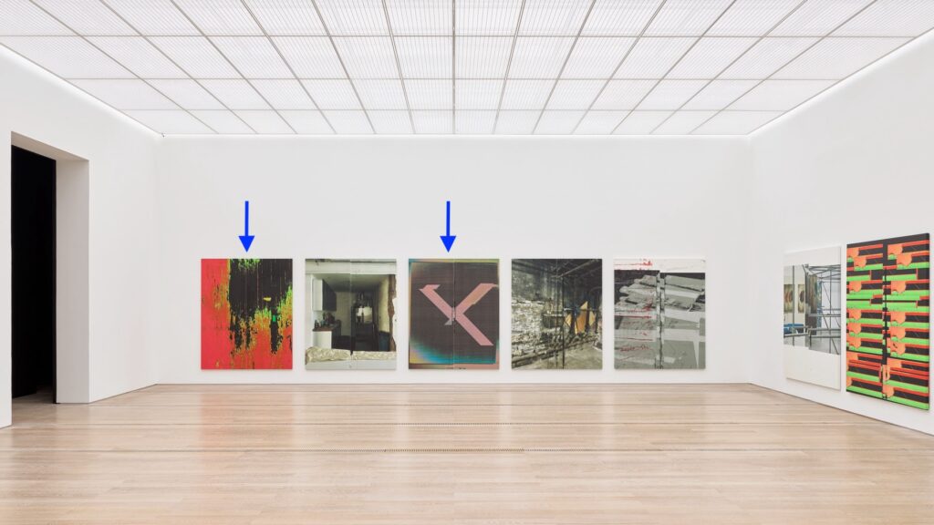
The Fondation Beyeler has just come out with your first Art Basel impulse purchase: two full-scale Wade Guyton prints of paintings showing at the Beyeler right now. Around here we’d call them facsimile objects, but they are very much what Wade does and how he does it.
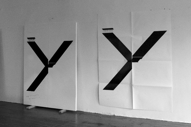
For six years, from 2014-19, Guyton made full-scale print facsimiles of his paintings as fundraising editions for Printed Matter. They were all posters of earlier black X-on-white paintings, and folding them by hand felt like part of the concept. From the proofs installed at the Beyeler, that does not seem to be the case anymore. These look as flat as the day they rolled off the Epson.
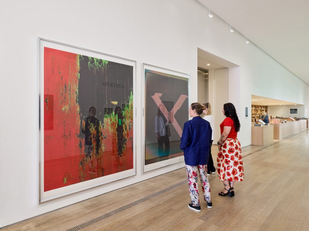
TFW I thought I’d seen these before, not just at the Beyeler, and I was like, “Duh, that’s his MO.” But no, I don’t mean in the “all Guytons look alike” mode. I mean in the sense that I felt like I’d seen these paintings before, at Guyton’s 2023 show at Matthew Marks. The X painting, WG5707, depicts a different scan of a different, earlier X painting than the one at Marks. And in fact, the 2024 Beyeler painting in the 2025 Beyeler print has striations that look like a photo of a monitor of a scan of a transparency of a painting, rather than just a scan of a transparency of a painting.
But the other one, WG5703, the photo of Guyton’s studio floor, is, in fact, the same photo, though not the same painting.
Guyton likes to paint, photograph, and repaint the floor of his studio, and these Clyfford Still-like layered abstractions are the glorious result. But what these two paintings show is not found wear & tear. The tape, the shoe[?] in the lower left corner, the separations [not just layering, it turns out] of color. This is the same photo, in different states, printed on canvas, twice. Three times, actually; the Beyeler already has another variation from 2021.
For a long time, Guyton was known to use the same files [.doc, .tiff], and give attention to the accidents and variations of the printing process. He staged multiple shows with identical layouts of images made from the same monochrome image, bigblack.tiff, and even sent five nearly identical paintings to his five dealers spread out around the Messe at Basel.
But from observing these little differences in the same content, Guyton has expanded his source image folder to include screenshots of the Times, and photos of his studio, his work, and his life. His 2021 show at Marks in LA included images of Guyton recording his temperature. In 2023 there were paintings made of photos of protests, and a Manet ham.
As the vagaries of printing become absorbed into the language of his work, Guyton has expanded what he says by making work of what he sees. His work, his shows, images, and the world around him, have all become animating subjects of his mature process. Mature, but not static; processes are revealed in between the finding and the printing. As these two floor paintings show, the images flowing around him may also be manipulated, altered, and created.
At first I thought the recursiveness was new, too, but I think it was always there; the works, their shifting formats, their nested titles, their numbering system, all make us aware of the artist’s awareness. The beauty of that churn, that cycle, of making and showing and remaking, is a compelling subject for at least a hundred people going to Basel for the 20th or 30th time for buying and selling. One hundred plus ten artist proofs.
Previously, related:
Waderunner
Wade Guyton [Manet] Simulacrum Facsimile Object
It’s the little differences
What’s that, you say?
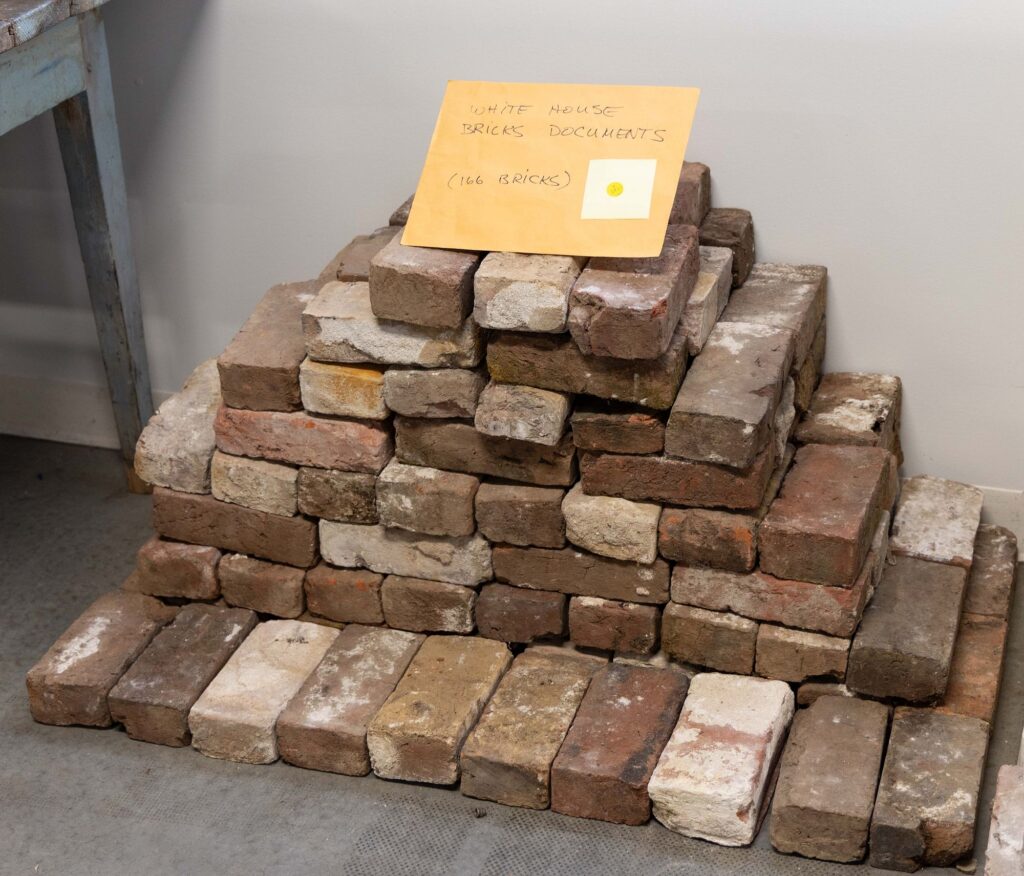
VERY RARE HISTORICALLY IMPORTANT COLLECTION OF WHITE HOUSE BRICKS?
I AM LISTENING.
Enslaved people made the bricks for the White House from clay on or near the White House grounds at least twice. After the White House was burned in 1812, most of the original 1792 bricks were too damaged to use in the 1814-17 reconstruction. The 1817 bricks were removed during the 1948-52 gut reconstruction of the White House by President Harry s. Truman. 95,000 went for projects at Mount Vernon. 10,000 went to a project at Fort Myer. A New York congressman bought White House bricks left over from the Fort Myer pile, along with 1600 lbs of White House stone, and stored it at some guy’s farm for a while. When came to pick up most of it, he left this lot of 166 bricks. “This may very well be one of the last large groups of White House bricks in public hands,” says the Shenandoah Valley auctioneer Jeffrey S. Evans.
I’m trying to imagine the excitement if these original White House bricks were returned to the White House, or if they were exhibited publicly near the White House today. Or tomorrow.
The bricks will be auctioned June 28, 2025.
Lot 2124 | VERY RARE HISTORICALLY IMPORTANT COLLECTION OF WHITE HOUSE BRICKS, est $10-20,000 [jeffreysevans]
Previously, related: Untitled (George Washington’s Coffin), 2016
[few minutes later update: It’s my brick in a box]

According to the Alexander Calder Foundation, there were 61 pieces of jewelry included in the artist’s first retrospective, Calder Mobiles, at the George Walter Vincent Smith Gallery in Springfield, Massachusetts, in November 1938. Was Encircled Star, 1938, among them? Christie’s doesn’t say. All they know is that Anne Bass bought it in 1972, when she was 31.
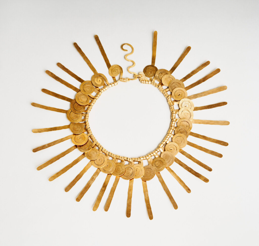
It is also not clear whether the similar necklace from 1937, in gold wire instead of steel, was not available, or if Bass figured steel was safer for wearing on the subway in the 70s.
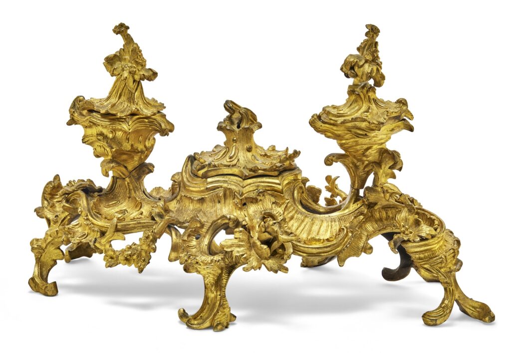
And speaking of celebrated metalwork of the ruling class, this rocaille inkwell. Holy moley, how is this real? It has resulted in the following words, a kind of poetry, at once luxurious and terrible, which I reproduce here in French and translation:
Continue reading “Two Metal Things At Christie’s”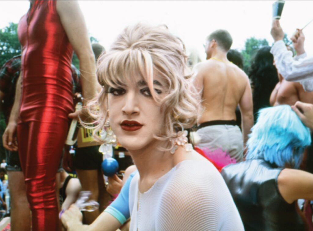
Nan Goldin has published two prints to raise money for trans justice-related organizations: the Leslie Lohman Museum, the Sylvia Rivera Law Project, and the Trans Income Project.
One’s Wigstock era iconic, the other pandemic freshness. They’re available through June 26, 2025. [leslielohman via hyperallergic]
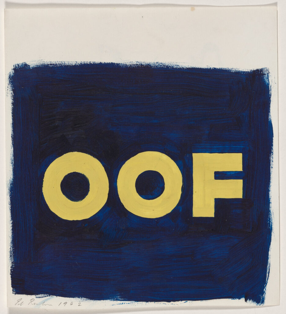
The National Gallery has acquired an incredible study for Ed Ruscha’s OOF, but, amazingly, that is not important now. Because on the back is this:
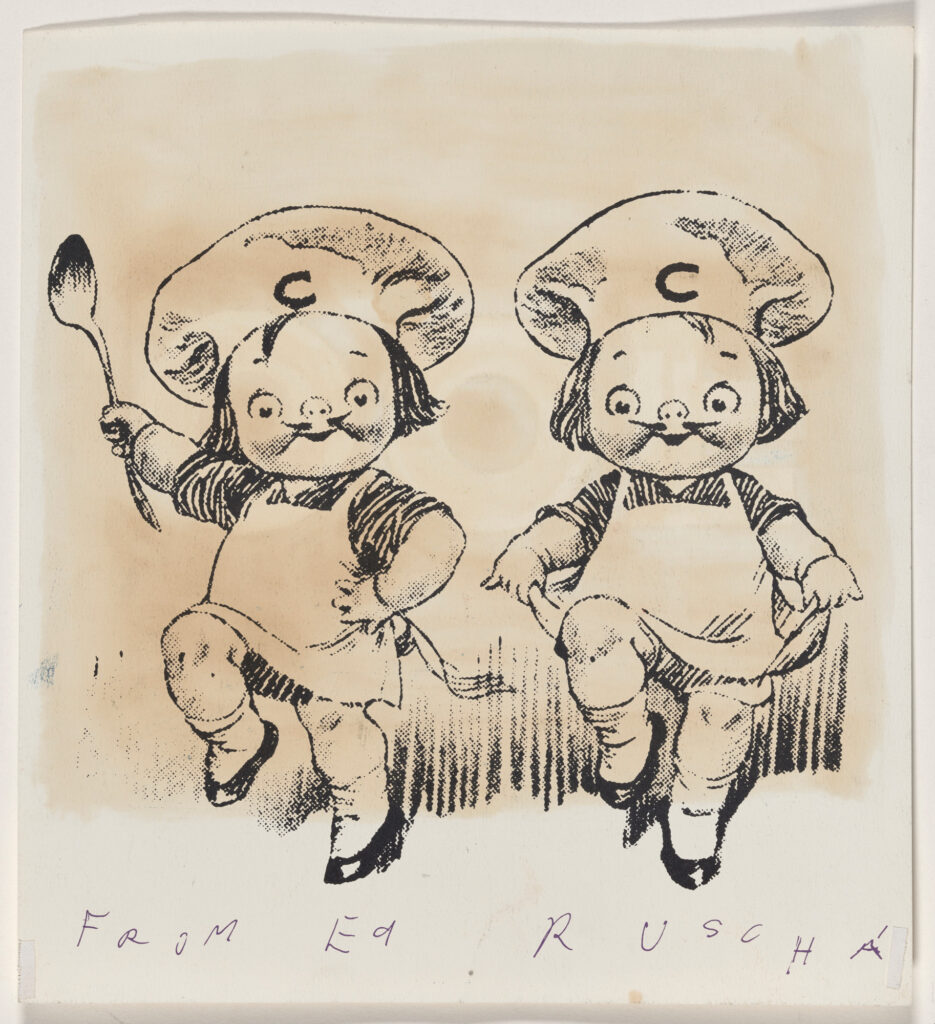
These are the Campbell Kids, used to sell soup. What are they doing on the back of Ed Ruscha’s study? I think they were left over from his 1960 Christmas card.
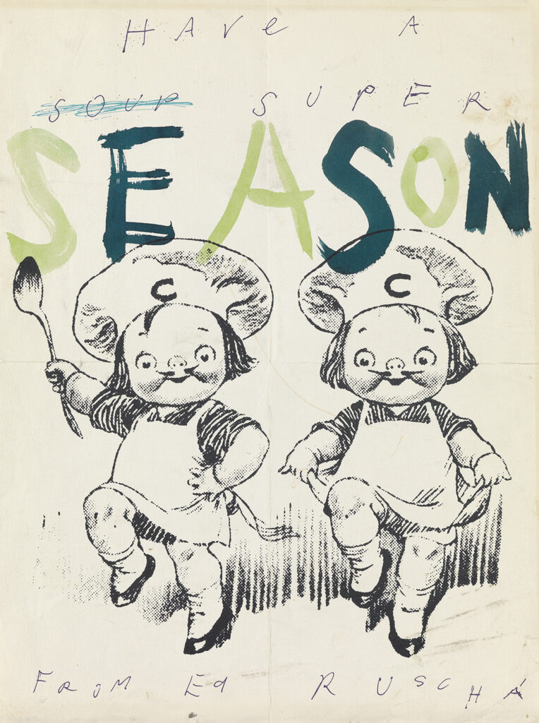
This one sold at Swann along with a whole stack of Ruscha deepcuts. The Campbell Kids have been lifted from a print illustration, obviously, but seeing them both, it turns out the “From Ed Ruscha” handwriting is printed, too.
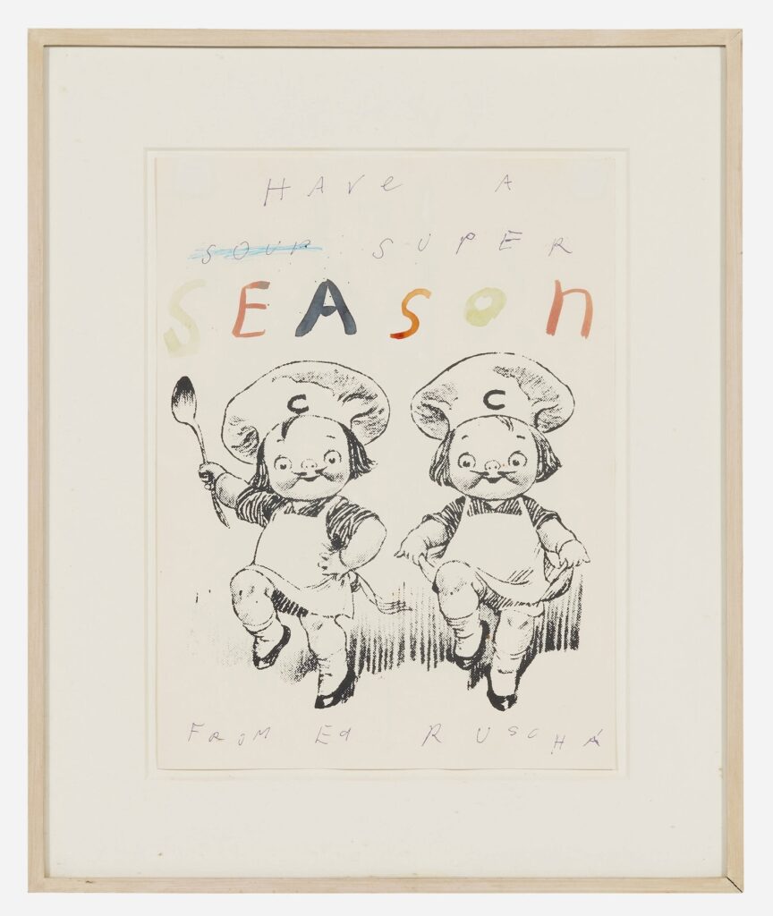
Amazingly, there is another one coming up for sale, if the emperor allows it, in Los Angeles in two weeks. So the OOF sheet had the “Have a soup super” trimmed off. How long did Ruscha use his leftovers as scratch paper? Are there Campbell Kids on the verso of any other drawings? So many questions!
What I do know is that this LA Modern image, without the OOF oil soaking through, will be easier to make a t-shirt from. Stay tuned.