November 2009 Archives

November 30, 2009

On Remembering Ross Laycock

ross_laycock_wovenland.jpg

I've thought about similar situations before, so when I saw the mention in the NY Times article about all the dela Cruz's Felix Gonzalez-Torreses I realized I was surprised at how infrequently I hear or see Felix's partner mentioned by his full name. Turns out yesterday was the first time the Times has called him Ross Laycock, not just Ross, in the nearly twenty years since he died of AIDS-related illness.

This, despite Ross's integral, intimate role in so much of Gonzalez-Torres's work. Despite? Or because of? It's partly the nature of Felix's work, but Ross is most widely encountered [by people who didn't meet him during his life, obviously] as an abstraction, a figure, a reflection, an absence, even, in the art work itself.

Remembering that there was far more to Ross than Felix's artistic gestures, no matter how poignant, could convey, I Googled around a bit, and found my way to Nick Dobbing, who had been thinking very similar things for far more personal reasons.

Dobbing knew Laycock before Ross was famous, and posted a Christmas snapshot of him:

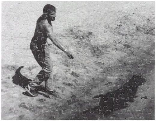
One can find pictures of Felix online easily enough, but (to my knowledge) none of Ross. I have often wondered, when people read about Ross, who is remembered mainly for being Felix's lover, who do they think he was?

So I scanned this from an old snapshot and put it up, as a memorial.

It's one of my most popular photographs, often revealed to others through Google searches, so I wonder if others are looking for a photograph of Ross.

Felix used several photos of Laycock in his works. Untitled (Ross and Harry) is a 1991 puzzle edition with the same dog:

felix_untitled_ross_harry.jpg

Recent Photos | Ross Laycock [wovenland.ca via flickr]

richter_4900_serpentine.jpg

Gerhard Richter used a randomizing computer program to place the 11,500 hand-blown squares of glass in 72 different colors in his 2007 stained glass window for the Cologne Cathedral.

He used the same program at the same time to create 4900 Colours, a work which revisits the color chart and color chip paintings he made in the 1970s. For 4900 Colours, square acrylic paint chips were glued to Aludibond, a European brand of aluminum composite panel.

4900 Colours, Version II, shown at the Serpentine Gallery last fall, consists of 196 panels, each nearly 1m square and containing 25 computer-placed chips. The panels were hung in randomly selected groups of four to make one work comprised of 49 panels. Hans Ulrich Obrist talks about the work and its various versions in this video.

I can't get over how gorgeous they look, even in the crates. Watching the installation and listening to the several random elements Richter deployed reminds me of John Cage's rolywholyover exhibit from 1993-4. Using a a list and map created each day by an I Ching-based program, the museum's art handlers would essentially perform by installing, moving, and removing artworks selected for the show. When not on the walls, paintings and such were stored on rolling walls, still visible, in a roped off section of the gallery. One of my absolute favorite art experiences ever.

Been trying to think about where the idea of painting an intentionally obscuring, computer-generated, institutionally applied abstract pattern onto a systematically produced aerial photographic map of the entire world fits into the historical painting/photography, abstract/representational context.

From Andre Bazin's 1945 essay, "The Ontology of the Photographic Image" [pdf]

...[P]hotography ranks high in the order of surrealist creativity because it produces an image that is a reality of nature, namely, an hallucination that is also a fact. The fact that surrealist painting combnes tricks of visual deception with meticulous attention to detail substantiates this.

In 1969, Allen Ruppersberg created Al's Cafe, a detailed, functioning facsimile of an archetypal diner, which was to operate/perform one night a week. Allan McCollum, who was making work in Los Angeles at the time, wrote about Ruppersberg and Al's Cafe in a 2001 catalogue essay:

I would like to explain a little of why this piece was so significant in L.A. in 1969. "Site" works and "performance" pieces were proliferating at the time; in 1970, for instance, Richard Serra would create an outdoors-brought-indoors installation at the Pasadena Art Museum, in which three immense California redwood logs were leant upon a fourth, and their cantilevered ends were sawn off and allowed to crash to the floor. The aftermath of this action created an enormously dramatic display, and the project was much talked about. Elsewhere, a number of artists of these years were crowding into their cars and heading out to the deserts to work with natural processes, the results of which were often brought back from such alternative, poststudio locales to wind up in the same clean white gallery spaces that the artists seemed to have abandoned so pointedly. Robert Smithson had worked to point out the dialectical relations between the "nonsites" of the urban galleries and the peripheral "sites" of marginalized geographic territories: slag heaps, rock piles, dry lakes, landfills. He and others who followed took to the Midwestern plains and the Western deserts, executing projects in the middle of nowhere, and bringing back aerial photographs, sketches, documentation, and truckloads of residues and samples from these relatively exotic, empty regions of the American map to display in the populated cities. A new vocabulary was building, and an exploration of how our culture's richness and complexity have always been framed and defined by our fantasies of the sophistication of our urban centers, and the purity of their showplaces and shrines, in relation to nature's marginalized and boundless emptiness.

A dilemma was beautifully revealed by these pioneering artists--and clearly spelled out for the younger artists--and the question ("naturally") arose: isn't our idea of nature just another idea? Another concept? Another cultural artifact? Does moving out of our urban habitats to make art really accomplish anything beyond promoting a further alienation, a further fiction, another kind of imperialism, a new imaginary idea of purity? It was within this growing discourse that Al's Cafe offered to sell a "JOHN MUIR SALAD (BOTANY SPECIAL)," or "GRASS PATCH WITH FIVE ROCK VARIETIES SERVED WITH SEED PACKETS ON THE SIDE." In Al's Cafe, Ruppersberg answered the growing mannerisms of Earth art with a slyly symbolic display of nature as always mediated, always already determined by the culture that processes it--both literally and figuratively--for its own use. He presented nature as a commodity for consumption, without the pretense of any pure "natural" vision.

I really planned to just quote the Serra description [emphasis added]. I'd heard references to the work before, but never to the process and content of the piece. Which means, I guess, I've never seen the catalogue for Serra's one-man Pasadena show, which documented the making of the work, which was titled: Sawing: Base Plate Template (Twelve Fir Trees). Also, I don't think they were redwoods.

serra_pasadena_1970.jpg

Smithson himself had installed a Non-site, Dead Tree, which consisted of just one tree, in the Dusseldorf Kunsthalle in 1969. Joe Amrhein and Brian Conley's 2000 re-creation of Dead Tree in Pierogi 2000 was a classic. [Here's a Frieze review by David Greene.] What's been written--or exhibited--about these two guys' early history together?

November 24, 2009

Feigned The Warhols!

You know what we haven't been hearing much news about lately? That's right, art crime. No Pebble Beach "Pollocks" bollocks, no Find The Warhols! updates from LA...

So it's a relief to hear that hilarious Warholian scams haven't all disappeared. A man and a woman in Utah were recently busted for trafficking in fake Warhol paintings. In February 2008--wow, take your time reporting that one--a California man paid $25,000 toward the $100,000 purchase of six supposed Warhol paintings, made in 1996, of Matthew Baldwin, aka The Lost Baldwin Brother. Never mind that Warhol died in 1987 and Matthew Baldwin is actually the writer of Defective Yeti.

After an appraiser pointed out the fakes, the woman tried to exchange them for a painting "she claimed was worth nearly $70 million." Hey! I know two guys who just lost a supposed $70 million painting!

This is officially the best Fake Warhol In Utah story since the artist sent an impostor to deliver a lecture at the University of Utah in 1968. [Sorry, aging Salt Flats hippie who's trying to sell the Warhol garbage bag he took home from the Factory.]

Couple charged with trying to sell fake Warhols [sltrib]

November 24, 2009

A Little Lamb

lamby_ikea_radiator.jpg

The uncovered radiator was starting to seem a little dangerous in the kids' bath, and since I had a bit of Ikea shelving left over, and a leftover can of primer turned out to match perfectly the color of my newly installed rubber floor, I took a page from Max Lamb's Reference Library x Apartamento Magazine playbook.

And that's how I saved $187 [$195 for a custom radiator cover, minus $8 for a pint of pink paint] and learned a nice lesson in the importance of proportion, all in one afternoon.

max_lamb_apartamento.jpg


Enzo Mari X IKEA Mashup, Ch. Last, originally uploaded by gregorg.

home stretch, from Thanksgiving 2007 to Thanksgiving 2009.

And it is done. [more pictures here]

Ikea x Enzo Mari Mashup Table

A quick recap:

An EFFE table based on a 1974 design by Enzo Mari, but made entirely from unfinished pine components of Ikea's Ivar shelving system. The vertical and diagonal elements are the square corner posts. [Some revisions were made mid-construction.] Horizontal elements are the pre-assembled shelving side trusses. [The center truss uses two trusses intact, while the end trusses use disassembled pieces.] The top is glued up from four Ivar shelves, which are braced underneath. [compare to Mari's original design below.]

mari_effe_kit.jpg

Though Enzo Mari's original design calls for the low-grade pine to remain untreated, I decided to finish the entire thing with Sutherland Welles tung oil varnish. Components received five coats of wiping varnish, with sanding in between, before the trusses were constructed [finishing nails and #10 stainless screws]. The trusses and top then received six more coats of medium lustre varnish. The top will get two more, then a final sanding with steel wool.

Not only did the varnish cost more than the wood, all this hand-finishing turns out to be an insane amount of time and effort. Even so, the incredibly uneven quality of the Ikea pine resists a fine finish. This top may be conceptually ideal, but a more practical solution may be required if we decide to use the table daily.

Previously:
Autoprogetazzione: The Making of an Enzo Mari dining room table
Ch. 1: Enzo Mari x Ikea Mashup
Ch. 2: Parts
Ch. 3: Decisions, Decisions, adapting Mari's design for Ikea lumber
Ch. 4: Finish Fetish
Ch. 5: In Process (Rev.)
Ch. 6: Ikeaness

conn_ave_hummer_gmap.jpg

For years, I've driven past the revival palazzo--the one with the Hummer and the Ferraris and the Porsche, the one that's just the exactly wrong color of chiffon yellow--on my way in or out of town, and I've wondered who? And then I saw him walking the little dog, the portly man with the toupee the colors of a red ruffed lemur. I am now at peace.

Just another, particularly beautiful, addition to the list of sky atlases throughout history which showed the entire universe. Or the known universe. Or the known universe that they could show:

goldbach_himmels_bibliod.jpg

Zwillinge (Twins : Gemini), a 1799 constellation map by Christian Goldbach from his book, Neuester Himmels - Atlas . Here is some discussion of Goldbach's depiction and technique, from the Linda Hall Library, where a full scan is available:

"The print style and technique was unusual. White stars are shown against a black background. The first pressing was made before the constellation figures and text details were added. These prints looked like a night sky. Then the finished plate was printed once more, providing a comparison with figures. The copper plates were printed in relief rather than the more common intaglio. While not the first to use this technique, his atlas was very influential on those that followed. His maps represent the stars with a Flamsteed projection."
[image via USNO rare book library by way of bibliodyssey]

I'm diggin' the crazy cats at WNYC and The Jazz Loft Project. After abandoning his family in Westchester, longtime LIFE photographer W. Eugene Smith wired his 6th Ave loft for sound and recorded the hell out it for several years in the 1950s. Until 1998, no one had ever listened to the 4,000+ hours of tapes in Smith's archive. Turns out they held the conversations, practice sessions, and jam sessions, and hundreds of jazz musicians, and they captured a remarkable slice of mid-century downtown/underground New York City.

They're up to Episode 6 right now. Ep. 7 will be about how "urban pioneers in New York's Flower District find ways to make lofts more livable."

Catch up with the series and check out the enticing web extras at WNYC's Jazz Loft Project page [wnyc.org]

Well known Twitter pioneer Shaquille O'Neal is curating an exhibition next February titled "Size DOES Matter," which will look at the issue of scale in contemporary art. The show will take place at the Flag Art Foundation, which was founded by the collector/greg.org friend Glenn Fuhrman. In reporting on Bloomberg's initial report, the LA Times's David Ng talked a little critic trash:

One has to wonder how much "curating" O'Neal actually did for the exhibition and whether the whole thing is just a savvy publicity stunt for the Flag Art Foundation, whose main backer is collector Glenn Fuhrman, a co-managing partner of MSD Capital LP.
Since no one put scare quotes around "curating" or questioned the Louvre's motives when they asked non-curator Umberto Eco to curate an exhibition, I will assume that Ng is really referring to the way everyone from bloggers to windowdressers are curating now.

Shaquille O'Neal, art curator? [latimes.com, original hed: "Shaquille O'Neal says curating is no slamdunk" ]

'We Like Lists Because We Don't Want to Die'

The headline was glib enough that I waited several days before actually reading it, but Spiegel's interview with Umberto Eco does turn out to be worth it.

SPIEGEL: But why does Homer list all of those warriors and their ships if he knows that he can never name them all?

Eco: Homer's work hits again and again on the topos of the inexpressible. People will always do that. We have always been fascinated by infinite space, by the endless stars and by galaxies upon galaxies. How does a person feel when looking at the sky? He thinks that he doesn't have enough tongues to describe what he sees. Nevertheless, people have never stopping describing the sky, simply listing what they see. Lovers are in the same position. They experience a deficiency of language, a lack of words to express their feelings. But do lovers ever stop trying to do so? They create lists: Your eyes are so beautiful, and so is your mouth, and your collarbone ... One could go into great detail.

SPIEGEL: Why do we waste so much time trying to complete things that can't be realistically completed?

Eco: We have a limit, a very discouraging, humiliating limit: death. That's why we like all the things that we assume have no limits and, therefore, no end. It's a way of escaping thoughts about death. We like lists because we don't want to die.

Interviews and breathless features about Eco are popping up everywhere because he has been a "Special Guest Curator" at the Louvre. The resulting show, "The Infinity of Lists," [1] is open through Dec. 13. Previous Special Guest Curators include Robert Badinter, Toni Morrison, Anselm Kiefer and Pierre Boulez. The Special Guest Curator program is absolutely not a publicity stunt. As Jean-Marc Terrasse, Eco's handler at the Louvre for the last two years explains in The Art Newspaper:
Umberto Eco is an ideal guest for many reasons. He is a man who has worked in all the artistic disciplines and who thinks at great speed and has thousands of very lucid ideas. He is a particularly interesting personality because he has a very clear, erudite vision of the art world, combined with a particular ability to marry high culture and pop culture, the sublime and the profane, the arcane and the new."
The Louvre's next Special Guest Curator is film director Patrice Chareau.

[1] Actually, the show turns out to be called "Vertige de la Liste."

Wow, who tore up Theodore Dalrymple's urban fabric and replaced it with a tower in a garden?

If there were no conservative polemic blogs for cranky, reactionary modernism haters, I'm sure the Manhattan Institute would've invented them. Oy.

The Architect as Totalitarian [city-journal.org via @bldgblog]

cooper_union_sign.jpg

Pentagram has nice coverage of Abbott Miller's work for the crisp signage and graphics systems at Thom Mayne's spectacular new building for the Cooper Union.

cooper_union_room_signage.jpg

Which looks, in some of its particulars, quite like Roni Horn sculptures.

roni_horn_dickinson.jpg

I look forward to hearing that Cooper Union students and faculty eventually learn to read the backsides/bottoms of the signs, too. And that the barcode-like patterns start to appear on peoples' business cards. [Do professors have business cards?]

cooper_union_sign_back.jpg

Kind of like how Rem Koolhaas/AMO made that awesome proposal for an EU flag by extruding the colors of all the member states' flags across the field.

eu_flag_amo.jpg

If I were a hostel-type, would definitely sew that on my backpack.

New Work: The Cooper Union [pentagram via greg.org reader br]

Angry crowd surrounds a fleeing Sarah Palin bus and shouts, "Sign our books!" and "Quitter!" You go to the bookstore with the mob you have, I guess, not the mob you want.

priceless angry comments on rumproast via @felixsalmon]

serras_bx_gmap.jpg

So last winter, after finding Jake Dobkin's, and Nathan Kensinger's photos during my search for Richard Serra sculptures visible on Google Maps, I got a little fascinated with the massive Cor-Ten sculptures Richard Serra stores in a riverfront machine yard in Port Morris, the Bronx. Google Maps showed a Torqued Spiral as well as several long, arced steel pieces [above]. A presumably more recent image from Microsoft Live/Bing [below] only shows the spiral.

serra_bx_bing.jpg

After talking to some friends at Gagosian and because there is a giant I-beam with "Bellamy" on it, I'd originally deduced that the Torqued Spiral was Bellamy one of Serra's first spiral sculptures, which he'd shown in the fall of 2001.

But that turns out to be wrong. Writing about her visit to the stored Serra for the journal Afterall, Mary Walling Blackburn reports that it is not Bellamy after all. Bellamy is currently in England.

The "Bellamy" I-beam on-site [visible in Nathan's photos], is apparently not a nametag or some such. Instead, they are used for stabilizing the curved pieces during transport and installation. They can be seen in use in Art21's series of photos of Joe being installed at the Pulitzer Foundation in St. Louis.

So that begs the question: what Torqued Spiral is it, then? Inquiring minds might want to ask the artist next time they see him. I know I will.

Now the truth can be told, says Lisa Kline, the New York corporate stylist who was called in on a moment's notice over Labor Day weekend by the McCain campaign to provide clothing and hair and makeup for, first, Sarah Palin, and then her entire clan. The result: a politically damaging $150,000 designer clothing shopping spree at Neiman Marcus that clung to the giant, phony Palin ship like a noxious fart cloud until it finally ran aground on election night. Or, uh, something like that.

Now that Sarah Palin has swum to shore and is settling scores with McCain staffers and her "New York stylist" in her book, Kline has finally agreed to tell her side of the story to the NY Times.

It's good, nostalgic reading. But the most important thing Sforza-wise is to clear up some early reporting on the story that I did here on greg.org, and possibly burnish the good name and credibility of one of my sources.

On October 22, 2008, soon after the $150,000 shopping spree story broke, I was combing through the McCain campaign's financial filings, when I spotted both the stylist's name, Lisa Kline, and the name of a Minneapolis baby store, Pacifier, which I recognized from my dadblogging activities. [I'd first tried to identify what kind of stroller the campaign had supposedly purchased for the prop baby Trig.]

The most prominent stylist named Lisa Kline I could find was from Los Angeles, a boutique owner who worked with Paris Hilton. I tracked down a video of her, showed it to Jon, the owner of Pacifier, and asked if he recognized her. He said he was "pretty sure" he did. It took a couple of days before I could track down LA Lisa Kline to deny her involvement.

stylists_lisa_kline.jpg

In her Times story today, Lauren Lipton mentions this East Coast vs West Coast Kline controversy. But now that we have NY Kline's photo [right], I think Jon's eyewitness account bears out. Those two stylists named Lisa Kline do look an awful lot alike.

Only Her Stylist Knows for Sure [nyt]
Previously, 10/22/08: NO WAY: Did Sarah Palin Use Paris Hilton's Stylist??
Sarah Palin's shopping spree is so Sept. 10th

I don't know who Bruce MacEvoy is, but his is the most exhaustive series of comparative analyses of various theories of color theory I've found. [aha. A web guy/artist who sold YHOO better than I did.]

As I debate in my mind whether to order paint colors for my Dutch Landscape paintings or to mix them myself, I find once again that painting, which I thought I knew something about, has deep historical, theoretical, and practical tranches which I'd never seriously considered.

Anyway, here's a tiny bit of MacEvoy's discussion of Zur Farberlehre (1810), the monumental, idiosyncratic, combative, and too-obscure treatise/polemic on color that consumed Johann Wolfgang von Goethe for nearly two decades:

goethe_color_magnet_handprint.jpgThis approach is exemplified in the watercolor Color Magnet (right), painted after a long evening discussion about the "polarity" of color with the poet Friedrich Schiller. The short vertical bars (far right) represent primordial yellow and blue refraction fringes (discussed below); the curved bars (at left), which are drawn to resemble the curve of iron filings across the opposing poles of two magnets, show the mixtures that result when "attracting" fringes are overlapped to produce the "union" mixture green (below) and the "deepening" extraspectral mixture purpur (above). These combinations produce Newton's spectrum (horizontal bar, center bottom) and the extraspectral purples (horizontal bar, center top). Linking all mixtures together end to end, just as bar magnets can be linked at their opposite poles, produces the central vertical bar, the circumference of the hue circle, with the light emitting colors of sun and sky at the center. There is an almost mystical simplemindedness in this pursuit of patterns, resemblances and associations, but it is the essence of the Goethean approach to color.

Unfortunately, Goethe's ambitious project has been rendered incoherent both by the deleted sections and by the English translation title: Farbenlehre simply means "chromatics," with no "theory" implied (just as Sprachlehre means "grammar" and not "theory of speech"). Given Goethe's sensitivity to language, it is not irrelevant to note that the root meaning of lehre is "lesson," "teaching" or "learning from experience". In the same way that a grammar of language simply describes the patterns in how we speak, Goethe wanted to develop a holistic "grammar" of color that describes how color behaves. He was looking for patterns in color experience -- not for a theory of colors extracted from physical experiments. This makes his book an important precursor to German phenomenology. All these complexities have disappeared from the truncated English version of the book.

And then there's this bit from further down, which seems to sidle up to the edge, to so speak, of these discrete polygons of algorithmic color I will paint:
Next, in what he motivates as a pedagogical move, Goethe illustrates the "primordial" shadowing or distorting of images with the colors produced by a prism. These illustrate what is probably the central analogy of his book: that color, to the extent it has an external, physical origin, results in the blending of edges or boundaries between dark and light; edges are both the essential element of an image and the primordial cause of color appearance:

"[When viewed through a prism], we have found all unbroken surfaces, large or small, to be colourless, yet at the outlines or boundaries [edges], where the surface is relieved upon a darker or lighter object, we observe a coloured appearance. Outline, as well as surface, is necessary to constitute a figure or circumscribed object. We therefore express the leading fact thus: circumscribed objects must be displaced by refraction in order to exhibit an appearance of colour." (¶197-198)

Not that Goethe was at all correct, of course. [Or as MacEvoy puts it, "Even when charitably summarized, Goethe's theory of color is incomplete, inconsistent and incomprehensible."] But it's still kind of fascinating.

November 17, 2009

Fischer Foul?

Is Charlie Finch feeling left out? In his new column on artnet, Finch downplays the New Museum's Dakis controversy--by throwing out several blind items he thinks are even bigger, yet unacknowledged scandals, including a claim he made in his Urs Fischer smackdown two weeks ago that, apparently, no one noticed, cared about, or believed:

The Fischer show is nothing but market driven, specifically by one collector with a heavy position in Fischer who has contributed mightily to the cost of the show and will handsomely reap the awards at future auctions. This is why Fischer provides the gullible, conformist art crowd with a whole floor of shiny boxes bedecked with consumer images, that is nothing more than a dull rehash of Andy's Brillo boxes.

Do you see the difference in subversive mojo between a jarring one-off like [Warhol's] Tunafish Disaster, which continues to project real dread and uncertainty, and a charlatan like Fischer regurgitating the Duchampian template for the cynical purpose of market domination? It's not that difficult, pass me a spare rib.

I can't think of anything less eyebrow-raising than a collector who buys a lot of an artist's work also supporting his museum show. But Finch somehow sees Fischer's case as atypical. So who's the manipulator? Looking at the list of sponsors, it could really be anybody [anybody but Dakis, he says]: I see Peter Brant, Adam Lindemann, Eugenio Lopez, Francois Pinault, Steven Cohen, and David Teiger. Pinault's already given Fischer a show in Venice. Lopez, Cohen, and Teiger aren't really speculator types, at least on Fischer's level or the compressed time frame Finch is hinting at. So that leaves Brant and Lindemann. And Finch's "spare rib" non sequitur could be a reference to Adam.

But then, so what? Adam's not hiding his Fischers; he puts them on his lawn. And he's not ducking the market, either. He backed a gallery, then married one of the partners, and he rather famously netted $15 million by flipping a Koons heart sculpture, via Sotheby's, right back to/through Gagosian. Whoever they turn out to be and however big or small the scandals, Finch's blind items are really just meant to bolster his own insider status when the larger conversation seems to be passing him by.

Spectacularious music video for "Style," a song from Shankar's Sivaji: The Boss [2007], the most expensive and highest grossing Indian film in history. It was shot on location in Spain, and stars Rajnikanth [b. 1950], the superstar of Tamil cinema, as a--oh, who cares what the plot is? We've come a long way from watching bad VHS dubs on "Namaste America" [Saturday night on Manhattan Cable's leased time channel], let me tell you.

This was my favorite production blurb from Sivaji: The Boss:

5. The team of Shankar saw important footages of most of Rajnikanth's films since his debut in 1975. They found that Rajnikanth looked best in Padikkadavan (1985) film. Then Shankar summoned the make-up artist to come up with a similar hairdo for Rajnikanth 22 years later.

6. Rajnikanth donned 15 different hair styles for this film. He also tonsured his head and shaven off his mustache for a get-up in this film. A make-up artist from France is flown in for this purpose.

Until I found this. Turns out they used CG to lighten Rajnikanth's skin in "Style," to show "how the superstar would look had he been a European." They cloned the skin tone of a British backup dancer frame by frame. Took over a year.

Which I guess makes Rajnikanth the Tamil Bruce Willis and Sivaji: The Boss the Indian Hudson Hawk.

Here's a higher-quality version of "Style" than the one at everythingisterrible.com. [via afc]

This has to be one of the funniest pullbacks ever.

November 14, 2009

The Player

I can't say how I feel about Francesco Vezzoli's work; that's not how my mama raised me. I will grant though, that he's extremely smart and astute and has successfully identified an elemental dynamic of the art world and makes highly successful art that taps into that dynamic. OK, fine. his work embodies almost every superficial, vapid, self-unaware, pseudo-celebrity, luxury consumerist aspect I hate about the VIP Preview art world.

So bully for him that he's turning the MoCA gala benefit tonight into the set for a performance/piece? This faux-ambivalent account of Vezzoli, his date/star Lady Gaga, and the preparations for the event in the LA Times makes for hilarious reading. I'm sure the event will be the biggest, starchasing cluster$%#& at MoCA since Tom Ford and Naomi Campbell turned the Takashi Murakami dinner into a commemorative plate-stealing riot.

player_lacma_redcarpet.jpg

Alas, Vezzoli's use of art to hustle celebrities into working for free unfortunately reminds me of someone I actually like: Robert Altman. To shoot the benefit scene in The Player, where Tim Robbins' murderous studio honcho Griffin Mills is honored by several hundred of his best celebrity friends, Altman threw a real fundraiser for LACMA, complete with black & white dress code, then hustled all his celebrity friends to attend--then he filmed them for scale for his movie.

At least now I can finally make sense of Lady Gaga: she is post-op Cher.

player_lacma_cher.jpg

Francesco Vezzoli escorts Lady Gaga to MOCA's gala [lat]

project_echo_i_inflation.jpg

The first Project Echo satelloon may have started out as a 100-meter sphere, but it didn't stay that way. Echo IA launched on August 12, 1960, and it stayed in orbit and visible to the naked eye until May 24, 1968. It inflated successfully, but as a paper in Bell Labs Report, Sept. 1961 explains, by May of that year, its shape had already been somewhat deformed in orbit:

On several early passes the average "scatering cross section" was equal to that corresponding to a perfectly conducting 100-foot sphere. From this it is assumed that the balloon inflated as planned.

There apparently has been a long-term decrease, of a few db, in the average "scattering cross section." As of last May, Echo I [technically IA, since Echo I burned up soon after launch in March 1960] was probably an approximately spherical object with a diameter of no less than 70 feet, and a somewhat wrinkled skin. There may have been a few flattened areas, as indicated by occasional deep fades in the radar signal, but voice communication was then still possible as shown by successful tests with NRL on May 25.

One factor may have been the solar sail effect, the slight pressure generated by photons from the sun bombarding the satelloon's skin.

image: The Odyssey of Project Echo [history.nasa.gov]

alex_brown_fairgrounds_feat.jpg

Though they're pixelated abstractions, and though they're almost as likely to be landscapes as people, Alex Brown's paintings feel a bit like the opposite of what fascinates me about the Dutch Landscape paintings I'm working on.

From a q&a with Brown that accompanied his most recent show this February at Feature:

.who or what are some of the things that inspired your interest to have your work delve into the interdependent relationship of representation and abstraction? Lack of skill as a painter in a more traditional sense of the word? Unwillingness to give you a clear picture of what's really going on in my brain?
That relationship is a direct result of the manner in which I have chosen to paint. I have always been confused by abstraction. Confused because of a lack of orientation. Taking something realized and turning it into something unrecognizable makes sense to me. I try not to think in those terms so much. They're all just paintings and some look more like something that you've seen in your experience than others do. It all trickles down in varying degrees from a clear source image to finished painting. My abstractions are really just less than overly clear realizations.

Brown developed his approach after realizing he can't paint straight; he deploys a grid and a filter on an undistorted source image, then painstakingly transfers the result to canvas. I imagine it's a process similar to Chuck Close's, whereby a photo is reconstituted, pixel-shaped abstract blob by pixel-shaped abstract blob.

But the distorting abstractions that unmoor the image from its specific subject and turn it into a painting are all Brown's. The abstract polygons in these Dutch Camo Landscape images have all been put there by someone else--who wants to obscure and despecify the underlying representation. In an odd, inverted sense, paintings of them will look abstract, but will be representational.

Anyway, there are many more wonderful images of Brown's work at Feature's website. Above: Fairgrounds, 2008 [featureinc.com, thanks 2 coats of paint for the reminder]

tsc_lowe_balloon_si.jpg

Thaddeus S. C. Lowe was once one of the country's most famous aeronauts. His grand plan to fly a balloon across the Atlantic was shelved by the outbreak of the Civil War. He preferred to be called Professor. On July 11, 1861, with the help of Prof. Joseph Henry of the Smithsonian Institution, Lowe demonstrated the aerial reconnaissance capabilities of his varnished silk, gas-filled balloon Enterprise by ascending 500 feet above the Columbia Armory [on the site of the National Mall where the National Air & Space Museum now stands] and transmitting the first aerial telegram to President Abraham Lincoln.

Like many first messages, Lowe's telegram is mostly about itself:

This point of observation commands an area near fifty miles in diameter. The city with its girdle of encampments presents a superb scene. I have pleasure in sending you this first dispatch ever telegraphed from an aerial station and in acknowledging indebtedness to your encouragement for the opportunity of demonstrating the availability of the science of aeronautics in the military service of the country.
Lowe persuaded Lincoln to appoint him Chief Aeronaut and to establish the Union Army Balloon Corps.

tsc_lowe_gasgenerators_si.jpg

Lowe ordered seven balloons be fabricated in Philadelphia, while portable gas generators were built in Washington:

The generators were built at the Washington Navy Yard by master joiners who fashioned a contraption of copper plumbing and tanks which, when filled with sulfuric acid and iron filings, would yield hydrogen gas. The generators were Lowe's own design and were considered a marvel of engineering. They were designed to be loaded into box crates that could easily fit on a standard buckboard. The generators took more time to build than the balloons and were not as readily available as the first balloon.
They sound fantastic, and I love the standardized buckboard-scale design. It's at once obvious and totally subjective. Do any of these things survive?

chain_bridge_civil_war.jpg

Anyway, even more than the establishment of Balloon Camp, this is my favorite part of the Balloon Corps story, partly because I cross the Chain Bridge at least once a weekday when I'm in DC:

By October 1, 1861, the first balloon, the Union, was ready for action. Though it lacked a portable gas generator, it was called into immediate service. It was gassed up in Washington and towed overnight to Lewinsville via Chain Bridge. The fully covered and trellised bridge required that the towing handlers crawl over the bridge beams and stringers to cross the upper Potomac River into Fairfax County. The balloon and crew arrived by daylight, exhausted from the nine-hour overnight ordeal, when a gale-force wind took the balloon away. It was later recovered, but not before Lowe, who was humiliated by the incident, went on a tirade about the delays in providing proper equipment.
The Balloon Corps continued with somewhat more success until Lowe resigned in 1863. The top photos are credited to Matthew Brady and date to 1862. They are from the Smithsonian's collection of awesome, unnecessarily watermarked public domain photos of military and scientific balloons. The bridge one is from wikipedia.

On This Spot [blog.nasm.si.edu]
Union Army Balloon Corps [wikipedia]

murakami_pixels_hi-lo.jpg

I didn't realize it until I surfed across this half-pixelated Takashi Murakami painting, but I have Murakami's factory lodged in my brain as a model of digital-to-analog painting and production.

Back before the whole Louis Vuitton thing, even before Kaikai Kiki, I used to go to Hiropon Factory, Murakami's Brooklyn studio, somewhat regularly. It seems quaint now, compared to the scale of the Murakami machine. But there'd be teams of painters carefully translating computer-generated illustrations to canvas, one mixed-and-matched color at a time. It was a Superflat paint-by-numbers.

For all the hype, there's something refreshingly cynical about Murakami's practice, which I think looks quite different in a Japanese/Asian context than it does from within the Western Art World.

The group show this painting was in, "Hi & Lo," was curated by trendchasing fashion guru Hiroshi Fujiwara at the Kaikai Kiki space last October. It included Murakamis and works from Fujiwara's collection, as well as works by Fujiwara fabricated by Murakami's staff. And there was merchandise--jeans, tote bags, t-shirts--"which used the paintings as a foundation."

Except that the paintings themselves are based on something: Murakami's underlying IP--his characters, visual language, design elements, etc. It's the same basis which gets translated into products and media from paintings to plush toys to cell phone charms, all at different price points. In the Japanese context, there is no distinction between craft and object and art. It's a perspective that makes me weigh my own assumptions and motives for making a painting vs a photo vs a print, an edition vs a unique work.

for this image and many more: "Hi & Lo" Curated by Hiroshi Fujiwara and Presented by Takashi Murakami [slamxhype.com]
Hi & Lo Opening [kaikaikiki.co.jp]

More from Paper Monument, the print version #1, an interesting critique of Tomma Abts' Turner Prize-winning exhibition in 2006 by editor Dushko Petrovich:

Understatement is of course a wonderful tactic, provided that you first have something to state. Without content, the muted tends toward the silent. If, on the other hand, a painting's content is the process of painting, then the general feeling drifts toward something worse--a kind of false modesty. It is hard to fault such carefully made, quiet--you could even say flawless--objects, but there is something about their very correctness, about their self-imposed limits, and the absence--or eradication--of risk, that makes their introversion hard to admire.

These paintings have been praised both for looking like early modernist paintings and for not looking like early modernist paintings. I think the trouble stems from the desire to make paintings with no referent. As the vocabulary for this kind of endeavor is inevitably limited (the surface of the painting can't refer to the surfaces in the world, the color can't resemble the color in the world, the shapes can't, et cetera,) a lot of the attempts are going to look like variations: both repeating and not repeating the previous patterns. This brings us back to the screen savers. The lesson seems to be that if you attempt to make a painting with absolutely no referent, this painting will look (a) like previous paintings with no referent and (b) like recently outmoded developments in technology.

But just because it's impossible doesn't mean it shouldn't be done.

The Painting of Triumph [papermonument.com]

Oh, Paper Monumentalists, please keep going. The only thing I don't like about your almost-too-short-to-tweet reviews is that there are too few of them:

Josiah McElheny
"Proposals for a Chromatic Modernism"
September 12 - October 17
Andrea Rosen Gallery

Ruined by a silver-haired power couple (for whom collecting contemporary art obviously constituted foreplay) crowing lustily over the artist's colored-glass towers while their horrible J.Crew children checked out the Tetsumi Kudo drawings in the back.

[via afc]

Related: "but Mies van der Rohe's building was a kind of pink." Modernism: any color as long as it's white

dean_fleming_heritage.jpg

You never know what'll turn up. In the same sale as that Sheeler study is this 1965 geometric abstract painting by Dean Fleming, one of the pioneers of SoHo. In 1962, Fleming founded the Park Place Gallery, an artist co-op, with a small group of other artists, including Mark diSuvero, Frosty Meyers, and Robert Grosvenor. Their first gallery director was John Gibson, and their second was Paula Cooper. Park Place was the first gallery in SoHo [though technically, it was north of Houston on LaGuardia Place], which made it basically the first center of the New York art world that emerged in the 1960s.

By 1966-7, Fleming was feeling burned out on the art scene/market. As he told Michael Fallon in 2005, "In New York I was the 'parallelogram' painter, which I thought sucked beyond belief." Well, I'm sure no one wants to sit around taping paint edges day in and day out to meet the uptown demand [detail below], but it sure looked great while it lasted.

dean_fleming_65_detail.jpg

Fleming's early 1960s abstraction is proto-minimalist, proto-op-art, a bit of East Coast Hard Edge, if there was such a thing, basically resistant to the canonical categories of 1960s New York as we've received them.

reimagining_blanton.jpg

Last year, Linda Dalrymple Henderson curated a show about the Park Place Gallery artists at UT-Austin's Blanton Museum. Here's a quote Sharon Butler pulled when she blogged about the show that kind of brings it all home:

"Park Place artists were united by their multifaceted explorations of space. Their abstract paintings and sculptures, with dynamic geometric forms and color palettes, created optical tension, and were partially inspired by the architecture and energy of urban New York. The group regularly discussed the visionary theories of Buckminster Fuller, Space Age technologies, science fiction, and the psychology of expanded perception, and these ideas become essential to their work. Dean Fleming's paintings of shifting, contradictory spaces were intended to transform viewers, provoking an expanded consciousness. Di Suvero's allegiance was to Einstein's Theory of Relativity, and his kinetic sculptures explored gravity and momentum in space.
Buckminster Fuller? No wonder the show looks like The Future. It's like going simultaneously forward and backward in time. [Here's a smaller slideshow with bigger images than the truly tiny UT-A site. The parallelogram in the background is the second-best Fleming painting in the show; Lime Line, also from 1965, looks like a perfect companion piece to the square Untitled.]

fleming_lime_line.jpg

Fleming's got a shed full of 50 years of work out back of his 40-foot geodesic dome studio at Libre, Colorado, the artists community/commune he co-founded in 1968. I have no idea what his current stuff looks like, but this sweet example from a fascinating, seminal center of activity that's long overdue for re-examination looks like a steal.

Lot: 67085: Untitled, 1965, Dean Fleming, acrylic on canvas, 32x32 in. est $1,200-1,600 [ha.com]

sheeler_barn_deco_heritage.jpg

To be honest, I've never felt very interested in the late paintings of Charles Sheeler. After his Precisionist, industrial peak, and his consistently strong, modernist photography, the delicate, highly constructed, cubist/abstract Pennsylvania barn compositions seemed a little twee. They certainly weren't where the action was in the 40s and 50s, either; that would be Action painting.

But I guess I'll need to take another look. I kind of like this loose little tempera study for one of his last paintings. Apparently, Sheeler would work out his composition in several preliminary stages; after paper came this one here, tempera on Plexiglass, which seems an odd step. Then came board, and finally canvas.

sheeler_barn_heritage.jpg

Maybe it's nothing great. Maybe it's just nice to be able to zoom all the way in and see what brushstrokes look like on a glossy, hard surface. Heritage Auction in Dallas certainly wins the prize for best online photodocumentation of its lots.

Lot 66036: Barn Decorations (Hex Signs), 1959, Charles Sheeler, tempera on plexiglass, 6.5 x 9.5 inches [ha.com]
Previously: starting the dutch landscape paintings project

November 6, 2009

From The Richfield Reaper

Greg Knauss's mention of the ancient web and an obituary spurred me to back up a little piece of my own hard drive that is the web. From Rootsweb/Ancestry.com's republished obituaries from Piute County, UT, is by great uncle's obituary, from the Nov. 9, 1944 issue of the Richfield Reaper:

St. Sgt. Lark Allen, 27, son of Mr. and Mrs. Chester Allen of Antimony, was reported killed in action on October 9, somewhere in Germany.

He had been wounded July 16 and released September 5 and sent back into active duty and had been overseas two years.

St. Sgt. Allen had taken part in the African invasion, the campaign in Sicily and in France. He entered the service July 7, 1941.

He has been awarded the bronze star and the purple heart was sent to his parents after he was wounded.

He was born in Circleville and attended the schools there. After graduating from the Circleville high school he attended the B.A.C. at Cedar City.

Surviving besides his parents of Antimony are the following brothers and sisters: Mrs. Dot Hall, Richfield; Miss Joye Allen, Logan; Champ Allen, Marysvale, Wayne Allen, Camp Pendelton, California and Calvert Allen, Richfield.

Memorial services will be held Sunday afternoon at 2 p.m. in the Antimony ward chapel.

(Richfield Reaper, 9 November 1944)

My dad was born just a couple of months after his uncle was killed. His parents named him Lark.

November 6, 2009

Let Them Eat Ribs!

Wow, I am sorry I missed the opening party for Performa 09 last Friday. A ton of ribs, a ton of honey, a ton of ice, a ton of glasses, a ton of bottles, a ton of peanuts. A ton of ironically gluttonous fun! And by doing it buffet, they save a ton on waitstaff!

Go to 16 Miles of String for the photos, and Claudia La Rocco at Artforum for the writeup.

Now that the Rubells are expanding their practice from collectors, hosts and sponsors to performance artists, the slightest hints of critical engagement with their role, influence, and context might be starting to appear:

"The only thing missing is a giant vat of Purell."

"'Mera's really having her moment,' one woman commented wryly."

Baby steps, people!

Related:
Lick and Lather, 1993:

antoni_lick_lather.jpg

Gnaw, 1992:

antoni_gnaw.jpg

Mortar and Pestle, 1999:

antoni_mortar_pestle.jpg

whoa, how's that last image? Big enough for you?

November 5, 2009

Curate The Controversy?

alma_thomas_watusi.jpg

So now that the White House has returned Alma Thomas's 1968 painting, Watusi (Hard Edge) to the Hirshhorn amid a flurry of interest in its making and in the artist herself, I assume the museum will quickly put it on public view. Probably with a bit of explanatory text about how and why the aged, arthritic Thomas appropriated her composition from The Snail, one of last works Matisse managed to create before he died.

Maybe they'd even put it alongside some Matisse paintings, which demonstrate the early modernists' bold innovation of appropriating motifs and forms from African art.

Or maybe they could go all out and borrow The Snail from the Tate, so it could hang alongside Thomas's painting, allowing a careful examination of what she saw, but also of what she changed.

I'll be waiting by my inbox for that press release.

alma_thomas_watusi.jpg

I guess I can understand if the White House saw the rightwing faux-controversy over Alma Thomas's Watusi (Hard Edge) as an unhelpful distraction, and it's not like the country elected Obama to be curator-in-chief, but that doesn't mean their people need to make shit up about it.

Randy Kennedy reported tonight on the NY Times' ArtBeat blog that the painting has been returned to the Hirshhorn Museum. Watusi is well-known [at least as well-known as a painting by Alma Thomas, an African American woman in DC who only began painting abstraction and exhibiting her work after she retired from teaching, can be] as a deliberate appropriation and alteration of a late cutout painting/collage by Henri Matisse. Some critics of the Obamas ignored this history and strategy and decided the work was plagiarized and that Thomas was either a fraud or a hack.

I read the every comment on the original FreeRepublic.com thread about this controversy, and I wrote that the criticisms were grounded in longstanding conservative views on the primacy of craft and originality in the evaluation of art. In contemporary art terms, the critics of Thomas's work rejected the pared down abstraction of both her and Matisse [without noticing or caring about the differences in technique: painting vs. collage], and they rejected the validity of appropriation as an artistic strategy [without noticing or caring about the significant differences Thomas introduced]. But it's now obvious that this controversy is not about Alma Thomas or even about art; it's about politics.

Which is the only explanation I can think of for why the White House misrepresented the painting's fate:

Semonti Stephens, the deputy press secretary for Mrs. Obama, said that the painting had been intended to go in the first lady's office and that the the decision not to put it there was made only because its dimensions did not work in the space in which it was to hang.

"This piece just didn't fit right in the room," Ms. Stephens said, adding that the first lady continues to admire the work of Alma Thomas and is happy to have one of her works in the White House. "There's no other reason," she said of the other painting. "It really has nothing to do with the work itself."

As long as you equate "decision not to put it there" with "decision to take it down," that statement is technically true. But the implication that the painting was not hanging in the First Lady's office is completely false. It was, and it was there for quite some time. The office is small, and the painting is big, but it certainly seemed to fit fine until a bunch of wingnuts pitched a fit over it.

Off The Wall: White House Drops [i.e., Changes Mind] About Painting [nyt]
Previously: On Wingnuts on Alma Thomas

November 4, 2009

John & Merce's Bob

rauschenberg_cage_dirt.jpg

Walter Hopps' 1991 exhibition at The Menil, Robert Rauschenberg: The Early 1950s, changed my art life, basically. Bob and Cy trekking around Italy. Bob and John and Merce collaborating. Bob and Jasper, whoa. Did not hear much about that at BYU's Art History Department.

Anyway, Merce Cunningham and John Cage's art collection is now being sold at Christie's to support the late choreographer's foundation. Some of the stuff is fantastic, and some is slightly precious.

Here's Clay Painting (For John Cage and Merce Cunningham), Rauschenberg's 1992 recreation/replacement of the seminal 1953 work, Dirt Painting (For John Cage), which the artist borrowed for a retrospective and never returned. He was working on it when Cage passed away in 1992.

Rauschenberg's original dirt painting was created after his visit to Alberto Burri's studio in Rome. But while Rauschenberg has acknowledged Burri and his material aesthetic as a central influence on his later Combines, the original dirt painting, with its notion of growing mould defining the form and composition of the work, probably owes more to the influence of a work like Marcel Duchamp's Dust Breeding of 1920. Duchamp was an important presence behind the creative thinking of both Cage and Rauschenberg who, in 1953, collaborated on a number of projects, most notably perhaps their Automobile Tire Print -- a printed drawing made by Cage driving a truck with a painted tire over a series of paper pages laid down by Rauschenberg. In this later dirt painting, Rauschenberg has chosen to use unfired clay as the material for this newer version of his earlier self-defining painting. In this work which, like many of Cage and Rauschenberg's works is dependent on the passage of time for its resultant form, the cracks that have appeared in the dried clay this time recall more closely the later Cretti paintings made of earth that Burri was to make in the 1970s.
Can you believe Cage driving the car? Automobile Tire Print is like a Zen scroll painting, action painting, a Newman zip, and Pop Art stunt all in one.

Nov. 10, NYC, Lot 5: Robert Rauschenberg, Untitled, 1953-1992, est. $200,000-300,000 [christies.com]
Also: Lot 6: No. 1, 1951, a 50+yr black painting colabo between Rauschenberg and Cage, est. $800,000-1,200,000
Related: Alberto Burri's Cretto on greg.org

Maybe I've just been living in the digital world too long, but I'd like to somehow extract a color list from these polygon-laden Google Map images, and then order paint that matches. Only I'm not finding a vast, well-developed, digital-to-analog paint matching infrastructure in place. Does anyone have any ideas?

noordwijk_gmap_camo.jpg

Obviously, I can see why no one would want to match colors to a JPEG or PNG; the range, accuracy, and quality of color in the physical world significantly outstrips the digital approximations. And it's not like there's a common, systematized language of color that crosses the digital/analog border. Binhex or RGB for paint? Pantone for Photoshop?

I've been talking to several painters about this the last few weeks, and they're all for mixing my own colors, or at least having an artist mix them for me, by hand/eye. And I can respect and understand that. With mediums and grounds and consistencies and undercoats and transparency and absorption, paint turns out to be a vast, complex, multifactored thing, and I'm fascinated by how quickly these conversations of a topic I nominally thought I knew something about leave me in the dust.

But the digital essence of the original seems germane here. Although I suspect the blob in the Noordwijk image above was just cut and pasted there by the obscurer [like the Dept. of Defense HQ clearly was], the camo polygons are usually generated by software, an algorithm that carves up the underlying [sic] digital image and then reduces each component to a dominant or average [sic] color. The data aspect will have to yield to the object at some point, if only when the paint actually hits the printed photograph's surface. Since the loss of information--or its censorship, or its transformative destruction--is one of the most interesting elements of these images, I'd like to make sure I'm accounting for the changes at each step along the way as best I can.

November 1, 2009

Collecting Dutch Landscapes

I just got the first prints of Dutch Landscapes to paint. And I've captured a few more to prep for printing. Here are a few more of the camo-obscured Dutch sites I also like but haven't gotten around to capturing and printing yet. Most are military or intelligence installations of some kind, culled from the Onherkbaar/Unrecognized list here:


View Larger Map

rotterdam_camo_before.jpg

The landscape and architecture around this one on the Maas in Rotterdam has a really nice, explicit geometry of its own. The light in some of these is just wonderful, too. So strong and clear. Which is what you'd want, obviously, for aerial photomapping. As Stefan reported on Ogle Earth back in 2006 when this dataset debuted, the fact that these were not satellite images is intrinsic to their camo censorship. Satellite imaging is considered to be beyond Dutch jurisdiction, but permits are required for aerial surveying, and the images are reviewed to censor "vital" military or intelligence buildings and sites.


View Larger Map

More landscape geometry. This one reminds me of Isamu Noguchi's admiration of hatake, the rice paddy landscape of Japan, a terrain which, like the Netherlands, was the product of centuries of intensive human sculpting and engineering. [That said, I can't find any mention of the Noguchi quote I'm thinking of.]


View Larger Map

huistenbosch_gmap_camo.jpg

This one's the Palace Huis ten Bosch, the Queen's residence. I love that the tennis court and the sculpture garden at the top are not considered "vital" sites. While trying to identify any of the installed works, I learned that H.M. Queen Beatrix is quite a fan and practitioner of sculpture and maintains at studio there at the palace.

November 1, 2009

'The Sound of Footsteps'

Tacita Dean on the making of Craneway Event, the rehearsals of the Merce Cunningham Dance Company in a former auto factory on the San Francisco Bay, which she filmed exactly a year ago:

I edited it alone on my film-cutting table using magnetic tape for the sound, which means you have to continually mark everything to keep the film in sync. The sound and image are separate, and the moment you lose sync it's a nightmare: It's just the sound of footsteps, which could be from anywhere in the film so it's nearly impossible to find sync again.
17 hours of film edited down to 1h48, which fits nicely with the "longueur of some of [her] other films." Looks and sounds fantastic.

Tacita Dean | 500 Words [artforum.com]
Craneway Event premieres Nov. 5-7 at St. Marks Church as part of Performa 09. [performa-arts.org]

Since 2001 here at greg.org, I've been blogging about the creative process—my own and those of people who interest me. That mostly involves filmmaking, art, writing, research, and the making thereof.

Many thanks to the Creative Capital | Warhol Foundation Arts Writers Program for supporting greg.org that time.

comments? questions? tips? pitches? email
greg [at] greg [dot ] org

find me on twitter: @gregorg

about this archive

Posts from November 2009, in reverse chronological order

Older: October 2009

Newer December 2009

recent projects, &c.


our_guernica_cycle_ivanka_320px_thumb.jpg
Our Guernica Cycle, 2017 –
about/kickstarter | exhibit, 2017


pm_social_medium_recent_proj_160x124.jpg
Social Medium:
artists writing, 2000-2015
Paper Monument, Oct. 2016
ed. by Jennifer Liese
buy, $28

madf_twitter_avatar.jpg
Madoff Provenance Project in
'Tell Me What I Mean' at
To__Bridges__, The Bronx
11 Sept - Oct 23 2016
show | beginnings

chop_shop_at_springbreak
Chop Shop
at SPRING/BREAK Art Show
curated by Magda Sawon
1-7 March 2016

do_not_bid_or_buy_iris_sidebar.jpg
eBay Test Listings
Armory – ABMB 2015
about | proposte monocrome, rose

shanzhai_gursky_mb_thumb.jpg
It Narratives, incl.
Shanzhai Gursky & Destroyed Richter
Franklin Street Works, Stamford
Sept 5 - Nov 9, 2014
about | link

therealhennessy_tweet_sidebar.jpg
TheRealHennessy Tweets Paintings, 2014 -
about

sop_red_gregorg.jpg
Standard Operating Procedure
about | buy now, 284pp, $15.99

CZRPYR2: The Illustrated Appendix
Canal Zone Richard Prince
YES RASTA 2:The Appeals Court
Decision, plus the Court's
Complete Illustrated Appendix (2013)
about | buy now, 142pp, $12.99

weeksville_echo_sidebar.jpg
"Exhibition Space" @ apexart, NYC
Mar 20 - May 8, 2013
about, brochure | installation shots


HELP/LESS Curated by Chris Habib
Printed Matter, NYC
Summer 2012
panel &c.


drp_04_gregorg_sidebar.jpg
Destroyed Richter Paintings, 2012-
background | making of
"Richteriana," Postmasters Gallery, NYC

czrpyr_blogads.jpg
Canal Zone Richard
Prince YES RASTA:
Selected Court Documents
from Cariou v. Prince (2011)
about | buy now, 376pp, $17.99

archives