January 2010 Archives

January 31, 2010

On The Existence Of Duchamp

I finally picked up a copy of the exhibition catalogue for the 1973-4 Duchamp retrospective organized by the Philadelphia Museum and the Museum of Modern Art. Here is the end of Hilton Kramer's non-review of the show for the New York Times:

Miss d'Harnoncourt and Mr. McShine have, I must say, done a brilliant job in assembling the visual evidence and in marshaling an elaborate elucidation of its alleged meanings (in a massive volume of essays not yet published). To understand the history of modern art in any comprehensive way, one must see this exhibition, and to grasp the nature of the ideology that has dominated an important part of that history one must read the essays brought together in this forthcoming volume. But one must be prepared to examine a cadaver, and to read through a literature that assumes with absolute confidence that the subject is immortal. One must be prepared, on other words, for the greatest Duchampian joke of all.
I'm starting to think, I must say, that Hilton Kramer did not much care for Marcel Duchamp.

I was going to call it a guilty pleasure, but entering Souren Melikian's reality distortion field every weekend is clearly a vice.

Melikian covers the art world for the International Herald Tribune--which, for him, begins and ends at the auction house--and his byline always sits atop the upper right-hand corner of the NYTimes.com Arts page.

Though his topics are tied to the vagaries of the sales calendar--one week it's Chinese jades in London, another contemporary art, this week it was Old Masters and French landscapes in New York--Melikian's soaring optimism is untethered by context, history, inconvenient facts, or actual reporting. While he may actually attend some of the sales he covers--he may have his own desk at Druout, for all I know--he could just as easily be writing about flipping through the Christie's catalogue. The Pat Kiernan Reads The Morning Papers To You of the art world.

Whatever his technique, though, and no matter how poor Melikian's subject is always, always the same: the booming market is full of connoisseurs, ready to throw caution to the wind in pursuit of an ever-dwindling inventory of masterpieces. Here's the setup for today's column, titled "Old Masters Set Off Intense Bidding":

Buyers pounced on Old Master paintings this week with a determination that has not been witnessed at auction in a long time.

Two reasons combined to account for what felt at times like a rage to buy. The gloom induced by the recession is slowly receding and awareness that supplies are drying up is spreading fast.

That's wonderful! Except that the next sentence--and most of the rest of the sales Melikian recounts--completely belie that upbeat thesis. Here's the next sentence:
The scarcity of goods was actually made painfully obvious at Christie's on Wednesday. The need to fill their catalogues with a minimum number of lots had apparently persuaded the departmental heads to accept too many second division works and to estimate them at levels more appropriate for gems.
Oh, you mean no good works, unrealistic estimates, and half the lots failing to sell. As for those pouncing bidders: "A single $6 million bid came in and the auctioneer wisely knocked down the Goltzius..." and "Where one might have expected competition to break out, only one hand went up."

You can literally click on any of his articles and find a hilarious gem, but here are a couple of choice Melikian Musings from last fall's contemporary sales, which, we were told, "revealed for the first time a deep interest in works on paper":

The auction market is booming and, when it comes to contemporary art, it is charging on at an accelerated pace, as it did before the financial turmoil broke out in the autumn of 2008.

This week, those attending Christie's and Sotheby's evening sessions traditionally reserved for the most important works might have briefly thought that there never was a recession. No awareness of it appeared to linger in the bidders' minds as they ran up paintings, drawings and sundry three-dimensional works to three times the estimate, or more...

twombly_christies.jpg

Other large prices paid for works on paper confirmed that a new pattern was emerging. A typical exercise in random scribbling by Cy Twombly made $722,500, nearly double the high estimate. The sketch does not markedly differ from the nascent bouts of creativity of 4-year-olds expressing pencil in hand their joie de vivre. Interestingly, this similarity to early childhood artistic endeavor has no bearing on the price. Visual aesthetics are clearly not among the primary considerations driving contemporary art buyers.

Contemporary art loves you too, Souren. In my mind, I picture Melikian at a Paris salesroom, indistinguishable, in his double-breasted suit, combover, and excruciatingly coordinated tie-and-pocket-square combination, from the affectedly elegant antiquities dealers he's chatting up. In other words, he embodies the International Herald Tribune of a certain age, the age before the Times gutted it, when the paper still mattered, when it served as the primary news source and the paper of record for a well-heeled, English-speaking, international touristocratic diaspora. No matter how bleak the news from a couple of days ago was, I'm sure Melikian's perennially sunny shopping outlook held equal appeal for the Tribune's antique-hunting readers and its antique-peddling advertisers.

So sure, I read him for the pointless outrage, but I also read him for the nostalgia. Just as they aren't making any new Old Masters, they sure as hell aren't making any new Souren Melikians.

January 30, 2010

In Your Face, Detroit!

The nightly LED show on the facade of the new Motor City Casino in Detroit [via sweet juniper]

Multiverse a now-permanent installation by Leo Villareal at the National Gallery of Art:

I think it's clear that when it comes to this sort of thing, DC clearly has Detroit beat!

January 29, 2010

That's What She Said

wesselmann_nude_jfk.jpg

So I went to the Archives of American Art at the Smithsonian this morning to do a little research on the Washington Gallery of Modern Art. Unfortunately, most of the WGMA's archives are still at the Corcoran, which merged [ahem, subsumed or salvaged?] with the WGMA to save it in the late 60s.

Still, I did find another account of "the Gallery's Wesselmann Incident," as WGMA Chairman Julian Einenstein put it. And though it differs from the version Mary Meyer biographer Nina Burleigh heard from Alice Denney, it doesn't necessarily contradict it.

In May 1963, Einenstein was told by James Truitt--yes, husband of, and a Gallery trustee, and someone who was very involved in its creation--that Art News would be running an editorial about the WGMA rejecting Wesselmann's Great American Nude #21, above.

It turns out they were just running a letter from the artist, complaining about the situation, but before they knew that, Einenstein composed a letter to Art News editor Thomas Hess, giving him "the facts." The letter was apparently never sent. [I'm not quoting at length here because I didn't really pay attention to what restrictions I agreed to about publishing Archive material. The kid was getting a little antsy in her stroller, and I didn't want to wear out her welcome.]

The whole thing went down in April. Einenstein framed the dispute as the result of "internecine warfare" between WGMA director Adelyn Breeskin, and the assistant director, Alice Denney, who was curating the show. Breeskin reportedly thought the painting of a nude figure with JFK was "in poor taste," and rejected it. Einenstein said it was Breeskin's decision to make.

Denney sought to reverse the decision "by both subtle and direct means. The pressure which she was able to apply was considerable," leading Einenstein to call a full Board meeting. Eleven Board members then voted, not on whether the painting was appropriate or not, but on whether Breeskin had the authority to make the decision. They all affirmed she did, and #21 was out.

You can see how this version could mesh with Burleigh's [which is Denney's]. And it's easy to imagine Einenstein's description of Denney's "considerable" pressure including getting Meyer to take the issue straight to JFK himself. What Einenstein didn't mention, though, was that Breeskin had already told the Board she would be resigning. The folders for the months before and after the "Wesselmann Incident" are full of Einenstein's letters soliciting recommendations for a replacement director.

Whether the Board was staying supportive of its director's authority, even as she was on her way out, or whether some Trustees didn't want the painting, but didn't mind having Breeskin's fingerprints on the knife, is still not clear. But I'm tempted to just say, "Forget it, Jake, It's Washington."

January 29, 2010

Danish Moisture Farmers

tatooine_double_sunset.jpg

Ten years, people. That's how long it took me to spot this. Ten. Years. What can I say, I got no excuse. I let you down.

eliasson_double_sunset.jpg
Olafur Eliasson, Double Sunset, 1999 [olafureliasson.net]

While I'm on the topic, my friend John Powers has been killing it with his new blog Star Wars Modern.

You may know him from such web awesomeness as Star Wars: A New Heap, which he published on Triple Canopy last year. Clearly, there's more where that came from.

rh_quaytman_rack_anaba.jpg

So jealous. MoMA bought R.H. Quaytman's awesome little storage rack of paintings, Iamb: Chapter 12, Excerpts and Exceptions, with Painting Rack, which the artist filled over the course of eight years, and showed in 2009 at Miguel Abreu. [Abreu, whose whole program is pretty much en fuego, had two of my favorite shows last year: Quaytman's and Liz Deschenes.]

Before that, she showed a storage rack full of paintings at Orchard [I miss them], in 2008, which is where Anaba got this photo. Then, it--or the show, anyway, was called Chapter 10, Ark, and it had more paintings in it, and you could pull them out like books. These racks are the most significant works of a blindingly smart artist whose paintings seem designed to actively thwart significance, at least individually.

P&S Curatorial Assistant Paulina Pobocha has a very nice writeup of it at Inside/Out, MoMA/PS1's forum-style blog.

Few people know it, unfortunately, but MoMA was the first museum anywhere to have a blog. Back in 2004, while I was co-chair of the Jr. Associates, we pushed hard for over a year to get permission to start a blog for our group's education and fundraising activities. There were even raging debates over whether we could call it a "blog." [No, it turned out.] It went well while we had a Museum employee dedicated to it, but when she went to grad school, it kind of fizzled.

It's good to see they've finally got some sweet blog momentum going.

R.H. Quaytman's Storage Rack: An Archive of Images and Associations [moma.org]

911_waterfall_test_bbc.jpg

The BBC has nice footage of the mockup for Michael Arad's World Trade Center Memorial waterfalls, which was constructed in Brooklyn last week. My impression: unexpectedly Olafur-esque.

Also, the [engineer?] guy saying it is to be an "Eternal Waterfall" that never gets turned off. Unless it gets cold or something. File that away for after the Memorial's dedicated, when we will be able to see/hear if they actually turn the Eternal Waterfall on and off during operating hours, which will seem like the logical/inevitable thing to do.

9/11 waterfall design unveiled [bbc]
The East River School

January 26, 2010

Zaha Hadid's Torqued Sheds

zha_glasgow_museum.jpg

This is really a beauty of a Zaha Hadid takedown of her firm's riverfront museum in Glasgow--and so much more.

I came for the roof-as-nth-facade condemnation:

And this futility just deepens... the building is an example of 'Google Earth Urbanism'. That is to say; all this complexity can only really be seen from directly above. Without a spare helicopter, all you are really left with is the façade, which is marginally more interesting than your typical shed, and the blank slug-like form of the 'swooshing' S-shape, which meets the ground with all the elegance of a squished gastropod.
and stayed for the thorough routing of turn-of-the-century Stylist Modernism:
He says the competition-winning concept they had to work with was a system of ridges and valleys, which had to be translated into a structure.

Read that again.

So this is what has happened to the Modernists' quest for a synthesis of the Engineer and the Architect in the last 80 years. Absolute disassociation. The architect wins the competition with a shape, which the brains then have to spend time figuring out how to solve. This isn't exactly a full circle (the negation of the negation blah blah), but this is a very strange cultural position to be in, a truly postmodernist one. Now of course the Modernists' quest for synthesis was vulgar and naïve, and of course this quasi-dialectical teleological view of the world and its cultural expressions had to be surpassed (ha!), but is this really where we've ended up, nearly forty years after Pruitt-Igoe and Complexity and Contradiction? The best architects in the world as decorators, as stylists? And what's more - all that structure, all that difficulty, all of the real work of the building will be completely clad, both inside and out, expressed only as shape.

Zaha Hadid Architects - Purveyors of Architectural Melancholy [youyouidiot via things magazine]

amazon_earthwork_antiquity.jpg

I guess if God can appear to a backwoods New York farmboy, send an angel to groom him for four years, and then command him to translate a sheaf of golden plates into the Book of Mormon, He can also guide Robert Smithson to build the Spiral Jetty in Utah; lure me out to visit it within a couple of months of its reappearance in 1994; and start me a-bloggin' years ago about Earth Art and Google Maps; so that, when it's on Discovery Channel, there'll be someone to point out that the Pre-Columbian geometric earthworks in western Amazonia are--duh--Lamanite-era copies of Nephite-style forts.

But since that would require paying even a little attention or credence to the archaeology-based school of Book of Mormon apologists I'll pass.

It's enough for me to think of the headaches these earthworks will give to Michael Heizer.

'Astonishing' Ancient Amazon Civilization Discovery Detailed [discovery.com]
Pre-Columbian geometric earthworks in the upper Purús: a complex society in western Amazonia [antiquity.ac.uk]

dolphin_spiral_bbc.jpg

I know dolphins are supposed to be super-intelligent and all, BUT. While this detournement of Smithson's Spiral Jetty executed from rapidly dissipating, tail-agitated mud is passably performative, as a critique of entropy, it's a little too pat and predictable. Back to the studio, dolphin!

Life: Bottlenose dolphins mud-ring feeding [youtube via, uhh..]

wesselmann_nude_44.jpg

When DC art lecturer and blogger John Anderson emailed to ask if I'd heard about the scandal surrounding the Washington Gallery of Modern Art and the Tom Wesselmann, I was like, "Tom Wesselmann scandal? Do tell!"

He pointed me to Nina Burleigh's account of it in A Very Private Woman, and now that I've read it, I'm kind of confused.

According to Burleigh, the problem involved Wesselmann's Great American Nude #44, 1963 [top], which was included in Alice Denney's "The Popular Image Exhibition" in April 1963. Several of the Gallery's trustees previewed the show and "questioned the propriety of the collage" which included "a framed portrait of the president of the United States with the silhouetted nude body of a movie star," who was interpreted to be the recently deceased Marilyn Monroe:

[The trustees] called for a personal meeting with Alice Denney. They demanded that she remove Tom Wesselmann's Great American Nude No. 44 from the show. "It was ironic, because we all knew what was going on at the White House," said Denney's assistant at the time, Eleanor McPeck. "Kay Graham and Marie Harriman and some others insisted this picture be taken down and taken out of the show. The board was very conservative. They were simply not prepared for it."

Alice Denney objected, but the board members were the museum's financial lifeline. Reluctantly, the curator prepared to take the Wesselmann down. But behind the scenes the matter had come to presidential attention. Mary Meyer, by then one of the president's occasional lovers and a confidante, told him about the little art imbroglio. She described the Wesselman collage with the Monroe nude beneath his official portrait. She told him about the ladies of the gallery board, all in a dither. The image of grande dames such as Marie Harriman scrambling to protect his reputation was too funny. The president laughed at the story and told Mary to tell the little Gallery of Modern Art that he wanted the Wesselmann to hang. The collage stayed in the show. [pp. 182-3, footnote: Alice Denney, Eleanor McPeck]

Which is awesome and hilarious, and it's become a part of Wesselmann's own story, too. But. That nude in Great American Nude #44, modeled after the artist's wife Claire, is hardly Marilyn Monroe. And with that actual radiator, actual coat, and actual telephone that was wired to ring every six minutes, this thing is more a multimedia assemblage than a "collage."

And as for JFK, I know JFK. JFK was a friend of mine. And you, head of a woman cropped from a Renoir painting, are no JFK.

All Burliegh's descriptions of supposedly scandalous elements--the sitting president leering at a reclining nude--actually match up to an earlier Wesselmann, Great American Nude #21, painted in 1961 [below]. But that nude looks even less like Monroe than #44, who, you could at least imagine just had her dress blown off by a steam grate.

wesselmann_nude_jfk.jpg

As the luck of the market would have it, both of these Wesselmanns have been resold in the last few years. Great American Nude #44 sold at Christie's in 2002 for $944,500. "The Popular Image" is listed at the top of its exhibition history. Then in 2007, the Abrams publishing family sold Great American Nude #21 at Sotheby's for $4.1 million. But there's no mention of "The Popular Image" at all. After a 1962 exhibit at Tanager, Harry Abrams bought the picture in 1963 and didn't show it publicly until 1976.

A press release for the Sotheby's sale [pdf] boasted about #21's controversy:

Demonstrating the potent power of Wesselmann's imagery, the work was censored from a 1963 exhibition at the Washington Gallery of Modern Art reportedly because the image of the President and a nude appeared together, perhaps with the Marilyn-like lips, a loaded reference to Kennedy, and Monroe, who was recently deceased. Wesselmann wrote a letter to the editor of Art News in the summer of 1963 against the museum's decision to censor the work.
So what really happened? Was #21 in "The Popular Image" show, only to get pulled after all? Did word of JFK's pillowtalk intervention come too late, or only after the fact? Or was #21 the image bandied about when deciding on Wesselmann's inclusion in the show, but it was never at risk of actually making it in? And was #44 ever at risk of being pulled from the show? The only thing I know for sure is that despite some rock-solid sources, the Washington Post never mentioned the issue--or Wesselmann's participation in the show--at all.

mary_meyer_1974_aam.jpg

I've been poking around to find examples of the artwork of Mary Pinchot Meyer, the Washington DC painter who was connected romantically to both Ken Noland and JFK. When her work is discussed at all, she's generally been associated with the Washington Color School, typified by Noland's and Morris Louis's saturation techniques using liquid paint on unprimed canvas.

But that's clearly not what's going on in this work, Half Light, from 1964, the year she died. It is crisply painted geometric abstraction. If it resembles anything, it's proto-Hard Edge-style Minimalism.

"This looks like that" is a pretty feeble art critical tool, I know, but it's still fascinating to consider Meyer's work when looking at, say, Carmen Herrera's Rondo, which was made a year later in New York, and which entered the Hirshhorn's collection in 2007, only after Herrera's incredibly prescient-seeming work was "discovered" by the market in 2004.

carmen_herrera_hirshhorn.jpg

Whatever the circumstances, contexts or differences between these two artists' works, Herrera's remarkable story serves as a reminder of just how incomplete our generally accepted notions of art history are, even--or especially--for the very recent past. And it also throws deserved doubt on the arbitrariness of amateur vs. professional, and successful vs failed when it comes to artistic production.

It's impossible to say from one painting, of course, but do we know that Mary Meyer should not be considered one of most accomplished painters ever to work in Washington DC?

Half Light, 1964, donated in 1976 to the Smithsonian American Art Museum by Meyers' sons [americanart.si.edu]
Rondo, 1965, Carmen Herrera, Hirshhorn Museum purchase, 2007 [hirshhorn.si.edu]

January 21, 2010

The Washington Wives School

You start pulling on a thread, and you never quite know what starts to come out. For some great stories about the Washington Gallery for Modern Art and "The Popular Image Exhibition," reader JA suggested, I should really check out Nina Burleigh's 1998 book, A Very Private Woman: The Life and Unsolved Murder of Presidential Mistress Mary Meyer. So I did, and wow. No kidding. But I'll get to that.

In addition to conducting an affair with JFK and getting killed soon after his assassination, Mary Pinchot Meyer was also one of Anne Truitt's best friends, Kenneth Noland's lover for a fairly extended period, and a very serious painter herself.

As Burleigh describes it, Georgetown and DC's insular, faux-hemian postwar art community--including the members of the nascent Washington Color School--provided the havens for Meyer's emotionally rocky life. [There are no images in the book to support it, but Burleigh repeatedly hints Meyer's own painting was central, if not formative, in the development of the Color Field School generally, and in Ken Noland's adoption of his signature bulls-eye specifically. Timing and other people seem to disagree with this idea, but I can't immediately find any images of Meyer's work. (see new post above) I'll have to come back to this.]

New art, whether it was Abstract Expressionism in the 50s or Pop Art in the 60s, was met with criticism and suspicion from even the most politically liberal of Washington's fundamentally conservative, power-anxious, ruling class. And art and culture were strictly gendered at a deep level almost unimaginable today--or maybe not.

A couple of brief excerpts really captured the character and challenges of Truitt's environment in a very unfamiliar way. For me it makes her creative and career accomplishments all the more remarkable to see more of the very specific local culture in which she was working.

Often the main ties between art and power were through the wives, many of whom either sat on gallery boards or were amateur artists themselves. For at time it seemed every other wife in Georgetown was either taking painting lessons or setting herself up in a studio, though most remained firmly in the dilettante class. Presidential candidate Adlai Stevenson was linked romantically with one of the Washington women who painted, Sarita Peet, who went on to marry artist Robert gates, one of Mary [Meyers'] teachers at American University. Undersecretary of State Dean Acheson's wife was a painter. Helen Stern, wife of lawyer Philip Stern and one of Mary's closest friends, painted. The wife of Estes Kefauver, Nancy Pigot Kefauver, was a painter. [she was the one tapped by the Kennedys to create the Art In Embassies program. -ed.] Tony Pinchot Bradlee, Ben's wife, eventually had her own show of sculptures. V.V. Rankine, the wife of a British speechwriter, shared studio space with Mary for a time. In a few years, Mary herself became one of the links between Washington artists and power politics.

Portraitist Marian Cannon Schlesinger, then married to Arthur Schlesinger, recalled that most Georgetowners were not all that interested in art but liked having artists in their midst to buttress their cultivated sensibility...

Marital ties between politics and the arts brought support to real artists who were struggling without money or personal connections. Having a cabinet secretary as a guest on the opening night of one's show was all to the good. Better yet, the women's husbands often had the money to buy the work...

Among serious artists, the capital was ruefully regarded as a backwater. New York was where they'd rather be. Washington did not provide much of a market for modern art, recalled Alice Denney, who handled the work of many of the big New York abstract artists in Washington. "I couldn't sell a Jasper Johns then." [p.154-5]

Whaddya know, the assistant director of the WGMA and the curator of "The Popular Image" had previously been a dealer. [Founded Jefferson Place Gallery, in fact, the Deitch Projects of its time and place.]

DC's spirit of suspicion, amateurism and of dismissing artmaking as a wifely diversion reached a zenith/nadir in an event that sounds so much like a script for a Paul McCarthy video, I want to see it re-enacted:

By the late 1950s modern art was not regarded as subversive; rather it was just silly, or at best baffling. In 1961 the Washington wives of a group of scientists and diplomats won fifteen minutes of fame [sic] when they decided to become abstract artists during their regular bridge games. Those who took breaks from the card tables went into the kitchen and splattered canvases with kitchen items--flour, syrup, ketchup, house paint, and anything else that would stick. After a few months they showed their "paintings" to their husbands, who found them amusing, and to a few Washington galleries, who showed interest and offered to buy them. Then they broke the story to the Washington Evening Star, which covered their stunt with tongue-in-cheek glee. "An Artistic Slam," said the headline. "Ten suburban bridge club women have pulled a fast one on modern art...Among them they have 37 children." [p155-6]
Is it really that far off from Clement Greenberg's description of Anne Truitt a couple of years later in Vogue?

update: Thanks to DC arts veteran and expert John Anderson for insights and corrections.

verne_blossum_wp.jpgAs I've been digging into the history of modernism and contemporary art in Washington DC, one of the most prominent events I keep coming back to is "The Popular Image" and its performance companion, the "Pop Art Festival."

Organized Alice Denney in the Spring of 1963 for the fledgling Washington Gallery of Modern Art, "The Popular Image Exhibition" was a very early exhibition of Pop Art, coming at the same time as the Guggenheim's Pop/Object show [which, unlike the DC show, traveled around the US], and less than six months after Walter Hopps' seminal "New Paintings of Common Objects" show in Pasadena. Alan Solomon, who wrote an essay for the DC catalogue, then reconfigured the show a bit that fall for the ICA in London [1], where it introduced the US variant of Pop to Europe.

I'm most fascinated with the Pop Art Festival, which included a Happening by Claes Oldenburg designed for a DuPont Circle dry cleaners; a sprawling Judson Church/Yvonne Rainer/Kluver/Who knows who else dance performance in an Adams Morgan rollerskating rink; and an opening night tape recording performance by renowned Pop Artist John Cage. I know, right? But let's wait on that. There's a mystery from the show first.

A Washington Post preview from April 14, 1963 titled, "Eruption of Pop Art Slated for This Week," mentions an artist I've never heard of, and who I can't find mentioned in any other reporting or reviews of the show: Verne Blossum.

"Verne Blossum, who is inspired by parking meters with red 'violation' flags," is mentioned between Roy Lichtenstein, "who likes comic strips," and Jim Dine, "who attaches a lawnmower to a canvas and paints around it." Blossum's painting [above], is reproduced alongside Large Campbell Peeling Can by Andy Warhol. So that's a pretty nice grouping. And yet.

And yet, they spelled his name wrong, for one thing. It's Vern Blosum.

In 1967, the NY Times reported that his parking meter paintings series, titled "Time Expired," was the subject of questions at a lunchtime docent tour at MoMA. "It's a series of time paintings culminating in a giant expiration," he replied. But no work by Blosum appears in the Museum's collection today.

In his Smithsonian archives interview in1972, Larry Aldrich also mentioned buying Blosum's work, but none is listed in the Aldrich Museum's collection database, either.

I mean, it sure seems like the guy was doing something right in the 1960s; his almost complete [apparent] disappearance--or at least his delayed re-indexing online--makes me want to find out more.

UPDATE: Woohoo, I'm hearing details from a couple of people, and am following some hot leads. This has the markings of a great story. Stay tuned.

[1] In his May 2009 dissertation at Case Western, titled "Just what was it that made US Art so Different, so appealing?" [pdf] Frank G. Spicer III notes that Blosum, George Brecht, and Robert Watts were in the DC incarnation of "The Popular Image," but were not shown in London.

bhqf_ian_adelman_nyt.jpg

A little while back, when I realized that Bruce High Quality Foundation, the ambiguous, anonymous art collective and The New Hotness, were behind The Gate, I took them at their word and began to question whether what we knew or assumed about the project was true, misinformation, or both. As they put it,

When there are moments of clear misinformation, those are generally used to make people be more conscious of the potential that it's all made up. They have a function so that you always know it has been written by someone somewhere.
Specifically, I wondered if the fantastic and seemingly serendipitous documentation of The Gate and the front page NY Times article by Randy Kennedy that followed were, if not fabricated, then at least planted, managed, manipulated or produced in some way by BHQF.

I should say that at the time, I was also writing arts features for the NYT. Though I don't know Randy Kennedy personally, I have a huge admiration for his work. My questioning of how the The Gate story was presented should in no way be construed as casting doubt on Kennedy.

But just imagine a publicist were involved. And/or that the Brooklyn designers who photographed and witnessed The Gate were friends or even enlisted participants of BHQF members. The contours and details of Kennedy's article could be entirely accurate, and from a journalistic standpoint, he'd be totally in the clear.

What would change is the perception and interpretation of BHQF and their work. What if Bruce--who, at the time, refused even to identify themselves as BHQF--had a publicist who helped them get their project into the NY Times? It's as far-reaching as it is far-fetched.

More plausible, though, would be the idea of setting up not just the execution of The Gate, but its publicity. The Gate's $2,000 budget was a challenge to the conflation of budget and value in public art. Christo and Jeanne-Claude's Gates had been loudly--and, I argued, inaccurately--presented as a $20 million "gift" of the artists to the public. Robert Smithson's widow Nancy Holt allowed his scruffy Floating Island to be realized posthumously with a $250,000 budget, which organizers touted as the "anti-Gates."

This was the context for BHQF's brilliant, absurdist, and flagrantly shoestring idea. But the question seems obvious, even intrinsic: if a floating gate chases a floating park and the Times doesn't cover it, is it public art?

So anyway, I contacted the two designers who were the Times' sources for the The Gate article, and I asked them more about their experience as BHQF's first audience. Basically, it all checks out. Here are some excerpts from their email accounts:

gerhard_richter_september_mg.jpg

Seriously, I could fall into Gerhard Richter's website and not surface for days. There's just so much stuff. And related stuff. And meta-stuff. Auction histories for specific works? Cross-referenced Atlas pages? It just goes on and on and on.

Recently, two interviews with Rob Storr were added: one is about Richter's Cage Paintings, which Storr showed at the Venice Biennale in 2007, and which are now at the Tate. [It's a comically great business model to make and sell giant series of paintings intact instead of slogging it out one by one.] There's a lot of discussion and still photos of the making of palette knife & squeegee process for the abstract pictures--I always thought Richter only painted them on a table, but there he is on his ladder. And Storr has a thoroughly enjoyable smackdown of the fiercely "deterministic" Rosalind Krauss's connection of Richter and Johns. I'd pay cash money to see that panel discussion.

Same day/same outfit is another video, Storr is in the office at Marian Goodman, discussing September, the small monitor/TV screen-sized painting of the World Trade Center attack that opened Richter's latest show at the gallery. [Yeah, I know it was actually a photo of the painting.]

It's funny, I'd conveniently forgotten how central war, destruction, civilian casualties, and terrorism have been to Ricther's work and his experience. How does that happen? Anyway, it's interesting stuff.

Gerhard-Richter.com [gerhard-richter.com]

richter_triangulation.jpg

Now that I can make any map or image into a color-averaged, triangular camo abstract wonderscape, I am in big trouble.

Triangulation - web interface [triangulation.jgate.de via andy]
original image: Stadtbild PL, 1970, Gerhard Richter [gerhard-richter.com]

ikea_ivar_dolly_aalto.jpg

So awesome. With a few skateboard wheels, some L-brackets, and some grip tape, Brussels-based videographer VJ Aalto turned the ladder-shaped side bracket from Ivar, my Ikea component system of choice, into a EUR18 dolly track.

The great-looking test videos are on Vimeo, and the complete parts list is
in the comments on Ikeahacker.

EOS 7D + DIY dolly / 1st indoor test from Aalto on Vimeo.

Hey, look, next to the window, another bookshelf waiting to be sacrificed! Run it from the ceiling for a Professione: reporter remake!

Ivar loves dolly [ikeahacker via @MatthewLangley]

daybreak_raven.jpg

I've been telling people in person all about Lucy Raven's multimedia tour of Daybreak, Utah since it came out last fall; it's way past time that I mention it here. Daybreak is a massive real estate development strategy disguised as an advanced, master-planned, Community of The Future. It's Kennecott Copper's parent company's venture to maximize the value of tens of thousands of acres of land they've accumulated--and as often as not, filled or flooded or contaminated with the remnants of their century-old, open-pit mining operation--on the southwest side of the Salt Lake Valley. It's a 70-year plan to build a 100,000 acre suburb.

Or it was. Or is. Or was. Raven's text, photos, and interviews at Triple Canopy caught this industrial-scale city planning operation last year, just after the real estate market went off a cliff. To overextend the metaphor, Daybreak is lying on the ground, twitching, and not quite realizing what happened to it.

Anyway, the part I love to quote is Kennecott Land's Myranda Baxter explaining Daybreak's "village centers", warmed over New Urbanist retail offerings for "all your basic daily needs":

In other words, there'll be a medium-sized grocery store, all your mom-and-pop restaurants and little cafes, bakeries, dry cleaner, hair dresser--but on a small. scale. There are offices above the shopping areas, and the parking, as you'll notice, very little parking on the streets, because it's all tucked. behind the buildings. So it becomes a very pedestrian-friendly area and not a strip mall.

One funny incident was, the last time the commercial director came here he said, "I love all the people you send my way, who are interested in opening businesses, however. If there are any more tanning salons--[laughs]--I have about 30 tanning salons that want to open a business here, and I don't need any more applications."

Daybreak, by Lucy Raven, Issue 7 [canopycanopycanopy.com]

As someone who backed into a project last September of making paintings of readymade abstraction, I was nervous, stoked, and inspired by "Besides, With, Against, and Yet: Abstraction and the Ready-Made Gesture," the group show curated by Debra Singer which just closed yesterday at The Kitchen.

I feel like I have no business making paintings, frankly, and no matter how fantastic I find the Dutch Landscape images I'm using, I can't help but wonder about the soundness of my basic idea. That said, it's invigorating to see, just as I started poking deeper into the techniques and drivers of various strains of abstract painting, an abstraction show full of artists I really like.

Colby Chamberlain articulates the show's ambivalence quite nicely in his Artforum review:

Thus merged, abstraction and the readymade risk canceling out each other's legacies. The secondhand status of a readymade sunders abstraction from its aspirational and emotive content, whereas the uninflected appearance of an abstract painting curbs the readymade's penchant for mischief. (To this day, nothing accommodates the definition of "art" so comfortably as stretched canvas.)
Add photography to the mix, and it only gets more complicated. I think of an artist like Liz Deschenes whose work regularly and rigorously addresses painting and abstraction at the same time it pushes the understanding of the photographic subject and process. And then there's the whole OG school of found abstractionists like Aaron Siskind. And Richter. I still can't help but think that readymade and abstraction are just two of the many balls he keeps in the air as he paints. Anyway, I'm rambling now. Great show at a great space with a beautiful website that's as tauntingly useless as a diamond ring encased in a paperweight.

lindsey_adelman_diy.jpg

I've recently stepped up my search for more examples of objects that resonate with Enzo Mari's autoprogettazione model: artists and designers who offer not just the non-authorial conceit of "made by anyone," but "permission to make it yourself." It's a surprisingly fine filter that keeps a lot of nominally instruction-based pieces off the list.

Anyway, I'll make an open plea later. Right now, though, I'll just give NY designer Lindsey Adelman a huge high five for publishing her "You Make It" chandelier. Adelman's main practice is creating intensely produced chandeliers and lighting made from custom, modular hardware systems and handblown glass. They're several thousands of dollars, and it shows.

Which makes it remarkably easy for Adelman to be so generous with the level of detail she offers on technique and parts sourcing for a $120 You Make It option; despite the beauty and conceptual similarity, there is no mistaking the one product for the other.

You Make It Chandelier [lindseyadelman.com via @ianadelman]
Related: Enzo Mari X IKEA mashup, ch. 4: Finish Fetish

frosty_myers_moon_museum.jpg

Regular readers of greg.org will recall the Moon Museum. Initiated by the artist Frosty Myers--who know prefers to be called Forrest Myers, I take it--the Moon Museum was the first art on the moon, a tiny ceramic chip containing etchings by six artists, which was secretly attached to the lunar landing module for the Apollo 12 mission in 1969.

When I posted about the Moon Museum in 2008, I was happy to even find a grainy picture of the entire thing. Andy Warhol's contribution, a graffiti-style doodle of a penis, was deemed unfit to print by the NY Times when the art project's existence was first revealed.

Now Reg at We Make Money Not Art has posted a much nicer, color photo of the chip from Myers himself. It was featured in an exhibition of "art of extreme environments" in Paris last fall. She actually notes that "a few were made," which is awesome. That means they might be--or become--available some day. At least one other example of the Moon Museum was, in fact, given to MoMA in 1993 by Ruth Waldhauer. It's described as a "tantalum nitride film on ceramic wafer." This warrants further inquiry.

January 12, 2010

'Little Uglies'

I've had a research question simmering on the back burner for a while, trying to figure out what the history of modernism and contemporary art have been in Washington DC. Partly, it was the dearth of good modernist architecture that got me wondering, then a crash course in the history of contemporary art and official Washington generally, and the odd genesis of the Hirshhorn Museum specifically. Then there was some sporadic attempts at securing Washington's place at the art world table [more on those later].

Then last spring, I attended a dinner in the State Department's Diplomatic Reception Rooms. Though they were originally built in an off-the-shelf, 1950s corporate modernist style that matched the building, in 1969, Walter Annenberg, Richard Nixon's newly appointed ambassador to Great Britain, gutted the space and installed the current veneer of neo-colonial splendor. That gut job stood in nicely for the essentially anti-modernist hostility of the Washington Establishment. Little did I know.

In the the latest batch of White House documents released by the National Archives and the Nixon Library this week is an incredible 1970 memo from Nixon to his chief of staff H.R. "Bob" Haldeman, outlining a direct, political assault on the NEA's support of "the modern art and music kick," which he he associated with "the Kennedy-Shriver crowd," art whose supporters "are 95 percent against us anyway."

The LA Times' Christopher Knight has some great context and quotes, but the full document is well worth a read [pdf]. My favorite part is the postscript, which has Annenberg's fingerprints all over it:

P.S. I also also want a check made with regard to the incredibly atrocious modern art that has been scattered around the embassies around the world...I know that [Kenneth] Keating has done some cleaning out of the Embassy in New Delhi, but I want to know what they are doing in some of the other places One of the worst, incidentally, was [career Foreign Service Officer Richard H.] Davis in Rumania.

We, of course, cannot tell the Ambassadors what kind of art they personally can have, but I found in travelling around the world that many of our Ambassadors were displaying the moder art due to the fact that they were compelled to because of some committee which once was headed up by Mrs. Kefauver and where they were loaned some of these little uglies from the Museum of Modern Art in New York. At least, I want a quiet check made--not one that is going to hit the newspapers and stir up all the troops--but I simply want it understood that this Administration is going to turn away from the policy of forcing our embassies abroad or those who receive assistance from the United States at home to move in the direction of off-beat art, music, and literature.

The "little uglies" probably came from MoMA's International Council, which, along with the DC-based Woodward Foundation, often arranged embassy art loans.

Until the creation of the committee Nixon referred to, that is. The Art in Embassies Program was started in 1964 by Nancy Kefauver, who was selected by John and Jackie Kennedy for the post. In a 1990 NY Times history of the AIEP, David Scott, who helped Kefauver get going, recalled that Washington was scorning modernism just fine before Nixon took over:

"It was at a time when we were still fighting the battle of whether modern art was seditious or evil or un-American...As a result of the McCarthy period, people were very suspicious about having any government agency deal with abstract art. If you didn't like the art, maybe the person was a Communist.''
Digging around, I'm kind of intrigued by Michael Krenn's 2005 book Fall-out shelters for the human spirit: American art and the Cold War, which looks at the US Government's interactions with the private art world, primarily through the State Dept, the USIA, and the Smithsonian. From the preview:
What the government hoped to accomplish and what the art community had I mind, however, were often at odds. Intense domestic controversies resulted, particularly surrounding the promotion of modern or abstract expressionist art. Ultimately, the exhibition of American art overseas was one of the most controversial Cold War initiatives undertaken by the United States.
At $50, though, I might need a little more than a Google Book preview.

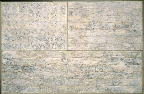
Meanwhile, poking around MoMA's archive site to try and see what some of these 'little uglies' might have been, I found the 1966 exhibition, "Two Decades of American Painting 1945-1965," organized by Waldo Rasmussen, which included 111 works by 35 postwar artists, including Gene Davis, Hans Hoffman and Jasper Johns.

It was a straight-up museum exhibit, not embassy art, but it did travel to India and Australia from Japan, and was accompanied by a film program, The Experimental Film in America, which sounds specifically designed to give Nixon an aneurysm.

And the Johns that was in the show? the a White Flag painting from 1955, which the artist held onto until 1998, when he sold it to the Metropolitan Museum.

johns_white_flag_met.jpg

January 10, 2010

'The Art Game In Washington'

Recently I've been researching the postwar history of contemporary art and architecture in Washington DC. This article sounds like it could have been written last week:

The Art Game in Washington
Amid a growing art boom, local artists feel they are being overshadowed by national museums, budget-conscious curators, overly commercial gallery owners and a public that all too willingly listens to critics.
by Bob Arnebeck, The Washington Post Magazine, Sept. 17, 1978.

This also goes on my Lists Of Things 'We' Did Not Know In 2008 and 2007, Which Is When James Wagner Mentioned It.

I admit, I largely pulled back from the whole Bruce High Quality Foundation hype when it, well, when it started feeling like trendy hype. Nothing courts fame like courting anonymity. So I missed the reference on AFC last summer to BHQF chasing Smithson's posthumously realized Floating Island with The Gate. And I missed their interview in Art In America last spring where they discussed doing the project before they even had their brand. And I missed James's mention of it way back in 2007, too.

Ironically, tracking down the anonymous artists behind one of the most supremely perfect public art gestures of the decade was actually on my list of things to do in 2010. I assumed I'd get word to them through Redhead, the gallery at the LMCC, where they showed the The Gate: Not the Idea of the Thing But the Thing Itself later in fall 2005. So I guess I can check it off.

But while I obviously have to relook at BHQF's subsequent projects in a less reflexively cynical light, I kind of feel the need to re-evaluate The Gate, too. Take their entire approach to fiction, which they discuss in AiA:

BHQF: We believe in the liberating properties of fiction. The whole fictional awning of The Bruce High Quality Foundation is not supposed to be about obfuscation. It's about framing things in a way that we feel is more accurate-even if it's steeped in fiction-towards a model we're trying to engage here.

...

When there are moments of clear misinformation, those are generally used to make people be more conscious of the potential that it's all made up. They have a function so that you always know it has been written by someone somewhere.

And then look at how they describe The Gate's serendipitous impact on their website:
In keeping with its institutional policy of doing extra-institutional interventions, and at a cost of 2,000 dollars, The Bruce High Quality Foundation set out to film a floating gate next to Floating Island. The foundation members were somewhat stunned by the attention that the project received. In large part the attention came simply because of a photograph taken by one man in the twenty-somethingth floor of an office building in DuMBo, and the image took on a life of its own.
bhqf_ian_adelman_nyt.jpg

The attention, of course, was a front-page story in The New York Times with a beautiful, giant photograph of The Gate chasing Floating Island, captured, we were led to believe, by accident.

As all this [i.e., the be-Gated motorboat chasing the barge] was happening, a group of graphic designers in a studio in the Dumbo neighborhood in Brooklyn, who had been monitoring the Smithson project's daily passing from their office window, caught sight of the little floating gate chasing the little floating park.

"We all thought it was kind of hilarious," said Ian Adelman, who took some photographs.

Randy Kennedy's article continues with detailed reporting of "a fellow designer, Elizabeth Elsas" going down to the riverfront to meet the The Gate boaters. Rereading it now, it's not clear that Kennedy himself was not on the scene.

Had he been there, of course, then the conceit of the story--thatThe Gate was unexpectedly discovered and photographed by some Brooklyn designers, who thought it was so hilarious they called the Times--completely falls apart. Even if Kennedy did not know about The Gate in advance, it's possible that Ian Adelman and/or Elizabeth Elsas did, and performed the necessary role of witness--and perfectly positioned photographer--for the event.

Either way, the shade cast by BHQF's fictional awning now reaches back to The Gate as well, and that project's details, context, and presentation may be far more premeditated and constructed than they first appeared.

Another in an unanticipated series of instances of projection of emotion upon inanimate objects:

To the cashmere sweater who falls from the closet shelf onto the back of your clothes, the tips of all those dry cleaner hangers you haven't thrown away are concertina wire, and when you take it out, you are not, as you may think, its savior, but its crucifier.

zwirner_cal_2010.jpg

Last month I watched the essentially sculptural process of designing and making fiberglass Eames chairs, and I wondered "how design and art ever stayed separate in those days."

The answer, of course, was that it didn't. David Zwirner just opened "Primary Atmospheres: Works from California 1960-1970," the kind of show I'd totally expect to see in a museum [1] [2]. From the press release:

While most of the artworks included in the exhibition can be referred to as minimal in form, their seductive surfaces, often madeout of nontraditional materials, and their luminescent use of color and light characterize them as uniquely Southern Californian.

...

The works on view capture some of the more specific aesthetic qualities of the Los Angeles area during the1960s, where certain cutting-edge industrial materials and technologies were being developed at that time. Many of the artists employed unconventional materials to create complex, highly-finished and meticulous objects that have become associated with the so-called "Finish Fetish" aesthetic.

These artists were also influenced by the industrial paints applied to the surfaces of surfboards and cars, as well as the plastics of the aerospace industry.

Industrial and commercial materials and processes, surfboards, cars, signs, aerospace. As awesome and long-overdue as Zwirner's show is, it sounds like there's a lot more about the relationship of postwar art and design to be discovered, written about, and shown. So hop to.

Primary Atmospheres: Works from California 1960-1970, through Feb. 6, 2010 [davidzwirner.com]
16miles reports beautifully from the scene of the opening [16miles.com]

image above: works by Craig Kaufmann in vacuum-formed plexi; Larry Bell in mineral coated glass; and De Wain Valentine in fiberglass-reinforced polyester, via zwirner.

[1] In fact, it feels like a slice of the Pompidou's much larger 2006 survey of Los Angeles, hopefully without the negligent destruction of the non-traditionally constructed art. Several of these artists were also in PS1's odd "1969" show last year, so not quite as unexposed as the press release implies.

[2] Zwirner's last Flavin show was the same museum-quality, but not to be found in a museum. And then there was the Flavin Green Gallery and Kaprow shows at Hauser & Wirth. How are there not more museums in town doing small-to-medium-sized, historical contemporary shows like this? The exhibition equivalent of an essay instead of a book? It seems like such a free way to work and think. PS1 is the closest I can think of, though I'm always ready to believe I just don't get out enough.

January 9, 2010

Carry On With The Despair

keep_calm.gif

My first reaction on reading the BBC's 2009 list 100 things we didn't know last year for 2009 was, "What you mean 'we,' Kemosabe?"

But seriously, the "Keep Calm and Carry On" poster was never actually used in WWII, it was only printed in two-and-a-half million times and stockpiled "in the event of a national catastrophe, but remained in storage throughout the war," and then pulped, except for one which some guy found in a box in 2000 and hung in his bookshop, which he eventually decided to reproduce, because everyone wanted to buy it, and thus started a nostalgic design craze?

I feel like 'we' should have known that sooner, if only so we'd be prepared for the BBC's tips for coping with the nationally catastrophic cold snap:

2. NEVER LET YOUR GUARD DOWN
3. GET USED TO SNOW
4. LEARN TO ACCEPT DEFEAT
5. HAVE LOWER EXPECTATIONS
Also, "46. Franco had one testicle." puts the whole General Hospital/performance art/Deitch thing into perspective. [via kottke]

January 8, 2010

On Rotating The Dishes

Sometimes I worry about the dishes.

I think we have half our dishes out, and half in storage. Not fancy china, which we felt right off was a pointless wedding scam, but the everyday stuff, which we still have a dozen place settings of, but no kitchen or dining room big enough to realistically deploy them all.

So we have dinner, take down a couple of plates, wash them, dry them, put them back. Have soup more rarely, take down a couple of bowls--big? small?--put them back.

And this is what I sometimes worry about: do I put them back on top of the stack? Do I put the bowls back in the empty front spot on the shelf? Because if I do that, then guess which dishes are going to get reached for the next time? That's right, the same ones.

So do I rotate them, put the dishes away at the bottom of the stack? Because the glass dessert plates are underneath the glass dessert bowls, and that means lifting the entire thing up and/or out to put the plates underneath. And the dinner plates are kind of snug under a rack that holds the salad plates, not so easy to get--anyway, I'm rationalzing now; the reality is, I don't really rotate the dishes that much. Not as much as I feel I should.

As I was explaining this to Jean last night, after a dinner of Indian food which required the use of an extraordinary number of our big rice bowls--four--plus the kid-sized cereal bowls, I actually joked about rotating the dishes because I didn't want the dishes underneath, or in the back, to be lonely.

But what I really think about isn't the dishes, or even us or me, necessarily, except that it is. When I pull down and put away the same plate a couple of times a day, always from the top, I imagine what the cumulative effect of repeated use will be over the years.

Then I imagine a guy living alone, eating alone, washing and putting away his dish alone, for years. One dish accumulating the scars and scratches and chips of use, while the three, or five, or seven, or even eleven dishes below it sit untouched.

I see old china at the flea market or in a vintage store, and I imagine finding such a set, and it makes me kind of sad.

But not as sad as imagining the same guy eating and washing and drying his dishes alone, and then carefully rotating them so that they wear uniformly.

Related, and the inspiration for posting this now: Roger Ebert's reflections on what it's like not to eat or drink or talk anymore. [suntimes.com]

The California College for The Arts is organizing an open pin-up show to honor Larry Sultan, the photographer, conceptual artist, and teacher who passed away last month:

This show is a way for us to mark his passing and his enormous contributions and come together as a community. It is somewhat informal and open to all participants, so please feel free to forward this information. You can contribute an image, an object, a letter, text, really anything you believe honors Larry as a person, artist, and teacher. The show will be an evolving installation in the Oliver Art Center on the Oakland campus from January 11-17th, 2010. We will of course be documenting the show as it comes together.
Submissions can be via mail, email, or in person in Oakland. For details, see the full post at Conscientious.

A Show For Larry [conscientious]

jmcolberg_ampixel2.jpg

Jörg M Colberg [who blogs photography at concientious] introduces complexity and subjectivity with content-sensitive jpeg compression:

These Adaptive Jpegs (ajpegs) [1] - "American Pixels" - are an experiment. Jpegs are images where the original information was compressed to save space. A computer that creates a jpeg does not know anything about the contents of the image: It does what it is told, in a uniform manner across the image.

My idea was to create a variant that followed in the footsteps of what jpegs do, but to have the final result depend on the original image: the computer algorithm becomes part of the image creation, in a very direct way. The idea was to build a hierarchical jpeg algorithm, where the compression - in effect the pixel size - depends on the information in each uncompressed pixel and its neighbours. So ajpeg is a new image compression algorithm where the focus is not on making its compression efficient but, rather, on making its result interesting.

The info of interest in many of Colberg's images is military [they're titled "American Pixels," after all] but I like the way the variegated pixels play out in the more ambiguous, atmospheric images best.

[1] UPDATE: Jörg emails to say that because the term "ajpeg" has been causing some misunderstanding about the works and how they're made, he's changed it to "acomp," short for "adaptive compression." Duly noted. He's also added some new images to his site; be sure to check back.

American Pixels [jmcolberg.com, thanks joerg]

So I was watching Marie Lorenz' video, Capsized, on WNYC's Culture Blog, like I was told to do.

And not just because she had co-curated Invisible Graffiti Magnet Show inside those Richard Serra torqued spiral segments stored along the Bronx waterfront, I clicked through to see photos from Lorenz' less harrowing journeys down the Tiber in her handmade boat.

Including Tiber River III, where she and a colleague from the American Academy look into the Protestant cemetery at Keats' grave.

Which contains the epitaph that ends, "Here lies One Whose Name was writ in Water," which prompts Lorenz to wonder what it means.

"I'm not really sure." said Margaret. "Something about spirituality maybe, or the eternal nature of art. Its just good writing." She said.
Well, the last one out of three, sure, but. So I looked it up.

And the full inscription overexplains it a bit:

This Grave
contains all that was Mortal,
of a
YOUNG ENGLISH POET,
Who,
on his Death Bed,
in the Bitterness of his Heart,
at the Malicious Power of his Enemies,
Desired
these Words to be engraven on his Tomb Stone:
"Here lies One
Whose Name was writ in Water."
th
Feb 24 1821
Which makes wonder if Keats was murdered by his editor.

No, The Phrases Finder entry from 2003 tells me that Keats, 25, whose tuberculosis was not, in fact, getting better on his winter trip to Italy, and whose pursuit of true love was thwarted by his poverty, composed the last bit, at least, as a reference to a line from a Jacobean tragicomedy called "Philaster, or Love Lies-Ableeding,": "All your better deeds/ Shall be in water writ."

Which is spiritual in an "All we are is dust in the wind," sort of way, I guess.

But then the Google Ad next to this epitaph is from an outfit called westmemorials.com:

toaster_shaped_memorial.jpg

She was everything to you
Mark her history
with something more
than a gray toaster-shaped
memorial.
Which, Bread of Life and all, maybe is something about spirituality, but really, it's just good writing.

Inspired by Hans Ulrich Obrist's perennial interview question, I wrote about artists' unrealized projects a few years ago for the NY Times. As I stack up some [as-yet] unrealized projects of my own--including, alas, catching up on my unread e-flux journals--I'm glad to hear HUO's still got the fire:

I see unrealized projects as the most important unreported stories in the art world. As Henri Bergson showed, actual realization is only one possibility surrounded by many others that merit close attention.13 There are many amazing unrealized projects out there, forgotten projects, misunderstood projects, lost projects, desk-drawer projects, realizable projects, poetic-utopian dream constructs, unrealizable projects, partially realized projects, censored projects, and so on. It seems urgent to remember certain roads not taken, and--in an active and dynamic, rather than nostalgic or melancholic way--transform some of them into propositions or possibilities for the future.
"Manifestos for the future", e-flux journal #12 [e-flux.com]


Adaptive Subdivision, originally uploaded by Quasimondo.

Saying they reminded him a bit of the polygonal distortions of the Dutch Landscape images from Google Maps, greg.org reader Patrick passed along these examples of adaptive subdivision from flickr user Quasimondo.

Googling around on it, I gather it's a tiling technique used in mapping that partitions an image based on the similarity of adjacent data; more similar=larger polygon. More detail/variation=smaller divisions.

I've been debating in my head whether to really delve into the actual algorithms and techniques used to camouflage the various military & intelligence sites I've been pulling. It's not clear that it'd help the project along in any way, but it does fascinate me.

What became immediately obvious is that while the geometric abstractions of some sites are clearly based on the underlying image, others have been pasted over by totally unrelated polygon blobs. Compare in the map of The Hague below, the detail of the Noordeinde Palace in the upper left and the outsize blob hiding the Department of Defense on the right.


View Larger Map

I wonder if sometimes it's best--or enough--to just be stoked for the found images I've found as I've found them.

Last night on very short notice, I went to "Running for Cover(age), A panel discussion on arts criticism in the DC area," organized by the Washington Project for the Arts. Here are the impetus and content of the discussion in a nutshell:

The Rubells have a Morris Lapidus-designed hotel in SW DC that they've been working to turn from ghetto-sketchy-by-the-freeway to edgy-hip.

A few years back, they bought a Dan Steinhilber sculpture at the WPA benefit auction, and he became suddenly/locally famous.

This year, the WPA asked Mera Rubell to select artists for its auction.

Instead of guaranteeing a big auction haul and a little more glamour by importing art world hotness, she decided to find work by visiting DMV [DC, Virginia, Maryland, it always confuses me] artist studios en masse.

The WPA received 200 applications. For studio visits. To donate art to a benefit.

[Slightly less dramatic pause/update: Adam from WPA emailed to clarify that donor artists receive half the proceeds of the work sold at the benefit auction, so it's not a straight-up, NY-style call for donations. Duly noted.]

I'm fine with somethings in the air, and zeitgeists, and influences, and inspirations, and appropriations. When I finish some of these Dutch Landscape paintings, I'll go up to Mary Heilmann and Gerhard Richter and a dozen other folks and give them each a big ol' hug.

But what I don't like is thinking I'm having my own thoughts and ideas, then getting blindsided by a trend. So until I can delve a little deeper into what painter Steve DiBenedetto means here, I'm going to have to be a little pissed off with myself:

One thing led to another, and it ended up being a reference to Gothic stuff or some of this crystalline Minimalism we're dealing with now.
Steve DiBenedetto
Breaking the ice--and the surface--with the painter.
By T.J. Carlin
[timeout.com via two coats of paint]

wmmna_deste1-.jpg

Just getting caught up on some blogs I lost track of the last couple of months. Regine at We Make Money Not Art has a great writeup of an amazing-sounding show in Athens at the DESTE Foundation titled, "A Guest + A Host = A Ghost," which is a witty play on words taken from a 1953 Marcel Duchamp piece. Here's what the DESTE Foundation is:

Each year, a show at DESTE focuses on the collection of Dakis Joannou, the industrialist who established the foundation in 1983. New acquisitions are standing side by side with older pieces, making emerge new meanings and relationships between the artworks.
What makes the show so interesting is that it was curated by artists whose works are in the collection. DESTE's curatorial adviser is the artistic director of the Fondazione Nicola Trussardi, Massimiliano Gioni, and he put the show together with Maurizio Cattelan, Urs Fischer, and Cecilia Alemani.

Up top is an Urs Fischer hole in the floor surrounded by Kara Walkers. Below is a Cattelan hole in the floor with a little Maurizio peering out at Paul Chan's portraits of the US Supreme Court.

wmmna_deste2.jpg

Reg has tons more photos and information. Jouannou's collection sounds amazing, and to see it through artists' eyes? Wow, where could you ever have something so cool, but in Greece? Unfortunately, we'll never get to see a show this cool, because "A Guest + A Host = A Ghost" closed Dec. 31. Oh well, an art lover can dream! Thanks, Reg, for sharing such a rare and innovative artistic treasure!

January 2, 2010

Neto > Bloc > Klein

While poking around last night looking for more films and videos made by Ernesto Neto, I found this clip, a black & white making-of short for Looking for the end, an installation Neto made in the southern Paris suburb of Meudon in 2007.

For Looking for the end Neto filled Andre Bloc's 1964 Habitacle with a construction of giant Octon-shaped elements cut out of strandboard

The look of the film--by Benjamin Seroussi, who grew up in Bloc's house, and whose dealer/collector mother Natalie Seroussi commissioned Neto's piece--echos very nicely with the Habitacle's most famous on-screen appearance, in the opening scene of William Klein's awesome 1966 debut feature, Who Are You, Polly Maggoo?

Who Are You, Polly Maggoo? is a Cold War fashion satire, the freakishly beautiful lovechild of a post-protest march hookup between Funny Face and Dr Strangelove. It's bizarre to think it came out the same year as Blow-Up.

Klein used Bloc's post-constructivist brick pile as the stage for a ridiculous fashion show, where models inserted or bolted into creations of razor-sharp, polished metal [by Paco Rabanne, of course] paraded in front of magazine editors perched on scaffolding. In the post-show scrum of designer adulation, the Diana Vreeland character proclaims, "Je suis galvanisée!"

The opening's on YouTube, but it turns out Criterion released Who Are You, Polly Maggoo? in 2008 as part of a 3-title box set, Eclipse Series 9 - The Delirious Fictions of William Klein.

What's the bigger news, that the traditional shell-and-machete-based distribution system of beachfront coconut water is threatened by industrial-scale canned product? Or that Ernesto Neto is releasing catchy video manifestos for the cause on YouTube?

Água de coco Ernesto Neto [youtube via centre for the aesthetic revolution]

There's also an Ernesto Neto listed as direção--along with Celso Vilalba and Tiago Gil--and as direção de fotografia [along with Vilalba] on this music video for "Ultimos dias," by Brazilian heavy metal band called Kiara Rocks. What else is Ernesto hiding there on YouTube, hmm?

Since 2001 here at greg.org, I've been blogging about the creative process—my own and those of people who interest me. That mostly involves filmmaking, art, writing, research, and the making thereof.

Many thanks to the Creative Capital | Warhol Foundation Arts Writers Program for supporting greg.org that time.

comments? questions? tips? pitches? email
greg [at] greg [dot ] org

find me on twitter: @gregorg

about this archive

Posts from January 2010, in reverse chronological order

Older: December 2009

Newer February 2010

recent projects, &c.


our_guernica_cycle_ivanka_320px_thumb.jpg
Our Guernica Cycle, 2017 –
about/kickstarter | exhibit, 2017


pm_social_medium_recent_proj_160x124.jpg
Social Medium:
artists writing, 2000-2015
Paper Monument, Oct. 2016
ed. by Jennifer Liese
buy, $28

madf_twitter_avatar.jpg
Madoff Provenance Project in
'Tell Me What I Mean' at
To__Bridges__, The Bronx
11 Sept - Oct 23 2016
show | beginnings

chop_shop_at_springbreak
Chop Shop
at SPRING/BREAK Art Show
curated by Magda Sawon
1-7 March 2016

do_not_bid_or_buy_iris_sidebar.jpg
eBay Test Listings
Armory – ABMB 2015
about | proposte monocrome, rose

shanzhai_gursky_mb_thumb.jpg
It Narratives, incl.
Shanzhai Gursky & Destroyed Richter
Franklin Street Works, Stamford
Sept 5 - Nov 9, 2014
about | link

therealhennessy_tweet_sidebar.jpg
TheRealHennessy Tweets Paintings, 2014 -
about

sop_red_gregorg.jpg
Standard Operating Procedure
about | buy now, 284pp, $15.99

CZRPYR2: The Illustrated Appendix
Canal Zone Richard Prince
YES RASTA 2:The Appeals Court
Decision, plus the Court's
Complete Illustrated Appendix (2013)
about | buy now, 142pp, $12.99

weeksville_echo_sidebar.jpg
"Exhibition Space" @ apexart, NYC
Mar 20 - May 8, 2013
about, brochure | installation shots


HELP/LESS Curated by Chris Habib
Printed Matter, NYC
Summer 2012
panel &c.


drp_04_gregorg_sidebar.jpg
Destroyed Richter Paintings, 2012-
background | making of
"Richteriana," Postmasters Gallery, NYC

czrpyr_blogads.jpg
Canal Zone Richard
Prince YES RASTA:
Selected Court Documents
from Cariou v. Prince (2011)
about | buy now, 376pp, $17.99

archives