July 2010 Archives

moholy_nagy_light_prop_br.jpgI'd known Laszlo Moholy-Nagy's 1930 kinetic sculpture Light Space Modulator indirectly as a film subject, and then in 2002 through incredible color photographs Oliver Renaud-Clement showed at Andrea Rosen in 2002. [And again, in direct relation to the artist's sculptures in 2007.]

The press release for that show quotes Moholy-Nagy on the LSM:

...a structure that is made to develop the sense of space and explore the effective relationships which must be within the quality range of any architecture - an ABC of architectural and projective space...

The mobile was so startling in its coordinated motions and space articulations of light and shadow sequences that I almost believed in magic.

Which is nice.

But I came to know it not as an object itself, a sculpture, and not as a film prop [the original title for the work is Light Prop for an Electric Stage], when I began researching the replication a similar object, Ray and Charles Eames' Solar Do-Nothing Machine.

The Eames's Solar Do-Nothing Toy on the cover of Radio & TV News, Dec. 1958

Eames called their creation, built in 1958 for an Alcoa ad campaign, a "toy," not a work of fine art. My own interest was to use the context of art to recreate the Do Nothing Machine--I want one and want to see and experience it in person. But it quickly became apparent to me that the Eameses' modernist, experimentalist work already resonated with the contemporaneous history of light and kinetic sculpture. Which Moholy-Nagy's work both prefigured and directly influenced.

Filled with dazzling close-ups of whirring, colorful components, the Eameses' film of the Solar Do-Nothing Machine could be a Technicolor Hollywood remake of Moholy-Nagy's film, Lichtspiel. But the Light Space Modulator turns out to be directly related to this project in another not insignificant way: it's actually a replica.

Moholy-Nagy worked on the LSM for an easy decade until 1930, but he also tweaked, repaired and altered it for use and exhibition up until his death in 1946. His widow Sibyl Moholy-Nagy gave the work to Harvard's Busch-Reisinger Museum in 1956.

But that was not what was exhibited when light and kinetic was the new hotness in 1970, both at the Howard Wise Gallery in New York, and at the Venice Biennale. And it's not what is exhibited now or since, or what is shown in nearly every image of the Light Space Modulator published these days. Those are all refabrications, or replicas, or approximations, really, of the original--or at least of its final state.

So from Eames, I've been diverted by the fascinating history and reincarnations of the LSM. Which I'll get into in a minute.

July 27, 2010

Heinz Mack, Daddy

heinz_mack_saharaproj_60.jpg

Digging around on Moholy-Nagy's Light Space Modulator and its relation to a later generation of kinetic light works by artists like Otto Piene, I came across some early works by Piene's Zero Group co-founder, Heinz Mack.

As early as 1960, Mack was showing plans for his Sahara Project [above, image via mack-kunst], which would, in classic Zero style, embody the most reductivist expression of art's essential elements, light and space.

heinz_mack_lichtstele_68.jpg

Mack showed his reflective and/or lit Lichtstele sculptures at various places, including in 1966 at Howard Wise Gallery, a center of kinetic and self-consciously future-oriented art. It took until the late 60's for Mack to realize his utopic, minimalistic, phenomenological sculptures in the desert, though.

heinz_mack_telemack_stele.jpg

They look utterly fantastic in photographs. Or film stills. Mack produced a documentary of his art projects in Tunisia in 1968-9 with the German television network ARD humbly titled, Tele Mack, Tele-Mack, Telemack.

I need to read further to figure out how Mack's work relates to what was going on around it. [The artist himself seems to see himself as a prophet of the future, a German incarnation of the otherworldly artist-showman in the Klein & Dali type. For some reason, this awesome still from Tele-Mack of Mack in his space suit makes me think of Klaus Kinski.]

heinz_mack_silver_suit_68.jpg

In his own bio, Mack namechecks artists he met in New York such as Reinhardt, Newman, and Marisol. But Tele-Mack, and by extension, his whole Sahara Project, have an inexorable connection to Land Art, too, and Smithson's Displacements. Tele-Mack was produced with the artist couple Gerry Schum and Ursula Wevers, who founded The TV Gallery in 1967. From Ute Meta Bauer's chronology of artist-driven exhibitions:

[The TV Gallery and later, the Video Gallery] exhibition took place on TV. Its duration was the length of the program.

Over a period of six months, Schum shot films with Land Art artists. He wanted to dematerialise art - to take away the character of art as a consumer item (opposition to Pop art).

Bernhard Höke, Hannah Weitemeyer and Gerry Schum made the film Konsumkunst - Kunstkonsum (1967). In this film, artist Heinz Mack stated that his art will exist on television and will only be shown to the audience by this medium, only to be destroyed afterwards. Later, in May 1969, this was realized in the Telemack TV broadcast.

Otto Piene also made an exhibition only for TV - a multimedia show.

Let's file that last one away, about a Piene TV show, for later.

If Mack's work was intended to disappear after being photographed or filmed or aired, it's working. I can't find a hint of Tele-Mack anywhere online, though it is apparently in various film archives. Mack has worked steadily, producing large, permanent works for public, government, and corporate situations. But his earlier work exists largely in the same handful of documentation photos. He installed a large Lichtstele in front of the Art Museum that was the center of the Osaka Expo70, but I can't find a picture, and the only Japan photo on Mack's website is the artist surrounded by young women in kimonos.

Perhaps the catalogue for the Ludwig Museum's 2009 show, Heinz Mack, Licht der Zero-Zeit, has something. According to the show's writeup, most of the works in that show come from the artist's collection and hadn't been seen for decades.

As dazzling and pristine and sublime as the work appears, I'm not sure there's still a there there. Maybe it's enough for someone rebuilding society in a postwar atomic present. But now that it's historical, I think The Art of The Future needs to be more than Not The Past.

Meanwhile, if anyone has any leads on how to see Tele-Mack, I'd love to hear it.

moving_serra_scr.jpg

Breaker, Breaker One-Nine,

I got Moving Serra, a documentary about transporting Richard Serra's 242-ton sculpture Sequence cross-country, from MoMA to LACMA on a fleet of flatbeds, that's blowing my mind right now.

We need a convoy of Serra torqued spiral/ellipse collectors to load their big rigs with completion funds right now and head on over to director Tom Christie's place, over?

Moving Serra [movingserra.org]

Oh Gerhard-Richter.com, why did I ever doubt you?

richter_1_of_4900_colours.jpg

Last February, while holed up in the Snowpocalypse, I thought the hell out of the Serpentine Gallery's catalogue for Richter's 4900 Colours. The work consists of 25 enamel color squares arranged randomly on 196 5x5 aluminum laminate panels, and it relates very closely to the random, pixel-like stained glass window the artist created for the Cologne Cathedral in 2007, which was in turn related to an earlier color grid painting Richter did in the 1970s.

The frontispiece of the catalogue [above] shows the artist, nattily dressed, with brush and paint in hand, contemplating the final yellow square on a 25-square panel. Yet the text describes the actual production process for 4900 Colours, which involved random color placement determined by computer [the same program used to create the window], and mass production of enamel tiles, which were assembled and bonded to the aluminum substrate.

How to reconcile this apparent contradiction: Benjamin Buchloh praising the work's industrial facture, while the making of photo captures The Touch of The Master's Hand? And to complicate matters--or to solve the paradox--the grid on the painting Richter was photographed working on does not match any of the 196 panels in the piece.

The answer was right there on gerhard-richter.com all along. Almost. A search for all paintings made in 2006 and 2007, around the time of the cathedral window and 4900 Colours, turns up ten paintings, all 2007, titled 25 Colours, which have identical dimensions and materials, and which appear to have identical colors, as the 196 panels in 4900 Colours.

richter_25_farben_search.jpg

Thanks to the artist's catalogue-raisonne-as-you-go numbering system, we can see the order in which they were created, and their apparent relationships or context. The Cologne Cathedral window is actually listed under paintings as CR:900, and is followed by four 25 Colours works, CR:901-1 through 901-4. Then comes 4900 Colours, CR:902, and six more 25 Colours numbered--wait for it--CR: 902-29, -31, -37, -39, -49, and -50. Which sounds like a series of four works, plus a series of panels, 196 of which go together, and 6 of which become autonomous works.

But. The photo Richter's painting up top doesn't match any of these ten, either. And if sharing a CR number means anything about their production, then the six 902 paintings are made exactly like 4900 Colours: at an auto body shop. Are CR:901's handpainted? Is the photo in the book of a reject, or a study, a 900.5 whose handpainted facture didn't pass muster? I guess we still don't know.

richter_cage_search.jpg

This chronological view, though, adds another dimension to the context of Richter's process, and it ties together three major projects involving randomness: 4900 Colours, the Cathedral window, and a suite of six large abstract paintings named for John Cage. There are 25 more squeegee paintings in between the window and the Cage paintings, but they are listed under only two CR numbers: 898 and 899. If I understand my Richter process, that means he worked on them in two batches, which might have taken "weeks."

I'd completely forgotten that the installation video for 4900 Colours reminded me of Cage's incredible exhibition-as-performance, Rolywholyover.

But I remembered watching Rob Storr talk about the Cage Paintings, though he doesn't project their relationship forward. Or sideways. Richter's window was dedicated in 2007, but the design was unveiled, fabrication had begun, and fundraising had been completed in September 2006. Which means Richter was working on the window and the Cage Paintings concurrently.

Storr quotes Cage on how, whatever randomness exists in your process, what's not "an accident is what you decide to keep." Which is about as close an answer as I can get for what happened to that grid painting up top.

So did the need for window randomness lead Richter to Cage, or did Cage lead Richter to randomness? I guess I'll have to start digging.

richter_4900_colours_site.jpg

In addition to the world's greatest artist website, artist Gerhard Richter also makes paintings.

Now these two endeavors come together with the debut of a micro-site devoted to 4900 Colours, the set of 196 5x5 grids of 25 randomly applied enamel-painted squares, mounted on Aludibond panels. 4900 Colours can be exhibited in any of 11 configurations. Above is Version IX, which I chose for its apparent zooming-in-on-pixels quality.

One point of note: the website lists 4900 Colours in the /editions/ folder. Update: the microsite URL has changed; it is now listed in /paintings/

And two points of great relief: the 4900 individual squares were indeed sprayed-on enamel, not handpainted by the finely dressed artist; and there are no drop shadows. I think we are making real progress here.

www.gerhard-richter.com/art/paintings/4900-colours/ [gerhard-richter.com via @gerhardrichter]

Previous coverage of 4900 Colours:
The Making Of, with special guest star Benjamin Buchloh
About facture and that handpainted square
About drop shadows and diagrammatic abstraction

lichtspiel_still.jpg

That Google Street View snafu yesterday reminded me of a still from Laszlo Moholy-Nagy's 1932 abstract//constructivist short film, Lichtspiel, or Lightplay.

Normally, I'd say that's the art-nerdiest possible free association in the world, but I've actually been meaning to write about Moholy-Nagy's film for a while. Or more specifically, about his incredible kinetic assemblage/sculpture used to make Lichtspiel, the Light Space Modulator.

Light Space Modulator is a motorized sculpture made of glass, mirror, steel, and acrylic, and it was a crucial object--or project--for Moholy-Nagy for more than two decades. The dates generally given for its construction are 1922-30, but the artist worked on or with it until he died in 1946. Last fall, Alice Rawsthorn wrote in the Times about the tragicomic scene of the refugee artist fleeing the Nazis in the 1930s, family and Light Space Modulator in tow, and having to explain the sculpture to customs and border officials along the way. The original was given by Moholy-Nagy's widow to the Harvard Museums, but more on that later.

According to the artist's official chronology, Lichtspiel [full title: Lichtspiel schwarz weiss grau] was made around 1930 in Berlin, and first shown in 1932 [MoMA has a brochure, designed by the artist, for an exhibition and screening.]

According to MKZ:

Lichtspiel, schwarz-weiß-grau was originally supposed to consist of six parts, but only the last part was filmed. The first five parts were supposed to show different forms of light in set combinations: from the self-lighting match, automobile headlights, reflections, moonlight, and colored projections with prisms and mirrors to the production of the "light prop," [i.e., the LSM]

This surviving segment/film, one of 7 extant Moholy-Nagy films, is listed with a 6-minute run time, but there are several excerpts and variations floating around. Here's the original, I think:

The Times has a great account from 1952 of a screening of an "abstract art film" program organized by "Captain [Edward] Steichen" for the Museum of Modern Art's "enterprising, energetic Junior Council," which included both Lichtspiel and the early direct animation films of Len Lye.

But SFMoMA's version is 5:17. The Minimalist Issue of Aspen Magazine, Nos. 5+6, published in 1967, includes a 1:40 excerpt on super-8 film. Fortunately for everyone without Aspen and/or an 8mm film projector, there's Ubu.

July 21, 2010

Dali's Pen Is

dalis_pen_moma.jpg

While scoping out the 1974 video art conference at MoMA, "Open Circuits, the Future of Television," filmmaker Jose Montes Baquer decided that for some reason, Salvador Dali should be the artist he would collaborate with for his documentary. Baquer tells the story of gaining audience with Dali at the St Regis to pitch the project in an all-too-short interview with Christopher Jones for Tate, Etc. Magazine in 2007:

Then Dalí took a pen from his pocket. It was plastic and ivory coloured with a copper band at the centre. He said: "In this clean and aseptic country, I have been observing how the urinals in the luxury restrooms of this hotel have acquired an entire range of rust colours through the interaction of the uric acid on the precious metals that are astounding. For this reason, I have been regularly urinating on the brass band of this pen over the past weeks to obtain the magnificent structures that you will find with your cameras and lenses. By simply looking at the band with my own eyes, I can see Dalí on the moon, or Dalí sipping coffee on the Champs Élysées. Take this magical object, work with it, and when you have an interesting result, come see me. If the result is good, we will make a film together."
The 2008 MoMA exhibit, "Dali and Film," says this quote came from a letter from the artist. The resulting film, Impressions of Upper Mongolia, Hommage to Raymond Roussel, concerns the relationship between macro and microscopic, and was shown on Spanish TV in 1976. As interesting as it is, Baquer's interview doesn't exactly help make sense of what the film actually turned out to be. But the mentions of painting over film stills, and Vermeer, and the Dutch penchant for mapmaking as an art form, almost persuade me to put up with Dali's pompous shenanigans to watch it.

Dali: The Great Collaborator [tate.org.uk]

July 21, 2010

Google Lens Cap View?

gmap_rockville3.jpg

I was on the phone, trying to give directions to a friend to a small Japanese grocery store in Rockville, Maryland, so I pulled it up on Google Street View. Which turned out to be useless, but weirdly beautiful. Turns out all the Street View panos on that section of the busy road are out of focus, with mottled light patterns that look like the inside of a perforated coffee can.

gmap_rockville1.jpg

Either last week's earthquake has sucked Rockville Pike into a wormhole, or someone skipped the "1. Remove cover from panoramic camera stalk" step in his Street View Driver's Manual.

Holy smokes, people, just watch how these things turn out. In April, I spotted this photo at MoMA; it was in the second floor hallway just past the cafe, with no caption, and a date: 1970. I spent a few weeks trying to search up the name of the artist who made this remarkable, undulating acrylic structure in the Garden, to no avail [MoMA's records didn't have any more info about the photo.] I looked through the archive of shows, trying to match it, nothing.

Look at that thing, though, it's like an ur-Dan Graham. an ur-Greg Lynn, for that matter. A more permanent Ant Farm inflatable. Suddenly, it occurred to me to ask John Perrault, who's probably forgotten more than I'll ever know about postwar art in New York. Sure enough, he nailed it: Les Levine. Star Garden, but 1967, not 1970.

Turns out 1967 was a great year for Levine--actually, looking through his works at the Center for Contemporary Canadian Art, a lot of years were great years for Levine. The Silver Environment (1961), vacuum-formed mirrored plastic? fabric? The perceptually disorienting acrylic bubble structures like Star Garden or Supercube Environment (1968)?

les_levine_disposables.jpg

Disposables (1968) [above], a pop-minimalist grid of vacuum-molds of household objects, sold cheap and meant to be thrown away when their moment is over? Wow, Levine's Restaurant (1968), New York's only Canadian Restaurant, operated as a artist project, like Gordon Matta-Clark's Food or Allan Ruppersburg's Al's Cafe, only earlier? Is that really TV test pattern print clothing there in 1978?

levine_slipcover_archleague.jpg

And then there's Slipcover, a 1967 installation at the Architectural League [image via], which ran concurrently with Star Garden: three rooms covered in sheets of mirrored Mylar, where the space is constantly in flux because of the giant Mylar balloons inflating and deflating. The NY Times article shows Levine working on a balloon while one Linda Schjeldahl seals the edges of the Mylar wallcovering. Schjeldahl, Schjeldahl, where have I heard that name before?

Of course! The University of North Dakota's archives of Gilmore Schjeldahl, founder of the Sheldahl Company!

The Company was the primary contractor for the Echo II Program. There are also files which contain information about the Echo I and II satellite balloons, as well as samples of Echo I and Echo II skins, and a file containing information about an art exhibition by artist Les Levine in 1967, at the Architectural League in New York City, which featured rooms made of Sheldahl's Mylar laminates.
Billy Kluver, whose company Bell Labs operated the Project Echo satelloons, introduced Andy Warhol to Mylar and helped him make his 1966 Silver Clouds.

Meanwhile, the manufacturer of those satelloons supplied the same Mylar for Les Levine's 1967 Slipcovers. Who had some help installing from his friend Linda Schjeldahl, the daughter-in-law of the company's founder. A friend who, like her husband, Peter, was somewhat involved in the New York art world at that point.

apollovision_still.jpg

I was half-watching the German artist Ferdinand Kriwet's Apollovision, a film & sound & video collage of the Apollo 11 moon landing as American media spectacle made, incredibly, in 1969, when I heard this:

Now you can follow the Apollo astronauts as they explore the Sea of Tranquility and the Ocean of Storms!

Brillo offers you an Official Rand McNally 18x24-inch Moon Map

Just send two labels from any Brillo product

to Brillo Moon Map Offer

Let Brillo give you the Moon--free!

Which is hilarious, except that it's completely not. How quickly did Brillo Boxes transmute from banal, everyday product to icon of Pop Art? For those who lived through the 60s, the dissonance might have been jarring, but now, Brillo just is an art object. What was it like to see it in 1969, when Pontus Hulten was, er, figuring out what to do with all those leftover boxes? Or when the folks in Pasadena and LA were asking Andy if they could whip some up, too, would he mind? It's for a show? What was Brillo in the culture at the moment it was making Art History?

brillo_moon_map_life19690808.jpg

I'm not sure it was anything, or that it really cared terribly much about Art History. As I write this post, the only Google result for "Brillo Moon Map" is from a
rather simple, beautiful ad in the August 8, 1969 mega-moon issue of LIFE magazine. It's just one of many ads with lunar tie-ins, ads for everything from frozen foods ["Everybody who's been to the moon eats Stouffer's"] to frozen foods ["Congratulations Neil, Buzz and Mike. We're just glad we could help./Frozen meals provided by O'Brien, Spotorno, Mitchell, a subsidiary of the Del Monte Corporation."] to toothpaste [Crest: "The Astronaut Dental Care Program"].

Hulten and the folks in Toronto who exhibited actual cardboard Brillo boxes got their shows up just in time, because by 1969, Brillo had redesigned its packaging. [update: in 1967, actually.] Which meant that the 1970 Pasadena boxes were now out of sync with the product they replicated; they were historic, not copies of Brillo's boxes anymore, or even James Harvey's, but copies of Warhol's Brillo Boxes.

Was there any moment where Warhol contemplated keeping them conceptually linked, maybe instead of varying the size, having the 1970 Brillo Boxes fabricated to look like Brillo's 1970 boxes? I'd guess no, but I haven't even heard the idea floated before. Warhol made his Brillo Boxes point in 1964, and the rest is history.

But what are the conceptual implications of the Brillo Boxes, and how did they develop? They were sculptures, symbols, objects, appropriations, readymades [at least the cardboard versions exhibited were]. If they had a conceptual element to them, though, might that affect the whole Hulten Box Affair, which I obviously can't wrap my head around?

Watch Kriwet's Apollovision (1969) on Ubu [ubu]

abinadai_friberg_iri.jpg

The things you learn at church. So of course I knew that the late illustrator Arnold Friberg's dramatic paintings of scenes from the Book of Mormon, with ripped Nephites and Lamanites striding around the Promised Land, are lodged in every Mormon's head for the last three generations. [If you don't believe me, as you study Friberg'g painting above, go ahead and listen to this impromptu ukelele rendition of "Abinadai" by the at least somewhat LDS ska masters GOGO13, who ask the eternal question of wicked King Noah (L), "Why you got that flower pot on your head?"]

And I knew that Friberg also did the concept studies, opening titles, and some key costume designs for Cecil B. DeMille's 1956 The Ten Commandments. What I did not know is how closely those two men--and those two over-the-top religious projects--were intertwined.

friberg_brother_jared.jpg
So let it be written: Brother of Jared sees the finger of the Lord, Arnold Friberg, 1951

Friberg was commissioned to make twelve BofM paintings in 1951 for the LDS Church's children's magazine, The Children's Friend. Four ran in 1953 and four in 1954, but Friberg stepped away from the project for several years, after growing frustrated with doctrinal micromanaging of the images. [1]

friberg_moses.jpg
So let it be done: Moses and the Burning Bush, Arnold Friberg, 1954

It was DeMille seeing a portfolio of Friberg's Book of Mormon lithographs in 1954 that clinched him the The Ten Commandments gig. Friberg's illustrations were extremely close to the finished look and feel of the movie, and in the process of working on the film, Friberg and DeMille became close friends.

Which led to DeMille meeting the President of the LDS Church at the time, David O. McKay. Who invited DeMille to speak at Brigham Young University's commencement in 1957. Which he did. He basically gave a sermon about the Ten Commandments. As part of BYU's The Board, a community service--meets-Mechanical Turk resource, someone named Laser Jock retyped DeMille's entire speech from one of BYU's two surviving transcripts. It's available on PDF. He was quite a preacher. [DeMille's relationship with BYU was such that after his death in 1959, his extensive archive was donated to the university. It is in the Harold B. Lee Library's Special Collections department, which seems to be almost entirely unavailable--or even unindexed--online. Amazing.]

Anyway, Friberg went back to finish the last four Book of Mormon paintings after the film, and they were published in The Children's Friend between 1961 and 1963. But more importantly, the paintings were included in softcover copies of the actual Book of Mormon starting in 1961. Which all but put the canonical seal of approval on them, paintings essentially functioning as scripture.

There has to be several doctoral theses worth of material about the cultural and theological impacts of Friberg's religious superheros, and on the symbiotic relationship between one of classic Hollywood's most bombastic religious spectacles and one of America's most unorthodox religions. Maybe there already are.

[1] Apparently, Churchs officials [whether ecclesiastical leaders of bureaucrats, I don't know] at the time had a strong aversion to LDS artists making portraits of Christ. They had no problem with using non-LDS artists' naturalistic representations, though. After much back and forth, Friberg's solution was to only show Jesus as a tiny figure descending from the sky.

This reluctance eventually faded, and there are plenty of illustrations of Christ by LDS artists in use, and even more in circulation. But I distinctly remember the frisson of faith when the Church commissioned a new portrait of Christ, and the rumor mill began churning about why it was the most accurate ever, because it was based on Christ's ID badge for the Church Office Building or whatever. nother thesis topic, perhaps.

Brigham Young University Commencement Exercises
Commencement Address: Mr. Cecil B. DeMille
Introduced by Pres. David O. McKay
May 31, 1957
[theboard.byu.edu]
Journal of BofM Studies: The Book of Mormon Art of Arnold Friberg: "Painter of Scripture" [maxwellinstitute.byu.edu]

July 17, 2010

Fumis de L'UX

The only word I can think of is the one Things already used: epic.

Sean Michaels goes long and deep for a Brick Magazine profile of the not quite invisible, not quite underground world of L'UX, Untergunther, La Mexicaine de Perforation, the culturebusting, space-infiltrating collective[s] who built a cinema in the catacombs of Paris, and who surreptitiously restored a giant clock in the Pantheon.

At least those are the activities we know about. Michaels talks at length with Lazar Kunstmann as well as with other urban explorers, to try to map out just what's going on down there. I can't say we really know any more than we did, but it's still fascinating stuff.

I have written a lot about LMDP and Untergunther over the years. In 2004, I interviewed Kunstmann and was the first to publish the screening program for LMDP's subterranean cinema, l'Arenne de Chaillot.. And when the Pantheon clock story broke, I posted pictures of their awesome Rietveldian crate chairs.

It's been great stuff and great fun, but I've never been under any illusion that I'm breaking news or actually investigating. I'm just asking questions that seem obvious to me, but that other journalists or writers never seemed to ask [like what films would you show in a secret catacomb cinema?], and which Kunstmann and his UX colleagues decide to answer.

Michaels ponders at length the somewhat maddening empirical unverifiability of some of UX's sensationalistic press coverage:

Kunstmann's tales, the activities he recounts, the cataphile culture he invokes--it is, [UX chief] Lanso suggests, a fumis. It is smoke. It is the smoke that fills our vision, fills newspaper pages, conceals the group's true projects and real work.

...

As for what this "real work" is, Lanso will not say. These projects, she underlines, are secret. "Don't think that I say this against you, or against journalists in general. It's the same for everyone. To be able to do what we do, this is how it has to work."
I have reached a dead end. Lanso's secrets are tantalizing, but I can neither confirm nor deny them. UX's deepest riddles cannot be Googled. The question I ask is, Do I believe them? And then I ask, Do I want to believe them? And then I know my answer.

One thing I DO know for sure, I missed the debut of Kunstmann's book last year. La Culture Clandestins, L'UX, which I now just ordered from Amazon.fr. Stay tuned.

kunstmann_UX_cover.jpg

The Lizard, the Catacombs, and the Clock: The Story of Paris's Most Secret Underground Society by SEAN MICHAELS, Brick, Summer 2010, Vol 85. [brickmag via things]
Buy La culture en clandestins : L'UX [amazon.fr]

sokolsky_bubble_seine_pre.jpg

Melvin Sokolsky's classic Bubble Collection photoshoot for Alexey Brodovitch's March 1963 Harper's Bazaar got BoingBoinged this week, and given the recent reorientation of the blog towards retrofuturistic orbs, Jason kindly passed along exactly what I was looking for: the making of, unretouched photos from Sokolsky's set, showing the bubble's cables and guy lines.

According to Photo.fr, Sokolksy erased the wires right in the negative for the shots Bazaar ran, but vintage prints of outtakes were exhibited last Spring in Paris. My favorite has to be the one above, where Simone D'Aillencourt barely alights on the Seine; it's similar to the shot used on the cover of the artist's 2000 monograph, Melvin Sokolsky: Seeing Fashion.

Bubbles Collection images have been circulating a lot online, but the best place to see them [assuming you love Flash, that is] is Sokolsky's own site. They're under "Classics > Paris 1963," and in addition to a couple of shots of the crew and the crane at the end, there's a fantastic color shot of a bubble floating against the New York skyline. Was Bubble Over New York [actually Weehauken] a prequel to Bubble on the Seine or an encore?

Quand Melvin Sokolsky faisait des bulles [photo.fr]
Melvin Sokolsky portfolio site [sokolsky.com]
Sokolsky Bubble Collection prints, vintage and modern editions, are out there [artnet]

July 15, 2010

Making Copies

The Times reports happily on the bright future of enlarging and printing our digital images--a future which is here today!

Some companies offer the option to print onto a stretched canvas. The effect is instant art, ready to be hung. Canvas Pop (canvaspop.com) specializes in taking everyday photos, including candids snapped with a camera phone, and blowing them up without losing detail. Company technicians work on each image to ensure that an iPhone photo looks as good stretched across four feet as it does on a 4.5-inch screen.

...

It also provides postproduction help for people who are not skilled at Photoshop. Want that Hawaiian beach landscape to be a wee bit longer? Wizard Print can use so-called liquid expansion to stretch an image while keeping it proportional.

Directly related, and by directly related, I mean directly opposite: Untitled (300 x 404) [20x200]


View Larger Map

Like leisure boats, beach houses in Emerald Isle, NC, where our family has gone for many years, are often given names. It appears that the practice tracks somewhat the expansion of the beach cottage rental directory business.

It may be nostalgia-induced prejudice and my disdain for the neon Floridization of Outer Banks cottage architecture, but it seems to me that older cottages' names aim for a kind of naturalistic postcard sublime, while the newer, larger, flashier McVillas have punnier, more self-congratulatory, more yacht-like names.

Anyway, on a recent trip, I decided to catalogue the house names along a stretch of Ocean Road, heading eastward, and ending with the best name of all, which is on the house above:

Top Notch
Windy
Sunspot
Impossible Dream
Granted Wish
Skinny Dipper

July 14, 2010

The Wildman Of Chelsea

wildman_smithson_weber_finch.jpg

So woohoo, Andrew Russeth pointed back to a Charlie Finch artnet gossip column from 1998, and just wow. I was there, I mean, I remember a lot of that stuff, and it is freaking me out how alien and long ago and far away it all sounds.

One thing I didn't know or remember, was Finch's story from John Weber, about how he found a 1961 Robert Smithson painting in his storage while preparing his move to West 20th Street. It was called The Wildman of Chelsea.

Finch's is the only mention I could find of it online.

But it got me thinking [again]. Smithson's Floating Island was posthumously realized based on a simple 1970 sketch, right?

rsmithson_floating_island.jpg

And Smithson left plenty of other comparably detailed sketches for projects. Who's to say that The Wildman of Chelsea isn't an early work in the series?

What's to stop someone from realizing Wildman right now, right here? With all the beards and jorts pegged jeans around town these days, it could probably be done and posted to flickr before dinnertime.

Obviously, what's really needed is a band of historically accurate enthusiasts to start researching this stuff in depth, and then re-presenting it, for both the aesthetic benefit of the public, but also for one's own experiential edification. It's like Marina Abramovic's white-coated MoMA crew meets Civil War re-enactors. For Smithson.

The Robert Smithson Re-enactors Society.

From Artforum:

On Thursday evening, the 2010 Renaissance Arts Prize awardees were announced. Winners Barbara Nati, Steffi Klenz, Laura Mergoni, and Natalia Saurin received awards donated by David Morante, cofounder of the prize and former Consul General of Italy in London, and a set of the rare Illy Art collection espresso cups Stati d'Animo, designed by artist Mario Giacomelli in 1997.
Oh, excuse me, espresso.

I was talking shop with Tyler Green this weekend, and he told me that the Washington Post's art critic Blake Gopnik actually did devote more than a paragraph in a review of two unrelated shows at a different museum to the National Gallery's extraordinary exhibition of Mark Rothko's black paintings. They're incredible works, and the installation the East Wing's skylit Tower Gallery is both beautiful and bold, and not just because they break with art world convention by continuously playing Morton Feldman's related, minimalist composition, Rothko Chapel in the gallery.

But yeah, no, I still couldn't find anything more than a cursory mention in a slight, "big picture" piece about monochrome painting in DC. For once, though, it's not Gopnik that got under my skin.

It's the arts editors [sic] at the Washington Post who, in 2010, not only published a sloppily argued, clichée-ridden letter about shows at Washington's top three museums--the National Gallery or Art, the Hirshhorn Museum, and the Phillips Collection--which the obviously hadn't seen. They managed to write a headline that matched the letter for proudly ignorant bluster:

My kids could match these color-crazed artists

Saturday, June 12, 2010; A13

I read with much interest Blake Gopnik's review of new exhibits at the Phillips Collection [Arts & Style, June 6].

I can't help but compare the artists' work with that produced by some artists very close to me. While Mark Rothko's blacks at the National Gallery invite "deep immersion and profound explanation" and Yves Klein's blues at the Hirshhorn are about an "astonishing gesture of reduction," my sons' graphite on blue-lined white backgrounds invite profound explanation about the astonishing number of orcs a person can depict being killed in one scene.

It's almost enough to make me feel sympathy for Gopnik, who actually has to work with these philistines. Or at least it helps explain some of his Corky St. Clair-isms.

len_lye_wind_wand_1960_R.jpg

Len Lye called his kinetic artworks Tangible Motion Sculptures, or just Tangibles, because they made visible motion and other phenomena, like the wind. In 1960, he and his wife Ann, along with some other friends, headed over to huge vacant lot near their home in the "West Greenwich Village," and set up the first Wind Wand. It was a 40-foot aluminum tube with a small sphere on the end to catch the breeze.

Judging by this photo, from the Len Lye Foundation at New Zealand's Govett Brewster Gallery, where the wand is leaning in the opposite direction from the blowing flag, this Wind Wand was a little too long and heavy to work quite right.

Also, the photo is backwards. That vacant lot, at the corner of Horatio and Hudson Streets, is now a city park. The building houses White Columns. Here is a correct version, followed by the current site on Google Street View.

len_lye_wind_wand_1960.jpg

hudson_horatio_lenlye_gmap.jpg

Which reminds me, I hope the preservationists are taking up the cause of cobra head street lights.

By 1961, Robert Moses had announced plans to raze the West Village, including the Lyes' house in Bethune St and their neighbor Jane Jacobs' place and replace it with high-rise residential towers. To prove that their neighborhood wasn't a slum, local artists rallied to stage a one-day exhibit at St Luke's Chapel. Though Franz Kline apparently contributed a painting inside, the Times' small article didn't mention him, only the presence of Lye's eight Wands in the playground. Roger Horrock's biography of Lye quotes an unnamed news source as saying the St Luke's wands, which ranged "to nearly 30 feet," were a hit with the kids: "The wands became ultra-modern May Poles just right for a junior bacchanal."

Lye later installed two Wind Wands on top of their house on Bethune Street, and five at NYU, where he taught. Miraculously, their gentle, hypnotic swaying fended off the forces of flashy, high-rise redevelopment, thereby preserving the West Village forever as a quirky, affordable haven for artists of all sorts. And so it remains to this very day.

Larry Gottheim's 1970 short film Fog Line is just beautiful to watch. 11 minutes of fog imperceptibly but inexorably dissipating in a rural landscape.

It reminds me a bit of Tacita Dean's Banewl, a 63-minute fixed shot of a Cornish cow pasture during a 1999 solar eclipse--only without all the action.

In 2005, the NY Film Festival hada mini-retrospective screening of Gottheim's work, including Fog Line.

len_lye_zebra_lifemag.jpg

I came across a mention of Len Lye's spectacular-looking kinetic sculpture a couple of weeks ago, while reading 1965 coverage of the Buffalo Festival of the Arts. Sandwiched in between a photo of Robert Morris and Yvonne Rainer in a nude dancing embrace and a headless mannequin dangling on the set of a Eugene Ionesco play was an installation shot of Lye's Zebra at the Albright-Knox: "It consists of a nine-foot rope of fiber glass which, when set in swirling motion by a motor, bends into constantly changing shapes."

Lye's kinetic works had been getting some traction in New York--the Govett Brewster Gallery in his home country of New Zealand begins its sculpture section with Harmonic (1959), another spinning work similar to Zebra, which was shown at MoMA in 1961. But according to his biographer Roger Horrocks, the Buffalo exhibition and the concurrent solo show at Howard Wise Gallery in Manhattan were really his first chances to show multiple pieces at once.

Thanks to some steady evangelizing, some scholarship, technological advances that help realize--or keep running--his work, Lye has become something of a posthumous hero in New Zealand. There was a retrospective in Melbourne and New Plymouth NZ last year that included refabrications of several sculptures.

But Lye's most frictionless path to history and fame is probably not his sculptures, but his films. He was probably the earliest practitioner of direct animation, drawing and scratching carefully synchronized abstractions and imagery onto celluloid as early as 1935, when Stan Brakhage was two years old.

Lye made A Colour Box as a pre-feature advertisement for the British General Postal Office. Other of his early animations were commercials, too. I'm so glad he did them, because they are awesome, but seriously, they seem like some of the most ineffective ads imaginable.

But as art and filmmaking, holy smokes. Just try, as you are mesmerized by all the separations and compositing and abstraction and color in Rainbow Dance, to remember that Lye made this in 1936:

He also made commercials using stop-action animation and puppetry, such as the rather incredible 1935 short for Shell, The Birth of the Robot, whose tiny kinetic figures and machines look like the missing link between Alexander Calder's Circus and Ray and Charles Eames's Solar Do-Nothing Machine:

It didn't occur to me until just now, watching Trade Tattoo, a 1938 GPO short in which Lye incorporates both direct animation and coloring and found footage, but the saturated, post-production colors and the collage of abstraction and photo/film realism suddenly reminds me of Gilbert & George's distinctive visual style.

I don't know what WWII did to the GPO Film Unit's output, but both Gilbert and George were born during the war, in the early 40s, and only George grew up in the UK. [Gilbert was born in Italy and moved to London to study.] Perhaps there was a Lye/GPO legacy lingering around St. Martins in the 60s. Or maybe it was all lava lamps and LSD. Who knows?

All of these YouTube clips, by the way, are from user BartConway, who turns out to be an OG filmsnob of the highest order, and thank heaven for it. He seems to be getting them from the BFI's extraordinary-looking PAL DVD collection of works by the GPO Film Unit.

oberlin_brillo_boxes.jpgHow much of this is really unanticipated, unexpected, unsurprising, and ultimately, unauthorized?

The Allen Memorial Art Museum at Oberlin College [no relation] has two Warhol Brillo Boxes from 1970. It describes them as "(enlarged refabrication of 1964 project)."

Then this:

Exhibitions
Warhol gave the Pasadena Art Museum one hundred boxes fabricated for the Andy Warhol exhibition, held 12 May - 21 June 1970. Oberlin's boxes were among a group [!] of reserve boxes produced at this time but not exhibited. Nor have they subsequently been exhibited outside of the museum.

Literature
The Oberlin Brillo Boxes
None. [italics added]

Or as the Warhol Art Authentication Board described it in their letter to owners of Stockholm Style boxes, "Warhol agreed to have facsimile editions of his 1964 box sculptures produced." Pasadena had theirs produced in May 1970 by the Jan Art Screen Processing Company, Pasadena. And Warhol subsequently donated the hundred to the museum.

warhol_pasadena70.jpg
Silkscreened Brillo exhibition poster, 1970, in the collection of the National Gallery of Scotland]

Warhol's decision to enlarge the boxes' dimensions--the 1970 boxes are 20x20x17 in., compared to the 1964 boxes' 17x17x14--and donate the results to a museum not only draws a distinction between two otherwise identical works, it preserves the value of the "originals" in the market. [Brillo Boxes were $300 each in 1964. And Gerard Malanga says Warhol was upset that almost all the box sculptures returned, unsold, from the Stable Gallery show. I'd expect more had sold by 1970, though, so there would be more collectors who would not want to see Warhol cranking out a hundred more here and a hundred more there as needed.]

But what of this "group of reserve boxes"? Oberlin's dutiful report about not exhibiting them out of the museum, combined with no published citations of "The Oberlin Brillo Boxes" sure makes it sound like they exist apart from "authentic" Brillo Boxes. So where'd they come from?

Provenance
Gift of the artist to John Coplans (1970)

Lent to the museum by Coplans in January 1980, then given in memory of Ruth Roush in December 1980.

Coplans was not just an artist. He wrote about the 1962 Ferus Gallery show of Warhol's Campbell's Soup paintings in a magazine he'd just co-founded, Artforum. [He became its editor in chief in 1971]. And he was a curator at the Pasadena Museum. In fact, he curated Warhol's 1970 show. So he made the boxes. And kept the extras. At least some of them. [A 2005 Sotheby's sale catalogue notes that 93 1964 boxes have been identified, along with 94 of a "presumed set of 100" from Stockholm, and a "set of 100" for Pasadena, "with an additional 16 identified to date." So the answer, apparently, is 16.] [sept. 2011 update: apparently Sotheby's has removed reference to the 2005 sale of a Stockholm Brillo box from their website.]

Now check this out:

For the 1970 retrospective of Warhol's work at the Pasadena Art Museum, John Coplans suggested that Warhol make a set of 100 Brillo Soap Pad boxes based on his 1964 box. The entire set has remained in the museum's collection (now known as the Norton Simon Museum). At the same time, Betty Asher suggested a set for the Los Angeles County Museum of Art. Using the same silkscreen printer as for the Brillo Soap Pad boxes, Warhol produced a set of 100 Kellogg's Cornflakes boxes for LACMA. In both cases, the boxes were made a few inches larger to differentiate them from the 1964 versions.

Mrs. Asher was a collector and the assistant to curator Maurice Tuchman, as well as a member of the Contemporary Art Council whose mission was to bring new art to LACMA. The full set of boxes was included in the 1972 - 1973 show that inaugurated LACMA's contemporary galleries and celebrated the work of the Contemporary Art Council.

The Los Angeles County Museum of Art retains fifty-seven of the 1970 Kellogg's Cornflakes boxes in their collection. Another ten boxes, including the present work, are known to be in collections outside of the museum.

That's from the catalogue for Sotheby's contemporary evening sale in May 2009, where a "Kellogg's Cornflakes [Los Angeles Type]" sold for $482,500. It's listed as cat. no. 936.67 in the Warhol catalogue raissoné. [updated Sotheby's link. -Sep 2011]

warhol_lacma_sothebys.jpg

So Warhol authorized 100 Cornflakes. The Contemporary Art Council paid for fabrication. The "entire set" was exhibited in a 1972-3 show called "Ten Years of Contemporary Art Council Acquisitions: Inaugurating the New Contemporary Art Galleries," yet the Warhol Authentication Board says these editions "were donated by Warhol to the museums." And yet LACMA only has 57, with another 10 known to be on the loose. Doesn't that leave 33 unaccounted for? And were there really only 100? [When this particular box sold at Sotheby's in 1999, for $57,000, the catalogue entry said, "Andy Warhol created this work in 1970 in an edition of 100, through the Contemporary Art Council fund for the Los Angeles Museum of Contemporary Art. Approximately 60 boxes are extant, the majority of which are in the collection of [LACMA]." So it sounds like they've flushed out a few more in the intervening decade. Also worth noting, is that the provenance begins with LACMA. Were these taken in, then deaccessioned? How'd that go down?]

And except for the involvement of collectors [who are also volunteering as curatorial assistants while serving on museum auxiliary acquisition committees, and who are apparently skimming anywhere from 10 to 33 Warhols off the top], how are the LACMA edition overages a work, and the Pasadena/Oberlin is not? Is it because they're above and beyond the documented/authorized 100? And yet they were given by the artist. And given by the recipient, within the Warhol's lifetime, to a museum? A museum that had close ties with Warhol's gallery? And in memory of another prominent collector of Warhol's work?

When none of these boxes was worth very much [which is to say, for the first 30 years of their existence], this was all a quaint theoretical bauble. Which is now being used to determine whether a box should sell for $100,000, $500,000 or $1 million--or nothing.

Andy Warhol, Brillo Boxes, 1970 [oberlin.edu]
12 May 09, Lot 4: Andy Warhol, Kellogg's Cornflakes [Los Angeles Type], est $200-300,000 [sothebys.com]

Wow, I knew about the Moon Museum segment because Jade Dellinger emailed about it. But I didn't know the first episode of this season's History Detectives also included a whole segment on satelloons and Project Echo. I love how they search for satelloons online--and then crop out the top few search results.

I guess if the Detectives suddenly discover an undocumented Richard Neutra house in Utah, I'll have to start making some calls. Meanwhile, watch History Detectives on your local PBS station! I'm sure you'll like it! [thanks cliff for the heads up]


July 7, 2010

On Gilbert & George

richter_gilbert_george_tate.jpg

I didn't make it the first time, of course, but I did see Gilbert & George's reprise of "The Singing Sculpture" in 1991 at Sonnabend. It left a pretty deep impression on me in a way their photo compositions really haven't. And there was always something about their conceptual conceit of being "living sculptures," and not separating art and life that seemed a little precious.

But holy crap--no pun intended--have you seen these guys work? No wonder art and life aren't separated, they have turned their entire life into the most systematic, all-encompassing, hyperefficient artmaking process I think I've ever seen or heard of.

I watched a 2000 interview/documentary/archive visit with them ["un film de Hans Ulrich Obrist," seriously], and I imagined Hans Ulrich dying right there on the spot and going into archival heaven. It was that intense and organized and incredible. When Gilbert [the non-balding one] is talking, George is training his gaze straight into the camera, as if he were hammering the point home. It's just--just watch it.

Fortunately, it sounds like the boys have finally gotten a little digitization in their process. Robert Ayers visited with them in 2007, and they now use a computer and a hi-res scanner to compose their images using the tens of thousands of photos they have taken and categorized and archived over the decades.

[One thing that I wonder about, from the movie: George holds up a model of an unidentified gallery which would house a show they've conceived of their entire 1977 series, Dirty Words Pictures, which to that point had never been seen together. The first person to identify the location would win "a special prize," he said.

So how'd that turn out? Because less than two years later, the Serpentine did show the Dirty Words Pictures, but that gallery mockup doesn't really remind me of the Serpentine.]

richter_gilbert_george_6125.jpg

Anyway, if they weren't interesting enough, in 1975, on the occasion of a show in Dusseldorf, they commissioned Gerhard Richter to paint their portrait. He ended up painting eight of them, using melanges and overlays of various photographs. Anthony d'Offay donated a pair to Tate Modern, where they are in the Richter Rooms. So strange, but the National Gallery of Australia's, above, is even stranger.

The Secret Files of Gilbert & George (2000), 35min, dir. Hans-Ulrich Obrist [ubu.com]
[images: Gilbert, George, all 1975, all Gerhard Richter. Top: via Tate, above: via Gerhard-Richter.com]

richter_faz_overpainted_12809.jpg

According to the Gerhard Richter's website, FAZ Overpainted, a 2002 squeegee paint-on-paper edition is

based on a photograph of a 2001 copy of the Frankfurter Allgemeine Zeitung (FAZ). The hand visible on the right is that of Richter. The photograph was taken for a FAZ advertising campaign with the slogan 'There is always a clever head behind it'
Which would mean that Tante Marianne, his 1965 painting based on a photograph of the artist as an infant and his teenage aunt is not, as the Dresden's Galerie Neue Meister claims, Richter's only self-portrait, just his first.

richter_tante_marianne_5597.jpg

[Ironically, the quickest recap I've found of Tante Marianne's devastating backstory is in Sotheby's 2006 catalogue for the painting's sale. Is it really true that Marianne's death at the hands of the Nazi' and Richter's discovery of his first father-in-law's involvement in the euthanasia programs that killed her only came to light in 2005? What does it mean that Richter painted this image, and then let the psychological timebomb of Marianne's story sit, unexplicated, for 40 years? Was he just sure it'd come out, and he was willing to wait?]

Anyway, the Met has an incredible, painting-like photo self-portrait from 1966; there are three double-exposure, overpainted photographs called, Self-Portrait, Three Times from 1990; and two straight-up, bust-size self-portraits painted in 1996.

Meanwhile, I'm going to assume that FAZ Overpainted isn't Richter's only appearance in an ad, either, just his first. Especially if they have Banana Republic in Germany.

FAZ Overpainted appears in "Press Art," an exhibition of print media-related works from the Annette & Peter Nobel Collection, at the Museum der Moderne in Salzburg. [via @gerhardrichter]

bidlo_not_warhol_1991.jpg

The Moment has a Q&A with Mike Bidlo, whose work, Not Warhol (Brillo Boxes, 1964), 2005 is currently on view in the Lever House lobby:

Did you ever meet him [Warhol] more formally?

Yes, at a party at Jean-Michel Basquiat's loft. There was a big group of people there, but I knew he knew who I was. It was a little awkward.

What about Gerard Malanga?

I was with him on a Brillo Box symposium in Nuremberg, Germany [in 1999] with Arthur Danto and others. He might come to the opening. To me he's the expert.

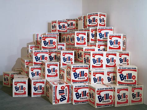
Malanga is the expert because he, along with Billy Name, did much of the fabrication of those first Stable Gallery Brillo Boxes in 1964. But everyone knows that story. What I want to know about is this "Brillo Box Symposium."

According to a footnote at warholstars.org, The International Symposium for Andy Warhol's Brillo Boxes was held "under the auspices of the Akademie der Bildenden Kunste in Nuernberg, Friday, 19 November 1999." Danto presumably discussed his 1998 paper, "The End of Art," which took Brillo Boxes as the inflection point of a 3,000-year art historical cycle or something.

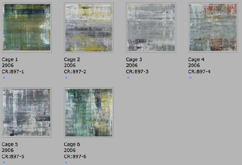
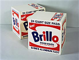
Malanga's paper titled, "How we made the Brillo Boxes," was reprinted in his 2002 book, Archiving Warhol. It provides the most familiar accounts of Malanga, Billy Name, and Warhol painting, turning, screening, and turning all seven varieties of the box sculptures in the first couple of months of 1964. [Four Stable Gallery boxes sold at Christie's in 2006 for $973,000.]

warhol_boxes_64_christies.jpg

But the 1964 Brillo Boxes aren't the only ones Warhol made. Or Bidlo. Or--well, hold on. Back to The Moment:

If your Brillo Boxes shouldn't be considered a simple substitute for the originals, what should New Yorkers be looking for?

There are so many more layers. When you start peeling back the layers you see that Warhol did all these different versions himself. There's the Stockholm version, there's the Pasadena, the original Stable gallery version. So really it's about learning about the different providences [provenances? -ed.] of the piece, the situations that they were made for.

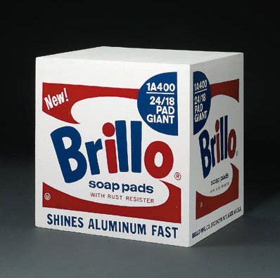
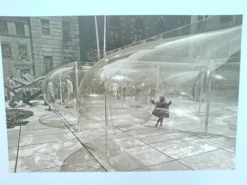
The image above is from the Tate Magazine, of 
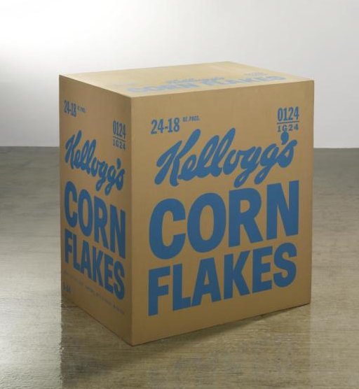
Not Warhol (Brillo Boxes, 1969), 1991, and is Bidlo's replica of the 100 boxes Warhol authorized the Pasadena Museum to fabricate in 1969-70 [LACMA was allowed to refabricate 100 Kellogg's boxes. Warhol donated both sets of boxes to the respective museums.]

And before that, there were the 100 boxes Warhol authorized Pontus Hulten and the Moderna Museet to make in Sweden for the 1968 show organized by Kasper Koenig. Or was it 500? Or was that 500 actual cardboard Brillo Boxes bought from the company and 100 wooden ones to fill in? Or 10?

Until 2007, everyone thought they kind of knew. Or they didn't think much about it. Then some Swedish investigative journalists from Expressen reported that no wooden boxes were ever exhibited in 1968, only cardboard.

And the 94 1968 "Stockholm Type" Brillo Boxes which passed the Warhol Authentication Board's test, and were accepted into the 2004 catalogue raisonne, were actually part of a batch of 105 boxes Hulten fabricated in 1990, three years after the artist's death, in Malmo, Sweden. And that Hulten represented them as 1968 works in shows in St Petersburg and Copenhagen that year. And that he sold at least 40 of them in 1994 as 1968 works. [Does that include this group of 10?] And that he gave six of them to the Moderna Museet in 1995 as 1968 works.

warhol_brillo_christies_98.jpg
Yow. "Provenance: Acquired directly from the artist by Pontus Hulten, Stockholm" - Christie's, 1998.

The Authentication Board hastily examined the Stockholm Type boxes and issued a letter to owners, saying there were two types of Stockholm Box, one of which might actually have been made in 1968 or so. Maybe there are 10 of those. But there are no documents so far authorizing either those 10, or the 105 Hulten made, only the Stable Gallery and the Pasadena boxes, that's it. So far. And yet they fully accepted the Stockholm Boxes, no sweat. At this point, the only thing the Warhol Foundation people are saying is that they had nothing to do with this mess.

But what in the world was Pontus Hulten thinking? I mean, come on, the guy's a modern art museum demigod who founded the Moderna Museet, the Pompidou, and MoCA. It's not like he really could have just thought, "What the hell, I'll order me up 100 Brillo Boxes and start showing, selling, and donating them as if they're from 1968." Could he?

Did Hulten get authorization from Warhol in 1968, then not really use it [all], and just assume it was still valid? ArtNews quotes an unidentified source as saying that Hulten fabricated his 1990 boxes at the Malmo Konsthall with the help of its director [and Hulten's friend] Björn Springfeldt. Surely he could characterize how he and Hulten talked about the motives and assumptions for the production. [Factcheck: ArtNews says Springfeldt was director of Malmo Konsthall in 1990 when these boxes were fabricated. Actually, he had quit in 1989, to become director of Moderna Museet. He succeeded Olle Granath, who had succeeded Hulten, and who had been a co-curator of the Warhol show, and who was directly involved in its installation. He also owns three Stockholm Style Brillo Boxes he says were made in 1968. If there's anyone in the Swedish museum world not directly implicated in this story, would you please raise your hand?]

How different is Hulten's situation from, say, Giuseppe Panza's later controversies over authorization and remote fabrication of work by artists like Judd, Flavin, Andre, and Nauman? Does this Brillo Boxes question dovetail with the emergence of artists' certificates and minimalist-style, no-artist's-touch production? Are there other examples lurking out there where artists phoned a piece in, then didn't actually get involved--or even see--the final product? I'm going to guess yes.

If ever there were a time for another Brillo Box Symposium, it's right now.

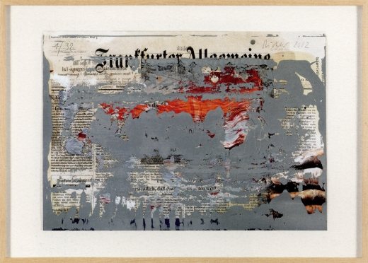
"Andy Warhol's famous Brillo Boxes," from the Frankfurter Allgemeine Zeitung, August 2007 [myandywarhol.eu]
2007 Authentication Board letter explaining the history and production of Warhol's box sculptures [zimblo.com]
Nice hustle, Art News: "The Brillo Box Scandal," Nov. 2009 [artnews.com, link updated to archive.org Sept. 2016]
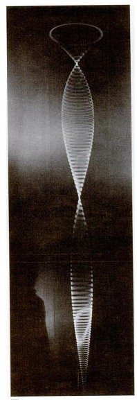
Last October, Mark Leckey presented In A Long Tail World at the ICA in London. From the writeups, it sounded like a cross between Chris Anderson, Joseph Beuys, Ted by way of the Guggenheim Las Vegas.

Leckey's now loaded the whole thing onto YouTube, in six parts. Though he's got a big, Laurie Anderson-y screensaver of an ending, my favorite segment is probably part 1, above. It includes both Leckey's re-enactment of the earliest TV broadcasting experiment [a recap of his 2007 work, Felix Gets Broadcast] and his quotes from Charles Sirato's Dimensionist Manifesto from 1936 which posited a new, dematerialized art with humans at the center.

If Leckey didn't quite make the case that the Long Tail was the fulfillment of Sirato's vision, it at least crossed its path. And it's a good watch. [via gavin brown's (!) blog]

planck_all_sky_survey1.jpg

ESA has released images of the first all-sky survey from the Planck space observatory, which is currently in orbit around Lagrange-2, a balancing point between the gravitational exertions of the moon and the earth.

Planck rotates at a constant 1 RPM, and it continually repositioned to avoid the sun, enabling it to produce a full survey of the entire sky in about a year. This computer animation video demonstrates how the survey image was constructed:

planck_survey_makingof.jpg

When Planck's data is added to the American Museum of Natural History's Digital Universe Atlas, it should help fill in that gigantic torus marked, "empty areas we have yet to map."

Planck all-sky image depicts galactic mist over the cosmic background [esa.int via javierest]
Scanning the microwave sky with Planck [esa.int]

hamamatsu_pmt_model-1.jpg
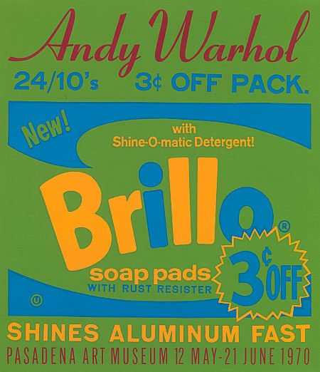
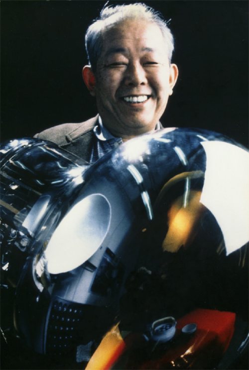
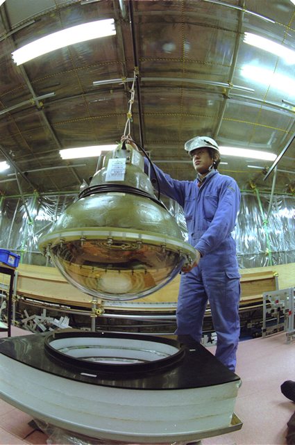
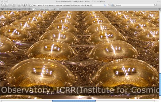
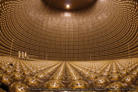
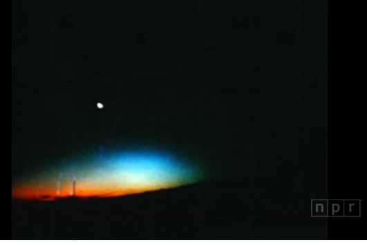
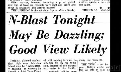
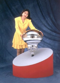
Photomultiplier Tubes, or PMT, are vacuum tubes used to detect electromagnetic energy. In 1979, Hamamatsu Photonics began development of the world's largest PMT, 25 inches across, which would be used in the Kamiokande proton decay detector being constructed by the University of Tokyo in a mine in rural Japan.

Within a year, Hamamatsu had managed to design a 20-inch (50cm) PMT, and successfully manufactured it by 1981. It was dubbed the model R1449:

Because this was a 20-inch PMT, the biggest question was whether or not its cathode could be manufactured correctly. The days leading up to the completion of the first PMT were anxious. Moreover, in steps such as antimony evaporation, there was no other recourse but to rely on the eyes and judgment of those professionals performing the tube evacuation task. An ordinary PMT can be held in the worker's hand throughout the production process, but the large 20-inch PMT first had to be secured in place. Then, the worker could perform his required tasks while walking around the outside of the PMT. The workers donned protective helmets equipped with explosion masks, mounted steps to the platform holding a large pumping bench, and began the final fabrication, which consisted of making the photocathode and sealing the PMT.

The color formed from oxygen discharge in the photocathode manufacturing process was visually attractive. When made to react with potassium after antimony evaporation, the tint immediately changed to an ideal color for a photocathode. Cheers arose from the staff gathered around the pumping bench, as it was a moment of high emotion for everyone.

Hamamatsu delivered 1,050 R1449 PMTs to Kamiokande, where they lined a giant tank of ultra-purified water 1,000 meters below the surface.

koshiba_hamamatsu_r3600-1.jpg

In 1987, the PMT array at Kamiokande detected for the first time neutrinos given off by a supernova. [It was a discovery for which Professor Masatoshi Koshiba [above], who spearheaded the Kamiokande research, was awarded the Nobel Prize in 2002. Those may be the two most awkwardly constructed sentences in this post.]

Meanwhile, an even larger detector was being planned for Kamiokande. Dubbed Super-K, the new tank, 39m high and 41m in diameter, would hold 50,000 tons of water and 11,200 PMTs. These new, improved PMTs, known as model R3600, were based on the R1449. They cover approximately 40% of the interior surface of the tank. Super-K began operations in 1996.

On November 12, 2001, as the tank was being refilled, a PMT imploded, sending a shock wave through the water, and causing a chain reaction which destroyed around 6,600 other PMTs.

hamamatsu_pmt_casing-1.jpg

The survivors were redistributed, protective acrylic shells were added, and research resumed. Beginning in 2005, newly manufactured R3600s were installed. The detector reopened in 2006 as Super-K-III.

kamiokande_icrr_detail.jpg

According to reports at the time of the implosion, an R3600 cost around $3,000 new, an extremely reasonable price for such a magnificently crafted object. I would most definitely like one. Also a convenient display stand. Also, that tank is absolutely stunning. If I were a sculptor of shiny round objects of a hundred feet or more in diameter, I would find it hard to get out of bed in the morning knowing this exists.

kamiokande_bottom_iccr_sm.jpg

20-Inch Photomultiplier Development Story [hamamatsu.com, the original Japanese version is a little more dramatic]
portrait of Prof. Koshiba hugging a Hamamatsu R3600 [u-tokyo.ac.jp]
hi-res images in the
Super-Kamiokande photo album [ICCR at U-Tokyo]
Accident grounds neutrino lab [physicsworld]

July 5, 2010

The Rainbow Bombs

starfish_prime_npr.jpg

NPR's Robert Krulwich had a fascinating story the other day that works even better online. Because there are slideshows and video footage of Starfish Prime, the hydrogen bomb the US detonated in space on July 9, 1962.

The launch occurred on Johnston Island in the South Pacific, and was part of an early test of ICBM technology--and an attempt to understand the weaponizing potential of the earth's Van Allen radiation belts. Just in case Moscow was up to anything funny.

Scott Hansen pointed to Peter Kuran's excellent-sounding documentaries about atomic testing, including Nukes in Space: The Rainbow Bombs.

dazzling_nuke_npr.jpg

Almost a thousand miles away, Hawaii had been primed for a potentially "dazzling" light show. NPR's lead-in called it "the single greatest manmade light show America has ever created."

And Starfish Prime delivered. Cecil Coale, who was involved with the launch and monitoring it from Johnston Island, described the flash that turned night to day and the ionizing rainbow that followed:
"It was like a flashbulb...then the sky turned green for a second.

then yellow and blue, "really vivid, unnatural bright color."

Then red. "it wasn't shimmering it was glowing red like a neon sign. Then it slowly disappeared, there wasn't any sound to this at all, it was entirely visual...i think about this every day of my life."

Listen to the Bomb Watchers [npr]
DOE library of historical nuclear test films of Operation Dominic, Operation Fishbowl, and Starfish Prime [doe.gov]

July 3, 2010

Blow

This FT essay by Daphne Guinness about buying Isabella Blow's estate before it was dispersed at Christie's is a wonderful, sad, incredible thing. [via @artnetdotcom]

All the way back in 2002, I overwrote a long post about Blow, Walter Benjamin, Bill Cunningham, fashion, and street photography. The occasion was Guy Trebay's writing about street fashion.

Frankly, I'm surprised at how much of it I'd forgotten. Did Benjamin really call the flaneur "a spy for the capitalists, on assignment in the realm of consumers"?? That is awesome, I could totally use that!

What I've never forgotten, though, is Cunningham's expertly serendipitous street photo of Isabella Blow blowing into a fashion show in Paris:

isabella_blow_nyt_2002.jpg

warrensburg_speyer_sunstein.jpg

In 2008, I discovered this drawing of A. James Speyer's Sunstein House, a 1940 modernist pavilion in the Adirondacks made of tree trunks and local stone, in an architecture guidebook published by The Museum of Modern Art. Even though the guidebook gave driving instructions, the lack of photographs, combined with utter online silence about the project or the client, made me wonder if the house actually ever got built at all.

Now, while searching for images of the house Gregory Ain built in MoMA's garden in 1950, I found that the Museum has since published its archive of press releases. And it seems that Speyer's Sunstein House was at least real enough to be included in a traveling exhibition the Museum organized in 1941 titled, "The Wooden House in America." [pdf] So the search is back on.

Speyer is probably best known for his work as a modern curator at the Art Institute of Chicago; Anne d'Harnoncourt cited his influence regularly and his innovations in both curation and exhibition design. But he also practiced architecture, primarily in Chicago and his hometown of Pittsburgh. His 1963 house for his mother Tillie Sunstein Speyer is his most widely praised work, but his most famous work is the Ben Rose house, from 1953, which he designed with David Haid. It was Cameron's house in Ferris Bueller's Day Off. [Which is still for sale, btw, asking $1.65m, down from last year's $2.3m.]

Anyway, Speyer got all International Style like that because he was Mies van der Rohe's first graduate student in the US, and the Sunstein House dates from the time he was studying directly with Mies. And it'd predate by a decade Mies' own first realized American buildings. So we'll keep on it, and see what's out there.

Previously: Forest for the Mies: A. James Speyer's Adirondack Mystery Cabin

banner_harrier_jaguar_3.jpg

Harrier and Jaguar, Fiona Banner's commission for Tate Britain's Duveen Galleries opened this week, and from the making of film and interview with the artist, it looks spectacular.

banner_harrier_jaguar_4.jpg

Banner has installed two decommissioned fighter jets--a BAe Sea Harrier XE695 and a SEPECAT Jaguar XZ118--in the grand neoclassical space. By altering each slightly, and by placing them in atypical, non-functional positions, the artist turned them into overwhelming, beautiful objects--sculptures--which nonetheless manage to retain all their original significance and meaning as highly advanced weapons of war.

banner_harrier_jaguar_2.jpg

The Harrier was covered with a delicately feathered matte wash and hung, nose down, just off the floor. It barely fits inside the limestone-clad hall. The SEPECAT Jaguar was stripped down to bare metal and polished to a mirror finish. It rests upside down, on its cockpit. Did I mention it looks spectacular?

banner_harrier_jaguar_1.jpg

With those reflections it generates, it's like a 3D realspace version of Google's distorted Street View portraits.

Video | Fiona Banner Harrier and Jaguar, 9'23" [tate channel]
Duveens Commission Series | Fiona Banner 2010, through 3 Jan. 2011 [tate.org.uk]

July 2, 2010

Olafur Street View

oe_innen_stadt_aussen_2.jpg

One of the simplest, best parts of Innen Stadt Außen [Inner City Out], Olafur Eliasson's multiple public and museum projects in his adopted hometown of Berlin this year, is now online as a short film.

oe_innen_stadt_aussen_1.jpg

In what feels like the diametric opposite of Google's Street View scanning, Olafur and his studio rigged a truck with a giant mirror and drove it around town. Part of me wants to not say what it is, but to let viewers figure it out. But the whole exhibition was promoted with photos of the truck. And I knew what it was, and I still was enthralled by every sequence and cut in the film.

Innen Stadt Aussen, from Studio Olafur Eliasson, 10'31" [vimeo via @grammar_police]

Souren Melikian's auction analysis for the International Herald Tribune/ New York Times is almost always entertainingly specious, but he is at his best/worst when he writes about contemporary art, about which he obviously knows nothing:

The next lot, "Cristina Passing By," was the fun figure of a girl realistically painted in tissue paper on stainless steel signed by Michelangelo Pistoletto in 1968. It also far exceeded the high estimate, if at a modest level, when it brought £313,250. Much earlier than the Cattelan, it is more original.

But originality or creativity is hardly what motivates the buyers of contemporary art in its forms now promoted in the auction arena. What triggers a response is an easy, instantly perceived image -- and the echo that it receives in the media. Like slogans in politics, the power of words repeated a hundred times generates success. Achievement has little relevance, if any at all.

Seriously, why does the Times keep publishing this untethered nonsense?

What does this even mean?? Novelty Sets Cheerful Tone for Christie's Contemporary Auction [nyt]
Previously: The Eternal Sunshine of Souren Melikian's Spotless Mind

gorky_sochi.jpg

I like writing the word camofleur.

In response to the burning question [sic] that arose from Ad Reinhardt's chronology, what was up with Arshile Gorky wanting to start a camouflage school in 1943?

Because everyone knows that Gorky was already teaching camouflage in 1942. He'd spent at least a year, and possibly longer, trying to get a camouflage class started, partly because he and other artists saw it as an alternative for getting called up in the draft. "Can't fight, too busy camouflaging!"

This need intensified after Pearl Harbor, and even after Gorky was rejected by the draft board for being too old. But that was also because Gorky needed money, and a class of 20 students paying $15/each a month sounded very appealing.

[Hayden Herrera has a chapter called "Camouflage" in her 2005 biography, Arshile Gorky: Life and Work. Most of this info comes from there.]

In his prospectus, Gorky wrote, "What the enemy would destroy, however, he must first see. To confuse and paralyze this vision is the role of camouflage. Here the artist, and more particularly the modern artist, can fulfill a vital function, for opposed to this vision of destruction is a vision of creation...

"Mr. Gorky plans a studio workshop in which each student becomes a discoverer..." The coursework would include modern theory, scale modeling, and "abstract constructions."

One of Gorky's particular concerns was how colorblindness might thwart camouflage. He also, we read, had "a plan to camouflage the whole of New York City," which he felt should be promoted heavily by the New York Times.

According to one of his most satisfied pupils, the then-future art dealer Betty Parsons, the class ran for from three to six months, and was highly popular. Of course, according to Harry Rand's book, Gorky's camo course "fared poorly." If the goal was to provide a steady source of income, I guess these can both be true.

And that might explain Gorky seeking help from Reinhardt to revive or rework the camo school idea in 1943. In any case, Gorky's eventual dealer, Julian Levy, said that camouflage was the key to the artist's character, whatever that means.

Previously: Civilian Camouflage Council
image: Garden in Sochi, 1943, Arshile Gorky, via Tate, and Telegraph UK

300x404_not_square.jpg

Thanks to greg.org reader Fred for sending along a link to a memo computer graphics pioneer Alvy Ray Smith wrote in 1995, soon after his company Altamira [the one he founded after Lucasfilm and Pixar] had been assimilated by Microsoft.

The Title: "A Pixel Is Not A Little Square, A Pixel Is Not A Little Square, A Pixel Is Not A Little Square!" [pdf via alvyray.com, a year later, he added, "(And A Voxel Is Not A Little Cube)"] Two guesses what it's about.

Alvy's rant sounds exactly like what I'd expect from circa 1995 Microsoft: brilliant, self-assured, and presumptuously prescriptive. Which is not, alas, the same thing as being entirely right or even aware of its own limitations.

Because it gets a little rambling, and because I am basically arguing pixels with the guy who worked on the Project Genesis sequence in Wrath of Khan, I have moved it all after the jump.

Since 2001 here at greg.org, I've been blogging about the creative process—my own and those of people who interest me. That mostly involves filmmaking, art, writing, research, and the making thereof.

Many thanks to the Creative Capital | Warhol Foundation Arts Writers Program for supporting greg.org that time.

comments? questions? tips? pitches? email
greg [at] greg [dot ] org

find me on twitter: @gregorg

about this archive

Posts from July 2010, in reverse chronological order

Older: June 2010

Newer August 2010

recent projects, &c.


our_guernica_cycle_ivanka_320px_thumb.jpg
Our Guernica Cycle, 2017 –
about/kickstarter | exhibit, 2017


pm_social_medium_recent_proj_160x124.jpg
Social Medium:
artists writing, 2000-2015
Paper Monument, Oct. 2016
ed. by Jennifer Liese
buy, $28

madf_twitter_avatar.jpg
Madoff Provenance Project in
'Tell Me What I Mean' at
To__Bridges__, The Bronx
11 Sept - Oct 23 2016
show | beginnings

chop_shop_at_springbreak
Chop Shop
at SPRING/BREAK Art Show
curated by Magda Sawon
1-7 March 2016

do_not_bid_or_buy_iris_sidebar.jpg
eBay Test Listings
Armory – ABMB 2015
about | proposte monocrome, rose

shanzhai_gursky_mb_thumb.jpg
It Narratives, incl.
Shanzhai Gursky & Destroyed Richter
Franklin Street Works, Stamford
Sept 5 - Nov 9, 2014
about | link

therealhennessy_tweet_sidebar.jpg
TheRealHennessy Tweets Paintings, 2014 -
about

sop_red_gregorg.jpg
Standard Operating Procedure
about | buy now, 284pp, $15.99

CZRPYR2: The Illustrated Appendix
Canal Zone Richard Prince
YES RASTA 2:The Appeals Court
Decision, plus the Court's
Complete Illustrated Appendix (2013)
about | buy now, 142pp, $12.99

weeksville_echo_sidebar.jpg
"Exhibition Space" @ apexart, NYC
Mar 20 - May 8, 2013
about, brochure | installation shots


HELP/LESS Curated by Chris Habib
Printed Matter, NYC
Summer 2012
panel &c.


drp_04_gregorg_sidebar.jpg
Destroyed Richter Paintings, 2012-
background | making of
"Richteriana," Postmasters Gallery, NYC

czrpyr_blogads.jpg
Canal Zone Richard
Prince YES RASTA:
Selected Court Documents
from Cariou v. Prince (2011)
about | buy now, 376pp, $17.99

archives