April 2012 Archives

smith_maze_aspen_ubu.jpg

For issue 5+6 of Aspen: The Magazine in a Box (1967), guest editor/curator Brian O'Doherty conceived of a conceptual art exhibition in a box. [Which really should be staged in real space somewhere. Has it ever been?]

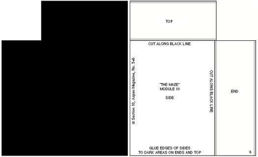
One of the first things you notice when you open the box is the little stack of cut and scored black matteboard, which is a make-it-yourself scale model of Tony Smith's The Maze (1957 1967).1 When assembled, if any ever were, the pieces formed four monolith-like blocks, which were to be placed in an open rectangle:

smith_ubu_mazeGrid2.gif

As is clear from the drawings, "The Maze" was originally designed for a particular space. Thus the pathways around the pieces as well as through it are an integral part of the design. For this reason it is a labyrinth rather than a monument.

I did not think of the symmetry of the piece as I was doing it, but I happened to notice when making the drawing that the central part is a five-foot square; the part including all the passages is a ten-foot square; then if you take the extension along the room, it is a fifteen-foot square. So it is a lot of expanding squares.

On the other hand if you take different divisions, for instance if you take all these squares and carry them through, they make a grid which interpenetrates-- the two sets of grids interpenetrate one another. In a certain sense it is a labyrinth of the mind. You can see that it becomes quite complex, but at the same time everything falls in very, very simply.

--Tony Smith

The Maze was designed for the exhibition Schemata 7, at Finch College Museum, May 1957 1967. The above statement has been adapted from the catalogue.

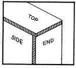
The actual dimensions of the modules were 6'8" by 10' by 30" (two modules) and 6'8"by 5'by 30" (two modules). The models have been scaled down to fit in this box. The models may be set up standing free on neutral ground. They should be set up in accordance with the plan indicated in the drawing. Those who wish to reproduce the work in its original dimensions (in metal or wood) may do so.

The individual pieces may be cut from the enclosed cardboards by a matte-knife (e.g. the General 850 available at any art supply store) guided by a metal ruler.

The parts should be attached as indicated i.e. the appropriate edges should be opposed to the grey areas. (Elmer's Glue All may be used). "White" edges should be darkened with ink or water color.

The drawing below may serve as a guide.
smith_ubu_maze_guide.gif

It's been more than 14 years since I discovered Aspen; 5+6 was the first, and for a long time the only, issue I could find. And it's almost ten years since I found the entire run of Aspen reproduced on Ubu.com, a move which brought Aspen out of unciteable obscurity. And now it's more than two years since I cooked up auraprogettazione, a comprehensive [sic] exhibition of the rare examples of instruction-based art work that the artist actually gave permission to make. And yet I only just now noticed that Smith authorized reproduction of The Maze. Has anyone ever done so? Before me, I mean, because I just added it to the list.

1: UPDATE So yeah, I thought 1957 was an extraordinarily early year for Smith to have exhibited an installation of four matte black minimalist sculptures, and at Finch College or anywhere. So Ubu's text is incorrect, and Smith's Maze was shown in Schemata 7 at Finch in May 1967, right around the time Aspen was published.

ANOTHER UPDATE Grace Glueck's May 14, 1967 review of the opening of Schemata 7 says the show's working title was "Walk-In Sculpture," and gave each of seven artists a chance to show their attitude "to scale and enspheric space." Of The Maze, Glueck wrote:

The room is kept in a subdued light and, though the scheme is simple, a walk among these gloomy, primeval presences evokes the feeling of an endless forest.
Sounds like a wildly different experience from the toy-sized cardboard model.

In addition to Smith, Schemata 7 featured work by Les Levine, Ursula Meyer, Brian O'Doherty, Will Insley, Michael Kirby and Charles Ross. So far, I can't find any installation shots of the original Finch version, but I'm on it.

UPDATE 3 And here's John Perreault's review of Schemata 7 for the Village Voice. He puts it in the context of pioneering minimalism shows like Primary Structures, which had just happened a few months earlier in 1966. Still no pics, though.

And speaking of big universes and small worlds, I'm starting to listen to the 1991 recordings of John Cage's Diary: How To Improve The World (You Will Only Make Matters Worse), and just ten minutes in, I'm reminded that Cage's childhood friendship with the unorthodox-but-nearly-canonical Mormon scholar Hugh Nibley is the most unlikely Mormon/modern music connection since La Monte Young [grandson of Brigham].

Without intending to, I'm going from lake to lake
Salt air
Salt Lake
Hugh Nibley
I hadn't seen him since high school days
I asked him what he thought about other planets
and sentient populations.
"Yes," he said, "throughout the universe.
It's Mormon doctrine."
We'd said goodbye.
I opened the door of the car,
picked up my attache case,
and everything in it fell out on the grass
and the gutter.
His comment:
"Something memorable always happens."
Which, hmm, if it only served to get me into a transcribing-and-posting mind for the next excerpt Cage read, then it's worth it:
Things we were going to do
are now being done by others.
They were, it seems, not in our minds to do.
Were we or they out of our minds?
But simply ready to enter any open mind
any mind disturbed enough not to have an idea in it.

April 29, 2012

Big Universe, Big Data

Ross Andersen has a fascinating interview with JWST scientist Alberto Conti about the orders of magnitude increases in the amount of astronomical data being gathered these days:

There are two issues driving the current data challenges facing astronomy. First, we are in a vastly different data regime in astronomy than we were even ten or fifteen years ago. Over the past 25 to 30 years, we have been able to build telescopes that are 30 times larger than what we used to be able to build, and at the same time our detectors are 3,000 times more powerful in terms of pixels. The explosion in sensitivity you see in these detectors is a product of Moore's Law---they can collect up to a hundred times more data than was possible even just a few years ago. This exponential increase means that the collective data of astronomy doubles every year or so, and that can be very tough to capture and analyze.
How Big Data Is Changing Astronomy (Again) [theatlantic]
Related: posts on the Palomar Observatory Sky Survey, an early decades-long attempt to photograph the universe.

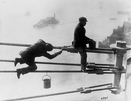
ZOMG, I will never complain about the minor annoyances of painting ever again.

1915_painters_nycmuni.jpg
Brooklyn Bridge painters at work high above the city, on December 3, 1915.

via Alan Taylor's archive-diving into the newly released digitized treasures of New York City's Municipal Archives.

April 27, 2012

Canal Zone: Yes Kate Moss

prince_unt_portr_kmoss.jpg

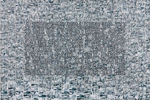
Can you tell I'm trying to clear out the to-post photos from my desktop? In Februarry Christie's sold an interesting, large Richard Prince Joke painting in London that was made in 2007. The date is significant for reasons that the lengthy catalogue description studiously avoids.

on closer inspection, beneath the dripping paint which adds such texture to the surface of Untitled (Portrait), it becomes clear that the entire background is comprised of images of the supermodel Kate Moss either topless or wearing a bikini top. Untitled (Portrait), then, is a contemporary palimpsest, a conceptual layer cake of imagery which allows Prince to juxtapose a range of seemingly discordant materials in order to play a complex game with the recognisability of celebrities from the art world and indeed the world in general: Pollock, Moss, and of course Prince himself.
The auction house namechecks Pollock, and goes on about Prince's de Kooning paintings, which he'd just completed in 2007. But the action paint-on-tearsheet collage Kate Moss painting is very similar in medium and process to the first work Prince made from Patrick Cariou's Yes Rasta photos.

rp_canalzone07_edenroc.jpg
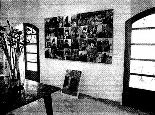
Canal Zone, 2007, Installation shot at Eden Roc Hotel, St Barth's, late 2007

The piece, actually titled Canal Zone (2007), consisted of a loose grid of 34 or so overpainted pages torn from Prince's copy of Yes Rasta, mounted on a board, and exhibited in a small show at the Eden Roc Hotel in St. Barth's over the Christmas/New Year holiday in 2007. Prince had purchased Cariou's book at a local shop, and then began writing, sketching, and painting in it over the course of his annual visits to St. Barth.

The Kate Moss painting seems to have been made in a nearly identical way, from similar source material--reproductions of highly aestheticized, black & white photography--at about the same time. It's not a stretch to imagine Cariou's photos taken--or at least simulated--by Steven Klein, just more of the same genre Prince is already working with.

April 27, 2012

The Chickpea Conspiracy

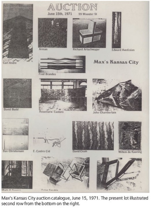
During the 1960s, Mickey Ruskin regularly let artists eat and drink for free or trade art for sustenance at Max's Kansas City. So when Ruskin ran into financial trouble, artists rallied and held a benefit auction for the bar, on June 15, 1971. Celebrated customers such as John Chamberlain, Roy Lichtenstein, and Willem de Kooning eventually became part owners of the joint, a relationship which has become known as the Chickpea Conspiracy.

Last month, the thick, painty work on paper de Kooning donated was sold by its purchaser's estate at Christie's. It's a bit of a mess, at least to my eye, perhaps not a drawing that de Kooning would miss as much as the Erased one. And it only made $338k against a $400-600k estimate, so I guess I'm not alone.

But anyway, point is, here is a section of the auction catalogue:maxs_kc_auction71.jpg

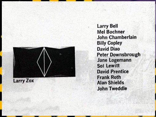
I though that was all, but the Max's Kansas City website has additional catalogue images, and a barely overlapping artist list. Hey, look, there's David Diao, who is the grownup in the Richteriana show:

chickpea_maxs_diao.jpg

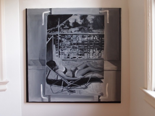
gregorg_drp-04_bikini.jpg
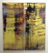
Destroyed Richter Painting No. 04, 2012, oil on canvas, 110x110cm

Postmasters is pleased to announce:

RICHTERIANA
GREG ALLEN, DAVID DIAO, RORY DONALDSON,
HASAN ELAHI, FABIAN MARCACCIO, RAFAËL ROZENDAAL

May 12 - June 16, 2012
opening reception, saturday, may 12, 6-8

Postmasters' new exhibition Richteriana attempts to examine the current canonization of Gerhard Richter, presenting six artists whose works pre-date, update, expand, and subvert "the greatest living artist's" own.

...[snip much amazing thinking and description of great artists and their work]...

Greg Allen's Destroyed Richter Paintings channel the elder artist's own private documentary images back into the photo- based painting feedback loop he once deemed "photography by other means." They reproduce the experience of encountering Richter's lost originals, while becoming new objects themselves. By engaging the sprawling Chinese photo-painting industry that has grown up in Richter's wake, Allen forefronts the market's incredulous perception of the artist's autonomy--and his right to declare or destroy his own work.

More to come, obviously.

Previously, related:
a destroyed Richter/Palermo collaboration
"I am practising photography by other means."
On repainting Gerhard Richter
Overpainted vs Destroyed Gerhard Richter

April 20, 2012

Fingerspuren

fingerspuren_richter_palermo_8364.jpg
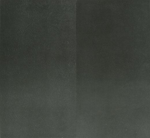
Fingerspuren/Finger Marks, with Palermo, 1970, image via gerhard-richter.com

Despite an 11-year difference in their age, Gerhard Richter and Blinky Palermo became fast friends in the early 1960s. Richter's first wife Ema sewed Palermo's groundbreaking Stoffbilder/Cloth Pictures starting in 1966, and Palermo influenced Richter's move towards readymade abstraction with the Color Chart paintings.

In 1970, while Palermo was studiosurfing among his Dusseldorf friends, he painted the first stencil/multiple version of his blue triangle over Richter's door. And then the two artists collaborated for the first time, on a painting.

Or rather, two paintings: Fingerspuren (Fingermarks) was a grey monochrome diptych, painted by hand, one side by each artist, that formed a 2-meter square whole. Palermo's canvas is the much busier one on the left.

In Dia's 2009 book on Palermo's masterpiece, To the People of New York City, Christine Mehring wrote about Fingerspuren:

It is tempting to see this as a manifestation of what many believe are differences in the artists' temperaments: Richter's more calculated, meticulous manner of painting versus Palermo's more process-oriented practice...It seems more likely that Palermo's disarrayed, isolated marks are gestures of self-assertion. After all, the gray monochrome was the domain of Palermo's friend, who furthermore relayed that the diptych originated from his own working on a gray monochrome and asking Palermo to "join in, and make one too." Fingerspuren remained a merely semi-collaborative beginning to Palermo and Richter's collaborative period.
This collaborative period was at its peak in 1971, when the duo's painted wall and sculpture installation was shown at Heiner Friedrich's gallery in Cologne, and when Fingerspuren was included in Richter's first major retrospective at the Kunstverein in Dusseldorf.

I haven't been able to find any info on the when or the how of Fingerspuren's subsequent destruction, but maybe its merely "semi-collaborative" nature accounts for some of the why.

Reuters' Jorge Duenes' cropped aerial shot of a 300-acre marijuana plantation "discovered" in Mexico last July that The Atlantic's InFocus photoblog ran today was dramatic and awesome enough to make me want to see the full thing.

Here it is:
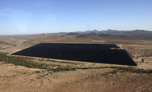
pot01_duenes_reuters.jpg

Stunning, right? Ellsworth Kelly himself couldn't have done better. But the full caption bears analyzing a little more closely:

An aerial view shows parts of the biggest marijuana plantation ever found in Mexico, in San Quintin, about 350 km (220 mi) away from Tijuana, on July 13, 2011. Mexican soldiers discovered the plantation in a remote desert, a top army officer said on Thursday. Soldiers patrolling the area found 300 acres (120 hectares) of pot plants being tended by dozens of men.
Because I have a hard time seeing how parts of it can be simultaneously true. For the plantation to be in the "remote desert" and in "San Quintin," for example. Or for it to be in "San Quintin" and "discovered."

350km from Tijuana does sound remote. But San Quintin turns out to be on the northern part of the Baja Peninsula, the part where the highway runs between the mountains and the sea. On Google Maps, it's clear the landscape is characterized by agriculture--and airstrips. To still be in San Quintin, the terrain in Duenes' photos almost certainly has to be just off the main highway, and one of the largest crops of any kind in town. Saying it was discovered, then, implies that its existence was not known beforehand, which, holding other factors constant, seems impossible.

Still, the important thing is, it does look awesome.

Its manifestations have been around and obvious for a while, but I can't quite tell if shanzhai is played out, over, or still a thing. Shanzhai translates as "mountain fortress" when people want to emphasize its unregulated, somewhat pirate nature, but also "cottage," when they want to highlight its backwoods, make-do lack of refinement.

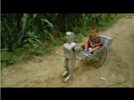
xiao-wu_robot_rickshaw.jpg

In 2007, Wu Yulu was making awesome homemade robots.

The Wall Street Journal hung its 2009 Shanzhai story on a wedding planner's homebrewed, online-only sendup of CCTV's Chinese New Year broadcast extravaganza, but in the context of a larger shanzhai trend that celebrated hacking, ingenuity, parody, and knockoffery:

On China's Internet, blogs, bulletin boards and news sites carry photos of automobiles jerry-rigged to run on railroad tracks ("shanzhai trains"), fluffy dogs trimmed and dyed to look like the national mascot ("shanzhai pandas") and models of the Beijing Olympic Games' National Stadium made out of sticks ("shanzhai Bird's Nest").

A property developer in Nanjing, hoping to lure business and buzz, set up storefront facades with logos such as "Haagon-Bozs," "Pizza Huh," "Bucksstar Coffee," "KFG" and "McDnoald's." Images of what became known as "Shanzhai Street" spread rapidly online.

The blog chinasmack has been my primary source for shanzhai, both for classic examples of pirated brands and electronics [including shots from that Shanzhai Street], but also for just flatout awesome DIYness like this 2009 video of "Shanzhai Drifter," a kid who's making smoke in his tricked out Changan delivery truck. Good times.

In 2010, at what might be the first simultaneous zenith and nadir of the contemporary art world's engagement with shanzhai, Cai Guo-Qiang curated "Peasant da Vincis," the inaugural show at the Rockbund Art Museum in Shanghai. The relentlessly corporate slickness of the monumental Shanghai World Expo was certainly ripe for questioning and deflation, if not direct criticism.

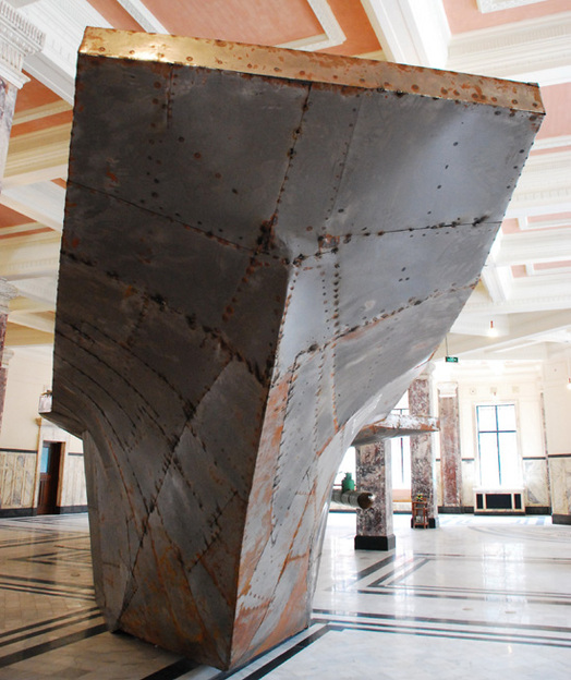
On the one hand, there were homemade planes and such. And Tao Xiangli did construct this insanely awesome scrap metal aircraft carrier, with shades of a folk art Serra or Burden. [image via the always comprehensive designboom]

tao_xiangli_designboom.jpg

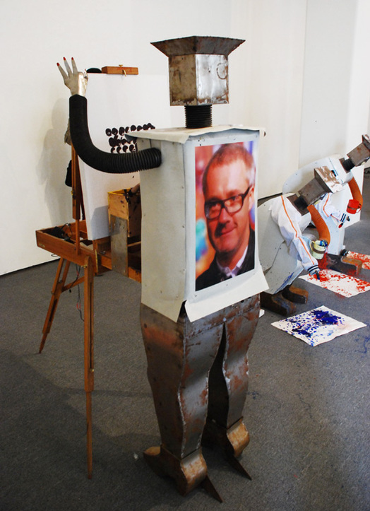
And sure, it's good that Cai turned over an entire floor to Wu Yulu's Robot Factory. But then Cai also commissioned Wu to make robot re-enactors of modern and contemporary artists at work. Like Yves Klein's Living Brush?

And Jackson Pollock, and seriously, Damien Hirst? Doesn't having to put a headshot of the artist your robot is mimicking automatically count as a fail?

cai_wu_hirst_designboom.jpg

Designboom says the artworks these robots created were sold as limited editions. Which only exacerbates the apparently complete absence of Jean Tinguely from Cai & Wu's Peasant da Vinci colabo. No excuse. [Wu Yulu's status as the Peasant King of Export Shanzhai was cemented by his 2011 profile in Colors Magazine.]

Anyway, I grew concerned because in yesterday's chinasmack roundup/translation of Hierarchies of Snobbery and Contempt by Chinese Netizens, the shanzhai option is consistently last in every category. Which, in one sense, sure, but in another, isn't that the entire point?

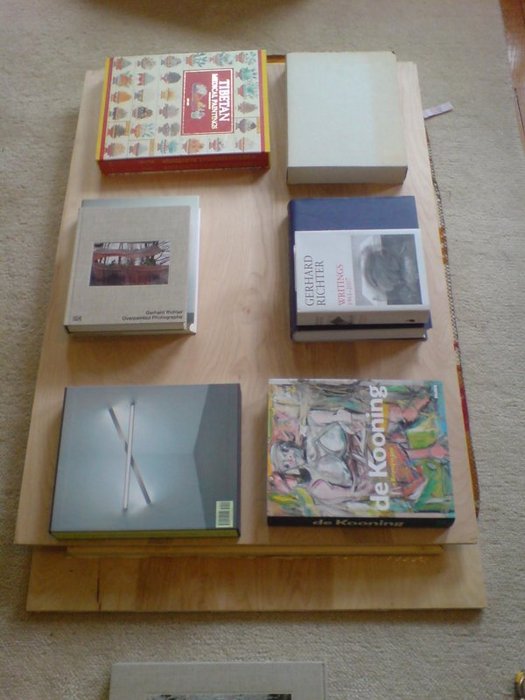
weight_of_art_history.jpg
top right is Bonnefoy's beautiful but otherwise ridiculous Giacometti, and center left is Gober's Sculptures and Installations, which turned out to be lighter than it looked.

So yeah, hmm, I probably should have glued up the braces on the back of this panel before gessoing it. Well, they're on there now!

And since they're set in a bit, my clamps won't work, and they might mar the surface anyway, so blanket on carpet to cushion the facture, board on glue, the weight of Art History on the board. And I still end up standing on it.

I have to remind myself this is still way more information than I ever got in advance about a painting.

Previous fun with art books: 2002: Rem Koolhaas book under a Wade Guyton table sculpture

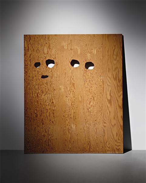
cady_noland_enquirer_pdp.jpg

I love this 1991 Cady Noland plywood edition, Enquirer Page with Eyes Cut Out Template, even more than the silk screened aluminum Enquirer Page with Eyes Cut Out itself [which is in SFMOMA's collection, along with Template I].

Lot 140: CADY NOLAND, Enquirer Page with Eyes Cut Out Template, 1991, ed. 5/5, est. $180-250,000 [phillipsdepury.com]

April 15, 2012

Our Man In Venice

I've liked this explanation Gerhard Richter gave in 1972 to Rolf Schön about the relationship in his work between photography and painting for a long time, but it's been particularly awesome lately:

RS: How do you stand in relation to illusion? Is imitating photographs a distancing device, or does it create the appearance of reality?

Illusion in the trompe-l'oeil sense is not one of my techniques, and the effect isn't illusionistic. I'm not trying to imitate a photograph; I'm trying to make one. And if I disregard the assumption that a photograph is a piece of paper exposed to light, then I am practising photography by other means: I'm not producing paintings that remind you of a photograph but producing photographs. And, seen in this way, those of my paintings that have no photographic source (the abstracts, etc.) are also photographs.

How objective, in the documentary sense, is your photographic painting?

It isn't. First of all, only photographs can be objective, because they relate to an object without themselves being objects. [hmm, well. -ed.] However, I can also see them as objects and even make them into objects--by painting them, for instance. From that point onwards they cannot be, and art not meant to be, objective any more--nor are they meant to document anything whatever, whether reality or a view of reality. They are the reality, the view, the object. They can only be documented.

Richter's interview with Schoen was first published under the headline, "Unser Mann in Venedig [Our Man In Venice]," in Deutsche Zeitung, on April 14, 1972, exactly 40 years ago. It was included that summer in the catalogues for both the German Pavilion and the Venice Biennale.

It's also included in both The Daily Practice of Painting and the reboot edition, Gerhard Richter: Writings 1961 - 2007 [pp. 59-60].

April 15, 2012

Weiwei's Red Lantern

An interesting detail from The Economist's report on Ai Weiwei's house arrest, and the irony of the police order to stop broadcasting his own webcams:

And he knows of at least 15 police surveillance cameras mounted within 100 metres of his home. Spotting them is easy, as the police have helpfully chosen to decorate each camera with a bright red lantern.
Which can be seen in David Gray's photo for Reuters, as published on msnbc's China blog, Behind The Wall:

120404_china_security_cam.380.jpg

One thing, though: this tweet from March 27 seems to indicate that Ai hung the 15 lanterns himself, not that the police did.

In January, when Ai was taken in for questioning and accused of "damaging" the CCTVs trained on his studio, he said that "he had once hung a red lantern under one of the cameras 'to make them look nicer'."

And in December, BusinessWeek reported that only a single CCTV camera, the one in front of Ai's door, had a red lantern on it, "marking National Day of the People's Republic of China." Which would be October 1st.

So did the police let Ai put up 14 more lanterns? Or did they replace Ai's lanterns with their own? Do we call these lanterns knockoffs?

House Arrest in China: Orwell, Kafka and Ai Weiwei [economist via new-aesthetic]

April 15, 2012

Opening: 'Canceled'

As in "Canceled" is opening, not "Opening is canceled."

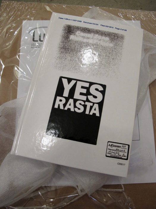
Thumbnail image for mondo_yes_rasta2.jpg

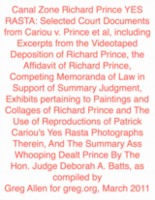
I'm very stoked to announce that Canal Zone Richard Prince Yes Rasta: Selected Court Documents from Cariou v. Prince et al... will be included in an exhibition at The Center For Book Arts.

"Canceled: Alternative Manifestations and Productive Failures," curated by Lauren van Haaften-Schick, opens April 18th and runs through June:

This exhibition presents cancelled or otherwise prohibited exhibitions that now exist as publications or in other formats. These publications document the process and politics of cancellation, exist as an alternative manifestation of the exhibit, act as a critique of the forces that called for its cancellation, or they may be an admission and exposition of an ultimately productive failure. In the context of the Center for Book Arts, Canceled highlights the book form as a crucial means of disseminating documentation and information on a wide and accessible scale, potentially in ways that are more historically stable, and more effective, than the original exhibition would have been. Through utilizing printed matter, these artists and curators have found alternative routes by which the politics surrounding the presentation and creation of art become at least as relevant as the work itself.

...

Publications, Works, and Documentation: Bas Jan Ader, Greg Allen, Jo Baer, Wallace Berman, Christoph Büchel v. Mass MoCA, Patrick Cariou v. Richard Prince, Dexter Sinister, Exit Art, Brendan Fowler, Guerrilla Girls, Hans Haacke, David Horvitz, Douglas Huebler, Wu Hung, Jill Magid, Rhoda Rosen, Seth Siegelaub, Temporary Services, Lawrence Weiner, Werkplaats Typografie, Anton Vidokle, Marion van Wijk and Koos Dalstra, Amy Wilson, David Wojnarowicz, and others.

After seeing Patrick from Mondo Blogo's photo above, Lauren asked for the original hardcover edition, which, right? I love that cover, with the legal exhibit reproducing the covers of both Prince's and Cariou's books. I mean, that's where my title came from. Maybe I'll have to bring that back on a revised edition.

Canceled: Alternative Manifestations and Productive Failures (April 18, 2012 - June 30, 2012) [centerforbookarts.org]

April 14, 2012

I Gesso

zerstoert_01_gesso20120414.jpg

Oh, I SEE.

Well this is a rather fascinating piece of information. Looks like I'll have to buy that awesome, 200-lb Carleton Watkins mammoth plates catalogue after all. [whoa, Tyler got blurbed!]

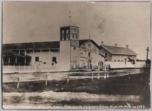
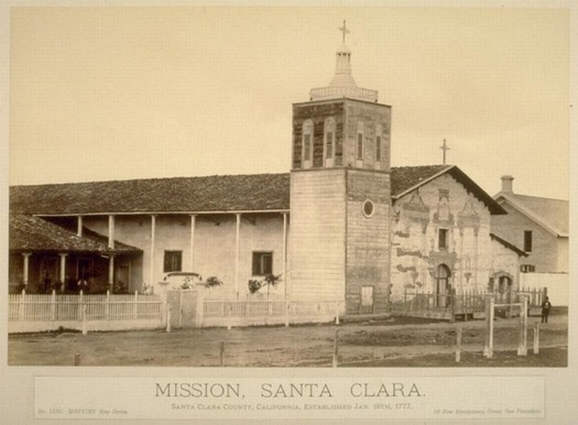
watkins_stclara_dag.jpg
Carleton Watkins daguerrotype, c.1855-8, image: Santa Clara Univ. Archives via Calisphere

In his historically grounded retort to the very idea of taking umbrage at William Eggleston making newer, bigger, shinier editions of his old images, Tyler Green looks at how pioneering photographer Carleton Watkins did it:

The photograph at the top of this post is in the Santa Clara University Archives. It shows Mission Santa Clara de Asis in Santa Clara County. The picture is a daguerreotype that the university believes that Watkins took around 1855-57, maybe as late as 1858.

The picture to the right of this paragraph [below -ed.] is a 1878-83 Watkins mammoth print -- not of Mission Santa Clara, but of the daguerreotype at the top of this post.

watkins_stclara_ucb_mammoth.jpg
Carleton Watkins, mammoth print, c. 1878-83, image: UC Berkeley's Bancroft Library via Calisphere

In other words, Watkins was rephotographing prints a hundred years before Prince. Tyler has another example of Watkins rephotography, which may even be of someone else's photo: an appropriation.

If they were doing it all in the 19th century, can we still call it contemporary art?

Putting Sobel v Eggleston suit in 19th century context [modernartnotes]

gmap_kelly_artic_02.jpg

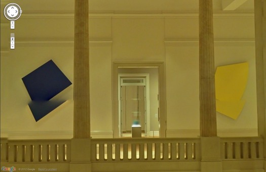
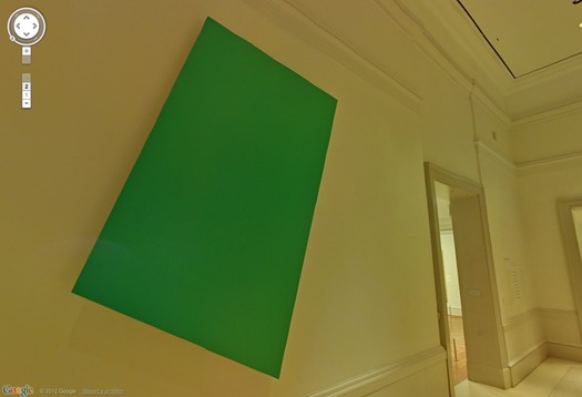
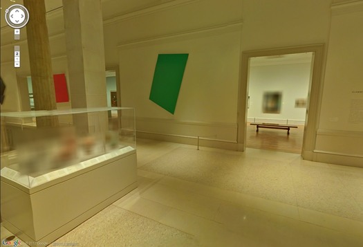
MoMA's not the only museum on Google Art Project to show works by artists living--or recently dead. The Art Institute of Chicago's stunning Sculpture Court is right there, too, with nothing less than Ellsworth Kelly's Chicago Panels, six monumental, shaped aluminum paintings from 1989-99. And they look fantastic.

gmap_kelly_artic_01.jpg

Their geometric precision makes Kellys almost ideally suited for marking Google's pano distortions. I love this double Kelly. How would that even exist as an object? Maybe we should get Bob Irwin on the horn.

gmap_kelly_artic_06.jpg

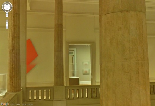
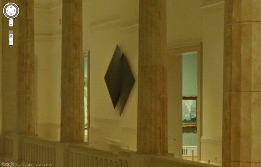
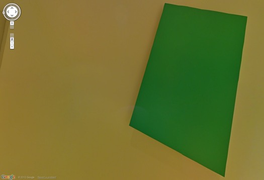
Even when they're not unevenly stitched, a Kelly in a Google Museum View pano is still distorted. Just tilting around inside a single pano sphere, you can watch the painting's dimensions pulsate and shift.

gmap_kelly_artic_green2.jpg

On Google, the kind of perceptual, perspectival changes a shaped Kelly goes through as you move around/along/towards/away from it now happen while you're standing still [sic], or whatever the term is for not warping to the next spot. This is what our art looks like on Google.

gmap_kelly_artic_green1.jpg

And this is what our culture looks like on maximalist copyright. Any questions?

gmap_kelly_artic_05.jpg
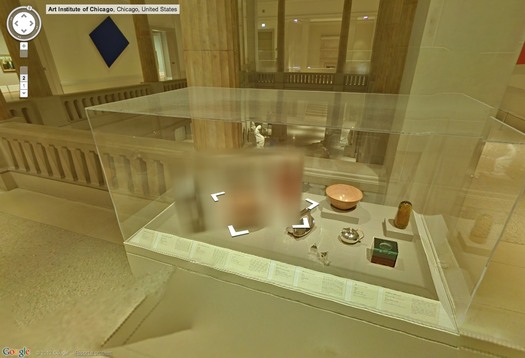
Just in these tchotchke-filled vitrines alone, the Art Institute may actually have more blurred out objects and paintings on Museum View than MoMA. Here's what we cannot see: products, design, ashtrays and pots.

gmap_kelly_artic_04.jpg

For these vitrines, I have to wonder if they just decided that clearing all these doodads from 20+ designers and their estates/mfrs was too much administrative work.

gmap_gok_artic_03.jpg

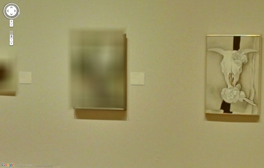
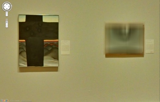
The spotty blurring in the Georgia O'Keeffe exhibit, though, indicates that something else was clearly afoot. It looks like the museum has repro rights for some works, perhaps those in their own collection, but not for others. Or maybe the Estate didn't give permission for some subset? Loaned works?

gmap_gok_artic_02.jpg

Including this probable landscape, which, hey, goodlookin', I'll be back to paint you up later. [update: it's Abiquiu Sand Hills and Mesa, 1945. Interestingly, it's from a 2002 gift--many of the AIC's O'Keeffe's came from the artist herself or Stieglitz--and it's one of two listed online as being "© Georgia O'Keeffe Museum." With no image, even a thumbnail, on the Museum's website. I think we have our explanation.]

gmap_gok_artic_01.jpg

Here is a 94-year-old Paul Manship sculpture [and pedestal], now, thanks to Google and the Manship Estate, remade very much for our time.

gmap_manship_artic.jpg

Now you know I love the blur, but even so, this shot actually kind of bummed me out. O'Keeffe hung on until 1986, but every other artist in Gallery 271, the Early 20th Century American gallery, has been dead for more than 40 years. I guess we should be glad Kelly was still alive to give his permission, because it looks like the estates put that kind of thing on lockdown. Or on the meter. [Not you, grandfils de Lachaise!]

gmap_lachaise_artic.jpg

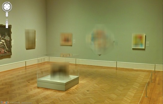
Here's an awesome but depressing view from Postwar, Gallery 262. I can't figure out the far left, but there's Jacob Lawrence, Ilya Bolokowsky, and Beauford Delaney on the wall there.

gmap_noguchi_artic.jpg

The unblurred Lawrence is nicely reflected in the plexi on the--seriously--blurred out Herman Miller table by Isamu Noguchi.

Previously: Blurring of Google Art Project comes as no surprise
Google Art Project v1.0: Les Blurmoiselles d'Avignon [Feb 2011]
Blurmany and the Pixelated Sublime [Nov 2010]

April 10, 2012

The 'Latest In Murals'

murals_equip_46_1.jpg

I hate when I lose the context of something, it's like I"m no better than a tumblr around here, minus even the traffic.

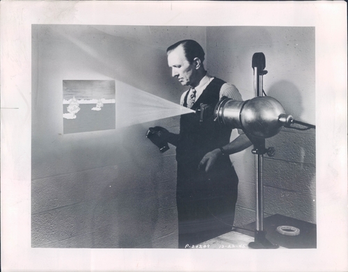
Anyway, this image of The Latest Photo Mural Equipment is from somewhere and some time in the past. The image of the back of this photo had a caption scrawled on it, "Photography Equipment
An emulsion, melted,
brushed on wall,
latest in murals."

Also a note that it was to run across two columns. So it is from a magazine. In any case, the idea seems to have been to paint the emulsion, then project an enlargement of a negative on it, exposing and developing it right on a wall surface. Which seems amazing, and also right tight with my theory [sic] about a connection between photomurals and large-scale, postwar painting.

Oh, there's a datestamp: Jan. 29, 1946.

northkorea_bigboard.jpg

The Japanese blog Itai [Painful] News has a nice photo roundup showing how North Korea's missile rocket control room compares to those of other spacefaring countries. I think it's safe to say that Japan is cowering in fear at North Korea's state-of-the-art powerstrip technology.

痛いニュース | 北朝鮮、発射施設公開 コントロールルームがひどすぎると話題に/ On The Subject of North Korea's Ridiculous Launch Control Room [dqnplus via @camcavers]

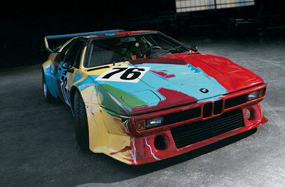
At first I was thinking this is odd seeing Warhol himself going at something with a big ol' brush. But then I figured the bloctchy paint scheme for the 1979 BMW M1 was similar to the underpaintings on his portraits, and to the Shadows paintings from the same time, so maybe it wasn't that unusual after all. At least for him.

Though it was for BMW. Warhol was the first artist to paint directly on his art car rather than have the company execute his maquette, which according to Art Car Project responsable Herve Poulain, was done with "exaggerated gestures, like a dancer." Combine that with his signature pit crew jumpsuit, and all the cameras, and it seems clear that Warhol was performing.

warhol_bmw_m1.jpg

Poulain describes Warhol's concept as camouflage, and a critique of the "war-like" aspect of racing, a reference neither he nor BMW apparently cared for.

commentary-free version of Warhol painting a BMW M1 [via warholstars]
Chattier, bouncier, talking head version of the making of Warhol's BMW Art Car [via bmwdrives.com]

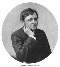
joseph_h_choate_metmuseum.jpgJoseph H. Choate, a civic-minded attorney and member of the Provisional Committee which, under William Cullen Bryant, undertook the creation of the Metropolitan Museum of Art, spoke for the Trustees at the dedication of the Museum's first building on March 30, 1880.

There are many quotes in circulation since then, which variously generate feelings of awesome prescience, inspiration, bemusement, and Bizzaro world dissonance. But so far Mr. Choate's speech appears not to have been published in its entirety, at least in any form that has reached the web. The most complete version I can find is from the June 1917 Bulletin of The Metropolitan Museum of Art, in memory of Choate's passing and his decades-long service to the Museum.

Here are the full paragraphs around a couple of oft-used quotes [in bold], which I've broken up because, hoy, who reads paragraphs that long online?

The erection of this building at the expense of the public treasury for the uses of an art museum was an act of signal forethought and wisdom on the part of the Legislature. A few reluctant taxpayers have grumbled at it as beyond the legitimate objects of government, and if art were still, as it once was, the mere plaything of courts and palaces, ministering to the pride and the luxury of the rich and the voluptuous there might be some force in the objection.

But now that art belongs to the people, and has become their best resource and most efficient educator, if it be within the real objects of government to promote the general welfare, to make education practical, to foster commerce, to instruct and encourage the trades, and to enable the industries of our people to keep pace with instead of falling hopelessly behind those of other States and other Nations, then no expenditure could be more wise, more profitable, more truly republican.

It is this same old fashioned and exploded idea, which regards all that relates to art as the idle pastime of the favored few, and not, as it really is, as the vital and practical interest of the working millions, that has so long retarded its progress among us.

...

Let me briefly state to you their [the trustees'] purposes. They believed that that the diffusion of a knowledge of art in its higher forms of beauty would tend directly to humanize, to educate and refine a practical and laborious people; that through the great masterpieces of painting and sculpture which have commanded the reverence and admiration of mankind, and satisfied the yearnings of the human mind for perfection in form and color, which have served for the delight and the refinement of educated men and women in all countries, and inspired and kept alive the genius of successive ages, could never be within their reach, yet it might be possible in the progress of time to gather a collection of works of merit, which should impart some knowledge of art and its history to a people who were yet to take almost their first lessons int hat department of knowledge.

Their plan was not to establish a mere cabinet of curiosities which should serve to kill time for the idle, but gradually to gather together a more or less complete collection of objects illustrative of the history of art in all its branches, from the earliest beginnings to the present time, which should serve not only for the instruction and entertainment of the people, but also show to the students and artisans of every branch of industry, in the high and acknowledged standards of form and color, what the past has accomplished for them to imitate and excel.

But the 1917 memorial version curiously leaves out what may be the best part: The Ask.

limo_row_met_nymag.jpg
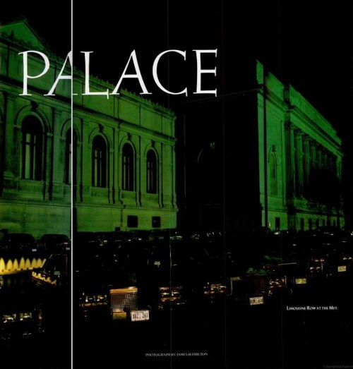
"Limousine Row at the Met", image via nymag

Near as I can tell, the Met's founding fundraising pitch first resurfaced in Calvin Tomkins' 1970 history of the museum, Merchants and Masterpieces, and then again in 1989, at the zenith/nadir of the museum's "Club Met" private party rental era, asbreathlessly, chronicled in New York Magazine by John Taylor. It really is awesome, and should be carved in stone on the Grand Staircase:

Think of it, ye millionaires of many markets--what glory may yet be yours, if you only listen to our advice, to convert pork into porcelain, grain and produce in to priceless pottery, the rude ore of commerce into sculptured marble, and railroad shares and mining stocks--things which perish without the using, and which in the next financial panic shall surely shrivel like parched scrolls--into the glorified canvas of the world's masters, that shall adorn these walls for centuries. The race of Wall Street is to hunt the philosopher's stone, to convert all baser things into gold, which is but dross; but ours is the higher ambition to convert your useless gold into things of living beauty that shall be a joy to a whole people for a thousand years.

I went to the Goethe Institute's Lunch Bytes panel today, primarily to hear poet and Ubu founder Kenneth Goldsmith. So I was caught off guard when I introduced myself, started my fanboi spiel, and he goes, "You're greg.org! It's so great to finally meet you!" and so on.

Whether he was just being smooth or polite or had an actual fanboi moment himself, it was very cool. And we signed each others' books, chatted a bit, and agreed to keep in better touch.

It all reminded me of a quote inside the 2-disc LP of Frankie Goes To Hollywood's Welcome To The Pleasuredome:

"I get buzzed off the fact that Andy Warhol's heard of us, because he gets buzzed off the fact that Picasso had heard of him."

Which really only proves that I'm old enough to have unnostalgically bought an LP.

chamberlain_supremes_64.jpg

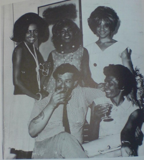
John Chamberlain with Diana Ross, the Supremes, and Diana Ross's mother--Mrs. Ross, if you're nasty--in New York in 1964. For no fathomable reason besides sheer awesomeness, it is included in the sculptor's chronology at the end of his catalogue raisonne.

Can I just say, it's only a couple of weeks in, but I'm loving Richard Prince's blog. [And loving Anaba all over again for linking to it. Thanks, Martin!]

Not really a blog, I suppose, but more of a journal. Some notes. They feel pretty perfect, though, very authentically him, for better or worse. Generally for better, though.
I've been going especially deep on Prince for the last few weeks as I try to prepare the script for a live reading/restaging of the artist's Cariou v. Prince deposition, which was won by some lucky bidders at Art Fag City's benefit auction in February.

That means turning the 400-page, seven-plus hour transcript into a couple of hours of informative, relevant, and hopefully entertaining highlights that accurately communicate the real issues of the copyright infringement lawsuit; and that capture the key elements of Prince's history and practice, and how this Canal Zone series fits into it. Even in the totally oddball pressure cooker environment of a deposition, where basically every question is adversarial, leading, and contested by the other lawyers in the room, Prince's reality comes through. He's not cynical, but he is a pessimist. He has very clear, even compelling insights about his work and his controversial methods. He's occasionally funny and awkward and pissed. A human, an artist, not a construct or a brand.

I keep meaning to go through the Canal Zone Richard Prince Yes Rasta book and post some highlights. Maybe in relation to this staging, I will. Meanwhile, here's one: Dan Brooks, the lawyer for photographer Patrick Cariou, who questioned Prince, definitely seemed to be operating under the hypothesis that Canal Zone was conceived as nothing but a giant moneymaking venture. In various times and ways, Prince rather convincingly refuted that, I think, but never more powerfully than when Brooks asked about a film pitch, and Hollywood, and turning Canal Zone into a video game:

DB: Where do the video game rights come into this pitch?

RP: Is that--are you asking me--you're asking me?

Q: These are your words in the interview?

A: Right.

Q: What did you mean?

A: I think I was thinking about the fact that I know nothing about video games and--but my--all my stepson's friends play them. And I felt that there might be a possibility to--I had seen some of the graphics involved in some of these games when they play, and I felt that the different tribes that take over the different hotels and they kind of, you now, it was just a thought. And I think I ran this by Michael Ovitz and he loved the idea.

Q: So you viewed this whole thing as an extremely commercially successful potential venture, paintings--

A: the pitch?

Mr. Hayes: Objection.

Q: Paintings, movies, and video game rights, right?

Mr Hayes: Objection as to form.

A: No, I've never thought that what I do or what I produce or what I put out will ever, one, sell.
I've made art for 34, 35 years and nothing sold. What I--my experience in terms of what i make, it seems that a lot of people just couldn't dig it. And to tell you the truth, it was not one--when I put up the Canal Zone show at Larry Gagosian's there was not one review in any newspaper, in any magazine. And I find that incredibly unsuccessful.

Q: But weren't some of the paintings sold before the show even opened?

A: They were sold, yes.

Q: For millions of dollars?

A: I wouldn't characterize it for millions. For a couple million dollars, there were two paintings I believe that were sold before the Lehman Brothers meltdown, yes, there were two paintings that were sold for approximately 2-million dollars.

OK, maybe the two million dollar part undercuts the never selling part a bit, but the point is, it's not about the money, people. It's getting Roberta over there to write about your show.

April 4, 2012

Archival Coconut Milk

moma_gmap_rirkrit.jpg
Untitled (Still/Free), 1992/1994/2007/2011, installation shot at MoMA via Google Art Project

Seeing Rirkrit Tiravanija's work Untitled (Free/Still) in MoMA's Google Art Project space reminded me that I've been meaning to write about it for a while now. I revisited it a few of times after writing about Rirkrit's awesome, blingy, highly collectable objects last fall. I ended by noting that as "MoMA's acquisition of the 2007 redo of the 1992 curry piece betray, Rirkrit's objects are often vestiges of the previous experiential pieces."

Which remains largely true.

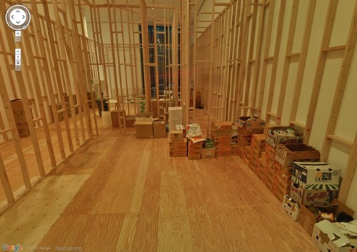
But I didn't quite expect the objects in Untitled (Free/Still) to be such literal artifacts.

MoMA's replication of 303 Gallery's space in ply & stud didn't bother me at all; it's classic Rirkrit. And for a while, I didn't mind the cases of ingredients stacked up around the installation; even though they felt a little like set dressing, they were also obviously part of the provisional space and the ad hoc dining experience.

rirkrit_stillfree_cmoa.jpg

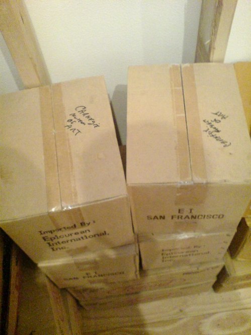
Until I gave up my table one time to some older ladies, and moved over next to these boxes of coconut milk or whatever which--hello--have "Carnegie Museum of Art" written on them.

rirkrit_stillfree_leibowitz.jpg

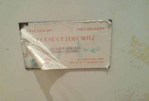
And then I head over to the beat-to-hell fridge and see Cary Leibowitz's Candyass sticker for Bob Shiffler on the door. Shiffler, an Ohio-based collector, was the original buyer of Untitled (Free).

rirkrit_stillfree_fridge_dz.jpg

And sure enough, here are some registrar stickers from the Carnegie, which borrowed the piece, and there's another shipping label, "11 of 14," for "DZWIRNER," who exhibited Untitled (Free) as Untitled (Still/Free) in 2007. So this fridge has been around, along with 13 other pieces or crates. An archival fridge.

So there was a certain explicit strategy to objecthood even at the formative beginning of Rirkrit's most important practice. What's going on here?

I finally asked MoMA curator Laura Hoptman, a friend from way back, who's been working with Rirkrit even longer. She explained that Rirkrit identified certain elements, like the fridge and the rice cooker, as permanent parts of the work. And they would be joined by some of the remnants of its installation, incuding leftover ingredients, and even trash. Some of those elements have accreted at each installation of the work [this was the fourth], and MoMA would add something to it, too. They become part of the history of the piece.

Which, OK. But Hoptman also reminded me of the historical context--and by historical, I'm afraid I mean 1994, which I was around for--of Rirkrit's work, and how almost desperately unsellable it was. And I guess I had forgotten that, that no, most collectors didn't jump at the chance to buy installations, much less artists' old appliances, in the mid-1990s. Even I kind of turned up my nose at the chance to buy a steamer full of old mussel shells back then, even though they were already in plexi! So the fact that Shiffler bought anything at all is sort of amazing.

Hoptman also spoke of Rirkrit's Buddhism, and related it a bit to how he perceived objects, as well as the generosity of the experience his work fostered. But that only made me think of that fridge and the Dalai Lama, who talked about the problems of becoming too attached to his watch. We talked about how Rirkrit certainly has an awareness of the art object paradox inherent in selling his social/experiential work, and that the shift to chrome probably includes a level of critique, or caricature, even, of the desire for bright, shiny things.

I came away reassured, I guess, that I'm not wandering lost in my interpretation of Rirkrit's work. But also kind of wary of how easily even our own histories and memories of art can be altered by the intervening present. Basically, because of the last decade-plus of market frenzy, I'd forgotten the 90s, when there was still a paradigm that art was being made for other reasons than to sell it.

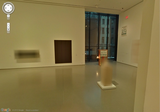
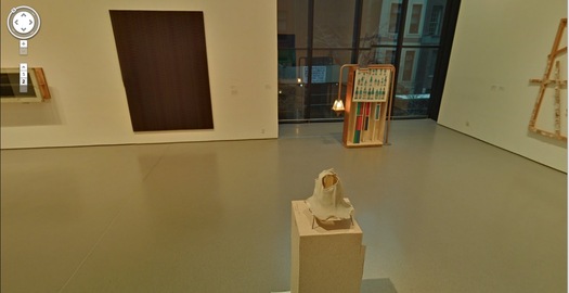
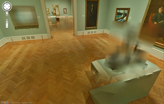
It looks like Les Blurmoiselles d'Avignon have some company.

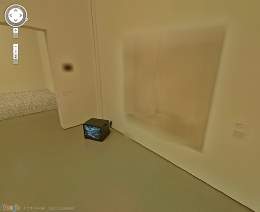
The Google Art Project has released a new batch of 134 museum participants, bringing the total to 150, though only 51 institutions are offering Street View Museum View. And a couple of those, like Tate Modern and the Crystal Palace at the Reina Sofia, have basically no art, just space. [Tate Modern Museum View rather brilliantly drops you into the Turbine Hall, facing a blank temporary wall. ]

But if any museums besides MoMA gave to deal with living artists, or works still under copyright, I haven't been able to find them. And so MoMA wins this round for adding a rotating show--Kathy Halbrecht's contemporary installation in the 2nd floor Kirk Varnedoe Galleries [I am calling them this forever now, btw]--of contemporary art, thereby demonstrating that living artists are easier to get clearances from than estates.

moma_gmap_rosa1.jpg

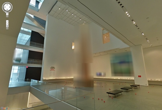
Most of them, anyway. Fortunately, there are some exceptions, and they look awesome cloaked in Google's Blurmany-style algorithms. Oh the first really is the best, too. Sanja Ivekovic apparently didn't sign on to have her atrium installation, Rosa of Luxembourg become Rosa of Luxembourg of Google Art Projects.

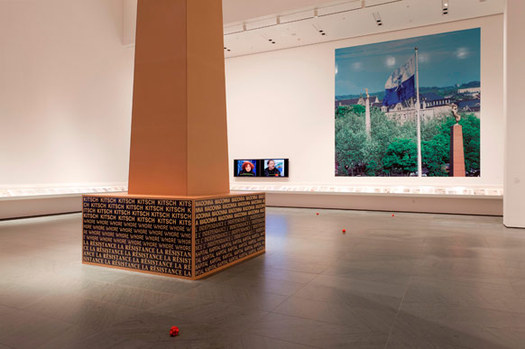
ivekovic_rosa_install_moma.jpg
Lady Rosa of Luxembourg (foreground), with the Gëlle Fra (background). Photograph by Christian Mosar. Courtesy Casino Luxembourg--Forum d'art contemporain , via moma.org

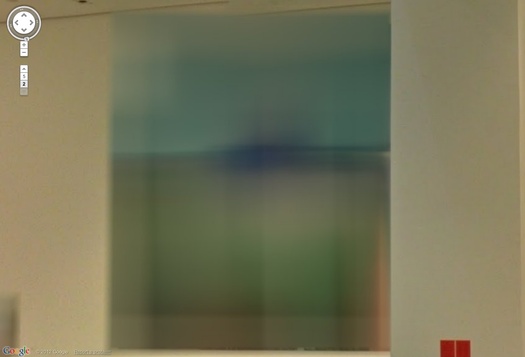
The monumental column is nice, of course, but the colors on that giant photo are utterly fantastic. That's the first one I'll paint.

moma_gmap_rosa4.jpg

Also, is the Bell & Howell helicopter over the staircase blurred out, too? Is that a fluke? Anyway, stepping back into the Varnedoe Galleries...

haveyouseenme.jpg

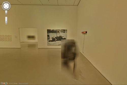
Still waiting to hear back on this one. I can't remember what it was, though from this angle, it looks like the bastard lovechild of Louise Bourgeois and Gerhard Richter raised by Thomas Houseago. Of course, after a speculative mashup like that, whoever it turns out to be will almost inevitably disappoint. Sorry, artist. That's a Reinhard Mucha in the back, though.
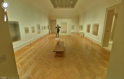
moma_gmap_muchaherold2.jpg

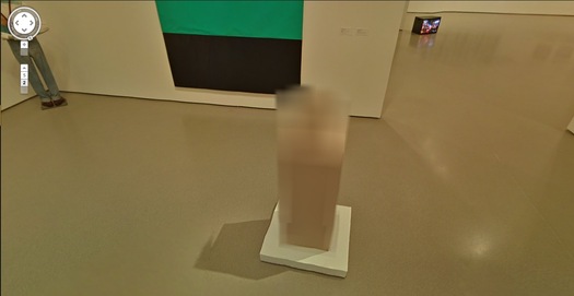
And when you head back there, both the Georg Herolds are also blurred. For a moment. Because you take another click/step, and they're not. The blur disappears. It's an unexpected reveal as Google's sheets of virtual ribbed polycarbonate clatter to the ground.

moma_gmap_muchaherold.jpg

Or is it like that stuff on the facade of the Issey Miyake Pleats Please store in SoHo? You're walking along, blur blur blur, and then you align with the material, and for an instant, you can see in. At least, in this case, for one pano. I suspect this is an oversight, so go try it quickly.

And no offense to Herold, because his underpants dome is quite fetching, but I'd totally get one of those LA acrylic guys to cast me one of these first:

moma_gmap_herold3.jpg

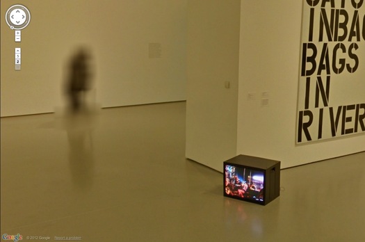
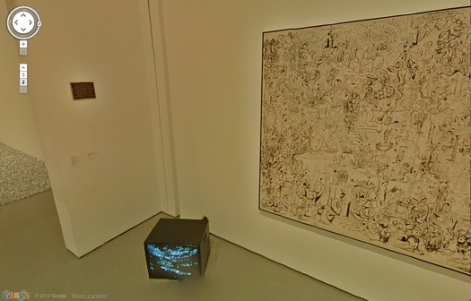
It's like an ethereal Anne Truitt. Also, don't you kind of wish that Kippenberger wasn't turned to the corner, so Museum View could blur its face? Also, it's interesting that the video monitor on the floor always has the same image in every pano. Was it on pause? Did they 'shop it in? Does it unsettle you, too, to have the simulation of moving through space without the simulation of moving through time? That is so Street View.

moma_gmap_sculpture.jpg

The Keith Haring mural and the Koons look great. [Which, Pace Prints just opened a show of another Haring mural, a unique silk screened scroll of his Blueprint Portfolio.]

moma_gmap_holzcondo.jpg

Ahh, but we're here for the blur. Ooh, a very nice double blur from George Condo [right, really?] and Jenny Holzer [left, really? REALLY? Did she maybe insist on the obscuring blur to promote her redacted documents-as-minimalist-paintings show at Skarstedt?]

moma_gmap_holzcondo2.jpg

But take another click forward, and the veil drops again, momentarily, whatever that means on GSV's frozen timeframe.

moma_gmap_holzer1.jpg

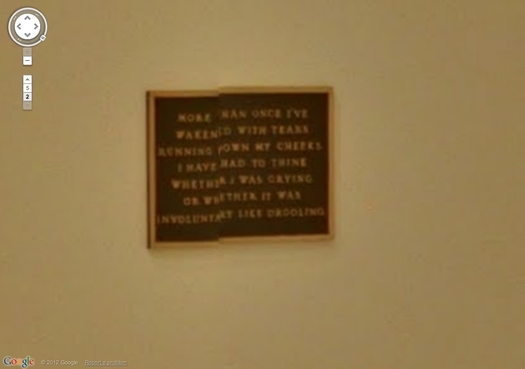
This is awesome, what the algorithm stitching this pano together did to this Holzer bronze plaque. Perfect, really, and such a conveniently discrete, little object. I think I could have that 3D printed before I have it cast.

Such Google Maps-generated anomalies are ususally site-specific by definition. And recreating them is entirely dependent on the alignment of anomaly, real space, and aesthetics. Like the piece I installed in Brian Dupont's Extra Gallery last fall which translated the [fortunately] misaligned Street View seam running through their window into real space.

As Google Maps gets more hi-res, these noticeable differences between the real world and its corporate map simulacrum will diminish, if not disappear altogether. So it seems important to map them, or at least to note them, and to be able to read them while we can.

MoMA Museum View [googleartproject]
Previously: les Blurmoiselles d'Avignon
Blurmany and the pixellated sublime

Since 2001 here at greg.org, I've been blogging about the creative process—my own and those of people who interest me. That mostly involves filmmaking, art, writing, research, and the making thereof.

Many thanks to the Creative Capital | Warhol Foundation Arts Writers Program for supporting greg.org that time.

comments? questions? tips? pitches? email
greg [at] greg [dot ] org

find me on twitter: @gregorg

about this archive

Posts from April 2012, in reverse chronological order

Older: March 2012

Newer May 2012

recent projects, &c.


our_guernica_cycle_ivanka_320px_thumb.jpg
Our Guernica Cycle, 2017 –
about/kickstarter | exhibit, 2017


pm_social_medium_recent_proj_160x124.jpg
Social Medium:
artists writing, 2000-2015
Paper Monument, Oct. 2016
ed. by Jennifer Liese
buy, $28

madf_twitter_avatar.jpg
Madoff Provenance Project in
'Tell Me What I Mean' at
To__Bridges__, The Bronx
11 Sept - Oct 23 2016
show | beginnings

chop_shop_at_springbreak
Chop Shop
at SPRING/BREAK Art Show
curated by Magda Sawon
1-7 March 2016

do_not_bid_or_buy_iris_sidebar.jpg
eBay Test Listings
Armory – ABMB 2015
about | proposte monocrome, rose

shanzhai_gursky_mb_thumb.jpg
It Narratives, incl.
Shanzhai Gursky & Destroyed Richter
Franklin Street Works, Stamford
Sept 5 - Nov 9, 2014
about | link

therealhennessy_tweet_sidebar.jpg
TheRealHennessy Tweets Paintings, 2014 -
about

sop_red_gregorg.jpg
Standard Operating Procedure
about | buy now, 284pp, $15.99

CZRPYR2: The Illustrated Appendix
Canal Zone Richard Prince
YES RASTA 2:The Appeals Court
Decision, plus the Court's
Complete Illustrated Appendix (2013)
about | buy now, 142pp, $12.99

weeksville_echo_sidebar.jpg
"Exhibition Space" @ apexart, NYC
Mar 20 - May 8, 2013
about, brochure | installation shots


HELP/LESS Curated by Chris Habib
Printed Matter, NYC
Summer 2012
panel &c.


drp_04_gregorg_sidebar.jpg
Destroyed Richter Paintings, 2012-
background | making of
"Richteriana," Postmasters Gallery, NYC

czrpyr_blogads.jpg
Canal Zone Richard
Prince YES RASTA:
Selected Court Documents
from Cariou v. Prince (2011)
about | buy now, 376pp, $17.99

archives