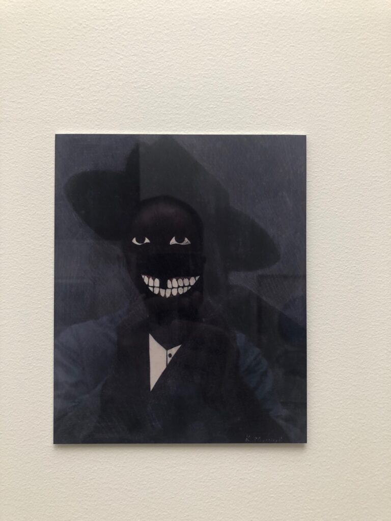
Self portrait with Kerry James Marshall Facsimile Object (M1), 2021, 8×6.5 in., dye sublimation print on aluminum
While working on the Scipio Moorhead Facsimile Object a couple of months ago, I started trying to figure out the challenge of a Kerry James Marshall Facsimile Object, too. Marshall’s portrait of Moorhead fills the gap in the historical record–there is no known depiction of or signature work by the painter considered to be the first Black artist in America. Meanwhile, the deep, multihued blacks of Marshall’s signature figurative style counter the uniform whiteness of American/European history painting, while also exposing how under-optimized the prevailing systems of image reproduction and circulation are for accurately depicting Black skin. Reproductions of Marshall’s paintings regularly fail in this specific way to mirror the experience of seeing them in person. So they are an excellent challenge for the Facsimile Object construct.
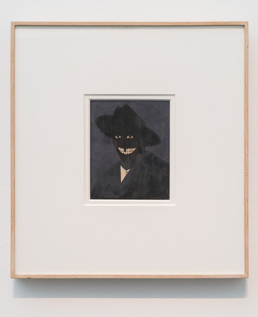
Kerry James Marshall, A Portrait of the Artist as a Shadow of His Former Self (1980), egg tempera on paper, installation view at MCA Chicago via CADaily
The calculation for making a Facsimile Object of a Kerry James Marshall work is pretty elegant in one respect, though. The epic scale immediately excludes most of his paintings. And the breakthrough work that marked a turning point in his practice–and that anchored his Met Breuer-filling retrospective a couple of years ago–is a headshot, a perfectly sized egg tempera on a sheet of sketchbook paper.
It took several attempts to find a good reproduction of A Portrait of the Artist as a Shadow of His Former Self (1980) that would reproduce on aluminum. This multistep filtration process, going from work to image to jpg to print, really gets a workout here, or at least, the apparatus gets seen operating in ways that might otherwise go unnoticed. Sometimes the work’s saturation is pumped up to bring out the red of the figure’s gums, for example, or the brightness is increased to emphasize the painting’s striated facture. Sometimes it’s printed in duotone, flattened into a pair of floating white eyes and an exaggerated grin. It extends the reach of Marshall’s own practice, “forcing the issue of perception by rendering an image that is just at the edge of perception.”
That Marshall knew his carefully calibrated painting was still at risk of being reduced to an undifferentiated black field, a shadow, is perhaps indicated by the title itself. That this was interesting to him is perhaps indicated by his subsequent decades-long practice of depicting Blackness in a world that is still catching up with him.
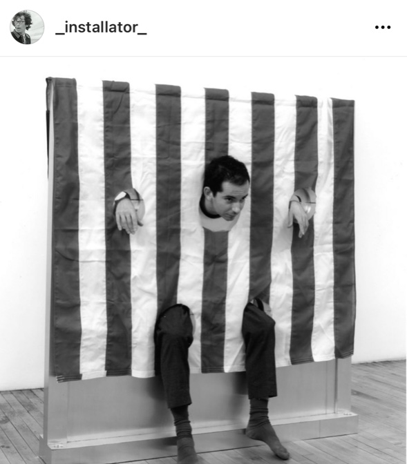
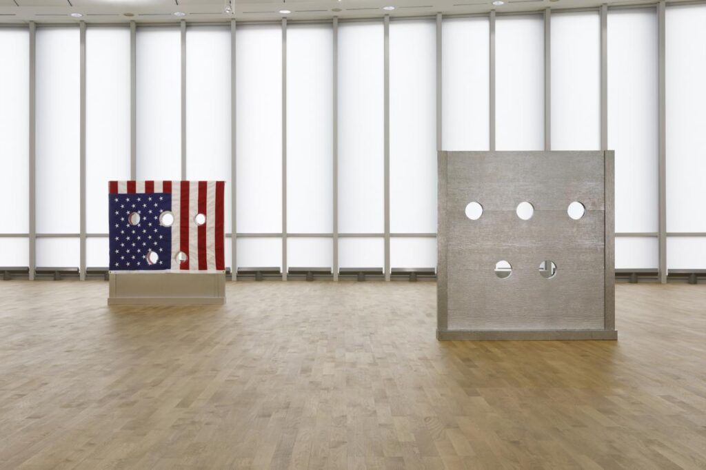
Lucien Terras in Cady Noland’s Gibbet, 1993/94 at Paula Cooper Gallery, 1994, image: James Dee via @_installator_’s IG
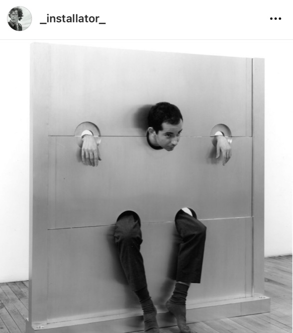
There are classic pictures of young art dealer Lucien Terras modeling stockades at Cady Noland’s 1994 exhibition at Paula Cooper Gallery. Gibbet, above, is named after the lamppost-like cages used to starve people to death in public. It has an American flag draped over it, with carefully placed holes to allow the stockade to function as it was designed. Your Fucking Face is named after your fucking face, I guess, and is identical except for the flag.
Lucien Terras posing in Cady Noland’s Your Fucking Face, 1993/94 at Paula Cooper Gallery, 1994, image: James Dee via @_installator_’s IG
What I’d never realized until I saw both photos side by side on @_installator_‘s instagram, was that they were of the same object. Or one played the other on film. Bruce Hainley’s Artforum review of the Frankfurt show is very clear that these two works are installed next to each other.
Installation view of Gibbet (L) and Your Fucking Face or actually Beltway Terror? (R), 1993/94 at MMK Frankfurt, via Bob Nickas’ review for Spike Art
Like in the photo above, which accompanied Bob Nickas’ Spike Art review. Except the checklist for the show did not include Your Fucking Face, and the stockade listed after Gibbet was called Beltway Terror. The Brants own “both,” so I guess we could ask if there is one stockade or two–or two stockades or three.
Installation view of Your Fucking Face and Gibbet, tho it really should be flipped, from Cady Noland’s 1994 exhibition at Paula Cooper Gallery. image via Bomb Magazine
Oh here is a photo of the 1994 show in Bob Nickas’ installation photo roundup in Bomb Magazine, with Your Fucking Face and Gibbet side by side, but on a plinth. And it looks like the transparency was flipped, or the flag was. When even her collaborators get confounded, I can see why the artist issues disclaimers about reproductions of her work.
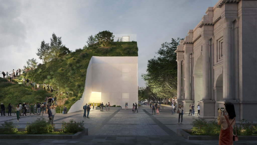
[JANUARY 2022 UPDATE: MVRDV has published a report of their experience with The Mound, and their analysis of its shortcomings. It is an exhilarating and highly persuasive read, and extraordinary in its rarity; if only more architects would apply their expertise to understanding the outcomes of their designs and the failures of the processes that led to them.]
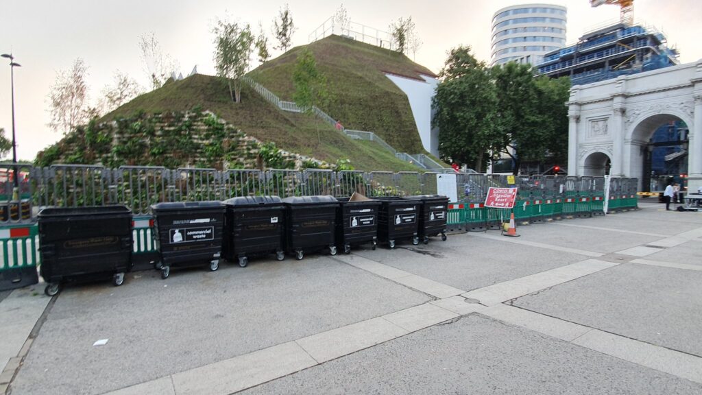
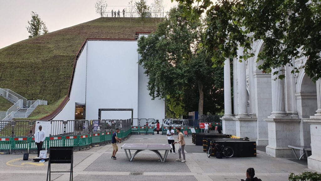
I have absolutely loved MVRDV’s Marble Arch Mound from the minute I saw it in Dan Barker’s epic tweet thread of visiting it on opening day in July. It hits every rendering vs. reality, experience economy, placemaking spectacle fail button, without costing me a farthing and without having to be my problem in any way. It is an upfront and honest disaster. And unlike some embarrassing and pointless destination stairchitecture closer to home, at least the Mound hasn’t killed anyone. Yet.
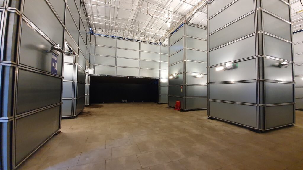
The interior of the Marble Arch Mound is finished to a very high level, but is also totally empty. image: @danbarker
A mountain of criticism has been thrown up on the Mound since, but Barker’s take still feels the clearest. He identifies the obvious things, like the cruft of fencing, garbage cans, and signage that delineate paid-access public space; and the nakedness of a new garden draped–it must be made clear–over a scaffold, and looking like a Minecraft skin–to me, a good thing!–but inevitably doomed by comparison to the lush renderings. He points to the complete absence of the promised interior program of a cafe and light installation: was it unfinished, abandoned, or still waiting for an intern to be blamed for not pulling it together?
architect’s rendering of Marble Mound Arch, via @danbarkerReality: What should freshly draped sod look like, and would we not have called BS if MVRDV put a ping pong table in their rendering? image: @danbarker
And he’s the first to point out what’s probably the Mound’s most significant failing: it’s too short to provide a view of anything except the buildings and construction sites surrounding it. Like so many failures in the UK these days, this one feels entirely predictable and avoidable. And yet here it is.
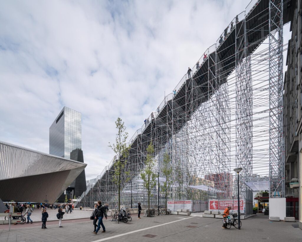
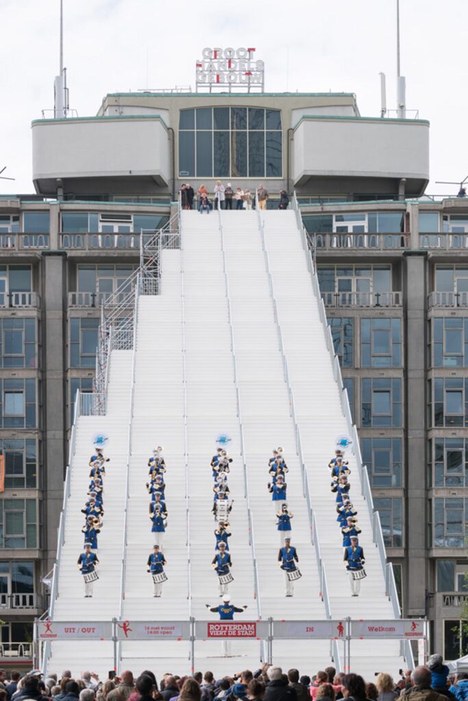
Two years before Beyoncé played Coachella, Ossip took this other photo of MVRDV’s (other) Staircase
Setting aside the obvious differences in site and program, MVRDV’s two temporary scaffold stair projects, can help see where we are, and where we came from since the Summer of 2016. The Stair to Kriterion was built to the rooftop of a building in front of Rotterdam’s central station. It evoked the city’s commemoration of post-war reconstruction and nostalgia for the long-closed movie theater at the top of the stairs. There was a cafe and an exhibit, but because it had an actual view, it was free, and packed. Though MVRDV principal Winy Maas suggested it should be permanent, it came and went as planned, in two months.
Marble Arch Mound sounds so dissatisfying it will be lucky to make it to January. At least when the leaves fall on the surrounding trees in a few months, they’ll stop blocking the view of the park. Instead of the Dutch throngs, access to the Marble Arch Mound is capped at 1,000 people/day, 25 at a time. This is the trickle of a crowd that was not only supposed to revitalize the shipping street next door, but to buy enough tickets to generate profits for Mound.
All of which was also clear on paper. The Marble Arch Mound is the transparent architectural embodiment of the cultural, corporate, and governmental institutions that brought it into being, of the strategic assumptions, values, and decision-making processes they used, and of the vision, constraints, and compromises they imposed.
Delia Gebrial’s tweet summed up the situation so succinctly, it became part of the headline for the Financial Times’ report on the Mound’s managerial failures: “I saw the marble arch mound today and honestly, i’m besotted and obsessed with how rubbish it is. it truly is a monument to 2021.”
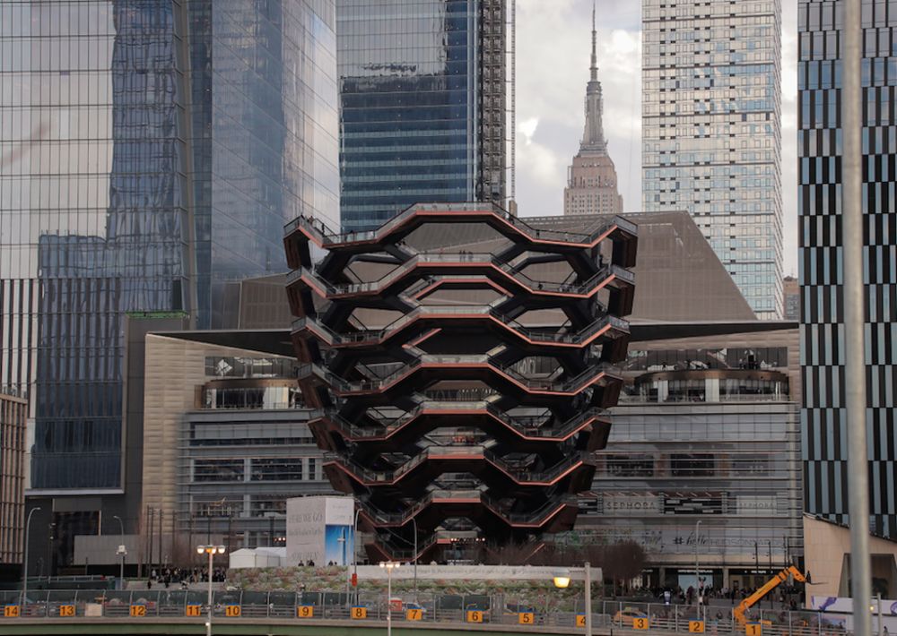
I cannot believe I have a picture of this piece of garbage on my internet website. via bloomberg/citylab
Just as the Vessel embodies Bloomberg-era New York real estate oligarchs’ compulsion for trophy spectacle, whereby an Eiffel Tower to yourself that turns out to be an ill-conceived suicide machine, the Marble Arch Mound captures this privatized, austerity-riddled, authoritarian, kakistocratic, pandemic moment in London with a truly terrible clarity. This Potemkin Village Green of a public building induces amazement and awe, at least from afar. If only it could outlive the political calamity that built it.
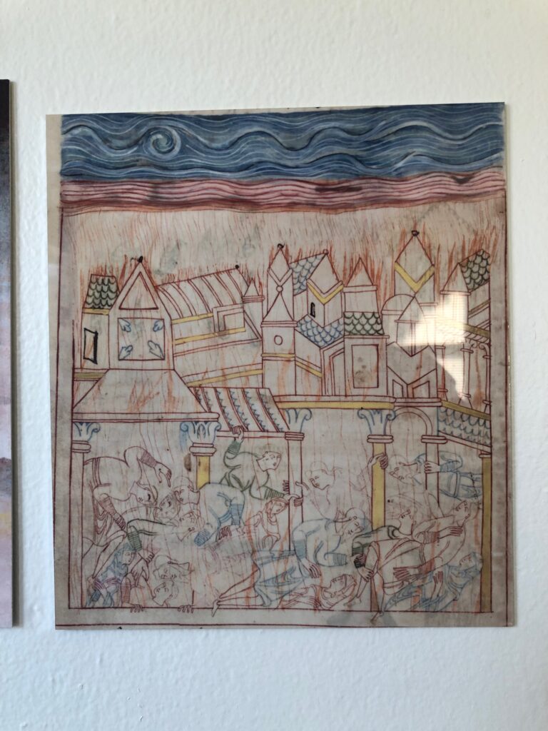
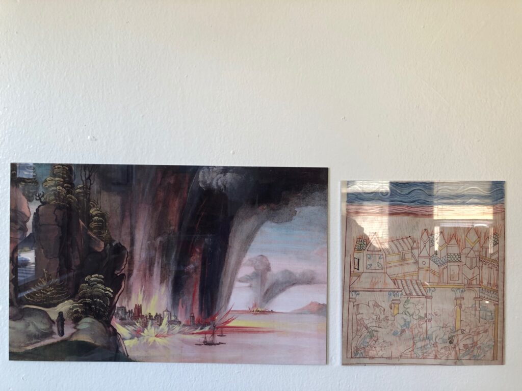
Old English Hexateuch Facsimile Object (H1), the Destruction of Sodom, 8.5 x 7.5 in., with wonky cropping
There was something beautiful and haunting and unexpected about the depiction of the destruction of Sodom from a medieval manuscript that got tweeted across my timeline the other day. Medievalist Dr. Erik Wade’s thread highlighted the blissed out, same-sex residents comforting each other, even as the city burned around them. I was also taken by the delicate line drawings, more refined than marginalia, but clearly less than fully filled in. I hesitate to say it is unfinished, though. The tangle of figures look so similar to each other, for a minute I wondered if the illuminator was tracing them.
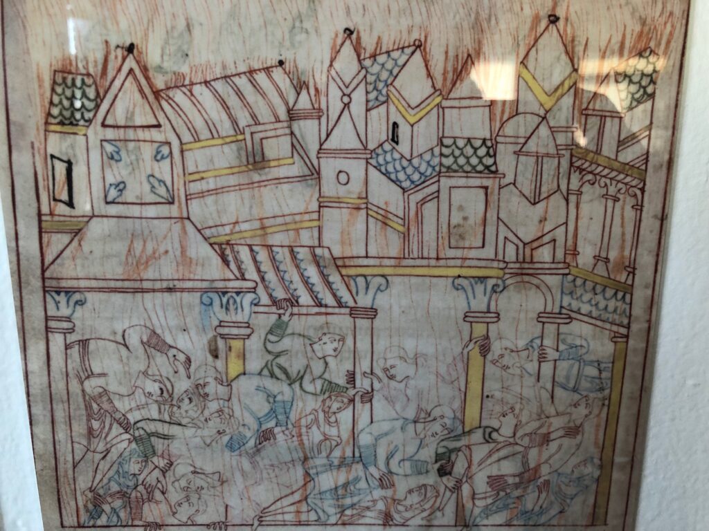
closeup view of FO (H1)
It’s from a late 11th-century manuscript known as The Old English Hexateuch, the earliest known English translation of six books of the Old Testament (basically, the Torah plus Joshua). Cotton MS Claudius B.iv, a name derived from one of the founding collections of the British Library, includes almost 400 illuminations in various states of detail. They depict the stories of the Bible set in the contemporary Anglo-Saxon milieu the manuscript’s lay audiences would recognize immediately.
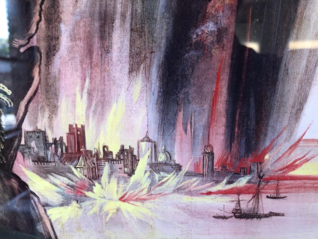
Detail from Dürer Facsimile Object (D3.38), 2021
I did not plan on making a Facsimile Object of Dürer’s verso painting of the Destruction of Sodom, but the brushy allure of the flames raining down on the cities proved irresistible. Now again, I find that the delicate lines depicting the victims, and especially the sketchy flicks of flame everywhere, made me want to hold the manuscript in my hand. As this was impossible, I made another Facsimile Object. Now I have an unlikely diptych, from centuries and countries apart, of an unlikely and terrible scene.
Depressing but beautiful: Facsimile Objects of the Destruction of Sodom
Not gonna lie, they hit a little differently now, when wildfires are raging across three continents, than in May, when I made the first one. So far Facsimile Objects have engaged with the present only temporally, by marking a (lost) moment in time: a missed auction preview, a pandemic-closed museum, the sale of a painting, a surprise Summer show. But with some religionists repeating the medieval model of blaming a conflagration on the existence of gay people, this pair of Facsimile Objects connects on a content level as well.
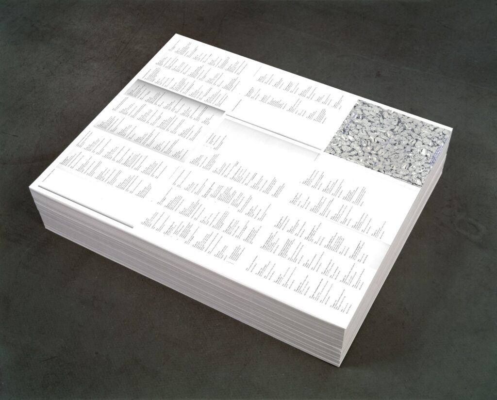
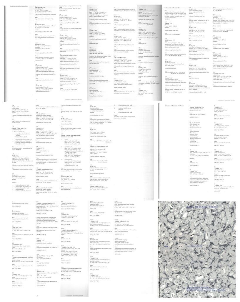
Untitled (Additional Material), 2021, study, 0ffset print on paper (endless copies) 20″ (ideal height) x 23″ x 29″, base image: FG-T Fndn
I’m as surprised as anyone that it was only when I finished posting about the orphaned appendices in the Felix Gonzalez-Torres catalogue raisonée that I figured out what to do with them.
I do still think that the Foundation should republish the information about the dozens of works Gonzalez-Torres made, and showed, and sent out into the world, which were later declared to be non-works.
Untitled (Additional Material), 2021, (detail) 0ffset print on paper (endless copies) 20″ (ideal height) x 23″ x 29″
By laying out the eight pages of the CR’s two appendices, Untitled (Additional Material) appropriates the strategy of the iconic stack, “Untitled” (Death by Gun), which reproduces entire pages from a special issue of Time magazine showing the people killed in the US by guns during one week.
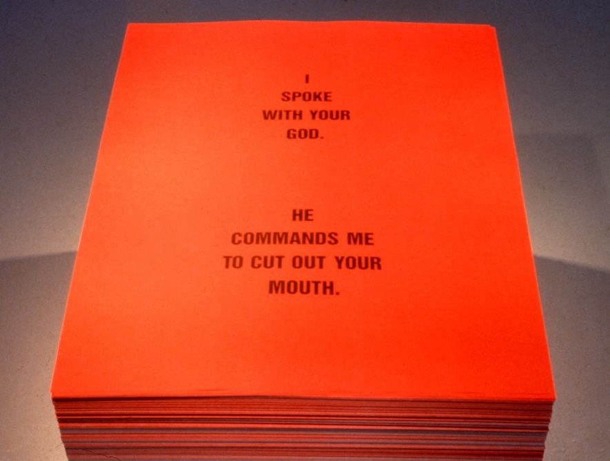
The dimensions, meanwhile are a nod to one of two pieces that ended up classified as Non-Works: a 1990 collaboration with Donald Moffett called, “Untitled” (I Spoke With Your God). The stack of printed text by Moffett on red paper (“I SPOKE WITH YOUR GOD/ HE COMMANDED ME TO CUT OUT YOUR MOUTH”) appeared just once, in a two-person show at the University of British Columbia Arts Center in Vancouver. [The print size, 29×23 inches, is one Gonzalez-Torres used in other stacks, too, including “Untitled” (Veterans Day Sale), 1989, the image of which was used above for a rendering of the piece. I did not print 20 inches worth of giant bootleg posters today.]
The stack by Felix Gonzalez-Torres and Donald Moffett formerly known as “Untitled” (I Spoke To Your God) [sic], 1990, image: Scott Watson via Felix Gonzalez-Torres Foundation
As it turns out, this Non-Work does have a Foundation webpage, complete with installation shots. It does not appear to be linked from anywhere, and the URL now ends in “-hidden.” I am in awe all over again.
[2025 update: In subsequent correspondence with the Foundation that is mentioned in the previous post, this absence of the non-works and additional material information was temporary, part of a reconfiguration and expansion of the Foundation’s presentation of works (et al). There is indeed an entry for this work/non-work, and the untitled title is now a designation, “Untitled” (I spoke with your God). Like the distinction between work and non-work, I feels important to note that the nuance of title vs. designation reflects subsequent reconsideration and refinement. From what I can tell of the historical record, in 1990 Felix’s works were shown with “Untitled parenthesis- something- parenthesis” [quotes mine] titles, and this stack was shown as a “collaborative poster” or a creation of Gonzalez-Torres. I feel this is not the last thing I’ll post about this work or show.]
[THERE’S AN UPDATE: READ ON, THINGS ARE BETTER THAN I WOUND MYSELF UP TO THINKING.]
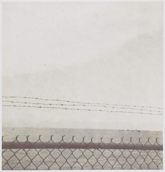
The earliest work by Felix Gonzalez-Torres in the Metropolitan Museum’s collection is also the smallest. It is untitled, an instant black & white photo of the sea through a Cuban fence. It’s about 2.75 inches square. It is signed and dated 1985, and has a fragment of a magazine collaged on the back that reads, “THE BO–/ ANYMORE.” By the time it was acquired at the end of 1996, the year of the artist’s death, the Met had already acquired two similar sets of photos by Gonzalez-Torres: photogravures of sand, and cloudscapes. Similar, but different: this one is not an artwork. “Although made, signed, and dated by the photographer,” the catalogue entry reads, “Gonzalez-Torres thought of works such as this [photo] as lying outside his core oeuvre.”
Published in 1997, just in time to record the Met’s acquisition, the Felix Gonzalez-Torres Catalogue Raisonée has three categories: Works, Additional Material, and Registered Non-Works. The photo above is in the second category. When the CR was released, Gonzalez-Torres was the most important artist in the world to me, and I wanted more of his works, not fewer. I was upset for these somehow downgraded works, and for the sleights they faced in the discourse, the gallery, the market. I couldn’t accept that the same artist who’d shown me that the most remarkable things could be art–a pile of candy, a stack of paper, a jigsaw puzzle, a pair of clocks–also said they couldn’t be.
My incredulity over Felix’s work fueled a years-long contest with the declarative process, what artists called objects, what they kept, what they destroyed. It helped me keep an eye out for these marginalized–and invisible, since there weren’t even any pictures–works. But even as I developed more nuanced appreciations of [other] artists’ agency, these non-art designations still gnawed at me. Until the other night, when I started writing this. It’s been almost 25 years: what’s going on?