Eileen Gray’s Eileen Gray Table

eileen gray adjustable table is two chrome rings, one the foot (which is partially open) and the other the top (full ring) connected by a chrome tubular steel rectangle that both holds and pierces the top. the top is painted black. being sold by lempertz in may 2025
Eileen Gray’s Eileen Gray Table, being sold as Lot 432 at Lempertz in Cologne, on 15 May 2025

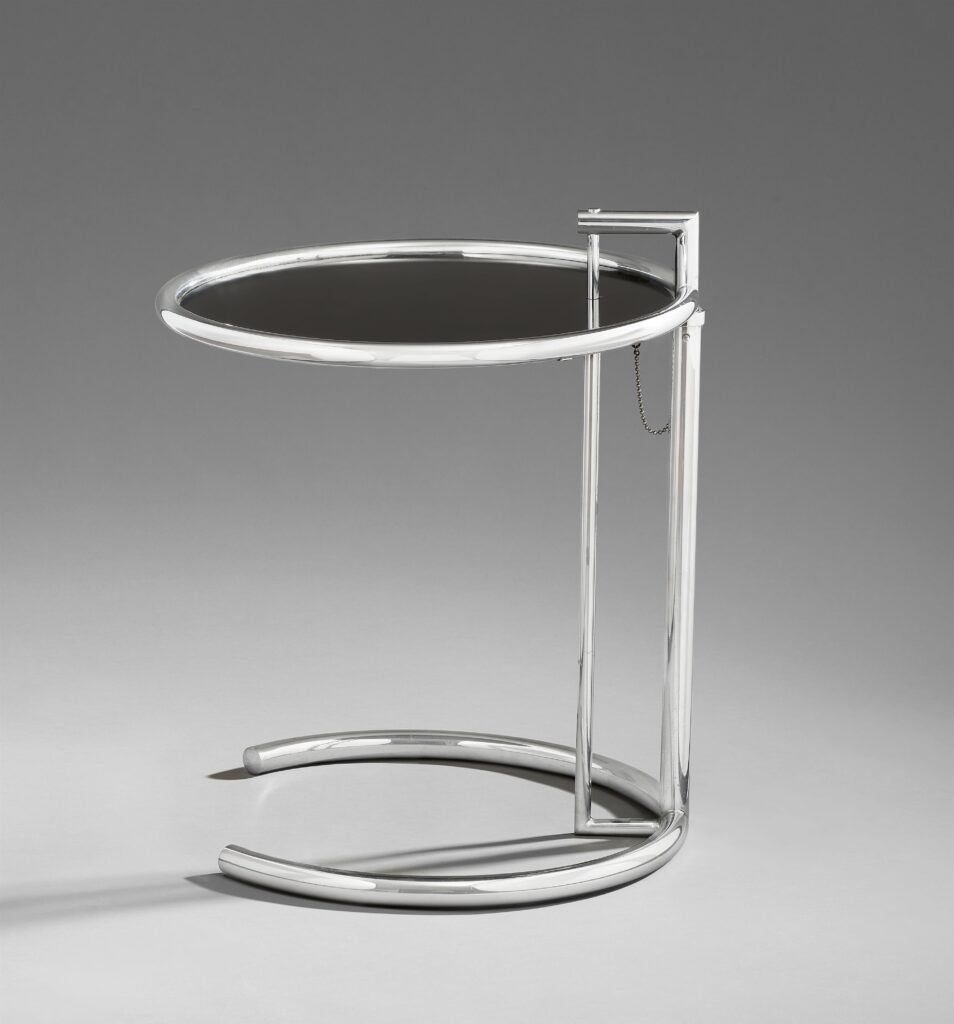
OK, have a seat, and pull up a table. The Cologne auction specialists at Lempertz are calling this, “An incunabulum of early 20th century design history,” and a “‘table ajustable’ for E.1027 from the personal collection of Eileen Gray.” The dates are 1925-28. The dates for E-1027 are 1926-29.

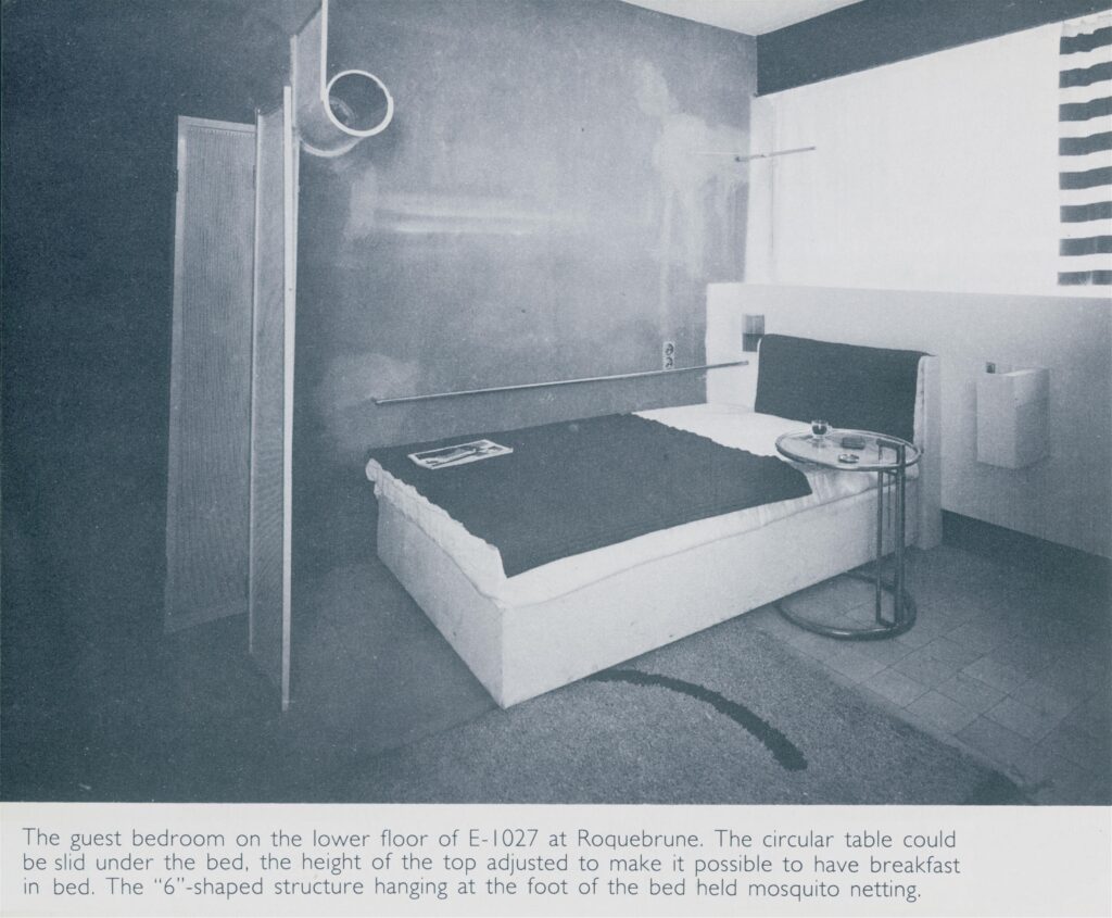
“Incunabulum,” of course, is a rare book term for the earliest printed books, before printing presses actually took off. So the implication here, is this is an ur-table of some kind. After all, this table has a black lacquered plywood top. And even the OG E-1027 table ajustable, in E-1027, in the guest room, which was designed for Gray’s sister to have breakfast in bed, had a glass top.

a black and white slightly washed out photo of a modernist bedroom, with a blocky double bed pushed into a corner. a metal screen at the end of the bed gives privacy. a night stand is cantilevered off the wall. a round chrome cantilevered side table that can slide under the edge of the bed is slid under the side of the bed. the image of eileen gray's guest room at e-1027, her house in roquebrune france, was published in a moma catalogue in 1979, where lempertz used it without credit, but no sweat, i found it.
vintage photo of E-1027 Guest Room with an OG Table, probably from Prunella Clough’s Gray Archive, as published in J. Stewart Johnson’s 1979 MoMA catalogue, Eileen Gray: Designer [sic], via Lempertz

“For E-1027” is not necessarily the same thing as “from E-1027.” The original furniture for E-1027 was sold off while the house itself languished, but Gray’s foundational modernist designs were recognized and canonized during her lifetime. MoMA dates the E-1027 Table to 1927. Their example was fabricated in 1976, the year of Gray’s death, and has a dark glass top on sheet steel. [I think. Maybe someone can doublecheck? It’s on view rn in the David Geffen Wing.]

This table has an Eileen Gray mark on the underside. It was put there—and on the rest of his collection—by Gray champion/biographer Peter Adam. Turns out Adams’ heirs put the table up for sale at Sotheby’s Paris in May 2021, where it was described as a “prototype.” Adam bought it from Gray’s neice, Prunella Clough, who inherited it from Gray. The date for the table then was “vers 1970.” Was it a prototype for a variant with a plywood top? Did it break? Had it been broken for years in the garage, and she was like, “I’m 92; just put a plywood top on it”?

It is all a marvelous mystery, because the auction specialists at Lempertz have provided absolutely no information. While I have blogged myself out of excitement about this table’s history, I am very excited to watch Eileen Gray’s table that didn’t sell four years ago for EUR40,000 sell next month for EUR150-200,000.

[sale morning update: apparently I am the only one wanting to watch this sale, because the table was withdrawn at some point after this post. Though the page has completely disappeared, there is still an extensive, two-page spread on the table in the pdf catalogue. It has all the detail and discussion one would hope for from an experienced firm like Lempertz, including:

“Peter Adam lists six known examples of the ‘table ajustable’ from the period between 1925 and 1928. The Galerie Jean Désert offered an initial small-scale production run from 1927 to 1929. In 1970, Eileen Gray sold the license for series production of the side table (and a few other of her designs) to the Galerie Zeev Aram. Today, we do not know which version formed the basis of her agreement with Aram. Our table has the lacquered top—and is thus perhaps the earliest. It is very likely that she later moved on to more functional solutions (i.e., a metal and subsequently a glass top).”

While this does not account for the 2021 “vers 1970” dating, it certainly provides more insight for this sale—if it had happened.]

Nobody Expects The Roma Deposition

this altered version of Caravaggio's Deposition from the Vatican Museums in Roma is a cascade of mourning figures holding or looming over the dead but still absolutely caked up body of Our Lord, with an outsized clipped version of Richard Prince's under-oath face roughly pasted onto the main figure in the center, the one who is holding Jesus, but, importantly, also looking straight at the viewer. Obviously, since this is a picture about Prince's deposition in a lawsuit, the so-called correct thing would be to paste his face on Jesus's, and in less apocalyptic times, I might have, but [looks at the world] I'm not taking that chance rn

For a brief shining moment in 2023, a website called depositionrow.com hosted the entire 6h42m42s video of Richard Prince’s deposition in the copyright infringement lawsuit over his Instagram New Portraits. And then it was gone.

Well, now you can watch it again. Starting today, it is playing on a computer on a table in a Janis Kounellis installation at Sant’Andrea di Scaphis in Rome, Gavin Brown’s deconsecrated side hustle. What are you waiting for?

[apr 30 update]: there is video now, it really is like this for six hours.

prev: The Second Deposition of Richard Prince, 2023

Jasper Johns: Take An Object, Add Some Little Guys To It

a close up film frame grab of jasper johns touching up the corners of a copper intaglio plate sitting on a white worktable at ulae. the horizontal rectangular plate features three stick figures holding brushes, a motif johns first used 7 years earlier. via hans namuth and judith weschler's 1990 film, jasper johns: take an object
Johns adding these little figures in Namuth & Weschler’s 1990 film, Jasper Johns: Take An Object

“I thought to add these little figures, which appear in a different drawing of mine, an old drawing. They’re in the bottom of Perilous Night, for John Cage.”

Oh hey, look, it’s Jasper Johns in 1989 discussing the addition of his little stick figures to another work for what sounds like the first time since he used them in 1982.

jasper johns 1990 print, the seasons, is a jumble of elements from his painting series of the same name, rearranged into an interlocked cross form, with three tiny stick figures appended to the bottom.
And little guys: Jasper Johns, The Seasons (ULAE 0249), 1990, intaglio, 50 1/4 x 44 1/2 in., ed. 50

Johns is talking to filmmaker Judith Weschler, who produced Jasper Johns: Take An Object with photographer Hans Namuth in 1990. The short film is bracketed by two extended scenes of Johns at work: in 1972, painting in his own studio, and in 1989, printmaking at ULAE.

Continue reading “Jasper Johns: Take An Object, Add Some Little Guys To It”

Twombly Four Gators

a 1972 work on paper cy twombly made for robert rauschenberg is a horizontal sheet of cream paper with a row of four souvenir postcards depicting alligators, rougly evenly spaced, with variously thick or thin lines drawn above and below them. a couple are overlaid with transparent graph paper. below them, in the lower center of the sheet, a fifth postcard is mounted face down, so that the text portion is up. it reads cy twombly captiva dec 20 72, to bob r. xmas 72. two clusters of thickly drawn, diverging diagonal lines point down from the top gator row, alongside the label postcard. small numbers are written near or above the various lines, with meanings not readily apparent. the work was in the collection of rauschenberg when it was published in twombly's drawings catalogue raisonné
Cy Twombly, Untitled, 1972, collage on paper, 22 3/4 x 31 inches, image via CR-Works on Paper, v6-17

You cannot fully understand Twombly’s art unless you know that there is gators.

Twombly went to Rauschenberg’s house in Captiva in November 1970 and made collages; in December 1971 and made prints, but those catalogues raisonnés were checked out, so who knows? In the winter of 1972, he made this collage as a Christmas present for Rauschenberg. It has four, possibly five, postcards of alligators on it.

I really didn’t think of collage as a Twombly thing. But it looks like a major part, maybe even most of his works on paper in the 1970s were collages. He collaged with catholic zeal: Leonardo images; mushrooms and natural history book illustrations; graph and drawing paper; fragments of other drawings; and, in Captiva, especially, touristy postcards.

Twombly’s lines here index the placement and width of the postcards, and of their crossed out captions, as if the composition is a conceptual schematic of itself. It’s still very much a drawing.

No King, 2025

a screenshot of laura hoptman's instagram post of a vertical cardboard sign with NO KING in big black letters above of brushy red bluish-white American flag rippling in a breeze, a protest sign painted and carried on april 5 2025 by artist verne dawson
Verne Dawson, No King, 2025 paint on paper and cardbaord, via IG/lhoptman

I love No King. I love the flag. I love Verne Dawson, who painted this protest sign, and carried it in a massive protest. I love the millions and millions of people around the country who protest. I love Laura Hoptman who posted it on IG. I hate that instagram took their sweet time showing it to me ten days after Laura posted it, and Verne carried it. And I hate that there’s a guy trying to be a king, speedrunning the violations of human rights and liberty in the Declaration of Independence with such malevolence, that it compels so much effort to stop it. And I hate that it’ll take more effort, but here we are. No King.

Sardine Bed, F’ing Couches, Judd Table

Not everything is absolutely terrible.

a wide installation shot of furniture designed by artists at leo castelli gallery in soho in sept 1972 is mostly open loft floor. in the back of the photo, some silvery minimalist objects sit on the floor. to the right, in front of the row of white painted columns, is a cube shaped chair made of intricately cut and assembled wood, by gus spear. above the open floor, a swing/chair by mark di suvero is suspended from the ceiling. its form resembles an opened paper clip or staple, made from thick pole, not wire. via aaa
installation view of Furniture Designed by Artists, with Marc di Suvero’s swing hanging in the center of Leo Castelli Gallery, Sept. 1972, photo: James Patrick via LCG Archives at AAA

For example, if I hadn’t gone to the Archives of American Art looking for information on Cy Twombly & Robert Rauschenberg’s two-artist show at Leo Castelli in 1974, I might not have found the September 1972 show at Castelli, Furniture Designed by Artists, which listed Twombly along with “Chamberlain, Judd, Lichtenstein, Morris, Stella [and] Warhol.”

TWOMBLY FURNITURE?? CLICK TO OPEN! Yeah so far, nothing, and the Warhol might be a Campbell’s Soup print on the wall. [Yeah, no, there is a typical Castelli invite for the show on ebay that lists six furniture artists: Chamberlain, Di Suvero, Judd, Lalanne, Rauschenberg, Charles Ross, and Gus Spear. Maybe everyone else was just art artists.]

a top down black and white photo of lalanne's sardine bed, made of foam and covered in silver-painted leather, as installed at leo castelli gallery in 1972. nine sardine-shaped cushions are lined up inside the foam "tin". in the upper right, an unidentified organic sculpture, perhaps a chair, sits on a white pedestal. on the upper left, a still coffee table by donald judd suddenly looks a lot like a tin of sardines. via aaa
installation view of Lalanne’s Sardine Bed, 1972, at Furniture Designed by Artists, Leo Castelli Gallery, Sept. 1972, photo: James Patrick via LCG Archives at AAA

But if I hadn’t clicked, I’d have definitely kept missing this Lalanne Sardine Bed. Which was a one-off, commissioned by the show’s organizer, Jane Holzer, of the Warhol Factory Jane Holzers, who at 31, had rebooted herself as an impresaria. Leo Castelli was apparently involved in her artist furniture startup Daedalus Concepts, which, except for the Times puff piece for this show, exists only in the provenance listings of of various John Chamberlain sofas.

Continue reading “Sardine Bed, F’ing Couches, Judd Table”

Villa Jasper: He Sold The House in St Martin

the patio and pool of a hilltop villa in st martin is enclosed by trees along the right edge. on the left, a tile roof held by thick, round columns shades a teak seating arrangement on the terra cotta tile patio. through it to the left, past a row of blue upholstered lounge chairs facing the rectangular pool, another deep veranda with tile roof leads inside a white stucco house and immediately through to a distant view of blue water, shore activity, and green mountain. the sky is bright blue with clouds. at the lower front edge, the corner of a similarly rectangular lily pond is surrounded by low shrubs. villa jasper used to be jasper johns' house in st martin, where he'd spend almost every winter since 1980 working. it's now a luxury rental property, part of the st martin blue luxury villa collection.
Oh sprawling farm in Sharon, we’re really in it now: the pool and patio at Jasper Johns’ old place in St Martin. I do not think the flamingo conveyed.

Speaking of artists retreating to remote beaches, it turns out Jasper Johns, 94, sold his hilltop house and studio in St Martin early in the pandemic.

Johns began visiting St. Martin in 1968, two years after a fire destroyed his home and studio in Edisto, South Carolina. He bought a house in 1972, which he had nazi architect Philip Johnson renovate in 1980.

From Sotheby’s International Realty: “While major upgrades have been made to the property’s comfort and amenities, much care and attention was taken to ensure that Philip Johnson’s distinct minimalism and purity of line was preserved and that the soul of Jasper John’s [sic] house remain palpable.”

It is now called Villa Jasper, and is available for rent as part of the St. Martin Blue Luxury Villa Collection. If the flamingo in the pool is not new, we’ll have to significantly update our understanding of Johns’ home vibe.

This Post Is Actually Mostly About Bob Petersen

cy twombly and rauschenberg reclining amind talk grass in 1974, probably. twombly's up on his elbow, his scrunchy hat and white blazer over a pea green sweater, looking off the left side of the image. rauschenberg is lying down, eyes closed, hands behind/under his head, in a short sleeved safari shirt. both are wearing dad jeans and brown leather shoes. bob's bf robert petersen took the photo.
The invitation postcard for the opening of Robert Rauschenberg & Cy Twombly’s two-person show at Leo Castelli Gallery, May 4, 1974, is a photo of the two lounging in Captiva by Bob Petersen, via @leomartinfaber

Bob Petersen: …is Columbia doing Cy Twombly?
Q: I don’t know. There’s a gallery at Columbia, but I don’t know.
Petersen: The oral history of Cy Twombly?
Q2: He died before—
Petersen: God, I have tons of stories from Cy.
Q: Oh, you mean as an oral history subject?
Petersen: Yes, right, just to record. God, Cy and Bob were of course so close.

In 1970 Robert Rauschenberg, 45, moved to Captiva, a Florida island only then only reached by ferry, and Gemini GEL printer Bob Petersen, 25, moved with him. They lived on the beach side of the wild, 16-acre property Rauschenberg had assembled, and eventually set up an experimental print foundry, Untitled Press, in a house on the other side. That’s where a bunch of artist friends stayed, including Cy and Nicola [that’s not in the Chronology], who started coming during the winters from 1971 through 1975.

Continue reading “This Post Is Actually Mostly About Bob Petersen”

Unfinished, Lost, Destroyed

a blurry 16mm film still of a crowd of pink people half dressed in pink, assembled atop a hexagonal platform draped with pink fabric and decorated around the edge with white, a sculpture of a birthday cake by claes and peggy oldenburg, who are on the cake with andy warhol and others, in a meadow of a farm in connecticut, shooting a film by jack smith. a thick wall of green trees is behind them. via callie angell and the jack smith archive, ultimately

In Summer 1963, amidst the scandals and arrests that marked the earliest screenings of Flaming Creatures, avant-garde filmmaker Jack Smith was already at work on his second movie, Normal Love. Andy Warhol, who’d just bought his first movie camera, was filming the first rolls of Sleep at his dealer Eleanor Ward’s rented farm in Old Lyme, Connecticut.

On the weekend of 11 August, Jack Smith and the cast of his new feature film-in-progress, Normal Love, also turned up [in Old Lyme]; they were there to film the Cake Sequence from Normal Love, in which the cast dances on top of a giant wooden birthday cake designed by Claes Oldenburg, which they constructed in a meadow on Ward’s property (figure 1). Warhol appeared in the Cake Sequence of Normal Love. that’s him on the right (figure 2), in the dark glasses; on the left, you can see poet Diane di Prima, in the turban, and Mario Montez to her right. And he also shot one of his very first films of this event, a four-minute silent color reel titled Andy Warhol Films Jack Smith Filming “Normal Love,” probably on the same day.

Continue reading “Unfinished, Lost, Destroyed”

Can’t Sleep, Red Chip

aaron paul screaming meme used incorrectly to say we didn't always have to say basel basel

It’s 4AM, and I can’t go back to sleep because I’m replaying Kate Brown and Annie Armstrong’s conversation about Red Chip Art in my head and screaming at every other word. We’re clearly in a blind people and a painted Banksy elephant situation, so let me add another set of hands.

Armstrong and artnet can have full credit/blame for the term. But if it’s going to be a thing that we have to reorder our discourse around now, like Zombie Abstraction and the Cursed Vibe, let’s at least acknowledge the bleak reality: Red Chip Art is bigger, older, uglier, and more problematic than the Cybertruck it’s parading in on. And the forces that propel it are more entrenched in the so-called art world than many people want to admit.

an elephant painted red with gold floral stenciling to match the wallpaper stands in a fake living room. the walls are hung with reworked paintings in elaborate frames. a white woman with a messy dark bob in a grey tank to and white trousers sits with her legs crossed on a chintz sofa, not looking at the elephant. the top of the back of a matching sofa runs along the bottom edge of the photo. from banksy explained, this was a 2006 pop-up exhibition in los angeles, which brad pitt and angelina jolie attended
The Elephant In The Room at “Barely Legal,” a 3-day warehouse popup in LA, image via Banksy Explained
Continue reading “Can’t Sleep, Red Chip”

Mondrian Green Cows

theo van doesburg's composition viii (the cow) is a landscape oriented painting of rectangles and squares of several colors on a white ground. a large yellow square centers the composition, while the black and red rectangles abutting each other in the lower right corner hint at the lowered head of a cow which gives the painting its name. and which makes the yellow square the side of the cow. in moma's collection
Theo van Doesburg, Composition VIII (The Cow), 1918, oil on canvas, 37.5 x 63.5 cm, via MoMA

For a 20th century art history class once, I had to make a version of a work in the style of another work, so I decided to remake Guernica in de Stijl. I’d been inspired by Theo van Doesburg’s 1918 painting, Composition VIII (The Cow), which teetered on the edge of recognizable representation and de Stijl-ian abstraction, but tbh, I got the idea for Guernica because my textbook only had a black & white image of the cow, so van Doesburg’s color was completely lost to me.

piet mondrian's painting of five cows in a lush green pasture behind a fence and framed by two trees in the foreground and a canopy of trees in the background is extremely brushy, even lyrical and borderline abstract, at least up close. otherwise it looks exactly like a sunny painting of cows in a field. selling at christie's paris in april 2025
Piet Mondrian, Vaces sur le pré, c. 1905, oil on canvas on board, 31 x 39 cm, via Christie’s Paris

None of this matters at all, but I suddenly thought of van Doesburg’s cow because I just saw this sick, little Mondrian painting of cows, which is coming up for sale in Paris in the morning.

a detail of three cows painted by piet mondrian, black and white against the brushy green background of the pasture and forest, and each cow is a barely coherent composition of a couple of messy, loopy brushstrokes. one cow, on the left, in profile, is only white brushstrokes, and the green of the grass behind it, while the other two have a dab or two of black paint. a sloppy masterpiece of a detail, at christie's paris in april 2025
groene koeien: Piet Mondrian green cows, detail, via Christie’s Paris

And just look at those cows. I haven’t seen a cow that green since the van Doesburg on my first trip to MoMA. That one on the left is as green as it is white. But even more than that, just look at those brushstrokes that make up those cows. Mondrian stood at the threshold of an entirely other abstraction in 1905. What would have happened if he’d gone that way instead?

10 Apr 2025, Lot 330, Piet Mondrian, Vaches sur le pré, est. EUR80-120,000 [update: market chaos can’t hold back green cow lovers. it sold for EUR138,600] [christies]

REJOICE! OUR TIMES ARE INTOLERABLE.

an ebay seller photo of the cover of zg magazine no. 81v2, Future Dread, as it sits on a dinged up walnut stained tabletop. The magazine is actually a folded newsprint tabloid. ZG 81 are in white on black in the upper left corner, while no. 2, 75p, and future dread, the theme, are in white on the bottom. a mirrored image of a janus-faced nazi idol of some kind, a stern aryan profile of a a white man with full heil hitler lips, a sharp chin, and the bored out stare of a marble sculpture, is rendered as if in charcoal and outlined in red like it's the cover of time magazine instead.
An eBay seller’s image of ZG 81 No. 2, Future Dread

The theme of the second issue published in 1981 of Rosetta Brooks’ edgy British art & culture tabloid ZG, was “Future Dread.” Dan Graham wrote about the fascistic and authoritarian aspects of the spectacular media favored by artists of the Pictures Generation in an essay titled, “The End of Liberalism.” At the top of Jean Fisher’s profile of Jenny Holzer titled, “The Will to Act,” was a disclosure: that an uncredited text published as an advertisement in ZG‘s previous issue was “not, as some seem to have believed, a proclamation of an ultra-right or ultra-left organization, but was a text piece” of Holzer’s. [From her series, Inflammatory Essays (1979–82).]

This reveal was revealed to me by Alexander Bigman’s Pictures of the Past: Media, Memory, and the Specter of Fascism in Postmodern Art (2024, really, bookshop.org? backordered?) [where he cites ZG 3 & 4; I think they started over each year, and 1980 had two issues. While zine scholars sort that out, I’ll follow the cover and say it was 81-1, “Image Culture” and 81-2.] Anyway, Bigman’s citation also gives only the first and last lines of Holzer’s anonymous text: “REJOICE! OUR TIMES ARE INTOLERABLE…ONLY DIRE CIRCUMSTANCE CAN PRECIPITATE THE OVERTHROW OF OPPRESSORS” and “THE APOCALYPSE WILL BLOSSOM.” And reader, if it was just that I found Holzer’s essay, this post could’ve been a skeet.

But I found the Holzer on Lorde’s back.

Continue reading “REJOICE! OUR TIMES ARE INTOLERABLE.”

Cy Twombly Post-It Notes

a tight photograph of two pale yellow post-it notes on the edge of a white painted bookshelf, with a somewhat unruly stack of papers, and a curled open book or magazine in two stacks. there is a third post-it note cropped out to the left, illegible. the rectangular post-ot reads the soul we once had, in sprawling, loose, and not especially straight writing with a black pen. the right post-it is square, with the word remanence written twice in all caps, once above a bisecting line, where it kind of gets cramped toward the end, and once below it.
tacita dean photographed these post-it notes in the library slash bedroom of cy twombly in gaeta italy, in 2008. they were published in a cataloge in vienna in 2009 at mumok.
Tacita Dean, Gaeta, 2008, originally published in Cy Twombly: States of Mind, MUMOK 2009

Just thinking about Cy Twombly’s Post-it Notes this morning.

When Tacita Dean made her 2008 Gaeta photos from an exhibition catalogue essay into a gallery installation (2015), she printed this picture on one of the last giant sheets of Cibachrome paper. GAETA 2015 — fifty photographs, plus one, filled the south gallery of Dean’s Spring 2016 show at Marian Goodman Gallery.

a white gallery wall covered with a freely hung array of photographs by tacita dean, printed on various endangered photochemical papers, and mounted and framed in a variety of ways, all photos were taken in 2008 at cy twombly's house in gaeta, and picture closely observed details like books, post-it notes, the landscape of a tabletop, etc. as installed at marian goodman gallery in 2016.
Tacita Dean, GAETA 2015 — fifty photographs, plus one (detail), 2015, installation view from Marian Goodman Gallery, 2016

It’s also in the upper corner of the installation at Tacita Dean. Sigh, Sigh, Sigh, her show at the Fondazione Nicola Del Roscio in Rome in 2021-22.

a curved temporary wall sits toward the back of a seemingly low ceilinged exhibition space, sandwiched between concrete slab floors and a concrete beamed ceiling. the wall is filled with tacita dean photos of cy twombly's house in gaeta, printed in various sizes and formats, large and small, black and white, and in color, on a variety of endagered chemical photo papers. from the fondazione nicola del roscio, in 2021
installation view of Gaeta (2015) at Tacita Dean. Sigh, Sigh, Sigh at Fond. Nicola Del Roscio in 2021-22

The Art of Spectacle Is Long But It Bends Toward Fascism

a 1980s style thermal computer image is mostly dark blue and black, with an asymmetrical flare of red/orange/yellow in the center. thin skittles-green lines along the left and right edge confirm that this is not a digital image, but a painting of a digital image, 8 by 9 feet, and six inches thick, by jack goldstein, and it is for sale in april 2025 at phillips london, after having been flipped in october 2022 at lyon & trumbull.
Jack Goldstein, Untitled, 1988, 84 x 96 x 6 fat inches of hi-viz green stretcher bar, for sale at Phillips 4/10

At this point Jack Goldstein paintings should come with a trigger warning.

Seeing this 1988 painting at Phillips reminded me of Michael Connor’s 2013 Rhizome interview with Lorne Lanning, who’d been Goldstein’s assistant during this era. Goldstein was deeply interested in painting spectacular images like the computers that generated them, and Lanning, then just 20, figured out how. It involved mind-blowing amounts of pre-mixing, taping, and airbrushing, building up the painted surface into a topographical relief map of color layers.

Continue reading “The Art of Spectacle Is Long But It Bends Toward Fascism”

Johns Cicada On The Loose

With so much to worry about and so much to do about it These Days, sometimes you gotta just let some other things slide. Like until we get the rule of law back, and the government can’t just grab you off the street and yeet you to a jungle gulag with no recourse or due process, I’m gonna stop getting annoyed by people breaking up print portfolios and selling them for parts. Especially fundraising portfolios, which are sort of a grab bag to begin with.

a jasper johns cross hatch lithograph titled cicada is dominated by red, as several of the stones usually used for multiple overlapping colors were, in this case, used to print only shades of red. it's sick as hell tho, and the best print in a portfolio of eight snoozers, made in 1981 as a fundraiser for johns' foundation for contemporary performing arts. this copy is being sold without the rest of the portfolio at bonhams in april 2025
Jasper Johns, Cicada, 1981, lithograph, 35 x 26 in. sheet, ed. 41/50+11AP is at Bonhams LA tomorrow, 4/8

Besides, this Jasper Johns lithograph, Cicada, is absolutely the best work in the Eight Lithographs to Benefit the Foundation for Contemporary Performance Arts, Inc. portfolio. I mean, the other fellas’ prints are nice, but this is the one that pops out.

Obviously it’s the red. Johns made a whole series of Cicada screenprints in 1979-81, in eight different color variations, starting with the crosshatch classic, red/yellow/blue. And in 1981, he also made two larger lithograph Cicada prints. All somehow have identical crosshatch patterning, with different text format along the bottom edge. In addition to the red on the red stone, I think the FCA portfolio Cicada swaps in red for the black crosshatches that give the print its structure. The result: a lot of red. I like it.

8 Apr 2025, Lot 131, Jasper Johns, Cicada, 1981, est. $25-35,000 [update: unsold] [bonhams]