
Have you seen me?
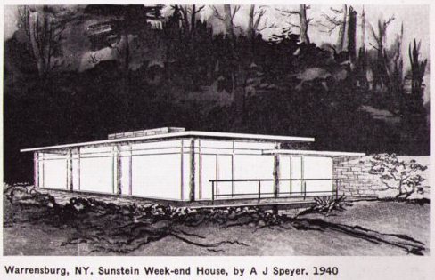
I’m fascinated by this house, though I can’t figure out if it ever even existed. It’s a “mountain week-end house” in the Adirondacks made with “tree trunk posts, slab sides, native stone, and 75% of walls glass.” Its architect, A. James Speyer, was at the time Mies van der Rohe’s first graduate student. Which makes the house sound like the strangely beautiful product of a one-night stand between the Barcelona Pavilion and a log cabin.
The house, like the Museum of Modern Art Guide to Modern Architecture: Northeast States it was published in, are both dated 1940, which could explain why there was only a drawing, not a photograph, available.
And yet I can’t find any mention anywhere of the house or its client/owner, one “Miss ‘Bird’ Sunstein.” Normally, I’d say that’s a sure sign the house was never built, but the guidebook contains detailed directions for visiting it. It’s several miles outside Warrensburg, NY, in the direction of the southwestern shore of Friends Lake. [Though they’ve upgraded some of the Earth Art locations recently, the Google Maps around Warrensburg are still unhelpfully low-res.]
Speyer would have been around 27 years old when the house was built. There are records of his architecture practice from as early as 1946, but his archives make no mention of any pre-war activities. [Speyer taught for many years at IIT, the Illinois Institute of Technology that was Mies’s American base. But he is probably best remembered as the longtime modern and contemporary curator at the Art Institute of Chicago. He passed away in 1986.]
In the last few weeks, I’ve cold-called a few promising-sounding Sunsteins and Speyers, hoping they’re related–and waiting to finally be asked to share their childhood tales of summers at Aunt Bird’s rustic modernist masterpiece. But so far, none of it rings the slightest bell.
Next up: contact the archivists at the Art Institute to see if there’s anything that may have fallen through the digitized cracks. Also, post about it online and hope that “Bird” Sunstein’s relatives are Googling during the holidays.
Category: architecture
I Love Paris In The Quarries
Spectacular. ITV took an underground tour of Paris with l’UX and the folks from Untergunther. They started in the sewer, went deeper into the quarries that provided the stones from which medieval Paris was built, and ended up–well, I’ll let you see yourself where they watched the sunrise from. [thanks for the tip, lazar!]
previous explorations of the explorateurs urbains of l’UX, Untergunther, and la Mexicaine de Perforation from greg.org
I’m Sorry, But This Headline Sounds Like It’s From The Onion
Housing Slump Begins to Hurt Classic Modernist Architecture [unbeige on a story in the la times]
Frankly, I thought the biggest threat to classic modernist architecture was the teardown-happy building boom.
Bruce Willis Type For President?
Two essays, each interesting and thoughtful on its own, crossed my desk this morning. I think they’re inter-related.
First from the always spatially aware Geoff Managh on the seemingly irrational landscapes of presidential campaigning:
…President Bush had stopped off this morning to speak about the credit crisis “with consumers and business people at Olmos Pharmacy, an old-fashioned soda shop and lunch counter” [1] in San Antonio, Texas.
The idea here – the spatial implication – is that Bush has somehow stopped off in a landscape of down-home American democracy. This is everyday life, we’re meant to believe – a geographic stand-in for the true heart and center of the United States.
But it increasingly feels to me that presidential politics now deliberately take place in a landscape that the modern world has left behind. It’s a landscape of nostalgia, the golden age in landscape form: Joe Biden visits Pam’s Pancakes outside Pittsburgh, Bush visits a soda shop, Sarah Palin watches ice hockey in a town that doesn’t have cell phone coverage, Obama goes to a tractor pull.
It’s as if presidential campaigns and their pursuing tagcloud of media pundits are actually a kind of landscape detection society – a rival Center for Land Use Interpretation – seeking out obsolete spatial versions of the United States, outdated geographies most of us no longer live within or encounter.
…
All along they pretend that these landscapes are politically relevant.

Then there was Matthew Dessem’s perceptive and awesome explication of The Criterion Collection’s seemingly inexplicable inclusion if Jerry Bruckheimer and Michael Bay’s 1998 oil-drillers [!] turned-astronauts-save-the-world disaster epic, Armageddon–which quotes the much-missed David Foster Wallace:
Critics who thought Armageddon was a sort of terminal end point for filmmaking (which is to say, all of them except David Edelstein, as far as I can tell) missed the point. Janet Maslin, for example, wrote, “Armageddon tries to tell a coherent story of guts, young love and space travel.” But I don’t think it does try; it’s not really interested. You wouldn’t criticize Star Tours or Batman: The Ride for shoddy characterization or wooden acting, and it doesn’t seem fair to me to treat movies like Armageddon as though their writers and directors had the same goals as, say, Tarkovsky. David Foster Wallace put it best (in “David Lynch Keeps His Head”):
Art film is essentially teleological; it tries in various ways to “wake the audience up” or render us more “conscious.” (This kind of agenda can easily degenerate into pretentiousness and self-righteousness and condescending horsetwaddle, but the agenda itself is large-hearted and fine.) Commercial film doesn’t seem like it cares much about the audience’s instruction or enlightenment. Commercial film’s goal is to “entertain,” which usually means enabling various fantasies that allow the moviegoer to pretend he’s somebody else and that life is somehow bigger and more coherent and more compelling and attractive and in general just way more entertaining than a moviegoer’s life really is…
…
The level of personal wish fulfilment in Armageddon is pretty easy to pick out; it’s worth noting that Michael Bay also sells a kind of national wish fulfilment. Armageddon has a serious hard-on for the early days of the space program, specifically for the sense of national purpose it gave the country. In fact, the movie suggests that that America, that national conception of ourselves, is still pretty much what we are, as you can see below.
In case you miss it, this shot is immediately followed by one of the astronauts saying “Kennedy, we see you. And you never looked so good!” Of course, he’s talking about the Kennedy Space Center…or is he? The point is, these sections are shamelessly manipulative and there’s nothing delicate about them. Nevertheless, they have an elegiac tone that’s more moving than anything else in the movie. And they seem motivated by a genuine longing for a national purpose, and national heroes, for a more innocent version of America. Of course, that America never really existed, and Armageddon offers Bruce Willis as just the sort of national hero we’re looking for, but hey, you take your pleasures where you find them…

Which makes me think that complaining about the irrelevance of political space is like critiquing the incoherence and narrative of Armageddon. The landscapes of the American political blockbuster are designed to provide wish fulfillment and a sense–however fictional or misguided–of “national purpose”–and ultimately, of a “national hero.”
As this remarkable montage of the US president [2] addressing the world shows, the common landscape of Armageddon‘s politics is the flat, square–and as Dessem points out, time zone-free–space of the television screen:
Minor Landscapes and the Geography of American Political Campaigns [bldgblog via city of sound]
#40: Armageddon [criterioncollection via goldenfiddle]
[1] as the photo shows and a bldgblog commenter points out, Olmos Pharmacy has actually been reinvented as Olmos Bharmacy, “a combination soda fountain counter and wine bar.”
[2] For a second I was worried, but then I realized that it was the other 1998 space-object-destroys-the-earth movie, Deep Impact that had the black president.
The Architect’s Wife
From Paul Goldberger’s review of 2 Columbus Circle, which began as Edward Durrell Stone’s Gallery of Modern Art and has ended up–for now, anyway–as Brad Cloepfil’s Museum of American–wait, what did the Craft Museum change its name to at the very moment that Craft gained such widespread recognition and acceptance?:
The Gallery of Modern Art, one of several quixotic cultural projects launched by Hartford, an heir to the A. & P. fortune, who died earlier this year at the age of ninety-seven, was originally intended to house his collection of figurative works and to stand as a riposte to what Hartford saw as the reign of abstraction at the Museum of Modern Art. The architect was Edward Durell Stone. Stone had been a leading American exponent of the International Style, but, in the fifties, his new wife, a fashion writer he met on an airplane, encouraged him toward elegance and decoration, and he began to fill his buildings with glitter and marble and screens and gold columns.
Oddly, he doesn’t mention that Stone was an architect on the original MoMA building, too. But what strikes me is the connection between Stone’s new, fashion-y wife and his move to decoration.
I followed the 2 Columbus Circle battle intensely closely; I practically lived next door to the Stone family on 64th St; I drive under his Russian wedding cake of a Kennedy Center whenever we’re in DC. And yet, I’ve never heard this thing about his wife. I’d always just understood that the International Style was petering out, following the Baroque/Rococo arc as architects sought to differentiate themselves and began responding to each other, with minimalist modernism echoing itself in the built environment. But really, it was the skirt “he met on an airplane”? [Not to get too Mad Men about it.]
What other random plane encounters do we need to rewrite into our understanding of history and how the world got to be the way it is?
Hello, Columbus [newyorker]
More On The Bosbaan Tribune Building, Gesloopt in 2003-4
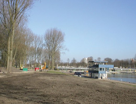
Here’s a picture of what turns out to be the finishing tower at the Bosbaan in Amsterdamse Bos. It was demolished when the Bosbaan was widened to meet international rowing competition requirements. I can’t tell, though, if this was the same as the “tribune building” “from the twenties” [??] that Korteknie Stuhlmacher Architects mention was also demolished in order that they could build a new boathouse for Okeanos, the student rowing association, and RKNB, the Royal Dutch Rowing Association.
There’s also a new finish tower, but it’s not really a tower, just a box.

Roeigebouw Amstelveen, 2000, 2005 | Korteknie Stuhlmacher Architecten [kortekniestuhlmacher.nl]
Foreman’s House At The Bosbaan (gesloopt)

The Bosbaan, or Woods Course, is the oldest manmade rowing lake in the world. It was built in the Amsterdamse Bos in 1936, and it was expanded in 1954.
Which gives a couple of interesting date possibilities for this awesome opzichtershuisje, or foreman’s house. The simple, clapboard and wood frame construction makes me think it’s the latter, though, a post-war modernist bonus. Here’s a Google Map view of it.
Do you see that floating staircase on the front corner there? Do you wonder if Winy Maas saw it at some point, too?
Unfortunately, “gesloopt” is Dutch for “demolished.”
Before There Were Shipping Container Architectures

Awesome, just awesome. Catherina Scholten’s set design for a 2005 production of Chekhov’s “Ivanov” at the outdoor theater in the Amsterdamse Bos [Woods] is just awesome.
Shipping containers topped with mobile homes and trailers, it’s the bestlooking mashup of prefab/modular and adaptive reuse I’ve seen in a long time.
As someone who grew up in North Carolina, where our rural landscapes were always dotted with trailer homes, and where our local newscasts were always dotted with reports of these same trailer homes being destroyed by tornadoes and hurricanes, the prefab and shipping container architecture industry’s condescending silence on the subject of trailer homes has been an embarrassment.
Get in touch with your brokeass roots, hipsters! The Dutch have already leapfrogged ahead!
There are wider and more detailed photos at mijn Amsterdam [via dinosaursandrobots.com]
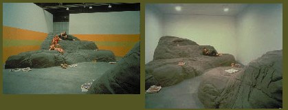
The Making Of A John Chamberlain Sofa
More 1970’s video awesomeness from Anton Perich’s YouTube channel: this time it’s John Chamberlain with a flensing knife in The Dakota.
The site is a smallish, park-facing room in writer John Hersey’s Dakota apartment. Much of the space is taken up massive, chest-high foam blocks lashed together with cords, which a gruff Chamberlain, dressed in full Pacific Theatre-veteran style–work shorts, mermaid tattoos, back hair, and suspenders–casually carves into one of his trademark sofas as a clutch of jaded groupies look on.
Unlike the low-slung prototype Chamberlain famously made for Donald Judd, Hersey’s couch stays high enough to climb into.; and it has two seating pits, not one; also, it doesn’t get the sleek, silk parachute cover, just a bunch of striped navy sheets, probably from Bloomingdale’s. Also, as far as I can tell, no one videotaped the inaugural line of coke being cut on Judd’s sofa.

The scale of Hersey’s sofa, plus the rawness of its fabrication remind me of Andrea Zittel’s space-filling Raugh Furniture series in a way that both Judd’s and Yvonne’s more furniture-like sofas don’t.
And watching Chamberlain, it’s impossible not to think of whale blubber being carved, either, which brings to mind–of all people–Matthew Barney. For all the car crashing of Cremaster 3 and the Vaseline-slice&molding of Drawing Restraint 9, I’d never thought of these two sculptors together before.
Anyway, if you’ve always wanted a Chamberlain sofa, but didn’t want to spend five figures for it, this is a great how-to video.
2025 update: Perich re-uploaded a slightly improved version from the one 16 years ago:
Salt Lake City Modern
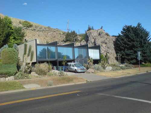
I almost never associate Utah with great–or even good–architecture, and certainly not with modernism. Even though I’ve been head over heels for this eye-popping, uncompromisingly International Style house on Salt Lake City’s east bench for something like 25 years.
Before I knew who Mies was, I just liked it for its alien qualities. With the exception of a couple of steel beamed ski cabins, it literally looks like no other house in Utah. And then there’s that giant boulder. It always comes back to the boulder.
Whoever built this house in 1959 [IIRC] did it just right; the juxtaposition of the two forms, the balance of their sizes, the tension of their placement, is all nearly perfect.
As McMansionization has swept the state–and the neighborhood, where the low-key, low-ceilinged original homes are regularly scraped and replaced with jacked up stone dream chalets–I take a lot of smug satisfaction from knowing that the coolest house in town is totally off the local radar.
I figure the boulder and the busyness of the street will help preserve it, even if its architectural merits are lost on the SLC real estate community. Or maybe a bunch of those Eichler groupies from California will discover Salt Lake’s under-appreciated modernist heritage. There’s nothing this stunning, but there are quite a few decent 60’s modern houses in the Foothill Village area. [I’ve posted some more pictures on flickr.]
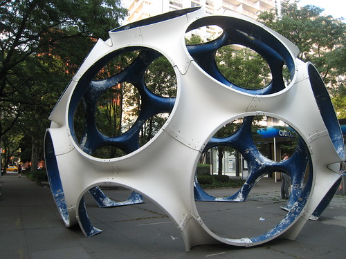
Welcome To The Fly’s-Eye Dome
The Center for Architecture, Max Protetch and the Buckminster Fuller Institute have teamed up to exhibit two of the original Fly’s Eye domes, the last dome scheme that Fuller developed.
The original 10-ft diameter dome is at the gallery, and this vintage 26-ft version from 1976-7 is currently installed at LaGuardia Park, below Bleecker St, in the Village.
It’d take some engineering, maybe thread some systems and climate management through the structure, but I could totally see turning the largest version of the Fly’s Eye into a house somewhere. Just get some of that tasty Bosch aluminum beam and build your free-standing structure within the larger space. Sort of like FAR’s Wall House, only with a dome instead of a tent.
I’d like to think that the practical problems of dome living are due to the cheap-ass, DIY nature of most of the projects, and not to something inherent in the structure. But just by virtue of it’s being cedar shingle-proof, the Fly’s Eye Dome wins the Fuller Dome Off in my book.
the Fly’s Eye Dome exhibits run through Sept 14 or so [aiany.org]
Previously: Bucky chandelier almost makes up for the severe artifact/object shortage
You’re A MoMA Gallery, You’re Garbo’s Salary, You’re Cellophane
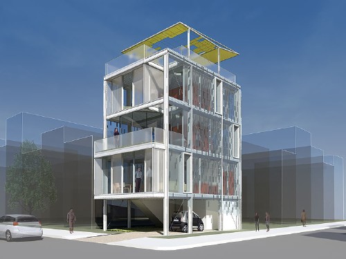
It’s been a low-intensity pleasure watching the pre-fab houses being constructed and installed for MoMA’s upcoming Home Delivery exhibition. For a variety of reasons, none of which involve seeing it completed in person, mind you, I like Kieran Timberlake’s Cellophane House the best so far.
The shortest explanation is it’s the one I could most see myself living in. Its vertical plan is urban and density-friendly. It’s extremely advanced and efficient in terms of its materials–the Bosch Rexroth extruded aluminum beams have the aesthetic sexiness, functional integrity, and off-the-shelf goodness that updates the innovations of the Eames House without merely aping its form. And its sustainability profile sounds excellent. Beyond this modernist idealism, it seems to truly extend and expand on the efficiency/quality promises of prefabrication; KT’s production paradigm of simultaneous component assembly is adapted from the automotive and aviation industries.
And part of the appeal may be the architects’ level of engagement and the amount of detail they’ve contributed to the Home Delivery construction blog, especially compared to some of the other firms. I loved this detail from a couple of weeks ago about bringing the finished building modules into the city from the factory in western New Jersey:
Time constraints, clearance limits for bridges and tunnels, and both local and federal Department of Transportation laws were taken into account to orchestrate the delivery of Cellophane House. New Jersey has a law which prohibits oversized loads from traveling on their roads at night, while New York has a law prohibiting oversized loads from traveling during the day. Therefore, all trucks will park on the New Jersey side of the George Washington Bridge before nightfall, and cross the bridge into New York before daybreak. Rigging is scheduled to commence at 6:00 a.m.
Cellophane House: Delivery [momahomedelivery.org]
KieranTimberlake site [KieranTimberlake.com]
KT just put out a book/DVD about Cellophane House’s most immediate precursor, Loblolly House, which was built on a remote island in the Chesepeake Bay [amazon]
Wait, So Is Not-Suicide Not-Painless?
Though I’ve never built a domehome or anything, I’ve been as much of an armchair fan of Buckminster Fuller as anyone. I mean, come on, man! DOMES!
But it also bugs that most of the discussion of Fuller today is wildly uncritical, tinged either with Boomer-era nostalgia for a near-paradise lost, or with the Koolaid-drunk ecstasy of the True-Believing dome builder. [Also, I’ve been annoyed by the seeming indifference among Fullerites for the material objects and artifacts of an ostensible architect/artist. But that’s just my collector’s bias.]
So the upcoming Whitney show on Fuller should be a winner on both fronts. Meanwhile, I wonder why it feels like it matters that Fuller apparently made up the oft-quoted anecdote of quasi-divine intervention that prevented him from killing himself and set him on his path to save Spaceship Earth and all her passengers? Is it because Fuller so unabashedly put on a messianic mantle? Or because even non-culty admirers like myself realize that they’d given the myth some kind of critical weight?
The Love Song of R. Buckminster Fuller [nyt]
The Architecture Market [sic] Bubble Has Popped.
The $19 million deal for Neutra’s Kaufmann House in Palm Springs has been canceled by the sellers for breach of terms.
The Rockefeller Guest House was a New York anomaly. The Farnsworth House was bought by the architecture collector. The. Collector. Andre Balasz’ Prouve is portable. After counting how many houses Michael Govan’s actually added to the LACMA collection, note that the overpriced Louis Kahn house failed to sell. The Breuer trailer-house deal barely made its reserve. Now with the Kaufmann deal unraveling.
I think we can safely say that the modernist architecture market is not, after all, a seamless extension of the art market. Somebody better tell Neutra’s son that he won’t be getting $140 million for the old office building in Silverlake. Or $3.5 million, for that matter.
Official: $19M Kaufmann House sale ‘terminated’ [via archinect]
Now That’s An Addition
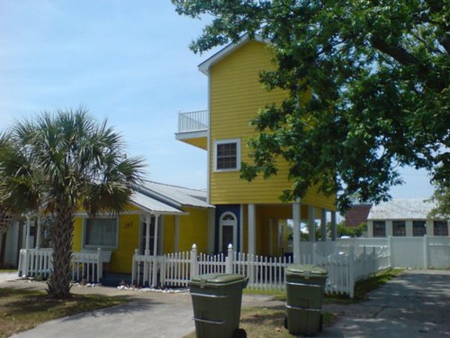
I finally pulled some pictures off my camera from last summer. That’s when I noticed this little bungalow–with a sweet, vertical addition–just off the mainstreet in Morehead City, NC.
There are a couple more shots on flickr.