
The Las Vegas Sun reports [via tmn] that because of faulty rebar–and, maybe just a little bit, because the real estate and financial markets collapsed–MGM Grand is lopping off the top half of Norman Foster’s still-under-construction skyscraper at CityCenter on The Strip. That’s the part that would hae contained the luxury condominiums. Construction on the bottom half, where the hotel will be, will continue.
Which reminds me of a story Alvaro Siza told at Columbia. He’d apparently been commissioned to design a building in Guangzhou or someplace, and when he went to the ribbon-cutting, he found out the developer had doubled the number of floors without telling him. Am I remembering that right? Because I can’t find any mention of it online.
Category: architecture
Koolhaas Hothaas

Sparks from Lantern Festival fireworks apparently lit construction debris on the roof of Rem Koolhaas’ Mandarin Oriental Hotel in Beijing a few hours ago, and the whole thing went up in flames. The hotel is part of Koolhaas’ CCTV headquarters complex. [image detail from reuters/daylife]
The NY Times reports that spectators noted that the timing of the fire was “inauspicious,” to which I’d say, “No freakin’ kidding.”
God Bless This Irredeemably Bloated, Crappily Built House
David Galbraith’s title is [un?]fortunately not a joke.
McMansions are Built With Paper and Staples
Note To Self Re: Dome Projection Using Spherical Mirror

There’s nothing specific on the horizon, but the way things are going, what with all the domes and mirrored domes and Buckminster Fuller and movies and all around here…
I mean, you never really know–and by you, I obviously mean me–so I thought I’d just go ahead and put this link to Paul Bourke’s patented system for projecting onto a dome using a spherical mirror, which he developed in 2003.
Actually, it seems to use a hemispherical mirror, and there are apparently inflatable domes for all your portable indoor planetarium needs–according to the FAQ, a 3m inflatable dome is ideal for half a dozen adults or a dozen children–and seamless works better than paneled.
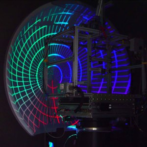
Another note to self: I don’t care what they call them in Wollongong, but I will not be calling them Sphemirs. And probably not Mirrordomes, though that is much better.
Dome projection using a spherical mirror
Variously referred to as “sphemir” or “mirrordome”,
Conceived by the author in 2003 [uwa.edu.au via city of sound]
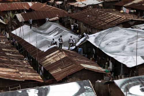
Google Earthwork: JR’s Projet Women Of Kibera
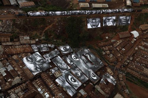
Well that didn’t take long. From the always awesome Wooster Collective comes word of a new work by the underground artist JR, Projet Women of Kibera, part of his ongoing 28 millimetres series he has been working on since 2004.
JR shot portraits of women in Kibera, a poor neighborhood alongside the train tracks in Nairobi, Kenya, and printed them on roof-sized vinyl, which was installed on the womens’ roofs. The photos are visible from the train–and from Google Earth–and the vinyl also helps keep the rain out.
And when Google Maps takes a higher-resolution pass over the slums of Nairobi, it’ll be visible there, too.
JR Finishes His Most Ambitious Project Yet [woostercollective]
JR’s portfolio site [jr-art.net]
See a whole slew of Kibera photos as the 28 Millimetres site [28millimetres.com]
Heads Up: Roof As nth Facade
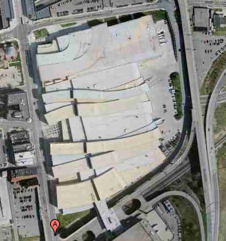
The first place I remember hearing the idea of the roof as a “fifth facade” was Peter Eisenman talking about his Columbus Convention Center, from 1989, but completed in 1993.
With an awkward, constrained site sandwiched between downtown and a tangle of freeways, Eisenman recognized that the most important vantage points for the building were from the air–from passing motorists, conventioneers’ hotel rooms, and arriving airplanes. So he translated his program of entry lanes and loading bays sculpturally across the building.
You’d think the triumph of the rendering and virtual formmaking software and the whole, architecture as sculpture/object era would have heightened sensitivity to 360-degree design. But Google Maps makes it immediately clear that architects can be divided into those who consider the roof, and those who consider the roof an easy place to hide the air conditioner. Well, it ain’t hidden any more, folks.
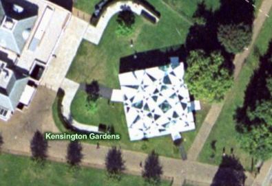
I was reminded of this while surfing through pmoore66’s vast collection of aerial views of modern and contemporary architecture. While there are definitely wholly considered designs that look good on Google Maps, there are a very few–like Toyo Ito’s 2002 pavilion for the Serpentine–which seem to give special attention to the bird’s eye view.
On the one hand, it seems obvious that this vast, global audience should be factored into the creation of architecture. But on the other, it seems absolutely insane to design a structure, a space, for people who won’t be anywhere near it, but sitting in front of some screen on the other side of the world.
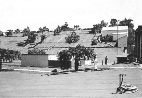
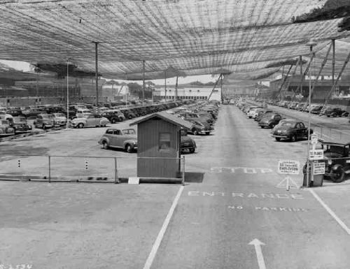
Maybe the next Bilbao Effect, sure to appeal to striving cities in these difficult budgetary times, will be to commission grand architectural designs purely for the benefit of the Google Maps audience. Like the rural streetscape camouflage which was applied to the roof of the Lockheed airplane factory in Burbank to thwart Japanese bombers during WWII, cheap, easy, flexible Potemkin roof structures could really put a town on the map, so to speak.
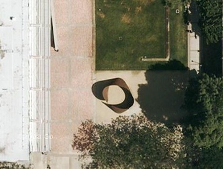
Richard Serra Sculptures On Google Maps
The whole thing about the only human construct you can see from space is the Great Wall of China will be amusing to people growing up in the Google Maps era, where you can’t hide anything from the satellite’s surveilling eye. It’s the geospatial equivalent of explaining TV before remotes and cable: it’ll just make you sound old.
So kudos to Richard Serra for being ahead of the curve [no pun intended] on making work that turns out to be well-suited for viewing from our new conveniently God-like vantage point.
I started to make a list with the Torqued Ellipse in front of Glenstone, Mitch Rales’ foundation in Potomac, and the suggestion from Guthrie of T.E.U.C.L.A., a torqued ellipse in the Murphy Sculpture Garden behind the Broad Art Center at UCLA, described at its installation in 2006 as “the first public work by sculptor Richard Serra installed in Southern California.”
And that reminded me that the Broads have had a Serra titled No Problem in their backyard for a while, which, thanks to Google Maps, is now public. Searching for that image led me to pmoore66’s collection of bird’s eye view Serras around the world at Virtual Globetrotting. If you count Robert Smithson’s Amarillo Ramp, which he helped complete after Serra Smithson’s death [!], pmoore66 has sighted 44 Serras around the world using either Google Maps, or Microsoft’s Bird’s Eye View, plus another four shots on Google Streetview. [Here are the search results on Virtual Globetrotting for “Richard Serra”, but that link looks a little unstable.]
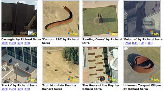
With more than 1,700 entries so far, pmoore66 appears to be almost single-handedly pinning down the modernist canon for architecture and outdoor sculpture. This warrants some looking into. Stay tuned.
The more oblique angles of birds-eye-view seems to suit Serra’s sculptures better, and they remind me of a series of little desk tchotchke-sized versions of monumental sculptures called minuments that I saw in the ICA London bookshop a few years ago. As soon as I can figure out how to get Google to stop spellchecking for me, I’ll get the artist’s name.
Mies Gas Station: I’m So Happy. Now I Have A Place To Put My Skyway
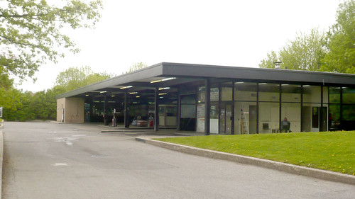
Alright, I know where I’m going to put my decommissioned Skyway: right next to my decommissioned Mies van der Rohe Esso Station.
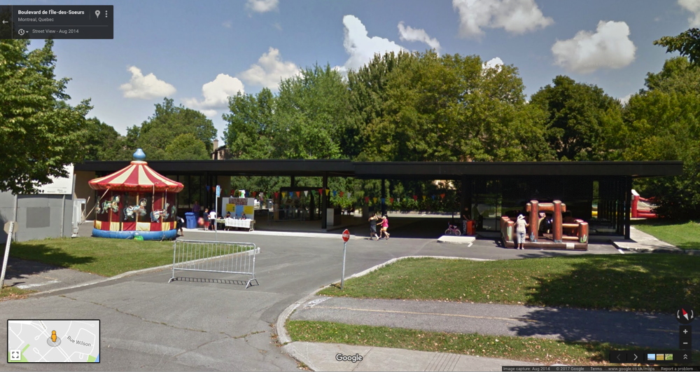
Mies’ office designed three apartment buildings on l’Ile des Soeurs in Montreal beginning in 1963, which were joined by a gas station in 1968, a year before he died. [here’s the Google Map of the gas station. There’s no streetview.2017 update: Oh yes there is. And it had a bouncy castle.]
The building is on a corner, and is long and low and mostly a void. The most prominent feature, the black steel awning over the pumps, runs between a glass & buff brick box on one end [the store] and a glass & steel box on the other [the garage and office]. Looking at flickr member zadcat’s photos up close, the gas station looks mostly stock; there’s none of the material preciousness of, say, IIT’s custom profile I-beams, and forget about the Barcelona Pavilion’s meticulously matched marble, travertine, and onyx. This is a utilitarian building created by a mature architect’s office which, for better and worse, knew its way around the construction industry.
Tucked away on the far, quieter side of an already quiet residential island, the old school Esso station lost business to a newer, more amenity-filled competitor near the bridge, and it was recently closed. Now a debate is on about what to do with the property.
Toronto’s Globe & Mail reports that public hearings on the fate of the defunct building, now owned by some developer, were set for this week. There’s talk of a flower market which might leave the building pretty much as is, or maybe they make it into a youth center, which means destroying it by remodeling it.
The option that wasn’t mentioned in the paper–perhaps because the city peres in Montreal were graciously waiting for me to proffer it–is to let me have the building in exchange for dismantling it and removing it to a new site so I can live in it.
It’s already clear that even though it is his only gas station, its timing, and the process under which it was designed mean it is not a super-important example of Mies’s work. In other words, Montreal shouldn’t get too worked up about it.
And that same standard issue construction quality means you don’t necessarily need to sweat wrapping and numbering every brick and plate of glass.
Practically speaking, dismantling, moving, and rebuilding offers the aspiring gas station dweller like myself the best of all possible worlds: the sleek, authentic industrial architecture and space, in the ideal setting of your choice, with absolutely none of the environmental toxicity complications of the original site. The fact that you’re preserving and breathing new life into the work of a master of 20th century architecture is pure bonus.
But it’s the bonus that makes the whole concept possible. No run of the mill gas station is worth the irrational expense and hassle of dismantling, conservation, and reassembly. And while it’d be arguably cheaper and more practical, building a house from scratch that is a replica of a Mies van der Rohe gas station just seems sad and pathetic to me, like making yourself an exact copy of Southfork. No, saving a Miesian landmark provides the necessary conceptual cover to make an otherwise crazy plan seem rational, even imperative.
And then the Skyway can be my office and editing suite right next door.
You can come live with me, Ritz! The Ritz of gas stations looks for a new life [globe & mail, via archinect and tyler]
Chad loves Mies’s gas station [tropolism]
previous residential gas station fantasies here and here
Minnesota NICE: Skyway For Sale On Craigslist
Ho-ly smokes.
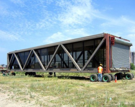
The Minneapolis architecture firm City Desk Studio just put a skyway up for sale on craigslist. A freakin’ skyway.
It’s a steel girder and glass box, 20 x 83 feet, and 14 tall, designed by architect Ed Baker [“the father of the skyways”] to connect JC Penney’s and Powers department stores. The 12-inch concrete floor accounts for about half of the skyway’s 280,000-lb weight. [That’s half a Richard Serra retrospective, for those keeping score at home.] It was apparently assembled in three sections and filled in with glass after it was installed.
City Desk Studio’s asking price is currently $79,500, which is a huge discount from the $1.2 million they expected to bring in by turning the skyway into the Skyway Retreat lakefront cabin and selling 12 4-week shares for $100,000 apiece.
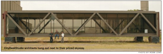
And it’s probably a little more than they paid for it in 2006, when the architects bought it on a whim at a University of Minnesota blind auction. According to a report at the time, it cost them more to move it [two blocks] than to buy it.
Right now, the skyway is sitting somewhere “near the University of Minnesota Minneapolis campus,” and you’ll need to move it. Fortunately, the U of MN is on the Mississippi River, so if you could get the skyway onto a barge, you could float it down the river and into the Gulf of Mexico. From there, you could load it onto a freighter and sail it anywhere on the East Coast. Hell, you could sail it anywhere in the world.
Then plop it down right next to the smug schmuck who just topped off his shipping container house, the one with the 8-ft ceilings and the less-than-10-ft wide rooms. Then invite him over for a hot dish.
Skyway for sale – THAT’S RIGHT – AN ACTUAL SKYWAY! – $79500 (Minneapolis) [minneapolis.craigslist.org, via walker blog, thanks andy]
A Disconnected Skyway: Downtown architectural firm considers new options for an ‘icon’ of the skyline [2006 downtown journal article, pdf]
City Desk Studio Skyway Retreat (unrealized) [citydeskstudio.com]
“Topaz Carpenter”
I’d had the idea all worked out, and the script outline–or a draft of it, anyway–all ready for a couple of years, but my paternal grandfather Champ passed away before I was able to make the original documentary about him I’d envisioned.
In 2001, I rather impetuously set off to interview my grandmother Avis, his wife, about their life. Which is when I learned he’d been in a band. With outfits and everything. A dance hall country band that traveled the desert towns in Utah and thereabouts. It’s how he and my grandmother had met. I guess that made her a groupie.
As long as I’d known, he was only ever the gregarious, Center Street businessman, the guy who ran the dry cleaners where everyone took their Sunday clothes. But my childhood memories of him picking songs for me on his guitar changed as I imagined how, for him, playing music was also a reminder of the life he’d given up when he had a family.
I’d met my great uncle Wayne, Champ’s brother, twice. At Champ’s funeral, and then a little over a year ago at Avis’s. It occurred to me that I should talk to him, hear his stories, see his photos and mementos. Because he is only one of a few people left who can provide some sense of my grandfather as a young man.
And so over Christmas, I took a few hours to visit with him and his wife. And that’s when he told me in addition to a musician, my grandfather had been a hobo. In central Utah in the Depression [aka, the last Depression, -ed.], there wasn’t enough work in your tiny hometown, so you had to hit the road to find a job.
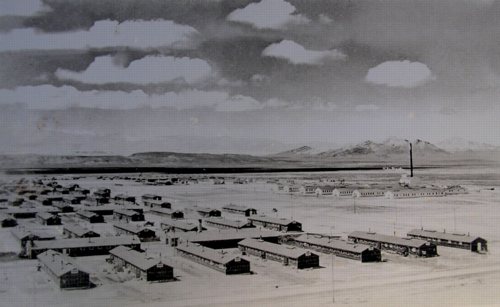
And in the Summer of 1942, after he and Avis married and had one, maybe even two kids, he left them and traveled to the desert town of Delta, where he got a job building the Topaz Internment Camp, where over 8,000 Japanese Americans were imprisoned for up to three years.
Like most all the internment camps, Topaz Camp was built in a hurry, on a grid, using plans adapted from military barracks. Tarpaper-covered sheds were finished in sheetrock on the inside, and each block was divided up into apartments in a range of sizes–all too small–to accommodate different sizes of families. If they wanted any furnishings beyond the military cot provided, the internees had to build it out of the scrapwood the carpenters–including my grandfather–left behind.
Specifics of the camp’s buildings and design were collected by the National Park Service, which conducted a survey in 2005 of all the sites and artifacts associated with the imprisonment of Japanese Americans [pdf], in order to identify candidates for National Historic Landmark status. In their report, it says,
Local craftsmen were used, but the requirements were not always stringent; in Millard County, Utah, near the Topaz Relocation Center, “Topaz Carpenter” is still a derogatory term, since anyone who showed up at the site with a hammer would be hired.
And a damn good thing, too, I guess. It’s an odd feeling to suddenly find oneself–or one’s family–on the wrong side of history. On several wrong sides, actually, if the “Topaz Carpenter” dig were real. I don’t doubt that some people say/said it, but it so happens that my maternal grandmother grew up in Delta, and neither she nor her people seem to have ever heard the term.
Until I posted about it, the NPS survey was the only Google reference to Topaz Carpenters. It was someone’s insult generations ago in the middle of BF Utah, and it ended up in a government history survey, sounding pretty official. Part of me wants to defend my grandfather by disproving the term’s popularity, as if that would somehow change its accuracy. Because he really was a guy who showed up with a hammer, got hired, and who, in just a few weeks, built a prison camp for his fellow Americans.
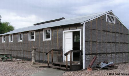
After the camp was closed in 1945, the barracks were either torn down or sold to local farmers, who used them as barns, even a home or two. There was one left nearby–half of one, really, a 20 x 60 section, being used as a shed–which was donated and restored in 1991 to help create the Topaz Museum. [images: greatbasinheritage.org] Which is now on my list of places to visit next time I’m in Utah with a couple of days to spare.
Previously:
This [Japanese] American [Internment Camp] Life [greg.org, 2007]
Ansel Adams Japanese American concentration camp photos from Manzanar [greg.org, 2003]
Muji Village: “Green, Plain, Community”

Muji has teamed up with real estate developer Mitsubishi Chiso [Mitsubishi Estate] to create Muji Village, a three-building condominium complex in Chiba Prefecture, the New Jersey of Tokyo. Or maybe it’s the Westchester of Tokyo, and Saitama’s New Jersey, but still. [here’s a Google map of the site. It’s near Maebara and Tsudanuma stations, and it used to contain a six-building municipal housing complex from 1960.]
The concept for Muji Village boils down to three points: Green, Plain, and Community. Green means trees, not ecologically sustainable. Plain means “white, 100 year concrete” and design that won’t go out of fashion [sic], plus flexibility to remodel as your family configuration changes, and Community means common spaces like libraries and a couple of gardens.
Frankly, even though Muji is pervasive to the point of saturation in Japan, I’d still suspect that Muji Village is being built on the premise of a particularly brand-centric “feel good lifestyle,” and that it is intended to attract like-minded Muji aficionados–Mujillas in this case, not Mujillahs.
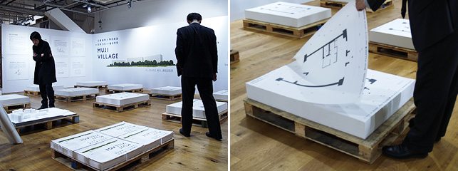
Last month at the flagship store in Yurakucho, Muji Atelier exhibited poster-sized Muji Village floorplans in a grid of stacks on the floor. They were meant for you to roll up and take home, so you could discuss them at your kitchen table and decide the layout you preferred best. Such presentation, such collaborative spirit, such freedom of choice! It’s as if Muji Village’s exclusive broker was Felix Gonzalez-Torres.
I can’t find any info on prices, or photos, or renderings. And yet the Muji Village website says they are currently looking, not for buyers, but for “members.”

update: Aha, here it is. 9 stories, 152 units, Sounds like Mitsubishi came with an existing project. Muji’s doing the exterior, unit interiors, and common areas, including the Community “living rooms.” Sales and model room debut in late January for Feb. 2010 occupancy. [via nikkei business preess, sept. 08, before the real estate development world ended]
Muji Village info page and exhibition [muji.net]
Muji Village website [muji-village.com]
Yet Another Muji House
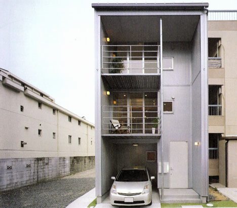
While New Yorkers still can’t believe they finally have three Muji stores, Japan last year got its third model of Muji House.
Last spring, the company introduced Ki no Ie 3-kai-date, a vertically oriented, 3-story variation of their 2-story Wood House. [The other model is Mado no Ie, Window House.] The 3-story model home was unveiled in April 2008 in Toyonaka, the Osaka metro city where Kansai Airport is located.
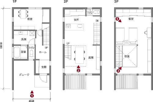
Holy smokes, it’s tiny. Less than 100 sq. m inside, 130 sqm including the carport, porch and balconies. Still, the interior feels pretty spacious, if only because it is; the third floor bedroom opens onto the living/kitchen below. If you need a second bedroom, there’s an office/storeroom on the ground floor.
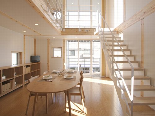
Muji Houses aren’t prefab; they’re manufactured, and assembled onsite. Ki no Ie is pretty spartan, and it uses a post & beam construction system of engineered wood which, as you can see, you can see. I couldn’t find price info for the 3-sty, but the 2-story Ki no Ie sells for about 108,000 yen/sq meter, or about $110/sf.
Muji Ie: Toyonaka Model House [muji.net/ie, in japanese. via mocoloco and jean snow]
Muji Ie – Muji House, main page [muji.net/ie, no mention of the 3-story model]
Muji House Blog – Toyonaka [ie.muji.net, their web presence is pretty damn complicated for such a pared down company]
Miguel Barcelo, 100 Tons Of Paint And $25 Million Walk Into The UN…
 Spanish artist I’ve never heard of #48 Miguel Barcelo got the commission to paint the domed ceiling of the UN Palace of Nations’ Human Rights and Alliance of Civilizations chamber in Geneva.
Eyeteeth has some photos; Designboom has some background on the making of, which involved pigments from around the world and paint ball guns.
Apparently, the minority right in Spain has raised a stink about the government’s share of the $25 million cost. In retrospect, they probably could’ve saved a bundle if they’d let Sony shoot a Bravia ad during production. A 4,600 sf paintball target of peace presents an attractive marketing hook.
Room XX by Miguel Barcelo [designboom]
The UN’s Stalactite Ceiling [eyeteeth]
A Tree Grows In Poundbury
I liked Stephen Bayley’s takedown of New Urbanist prig Duane Urbany in the Guardian last weekend, partly for its awful description of Poundbury, a traditionalist-veneered village [sic] in Dorset that’s beloved of Prince Charles:
To visit Poundbury is to be delivered to the furniture floor of a provincial department store in 1954, translated into architecture. It is fake, heartless, authoritarian and grimly cute.
Sounds like early Levittown, but without the charm.
But I love Paul Russell’s bleak photoset of Poundbury, including this unexpectedly awesome photo of a tree. If I were feeling poignant, I’d say it’s doing a deft impression of a Rebecca Horn sculpture. But given the setting, we can be sure it’s actually trying to knock down the wall and flee. [via things]
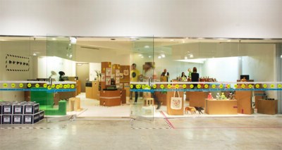
Also, You Can Totally Sleep In A Cardboard Box
From Unbeige:
Box Top is no mere pop-up shop; it’s a four-day retail experience. Open through Saturday in Miami’s Design District (4141 NE 2nd Ave.), the ephemeral emporium is the collaborative effort of I.D. Magazine, Areaware (our favorite purveyor of extraordinary things), and “quintessential lifestyle navigator” Charles & Marie.
Mhmm!
Here’s Rich, Brilliant & Willing’s concept for “BOX TOP SHOP: A [hey!] four-day retail experience” :
Using the language of shipping materials, namely cardboard boxes and tape, Rich Brilliant Willing has devised a practical solution to create a temporary retail environment. By using flat-packed hollow volumes (cardboard boxes), a shop is assembled in a single day. The boxes provide the necessary presentation requirements of merchandise using a minimal amount of material–the boxes themselves are readymade components drawn from a variety of manufacturers and industrial suppliers. Rich Brilliant Willing assembles these ubiquitous elements into a cohesive, functional whole: The Box Top Shop.”
Time was when the design world’s biggest disconnect came in the translation from rendering to realization. As RBW’s photo and rendering show, that is not the case here.

First on Unbeige [sic]: Design Miami: I.D. Magazine Teams with Areaware, Charles & Marie on Box Top Shop [unbeige]
Design Miami 2008, November 21, 2008 [id-mag.com]