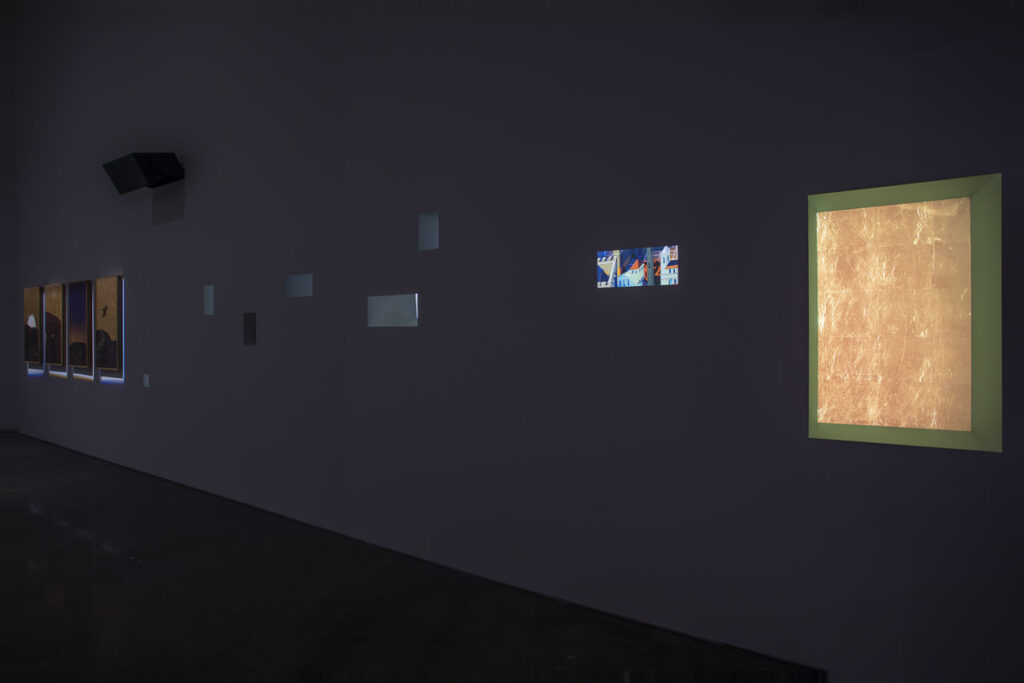
How can something feel completely otherworldly and viscerally, personally real at the same time? Or maybe it toggles back and forth, faster than a toggle, a vibration, a quantum state where quotidian sensation and transcendence are both present until the instant you take measure of it. And then you realize you’re in a darkened gallery, with several of Mark Leckey’s multichannel video and audio works looping around you at once.
And some of the things on the wall are paintings, icons, and some are monitors, and some are apertures. But then Leckey’s comment about icons collapses those distinctions: “they are not an image, or a picture, but a window through which we can mediate between material reality and disembodied realms, and between distant persons and ourselves.”
A fleeting credit title in one work and and the shoutout to the artist’s longrunning radio show orient Leckey’s Gladstone Gallery show toward music. But it’s only when I’m home that I realize how familiar some of the overwhelming elements of the installation are, and why: they include audio tracks on his Bandcamp and videos on his YouTube.
These platforms are as much studio as presentation, especially in the moment—2021-22—when the most intense experiences of the pandemic remained largely unprocessed, and normal [sic] life was still a tentative thing.
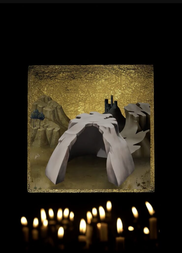
Screenshot from Mark Leckey’s Carry me into the wilderness, 2022, depicting an icon after Lorenzo Monaco, via youtube
Leckey’s show,3 Songs from the Liver, is at once an evocation of these moments and memories of trying to live and connect online while barely holding it together, and a rejoinder that physical experience and IRL encounters can be sublime, even sacred. For all their elegiac sense of having made it through the wilderness, the show’s visual references to 14th century painting also nod to the future. Taken together with the most disturbing sculpture/video from the present, it’s not clear whether Leckey sees another Renaissance awaiting us, or just wars, plagues, and tyranny. Maybe it’s both.
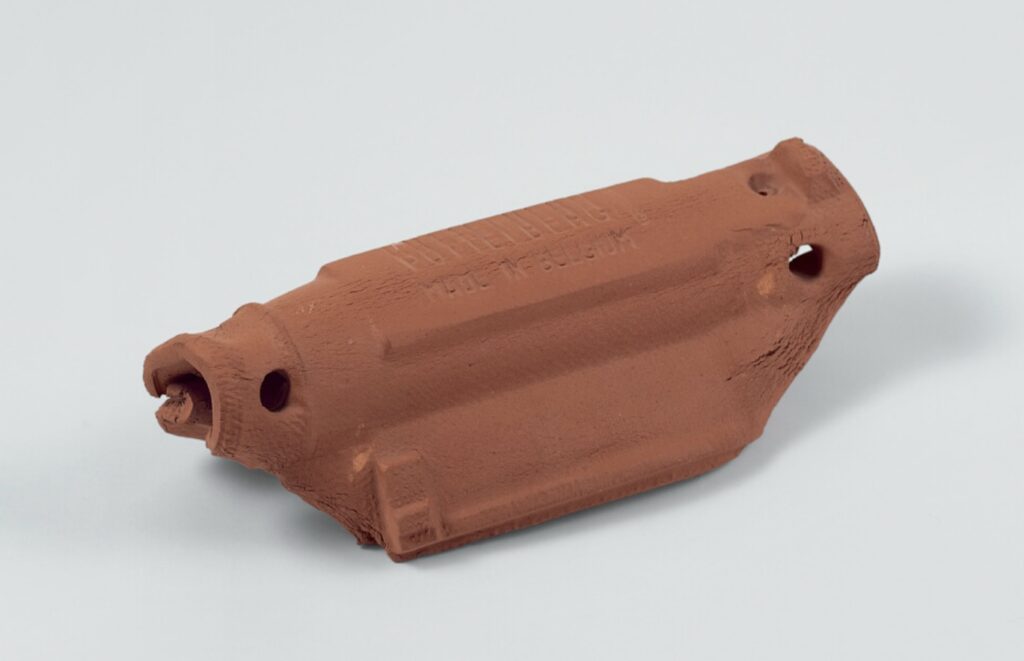
In 1993 Gabriel Orozco made sculptures by poking, clawing, and bending ceramic roof tiles on the Pottelberg factory floor in Coutrai, Belgium. Then they went into the kiln, fixing the artist’s slight gestures, marks, and even fingerprints forever. Or at least as long as you take care of them.
At least two variations resulted:
Pluie de Doigts (Rain of Fingers), was a group of sixteen flat, interlocking tiles, in which the main gesture was Orozco poking the clay with his fingers. Though a couple of the tiles show a little more aggressive manipulations, the overall effect of the stacked tiles is of the slightness of the raindrops’ traces.
Gabriel Orozco, Made in Belgium, 1993, terra cotta, one of 14, a 2023 gift of Howard and Donna Stone to the Art Institute of Chicago
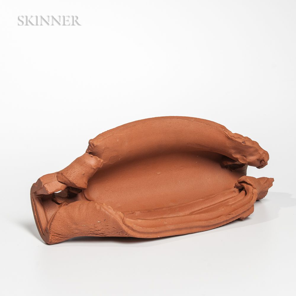
There was also a group of fourteen half round tiles, with the title of the foundry’s stamp, Made in Belgium. They were each clenched in intimately ominous ways that evoked the clay lump of one of Orozco’s earliest masterworks, My Hands are My Heart (1991); and torqued into forms that Richard Serra would later explore in steel on another factory floor years later.
Gabriel Orozco, Made in Belgium, 1993, sold by the estate of Richard Anderson at Skinner in 2018
These were exhibited as an installation scattered across the floor of the vaulted cave of Chantal Crousel’s Paris gallery, but were sold individually, as unique editions.
So this body of objects is scattered, and their relationships and this installation, are basically lost. And the ostensibly more significant unique sculpture, which is fine but whose interventions are ultimately less interesting, is acquired by a privileged collector, and preserved and promoted—and is now to be purged.
This paradox is acute with Orozco’s work, which has often found extraordinary beauty in the most ephemeral gestures or fleeting observations that run counter to the market’s—and, frankly, institutions’—conflation of scale and effort with importance. While collectors were offered large, indistinguishable gold leafed paintings, Orozco’s tablesful of maquettes and tiny, perfect objects would only be sold en masse, to a museum. [Or a collector’s private museum, RIP.]
The Funeral was good, though, and its sense of being unresolved really comes through irl.
But the way bigger is better, and a unique [sic] work is privileged over an edition, is a real, net negative for artists who have some of their most important achievements in series or small works. I just saw a room at the Met filled with giant Manets, and all I got was a longing for a little dog. I bought the last of the Made in Belgium edition more than 25 years ago, and even on its own, it’s better than Rosa’s. She had some truly major Orozcos, and this ain’t one, but good luck Wednesday.
[update: congratulations to the $15k bidder who got them for $18,900 all in] Previously, related, but kind of cranky of me, tbqh: Gabriel Orozco at Documenta 11
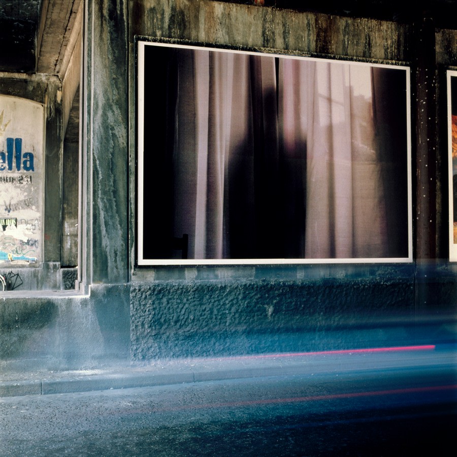
Felix Gonzalez-Torres, “Untitled”, 1992, billboard as installed in Copenhagen in 1992 for Paradise Europe, image: Bizart via Felix Gonzalez-Torres Foundation
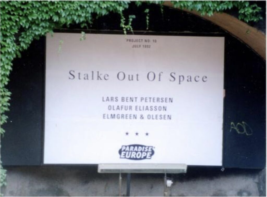
In July 1992 Felix Gonzalez-Torres showed “Untitled,” a photograph of a figure silhouetted against a curtained window, in Paradise Europe, a group exhibition in Copenhagen of 120 artist billboards organized by Bizart, Ny Carlsberg Glyptotek, and five galleries. [One, the local gallery, Stalke Out of Space, had already begun postering Copenhagen as an artistic practice and distribution platform in 1991, and was itself part of the exhibition, in addition to representing four of the artists. But let’s come back to that.]
Felix traveled to Copenhagen and presented a lecture there, which we know from a 1993 interview, published by A.R.T., when Tim Rollins mentions “grumbling” over “the lack of overt political or Latino content” in his work:
I had a problem just recently in Copenhagen where I went to give a lecture. A man in the audience immediately started talking about winning the battle for multiculturalism. I said: “Look, okay, first I have trouble with that kind of language about winning battles. That’s too male-oriented for me. That’s too macho, that’s too much about war.” Then he said something about numbers-a certain amount of women, a certain amount of Hispanics, etc. No, multiculturalism is not about numbers, it’s about inclusion. It’s about opening up the terms of the argument, opening up the terms of the discourse so that everybody can participate with equal footing. It’s not about naming two female, three Hispanics, four whites, five blacks… It’s not about quotas. Sometimes quotas are necessary when it comes to concrete things like businesses, but in culture it’s more complex. It’s about opening up the terms of argument, and it’s about re-addressing the issue of quality and who dictates and defines “quality.”
Now in the latest episode of The Art Newspaper’s podcast, A Brush With…, where Ben Luke interviewed Michael Elmgreen & Ingar Dragset, we learn that Michael was in the audience for Felix’s lecture. Michael, who still considered himself a poet on the threshold of being a fine artist, wrote to Felix, inviting him to dinner, “because I had a lot of questions about how to do art, and how to deal with identity in such a fantastic way, like he did.”
It’s a wonderful story which the super-prepared Luke had never heard, and which I, who’ve been immersed in these artists’ work for decades, had never heard, either. And yet it seems to have been profoundly important to Michael’s work: “We spent a long night where he generously gave me a lot of inspiration, and a lot of hope for continuing doing art projects.”
In the interview Michael didn’t mention the year, so I pulled that, and the show, from Felix’s exhibition history. Felix’s response to Rollins resonated anew with Elmgreen’s response to Josh Spero in the Financial Times in October:
He is slightly less delighted when I read out a quote from a 2002 review, which says — in an apparently supportive way — that Elmgreen & Dragset had staged “a ‘gay infiltration’ of minimalism’s famously macho high aesthetics”. “Minimalism has been infiltrated by queerness from the very start,” Elmgreen says. “I’m sorry, dear heterosexuals, but you can’t trademark minimalism as yours that will [then] be infiltrated by queers . . . You don’t need to accept being boxed in as a queer artist and having certain sets of aesthetics that are provided to you because you are not a heterosexual man.”
What I did not expect to find was the full artist list for Paradise Europe [pdf]: Lorna Simpson, Guillermo Paneque, Sean Landers, Felix Gonzalez-Torres, Emilio Fantin, Federico Guzman, Formento-Sossella, Tommaso Tozzi, Lars Bent Petersen, Stalke Out of Space, Alan Belcher, Olafur Eliasson, Lothar Hempel—and Elmgreen & Olesen.
poster for Paradise Europe, “Project No. 18” of Stalke Out Of Space, with billboards by artists Lars Bent Petersen, Olafur Eliasson, and Elmgreen & Olesen, published in Sam Jedig’s Flying Notes On ArtStamp.dk
So not only was Michael in the audience, he was in the show. And in a collaboration with, I think, Henrik Olesen. Olesen’s CV does not include this show, or any work before 1995. Elmgreen & Dragset, meanwhile, mark the beginning of their artistic collaboration to 1995, after becoming a couple in 1994.
Besides that Stalke poster above, the only other prominent online mention of Elmgreen & Olesen is of work held at the Esbjerg Kunstmuseum.
But as much as I want to know more about this collaboration and their work, I’m even more intrigued by the idea of Elmgreen— and Dragset—being inspired by Felix’s work. And not just because I have a work from the 1990s by them, that is a slide projection on a wall of the silhouette of a man. For years, I’d lowkey regretted not also buying the emptied pairs of jeans and underwear on the floor, which was in the same show. But now I think I’m good. And I want to dig that piece out of storage again.
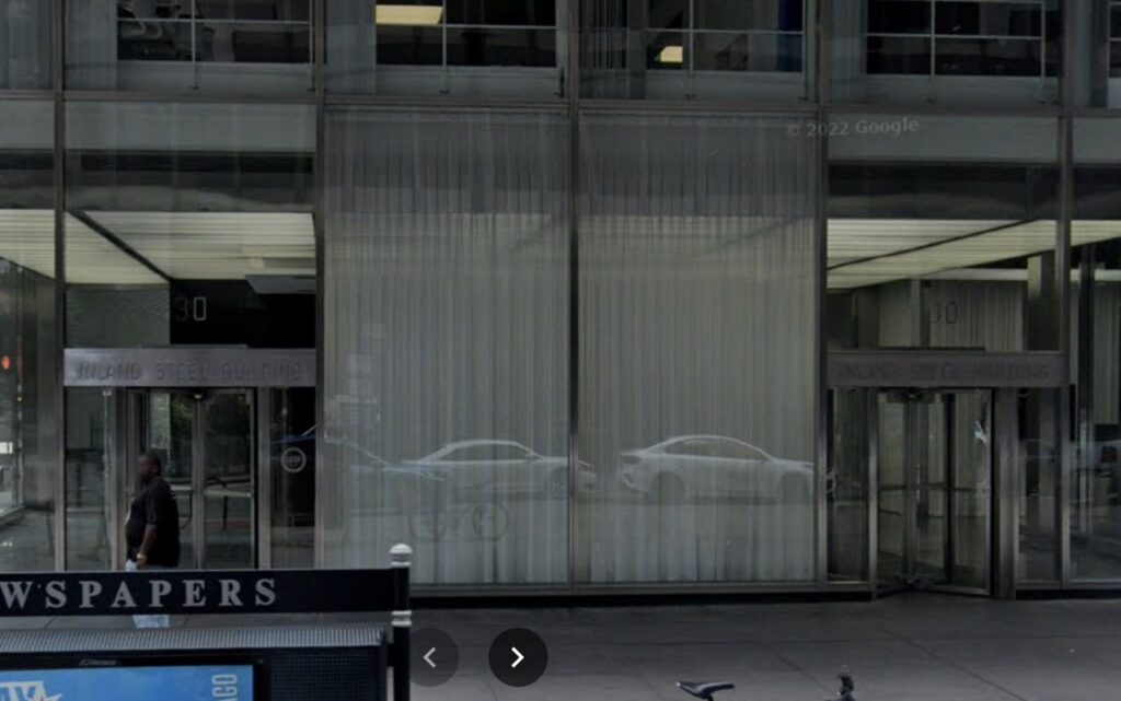
Inland Steel Building, 1958, Chicago, as documented in Aug 2022 by Google Streetview
While looking at Skidmore Owings & Merrill’s Inland Steel Building in Chicago, I was surprised to find curtains had been hung in its iconically transparent lobby.
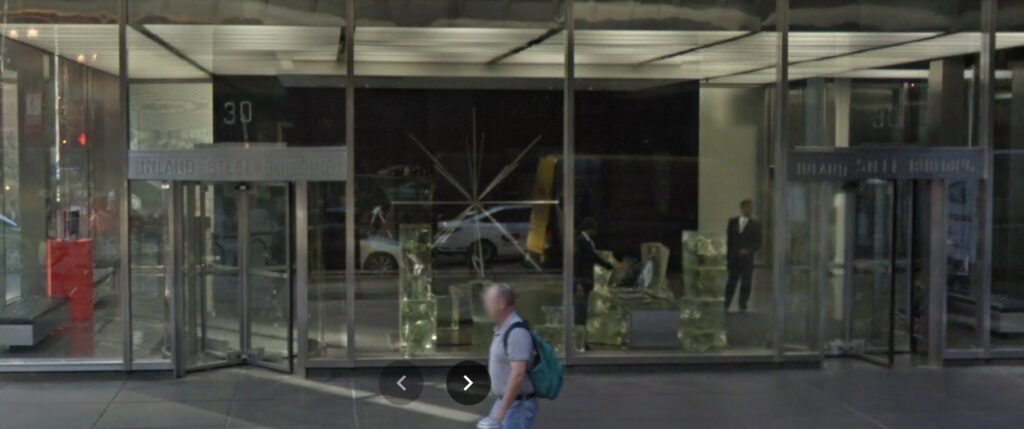
Inland Steel Building, Lippold, and Gehry, as documented in Sept 2017 by Google Streetview
Installed between the 2017 and 2018 Streetview updates, the curtains entirely block the view of Radiant I, Richard Lippold’s perfect lobby art, a sculpture of webbed wire, steel, gold and copper, hovering above a reflecting pool. But I suspect that is just collateral visual damage, and they were really installed to block the view of the massive cast glass jumble of Frank Gehry’s security desk. Or perhaps they’re really just to give the security guards a bit of privacy in which to check their websites, and blocking the view of Gehry’s desk is just a bonus.
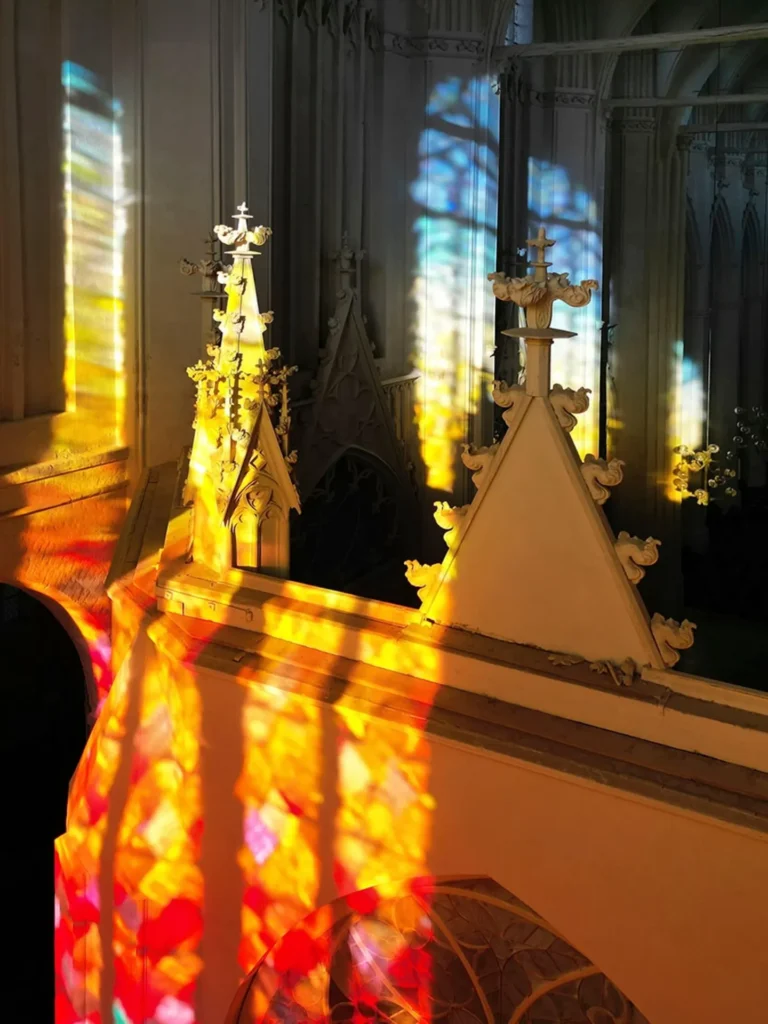
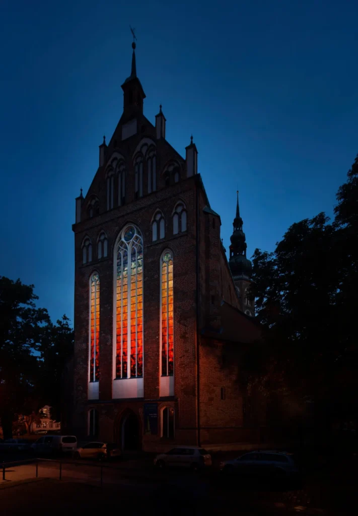
Olafur Eliasson, Window for Moving Light, 2024, stained glass and heliostat, St Nicholas Cathedral, Greifswald, Germany, image: Jens Ziehe via olafureliasson.net
Olafur Eliasson has created a work of light and handblown glass for the east windows of St. Nicholas’s Cathedral in Greifswald, a Hanseatic city near the Baltic coast of Germany, which was the birthplace of Caspar David Friedrich. Originally built in the 14th century, the church was remade in the 19th century with woodwork by Friedrich’s brother, Christian Adolph, including the elaborate Gothic choir wall which closes off the windows from the rest of the interior.
The work is titled, Fenster für bewegtes Licht (Window for Moving Light). Because the east window only catches the morning sun for a small portion of the day—and that portion is limited further by the building directly across the street—Eliasson installed a heliostat, a mirror that tracks the movement of the sun, on that building to reflect afternoon sun into the morning window.
Olafur Eliasson, Window for Moving Light, 2024, exterior view of the east facade of St Nicholas’s Cathedral, Greifswald, photo: Jens Ziehe via olafureliasson.net
When I first discussed with Olafur an idea for a work that involved a heliostat reflecting light into our north-facing apartment in New York, in 2003, [while I had the concept, he already knew what a heliostat was and where to get one], I imagined sunlight that doesn’t move around the room would become very unsettling.
So it is buck wild to see a similar setup behind the altar of a church, where it is intended to encourage “pause and reflection – aspects central to both the Romanticism of Caspar David Friedrich and Protestant spirituality.”
Or does an beam of sunlight coming at an uncharacteristic time into a building oriented so specifically have a different effect? The afternoon sun from the east can become a metaphor, or it can encourage pause and reflection on the human, artistic intervention that produced it, drawing viewers’ attention to the world outside the church.
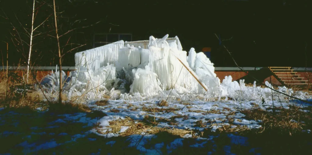
Olafur Eliasson, Atlantis, 2003, photogravure on Hahnemühle, 34 x 68 cm plate on 54 x 84 cm sheet, ed. 35, produced in 2004 by Niels Borch Jensen Editions, image via olafureliasson.net
I don’t know why, but this early-ish Olafur Eliasson work popped into my head this morning: a pile of debris accumulated outside Eliasson’s studio near the Hamburger Banhof in Berlin, which the artist sprayed regularly with water until it formed this mass of ice. Which, I never realized all this time, he photographed at night. Maybe it was called Atlantis because it was soon lost. Not clear whether it’d ship in time for Christmas, but you can check.
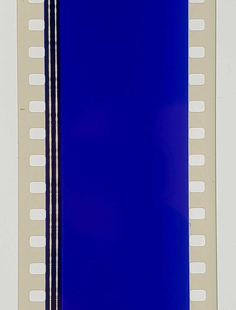
2013 was my last exercise to understand how Jarman made Blue blue. Early live performances used a filmed loop of an Yves Klein painting. That was replaced by a blue gel. Rowland Wymer’s 2006 book said the blue was “electronically produced,” which, if the image above is to be accepted, means it was not filmed in camera, but on the film stock itself.
Perhaps it is far past time to make some actual inquiries instead of just poking around in books.
[a little later update: In 2014, Mason Yeaver-Lap wrote about Blue, “a film without film,” and how the Walker Art Center exhibited it on a loop in a gallery. Though the museum has a 35mm print, for conservation reasons, they went with, “a flickering projector (aided by a piece of kit called T’he Flicker-O-Meter,’ whose manual can be found in the Walker archives) [which] would beam through a projection window coated with a blue gel. This filmless projector would thus throw a perfectly IKB shade, accompanied by a CD dub of the soundtrack. Again, Blue was a film without film.”
FWIW, this blog post will be the second mention on the internet of the “Flicker-O-Meter. We’re gonna need to see that manual.
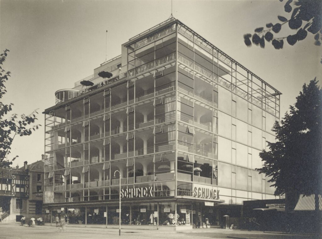
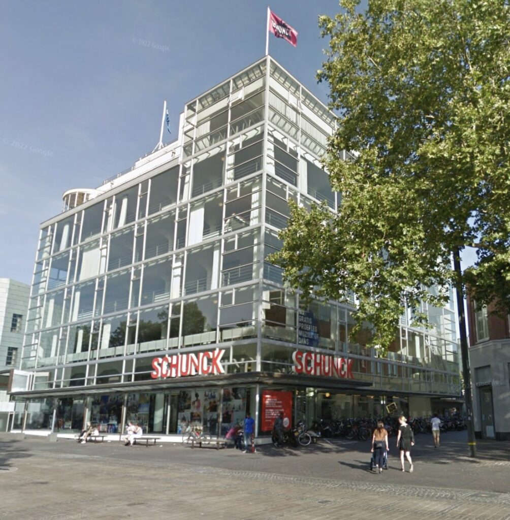
Werner Mantz, photo of Schunck’s Glass Palace, Heerlen, NL, 1935-6, 169 x 227 mm, gelatin silver print, selling 15 Dec 2024 at Grisebach
Before seeing Werner Mantz’s photo of it, I had never heard of Shunck department store, which sits at the center of Heerlen, a coal mining town in the southern tail of the Netherlands near Maastricht (actually, it’s closer to Aachen, Germany). Commissioned in 1932 from unorthodox modernist Fritz Peutz, it has an extraordinary glass curtain wall separate from but surrounding its 8-story, beamless reinforced concrete structure, on three sides.
Deparment store owner Peter Schunck and Peutz were apparently inspired by the Van Nelle Factory (1925-31) near Rotterdam, which has a pioneering but less ambitious glass curtain wall. I’m not going to get into the dispute of who designed that one.
Anyway, the building quickly became known as the Glaspaleis, and it was rescued from destruction in the 1990s, beautifully restored, and now functions as the town’s cultural center. The spot where Mantz was standing is now a McDonald’s. Nice work, everybody.
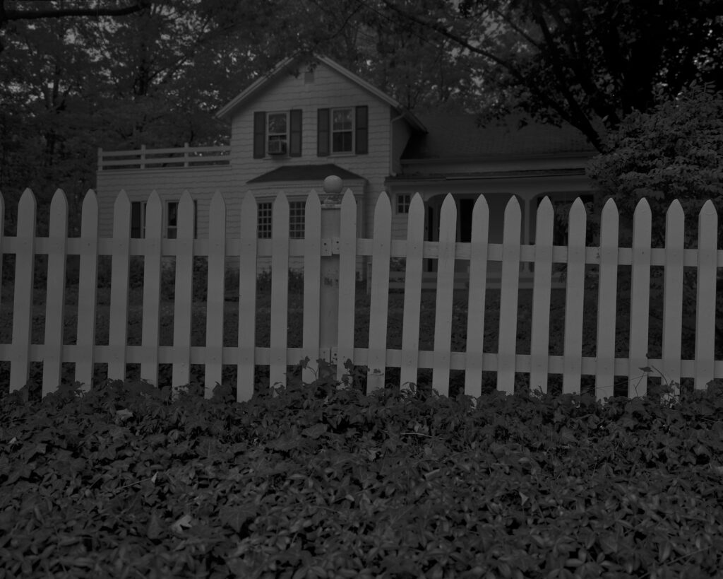
Dawoud Bey, Night Coming Tenderly, Black, Untitled #1 (Picket Fence and Farmhouse), 2017, digital dissemination image, via Art Institute of Chicago
How I missed Night Coming Tenderly, Black, Dawoud Bey’s extraordinary series of photos about the Underground Railroad is completely beyond me. Maybe Colson Whitehead had me looking one way, and Bey was right in front of me with portraits. Still, I have no excuse. So thank you, Michael Lobel for putting this 2017 project in my timeline.
Night takes its title from two lines by Langston Hughes, and its deep, dark tones and printing from Roy deCarava, but the evocation of place, history, memory, and the at-once embracing and ominous atmosphere of these nighttime spaces is entirely Bey. The series, 25 images, printed large, was commissioned by FRONT International: the Cleveland Biennial curated in 2018 by Michele Grabner. It was installed in St John’s Episcopal Church, the oldest church in Cleveland, and one of the last stops on the Underground Railroad for enslaved people before crossing Lake Eerie to freedom in Canada. In 2019 the series was exhibited at the Art Institute of Chicago.
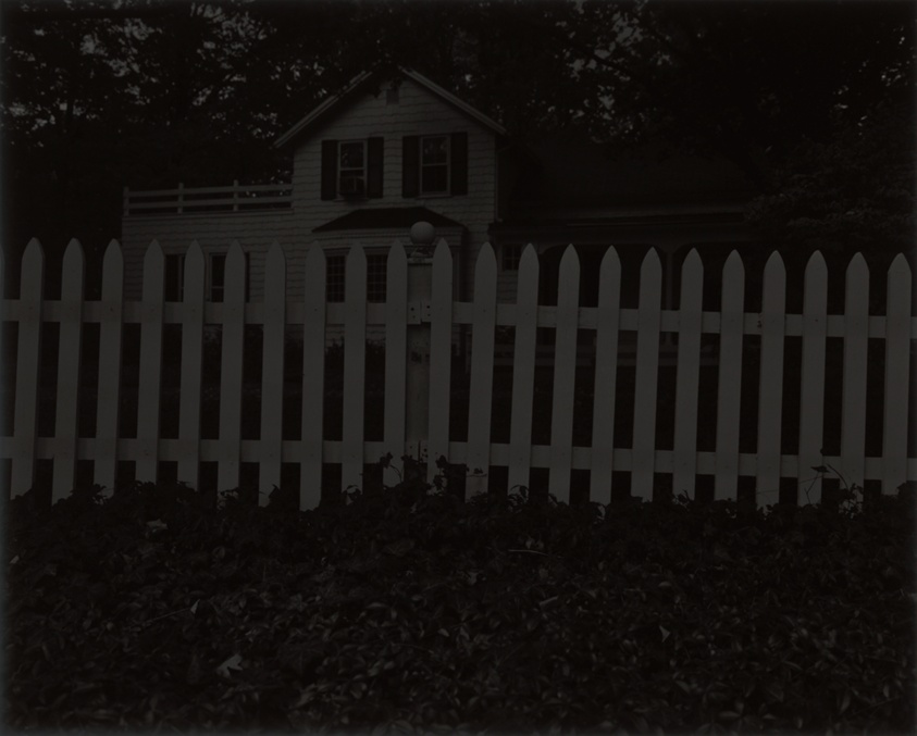
Dawoud Bey, Night Coming Tenderly, Black: Untitled #1 (Picket Fence and Farmhouse), 2017, 44 x 55 in. silver gelatin print, printed in 2019, as reproduced in the Collection record of the Art Institute of Chicago
What absolutely blows my mind is that Bey printed these giant, 44 by 55 inch gelatin prints, manipulating the details of tone in the darkroom, and resulted in prints you can really only see in person:
By printing large, he makes room for the viewer’s body, and by printing so darkly, he effectively renders the viewer’s knowledge partial as well. The works demand time. We must stand before them and wait until details become clearer, then change our position to overcome additional interruptions from reflections or glare.
The prints, moreover, do not reproduce well. All illustrations of the works (including in these pages) are made from image files that Bey lightened with dissemination in mind. The originals would be hard to decipher in print, and they are also difficult to transmit via smartphone—they come through as black rectangles. The nighttime passage may thus be grasped only in person; it cannot readily be “shared” or “liked” and the version made available to a broad audience is a deliberate compromise.
Even between the image circulated by the museum for the show [top] and the image used to record the Night print the museum acquired, the difference is dramatic.
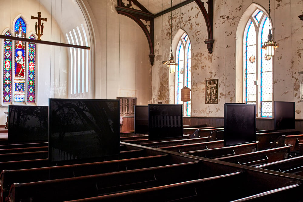
Dawoud Bey, Night Coming Tenderly, Black, 2017 installation view at St John’s Episcopal Church, Cleveland, for FRONT International, via archpaper
But from the installation view in St John’s Church, it is only partly accurate. The prints look like monochrome slabs that only reveal their image over time, to someone sitting in front of them in the pew.
Bey’s project turns out to not to be an illustration of the secret network which was only possible because of its invisibility, but an incarnation of that invisibility itself. And of the difficulty we in the present face as we try to look back into the past.
In 2010 the National Gallery of Art acquired hundreds and hundreds of trial proofs from Jasper Johns. They document, if not easily reveal, the intricate process of making Johns’ prints, a process Johns has brought into the center of his practice from almost the beginning.
Searching through proofs on the NGA’s website is a bit of a slog, but when this sketch for Leo Castelli’s Little Guys print turned up, I thought I’d better go through the stacks.
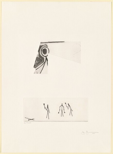
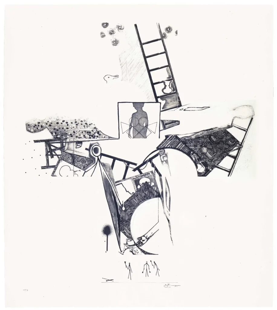
Jasper Johns, The Seasons (Trial Proof), 1990, etching & aquatint, three plates on a 29 3/8 x 21 1/4 in sheet, collection National Gallery of Art
And so I found this trial proof for The Seasons, a 1990 ULAE print that is one of the earliest print appearances of the trio of stick figures. And it looks like they travel by themselves. The proof is actually three separate plates from what would be a much larger composition. Coincidentally or not, the other plates contain part of the other stick figure Johns uses, from the UNESCO Picasso.
Jasper Johns, The Seasons (ULAE 0249), 1990, intaglio, 50 1/4 x 44 1/2 in., ed. 50, via ULAE
Whether all prints, or all Johns’ prints, are made this way, I have no idea. But now that you mention it, this print in particular feels very much like that: composed by assembling and setting multiple, prepared plates together like an old timey newspaper publisher. That certainly takes away much of the stress of working images into a 50-inch plate without error or change, I guess.
In any case, the plate with the Little Guys is 4 1/2 x 12 1/2 inches, and notably includes another element, an X marking the spot over to the left, and a line defining their ground.
The Picasso stick figure is embedded in the center of the composition, and all the other figures—the child silhouette, the shadows and inverted shadows from the Seasons paintings read as Johns himself, the Duchamp profile, even the snowman—are integrated as well. But these three stick figures at the bottom seem to still be set apart and doing their own thing, in their own space, even with their own ground to stand on—while still a part of the entire image.
In 2021, on the occasion of the sale of the most significant artwork documenta IX curator and SMAK Ghent founder Jan Hoet received from David Hammons, his daughter Marianne Hoet, Head of Business Development and Deputy Chairwoman, Phillips Europe, reflected on accompanying her father to the artist’s studio in the late 1980s:
At the studio, we were able to touch objects and works, without being sure if it was an object or already an artwork. At that time, David always gathered objects and found inspiration in the streets. As an outsider in the contemporary scene, he was able to transform material into experience, which also alludes to an African-American tradition of creating art from found objects … Most important was to understand and feel the deep friendship between David and my father. It was a friendship as we remember from our childhood, soulmates as outsiders.
It echoed the uncredited lot description for the sale in 2018 of the most significant artwork Jan Hoet got from David Hammons that his family still owned:
Hammons’ oeuvre is a masterful narrative on the experience of the African American community in American society, introducing his own physicality into his work as well as the debris surrounding him. Through a deft reworking of found-objects, Hammons’ sculptures assume a quasi-mystical status; soldered, glued and nailed, these extracted materials are composed into beautifully rendered structures of detritus, utilising quotidian objects which are often loaded with associative connotations. The present work thus forms a crucial part of Hammons’ highly original artistic approach and, at the same time, symbolises a pivotal relationship between innovative artist and curator, both unified in their shared motivations.
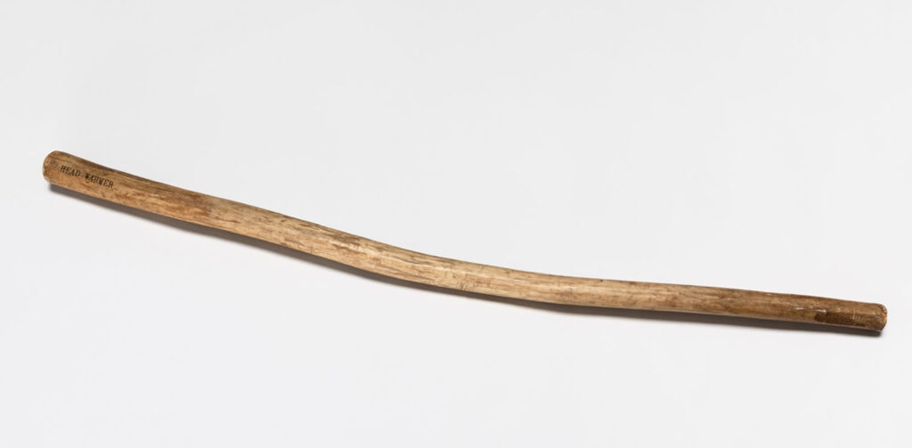
And Marianne’s comment was considered worth repeating to sell in 2023 what is…what is a productive way to describe this…the most conceptual? most austere? most elemental? artwork Hoet got from Hammons, which is this stick.
David Hammons, Head Warmer, 1998, 99 x 4 x 4 cm, wood, img from a 2023 PhillipsX pop-up collab with AQUALEX a provider of fine drinking water systems in Knokke-Heist, the Hamptons of Belgium
In each case Hoet’s relationship to Hammons is considered an inextricable element of the work’s significance in ways that surpass mere provenance. This may explain why this stick, on which this phrase Head Warmer is carefully lettered, and which is is also signed, was made available first to the Belgian collecting world who also knew Hoet—or Hoets at this point—via a pop-up sale at the beach in August.
Well, Belgium passed, and now the stick is at Christie’s. And what does Christie’s have to say about Head Warmer? Just that it “is emblematic not only of Hammons’ ability to transform found materials into art but also of the close relationship that Hoet and Hammons shared.”
The Hoets’ claim for this work/these works as somehow manifestations of Jan’s relationship with Hammons exceeds but is inextricable from their view of Hammons as a quasi-mystical shaman of the Black Found Object Arts. For a curator who put himself on the cover of his documenta catalogue while writing off Africa as irrelevant, I guess we should expect nothing less. Me, I’d just be happy to have gotten three free Hammonses.
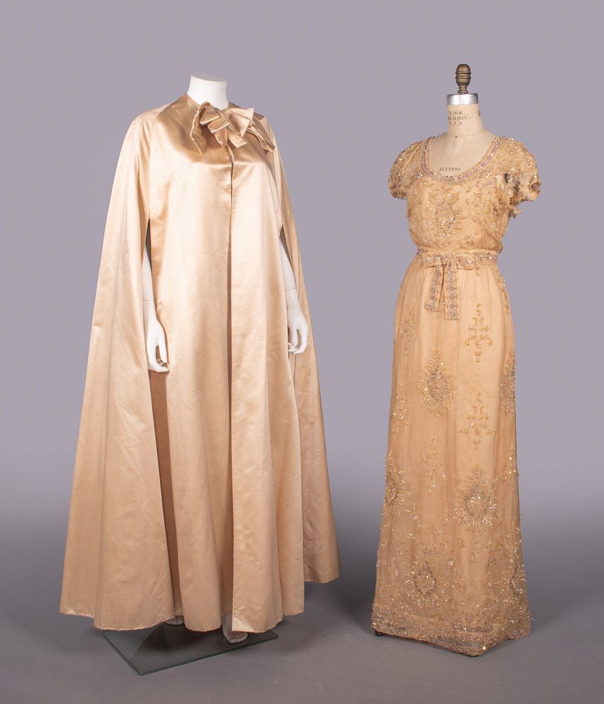
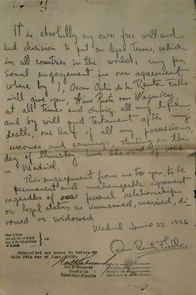
This couture cape in peach paduasoy and the sequin and crystal embroidered chiffon gown are both from Jeanne Lanvin, circa 1961. The cape, at least, is attributed to Oscar Renta Fiallo, who that year left his apprenticeship with Cristóbal Balenciaga to work with Antonio del Castillo, the Spanish designer brought to Paris to revive Lanvin. Both garments belonged to Baroness Aino de Bodisco.
I had to look up paduasoy, which is maybe a Spanish term for peau de soie, a variant of silk satin. Which is absolutely the least important thing in this situation. Because the auction listing of these two items also includes a copy of the mindboggling, handwritten pledge the 24-year-old man who would become known as Oscar de la Renta made to Bodisco in June 1956.
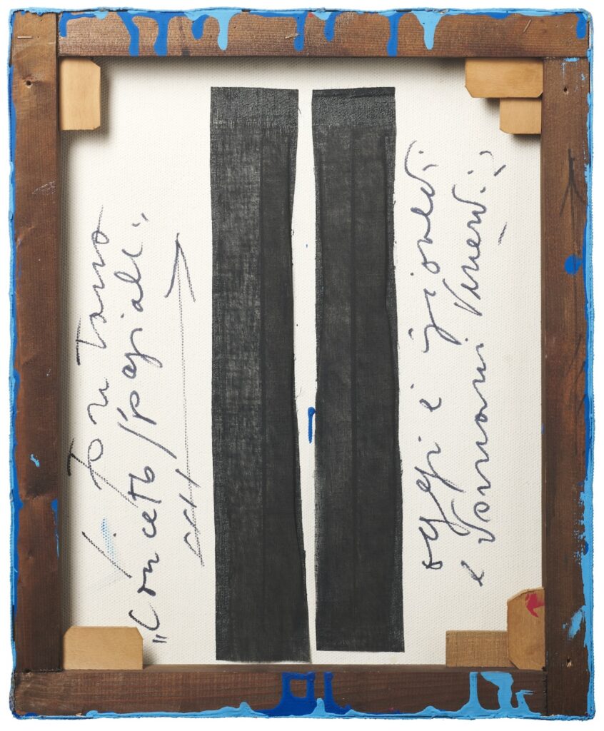
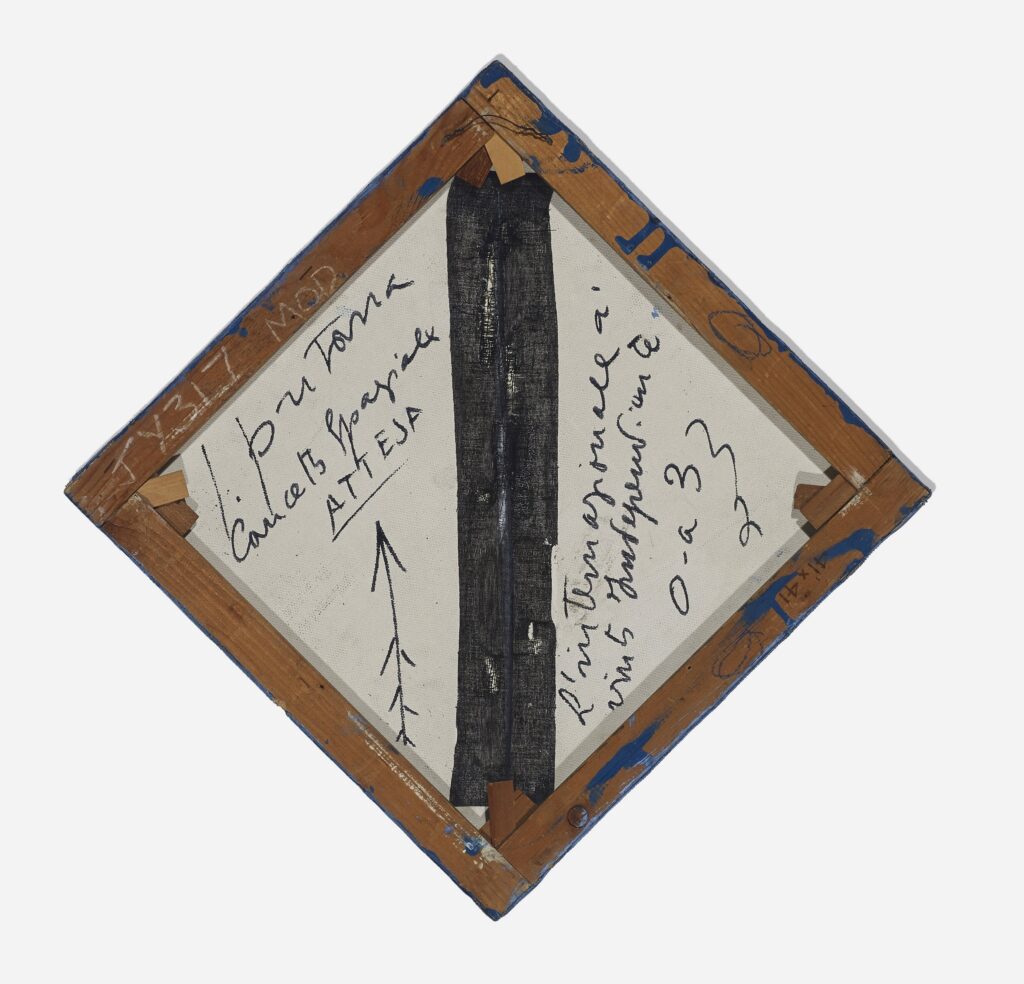
the verso of Lucio Fontana’s Concetto Spaziale, Attese, 1966, 47 x 38 cm, sold at Il Ponte in Nov 2024, via @octavio-world and @archiveofcanvas
For a split second after @octavio-world brought this image of the back of a little Lucio Fontana that sold this week in Milan into my tumblr timeline, I had to process the ghost of the World Trade Center. Then I marveled that I’d never seen the back of a Fontana before, and did they really all look like this?
Now from the front, “water paint on canvas” via Il Ponte
Fontana, whose whole spatial concept for his Concetto Spaziale was the piercing and slashing of the picture plane, then carefully bound it back up with black tape?
Yes, yes he did. This remarkably similar little Fontana was found at the flea market on 6th Avenue in 2001, was cleaned up, consigned at Christie’s, and then withdrawn after being declared by the Fondazione Lucio Fontana to be authentic but “irremediably damaged.”
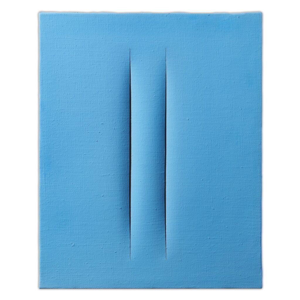
“Originally executed by Lucio Fontana, Concetto Spaziale, Attesa,” n.d., acrylic on canvas, 58×58 cm, sold at Wright20 in 2014
When Wright20 sold it in a design auction in 2014 [for $50,000, a tenth of what the Milan painting just sold for], they noted this alleged but unspecified damage was not apparent to the conservators or auctioneers.
Verso of the painted object originally executed by Lucio Fontana, via Wright20
But in addition to some discloration and unevenness to the field of color on the front, the back shows this black tape has been frayed, torn, or itself punctured anew. Was this black fabric strip, ostensibly meant to ensure a featureless backdrop to the slashed void, and to prevent further tearing, also actually holding the work together conceptually?
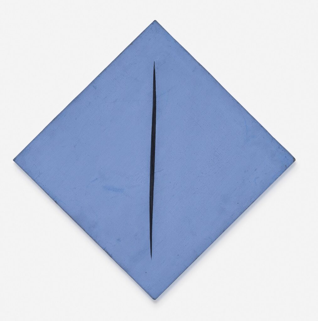
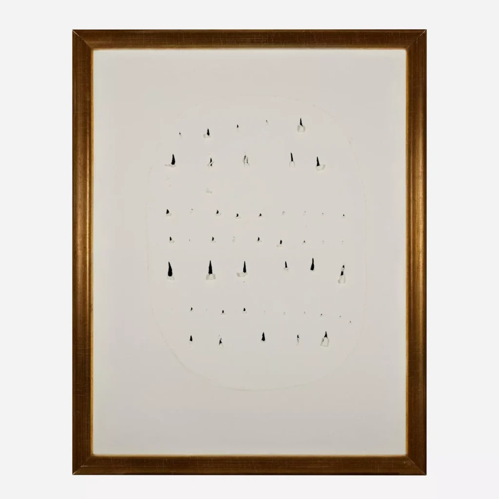
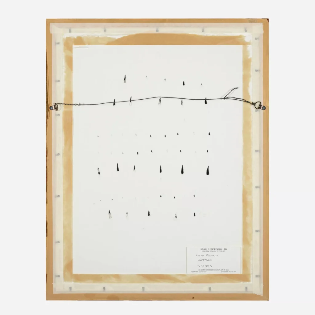
A third Fontana makes me wonder if what’s going on in the back has been more important than we realize. This Concetto Spaziale on paper, with a series of orderly stabs contained in a roughly outlined egg shape, sold at Rago Arts in September 2024.
stabbed in the verso, via rago
Comparing the recto and verso, and the direction of the tears and paper residue, it looks to me like Fontana stabbed it in the back. We may have been looking at the wrong side of these works the whole time.
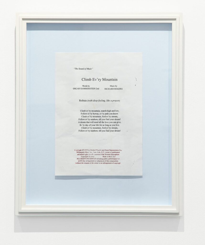
Robert Gober, Untitled, 2011, potato print in artist’s mount and frame, 19 1/2 x 16 in., ed. 15, at Krakow Witkin Gallery
I’m repeatedly fascinated by how Robert Gober brings the same extraordinary production detail to his editions as to his sculptures. Sometimes the goal seems to be uncanny, handmade verisimilitude, as when he makes a receipt or a movie ticket stub. But Untitled (2011) is something else.
Untitled is a two-color potato print of the lyrics to the Rogers & Hammerstein song, “Climb Ev’ry Mountain,” from The Sound of Music, along with the copyright notice. It is mounted in an artist’s frame, so it is really an object, not just a print, but the primary point is, it is a potato print.
An example of the edition of 15 is on view in Boston at Krakow Witkin Gallery’s One Wall One Work series. The gallery also has published an extensive account of the production process, which could not be more different from the time you or I made a potato print at camp with a pen knife and tempera paint.
It involves freeze drying potato slabs, and infusing them with something solid enough to engrave the text with a CNC router. In the first step, it perhaps resembles Gober’s presentation of a bag of donuts. The latter engraving process feels like the kind of technical challenge a master printer would love. Then there’s preparing the paper, and bringing it all together.
Indeed, the whole process here, and its innocent childhood implications, seems to be as prominent as the subject and content itself. As the gallery puts it,
A potato print is a rudimentary printmaking technique often used by young students, using half of a potato rather than metal or stone plate. Gober has taken this makeshift single-use medium and refined it to such an extreme that he could create a highly detailed, illusionistic image repeatedly (in an edition of 15). The themes of ‘how what can work for children can also be used by adults’ and that ‘there can be creative solutions to seemingly insurmountable situations’ feel directly related to “The Sound of Music,” nostalgia in general, and the present moment.
It now makes me wonder where it came from, and where it circulated. It contains much detail of the behind-the-scenes between the conservators, engravers, printers, and studio; was it provided to buyers by the gallery? Do the buyers of Gober’s work receive a packet of information to the inevitable question, “How’d he even do that?” Does there exist among Gober collectors a layer of intricate knowledge even beyond that gleaned by living with his work?
And I wasn’t going to get into it last night because of the sheer fascination of the potato, but the gallery’s mention of the careful reproduction of the copyright notice and the artist’s receipt of authorization from the Rogers & Hammerstein folks also appears in this production document. The exactness with which Gober, et al. observe the lyrics’ IP—and then document it—brings the whole cultural system of music publishing and performing into this work that was, again, printed with potato.]
In her studio, many dozens of these works, constituting acres of potential wall space, were folded into little boxes, closely stacked: the canny stratagems of an artist without much money, physical mobility, arm strength, storage space, or external expectations of what she should be doing, but with an inextinguishable urge to make art. I thought about that, afterward, whenever I saw a show where an artist had evidently been handed a large production budget and acquiesced to making more of the stuff that demonstrably sold.
The particular work he’s describing is made from the textile offcut/void/remains Italian fashion designers. Which is fascinating enough, but he also considers other artists not producing on an assembly line: Paul Chan, Duchamp, Bruce Connor, Sarah Rapson, Sara Deraedt. No one writes better than Martin Herbert about artists thwarting the art world in the name of art.

![what happens when you want the unique work, the bigger work, instead of the edition, is you might end up with the more boring work, like rosa de la cruz [rip] did with this set of 16 terra cotta tiles which gabriel orozco poked with his finger a few times each. no disrepect, and these are definitely the best ones selling this week (december 2024), but the other ones are better](https://greg.org/wp-content/uploads/2024/12/gabriel-orozco-pluie-delacruz-christies-2024-1024x732.jpg)