Ruh-Roe

a rephotographed poster for the movie point break with a young keanu reeves'  disembodied head floating above a group of bank robbers with president masks on, and behind is the disembodied head of patrick swayze except that swayze's face has been photoshop replaced by roe ethridge's own young mug, this would be his greatest self portrait ever if he hadn't made that one with the black eye before this. still, just incredible work all around, and this copy is being sold to pay off the creditors and clients of art advisor lisa schiff who is at the moment serving time i think for her crimes. anyway this is at phillips in july 2025

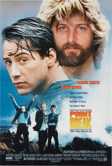
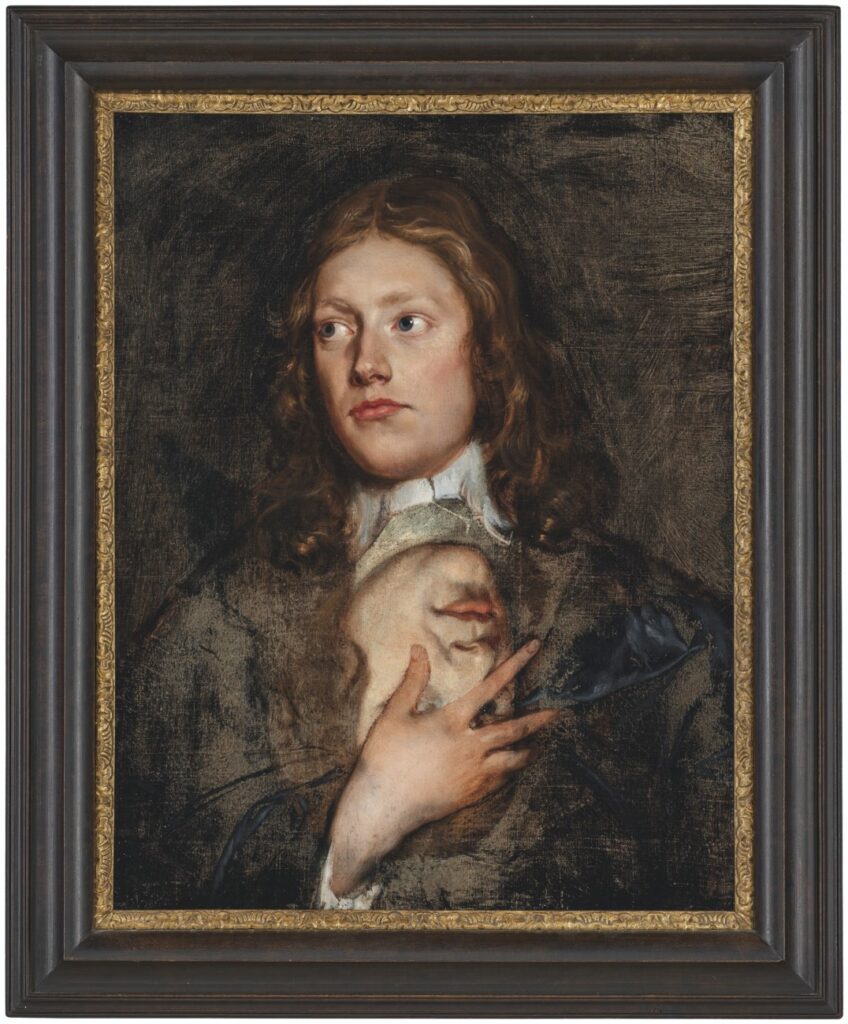
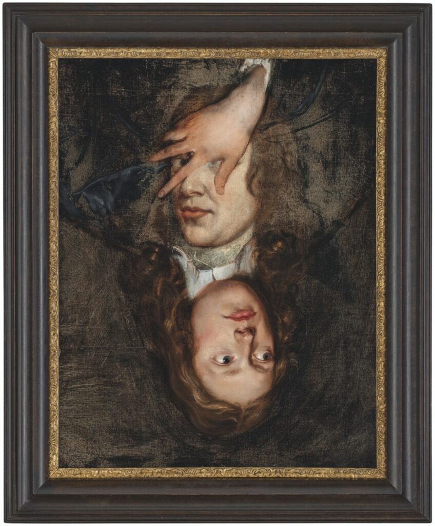
How no one bought the second greatest self-portrait Roe Ethridge ever made last fall, when it would have brought the creditor victims of Lisa Schiff’s purloining $3-4,000 before Phillips’ fees, is beyond me. Anyway, violent mask-wearing thieves disguised as US presidents could not be more on brand right now, and so it’s back, with a lower estimate and at least one bid.

2 July 2025, Lot 172 | Roe Ethridge, Untitled (Point Break), 2010, ed. 1/5, est. $2-3,000, current bid: $1,000, PROPERTY TO BE SOLD TO BENEFIT THE CREDITORS OF LISA SCHIFF AND SCHIFF FINE ART [update: sold for that one bid, $1,270] [phillips]

30 seconds later update: LOL this is insane. I just read an article about someone who suddenly decided to pay off a school’s entire lunch debt of $865, and then went on to raise money to pay off more, and then got a law passed to abolish lunch shaming. So if you have only $2,000, do NOT spend it on this Roe Ethridge portrait, the net proceeds of which will go to several millionaire collectors who won’t even notice. Instead, pay off an entire school’s lunch debt with it. And if you have much more than $2,000, pay off a school’s lunch debt, then just contact Kreps and buy another edition of this perfect picture. What are we even doing here?

Hardcore / Love, Leckey / Jafa

a screenshot of the poster/announcement for a two artist show, hardcore / love, of video works by arthur jafa and mark leckey, at the whitgift centre in croydon, starting 28 june thru 10 august 2025, is all black text on hilighter green, taken from the conditions.studio instagram grid

This has been hanging around on my instagram feed, but I just listened to Arthur Jafa and Mark Leckey talk about it on The Art Newspaper’s podcast, and now I must post.

This two-artist show titled Hardcore / Love at Conditions Studio Programme in Croydon brings together two of the most amazing works of video art of the century: Mark Leckey’s Fiorucci Made Me Hardcore (1999) and Arthur Jafa’s Love is the message, the message is death (2016).

The artists’ conversation with Ben Luke is unexpected and interesting, drawing affinities between these two works and the musical moments they inhabit. But also, as Mark points out, each film embodies the technology of its moment while marking a significant shift in media: from digital to analog, and from chronological to algorithmic.

I worry we’re too late for Jafa’s turn on NTS, the experimental radio station where Leckey has been programming for so long, and to such great effect. Maybe it’s archived. [here’s a direct soundcloud link]

Hardcore / Love is at The Whitgift Centre, Croydon, by Conditions, from 28 June through 10 August 2025 [conditions.studio]
Arthur Jafa & Mark Leckey on The Week In Art, with Ben Luke [theartnewspaper]
Arthur Jafa & Mark Leckey playlist 06.27.2025 [nts.live]

R.H. Quaytman Book Talk

A couple of weeks ago Miguel Abreu Gallery hosted a launch event for Book, the second volume of R.H. Quaytman’s catalogue raisonné/artist book, which covers her work through 2022.

I’ve always been interested in Quaytman’s accounts of being the child of a painter, and of inheriting the legacy—and full storage spaces—of her father Harvey Quaytman.

But that is not important now, because now all I want to hear about is the incredibly dynamic of being on a panel with your mom. Quaytman’s mother, the artist-turned-poet Susan Howe, absolutely ran away with this conversation, even as she managed to (mostly) keep the focus on her daughter and her book.

Which, she cannot believe she called her book Book, what was that about? Just when you think the family dynamic has ebbed, and the conversation has slipped back into typical panel mode, everyone jumps on the pile of discursive rubble trying to figure out what Benjamin meant with the Angel of History.

I hope there is a mother-daughter podcast in the works, because I’ve got $5/month burning a hole in my pocket rn.

R.H. Quaytman, Ones, Chapter 0.2, has been extended through July 12, 2025 [miguelabreugallery]
Previously, related: R.H. Quaytman, Paul Klee, and Martin Luther walk into a bar

George Inness, Industrial Niagara

a george inness painting of niagara falls is misty and indistinct in the lower, watery, bluish white half, and smoky hazy in the cloudy, smoggy purplish mauve of the smokestack spewing sky half. at the bottom left edge a thin strip of green landscape is inhabited by two tiny white flecks, presumably canvases of indistinctly painted painters. in a thick but not overly ornate gilt frame. at the smithsonian american art museum, c. 1889.

I had to go check something at the Smithsonian American Art Museum for a thing, and on the way, I got stopped by the tiny painters in the lower left corner of George Inness’s misty, smoky 1889 painting of Niagara. It had just recently been declared a state park, and the factories, mills, and brothels along the cataract had not yet been cleared away. Pretty sure it’s an edenic paradise now, at least from some angles.

どうでもええ… LV X YK Surfboards

a white surfboard with red dots all over it and the name louis vuitton running down the center in tighter red dots, leans against a white wall. being sold at sbi auction in japan in july 2025
The best thing I can say about this is it’s 224 cm tall, via SBI Auction

I could have gone another couple of years without realizing Louis Vuitton made several hundred Yayoi Kusama surfboards as part of their sprawling animatronic collabsploitation in 2023.

There’s a longboard and a shortboard variant, and at least two motifs: dots and tentacles. The PR copy regurgitated on all the hypesites says they’re a tribute to Kusama’s pumpkin sculpture on the dock at Naoshima. If that’s the true, then why aren’t they all destroyed in a typhoon?

12 July 2025 lot 69 [not nice] | LV x YK Surf (red & white), ed. 100, JPY1.5-2.5m [sbiauction]
Previously, all too related: Kusama X Vuitton: ‘I was finally able to bring home the crown’; The Infinity Room is now an LV Pop-up

Gavin Brown Woodblock Prints @ La Pulce

screenshot of viva la pulce's instagram story of an installation photo of the gallery, with a white wall filled by a three row grid of book-sized black on white woodblock prints, and a white guy with dark hair, facing the wall at a ledge/desk. they're by gavin brown

In the year 2000, on the small bookshelf in the grass-roofed house we rented on the beach in Tulum, was a years-old Gallery Guide, the monthly, pocket-sized directory of all the shows in all the galleries around town (NYC). Flipping through it, I was surprised to see Gavin Brown, a dealer friend, had had a show at David Zwirner. He was a bit cagey when I asked him about it later. I’m very glad that over the years, he has eased up, and has gotten back to showing work.

a screenshot of passerbystop's post of a photo of a square-ish black on white woodblock print of soutine's bellboy, made of thin hatching marks, pinned under a sheet of glass, at la pulce in roma in june 2025
@passerbystop regram of @thconrad’s story of @passerbystop’s Soutine print at @vivalapulce_

Last night Gavin opened Proof of Life, a show of woodblock prints at La Pulce, his second project/gallery space in Rome, which opened this spring. I could not make it, but I am glad to see the results spreading on instagram. Brown has turned to a laborious mediated process to make fleeting images of daily life. That perhaps included a trip at some point to the Pompidou, or to an exhibition somewhere one of my favorite Soutines was on loan.

Gavin Brown Proof Of Life is at La Pulce, Via Dei Tre Archi 5, Roma, till idk [ig]

Deliberation Before Action Protects You From Regret

a top down view of an 18 inch diameter white porcelain bowl with thin, geometric, elongated, almost abstract kufic-style arabic calligraphy around the rim, with extensions down into the bowl, written in black slip. from 10th century iran, at the met
Bowl with Arabic calligraphy, 10th century, Nishapur, Iran, 18 in diameter, collection Met Museum

The new-style Kufic calligraphy on this 10th century bowl is glorious. It translates to “Deliberation before action protects you from regret; good fortune and good health.” I’m assuming that’s not an Oxford semicolon.

Here is a reading and translation that follows along the inscription.
[via @sarcher.bsky.social]

Isaac Fuller Portrait Do-Over

a 17th century portrait painting of a longhaired white guy with delicate features, looking up and to his right, with his hand on his chest, where it partially covers the upside down face of another person, painted somewhat larger, but with a similar longhaird white guy vibe. in a black and gilt frame, by isaac fuller, from christie's c. 2021
Isaac Fuller, portraits, 17th c sometime, I guess, oil on canvas, 18 3/8 x 14 1/2 in., sold at Christie’s in 2021

I don’t know anything about 17th century English painter Isaac Fuller, except that he has a dozen paintings attributed to him at the National Portrait Gallery. And, according to the brief text accompanying this painting at Christie’s in 2021, he was a “flamboyant painter,” and a “notorious drunkard” with a “bohemian lifestyle” whose fresco in All Souls at Oxford was “too full of nakeds” to last, and whose last series of works consisted of “decorative schemes” for a string of taverns he frequented.

a 17th century portrait painting of a longhaired white guy over the portrait of another longhaired white guy, but turned 180 degrees so that the underpainting is upright. the body of either figure is faintly sketched out, and perhaps was lost in the restoration process that uncovered the earlier portrait. or maybe the painter isaac fuller did all the work on the face, and in the case of the overpainting, the hand, and never got to finishing either one.  via christies

None of that is quite as interesting as this picture, two pictures, really, one on top of and around the other. The portrait underneath, which is now upside down, was uncovered in a recent restoration, says Christie’s. The way it’s been uncovered to keep as much of each portrait intact does make it feel like a deliberate composition, not just an overpainting. Like that extraordinary Ludolf Backhuysen seascape painted around that Isaack Luttichuys portrait that Simon Dickinson brought to TEFAF this year.

What was up in the late 17th century that painters were piling paintings on top of each other, though?

8 Dec 2021, Lot 183 | Isaac Fuller, Portrait of a gentleman, with another portrait underneath, nd, est. GBP 25-35,000, sold for GBP 30,000 [christies]

Jonas Would Never

mark zuckerberg confirming the nerd-to-misogynist fascist pipeline posing in a pair of surveillance oakleys and an oakley t-shirt, with his arms folded, in front of a 2017 jonas wood print titled shelf still life, which depicts two shelves of painted ceramic pots by wood's wife shio kusaka including one with dinosaurs on it that wood has made large scale paintings of, which you'd think zuck would be able to afford, but I guess he needs to surveil you more first. image: the verge, i think
one of the worst people in the world modeling surveillance Oakleys in front of Jonas Woods’ benefit print, Shelf Still Life, 2018, a lithograph/silkscreen published by Cirrus & WKS Editions in an ed. 80+20AP

Unless you pay this man $399 so he can surveil you and everything and everyone you see, he’ll never be able to afford Jonas Wood paintings, and will have to keep buying large edition benefit prints.

All Jack Pierson’s World’s A Stage

an eight foot tall curtain of silver tinsel is attached to two walls in the corner of a white cube gallery, making a backdrop for the 4 by 4 ft stage of black painted and scuffed plywood. a string of tiny lights traces the top edge and back edge of the tinsel curtains. the 1991 sculpture is called silver jackie, by ostentatiously sloppy boy jack pierson
Jack Goldstein, Silver Jackie, 1991, paint wood, tinsel, lightstring, 96 x 48 x 48 in., via artforum

Speaking of go-go dancing platforms and light strings, I cannot get out of my head the confluence of Jack Pierson showing Silver Jackie at Pat Hearn less than a month after Felix Gonzalez-Torres showed “Untitled” (Go-Go Dancing Platform) at Andrea Rosen.

Pierson’s show was called Diamond Life, and it was the 30-yo artist’s nostalgic lament for the squalid glory of his lost youth. In the main gallery of Hearn’s third-floor Wooster St walkup, Pierson staged a recreation of his apartment from his early 20s Miami beach bum era. And in the back was this tiny, abject, artificially aged stage—Pierson’s always called it a stage, I think—which called out his punk and performance art days in Boston.

The Aspen Art Museum re-staged Pierson’s first five shows in 2016. David Rimanelli wrote most generously about Silver Jackie in 2021, when it was on the cover of Artforum. Rather than influence or interaction, or two nearly simultaneous critiques of Michael Fried’s Minimalist theatricality (derogatory), the more I look at these two ostensibly similar works, the more I think they were two artists who happened to be dancing at the same time, but to their own tunes.

Window, McMansion, Randolph

an artwork of two vertical rectangles, a monochrome white canvas above and a faint grey assemblage of painted wood below, divided into three sections with black painted vertical wood trim, the whole thing reads as a tall window with mullions, but is a 1949 work by ellsworth kelly
Ellsworth Kelly, Window, Museum of Modern Art, Paris, 1949, oil on wood and canvas, two joined panels, 50 1/2 x 19 1/2 in., a gift of the artist to the Centre Pompidou, image via ellsworthkelly.org

In our timeline, in October 1949, Ellsworth Kelly, a young former soldier studying painting on the GI Bill, saw the windows of the Museum of Modern Art in Paris in a new way, as a composition, one that could become a painting/object just as it was, and in fact, the whole world was like that, full of subjects he could spend his whole life discovering and transforming into paintings.

a detail of a real estate listing for a cursed new house in north carolina where the vinyl siding and etsy accent barnwood are all outlined with black trim like a line drawing, and mcmansion hell has added an annotation of a dozen or more question marks to a porch roof that doesn't match, but this image is posted here because on the left side of the house is what appears to be a double height window made from two single sindows, which is misaligned to all the rest of the black trim, but which also bears a resemblance, however cursed, to the museum of modern art paris window that ellsworth kelly saw in 1949

In another timeline, a young Ellsworth Kelly saw these two off-the-shelf prairie mullion windows kludged together to look like one tall, misaligned, window on a house in the middle of a gravel field in North Carolina that was just posted on McMansion Hell, and drove straight to the army to re-enlist as a requisitions compliance auditor, eventually retiring from a job at a cubicle in Ring C of the Pentagon. His little yard is full of old stoves, which he salvages from apartment turnovers, repairs, and sells on Facebook.

Window, Museum of Modern Art, Paris, 1949 [ellsworthkelly.org]
glam metal modern but also your contractor is going to jail dawg [mcmansionhell]

Beuys Collector Collection Shelf

a very simple wood book shelf designed by joseph beuys consists of two vertical ladder like supports and six wooden planks going through them. a stark lighting situation casts shadows of the structure, which is otherwise photographed head on, which kind of privileges composition over detail of the construction. but then, this photo was taken by an auction house to sell it, so
Joseph Beuys, Royal Pitch Pine, 1953/2008, pine, 266 x 220 x 34 cm

After working with Joseph Beuys on his multiples for many years, Jörg Schellmann made small editions of four pieces of Beuys-designed furniture in 2008, 22 years after the artist’s death.

Schellmann Art’s description says all these pieces—three tables and a bookshelf, no vitrines, no felt—were originally made in 1953 for an unidentified collector in Dusseldorf. I’m not sure why they’re being so cagey. In 1953 Beuys’s two major collectors were brothers: Hans and Franz Josef van der Grinten. Besides collecting his work, the van der Grintens gave Beuys his first show, in their house, let him move in with them, and represented him in their gallery. Was it somehow not them?

The original table Beuys made was later incorporated into an artwork, and then into Block Beuys, the seven-room gesamtkunstinstallationwerk at the Hessisches Landesmuseum in Darmstadt. A controversial renovation and conservation project, including a March 2008 symposium on what to do with the original jute wallcoverings and carpets, was the immediate context, if not the specific impetus, for the collection. [spoiler alert: they’re still gone.]

Anyhow, I like this shelf more than I expected. And I like how the lighting in this example, which sold for much less than retail at Phillips in April 2020, right in the mouth of the pandemic, shows the ladder-like structure.

34 cm deep including the flat verticals, so 220 x 30cm pine boards, but built up from 2x15cm via phillips

If you can’t wait for another to turn up, the form could be replicated in Ikea IVAR components, but not its details. Though the shelves look to be straight up lumber. And built up? The verticals are pinned to the wall, and are rounded, but and the shelves are neither. The desks all have extensive joinery, so though the carpentry details that will keep the whole thing from wobbling itself to death in actual use are not apparent, there must be something. Right?

Joseph Beuys, Royal Pitch Pine, 1953/2008 [schellmannart]

Maurice Darantiere, Ulysses Cover Proof

the final proof lithograph of the cover of james joyce's ulysses is a surprisingly brushy horizontal rectangle of blue, with the title and author's name on the right half. the proof is in the collection of the library at suny buffalo
Maurice Darantiere, Cover for Ulysses [final proof], 1922, lithograph, Poetry Collection of the University Libraries, University at Buffalo, the State University of New York, via The Morgan Library

I knew the story about Joyce wanting the cover for Ulysses to be the blue of the Greek flag. But I did not know that he ended up giving the little Greek flag hanging in Shakespeare & Co. to his artist friend, Myron Chester Nutting, to match the color.

I learned this from The Morgan Library’s online exhibition celebrating Ulysses‘ centenary, which includes the extraordinary lithograph above, the final proof for Joyce’s Ulysses cover, prepared by the Dijon printer Maurice Darantiere.

At first the bleed around the edge and the brushmarks made me wonder if there was an ur-monochrome painting, a Nutting original, but I think not. The stone or the plate was painted with a solid field, which Darantiere printed using ink prepared to Nutting’s specification. The title seems to be set in negative, masked so the unprinted paper shows through.

Maybe I must now make the entire cover, as printed, not just the front. I feel like it should match the dimensions of the book, and the page inside, but those bleeding edges do call to me. Either way, I obviously must make it like this now.

a diptych of the blue cover of the first edition of james joyce's ulysses on the left, and the frontispiece, with marsden hartley's inscription on the right. a study for a print by greg.org
Study for Untitled (This copy of Ulysses belongs to me, Marsden Hartley), 2025, prints of some kind, 4to, 242 x 190 mm [still trying out titles, obv]

And I have to get the color right. Is it best to match the modern color of Marsden Hartley’s copy? Is it even possible to match the original, given that they’re all 100 years old, too? Do I try to match the proof? Is it a Ulysses conservation standardbearer? Nutting apparently warned Joyce that the blue would fade, and it did?

a 1934 illustration from a greek encyclopedia of a bunch of variations of the greek flag, which is a paler, cornflower blue than the contemporary version. via wikipedia
Administrative Flags of Greece (1934) via wikipedia

I’ve seen discussion of Joyce’s Greek flag blue not actually matching the Greek flag’s blue, that perhaps the Shakespeare & Co. flag had faded, as well as the books. But Ulysses matches the color of the Greek flags reproduced in this 1934 encyclopedia plate. Honestly, I can see the appeal.

Getting the Right Blue on the Cover [themorgan.org via @mclees-fiona via @joshuajfriedman]
Previously, related: Untitled (Joyce Hartley), 2025
At least Luigi Lucioni got his copy of Ulysses back

Tania Bruguera Terror Chic

two tshirts, a mirror, and an olive green canvas all printed with tania bruguera's 2005 slogan, never forget your first revolution. from terror chic, by editions schellmann
Tania Bruguera, Terror Chic, 2005, ink on t-shirts, shoulder bag, mirror, canvas, ed. 50, published for the 51st Venice Biennale by Editions Schellmann

Coming in 2005, smack in the middle of the Global War On Terror™, the 51st Venice Biennale may have been #toosoon for Tania Bruguera to drop two editions named Terror Chic. Twenty years and a few revolutions in, let’s see how it’s going.

One edition is what we might now call the Terror Chic Capsule Collection: a group of fifty objects—mirrors, messenger bags, t-shirts, stretched canvases—each printed with what Edition Schellmann calls Bruguera’s “thought-provoking slogan, ‘NEVER FORGET YOUR FIRST REVOLUTION.'”

a metal stencil with the phrase never forget your first revolution punched out in all caps in the center, an edition by tania bruguera from 2005 titled terror chic, published by editions schellmann
Tania Bruguera, Terror Chic, 2005, metal stencil, 26 x 55.5 cm, ed. 200, published for the 51st Venice Biennale by Editions Schellmann

The other is more interesting: a Terror Chic metal stencil in an edition of 200, “to be used to print slogan on T-shirt, bag, wall, car, or any other object.” Now we’re talking. Bruguera’s stencil hasn’t even sold out yet, but it’s efficiency and durability have surely already spawned several revolutions, as well as a whole trend of fundraising edition stencils.

Meanwhile, if you’re in the market, never forget to shop around. The revolution can be had with a vip discount.