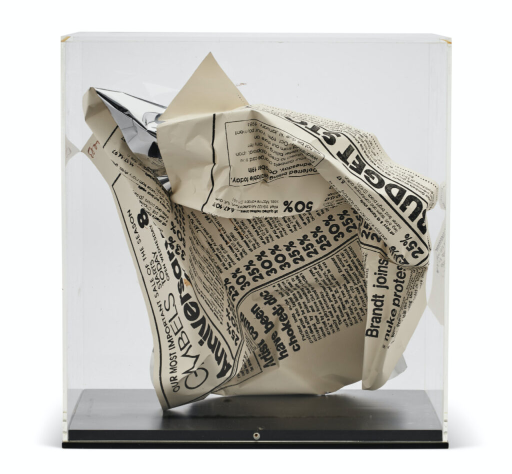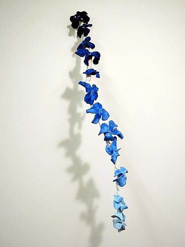
36 x 10 x 16 inches, image via Derek Eller
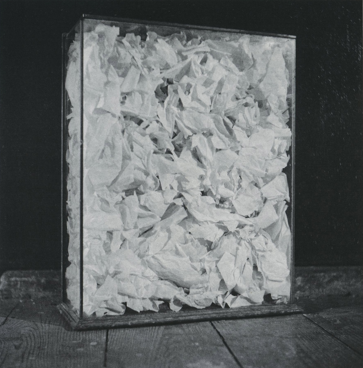
Speaking of photographs of perfume, in the early 2000s artist Erik Hanson was making sculptures of music. The first one I saw was at White Columns; it was blue stalagmites. Hanson dripped plaster into a stalagmite for the duration of each track on a David Bowie album. The two album sides were made on separate boards, which were then joined, facing each other, into a little box-like cave.
After the study I saw at White Columns—I think it was Ziggy Stardust—Hanson did a show of Bowie’s discography as little caves at Derek Eller. They were elegant, esoteric sculptures whose process was evident, but whose system was embedded in the titles. I’m left writing about sculpture because I can’t find any images online. Hanson made spiral drawings and other sculptural forms with the same durational strategy; the resulting work indexes the artist’s subjective experience of listening—or of making while listening—to a song. The body of work, then, becomes a catalogue of formative musical experience: playlist as autobiography as form, like the 2003 cascade of sculpey flowers above, Disco Songs I Liked When I Was A Punk DJ.
This, along with Chris Rusak and Amelia Konow’s Lumen Prototypes, make me think back on the systemic works of Steve Roden. He would devise a scheme, seemingly but never arbitrary, more or less mathematical, subjective or convoluted, and set it in motion to produce one thing from another: text into sculpture, city into sound. One thing I’d forgotten him saying about his 2009 project in Philadelphia, Nothing But What Is Therein Contained, is the importance of intuition within the parameters of the system, as the point, even. And I’d forgotten it in 2009, too.