SLA Group Photo with Floating Head, 1991, paint and silkscreen on aluminum, 75 1/2 x 60 5/8 in., formerly of the Sammlung Goetz, yet another private museum which started offloading stuff, illustrated in what is now being used as Cady Noland’s de facto catalogue raisonné
Instead of posting an artist disclaimer on a work for sale, Sotheby’s just cites its appearance in the artist’s book, and the four three museums, public and private—and whatever Peter Brant is doing—which hold other variations on the work. Whatever else is going on in the world, we do live in a Golden Age of Cady Noland Marketing.
This is the fifth year that Hellman has put together a collection of artist-designed plates whose sale benefits the Coalition for the Homeless in NYC, and it is remarkable. Once the APP began debuting the plates at art fairs, they’ve taken on a wild, competitive philanthropic eshopping energy.
This year there are fifty plates, each in an edition of 150, with the first 100 reserved for the opening day of Frieze NY. The rest will go on sale the following week at Artware Editions. The plates are just $250 each, about the price of a lunch at an art fair. [Artware also has some previous years’ plates, including individually signed plates, and a couple of complete sets, no waiting.]
Jasper Johns, Untitled, 2001, pastel on paper, 25 1/2 inches diameter, via Matthew Marks Gallery
What’s wild about Johns is not that he did it, but that he had a tondo drawing ready for instant plate adaptation. Johns had used both the Picassoid head and wife/mother-in-law optical illusion in many works for years; having them sprout surreally from a tree branch, in a round pastel? Not so much. But he showed this picture in the 10th anniversary drawings show at Matthew Marks at the end of 2001.
Oh wait, actually he did not. That is an entirely different work—same motif, different object. When the Marks drawing turned up at auction in 2015, it had an uncharacteristically full essay, especially for a day sale, with a surprisingly full discussion of Johns’ references.
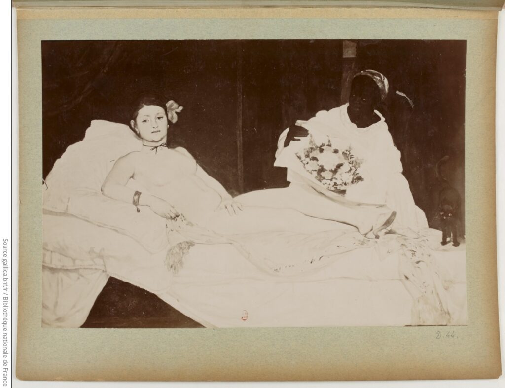
In the latest Irving Sandler Essay in The Brooklyn Rail, artist Alexi Worth lays out a fascinating theory about the revulsion contemporary critics expressed about Manet’s Olympia when they first saw it at the Salon in 1865: they were confounded by Manet’s depiction of full frontal lighting. Worth extends his observation from a 1971 essay about the “lantern gaze,” in which Michel Foucault reads Manet’s paintings as lit from where the viewer—and before that, the painter—stood:
Why was frontal light invisible—or uninteresting—to scholars? One reason is simple: Manet himself never “authorized” the topic. A secretive artist, Manet left few records, and never said a word about his reliance on frontal light. But Manet’s silence is only half the explanation. Perhaps more important, frontal lighting just seems unremarkable. Familiar. Normal. All of us, scholars and non-scholars alike, are habituated to bright frontal light. We see it all around us: in the faces of fashion models and TV anchors, in images by Andy Warhol or Nan Goldin, or for that matter in any flash-lit photograph.
“You could say,” Worth goes on, “to put it too simply, that frontal lighting looks like early Manet.” I’ll try to remember this the next million times I can’t unsee the ring lights reflected in the eyes of every youtuber and influencer.
James Lee Byars, no title, no date, lacquered bronze, 5 x 10 1/2 x 9 1/2 in., image via Wright20
As I was thinking of ephemerality, handmade paper, and Japan, and artists who should have been asked to make an Art Kite for Lufthansa in the 1980s, who should drift into view but James Lee Byars.
And as I was looking to see if Byars ever made a kite, I stumbled upon this sculpture of lacquered bronze. It’s melon-sized, 10 x 9 inches, but only half that high, flattened, like a giant Junior Mint. In a sculptural oeuvre full of marble, gold leaf, handblown glass and giant spheres, it is not the most remarkable object.
But what a history. It has been around. It was in the collection of Robert Mapplethorpe. Then in 1989, while the AIDS crisis and rightwing attacks on the arts—and on Mapplethorpe—raged, it was sold at Christie’s by the artist’s estate. And it was acquired by the American Medical Association. What its existence was like at the AMA is a mystery. Was it in the president’s office? On a pedestal? In a nook? In a closet? What we can know, presumably, is that after a couple of decades, someone looked at this giant, bronze Junior Mint and decided the organization would rather have $10,000. So they sold it at Wright, the local auction house in Chicago—where it actually brought in $31,250. Which probably left them feeling pretty good about their decision. No word on it since.
There is a book. I did not know there is a book. I’ve visited the Felix Gonzalez-Torres show at the National Portrait Gallery & Archives of American Art multiple times and have written about it even more, and I did not know there was a book. I fixated on Felix’s “Untitled” text portrait in both its installed versions, and wondered how the Smithsonian’s curators made them, and I picked through the history of this and other text portraits, and wrote a whole-ass blog post about it, and I didn’t know there was a book.
Reader, there is a book, and it is literally about all of that. In Felix Gonzalez-Torres: Final Revenge (A Workbook), co-curators Josh T. Franco and Charlotte Ickes wrote a whole essay on their experience and process of creating the versions of “Untitled” they’ve showed. Along the way, they fill out many key aspects of Felix’s work, from its changing history to its changing present.
I guess I’ve never actually asked, but all this time I assumed that the books Jacob Kassay inserted his prisms into were all on an undisclosed reading list of some kind. An esoteric phenomenology syllabus, ex libris Alain Robbe Grillet, whatever, some kind of over-arching epistemology that may have been invisible on the scale of a lone volume, but that cohered in some way of the artist’s devising.
And that the glass prism was then crafted to fit precisely in a certain spot in the book—or at least in a certain volume—that, when you looked in, distorted and perhaps simultaneously revealed one piece of a larger informational puzzle.
Jacob Kassay, coin de verre & livre de bibliothèque, via Ross Art Studio
And now I wonder if I have it exactly backwards, and it’s the wedges that are the drivers. Kassay has donated a glass & library book sculpture to the upcoming Printed Matter benefit auction [less than four days left to bid!], and the winning bidder will receive, “a dummy book and wooden dummy wedge to be used only to procure the correct format of library book.” So maybe there are instructions of genre or title, but it sounds like the determining factor is “correct format”? Which you test with a dummy wedge and dummy book?
“The positions of the glass wedges inside the library books are necessarily temporary. The wedges don’t belong to any particular book but rather shift from book to book like a hermit crab, finding the other book that precisely fits it. This is why I chose to house them in library books – as a kind of format logic which focuses on their qualities as objects, rather than as texts with specific content.”
And now the image of distorted texts is replaced by roaming wedges, ever in search of a new book—or at least ready to trade up if the fit is right.
the white veined marble and light grey granite façade of Gordon Bunshaft’s Beinecke Library, 1963, image: Lauren Manning via Vermont Danby Marble
Also, I found this comment from Kassay’s glass fabricator, that the wedges are “inspired by the façade of the Beinecke Library at Yale.” which, I assume is a reference, not to the translucent marble, but to the beveled granite lattice that holds it. Maybe I should just ask.
Robert Rauschenberg, Sky House II, screenprint on silk collage, bamboo, 372 x 248 cm, image via ig/RRF Sky House I, meanwhile, Rauschenberg kept for himself, according to former assistant Thomas Buehler
Robert Rauschenberg’s genius in making a 20×10-foot Art Kite was in understanding the opportunity while ignoring the assignment. Because the opportunity was to make two Art Kites, and have your Art Kites fly in the “vernissage in the sky” at an Art Kite Festival held amidst the blossoming sakura on the grounds of Himeji Castle. While the assignment was to promote Lufthansa.
And for the first 461 pages, I thought the show was about how flying and art are the same glorious expression of human freedom: “The world tour of the Art Kites is sponsored by Lufhansa” [p.462]
Obviously, it was more than that, but also just that. The Art Kites Project was sponsored by Lufthansa and organized by Dr. Paul Eubel, director of the Goethe Institute Osaka, which commissioned 100 artists from around the white world and Japan to create Japanese-style kites in 1987. The kites would fly once in Japan, on April 1 & 2, 1989, and once in Europe, on April 21 & 22, 1990, go on tour for three five years, to 21 museums in Japan (8), Europe (12), and Canada (1), before being auctioned off.
Cady Noland? Untitled, 1994, 15 ½ x 13 x 2 in., screenprint on aluminum panel, Christie’s says it’s signed twice, but without a statement from the artist, can we really even know?
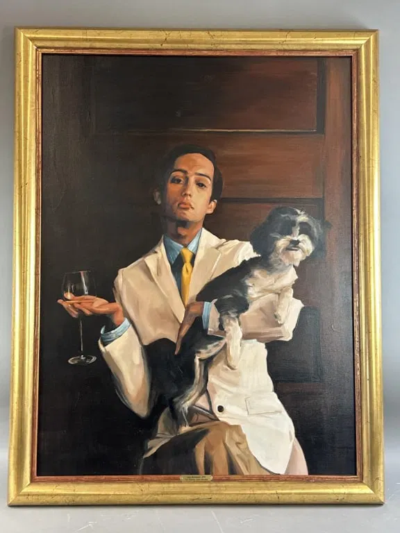
Sam McKinniss, Joe Santos, Class Passing, 2006, 29 1/4 x 39 1/4 in.,
I’ve been wanting some Sam McKinniss painting in my life, and I did not see the show he just had in LA. So I looked through the auction internet, and found this great, odd, early painting of actor Joe Santos? Is that what I’m seeing? A 2006 painting of Joe Santos looking like an Instagram Birkinfluencer? Did it really sell at the Auction Barn last August for just $900? Was everyone at the beach? WTF is happening?
Only when I was looking for the backstory, and looking at the back of the painting, did I realize it had actually sold once before, in 2015. For $1800, also in Random, Connecticut. The first seller had the invoice and McKinniss’s CV and artist statement in a folder taped to the hanger wire. Very responsible.
Which is all fine. But in 2006 Sam was still an undergrad, finishing his BFA at the University of Hartford. His first solo show, at the Charter Oak Cultural Center in Hartford, was only in 2007. It was titled, Portraits. What else was in this show? Is it in the new book?
[a bit later after ordering the book update]: It might be in the book. In a conversation with Natasha Stagg, McKinniss explains that he used to take photos of “people in his life” that he would turn into paintings “in a diaristic way, not dissimilar to examples set by Nan Goldin, Jack Pierson, or Mark Morrisroe, the Boston School.” This practice extended into the mid-2010s, while it’s not so clear when McKinniss began painting from iconically found paintings. So maybe we should be more awed at an early, incredibly deep cut publicity photo of young actor Joe Santos in a regional production of Brideshead Revisited, than a glamor shot of one of McKinniss’s classmates doing Insurance Executive Realness.
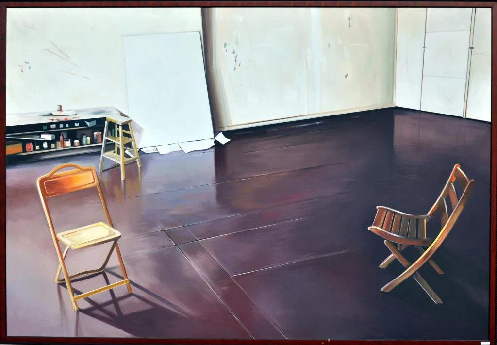
Lowell Nesbitt, Alex Katz’s Studio – 72, 1972, oil, 65 x 95 in., somehow didn’t sell in 2015 OR 2016?
Nine feet wide? This painting by Lowell Nesbitt of Alex Katz’s studio is an absolute unit. And look at that floor. That wall. That blank canvas. Those chairs. OK, maybe not the chairs so much, but actually, yes, the chairs, too. Like so many of Nesbitt’s paintings, it’s odd, slightly off, and beautiful. And the kind of thing that could hang a Sam McKinniss painting next to.
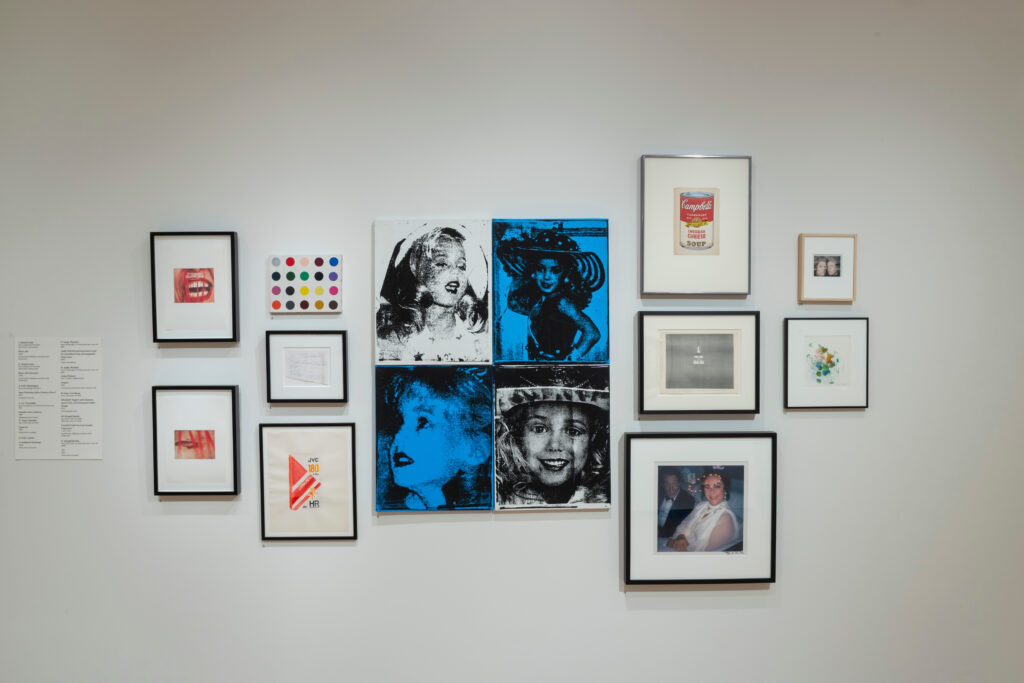
Installation view from Coming Attractions: The John Waters Collection, a 2022-23 exhibition of promised gifts at the Baltimore Museum of Art
Yesterday Eric Doeringer posted his discovery of his bootleg Damien Hirst spot painting among the works John Waters has promised to the Baltimore Museum of Art. It was on view at the museum in 2022-23 in a selection—curated by Catherine Opie and Jack Pierson—from nearly 400 works from Waters’ collection. It hung next to a Warhol Jackie-style grid of Jonbenet Ramsay portraits by Eric Luken. While being perfect objects on their own terms, these two works help situate Waters in the place, moment, and discourse of art. For the Doeringer, that was on the mean streets of early 2000s Chelsea. For the Luken, that was probably an emerging art fair. [His only show (so far?) was with Joel Mesler & Daniel Hug’s short-lived LA gallery that rode the 2000s art fair wave.]
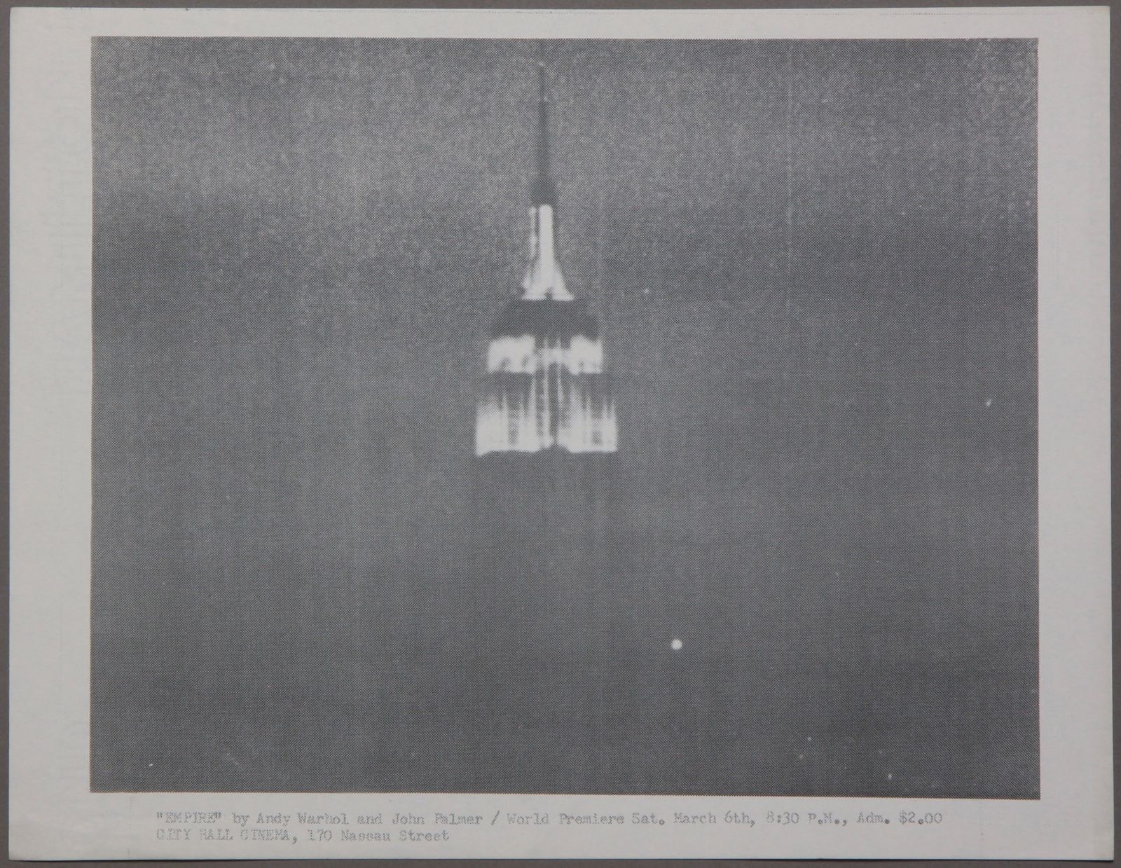
Speaking of short-lived collabs you never hear about, Waters also has the best/only thing you can really collect from one of the greatest artworks of the 20th century: a flyer made by Jonas Mekas for the world premiere of EMPIRE (1964), by Andy Warhol and John Palmer.
If you think I’m leading with all this to head off criticism that I’ve become a one-topic fanblog, you’re only partially not wrong. Because this is all stuff I found along the way while trying to get a legible image of the work beneath Doeringer’s painting, which is a scrap of paper on which Cy Twombly wrote his address.
Her emphasis was on the ordinariness of the people involved, and the seeming smallness of their actions, even though they faced real, dangerous consequences. This is all the more important now as we ourselves are confronted with choices to do the next right thing without assurance of the impact. [the YouTube channel that posted video of the speech could not be more random, and its nascent virality is leading it to be reuploaded, so I’ll watch to keep the most authoritative version here.]
The star of the “one if by land, two if by sea” story is Paul Revere, but Cox Richardson gives full attention to his collaborators, John Pulling, Jr. and Robert Newman, who had access to the Old North Church and who actually lit the lanterns. [As a keyholder for the church, Newman was arrested the next morning, and Pulling bounced to Nantucket.]
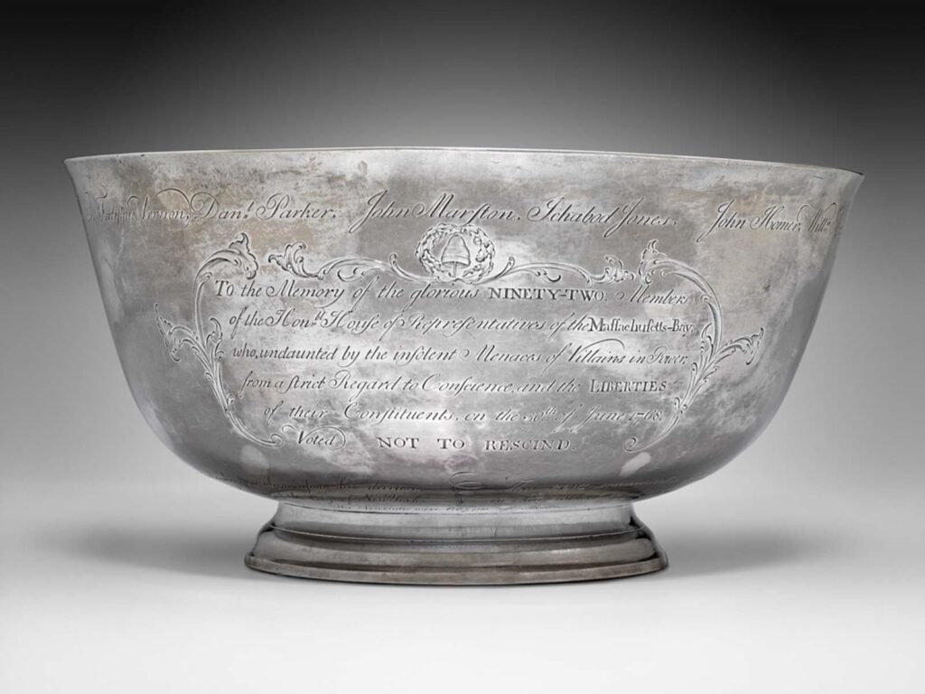
Actually, it’s because it’s been polished so much that it looks like that. Paul Revere, Jr. Bowl, 1768, silver, 5 1/2 in high, 11 in. diameter, collection MFA Boston
The seeming insignificance of a particular action of resistance was on my mind when Liz Deschenes posted a picture of the Sons of Liberty Bowl on instagram today. Conceptually, at least, I’m a Paul Revere engravingfan, but I confess, I’d never given the Sons of Liberty Bowl much thought. And despite what the MFA Boston says, if you had asked me to tell you the nation’s third “most cherished historical treasures after the Declaration of Independence and the Constitution,” I would never in a million years have said the little punchbowl Paul Revere made for his friends.
But we are in different times, and have a different relationship to tyranny than we did even a few months ago. And it has been worth giving the bowl a new, closer look.
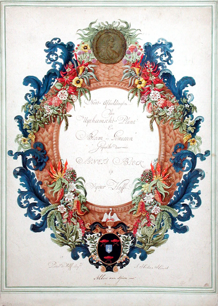
Albert van Spiers watercolor frontispiece for Agneta Block, 17¼ x 12 5/8 in. when it was sold at Christie’s in 2004, but since it’s been mounted, it’s 19 x 13 1/2 in. at Arader Galleries
Speaking of pioneering 17th century Dutch naturalist and pineapple cultivator Agneta Block, this extraordinary watercolor with Block’s family crest and her medallion portrait was a painted for her by Albert van Spiers.
Based on the inscription, it’s thought to be the frontispiece for a collection of botanical illustrations Block commissioned from Johanna Helena Heroldt, who was the daughter of another botanical illustrator Block supported, Maria Sibylla Merian. At least 126 illustrations by Heroldt in three groups could be connected to the project for Block, who had one of the largest collections of exotic and rare flowers and plants in Europe.
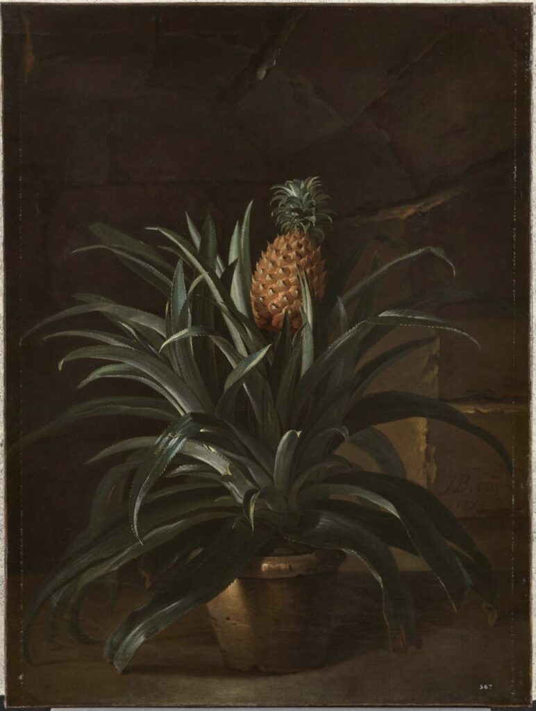
Jean-Baptiste Oudry, Ananas dans un pot, 1733, oil on canvas, 130 x 98 cm, collection Chateau de Versailles
In 1733 Jean-Baptiste Oudry, 47, had been a painter to Louis XV for several years. He had a studio in the Tuileries and an apartment in the Louvre. He kept very busy being on call, painting whatever the king wanted painted. He painted the king’s hunt, both the action and his dogs and daily catch; he painted the exotic animals in the king’s menagerie. While cranking out paintings on demand for the king, he was also named chief designer for the king’s tapestry manufactory at Beauvais, and for the factory at Gobelins. And some time probably toward the end of the year, he painted a portrait of the first pineapple grown in Europe France*. [whoo boy updates below]
For a brief shining moment in 2023, a website called depositionrow.com hosted the entire 6h42m42s video of Richard Prince’s deposition in the copyright infringement lawsuit over his Instagram New Portraits. And then it was gone.
Well, now you can watch it again. Starting today, it is playing on a computer on a table in a Janis Kounellis installation at Sant’Andrea di Scaphis in Rome, Gavin Brown’s deconsecrated side hustle. What are you waiting for?
[apr 30 update]: there is video now, it really is like this for six hours.




![this altered version of Caravaggio's Deposition from the Vatican Museums in Roma is a cascade of mourning figures holding or looming over the dead but still absolutely caked up body of Our Lord, with an outsized clipped version of Richard Prince's under-oath face roughly pasted onto the main figure in the center, the one who is holding Jesus, but, importantly, also looking straight at the viewer. Obviously, since this is a picture about Prince's deposition in a lawsuit, the so-called correct thing would be to paste his face on Jesus's, and in less apocalyptic times, I might have, but [looks at the world] I'm not taking that chance rn](https://greg.org/wp-content/uploads/2025/04/richard-prince-deposition-roma1-689x1024.jpeg)