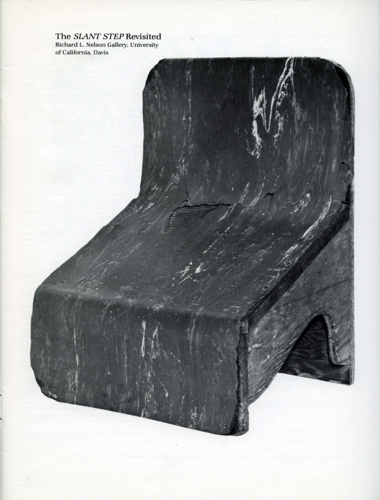
It’s been told and retold enough that even if you’ve somehow never heard it or seen its inspiration, it’s clear that several generations of artists ascribe to the Slant Step Theory of post-minimalist and conceptual sculpture: In 1965 William T. Wiley bought a plywood & linoleum stool with a steeply slanted seat at a Bay Area thrift shop. Installed in the studio of his student at UC Davis, Bruce Nauman, the Slant Step’s nonfunctional mystery and alluring form made it an aesthetic fetish object. It inspired at least two shows in the 1960s and several more since. It got passed around, stolen and rescued, surviving as an intentionally absurd teaching prompt until it entered the collection of UC Davis’s museum.
As far as I can tell, the first time it was publicly recognized as a stool for helping you squat on the toilet and take a better shit was only in 2014, well into the Squatty Potty era. Even so, it’s not clear that later shows have addressed this fundamental reinterpretation of an enigmatic totem as a highly specific, utilitarian, biological tool.
It reminds me of the novel-for-some-mundane-for-others theory of paleolithic tally sticks as lunar or menstrual calendars. And of Ursula K. Leguin’s Carrier Bag Theory of Fiction, where human experience can be understood through narratives other than violence and conflict, and motives other than competition, killing, or subjugation. The Slant Step Theory may be similarly narrow and incomplete. It’s not a mystery; it’s just you.
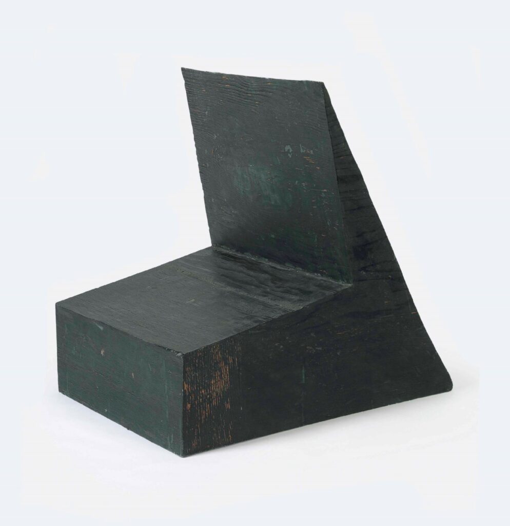
Nauman made Device to hold a box at a slight angle in 1966, with the Slant Step in his studio. It had already been shown twice before Philip Johnson’s partner David Whitney curated it into Nauman’s first show at Castelli in 1968. It went from there to documenta 4, and when it came back, Cy Twombly bought it, in 1969.
The Cy Twombly Foundation sold it in 2014. What happened to it in those 45 years? I don’t know of any photo of Twombly interiors in which Nauman’s Device appears. Did Twombly study it? Contemplate it? Respond to it? Store it away? If a revision of the Slant Step History of contemporary sculpture is in order, who knows what might be learned by tracing Twombly’s connections to and from this Nauman he kept for so long?