Being Pontus Hultén must have been absolutely amazing, the king of all he surveyed. He was the founding director of at least three modern art museums and one of the most influential figures in 20th century art. A groundbreaking curator, a friend to major artists, and a stone cold crook.
Hultén made the first re-creation of Tatlin’s lost Memorial to the Third International for an exhibition at the Moderna Museet, which, great.
With permission from Duchamp, Hultén made exhibition copies of Duchamp sculptures, including the first copy of the Large Glass, for the Moderna Museet in 1961, which Duchamp signed as recognized copies on his visit to Sweden. No problem, but watch this space.
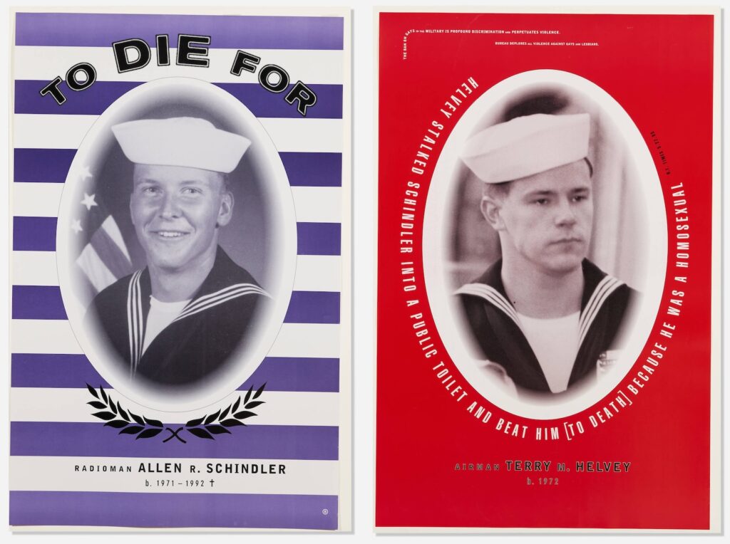
In 1968 Hultén bought hundreds of actual cardboard Brillo boxes, from Brillo, for a Warhol exhibition, and had a few made of wood in Stockholm, maybe 10-12, and not more than 15, with, if not Warhol’s permission, then his awareness. OK.
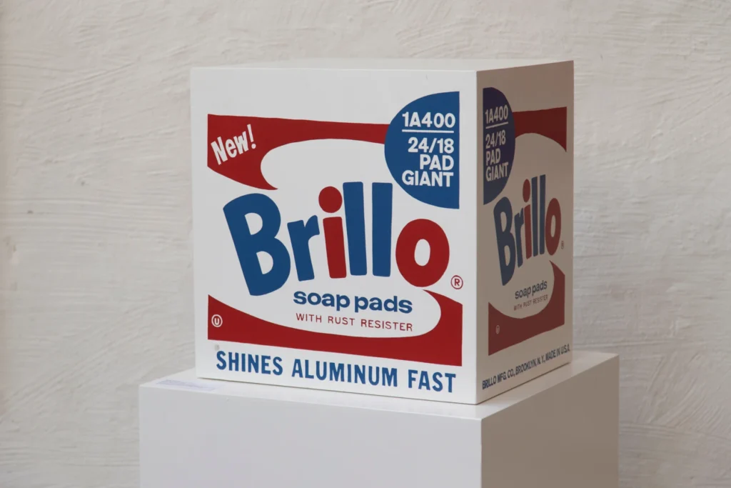
But then in 1990, after Warhol’s death, Hultén had 105 more Brillo boxes made in Malmö, which he said were made in Stockholm in 1968. He donated or sold these boxes all over the place until his death in 2006, based entirely on his association with Warhol, and his own assertions of authority. He sold 40 to Duchamp dealer Ronny van de Velde with certificates of authenticity saying they were from 1968. But Warhol never authorized these, and he definitely didn’t do it after he was dead. It turns out many people in the Swedish modern art world knew Hultén’s Brillo racket. Not OK.
An entire investigation and report on the various fabrications of Brillo boxes was conducted by the Warhol Foundation in 2010, which declared all the Hultén boxes to be Hulténs, not Warhols. (This, after Hultén got the Warhol Authentication Board to approve and add 94 1968-I-mean-1990 Stockholm/Malmö boxes to the catalogue raisonné in 2004.) Shady, a bummer for a few collectors, but kind of hilarious.
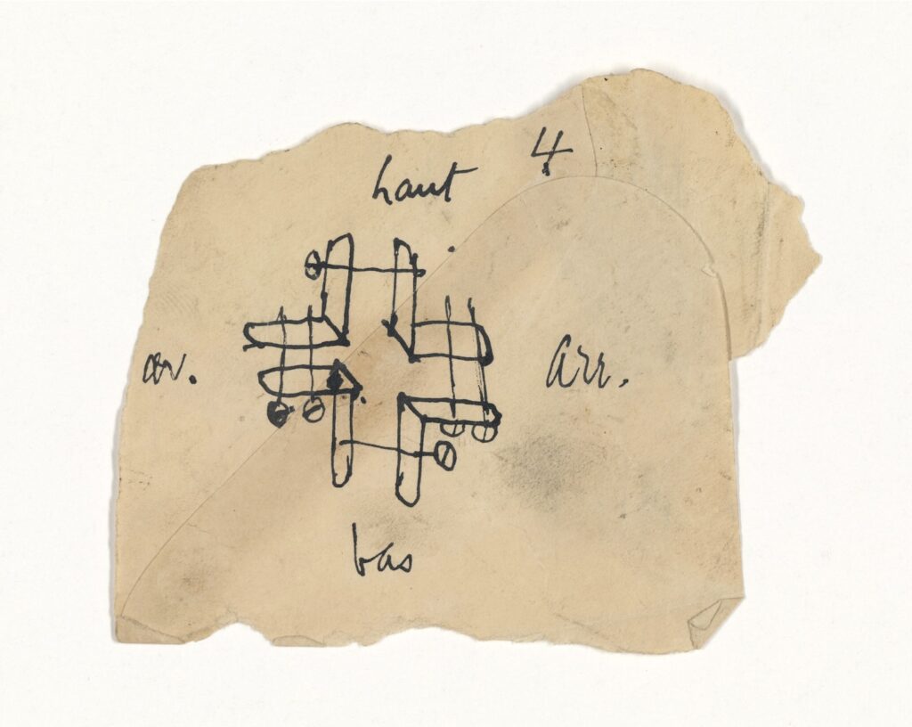
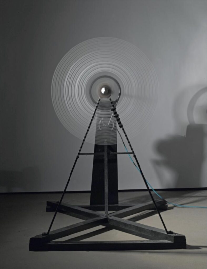
But in 1960 Pontus Hultén also straight-up stole at least four Duchamp drawings from Yale University Art Gallery. Katherine Dreier had donated Duchamp’s 1920 sculpture Rotary Glass Plates to Yale in 1941 as part of the Société Anonyme. Hultén visited the sculpture for what Yale’s extraordinary provenance note for this sketch on an envelope of the Rotary Glass Plates says was to consider it “for inclusion in an exhibition.”
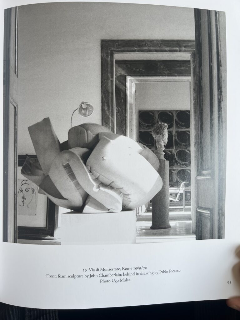
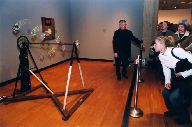
What he was doing was studying how to refabricate it. The 1961 exhibition, Movement in Art, for which Hultén and Ulf Linde fabricated all the Moderna Museet’s Duchamps, including a Rotary Glass Plates. [Actually, Linde made the Large Glass; Hultén made Rotary Glass Plates with Per Olof Ultvedt and Magnus Wibom.]
Yale writes that “Hultén reportedly removed the sketch, along with three others, from the artwork’s storage box.” I think it illustrates how to clamp the painted glass plates to the central axle on which they rotate. Hultén apparently gave the sketch to Linde as a birthday present, and his widow, along with Duchamp scholar Paul B. Franklin, returned it to Yale in 2018. No word what or where the three others are, but Yale clearly has some idea.
It turns out Hultén made another Rotative Plaques Verre, in French, for the Pompidou in 1979. In 1980 Hultén’s Pompidou published a facsimile set of 289 Duchamp notes and scraps with Paul Matisse, Duchamp’s step-son, with the originals in the collection. Nothing in there seems obviously stolen from Yale.
[Shoutout to rare and amazing artbooks dealer Yoshi Hill for posting the buck wild archive entry to his Instagram yesterday.]