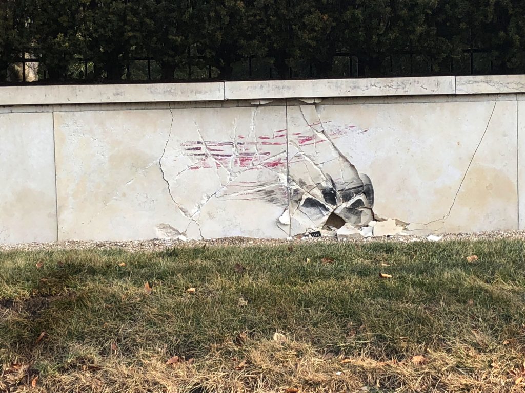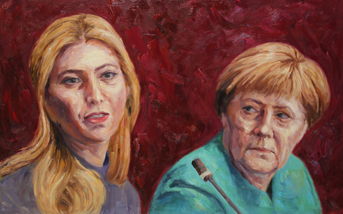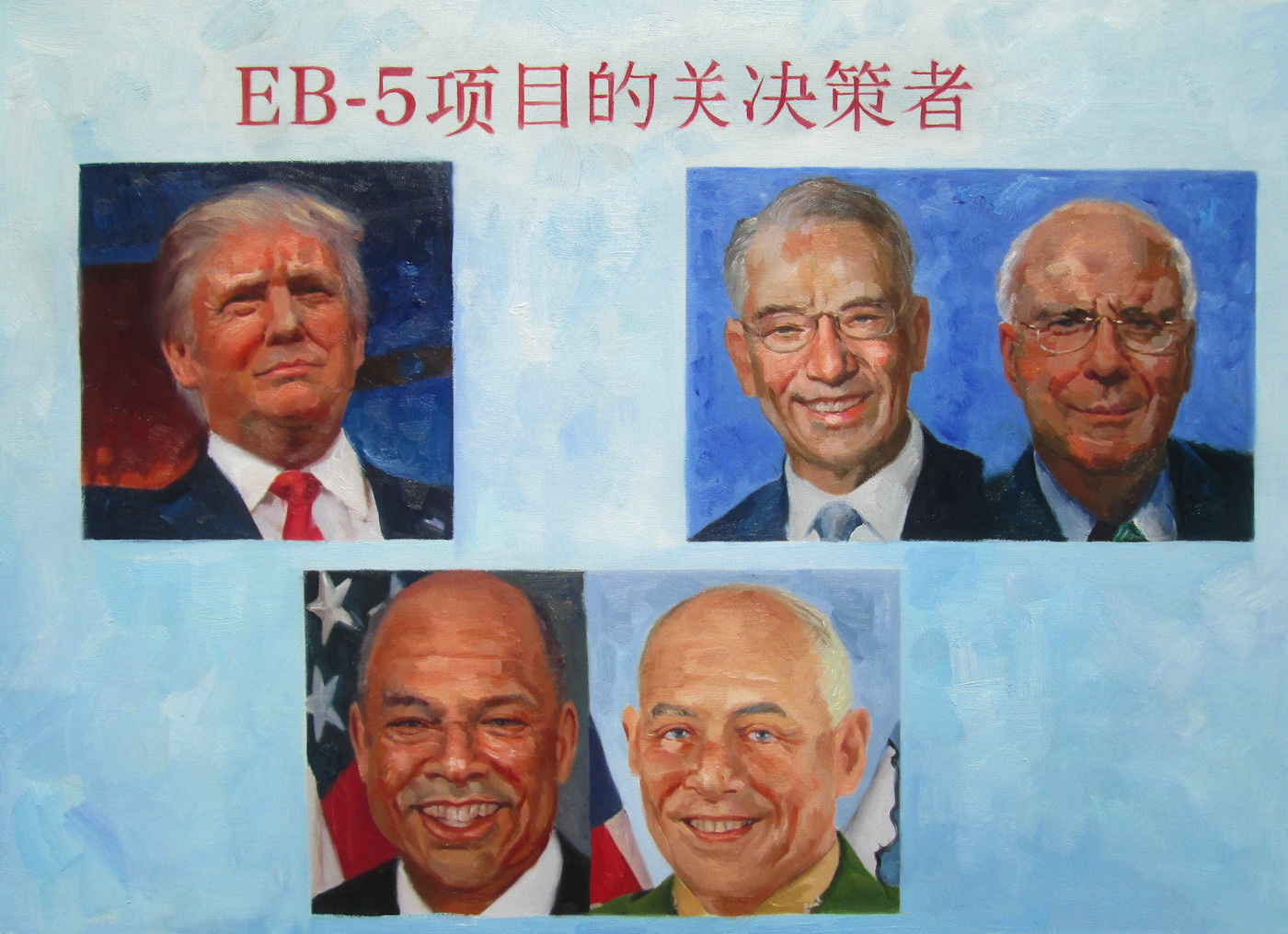
Our Guernica Cycle – EB-5, 05.06.2017, in the style of George W. Bush, 2017, oil on canvas, 50x80cm (20×28 in.)
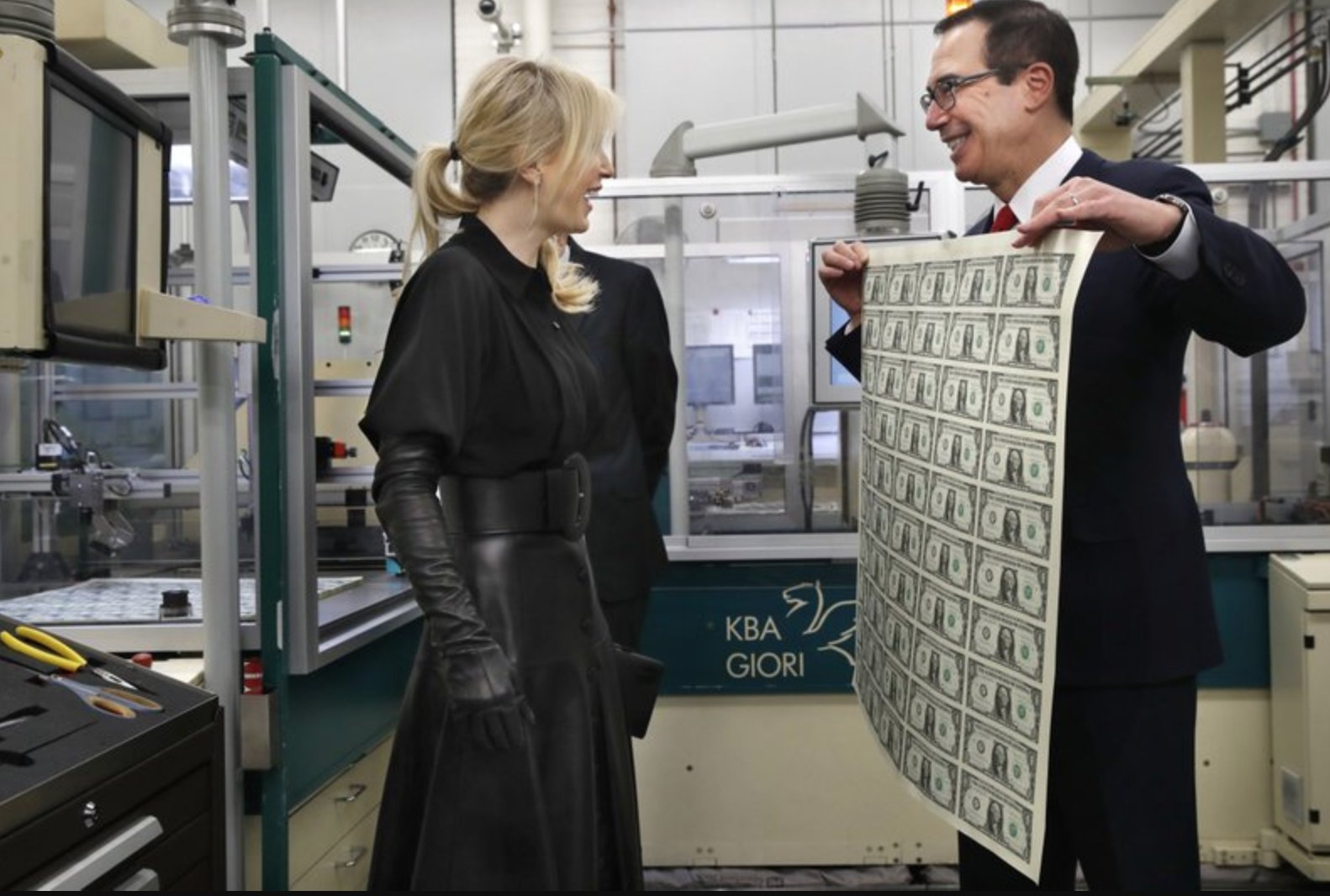
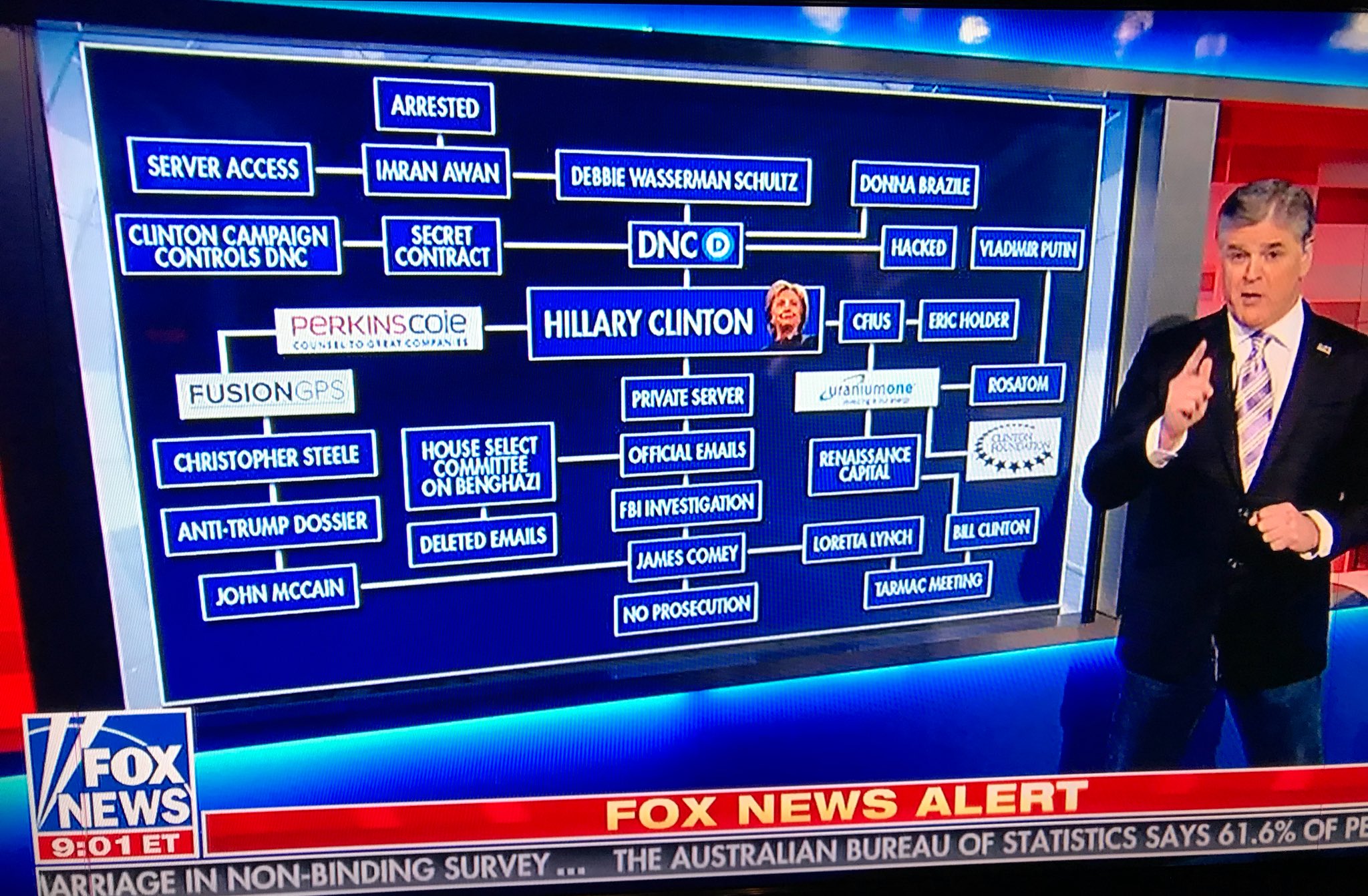
On May 6, 2017, The New York Times reported, Jared Kushner’s sister met with potential investors in Beijing, trying to raise $150 million for the family’s Jersey City real estate project. She was promoting the EB-5 visa program, which essentially sells US green cards for making a $500,000 investment. Her PowerPoint slide showed photos of “EB-5 Visa Key Decision Makers,” including Senators Grassley and Leahy; DHS Secretaries Jeh Johnson (ex-, obv.) and Gen. John Kelly (now ex-, too, obv., and White House chief of staff); -and her brother’s father-in-law (and boss) Donald Trump.
Jared Kushner still owned major stakes in his family’s business at the time, having transferred only some of his holdings to his other family members when he became a White House employee. He would subsequently revise and refile his financial disclosure forms repeatedly to include previously undisclosed conflicts, contacts, and investments.
Kushner had tried mightily during the transition to secure Chinese investment in his company’s overleveraged flagship property, 666 Fifth Avenue. His efforts failed, and his partner, Vornado, has since declared that their ambitious plan to redevelop the office building into a multi-use megatower-and refinance it at a much higher valuation-was no longer feasible. The property is on track to go bankrupt as early as 2018, putting the Kushner’s equity at risk.
Our Guernica Cycle – EB-5, 05.06.2017 is the second painting in an ongoing series. I now see the Our Guernica Cycle as proceeding in roughly chronological order. It is November, and the outrageous Guernica moments since May are obviously piling up like leaves in the gutter. But the pace of disaster puts us all at risk of forgetting or acquiescing to the obvious wrongs of just a couple of months ago. If painting can do anything at all, it should be able to recalibrate our narrative clocks a bit.
So here is a painting, and a pyramid of prints, of the US president’s family hyping his political power to sell visas in exchange for investing in their private real estate company.
While it is similarly painted in China, in the attempted style of our still-most-relevant painter,
George W. Bush, EB-5, 05.06.2017 obviously differs from the Ivanka / Merkel 03.17.2017 work in several ways. For one thing, it’s done before you decide to buy it. I honestly cannot imagine how this helps. But then, given what we all knew going into it, I could not imagine why anyone, including me, would want to have an awful painting of Ivanka & Merkel in my life, either. Even more than before, this is a case of urgency, of feeling the need for an image of a moment of a crisis to be produced, disseminated, and preserved, even while the crisis continues. To bear witness, to #neverforget.
This work is further complicated by having the actual picture of Trump in it. Could it be any tougher of a sell? On the bright side [sic], the execution of the image is, I believe, more skillfully Bushian than ever. So at least it’s a good bad painting of a corrupt cabal. Right? And anyway, the gradient is probably the best part.
The Modified Kinkade Pyramid is in effect, and all prints will be available in the identical sizes and editions as the first work. However, blighting the image by hand will only take place upon request. So please make a note if you want more blight. The print was made available first to original Kickstarter backers, and now it is available generally, for a limited time. It is discounted 10% because y’all are all VIPs to me, but also to take into account a better sense of actual production and shipping costs. As before, any surplus will be turned back into producing the next images in the Cycle.
Literally no one has asked, but it is possible that the first print, Ivanka / Merkel 03.17.2017 could be made available as well.
Thank you again for your engagement during this ongoing disaster.
[via paypal]
Previously: UPDATED: Our Guernica Cycle – Ivanka / Merkel 03.17.2017

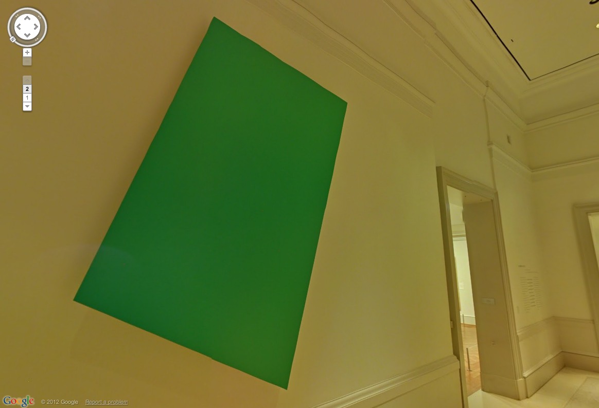
 Speaking of painting, the Proposte monocrome, gris has been accepted. I’m not sure I agree with the choice, but it was really out of my hands.