
to be continued:
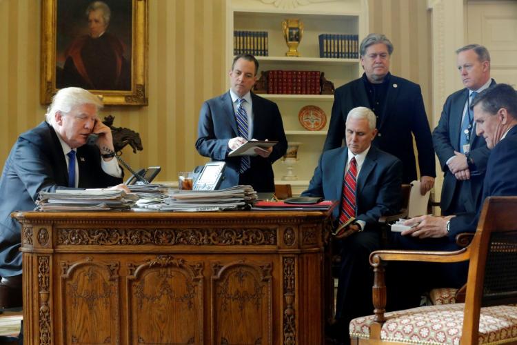

[cf. stalin & friends; original image of Trump talking to Vladimir Putin on Jan. 28, 2017 via @yashar]
Category: dc
Untitled (Koch Block), 2014 –
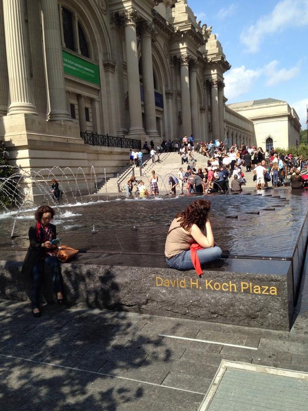
Close, but not quite: Study for Untitled (Koch Block), image by @sailingfanblues
First conceived in September 2014 in response to a tweet by Zachary Kaplan, Untitled (Koch Block) is a collaborative public artwork situated permanently at the Metropolitan Museum of Art in New York.
It comprises an endless succession of volunteers who sit on the edges of the fountains in front of the museum in a manner that obscures the engraved name of the museum trustee, David Koch. The work includes the engravings on both fountains, and so is ideally performed by two or more individuals at any time. While a sitter’s personal items such as a stroller, wheelchair, shopping cart, or backpack might be placed in front of the engraving for extra-wide impact, no permanent alteration, damage, or obscuring of any kind should take place, at least not as part of this artwork.
Any one individual or group should feel free to sit and block public view of the name for as long as they wish, but all should be mindful of others who might also wish to participate. The Artist Is Present-style marathons are discouraged. Instead, try taking turns, coordinating, and/or making arrangements onsite to continue the work. Formalized schedules or shifts should also be avoided, even if this means the work is not persistently instantiated.
It’s true that awareness of the work could be facilitated by people posting photos on social media using a hashtag like #KochBlock. My concern, though, is that viral messaging might run counter to the essential nature of the work, which is to deplete the mindshare and social capital that typically accrue from such purportedly eleemosynary naming opportunities. Still, such efforts are obviously beyond my control, and if the 7 million visitors to the Met each year decide they all have to post #KochBlock selfies, well, we’ll re-evaluate.
The ideal state of the work is for the names to be permanently blocked from view through uncoordinated but widespread acculturation. At any moment in which a sitter finishes blocking and rises from her spot, another individual naturally and un-self-consciously takes her place. Some folks will undoubtedly make a point of visiting the fountains to participate. Some might make it a routine. People might come to recognize the faces of other regulars. Eventually, Koch blocking should become an ingrained behavior common to sharing civil, public space, as obvious and natural as dodging slow-moving tourists or jaywalking. [s/o @man for reminding me this needed to be formally auraticized.]
UPDATE: Just realized this is my third piece at the Met. Thanks for the support!
The Richard Serras Of Friendship Heights
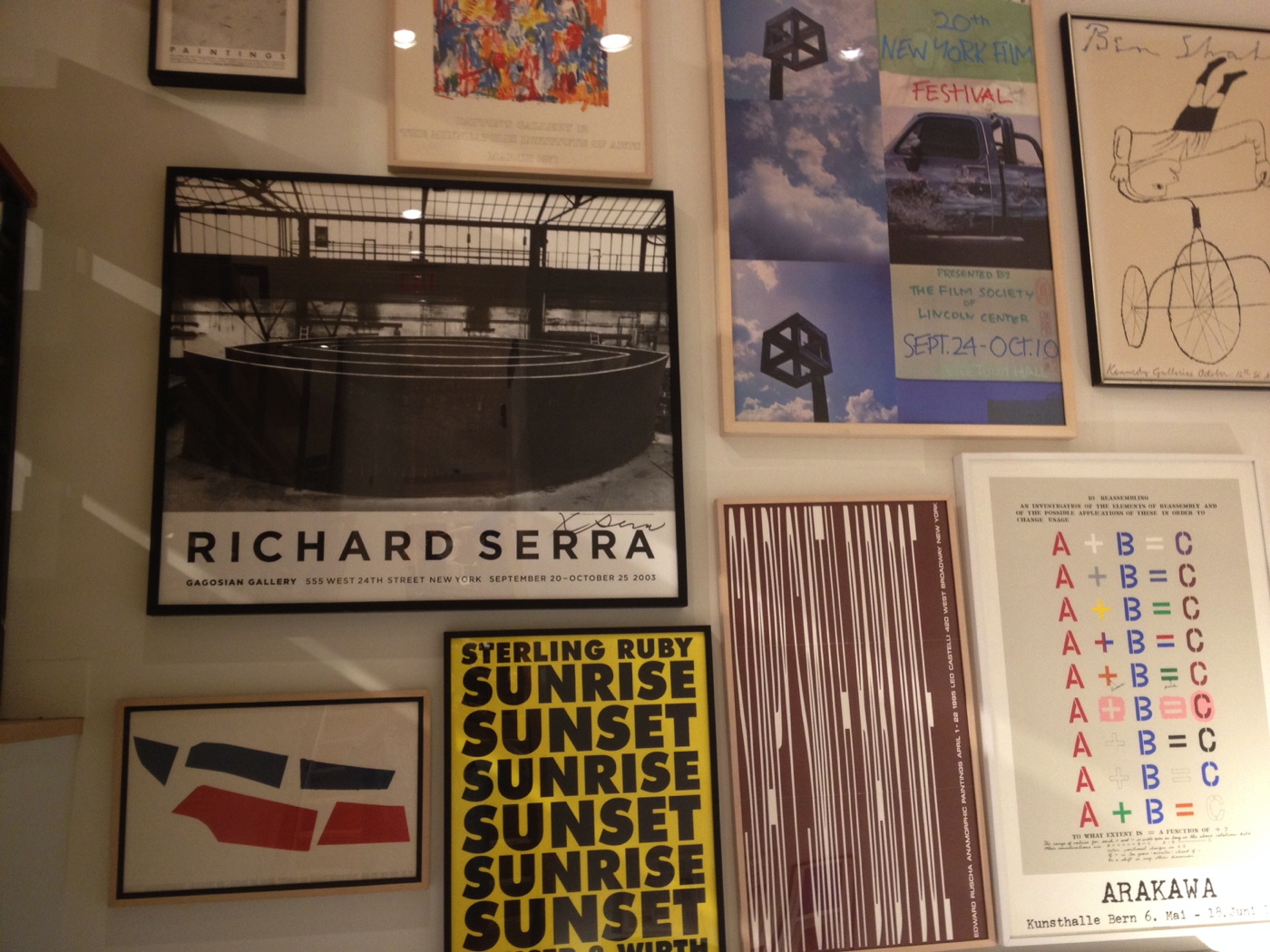
If you’re wondering who the one person was who went to the mall in Chevy Chase, to the J. Crew store Monday, it was me. And I was only picking up a catalogue order.
And marveling at the giant [signed!] Richard Serra Torqued Spirals exhibition poster from Gagosian, c. 2003, one of two constellations of highly curated posters and prints lining the staircase.
I contemplated the state of the brick&mortar retail industry, making a note to watch the liquidation auctions for a deluge of contemporary art ephemera when the reaper comes for J. Crew. And figuring if the swag doesn’t turn up, we’ll know the store designers who fantasy-shopped it all together have absconded with it in lieu of severance.
Just as I was thinking, this poster was my most unexpected Serra sighting ever, I stepped outside, and found this, in the garden of the condos across the street.
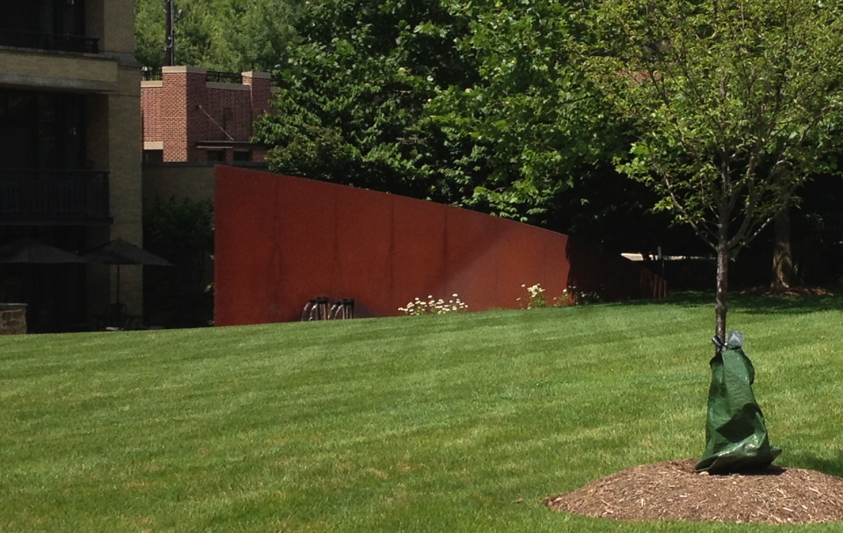
I approached to take a photo, and the carefully calculated elevations of the lawn revealed the bottom quarter of the Cor-Ten slab. If only he’d added a water feature, I bet Tilted Arc would still be standing.
Untitled (Unpainted Wall), 2017
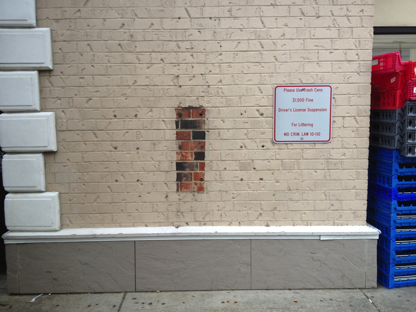
Untitled (Unpainted Wall), 2017, brick, concrete, 18 lag shields, exterior latex paint. Installation view, Chevy Chase, Maryland
In his 1977 Whitney catalogue, Michael Crichton wrote about the origin of Jasper Johns’ 1967 painting Harlem Light:
It has a peculiar background. Johns was taking a taxi to the airport, traveling through Harlem, when he passed a small store which had a wall painted to resemble flagstones. He decided it would appear in his next painting. Some weeks later when he began the painting, he asked David Whitney to find the flagstone wall, and photograph it. Whitney returned to say he could not find the wall anywhere. Johns himself then looked for the wall, driving back and forth across Harlem, searching for what he had briefly seen. He never found it, and finally had to conclude that it had been painted over or demolished. Thus he was obliged to re-create the flagstone wall from memory. This distressed him, “What I had hoped to do was an exact copy of the wall. It was red, black, and gray, but I’m sure that it didn’t look like what I did. But I did my best.”
Explaining further, he said: “Whatever I do seems artificial and false, to me. They-whoever painted the wall-had an idea; I doubt that whatever they did had to conform to anything except their own pleasure. I wanted to use that design. The trouble is that when you start to work, you can’t eliminate your own sophistication. If I could have traced it I would have felt secure that I had it right. Because what’s interesting to me is the fact that it isn’t designed, but taken. It’s not mine.” [p. 54-55]
And that, my friends, is how I am different from Jasper Johns: I got the picture.
Previously typed this in, related: Driving Taxis Through Heavy Neighborhoods To Look At The Paintings
Untitled (I Can See Russia From My House), 2017

Installation shot: Untitled (I Can See Russia From My House), 2017, 15′ x 10′ x 6′, dye sublimation printed carpet, bolts, washers, lumber.
I’m psyched to announce the public installation of a new work, Untitled (I Can See Russia From My House), in Warrenton, Virginia. It is a dye sublimation print on carpet, mounted on a wood support.
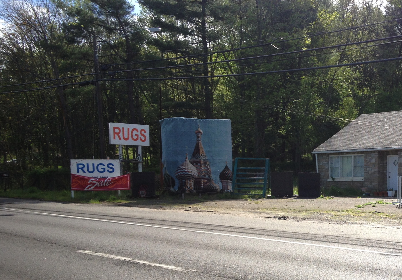
I suppose it could also be installed indoors, but it would lose a lot of the impact; it really is a piece that is best come upon in the course of daily life.

Untitled (I Can See Russia From My House), 2017, washer and bolt installation detail
The carpet is affixed to the support using bolts and washers [above]. Longtime Kremlin watchers will note that the image, of the south facade of St. Basil’s Cathedral, is here reversed.

Although an installation shot from December 2016 shows unrelated works installed nearby. It is the artist’s intention that this piece be viewed and appreciated on its own. Despite what you might assume, it is currently not for sale.
Better Read #013: Modern Art Shackled To Communism, by Congressman George Dondero
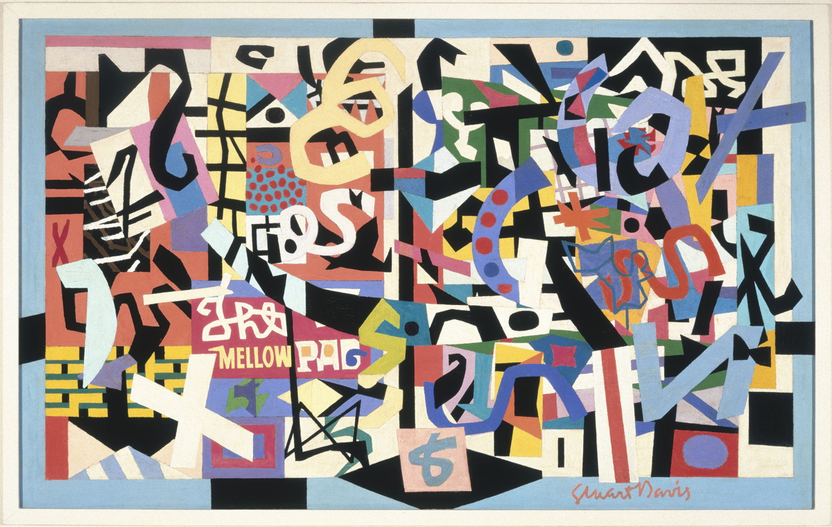
The Mellow Pad, 1945-51, by Stuart Davis, co-founder of the American Artists Congress in 1936, image: whitney.org
This edition of Better Read features a speech delivered by Michigan Republican congressman George Donderos on the House floor on Tuesday August 16, 1949 titled, “Modern Art Shackled To Communism.” I came across quotes and excerpts from this speech while researching the American Artists Congress, the group that brought Picasso’s Guernica to the United States for a fundraising tour in 1938.
Dondero made several fiery speeches against modern art during this, the McCarthy era, repeatedly accusing modernism and all its subsidiary “isms” of being a vile foreign-led Communist plot to destroy American art and values.
Near as I can tell, this is the first time Dondero’s complete speech has been available outside the Congressional Record, which turns out to be a lot harder to get ahold of than I expected. I am currently preparing a compilation of all Dondero’s art-related speeches, and the responses they engendered from the accused, the threatened, and even, surprisingly, the nominally allied. Because even I have a hard time listening to a robot for 26 minutes, the complete text of Dondero’s speech is included after the jump.
Download Better_Read_013_Dondero_Communist_Shackles_20170417.mp3 [26:49, 39mb, mp3 via dropbox greg.org]
Continue reading “Better Read #013: Modern Art Shackled To Communism, by Congressman George Dondero”
Remember, Remember, The Grift Of November
The first draft of history. History written by the victors What even is it? The barrage of nonsense comes so fast and thick and is so full of bullshit that the very notion of history feels out of date. Which is probably someone’s point. Or at the very least, in someone’s immediate interest.
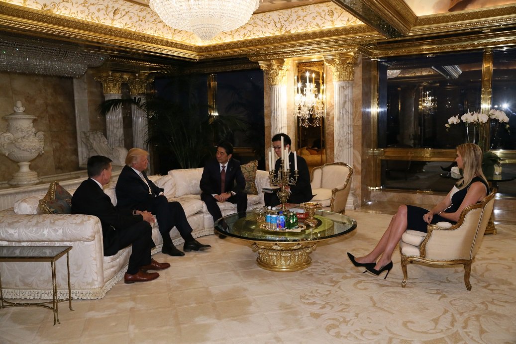
Do you even remember the outrage when the Japanese Prime Minister’s Press Office released publicity photos of Shinzo Abe meeting Donald Trump at Trump Tower on November 17th, which revealed that Ivanka and Jared were sitting in on the meeting?
And then like two weeks later, the Times kind of buried the lede that at that very moment, Ivanka’s fashion label was negotiating a licensing deal with a Japanese apparel conglomerate whose majority shareholder is a development bank owned by the Japanese government.
Oh, hands were wrung, potential conflicts of interest were ruminated upon, denials and assurances were floated. And it all turned out to be bullshit, and that was also the same time Jared and Ivanka were in fact preparing to take up offices and jobs in the White House.
So maybe that’s a power of a painting: the ability to slow things down, even just long enough to have an impact, to make something stick, to give some context. It rewards the exercise of looking, looking longer, and looking back.
Campaign Ends April 26th: Our Guernica, After Our Picasso: A Kickstarter
Our Guernica, After Our Picasso: A Kickstarter
I’m not saying we should commission GWB to paint this, but I’m not saying we shouldn’t [deleted twitter url to a pic of angela merkel giving side-eye to ivanka trump at a white house mtg]
— gregorg (@gregorg) March 17, 2017
I swear, I tried not to do it, but the image was too strong. In the days since I started drafting this Kickstarter campaign, I quit several times. And then history kept catching up to this image. In fact, history started lapping it.
So yes, we need to mark this moment, this look on Chancellor Merkel’s face, on all our faces, when it was still possible to not believe what was happening before our eyes. And there’s only one painter who can do this moment justice. Unfortunately, he and justice are not really in a great spot right now, so we’re gonna use #chinesepaintmill and the Thomas Kinkade Editions Pyramid.
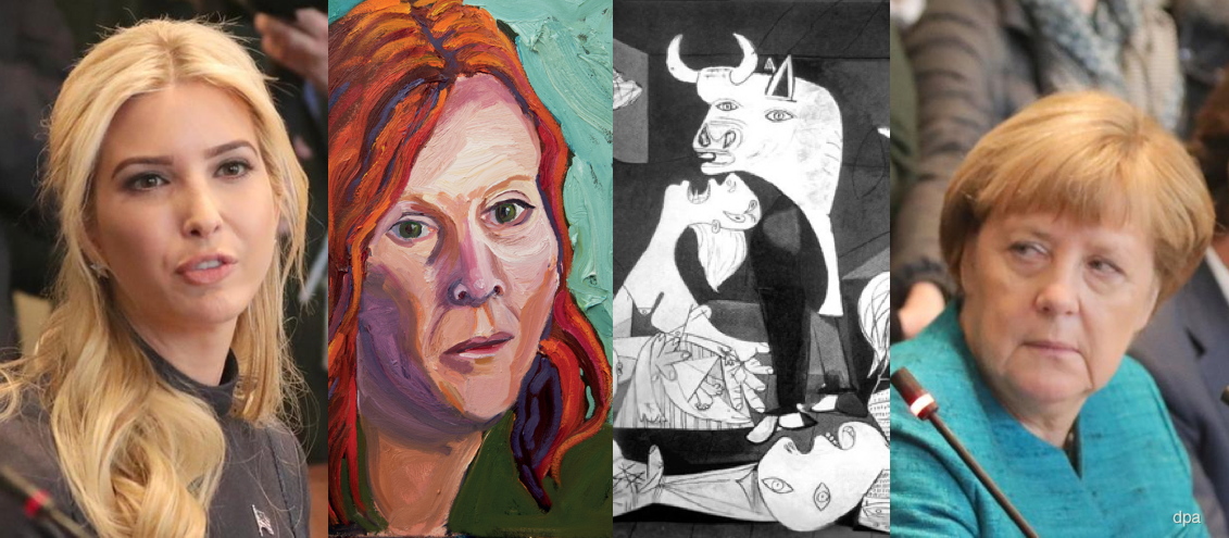
Our Guernica, After Our Picasso: collaged details from Michael Kappe/dpa photo, George W. Bush painting, and Picasso’s Guernica
In my darker moods, I imagine a series of paintings of such moments will come- Angelus Novus looking back and piling JPG upon JPG at his feet as the storm irresistibly propels us into the future. Can our brush-wielding Chinese allies capture the essence of Trumpian corruption with authentic Bushian flourish? Can we spread the resulting image(s) to the four corners of the warming, flooding earth to bear adequate witness? Let’s start with one and see.
Back “Our Guernica, After Our Picasso on Kickstarter now
UPDATE #1 After just a couple of days the project has gotten over halfway to its funding goal, thanks!
It has also been the subject of reportage by Will Fenstermaker at Artspace [who is also a backer, write what you know!] and AFC [“that’s a lot of layers to unpack for what’s essentially a meme” I do not disagree!]
On the more depressing news front, today, Day 3, might pass without a single new backer. Perhaps everyone’s too stunned at the floating of #Ivanka2024 by The Daily Caller [not linkin’, look it up], and worrying how a painting can somehow head off this meta-disaster. It probably can’t, but there’s a lot to be done in the mean time.
I’ve also noticed that backers are a savvy bunch. Folks seem to prefer the lower-priced, smaller prints at this stage. Possibly, I thought, because you’re reluctant to put up larger amounts of money for an artwork that you’ve 1) not seen because 2) it doesn’t exist yet.
It might be useful to reframe the entire project as a single conceptual piece, in which case, the physical manifestations are secondary to its core expression. But it’s still natural to wonder how it’ll look, especially if you’re contemplating getting a big one. I’m trying to think up a solution for this. Any advice or thoughts are welcome. And thanks again for spreading the word!
UPDATE #2 WHOA IT IS HAPPENING, THANKS! THE BALL IS ROLLING, THE CAMPAIGN IS CONTINUING. LET’S BUILD THAT PYRAMID AND LAUNCH A WHOLE BUSHMASTER CYCLE OF PAINTINGS TO DOCUMENT THIS THING!
1971: The Year In Andirons
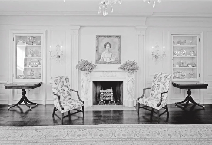
The Vermeil Room in the White House as redecorated by Pat Nixon’s plumbers, photo c.1992, LOC via Phillips-Schrock
The White House needed renovation and redecoration, and the Nixons were determined to put their mark on the place. By 1969, the French interiors commissioned by Jacqueline Kennedy were worn from use. Also they were detested by politicals as reminders of a martyred rival. H.R. Haldeman and new White House curator Clement Conger set out on an aggressive fundraising effort to remake the White House and its collections, a campaign publicly led by the First Lady Pat Nixon. The period room-style appearance of the White House to this day largely reflects Mrs Nixon & co’s work.
Based on my Google Books previews of it, this story of “the Dismantling of Camelot” is meticulously told by Patrick Phillips-Schrock in his 2016 book, The Nixon White House Redecoration and Acquisition Program: An Illustrated History.
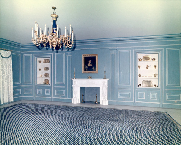
Vermeil Room a la Boudin, c. 1964, image: whitehousemuseum.org
Phillips-Schrock’s account of the 1971 redecoration of the Vermeil Room on the ground floor of the White House is representative. From a caption of a photo of Boudin’s Kennedy-era design: “The room was expensively finished in painted surfaces in blue and white with vitrines lined in white silk. Conger found it offensively French…” [p.74]
From an interview with Conger: “What we have done in ‘face-lifting’ the Vermeil Room is to change the room from a very dark blue–which is rather depressing–to a light green-gray, the appropriate color as the background for vermeil, which is gold. You use blue with silver, but never such a dark blue!” [p.76]
The room was reconceived as an early 19th century sitting room, with a table at the center “attributed to the workshop of Duncan Phyfe, it was on loan until a donor could be found to purchase it.”
An 18th century lighting fixture in crystal with 10 lights replaced the Kennedy chandelier of bronze and blue tole. Further lighting was supplied by four matching sconces and by two candlesticks given by Mrs. Marjorie Meriwether [sic] Post, which were placed on the mantel. The fine Louis XVI marble fireplace was acquired and installed in 1962. [not too offensively French, I guess. -g.o] Within the firebox were a pair of valuable brass andirons, obtained from Israel Sack of New York. When the room was opened to the public, Conger related, “These are American andirons, so called ‘in the Paul Revere Manner’ with the flame and diamond lozenge–except they are a little more petite and narrow than the heavier ones of this same design one generally sees.” [p. 77]
The andirons abide.
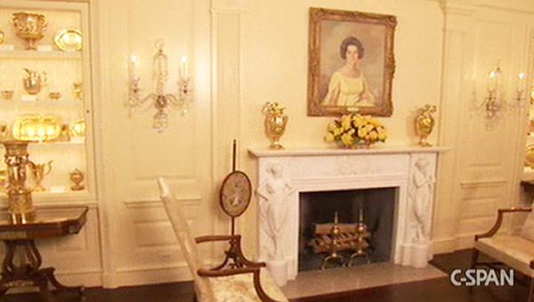
American Andirons in the Vermeil Room, c.2008, image: CSPAN via whitehousemuseum.org
I mention this because I just googled across it. And because 1971 was a busy year for well-provenanced, Paul Revere-ish andirons. It was the same year Mrs. Giles Whiting bequeathed her Paul Revere (Attributed) andirons to the Metropolitan Museum. Interestingly, Mrs. Whiting’s Revere-ian andirons did not have a diamond and flame, but an urn and flame finial. Actually, I don’t know if that’s really interesting at all. Maybe what’s interesting about andirons is not the things themselves, but the complicated narratives into which they are enlisted.
Previously, related: Untitled (Andiron Attributed To Paul Revere Jr.), 2014 [greg.org]
Sforzian Resistance

I confess, when I heard parts of downtown DC were blocked off yesterday morning, my first thought was how this might affect my driving to the National Gallery.
But the composition and placement of this RESIST banner by Greenpeace makes this the most masterful work of art of our new era. Better even than the styrofoam copy cake. Scott Sforza could not have done it better himself.
Better Read #11 – Forrest Bess: The Asteroids (1946)
Forrest Bess, The Asteroids #3, 1946, oil on canvas board, via Phillips Collection
In 2014 the Phillips Collection received eight works by Forrest Bess from Miriam Shapiro Grosof, including a set of four paintings titled, The Asteroids (1946). They depict a dream Bess had, and the ceramist Arlene Shechet has put them on view for the first time as part of her museum-wide project, From Here On Now. [The other Bess paintings can be seen in the (Part 2) video here.] Shechet has made work in response to particular works and spaces at the Phillips, and has reinstalled at least five spaces, to absolutely riveting effect.
Shechet’s ceramic and cast paper sculptures are variously abstract and referential, and are accomplished on their own, but as catalysts for and participants in dialogue with works from the collection, they appear essential. Shechet has chosen and placed extraordinary works, which should be familiar, but which all feel like revelations, in a way that makes the Phillips spring to life. I’d say she should curate the entire museum, but many of the galleries Shechet did not curate also vibrate with unexpected and fascinating paintings of all eras, from Bonnard, to Ryder, to Robert Natkin? Somehow, yes. With a tribute show of the late William Christenberry’s work and Jacob Lawrence’s Toussaint L’Ouverture prints, I’d say the Phillips is the most unexpectedly awesome show in town right now.
Now on to Bess.
Download Better_Read_011_Forrest_Bess_The_Asteroids_1946.mp3 [dropbox greg.org, 3:10, 4.5mb]
From Here On Now, by Arlene Shechet, runs through March 7, 2017 [phillipscollection.org]
Podcast: Play in new window | Download
Subscribe: RSS
Untitled (Republican Years), 2017
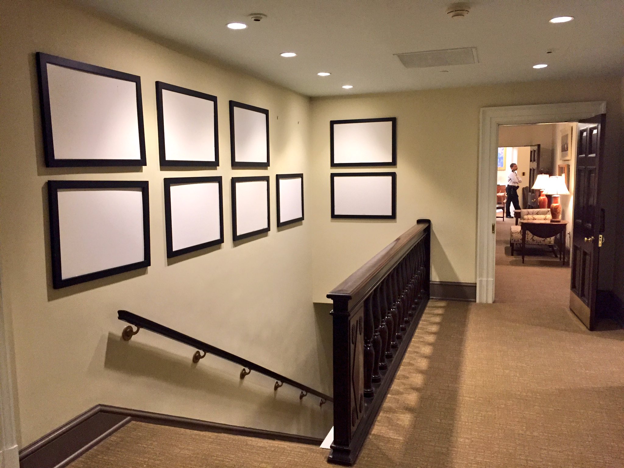
Untitled (Republican Years), 2017, nine empty jumbo frames, installation photo: @davidnakamura
Pleased is not the right word, but I will announce the installation of a site-specific work, Untitled (Republican Years), in the West Wing of the White House this afternoon.
The title is a reference to a 1992 stack piece by Felix Gonzalez-Torres, “Untitled” (Republican Years) (below), to which it bears a resemblance.
Felix’s is, of course, an endless number of prints.
This work consists of nine empty frames for the large, official photos known as “jumbos”, lining a staircase north of the Oval Office. The wall normally contains ten jumbo frames, but one has been removed. Personally, nine still feels like too many. One feels like too many. In any case, tomorrow the work will no longer be on view.
Monday Update: Indeed, the work is gone. [via @davidnakamura]
We The People

Public Art Fund installation, 2014, image: James Ewing via PAF
I have been thinking a lot about [among other things, obviously] context. How much the time, place, history, experience, and state of mind influence our experience with an artwork.
I think of my encounters with Vermeer’s View of Delft, and of reading about Lawrence Wechsler’s crucial visits to Vermeers in The Hague while covering Bosnian war crimes tribunals at the International Criminal Court. Art provides solace, sanity, respite, and sometimes, it makes difficult truths known, quietly and powerfully, to those who seek, sometimes through what Berger calls, “a felt absence.”
A lot of people I see are turning to art for some of these same things right now, trying to grapple with the devastating results of the US presidential election. Which might be nice. But I can’t help thinking of a work I liked immensely, but which now feels all but unbearable.
Fridericianum install shot by Nils Klinger via CAD
The Public Art Fund brought some to New York in 2014, but Danh Vo began showing pieces of We The People, his full-scale replication of the Statue of Liberty, at the Fredericianum in Kassel in 2011. That show’s title, JULY, IV, MDCCLXXVI, came from the tablet in the Statue’s hand.
Oddly, I didn’t remember the press release for the show being this explicit:
the sculpture is dissected into its individual parts and thus abstracted. In his recreation, Vo concentrates on reproducing the thin copper skin (the iron scaffolding supporting the figure is missing), which gives WE THE PEOPLE a special fragility. The broken icon, the destroyed allegorical figure of Libertas, forms a strong counterpoint to the massive materiality.
Maybe it’s the difference between abstraction and reality. Or their collapse into each other. A felt absence.
Untitled (George Washington’s Coffin), 2016 –
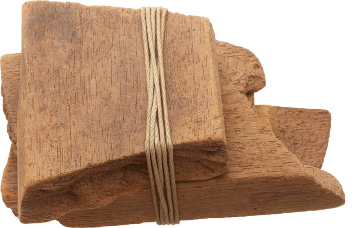
I cannot explain how I didn’t catch this when I saw it many months ago, but re-reading Steve Roden’s blog post about his return to painting after a year-long hiatus, this completely floors me:
Recently, I have also been obsessed with a photograph of two seemingly insignificant pieces of wood about the size of the inner part of a closed fist. The photograph appeared in an auction catalog, and I was fascinated to discover that these seemingly ordinary, or pathetic objects were pieces of George Washington’s coffin, and as such, their presence transcends their objectness.
Probably! But right now it is their objectness that I’m obsessed with.
Continue reading “Untitled (George Washington’s Coffin), 2016 –”More Aaron Kuriloff, Please
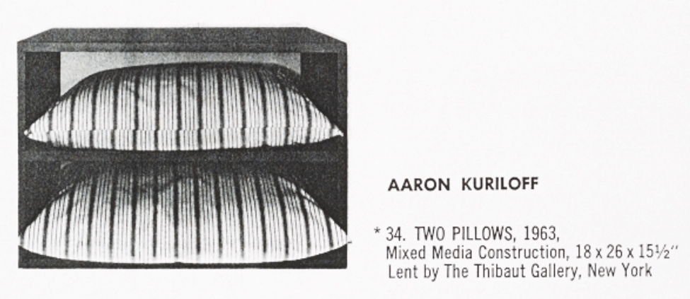
Aaron Kuriloff, Two Pillows, 1963, image and caption from Walter Hopps’ Boxes catalogue, Dwan Gallery, 1964, image: aaa.si.edu
In his Dwan Gallery catalogue essay, James Meyer calls him “a now-forgotten trader in readymades,” but I recognized Aaron Kuriloff’s name from Donald Judd: Complete Writings 1959-1975. Judd reviewed Kuriloff’s April 1964 show at Fischbach Gallery for Arts Magazine. He did not like it, dismissing the artist’s lightly assisted readymades as domestic misfires done better by George Brecht.
Now that I’ve seen some pictures, though, I’m kind of intrigued. For Boxes, the February 1964 group show organized by Dwan Gallery director John Weber, Andy Warhol sent three Brillos and a Heinz Ketchup, scooping the Stable Gallery by a month. And Kuriloff sent Two Pillows, 1963 [above], in which blue ticking-covered pillows were inserted in a blue-painted wood shelf.
No wonder Judd didn’t like it. I bet Haim Steinbach would, though. And Mark Stahl, who had a similarly promising-but-brief career with similarly found objects in the 1980s.
No less than Brian O’Doherty liked Kuriloff’s work, too. He reviewed the Fischbach show for the Times:
Both these shows, one [George Ortman] turning symbols into objects, the other [Kuriloff] objects into symbols, make a new cross‐roads where the traffic is getting heavier –a cross‐roads at which Jasper Johns originally planted his painted flags, breaking our reflex responses to the most loaded of symbols.
I’ll add some more images of Kuriloff’s works from 1963-67, the only period I’ve been able to find so far, and let’s just have a fresh look.
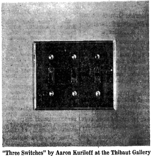
Aaron Kuriloff, Three Switches, 1963, Thibaut Gallery, image via nyt
The Times has at least two other reviews of Kuriloff’s work, both illustrated. In December 1963, he was in “Hard Center,” a group show at Thibaut Gallery organized by Elena and Nicolas Calas. From Brian O’Doherty’s review it sounds like it focused on the recontextualization as art of mass or consumer objects, an early example of Pop getting in formation. And the artist list shows just how far Pop has shifted since: Robert Breer, Nicolas Calas, Kuriloff, Walter de Maria, and Robert Morris. There’s a catalogue out there somewhere.
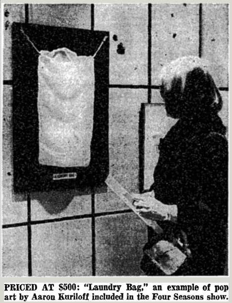
Aaron Kuriloff, A Laundry Bag, installed in 1965 at The Four Seasons, image: nyt
In 1965 Kuriloff is mentioned in a benefit sale/exhibition held at the Four Seasons. It seems kind of a mess, frankly, and the Times report doesn’t do it much justice, just sneering at now-acclimated art audiences not rioting over Pop Art. Kuriloff’s A Laundry Bag was just that, mounted against a green background, with a label, Erased de Kooning Drawing-style. Priced at $500 for mental health charity, it’s not clear if it sold.