
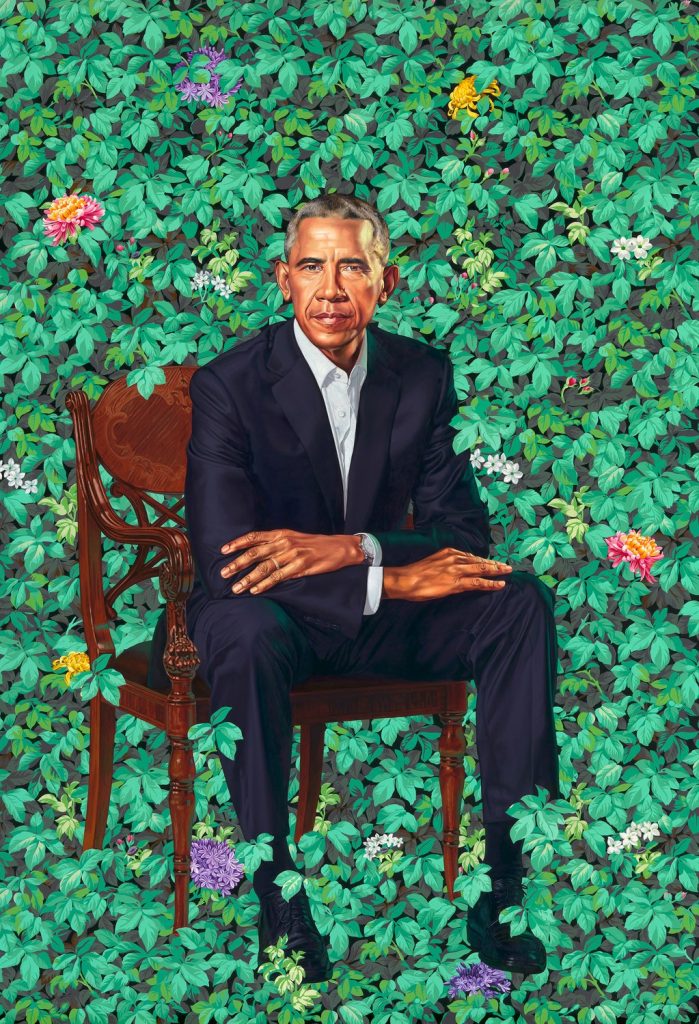
Last week I went to the Obamas Portraits Unveiling and wrote about it for ARTnews. What I wasn’t able to conclude was what low-key obsessed me the most from the moment I left the National Portrait Gallery: what is up with that chair?
I’m off the sauce now, but there was a time in my life where I was pretty deeply interested in American antique furniture, and so the significance of the chair Kehinde Wiley depicted President Obama sitting in felt like a story waiting to be told. Because no one mentioned it at the National Portrait Gallery event; I didn’t think to ask him about it until later; and none of the hottest takes I’ve seen have really taken up the subject.
Also, that chair felt terribly specific, and yet it is also pretty confounding. Its stylistic details do not line up easily with any period of 18th or 19th century American design. And if it wasn’t American, it might be British, and how did that happen? And if it wasn’t British, well, what could it be? The more I searched archives and museum collections and auction databases, the more convinced I became that the chair held a secret, especially when some of the similar comps out there were mid-19th century Neoclassical Russian. Oh damn, is that why Obama looks so serious? What sort of chair drop was this? [SPOILER ALERT: IT WAS NOT RUSSIAN.]
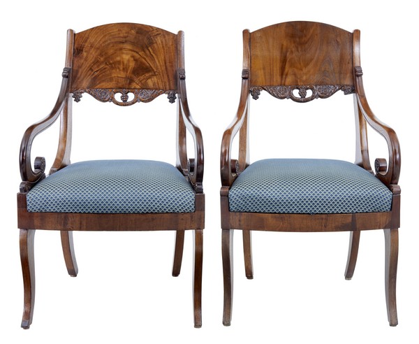
The details: an armchair with curved arms, with scroll ends that don’t reach the seat but have some kind of support, sometimes called an elbow chair. The arms are reeded, aka, they have grooves along the top. The skirt appears to have an inlaid pattern. The front legs are turned on a lathe. The back has both an oval top, which is either inlaid or carved, and a pierced splat below. All of this indicates a fine wood, either rosewood or mahogany. There are elements of Regency style, common in the 1800-10s or so, but most of the similar examples are from England. The round back feels like much later 19th century, though, and one super-savvy designer friend I asked suggested it was an 1870-80s American interpretation of earlier, Regency style.
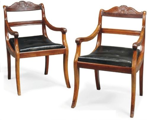
So what does that mean? Where does it come from? Maybe the historical record is the better way to a solution? Except there is no remotely similar chair in the White House collection, or in portraits of previous presidents. (I think it was LA Times critic Christopher Knight who saw a reference in Obama’s pose to a seated Abraham Lincoln in a group portrait by George P.A. Healy. A salient reference, even if the chair is clearly different.)

I asked decorative arts curators, and an antique dealer, who all felt the chair was unusual, even odd, but no one could identify it or explain its significance. It felt like conceding defeat to ask the artist for the answer, which I did, two days later, via the NPG’s press office, since it’s their painting now.
Word came back, but no detail: Wiley had created the chair. It is an imaginary synthesis of design details for which there is no explanation. At least it’s not me, I thought. And I wondered whether this fixation on decoding stylistic quirks, the foundation of antique connoisseurship, was a foreign language of exclusion and privilege (yeah), and whether that came to bear. Or maybe the point of the chair was simply visual, aesthetic, a requirement for how it functioned in the painting in terms of pattern, form and design (maybe). The flowers may transmit a coded signal, but the ornate particulars of the chair are noise.
Or maybe there’s more explanation to be had some day
Previously, related: On The Unveiling Of The Obama Portraits


