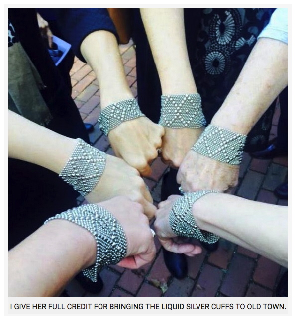
In Bruce Hainley’s new essay on Cady Noland [Artforum Jan ’19, too short at 12 pages] I learned that the artist’s mom, Cornelia Langer Noland Reis, was the co-owner with Maria O’Leary of a world-focused jewelry and fashion boutique in Old Town, Alexandria known as Nuevo Mundo.
The image, with caption, at top, is from a 2015 remembrance of O’Leary, who was a life/style icon to the moms and daughters of Old Town. The image above was screencapped from a checklist of Robert Gober’s 2014 MoMA retrospective. It included a re-staging of his 1999 group show for which Cady Noland made Stand-In for a Stand-In, a cardboard version of a stock.
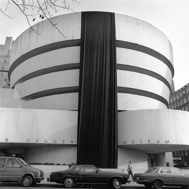
Nancy Spector posted this to Instagram today. For the second World AIDS Day, December 1st, 1989, and the first Day Without Art, she and her then-boyfriend/husband-to-be Michael Gabellini unfurled a massive, black shroud from the Guggenheim. The original call for Day Without Art was to close museums, or to cover works of art as a reminder of the art that would not be made because of AIDS-related deaths.
“At the time, we didn’t know the depth of loss we would be facing in the art community,” Spector wrote.
Last winter I was visiting museums on the Mall a lot in order to write this review/roundup. It was pretty grim going, and I don’t think I was wrong about the mood.
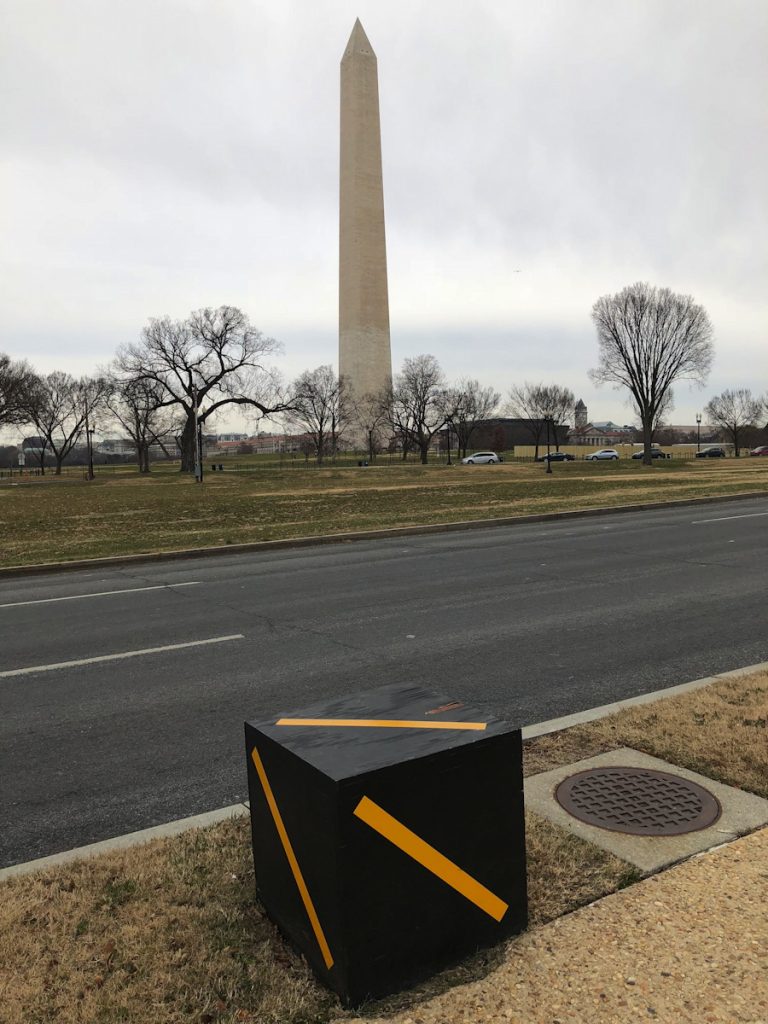
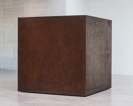
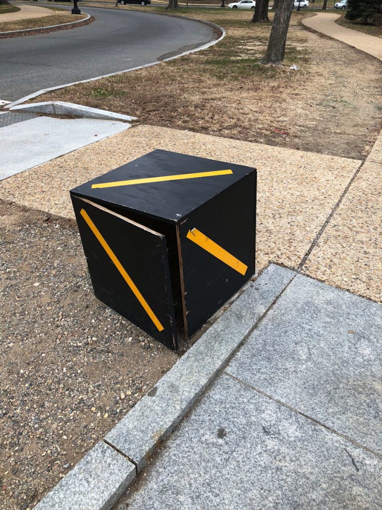
These black cubes appeared along my drive, and I would take note of them, think about them. They had an eye-catching, out-of-place presence and no discernible purpose, which made them feel of temporary sculpture. They were also alongside a conduit road whose main feature was not slowing you down on your way, which created a tension, if only for the briefest (passing) moment.
Tony Smith, Die, 1968, 400px image via NGA, because I guess any larger scale would have made this jpg a monument.
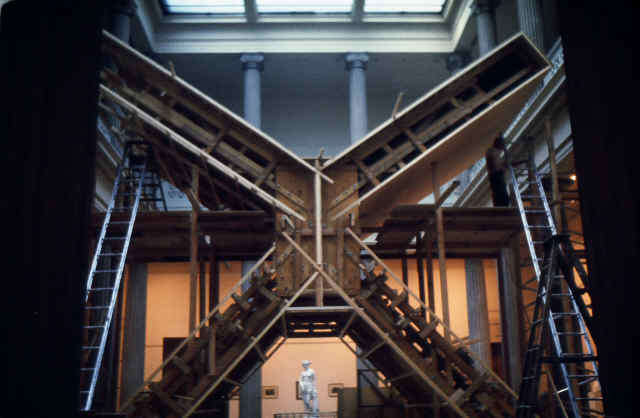
They made me think of Tony Smith’s Die, obviously, but if anything, that easy association pushed back against my own doing anything with these cubes. They also made me think, though, of Smith’s massive 1967 sculpture Smoke, which, like so much of his work, first came into being as black plywood.
Smoke being built in the Corcoran, 1967, image via Tony Smith Estate
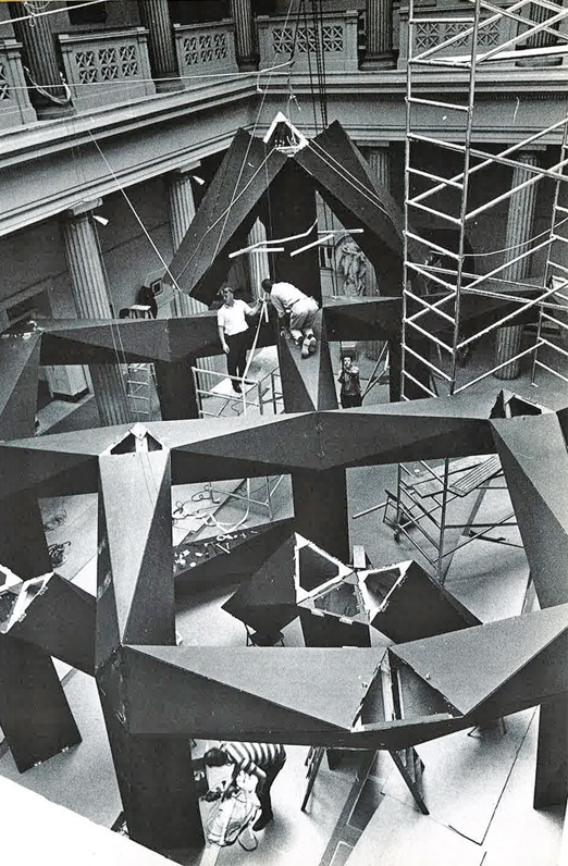
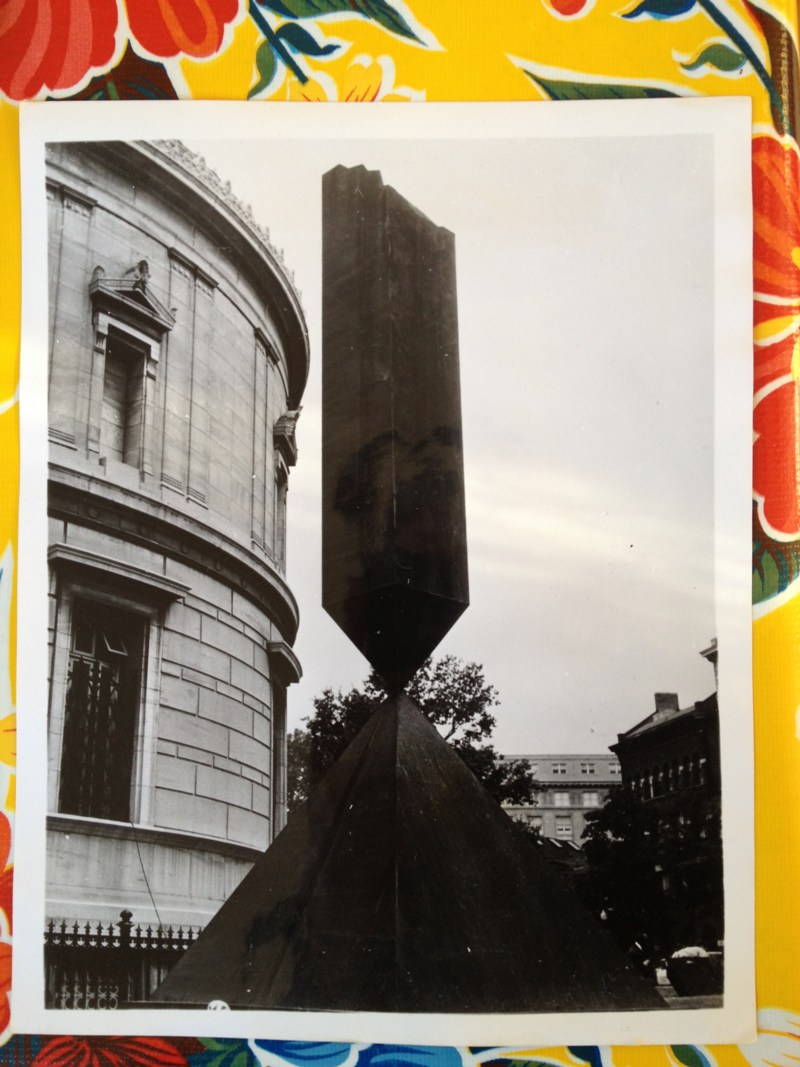
Smith built Smoke in one half of the Corcoran’s atrium while Ronald Bladen built X in the other. Or rather, the Corcoran built Smoke and X for Smith and Bladen. The sculptures were commissions, fabricated by the museum’s carpenters for a three-artist show called, “Scale as Content.” [The third work was Barnett Newman’s Broken Obelisk, which was installed outside, facing the White House and the Washington Monument. The Corcoran ended up owning none of these works.]
construction of Ronald Bladen’s X, 1967, image: royslade.com
Artforum’s retardataire reviewer didn’t like it “as art,” but “Scale as Content” feels pretty on the nose for Smith, who realized Die in six foot steel in 1968 after noodling for six years over a six inch cardboard model. [In 1967 Smith also showed a plywood version of Maze, and published the cardboard version in Aspen Magazine.]
An old photo I have of Broken Obelisk installed for the first time, at the Corcoran Gallery, 1967, via
Anyway, these boxes were not placed where they are for artistic reasons. I finally went to investigate them on foot in January. They’re cover/markers for some infrastructure node, presumably related to the construction staging on the lawn between the Tidal Basin and the Washington Monument. They’re close to crosswalks; maybe they’re hookups for eventual pedestrian crossing signals.
Inside the Black Cube? UntitledICE, 2018, paint, plywood, reflective tape, installation shot
But this is not really the time, and these are not in the place, for benign indifference to the apparatus of the state. In this era of plate readers, wifi sniffers, Stingrays, and ICE raids on pizza delivery guys, these black boxes now feel like–like black boxes. Given what we keep finding out on a daily basis in DC, what could we possibly not know yet? You don’t have to be Trevor Paglen to wonder about the menace of ersatz apparatuses popping up on the major thoroughfares of Washington. Are they some nefarious surveillance system in waiting, or one that’s already at work?
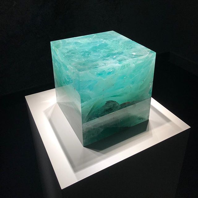
Trevor Paglen, Trinity Cube, on view at SAAM via IG:gregdotorg
The intervening months have also brought Paglen’s Trinity Cube and Rachel Whiteread’s cast voids to town, and so I still pass these cubes and still think. One thing I think a lot about is the point of declaring something a work. Another thing is declaring. Another is a work. Sometimes, during a year of wondering if I’m rationalizing, I wonder if the reflexivity, the impulsion, the emptiness of these things are reasons in themselves. Emptiness as Content.
As Tony Smith said about Die: “This is a complicated piece. It has too many references to be coped with coherently.”
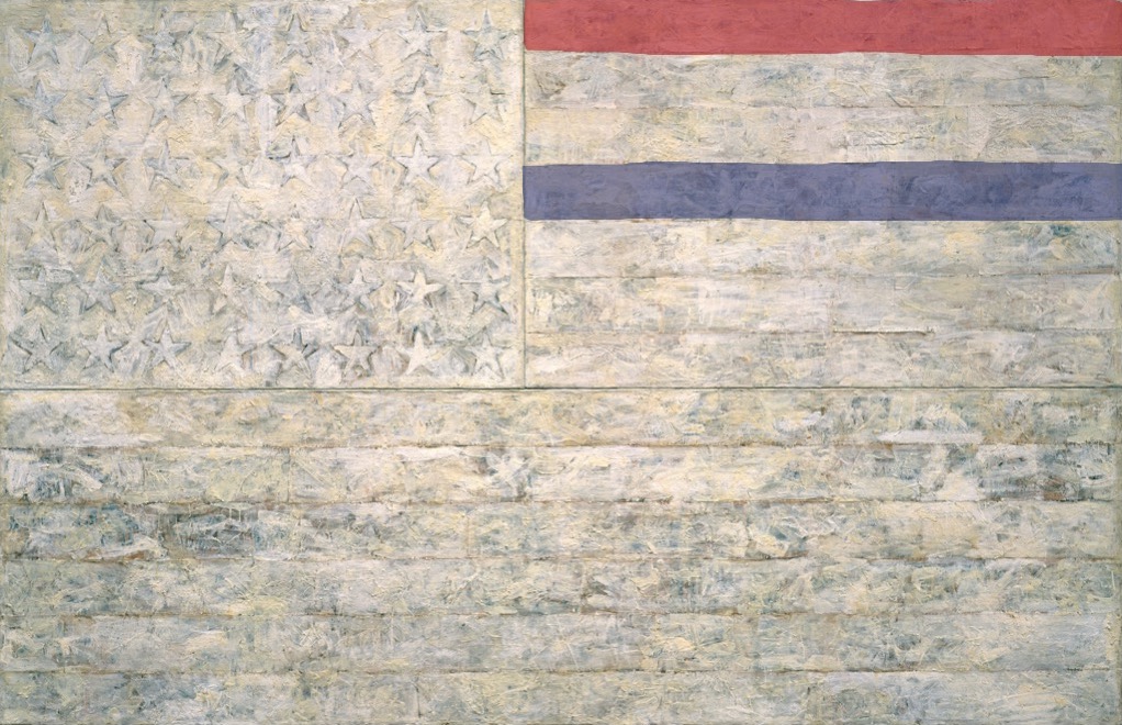
White Flag, 2018, Encaustic, oil, newsprint, and charcoal on canvas, 78 5/16 x 120 3/4 in. (198.9 x 306.7 cm)
“One night I could not have dreamed that I painted a large American flag, but the next morning I got up and I went out and bought the materials to begin it.” Those materials included three canvases that the artist mounted on plywood, strips of newspaper, and encaustic paint—a mixture of pigment and molten wax that has formed a surface of lumps and smears. The newspaper scraps visible beneath the stripes and forty-eight stars lend this icon historical specificity. The American flag is something “the mind already knows,” but its execution complicates the representation and invites close inspection.
By draining most of the color from the flag but leaving subtle gradations in tone, the artist shifts our attention from the familiarity of the image to the way in which it is made. “White Flag” is painted on three separate panels: the stars, the seven upper stripes to the right of the stars, and the longer stripes below. The artist worked on each panel separately.
White Flag, 2018, I: Encaustic, oil, newsprint, and charcoal on canvas, 41 3/4 x 64 3/8 in. (106.1 x 163.6 cm). II: Encaustic, oil, and collage on fabric mounted on plywood, 22 1/2 x 32 1/2 in. (57.2 x 82.6 cm)
After applying a ground of unbleached beeswax, the artist built up the stars, the negative areas around them, and the stripes with applications of collage — cut or torn pieces of newsprint, other papers, and bits of fabric. The artist dipped these into molten beeswax and adhered them to the surface. The artist then joined the three panels and overpainted them with more beeswax mixed with pigments, adding touches of white oil.
cf. Study for White Flag, 2018, Crayola washable marker on coloring page, 8 1/2 x 11 in. (21.6 x 28 cm)
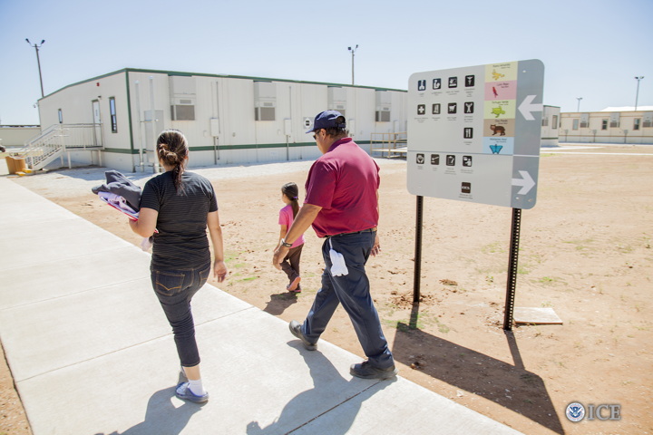
Everything’s bigger in Texas, including the family prisons. image: ICE
I’ll be honest, when I first heard that the ICE immigrant family detention centers full of Central American refugee kids and moms had animal-themed cell blocks like red bird and blue butterfly, I imagined they were using Eric Carle drawings, and I got a dark, blogging thrill.
But no. The South Texas Residential Center in Dilley, the largest family detention center in the world, run by the for-profit prison contractor, Corrections Corporation of America, was too cheap to license Carle’s work, and just used random clip art instead.
ICE, ICE, babies.
Also, the government’s punitive detention of these people is shameful, and it can’t end soon enough. Most of these families are fleeing war, violence, and abuse in their home countries and have already qualified for refugee hearings the US, but remain in these remote prisons, guarded by actual prison guards, temping in khakis and polo shirts, as a feeble deterrent to other refugees.
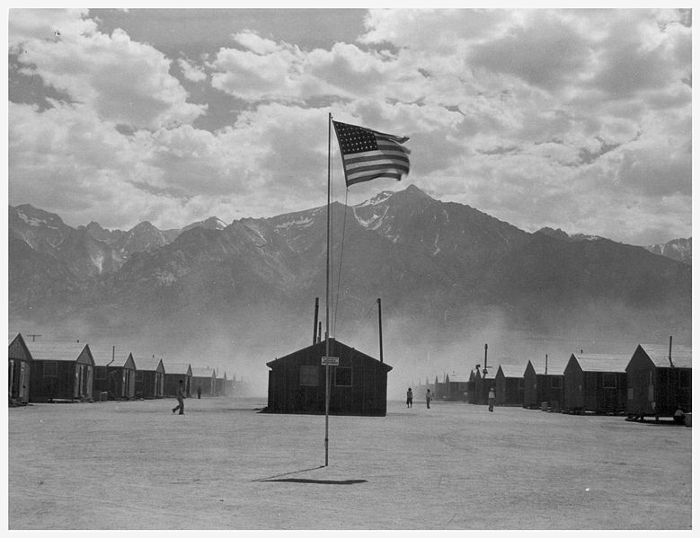
I resisted comparing ICE’s outsourced prisons to the desert detention centers Japanese-American families were forced into during WWII, even when I saw Bob Owen’s photo in the San Antonio Express News, which is a damningly straight-up evocation of Dorothea Lange’s photos of the War Relocation Authority’s internment camp at Manzanar, California.
Dorothea Lange, flag and barracks at Manzanar internment camp, July 1942
Ansel Adams also took photos at Manzanar, which he published in a book, Born Free And Equal, alongside a text that reads today as disturbingly upbeat in its praise of the gumption and loyalty of American citizens forced into desert prisons. I’ve always viewed Adams’ project as a protest, a condemnation of the injustice visited upon Americans because of the racist fears of their neighbors and political leaders. But that is over-optimistic hindsight. Re-reading Adams’ text now is pretty depressing. To think that it’s all the Constitution and fundamental principle that wartime white America could handle at the time.
At least it helps make sense for how this country could get so cross-wise with its own professed ideals today; we really have not changed that much at all. And when I tried to put some evolved distance between the ironies of Adams’ treacly government-reviewed-and-approved fluffing and this account from inside Dilley, I couldn’t. So here it is:
While children wait for their mothers to talk to lawyers and legal aids, they are usually watching kids’ movies dubbed in Spanish, namely Rio or Frozen. The children of Dilley, like children everywhere, have taken to singing Frozen’s iconic song “Let It Go.”The Spanish-language refrain to the song “Libre soy! Libre soy!” translates to “I am free! I am free!” It’s an irony that makes the adults of Dilley uneasy. Mehta recalls one mother responding to her singing child under her breath: “Pero no lo somos” (But we aren’t).
Do you know the chorus of “Let it Go” in Spanish? I did not, but it is one helluva song for kids to be singing in a corporate prison in 2015:
Libre soy, libre soy
No puedo ocultarlo más
Libre soy, libre soy
Libertad sin vuelta atrás
Y firme así me quedo aquí
Libre soy, libre soy
El frío es parte también de mí
I am free, I am free
I can’t hide it anymore
I am free, I am free
Freedom without turning back
And I’m staying here, firm like this
I am free, I am free
The cold is also a part of me
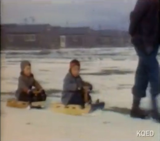
Dave Masaharu Tatsuno ran the dry goods store at Topaz Mountain, where Japanese Americans from the Bay Area were imprisoned during WWII. And he took a bunch of 8mm home movies, using color film which he’d pick up on buying trips back east. And then he edited the movies together into Topaz Memories [or Topaz, which is how it was listed when it was accepted onto the National Film Registry], a film/presentation which he gave at organizations around the country after the war.
Or maybe beginnin the 1990s, I haven’t watched the end of the local PBS documentary on Tatsuno, produced after his death in 2006, to figure it all out yet. I was so amped up by these detainee-made sleds at 20:05, I had to post them right away. That’s Bill Fujita, Tatsuno’s brother-in-law, pulling David Fujita and Tatsuno’s oldest son Sheldon in 1943.
The Tatsunos were expelled from their home when Dave’s wife Alice was nine months pregnant, and their second son Rod was born at the Bay Area assembly/processing center at Tanforan race track. Their daughter Arlene was born at Topaz.
My grandfather was a teacher in central Utah and volunteered to help teach the children there. He was appalled that these good people were interned (imprisoned) and admired them for how hard working and intelligent they were, and also for the patriotism to put up with this. I never knew this until I read his journal after he passed.
Ironically, he was a German immigrant whose travel to America was sponsored and encouraged by his Jewish employers who seeing the infant Nazi movement told him that if they were his age they would go to America.
They lent him the money on his word that he’d pay them back, which he did. I don’t know what happened to them.
Back to Topaz, that place is literally in the middle of nowhere desert.
You’d think that as a parent, I’d be less surprised by now at the constant discoveries of the extent of my own ignorance.
And yet.
Last night, while surfing through the archive of the War Relocation Authority’s nearly 7,000 photos of WWII Japanese American internment camps for “furniture,” [right, I know.] I was confused by the number of search results that included George Nakashima and his daughter Mira.
Mira spends a lot of time with her father in the workshop, has learned to use a hammer, drill, end plane, scorns miniature tools.” image, Gretchen Van Tassel, via UCB
The internment camps only imprisoned Japanese Americans on the west coast; Nakashima, modernist woodworking master, lived in New Hope, Pennsylvania, so he should’ve been totally unaffected.
And it’s only then that I looked at Nakashima’s bio, and sure enough, the architect, his wife Marion, and his newborn daughter were expelled from Seattle and detained at Minidoka, Idaho in the Spring of 1942. It was only through the protracted petitions of Antonin Raymond, an architect and former employer, that the Nakashimas were able to leave the camp for Raymond’s farm in New Hope.
The picture above, by WRA photographer Francis Stewart, shows George Nakashima at Minidoka in the Fall of 1942, “Constructing and decorating model apartment to show possibilities using scrap materials.” Which, just. Wallpaper made from bookpages and blueprints and a proto-Conoid table made from prison scraps. This room should be in the Smithsonian.
The irony, if that’s the right word, is that it was at Minidoka that Nakashima met Gentaro Hikogawa, an issei hotel manager three years older than he, who’d immigrated from Shikoku to Tacoma. Hikogawa was also a master carpenter, who taught Nakashima Japanese joinery and rural handtool techniques that formed the foundation for Nakashima’s philosophy and later innovations.
Speaking of which, here are two photos of 3-yo Mira Nakashima posing next to two beds her father made, one for her, and one for her doll, in her bedroom in New Hope.
the whole point is the caption, people, read below. image: NARA via The Atlantic
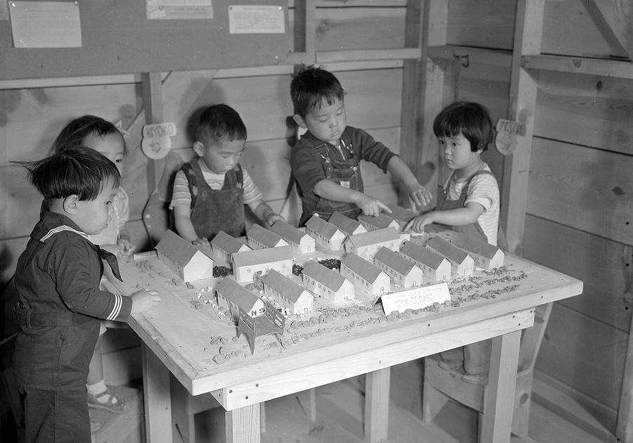
The photo blog on The Atlantic has been running extended looks back at images from World War II. Today’s theme: Japanese-Americans forcibly removed from their homes and businesses and shipped to internment camps in the middle of the freakin’ deserts.
The caption on #39 just bummed me out: “Nursery school children play with a scale model of their barracks at the Tule Lake Relocation Center, Newell, California, on September 11, 1942.” Their barracks.
On the bright side, check out the sweet little pine plank nursery chairs they’re standing on. How many civil right’s a brother gotta give up to score a few of those, I wonder?
Dorothea Lange, flag and barracks at Manzanar internment camp, July 1942
America’s imprisonment of its own citizens because of racial bigotry during World War II has been of great interest to me since discovering Born Free and Equal, Ansel Adams’ self-published photobook of Japanese Americans detained at Manzanar, in the early 1990s. It always felt like important history that must be faced and not forgotten. Now, of course, it is a crime being surpassed and magnified, with families being torn apart and children fleeing for their lives being subject to state-sponsored terror at a scale this country hasn’t seen in almost a century, and all for the accumulation of Mautocratic political power.
It is not a sufficient response by any measure, but I am republishing a series of blog posts here which I made over the years at Daddy Types, the weblog for new dads, which I ran from 2004 until my CMS broke late last year. On DT I often wrote about the overlooked or forgotten histories and objects of parenting, with a focus on modernism, design, DIY, and dad-related projects. That included frequent posts on the material lives of Japanese American children imprisoned in detention camps during WWII, including the attempts to provide kids an approximation of a normal environment through schools, playgrounds, and domestic spaces built out of scrap lumber.
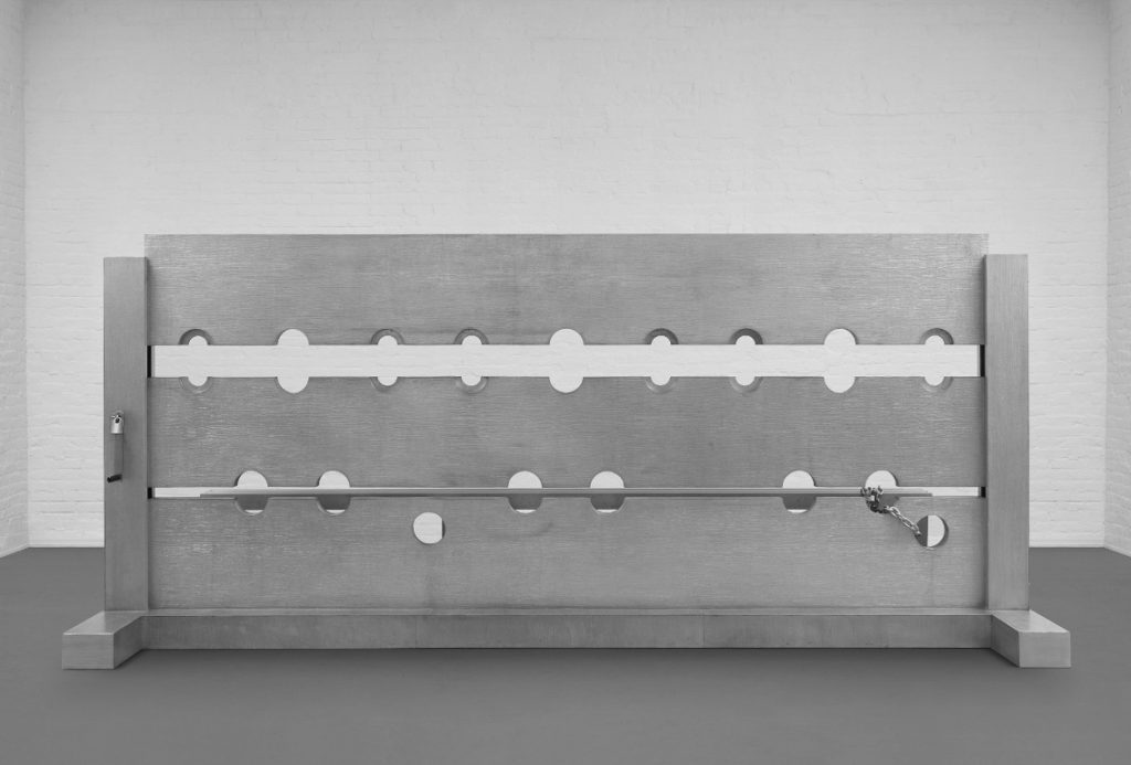
Let’s take a moment to consider the greatest Cady Noland sculpture of all time [No offense, Tanya!] Which I forgot about for 23 years.
Tower of Terror (1993-94) is a 4-meter long, three-person stockade made of cast aluminum. It was created for Noland’s room-filling installation in Public Information: Desire, Disaster, Document, the show that inaugurated SFMOMA’s new building in 1995. I went to that show. And have not recalled it until seeing Tower of Terror turn up for sale at Phillips this week. But I am not alone in this blinkered state.
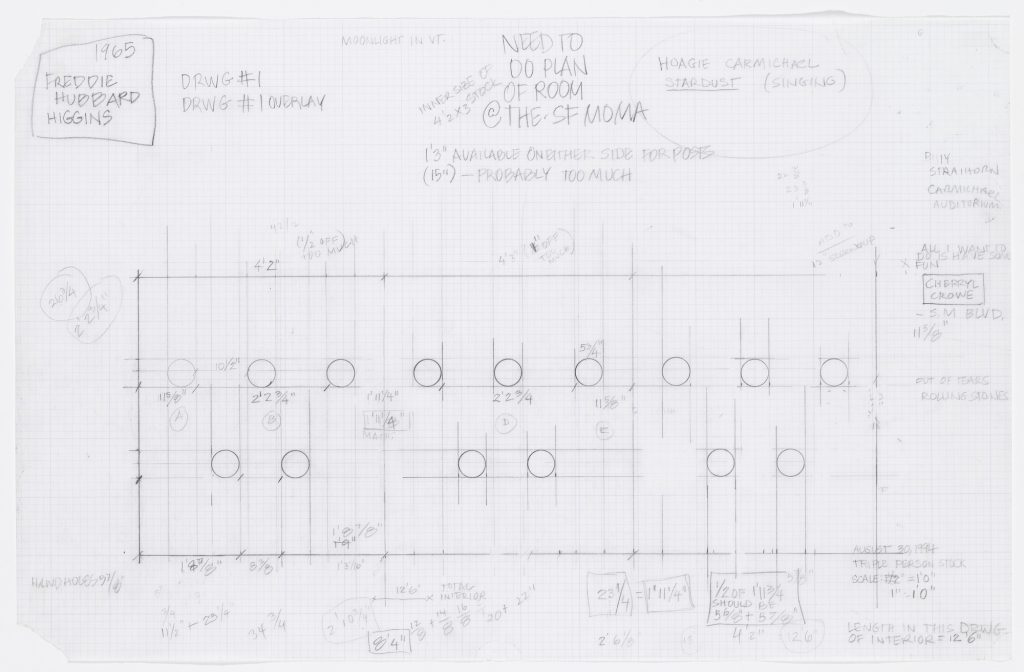
Cady Noland, Tower of Terror Studies, 1994, collection: MoMA
Gary Garrels surely knew. He helped curate the SFMOMA show. And ten years later, when he helped Harvey Shipley Miller assemble a massive collection of works on paper to be donated to MoMA by the Judith Rothschild Foundation, he made sure to get Noland’s preparatory drawings, 21 of them. [They were only digitized some time after I confessed to knowing nothing about them in late 2015.]
But he did not get the sculpture itself. Where did it go? Norah and Norman Stone apparently didn’t keep track of it. Though they were friends of SFMOMA, and the artist, and had an even bigger work by her, they called their Log Cabin Blank with Screw Eyes and Café Door (Memorial to John Caldwell)“Cady Noland’s only outdoor sculpture to date.”
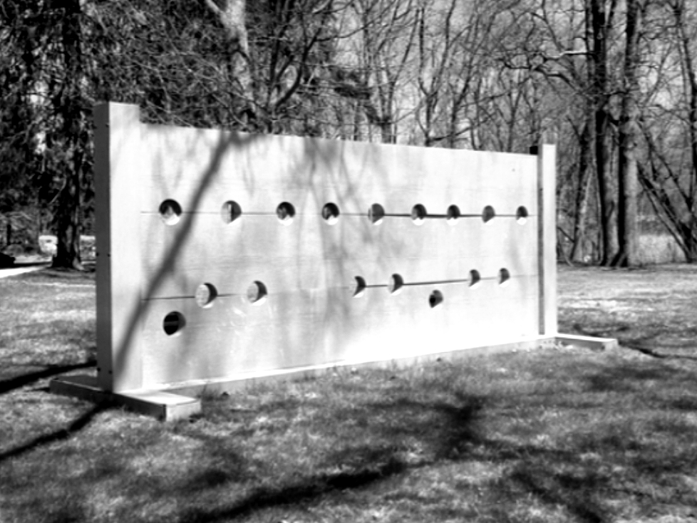
Cady Noland, Tower of Terror, installation view at Dowling College, Oakdale, LI, no date, image from the college’s pre-bankruptcy website, thanks greg.org reader dg
Which means they did not know that Tower of Terror had been installed outdoors at Dowling College, on the south shore of Long Island, for more than 20 years. The sculpture had apparently been acquired directly from Noland in 1995 by Albert & Beverly Davidson of the Davidson Aluminum & Metal Corporation, and promptly donated to Dowling, a small college on a former Vanderbilt estate near the Long Island Sound. It apparently sat in the woods, near the student parking lot, and in front of estate’s former Ice House, which had once been the residence of the college president, but was, I believe, being used as office space. I finally found it on Google Maps. Let’s say it was not where I expected.
Tower of Terror in situ at Dowling College, via the Dark Ages of Google Maps, what is going on here?
So for 22 years, students walking from their cars to– actually, to nowhere. As far as I can tell, the actual school buildings were in the opposite direction. So who ever passed by? Who knew that this massive masterpiece was sitting in public, just off the Southern Parkway, an hour outside the city? Someone knew, because when Dowling College went bankrupt in 2016, they knew to swoop in and liquidate that asset. And now it will be flipped.
The new owners and Phillips also know–by now, don’t we all?–to consult Ms. Noland about her work. The auction listing carries a new non-disclaimer: “We thank Cady Noland for reviewing the cataloging for this work.” We all do, Phillips, we all do. And we thank her for making it. [So if she is fine with this sentence, must we be? “Tower of Terror, 1993-1994, represents the central tenant of Cady Noland’s conceptual practice: the subversion of the American psyche through celebrity and violence. “]
Some other thoughts about this work that I don’t really know how to fit into a narrative: Tower of Terror is also the name of a Disney ride that opened in July 1994. [The study above dates from August.]
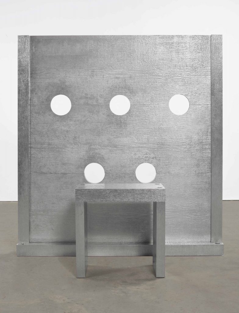
Cady Noland, Beltway Terror, 1993-94, stamped aluminum on wood, not sold by the Sammlung Goetz at Christie’s, Nov. 2016, for $800-1.2M
Another stockade from the SFMOMA show was recently put up for sale, until it wasn’t. In November 2016, the Sammlung Goetz sent the domesetically scaled Beltway Terror to Christie’s with an estimate of $800,000-1,200,000. Then it was withdrawn. Beltway Terror looks very similar, yet also substantially different. Obviously and adorably, it only fits one person. But it is also stamped aluminum laminate over wood, where Tower of Terror is cast aluminum. It now seems significant that the work was acquired by the owner of an aluminum processing company. Perhaps it was acquired in exchange for fabricating it.
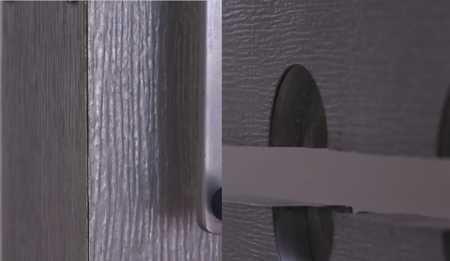
those sure look like seams to me. stamped aluminum on aluminum?
Perhaps it was cast from a stamped sheet-on-wood model? No. When I see the video, there is either some Gober-level simulacralization of the seams, or this is stamped aluminum laminated on cast or milled aluminum. In any case, Tower of Terror is epically superior to Beltway Terror. I hope whoever buys it puts it where it belongs, in a museum of modern art.
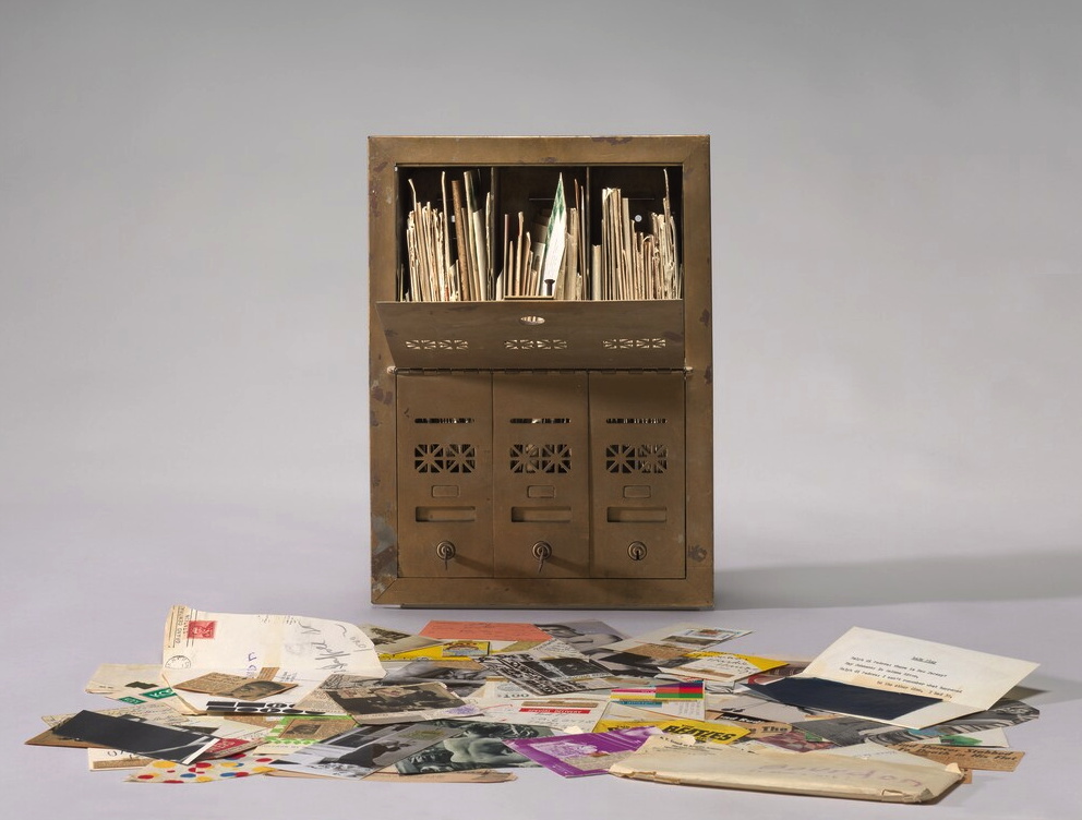
Ray Johnson, Untitled (Letterbox), 1964, correspondance with David Bourdon, collection: NGA
[UPDATE: WE KNOW.]
It’s hard to process Ray Johnson’s work, there’s so much of it. It’s intentionally slight and esoteric. It often feels like a quick visual read. But it can also reward a slower look, even when it’s sort of stuffed and strewn about.
The National Gallery has a 1964 piece, Untitled (Letterbox), which is actually a mailbox stuffed with a few years’ worth of correspondance art pieces Ray Johnson sent to the critic David Bourdon. If I remember the label correctly, the stuff was piling up, so Bourdon got a classic brownstone-sized three-unit mailbox to hold it all.
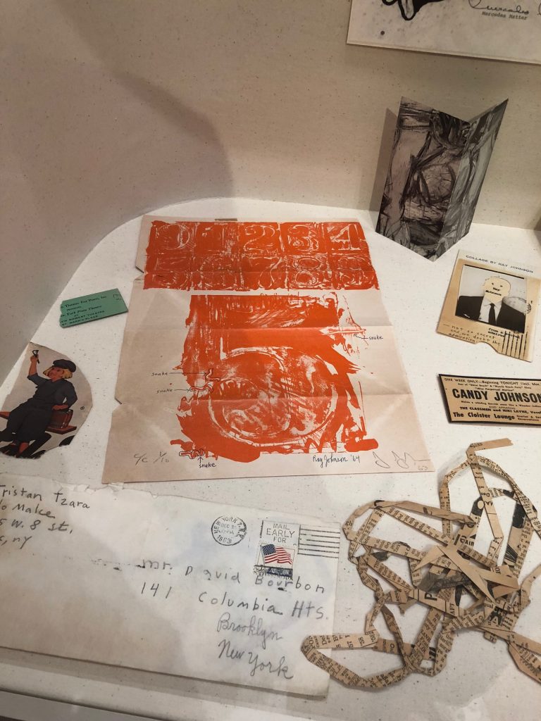
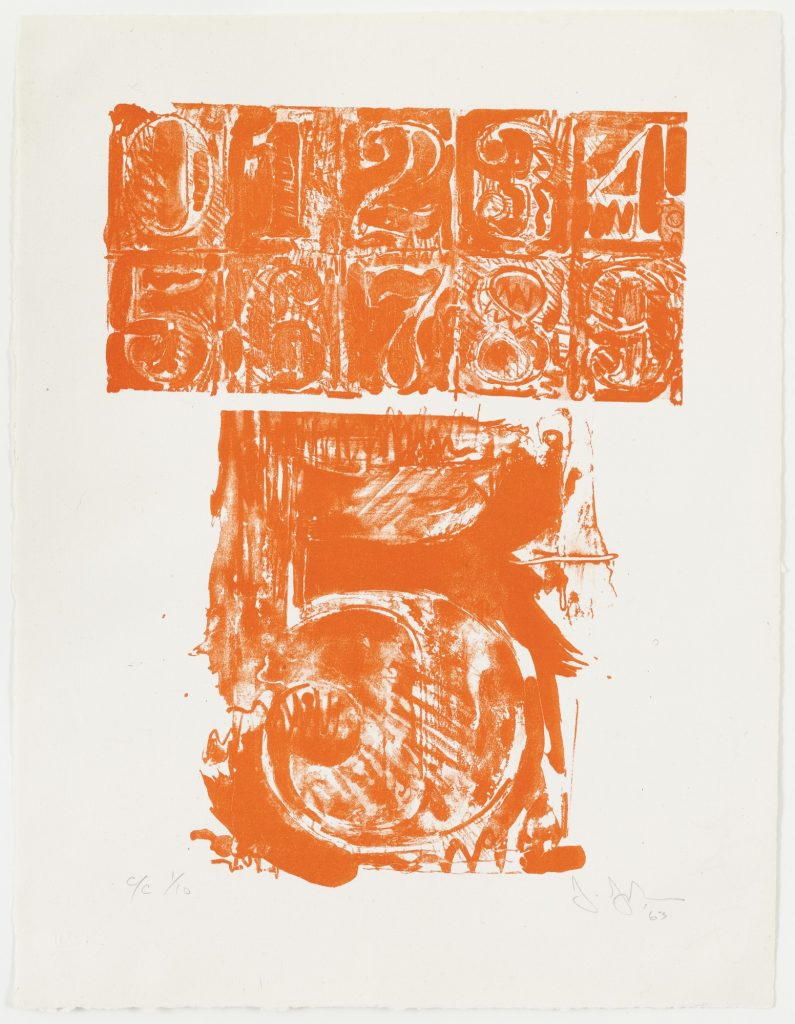
Ray Johnson drawing & notes on Jasper Johns’ #5 from 0–9 Color, 1960-63, in Untitled (Letterbox), collection: NGA
Anyway, I’ve seen but not really looked at it since it was installed way back before the world ended, but the other day I noticed that unlike other pieces, this was not a Jasper Johns exhibition announcement; it was a Jasper Johns.
And not just any Jasper Johns. This is from 0–9 (1960-63), the foundational series with which Johns began making prints, and with which he began his extensive relationship with Tatyana Grossman and Universal Limited Art Editions. [Though other prints were completed and published before 0–9, I think it was the first one he started.] It’s signed and numbered–and folded up and stuffed in an envelope at some point, apparently.
Grosman wooed Johns to start making prints with her fledgling contemporary foundry by sending him a lithography stone to play with. Over years, Johns worked his stenciled numbers on the stone’s surface, printed some, and then wiped and started drawing and printing again. The sequential prints in 0–9 trace the changes and palimpsests of the process, capturing the lithographic process the way Johns’ encaustic froze the mark of the brush that applied it. This ambitious series was published in three versions: a rainbow of colors, black, and grey.
The print Ray Johnson used here is #5 from C/C 1/10, which means it’s from the first edition of the color set. Johnson took this first print of his friend’s massive project, and started circling and labeling individual lines in the print as “snakes.” Then Johnson signed his name and date next to Johns’. And then he folded and taped it up and mailed it to Bourdon.
Snakes were a thing for Johnson. That same year Dick Higgins published a compilation of his correspondance works from Johnson in an artist book he titled The Paper Snake. But this is ultimately less surprising than his readiness to treat an artwork from a friend like a cigarette wrapper or rubber stamp, as an element of his own production. [Of course, Johnson was friends with Rauschenberg and Sue Weil, too, so he certainly knew of Bob incorporating Johns’ and Weil’s paintings into his own combine. And don’t forget Twombly drawing all over everything. So maybe surprising should not be the word.]
So far two of the three artist proofs of 0–9 (Color) (ULAE 19) have sold at auction: Merce Cunningham & John Cage’s set, in 2009, and last year, the set Johns gave to art historian Robert Rosenblum, who wrote the accompanying text. [Awesomely, on four of Rosenblum’s ten prints Johns inscribed, “Proof to replace stolen.” So keep your eyes peeled for four rogue prints.]
The Museum of Modern Art has one of each variation, of course, because back in the day MoMA and ULAE made it so the museum could get the first print from every edition they published. And hey, look at that, MoMA’s print of 0–9 (Color) has the same number as Johnson’s. Did someone mention rogue prints? How’d this happen?
A FEW DAYS LATER UPDATE: Thanks to some attentive folks at the National Gallery, we know how this happened.
Curator Jennifer Roberts explains that the Johnson Johns is not a print, but a page from a Vogue Magazine article on Johns by Harold Rosenberg (“Jasper Johns: Things the Mind Already Knows,” Vogue, February 1, 1964, 174-175.)
Johnson has annotated a paragraph on the reverse (page 175) in pencil, adding half-brackets, three underlined selections, and a notation in the margin that says, “this paragraph could be sent to May Wilson.”
There is nothing commonplace about an 8.
The symbols selected by Johns are separated from the banal by their abstractness and dignity, qualities which are also outstanding in Johns’s personality. In the absence of his big grin, he reminds me of William S. Hart, the deadpan sheriff of the silent Westerns. Johns has Hart’s long, flat poker face, thin lips and alert eyes slanting up at the outer corners. Like Hart he gives the impression of one who sizes things up, keeps mum, and does his job. Johns’s detachment is of the era of the beats, the cool cats, and Bohemian Zen, as Hart’s belonged to that of “Howdy, stranger” and the cardsharp. With his level stare Johns paints targets: Hart perforated his with a six-shooter.
Roberts also notes that Johnson has covered half an illustration of a Johns lightbulb sculpture on the back (p.175) by taping an ad for a George Overbury “Pop” Hart watercolor exhibition held at Frederick Keppel and Co., New York, over it. Thanks to Stephanie, as well as to Anabeth Guthrie and Peter Huestis of the NGA for noticing the mystery and sharing these details.
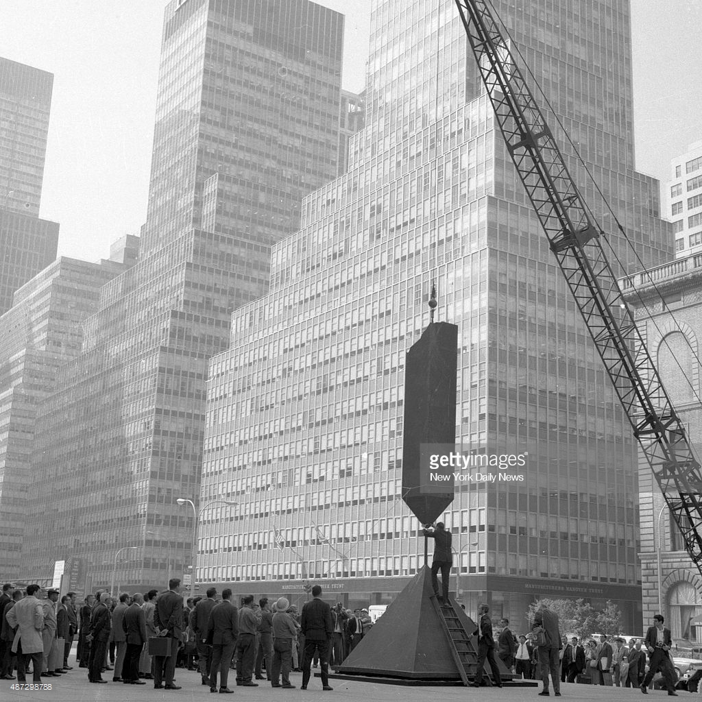
Barnett Newman’s Broken Obelisk being installed by crane at Seagram Plaza, Sept. 1967, image nydn via gettyimages’ horrific website, which literally siphons information away from you, just google it
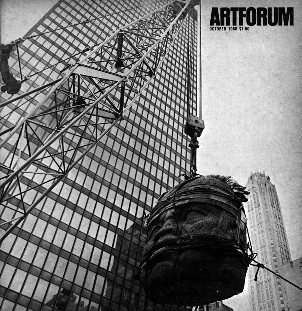
San Lorenzo Monument One being installed at Seagram Building on Park Avenue, May 1965, as seen on the cover of Artforum in October 1966
So imagine my surprise when looking for a different image of Barnett Newman’s Broken Obelisk, I instead found this 1967 pic of it being installed by crane on Seagram Plaza, two years after the flying Olmec head made the cover of Artforum. Everyone gets a plinth by Philip Johnson!
The occasion? A 27-work show organized by New York City called “Sculpture In Environment” that temporarily installed contemporary sculptures all over town.
Dr. Matthew Stirling & friends admiring a cast of an Olmec head from La Venta installed at the NGS in 1943, via Historic Images (obv) on eBay, where I (also obv) did not buy it.
First I stumbled across this 1943 photo of a giant Olmec head at the National Geographic Society.
Then the caption says it’s actually a cast of the 20-ton original, which remains in La Venta, Mexico, where Dr Matthew Stirling (kneeling) led the NGS-Smithsonian expedition to document them. Stirling was the leading anglo archaeologolist working on the Olmec, a civilization that pre-dated the much better-known Inca and Maya.
Then while I tried to find out more about casting a 10-foot head onsite in the middle of World War II (turns out the head was one of five uncovered on a 1940 expedition), I stumbled upon Luis M. Castañeda’s extraordinary essay from 2013 for Grey Room, a journal at MIT Press. Castañeda tracks the history of exhibiting Olmec megalithic heads in the modernist North, and their shifting political, aesthetic, and ideological contexts.
Olmec megaliths were shown in the early 1960s at the Petit Palais in Paris; the LA County Museum of Art; the Museum of Fine Arts Houston; the Mexican Pavilion at the New York World’s Fair–with a pit stop on the plaza of the Seagram Building.
Castañeda tracks the equal interest in the megaliths as exoticized artifacts and engineering mysteries, and how they were experienced, in spectacular motion, temporarily installed in high modernist spaces. Here’s folks discussing the most epic way to transport an Olmec head from its original site in Veracruz, Mexico to the new Mies van der Rohe-designed museum in Houston:
Before they decided to use a trailer, [documentary filmmaker Richard] de Rochemont and [MFAH director James Johnson] Sweeney considered other options. In a June 19, 1962, letter, for instance, de Rochemont wonders whether a helicopter could get the job done more efficiently. In making this suggestion, de Rochemont also makes explicit that the real point of the project was not Figure 5 the head itself but the spectacle of its motion. “I estimate that ‘your’ head,” he writes to Sweeney, “weighs 15 tons… . Biggest known helicopter … lifts 10 tons … Would [Mexican authorities] mind if we cut the head in half?” Although the artistic and archaeological value of the Olmec head was of importance to Sweeney’s exhibition, in de Rochemont’s words, the visual documentation of the massive head’s movement was what truly transformed the film and the exhibition into “an archaeological epic.”
San Lorenzo Monument One being installed at Seagram Building on Park Avenue, May 1965, as seen on the cover of Artforum in October 1966
Also here is one of two Olmec heads being installed on Seagram Plaza, on a base designed by Philip Johnson, on the cover of Artforum, where Irving Sandler writes of the impact of the head on contemporary sculptors.
Most stunningly, Castañeda notes, that almost no one has looked closely at these Olmec sculptures, their genesis and impact, on the work of land artists like Robert Smithson or Michael Heizer. Heizer’s father Robert was a protege of Stirling, one of two US archaeologists who established Olmec studies as a distinct field. By the 1960s Heizer the father had left his research on Olmec engineering techniques and had begun helping his son excavate artworks in the Nevada desert. When LACMA opened Renzo Piano’s Resnick Pavilion in 2010, it was with a show titled, Olmec: Colossal Masterworks from Ancient Mexico, which featured two megalithic heads on cor-ten steel bases designed by Michael Heizer.
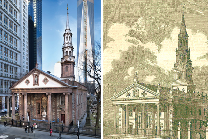
St Paul’s Chapel celebrated its 250th anniversary in 2016. image: trinitywallstreet
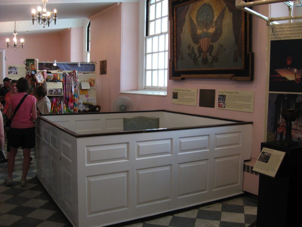
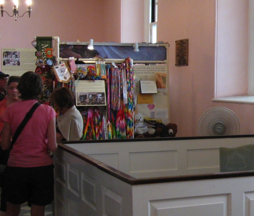
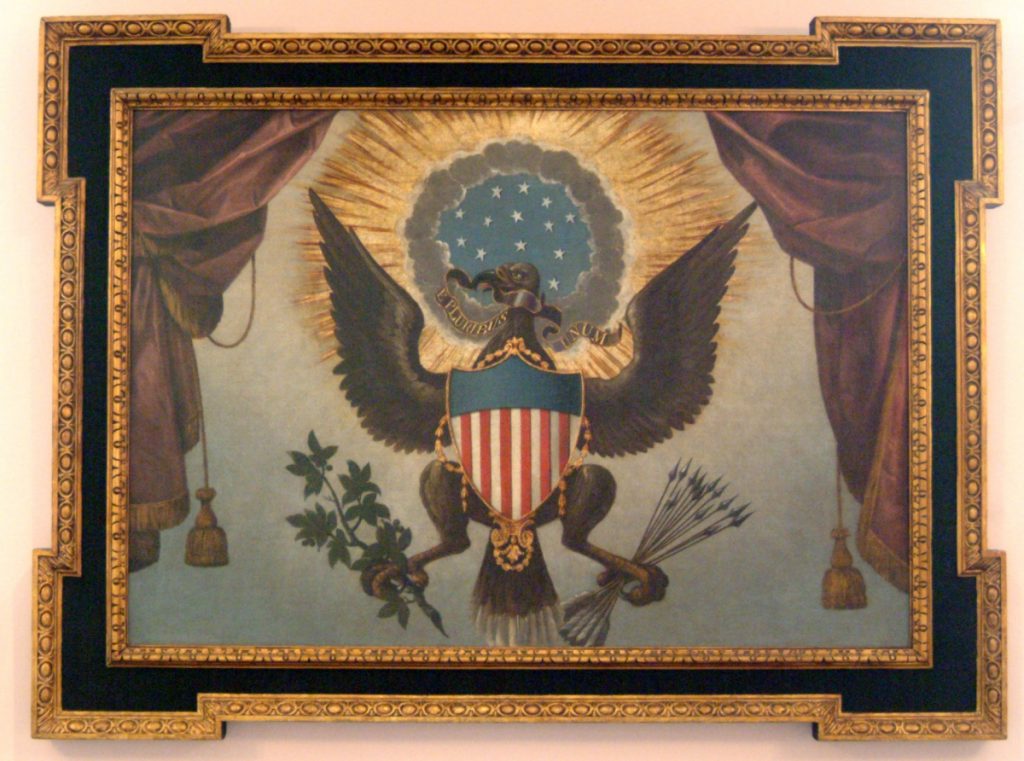
Built in 1766, St. Paul’s Chapel is the oldest public building in New York City and has been in continuous operation for over 250 years. When its sister parish Trinity Church (built 1698) burned down in 1776, St. Paul’s Chapel served as the primary place of worship for the likes of George Washington while Trinity was rebuilt. This august, historic, sacred space contains one of the two earliest public depictions of The Great Seal of The United States, of which visitors to this site have so recently read.
And St. Paul’s Church is also the place where my critique of the impertinent treatment and presentation of The Great Seal gets laughed out of town like a mobbed up president’s stooge claiming attorney-client privilege.
The Great Seal of the United States painting and friends, St Paul’s Chapel c.2013, image: pastinthepresent
Behold the wide shot of the painting of The Great Seal hanging in its original spot, over the Washington Family Pew (reconstructed to some non-original spec, apparently some time after the radiators went in), and sandwiched in between World Trade Center Relief Swag exhibitions made of PVC jungle gym and clip-on tracklights? Are these original, historic exhibition fixtures made by first responders in October 2001?
#neverforget? no problem! what is this? c. 2013, image via pastinthepresent
Is it still there? Because this photo was taken in 2013 by historian/blogger Michael Lynch. So maybe it’s gone? I honestly don’t know whether to scream or ask for their fabricator’s contact info, whether to help one of the richest parishes in the country Kickstart some proper vitrines or take a vow to never show work again without a PVC kiosk.
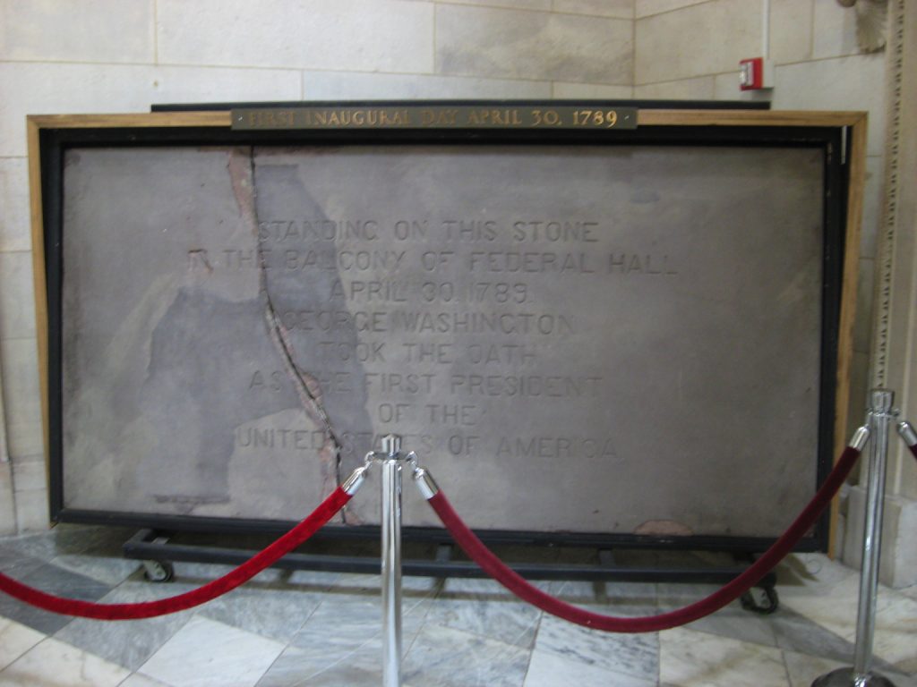
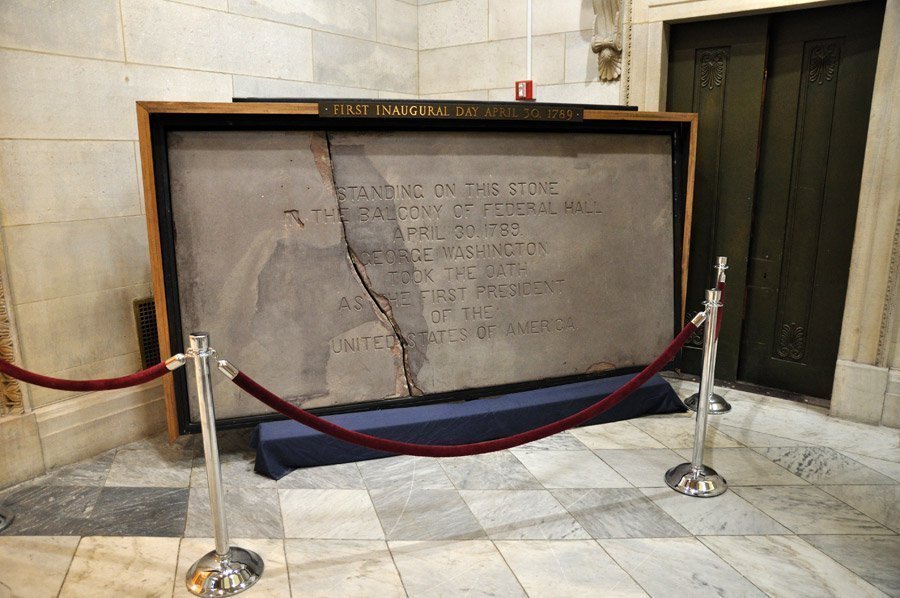
But Professor Lynch is not through. He also went to Federal Hall, the site (but not the building) of George Washington’s inauguration on April 30, 1789. I have stood on the porch of Federal Hall. I have seen a musical version of the life of JP Morgan performed on the steps of Federal Hall. I have gone to the gym many times across the street from Federal Hall, but somehow I have never been inside Federal Hall.
Fragment of Federal Hall 1.0 Balcony on view at Federal Hall 2.0, c. 2013, image: pastinthepresent
So I have not known about the slab of the balcony from the original Federal Hall, which is on display there. The National Park Service calls it a balcony, but looking at this engraving of Washington’s inauguration, I might call it a loggia.
Federal Hall, Seat of Congress, 1789 engraving by Amos Doolittle of Washington’s inauguration, image via wikipedia
Anyway, despite being the site of the 1st Congress, the formation of the United States, the adoption of the Bill of Rights, and Washington’s inauguration, Federal Hall went back to being City Hall when the capital decamped to Philadelphia in 1790. And then New York City tore that place down in 1812 when they built their new City Hall.
Pay no attention to the little cart behind the blue curtain. Also, elevator out of service, probably. image: intro-ny
Fragments of the building were saved, including this piece of brownstone from the loggia, which apparently went on display at Bellevue Hospital until it was returned in 1889, for the centennial. And it was given a coat of concrete, so they could carve it. And it was put in a frame on little wheels so it could be rolled around. Oops, it broke. At least now we can see the actual stone under the concrete skin, the part where the concrete repair came off also.
Here is a concrete-coated-and-carved piece of stone which you can barely see the original of, which used to be on the building here, till we tore it down, and anyway, George Washington probably stood on this to found our country. Or near it, it’s really hard to say. But this is how we do, and it apparently always has been.
fragment of the balustrade of the original Federal Hall where G. Washington was inaugurated, painted wrought iron, later oak base, collection: NYHS
Fragments of the building were saved. In a minute I have found another: the balustrade of the balcony where Washington was inaugurated. It, too, went to Bellevue, where it was incorporated into a portico. Perhaps this stone was, too? Anyway, in 1883 the balustrade went to the New York Historical Society, where it remains. [Interesting. A 1917 catalogue of Old New York views distinguishes between the NYHS and Bellevue balustrades.] It is positively lyrical. Was it by Pierre l’Enfant, who was commissioned to renovate Federal Hall in 1788? Yes. It is dated 1788-89. Thirteen arrows. Wrought iron painted yellow-gold. The New York Historical Society was headquartered in Federal Hall in 1809 and took the city’s donation of some of the original furniture.
fragment of a painted silk flag flown at George Washington’s inauguration, Apr. 30, 1789, collection: NYHS
The Great Seal of The United States, painted by an unidentified artist in 1785 for Trinity Church on Wall Street. image: Trinity Church
In 1776 a committee of Thomas Jefferson, John Adams, and Benjamin Franklin were charged by the Continental Congress with creating an official seal, a sign of sovereignty and authenticity, for the new United States. Two committees later, in 1782, the primary suggestion from their committee included in the final design was the motto, E Pluribus Unum. Other committees, meanwhile, contributed the eagle, and the use of 13 elements–stars, stripes, arrows, olive leaves–to symbolize the original states in the Union.
The final design was described in terms of its heraldic elements by Congressional Secretary Charles Thomson, and this text remains the law Congress enacted in June 1782. Thomson provided an engraver with a sketch, which was turned into a die and put to use by September.
In October 1785, as the new Constitution was being negotiated nearby, the Vestry of Trinity Church on Wall Street commissioned an unidentified artist to paint one of the earliest public depictions of the Great Seal of the United States. The painting was installed on the north wall of St. Paul’s Chapel above the pew reserved for George Washington’s family. The pew is gone, but the painting (above) remains.
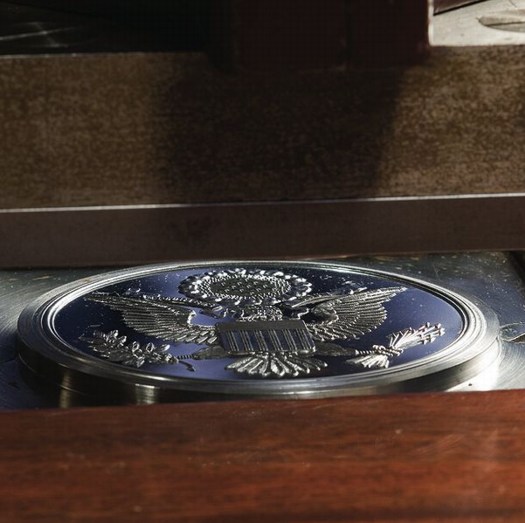
After his inauguration in April 1789, President Washington asked Thomson to transfer custody of the Great Seal from Congress to the Department of Foreign Affairs. It has remained under the charge of the Secretary of State ever since.
The counter-die of the Great Seal of the United States, at the Department of State, or it was…
Between 1782 and 1885, four dies were created as replacements were needed, with minor changes or heraldic corrections each time. But since 1885, the die’s design has been fixed. It was installed inside a new press in 1904, and in 1986, the current die, along with a master die from which all future dies may be created, was put into service. An officer of the Department of State uses the Great Seal for 2-3,000 official statements, treaty documents, ambassadorial appointments, and such, per year. It is most widely seen via its depictions on the back of the $1 bill and the covers of US passports.
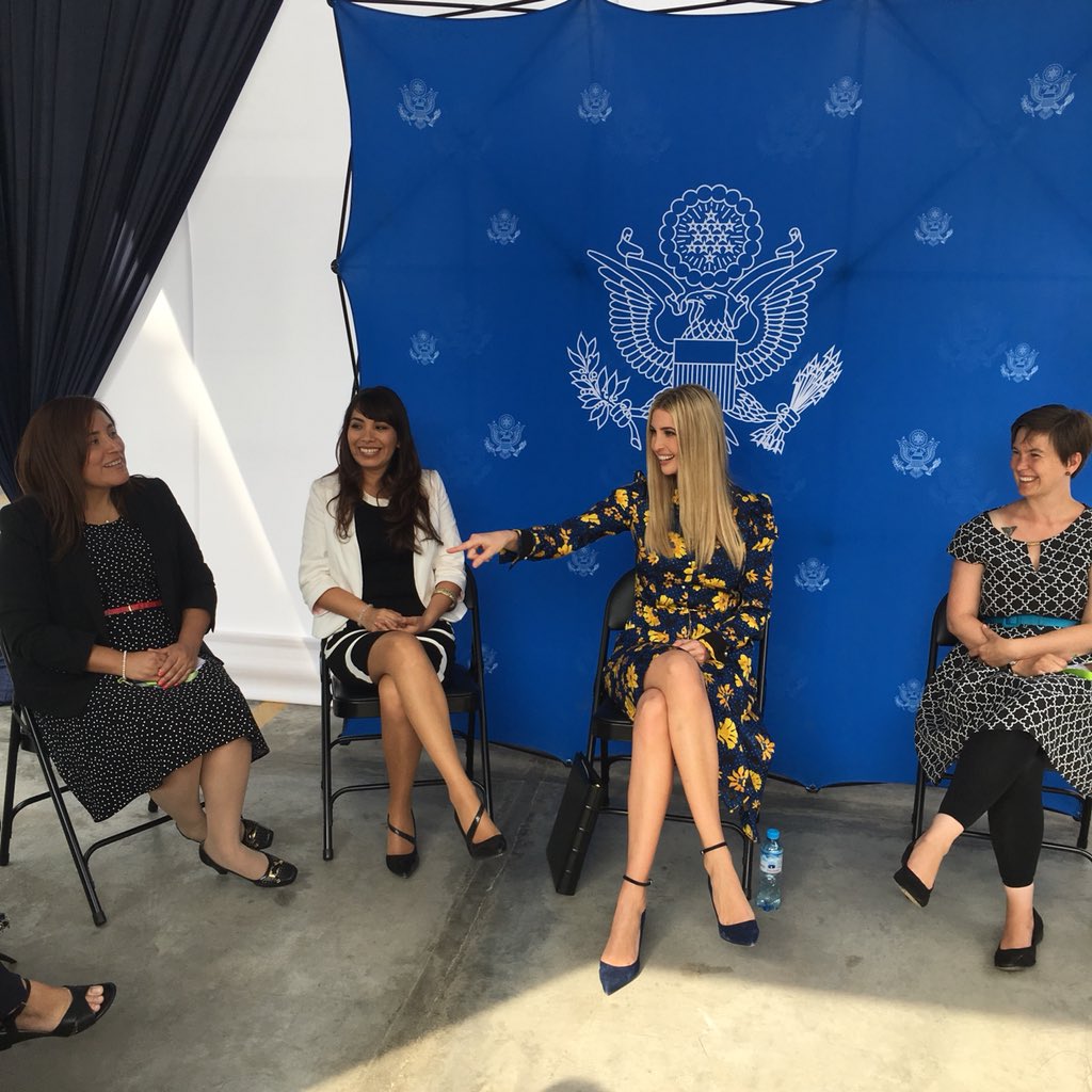
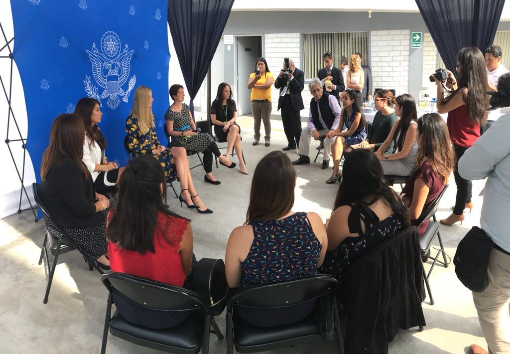
Untitled (Art In Embassies), 2018, 8 x 8 x 1 ft, inkjet print on fabric, powder-coated aluminum, plastic; ed. 1/3+1AP installation view, US Embassy, Peru, 12 Apr 2018
With this context in mind, I hereby announce a new work, Untitled (Art In Embassies), which went on exhibition this week in some courtyard at the US Embassy in Lima, Peru. It comprises a pop-up The Great Seal step & repeat tradeshow photo-opp backdrop and thirteen folding chairs, arranged in a circle.
The installation is visible in these photos showing the US’ official representative to the Summit of the Americas, a relative of the president with no experience or actual role, who cannot obtain a security clearance because she and her family are under criminal investigation; eleven alumnae of some economic development grant programs of the previous administration; and someone’s tio.


My grandfather was a teacher in central Utah and volunteered to help teach the children there. He was appalled that these good people were interned (imprisoned) and admired them for how hard working and intelligent they were, and also for the patriotism to put up with this. I never knew this until I read his journal after he passed.
Ironically, he was a German immigrant whose travel to America was sponsored and encouraged by his Jewish employers who seeing the infant Nazi movement told him that if they were his age they would go to America.
They lent him the money on his word that he’d pay them back, which he did. I don’t know what happened to them.
Back to Topaz, that place is literally in the middle of nowhere desert.
[Originally published on Daddy Types on March 29, 2013, as Topaz Mountain Sleds by Dave Tatsuno and Bill Fujita, with a relevant comment included here.]