Le début du point de vue Google Mappienne

pt_lou_philippe_ballon.jpg
On June 19, 1885 Gaston Tissandier and Jacques Ducom set off in across Paris in a balloon. They were on a photo expedition, and managed to get seven shots. This one, of the pont Louis-Phillippe, at the western tip of the Ile St-Louis, was the most successful, in that it was nearly straight down. Though it was not the first aerial photo of Paris, it caused a sensation and was exhibited and reproduced widely for many years.
The photo historian Thierry Gervais wrote about it in a 2001 article in Etudes Photographique, “Un basculement du regard, Les débuts de la photographie aérienne 1855-1914”:

In 1885, Gaston Tissandier and Jacques Ducom know the objectives and results of aerial photographs obtained by Nadar. When they fly over the capital on June 19, their goal is clear: “After many attempts, it still needs to be demonstrated that the proofs obtained in a balloon may be as sharp as those taken on land in the ordinary conditions and resolve in a word completely the problem of free balloon photography.”
Beginning at the Auteuil aeronautical workshop, the 13 x 18 camera, known as a touriste, is set on the edge of the platform, with the lens oriented to the ground. The crossing of Paris is done from Porte d’Auteuil to Ménilmontant via a light wind from south-west which takes them up to Meaux. Seven photographs are made, five of the capital and two of the banlieue. If “all are good enough to be reported,” that of the Ile Saint-Louis holds particular attention, taken at 600 meters, this photograph is of a perpendicular sharpness that “leaves nothing to be desired.”
The photograph of Île Saint-Louis gained real notoriety. Mentioned in the columns of le Bulletin de la Société française de photographie, it was noted that “now that any party was able to shoot the Geography, Topography and Military Arts,” it will be reproduced on many occasions. It is published in an article in la Nature describing the expedition. In 1886, Gauthier Villars printed rotogravure and photoglyptie in the book of Tissandier titled, La Photographie en ballon. Two years later, Albert Londe chooses to illustrate his chapter on aerial photography in La Photographie moderne. In 1889, it appears alongside the tribute of Paul Nadar at the Exposition universelle.
But the diffusion also means that the photograph of the Ile Saint-Louis is one-of-a-kind in the late 1880s. Tissandier and Ducom’s experimentation was not followed by an intensive production of aerial photographs. Commandant Freiburg made several attempts to shoot from a balloon, but the military are confronted with a problem context. To be out of reach of projectiles, the balloon must be at least 5000 meters. Accordingly, the camera needed to be equipped with a telephoto lens to produce legible images. Having noticed, during the Exposition of 1889, the value of aerial photography for the strategy, the military focuses its attention on getting results with long lenses.

What strikes me is how little has changed in over 100 years, at least from this perspective.
Here’s the same shot today on Google Maps:
tassindier_google_map.jpg

Verner Panton Vilbert Chair For Ikea


Verner Panton Vilbert Ikea chair, originally uploaded by JForth.

The dates for Verner Panton’s Vilbert Chair run the gamut, but they cluster around 1993.
He created the chair for Ikea, and it didn’t sell for very long–I’ve seen “six months,” “a season,” and “a year”–and apparently, it didn’t sell very well, either.
As you’d expect from Ikea, it’s made out of melamine-coated MDF. I’m not a huge fan, but I find it very amusing to see how Panton fans and modernist furniture aficionados spin a famous designer’s commercial failure on the cusp of his resurgence.
One hack design site gets just about everything about the chair wrong in one, short sentence: “IKEA began a Panton revival when they reproduced his Vilbert Chair in 1994.”
One Dutch dealer says, “Only shortly Sold as Ikea made the Chair from different Materials as Verner Panton Required.”
But the most frequently repeated explanation, is “The design was perhaps too radical for IKEA shoppers and not that many were sold, making them rare to find today.”
and
This chair proved to be too abstract for the mindset of the Ikea clientele…”
Oddly, the Vilbert is not faring much better in its afterlife as a rare, connoisseur’s collectible, either. At auction, one sold for $450 in 2002; an unopened Vilbert didn’t sell in 2003; six sold for EUR 266 apiece in 2006, two didn’t sell for 400 pounds in 2007. Examples for sale online range from EUR275 to EUR450, while the most sensible prices are still in the thrift shop/garage sale range: EUR25 and “Sure, whatever, just take it.”

Wait, What? Mrs Jeff Lubin Closed Mrs John L. Strong?

I was a bit skeptical when Nannette Brown and her husband Jeff Lubin bought Mrs John L. Strong, the venerable Madison Avenue stationer in 2002. But if Mrs Lewis, who’d been seeking to retire, was willing to sell to them, what could one do but trust her?
And for sure, the expansion opportunities–the readymade papers, stationery, and related gift products–that the Lubin-Browns saw as the brand’s low-hanging fruit seemed plausible, even though the company didn’t consider itself something as crass as a brand. [We gave the little desk calendars as Christmas gifts, and they were always exceptional, right down to the packaging.]
Once one overcame the conceptual hurdle that Mrs Strong was a brand, a business, it seemed possible, maybe even not undesirable, that it could be grown and evolved into, say, an American Smythson. But it didn’t seem necessary, more like renovating an ancient house to triple mint.
As Mrs Brown told Forbes just last November, “Although the company turned a small profit at best, I thought it was a great opportunity to build a much bigger brand and to introduce it to a larger audience.” That audience, she figured, would order frequently if Mrs Strong’s products were more closely linked to the fashion world:

“For example, if Marc Jacobs is using a certain coloration, or Lanvin a certain beadwork, that might translate into company designs,” she says. “Two seasons ago, Zac Posen did a caramel-colored croc that I loved, and I used that for envelope linings.”

Well that didn’t turn out so well. One has a right to be surprised and more than a bit dismayed to learn that a couple of weeks ago, Mrs Brown abruptly pulled the plug on Mrs John L. Strong and announced the death of luxury:

Eighty-year-old luxury stationer Mrs. John L. Strong is closing due to the economic downturn, according to a press release CEO Nannette Brown sent out today. “This is a sad day for Mrs. John L. Strong and a sad day for luxury as the world has become increasingly bereft of unique, hand-finished products,” Brown says in the release. The brand’s Madison Avenue atelier and Barneys boutique will both close, as well as its finishing facility in the garment district and outpost in Beverly Hills. The company built a following of A-list clients over the years, from Oprah Winfrey and Bruce Springsteen to Tommy Hilfiger and Anna Wintour.

Let’s just acknowledge upfront that one problem might be targetting, the perception of who constitutes an A-list clientele. Wintour’s obviously a special case, but I can’t imagine a single, solitary customer of Mrs. John L. Strong who would be swayed or encouraged by an association with Oprah, Bruce, or Tommy. [When we were ordering baby announcements post-Brown buyout, one of the samples in Mrs. Lewis’s stack was for Francis Bean Cobain, and another for a Matt Lauer kid. I didn’t blink at the latter, but I’ve always wondered whether the Cobain thing was a plant, a prop.]
Which wasn’t even my point. My point was that Mrs Strong was a profitable, if small, business as it was. NY Mag didn’t include it, but Mrs Brown’s press release had two other quotes with which one must take issue. First, from Tom Kalenderian, EVP GMM, Men’s and Chelsea Passage Barneys New York: “Upon assuming the stewardship of Mrs. Strong, Nannette Brown restored the luster to the brand infusing her exquisite taste and infinite dedication…” Not to impugn Mrs. Brown’s fashion sense or dedication in any way, but the fact is, she was basking in a luster, not restoring it.
Then there was this other, somewhat oddly tensed quote from Mrs Brown herself:

“…investor’s failure to finance the business’ expansion plans combined with a challenging retail and economic environment, left the company with no alternative but to close its doors. Further efforts to capitalize or sell the business had failed.”

It is always awkward to talk about one’s own money. The investor in Mrs Strong was, of course, Mrs Brown and her husband, Mr. Lubin, who, it was just announced Monday, was leaving his post as managing partner of the European operations of Cerberus Capital Advisors, the private equity firm whose controlling equity stake in Chrysler was just wiped out by the company’s bankruptcy and acquisition by Fiat. [As an aside, soon after Lubin joined Cerberus, the company named former Bush treasury secretary John Snow as its Chairman. Mr. Lubin’s nominal former boss, the head of Cerberus’ International Advisory Board, is Dan Quayle. Another partner is indicted Bernard Madoff associate Ezra Merkin.]
Which is not my point, either, except that the “challenging economic environment” Mrs Strong faced can be particularized to some degree to the reversals facing Mrs Brown and Mr. Lubin. And to the customer segment who looked to Oprah for luxury and fashion inspiration.
Which is to say that there exists at least the possibility that Mrs John L. Strong might be able to find a new life, not as a global luxury brand, but as the small, largely invisible, extremely specialized business it once was. At the very least, Mrs Strong’s archives and inventory of dies and papers should be brought back into service, and not just as a side business of Kate’s Paperie or whatever.
I would expect that an old guard clientele of Mrs Strong would show sufficient goodwill toward a talented, slightly obsessive, self-effacing, stationery connoisseur–a Jonathan Hoefler of paper with a passion for understated service–to sustain a small, efficiently run business. Then let the brides have their thing, properly guided, and when the status quo ante is stabilized, the new steward can explore thoughtful, appropriate, organic product growth–or not.
Mrs John L Strong perfected a certain rareified tradition of personal paper as a direct embodiment of personal identity. Unfortunately, Mrs Brown’s fashion-focused strategy was dependent on people whose identity stood solely on their Zac Posen crocs. One hopes that Mrs Brown will take her stewardship seriously enough to pass Mrs Strong into appreciative, if humbler, hands. Because I’ve got two boxes of stationery left, and I will be needing to reorder in a year or so.

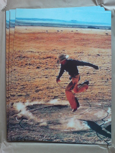
Richard Prints: Untitled (300 x 404)

Untitled (300 x 404, After Untitled (Cowboy), 2003 by Richard Prince)
I just got my first edition of Untitled (300 x 404, after Untitled (Cowboy), 2003 by Richard Prince) from the printer. It’s a 1px = 1mm version, which came out to be 12 x 16 inches, inkjet printed on aluminum.
Though it’s crazy to feel any sense of accomplishment for an image I appropriated whose fabrication I outsourced, I’m actually kind of stoked. The print looks fantastic, with a graininess that doesn’t map to the supposed pixel dimensions.
When you zoom in on a screen, a pixel is so nice and tidy and square. But unless you’re a mosaicist or a North Korean cardflipping stadium extravaganza director, physical pixels are probably not going to be square. Who knew?
Anyway, since it cost the same to make one as a dozen, there’s an edition of ten, with a couple of proofs. If I had a dealer, a gallery, an artist career, or an idea to have any of the above, I’d probably sell them. I’m sure they’d be cheaper than the Richard Prince.
Previously: West Trademark @)#(*$ed Up
Untitled (300 x 404): the making of
update: Just found out via Joerg’s post that the original photographer was not Jim Krantz, but Sam Abell, the great National Geographic photographer. He shot it in 1996 for Leo Burnett, Marlboro/Philip Morris’s agency. PDN had an interview with Abell about it last year, on the occasion of Untitled (Cowboy)‘s prominence in Prince’s Guggenheim retrospective.

This. Is. Sewious.

I’d never much thought of it before, even when I was reading Mondo 2000, and I don’t know enough to say whether splitting blocks and products will help. But for the record, I too want to register my concern “about people using nanocomputers to brute-force AI without knowing what they are doing, and ending up with a recursively self-improving human-indifferent superintelligence.”

“Bucky Life” Chandelier With Token Swarovski By Ben Jakober

Hmm, looks a little familiar?
ben_jakober_swarovski_bucky.jpg
Ben Jakober created “Bucky Life” for the Swarovski exhibit at the 2004 Milan furniture fair, where it was overshadowed by Ron Arad’s LED crystal news ticker lamp, the Lolita. Says the press release:

Renowned sculptor Jakober coalesced fibre optics and geometries to create light from air. The chandelier’s geodesic shape was inspired by a Buckminster Fuller work from the sixties. Using 270 polycarbonate hollow transparent tubes, 36 Swarovski optical fibres and 72 Swarovski crystals this retro shape was realised using modern materials and technology.

Hmm, even if I didn’t despise Swarovski for their rampant colabo-whoring–everything does not look better with your friend’s family’s rhinestones on it, hipster designers–I don’t think I’d be all that into this.
The prisms set light in play across the whole thing, not just pinpoints at the corners. Plus, it’s just hard to beat a futuristic chandelier, hand-tied and with no actual lights with anything, but plastic straws? Uh-uh. Jakober should’ve gotten ahold of a batch of Fortress of Solitude-style Swarovski prisms, then we could talk.
Still, it gets an A for inspiration. [press release in pdf, image via mocoloco]

Enzo Mari x Ikea Mashup, Ch. 6: Ikeaness


Enzo Mari x Ikea – Joinery, originally uploaded by gregorg.

The tile in the guest bathroom in North Carolina was handmade and sun-dried in Mexico, as you can tell by the single square with the artful flaw, a footprint from a wandering dog.
Woodworking aficionados get off on things like grain patterns and joinery, the more intricate the better. So it’s at once surprising and totally not that after spending so much time finishing this wood, I’m starting to dig its industrial qualities, its intrinsic Ikeaness.
Ikea’s IVAR shelving system is made from unfinished pine, but that’s barely half the story. When you start looking closely, you see that even the simplest board is actually made up of several pieces of wood, spliced together.
It’s never the same, either. Each identical-seeming 72-in. post is unique. It’s almost like they piece all these scraps together with this insane, zig-zag scarf joint, into a single, endless piece of wood, which gets extruded, drilled, and cut to length on the other end.
Once you notice these joints–this one is the highest-contrast of the whole pile–your eyes are drawn to them, like learning a new word and suddenly hearing it everywhere.
The shelves are glued up from pine strips, that’s obvious. But was I really so focused on selecting the “right” color ranges that I didn’t notice this string of lozenge-shaped plugs which filled a massive gap in one of the the shelves? I think that will be the table’s dog footprint.

June 4th: June 5th, 5th Man

Incredible updates to the Tank Man photographs story from yesterday’s NY Times Lens blog.
After twenty years of just telling friends about it, Terril Jones, a former AP reporter who had been covering the Tienanmen Square demonstrations for several weeks, came forward in the Times with his own photograph of Tank Man.
Jones was shooting on the ground in front of the Beijing Hotel, and his photo captures the chaos of people running and ducking for cover–while Tank Man waits calmly in the middle of the street, prepared to confront the oncoming column of tanks alone.
Meanwhile, in the comments, Robert Dannin, a former director at Magnum Photos who says he’s the one who sent Stuart Franklin to Beijing, reveals that Franklin’s original slide, which was provided to Time [he’d been put on assignment to the magazine], disappeared before it could be returned. Time hastily settled with Franklin and Magnum, which had made good duplicates, but the original, 1st generation slide has apparently never surfaced.
Behind the Scenes: A New Angle on History [lens blog]

Four Men With Cameras And An Elephant

stuart_franklin_magnum_tankman.jpg
The NY Times’ Lens blog has absolutely riveting accounts of the four journalists who shot photos of Tank Man, the still-unidentified man with two shopping bags who confronted a column of People’s Liberation Army tanks rolling into Tienanmen Square on June 5th, 1989.
Because he was shooting for AP, Jeff Widener’s version got the greatest immediate distribution, but it’s arguably the lowest quality photo of the bunch. Magnum photographer Stuart Franklin’s wide shot [above] with the burned out bus has a more powerful composition. Newsweek’s Charlie Cole and Reuters photographer Arthur Tsang Hin Wah were both new to me.
tankman_frontline1.jpg
Tsang’s editors actually didn’t release his facedown photo until twelve hours later; instead, they went with his “action shot” of Tank Man climbing up onto the tank and confronting the driver. Tsang’s is the only account of the four which mentions this detail, even though they all remember People’s Security Bureau agents apprehending the man after he climbed back down.
tankman_frontline2.jpg
Which unfortunately supports Cole’s point:

In my opinion, it is regretful that this image alone has become the iconic “mother” of the Tiananmen tragedy. This tends to overshadow all the other tremendous work that other photographers did up to and during the crackdown. Some journalists were killed during this coverage and almost all risked being shot at one time or another. Jacques Langevin, Peter and David Turnley, Peter Charlesworth, Robin Moyer, David Berkwitz, Rei Ohara, Alon Reininger, Ken Jarecke and a host of others contributed to the fuller historical record of what occurred during this tragedy and we should not be lured into a simplistic, one-shot view of this amazingly complex event.

As remarkable as these stories are–and the lengths these photographers went to to not have their film confiscated is truly mindblowing–they all ignore an important fact: the most memorable and widely seen image of Tank Man and his whole brave dance with the tank was actually TV footage.
Behind the Scenes: Tank Man of Tiananmen [nyt lens blog]
PBS Frontline overproduced a Tank Man documentary in 2006. The confrontation footage begins about five minutes in. [pbs.org, where I took the climbing images above]

Bought A Bing

And in other “laughable corporate attempts to build brand equity through campaigns designed to intentionally genericize trademarked-but-tangential phrases that rhyme with ding-a-lingnews:

Microsoft’s marketing gurus hope that Bing will evoke neither a type of cherry nor a strip club on “The Sopranos” but rather a sound — the ringing of a bell that signals the “aha” moment when a search leads to an answer.
The name is meant to conjure “the sound of found” as Bing helps people with complex tasks like shopping for a camera, said Yusuf Mehdi, senior vice president of Microsoft’s online audience business group.
And if Bing turns into a verb like, say, Xerox, TiVo or, well, Google, that would be nice too. Steven A. Ballmer, Microsoft’s chief executive, said Thursday that he liked Bing’s potential to “verb up.” Plus, he said, “it works globally, and doesn’t have negative, unusual connotations.”

Mhmm. “Verb up.” I wanted to Twitter about leaving a Zing! on Bing, but the URL just redirects to decisionengine.com.
Microsoft’s Search for a Name Ends With a Bing [nyt]
two’s a trend?: Miracle Whip: The App

An Open Letter To The Makers Of [Brushes/Red/Legal Pads]:

Dear Sirs and/or Mesdames:
I recently purchased [Brushes/ Red/ a stack of legal pads] after it was featured [all over the Internet and newyorker.com/ Cannes/ in every author Terry Gross has ever interviewed]. It is with great disappointment that I must write to inform you that your [iPhone app/ HD camera/ notebooks] are defective and do not perform as advertised.
It’s been several days already, and still your product has not produced a [New Yorker cover/ feature film/ novel]. What gives? I even watched the instructional [YouTube animation/ director’s commentary track on Che, both parts/ Booknotes with Brian Lamb on C-SPAN], and still, nothing even close.
So I am forced to return your product, and I expect a full refund in the amount of [$5/ $26,000/ since I stole them from the office, the legal pads were free] to be paypalled to me promptly. Thank you.
Respectfully,
Greg Allen
Below: Untitled (with apologies to Olafur and his dad on that boat, William Anastasi on the subway, and Brice Marden anywhere), 2009
brush_oe_wa_bm.jpg

Miracle Whip: The App

miracle_whip_loser_1983.jpg
I guess the “and that’s half the battle!” view of MTV’s relentless pursuit of their demo is their success in completely baffling someone who’s aged out of it. I hadn’t watched MTV once in the last five years, at least, before we ended up watching the last half of Star Wars Sunday night, because there was literally–literally–nothing else to watch in our entire cable/HD/VOD/TiVO-verse.
And wow, besides the commentary bumpers with a hatin’ it Mark Hammill, and a cuh-razy Peter Mayhew, the greatest thing was the commercials. MTV has commercials for things I had no idea even had commercials. Brands who have a strategy, but don’t have enough money for a campaign, just a commercial. Which they run in MTV spot buys late at night.
Brands like Wonka, not Nerds–or not just Nerds, they want to get the umbrella brand in there, too. And Miracle Whip. As befits a commercial from the dweebiest condiment in history, Miracle Whip’s attempted ad makeover is an instant classic of the Gigantic Corporation Tries Way Too Hard To Look Way Too Edgy genre [cf. Intel, HP, Sprint, Zune]. The kind of commercials where you don’t know who to be embarrassed for more–the company with a hopelessly banal product to sell, the agency who’s stuck with the account, or the target demo, who you really, really, really hope is able to see through Cheap Fake Mayonnaise’s attempt to be their coolest friend.
So far, though, I can’t find the commercial to link to, probably because unlike all Kraft’s desirable customers, I’m not on Facebook. I’m left to read about the campaign, which is fine, because almost every word in BrandWeek’s recent article, Miracle Whip Whips Up Social App” makes me giddy with excitement for the future of the English language:

“What we’re trying to do with Miracle Whip is really get our target of 18 to 34 who grew up on brand. Many of them have just stopped using the category,” said Chris Kempczinski, svp of marketing for meals and enhancers at Kraft. “This campaign was about reengaging with 18- to 34-year-olds. The biggest place to go after them is in digital, and a big part of what they’re doing there is in social media.”

So perfect.
zingr_screenshot.jpg
But that means the commercial I saw, with grungy hipsters gettin’ all Pop-Up Video with their Miracle Whip label-shaped thought balloons, was just a sop thrown to the mangy, three-legged dog of television. The real action is in digital, in social media. Which is why Miracle Whip created a Firefox extension/”app” called Zingr, which lets you annotate the web with Miracle Whip-lookin’ “Zings!” which it then shares for you while you social media in digital:

Miracle Whip hopes the use of Facebook Connect, which allows third-party developers to tap into a users’ social network, will spread Zingr (and the brand) far and wide. Leaving a “zing” on Kraft’s site, for example, triggers this message to a user’s Twitter network: “I just left a Zing! On brands.kraftfoods.com Check it out: http://tinyurl.com/oorhaa#Zing!”
The subtle branding was a tradeoff to make sure Zingr didn’t appear “too corporate,” Kempczinski said. But Miracle Whip will benefit from its own association with “zing,” he said. “If we can get ‘zing’ adopted as part of the digital vernacular, it will be tied into everything else we’re doing.”

Oh no, don’t worry, it’s really subtle, doesn’t look “‘too corporate'” at all. And it is indeed tied very well to everything else Kraft has been doing for their demo’s entire lives. In the Depression and the Baby Boom, Miracle Whip was about being a thrifty mayo substitute. But since at least 1979, when a chorus of hamburgers sang the enhancer’s “Zesty” praises, Z words have been central to Miracle Whip’s brand essence. In the 80’s it was “Zip” for your late-night sandwich binges, and even when America abandoned hamburgers for chicken in the 1990’s, we still “gotta have our Zip!”
Of course, by “we,” Kraft meant the now-grown, suburban Boomer schlubs in their ads, who were even then a caricature of anti-MTV lameness. But WTF, dude, that was over 18 years ago! Before some of Kraft’s awesome, new, social mediaing digital demo was even born! Now Miracle Whip is not all about consuming the category anymore. It’s all about Zing!ing and stuff; you know, part of the digital vernacular like you guys.

“It’s a pretty cool app,” Kempczinski said. “Even if you’re not a Miracle Whip lover, you can fall in love with the app and hopefully you’ll fall in love with Miracle Whip along the way.”

Miracle Whip Whips Up Social App” [brandweek]
Tangentially related, and from the same week, practically, as BrandWeek’s found poetry: “Hackers Can Sidejack Cookies” by Heather McHugh [newyorker.com]
Also, mad digital props to Harry Shearer Le Show. “Reading The Trades” is like the funniest parts of business school, for free, on the radio.

I’ll Take Manhattan: Vintage Ikea On Exhibit In Munich

ikea_manhattan_munich.jpg
The Neue Sammlung design museum in Munich has organized the first [??] exhibition of the history of Ikea design. The idea of vintage Ikea fascinates me, and not just for the incongruity of it. Alright, mostly for the incongruity of it.
“Democratic design” and “beauty for everyman!” have a nice, if slightly messianic ring to them, but the reality of Ikea’s cheap furniture is often that it doesn’t last, doesn’t get preserved–by design. That Spike Jonze Ikea ad about how it’s crazy to cry for the lamp that gets thrown away, even though it still works? Obsolescence and replaceability are baked into Ikea’s strategy as surely as the ruthlessly unsentimental winnowing of any designs that don’t perform as well over time. Or that get too expensive to produce and thus get replaced by some sawdust&resin replica with a fatter profit margin.
To the extent that history is nostalgia, it just doesn’t exist in Ikeaworld. So there’s no way the company would keep making the totally solid-looking, mid-century Scandinavian all-wood product like Bengt Ruda’s 1960 Manhattan cabinet; it’s just not in their DNA.
Still, there’s a history there–and no doubt many interesting design stories and inspirations–to be had. I’d like to see more Ikea scholarship, frankly. And I’d like to see more vintage Ikea design; it can’t all have been thrown away, can it? Wouldn’t it be a riot if someone licensed some of Ikea’s original designs, which can’t be mass produced at Ikea’s price/profit point anymore, and brought them back into small-scale production? Anyone?
Democratic Design – IKEA runs through July 12 die-neue-sammlung.de via atelier]
Stylepark’s a little snobby-cranky, but they have a lot of pictures [stylepark]
A couple of nice flickr sets here and here, though the exhibit looks a little PR-y. [flickr]