
Here [via COS] is David Shrigley’s animated short for Save The Arts, which is trying to help arts organizations in the UK avoid debilitating budget cuts.
At first, I thought WTF?? The Arts are so screwed! Then I thought, well, maybe they should’ve just gotten Nizlopi to do it. And then I thought for the whole “think of the children!” angle to work, it’d be nice if the kid–who HAS the arts right now, mind you–wasn’t an inert loser with less than three lines to string together. And then I saw, in my related videos selection, and I mellowed the heck right out.
Because Shrigley being Shrigley had previously saved Pringle of Scotland from being shuttered. Not only did he save Pringle, he helped get all the other jumpermakers bombed back to the sockmaking age.
And what did he save Pringle to do, you ask? Why, to commission Ryan McGinley to film Tilda Swinton’s exploration of the moody Highlands in Pringle eveningwear for the Spring/Summer 2010 collection:
And then it all came together when I saw the credit: Creative Director – Neville Wakefield, the great roving-so-as-not-to-have-to-give-up-too-many-side-gigs curator at PS1. I think the Arts will be just fine.
update: And a good thing, too, because Shrigley’s right: Tracy Emin’s not going to come put out your housefire. [via @bhoggard]
Category: making movies
The Trendmaking Eye
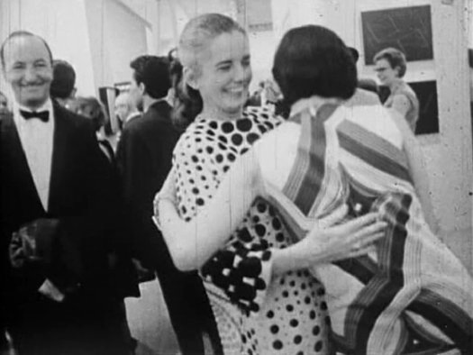
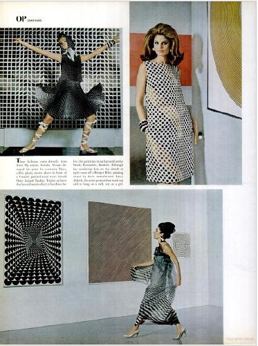
One of the great stories surrounding MoMA’s 1965 exhibition “The Responsive Eye” is how collector/garmento Larry Aldrich turned several Op paintings he owned into fabrics, and then into dresses, which fed into the Op Art Trend that was apparently swirling around New York. Of course, it’s a great story if you’re not named Bridget Riley.
It’s a well-known story, partly because Aldrich had invited a Herald Tribune columnist and photographer to his showroom to meet Riley who, until that moment, had no idea about the project. And she. Was. Pissed. Riley reportedly tried to sue, and differing accounts say she was either successful or thwarted by US laws. The line was either a raging, lucrative success on the artist’s back, or a failure, because a million other Op Art designs instantly saturated the market.
But that’s jumping ahead. Let’s let Aldrich set it up with his rambling, entertaining, and humiliating side of the story, as told to Paul Cummings in a 1972 Archives of American Art interview:
LA: I showed Bill all of those paintings that I thought were a new form of geometries, and I believe that he picked out two of them for the Observant [sic] Eye show that he did not know about. One was an Avedisian and the other one whose name we can’t remember at the moment — It was at the Martha Jackson Gallery. But when we were in our cutting room, he said, “You know, Larry, really I think it would be a terrific idea if you were to convert some of these to fabric.” I had a less expensive firm as well as the Larry Aldrich clothes called Young Elegants, and I got Julian Tomchin who was a fabric designer. I had the Vasareley and the Bridget Riley and Anuszkiewicz and this other young man who I can’t remember [Julian Stanczak] were fine with it. But then, and I said I would like to convert these into prints. I said I don’t want them to be copies of these paintings, but I want the prints to be inspired by these paintings. Of course this is something that you’re going to have to do exclusively for me. And so he presented quite a number of sketches for this line. And then he made up the fabric. I stress again that he was to make these exclusively for me, but he was a very clever little boy, for while he made those exclusively for me he made variations on those and put them on an inexpensive fabric that was shown and sold to inexpensive blouse people and what not.
PC: So they were everywhere?
LA: They were everywhere all of a sudden. Anyhow, the Bridget Riley one was not necessarily the most successful, but because it was interpreted in black and white and in grey and white, it was quite effective. And Bill said, “I think it would be wonderful if you gave Irma [his wife] a cut of the fabric, and she could have a dress made out it to wear to the opening of the Observant Eye show.” And a turban. I sent her a big swatch of it. In the meantime, we had designed some dresses, and I showed them to Life magazine. And Life went for them and had a feature that came out shortly after the Museum of Modern Art show opening. Anyhow, Anuszkiewicz, whom I had gotten to know quite well by then, was just thrilled with the idea of what I had done. This other chap at Martha Jackson’s Gallery [Stanczak] was very, very happy about it. The one that lived in Paris I didn’t hear from.
PC: You mean Vasarely?
LA: Vasarely, yes. Bridget Riley was coming for the show, and I met her at the opening dinner. In fact, this was such a big event that NBC or CBS were filming, and they asked that I be filmed with her in front of the Bridget Riley, which I had loaned for the show and [they had me] tell how I happened to buy it, you know, the whole story of seeing it in the Tate and so forth. And she was very attractive, and so I said, “Would you come down to my showroom? I have something that I’d like to give you as a gift.”
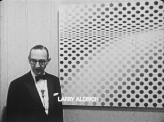
And that’s where the Herald Tribune picks up the story. Sure, we can be shocked, shocked that Aldrich just went ahead and did all this without asking the artists first. But then shouldn’t we also be amazed that Aldrich says the idea to turn the paintings into fabrics in the first place came from MoMA curator William Seitz?
That LIFE Magazine spread, by the way, is right here. Shot in the Modern’s show. I have to agree with Aldrich, the Riley print on the upper right is not that great.
And while Aldrich is not doubt remembering Mike Wallace’s “Eye on New York” show about “The Responsive Eye,” that’s not who interviewed him at the opening. It was a 25-year-old film student from Sarah Lawrence named Brian de Palma, and his be-boa’ed 26-year-old producer Midge Mackenzie, who made a 20-minute documentary short called The Responsive Eye.
The filmmakers interviewed Seitz during installation, and then they had free access to film in the show’s black-tie opening. Since it’s dePalma, I did a split screen combining the opening titles because, really, make me think their film was commissioned by the Modern itself. There’s no mention of it in the Museum’s press archive, but in 1963, de Palma was presented with an under-25 award at the Museum by the Society of Cinematologists for his undergrad short Woton’s Wake. Somebody want to ask de Palma what the deal was?
In 1965 Riley complained that the “explosion of commercialism, band-wagoning and hysterical sensationalism” was obscuring the “serious qualities” of “The Responsive Eye.” And her collectors, the curators, and the Museum were right in the middle of it. As Bill Seitz said to Mike Wallace, “it’s really the absorption of modern art into modern life. And that’s something we all wanted, but, uh, it may change the character of the art a bit, too.”
Creative Time And The Afro-Icelandic Liberation Front

Danish artist Jacob Boeskov flew to Lagos, Nigeria to make and star in a short action film he wrote titled, Dr. Cruel and the Afro-Icelandic Liberation Front with the noted Nollywood director Teco Benson. The film was produced by Creative Time Global, a new series of international initiatives launched this year by the NY public art organization.
Nollywood is known for its vibrant, near-zero-budget film industry, which should probably be called a video feature industry, since HD, DV, and even phonecams are the norm, and everything goes straight to the street on DVD. Dr. Cruel premiered in May in New York, but Creative Time recently posted Boeskov’s production diary online:
It has been a long day and Teco has surely delivered. He really is the finest action director in Nollywood. We have filmed chases and fights. I have destroyed a pair of my pants in one of my amazing stunt moves. He has been great to work with. He has an ability to make actors and crew feel good, even when he shouts at them. But it is late now and everybody is tired.
Just as we’re wrapping up a scene, I hear the sound of a generator dying and the room goes black. The production manager runs down to the street to look for black market fuel. There is a fuel crisis in Nigeria because of the absence of the president and… well, it’s a long story.
I go to the window and light a cigarette. The room is dark, lit only by the cell phones from the actors and the crew. The mood in the room is intense, but okay, I guess. People talk low, or are silent. The production manager is back, looking triumphant. He has managed to buy some fuel in the street, and the generator is running again. The lights are turned on. Back to work.
It all sounds a little crazy, but interesting. Here’s the trailer:
Dr. Cruel and the Afro-Icelandic Liberation Front [creativetime.org via @annepasternak]
I Didn’t Know ‘What I Did On My Vacation’
Holy smokes, Gordon Hyatt, I didn’t know what you did 44 summers ago.
Among the episodes of CBS’s news program “Eye on New York” which were acquired by The Museum of Modern Art in 1967 for their Television Archive of the Arts is “What I Did On My Vacation,” which, wow. It was a series of Happenings. In the Hamptons. Conceived and produced for television, by television.
According to Jeff Kelley’s Childsplay: The Art of Allan Kaprow, the producer of “Eye on New York,” Gordon Hyatt, approached Kaprow in the summer of 1966 with the idea of staging a series of Happenings across the Hamptons over the course of an August weekend:
The general idea for Gas, which was largely conceived by Hyatt (and supported in part by Virginia Dwan of the Dwan Gallery), was to interject a series of Happenings into the leisure activities of summer vacationers and locals, who would presumably be caught unawares as they disembarked at the railroad station, took the ferry, swam at the beach, and so forth.
Kelley’s exhaustive recounting of Kaprow’s Happenings is invaluable for getting a sense of what actually happened, but it’s also full of uncritical assertions, revisions and spin. It’s almost as if Kaprow was trying to distance himself after-the-fact from a TV spectacle he readily agreed to, but which he later came to regret. Interesting.
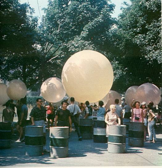
Gas began on Friday August 5th. A parade of oil drums, weather balloons, and homemade hovercraft met the city crowd as the LIRR pulled into Southampton. [photos are documentation by burton berinsky, not stills from the show] On Saturday, Kaprow brought bands, smoke bombs, and skydivers to Coast Guard Beach [now Atlantic Avenue Beach] in Amagansett, where Frazier inflated a giant black phallus of a skyscraper-shaped balloon. Or as the flyer put it, “Procedure: Children and adults may help release helium balloons, frug on the beach, help to start plastic skyscraper, swim.” [Note: If you think you might retell this story sometime, frug is pronounced froog. It is the ultimate White Guy Shuffle.]
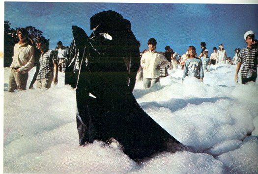
From Amagansett, the Happening crew hustled out to Montauk Point, where the fire department was waiting to pump gallons of flame-retardant foam over the cliffs and onto the beachgoing audience.
On Sunday, after arranging for three bedsful of nurses to meet the Shelter Island ferry, Kaprow staged two decidedly North-of-the-Highway Happenings in Springs for the kids: a car painting picnic at the auto junkyard, and a foam-filled relay race at the town dump. Alastair Gordon, who was 13 at the time, wrote about participating in the dump event in his awesome book, Spaced Out: Radical Environments of the Psychedelic Sixties, which was excerpted in the Easthampton Star in 2008:
Someone was barking through a megaphone: “Keep moving . . . not too fast . . . don’t look at the cameras. . . .” We were told to move deeper into the sandy pit, slowly, toward a group of people wearing black plastic capes at the bottom of the slope. We wore pink buttons that read “GAS — I’m a Happener” and blew whistles as we marched downward. Stacks of multicolored oil drums were pushed from a ledge, and we were told to roll them back up the slope through the sea of firefighting foam.
I guess I was too young to pick up on the sexual allusion at the time, but the foam felt weirdly comforting as it oozed around my ankles and bubbled up to my waist. Mud stuck to the drums and made them difficult to roll, but we kept pushing because there were men with cameras, and we were going to be on TV.
Though they should have been obvious going in, Kaprow’s problems with Gas seem evident in Gordon’s account: the Happening didn’t just ‘happen,’ it was staged and performed for cameras:
Though nearly everyone, including Hyatt, deemed Gas a success, Kaprow saw it as a reversion to theater. It was a string of “spectacular” Happenings intended more to be seen than enacted, both during the events and on television.
The feedback loop Kaprow loved had been replaced, he found, with
the false feedback of narcissism on a mass-media scale, in which the culture, through the mirror of television, watches itself having a gas.
In the end, the experiment failed because Gas participated in the popular cliches of what Happenings were.
And the avant-garde was inextricably linked with the leisure entertainments of affluent youth. All of which, well, guess what? Whatever Kaprow’s later regrets about it, Gas seems like a peculiar, even unique experiment in corporate-avant-garde collaboration. And the involvement of Hyatt, a member of MoMA’s Junior Council and Dwan in the transform “What I Did On My Vacation’ from arts journalism into public art.
At the very least, it’s a vast improvement over the cliche-ridden, made-for-TV art happenings they’re throwing up these days. [OR. Does good Art-for-TV really just equal failed Art-for-TV + time?]
“What I Did On My Vacation” was shown at Hauser & Wirth’s Kaprow restaging last year, but I can’t find it online. No problem, though, because the National Film Network has a DVD for just $22.
“What I Did On My Vacation” aired on WCBS on Sunday, September 11, 1966.
Vintage coverage from TIME: Gas: Happenings in the Hamptons [time.com]
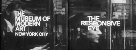
MoMA, CBS And The Responsive Eye
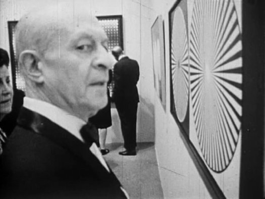
After watching the first segment at maryandmatt’s blog, I was hooked. Mike Wallace, shooting a 1965 episode of WCBS news show Eye on New York in and about The Museum of Modern Art’s blockbuster exhibition of Op Art, “The Responsive Eye.” [Part 2 and Part 3]
The music, by Specs Powell, a jazz pianist and percussionist who was on staff at CBS, is as stunning as it is jarring. I kept waiting for irony, or Mondo Cane-style sensationalism, or–worse and more likely–the snide philistinism of Wallace’s future 60 Minutes colleague Morley Safer, who infamously sandbagged contemporary art in 1993, resulting in, among other things, Glenn Lowry’s awesome shutout of Safer from covering the Museum’s 1998 Jackson Pollock retrospective. But there was absolutely none. The entire show was serious and straight-up. Part 3, particularly, focuses on arts coverage in the media, and media’s culpability in hyping, distorting, or even fabricating trends for their own purposes. I can almost imagine the pitch meeting for “Eye on New York” as a rebuttal of Time magazine’s dismissive coverage of “Op Art.” “Responsive Eye” curator William Seitz nails it when he kind of laments to Wallace about the impact of superficial arts coverage:
And this, in a sense, does worry me, because it is really, an impact of a–
Well, it’s really the absorption of modern art into modern life. And that’s something we all wanted, but, uh, it may change the character of the art a bit, too.
But should this be at all surprising? CBS’s founder Bill Paley was the Modern’s president at the time. Already a long-time trustee, Paley was tapped by David Rockefeller for the position in 1962, and to succeed him as the first non-family chairman in 1968.
![]() A couple of folks on Twitter have suggested, rightly, that MoMA should screen this awesome program. As it turns out, they already have been, since 1967. That’s when the Museum’s Junior Council announced the creation of a Television Archive of the Arts, a three year effort which had actually begun identifying, reviewing, and acquiring film and television media about art and artists in 1964. The Archive began when museum officials learned that some of the films and tapes–they don’t say which–were in danger of being destroyed or lost.
A couple of folks on Twitter have suggested, rightly, that MoMA should screen this awesome program. As it turns out, they already have been, since 1967. That’s when the Museum’s Junior Council announced the creation of a Television Archive of the Arts, a three year effort which had actually begun identifying, reviewing, and acquiring film and television media about art and artists in 1964. The Archive began when museum officials learned that some of the films and tapes–they don’t say which–were in danger of being destroyed or lost.
The Archive was to be housed and made available in the new International Study Center, which was under construction. [It’s now demolished, but it stood on the west side of the sculpture garden, about where Taniguchi extended the glass corner of Cesar Pelli’s tower. It’s funny to remember a building and space so clearly, only to realize that not only is it gone, it’s just as likely no one knows what you’re even talking about.]
The PDF archive of MoMA’s press releases is absolutely incredible, by the way. Here are the announcement of the Archive, and the initial checklist. The first 64 programs from ABC, CBS, NBC, National Educational Television, and NYC’s Channel 13 included dozens of artist interviews and documentaries.
One thing that stands out, though, is that only CBS, and only programs like “Eye on New York,” donated their own archive of complete interviews and extra footage. Maybe this was because Gordon Hyatt, the producer, was also on the Junior Council’s committee which put the archive together.
I’m probably long overdue to point this out, but this is really why I’m writing this post: for almost ten years, I was the co-chairman of MoMA’s Junior Associates, which is the successor group to the Junior Council, and I joined the Film Department’s committee after stepping down. And yet so much of this history is completely new to me. So much of the Museum’s activities and programs are professionalized now, but I can still recognize the deeply ingrained culture of, for lack of a better word, “amateur” involvement. It’s really rather remarkable, and it has been for a very long time.
[maryandmatt.net, thanks andy]
If You Can’t Say Anything Nice, Come Sit For Me
 I watched the documentary Alice Neel last night, made in 2007 by the late artist’s grandson Andrew Neel. It’s pretty good, definitely worth a watch. Documentaries by family members come with a whole set of conflicts and challenges baked in, but Neel succeeds, I think, at identifying the craters and unexploded mines as he maps out the family’s emotional landscape.
Neel’s story is intense–John Perreault, variously a critic, colleague, friend, and sprawling nude subject of the artist, thinks it’s long overdue for a Hollywood adaptation–and it’s hard to imagine that the definitive significance of the paintings left behind is somehow “worth” the suffering and abuse and privations endured by Neel’s kids (and grandkids). But then, that’s not a fair tradeoff. Neel’s rightwing son Richard is right to recognize that if it weren’t this set of problems, it would’ve been something else. Neel had to make her art; it was an obsession, really. And being able to make it, Perreault argues, made Neel a “better mother (and person) than if she had lived a horrid life of creative frustration. And took it out on her sons.”
But that’s not the point. I mean, it is, but what I was wanting to post was the hilarious interview with Alex Katz, who Andrew effectively cast as “Figurative Painter #4,” When Katz finally manages to stop talking about his own work and how actually, he was doing whatever it was Neel was doing, only earlier, all he can say about Neel is that she was “an angry housewife.” You stay classy, Alex.
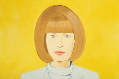
While Googling the quote, I found thanks to Time Out London, that Neel and Katz are having a portrait facedown at the moment. Though it’s hardly a fair fight. The Whitechapel Gallery’s having an Alice Neel retrospective, while Katz is showing new work at the National Portrait Gallery, including this lovely work, his portrait of Anna Wintour.
John Cage’s One11: The Making Of, Now In English
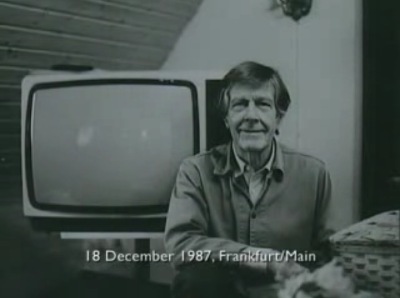
A couple of weeks ago, I watched Henning Lohner’s film essay/documentary about working with John Cage to make One11 and 103, Cage’s only feature film project, completed just before he passed away in 1992.
It’s on YouTube, chopped up in several parts, and mostly in German [One11 and 103 was made for German TV], but now Ubu has posted the English version, so you non-Germans can actually figure out what’s going on. [ One11 and 103 is online, too, though it has the 3sat logo burned into the upper corner, which turns the whole thing into a 90-minute promotional bumper for the station.]
For One11, Cage and his collaborator Andrew Culver used a computer program to generate a series of chance operations, instructions for light placement and movement within an empty soundstage; for camera movement and positioning; shot length; and for editing.
Narrative- and nearly content-free, the 17-segment film was accompanied by 103, a 17-segment orchestral composition that was also based on chance operations. The film’s title follows Cage’s numbering system: the eleventh composition for one performer, in this case, the camera man. So while Cage explains the film as being “about the effect of light in a room,” it’s also very much about the perception, movement, and recording of the cinematographer, Van Carlson.
Cage made the point to Lohner early on that his idea wouldn’t “waste” any film. And sure enough, it turns out the final shooting ratio was an astonishing 1.4:1, with less than 600 meters of extra footage–which, we are told, was used in the opening and closing credits. It’s almost like Cage went to film school during the Depression.
The obvious appeal of an abstract light show aside, watching all this self-conscious randomness [I’ve been going through and replacing “random” with “chance,” since that’s the specific term Cage uses. I think there’s a meaningful difference.] really puts the conscious decisions of location and content into high relief. It also makes me want to remake One11 in another environment and see what happens. I’d also wonder how many more decisions could be randomized, and to what effect? Eventually, if you put a decision factor into play, the randomness of it will generate a distinctive effect, if not an actual style. It’s one of the conundrums of Cage’s work that I like picking through.
One11 and 103: the making of [ubu.com]
You know, at $27, it wouldn’t kill you to buy Mode Records’ DVD version of John Cage: One11 with 103, either, from The Complete John Cage [amazon]
NOW THAT I THINK ABOUT IT UPDATE: You know, posting this really seems like a departure for Ubu. I mean, Ubu began posting vintage, impossible-to-buy-or-even-find works, but with One11 and 103, they basically ripped a commercial DVD published in 2006 by a small, well-known, high-quality independent publisher of modern music. Am I missing something here?
UPDATE UPDATE: Yeah, Ubu’s versions of both One11 and Making of One11 first appeared on The Sound of Eye, an equally amazing art film and experimental music blog, albeit one with a different approach to posting works that are readily available in the commercial market. Ubu announced a collaboration with Sound of Eye a little while ago.
Someone Get Moving Serra Moving
Breaker, Breaker One-Nine,
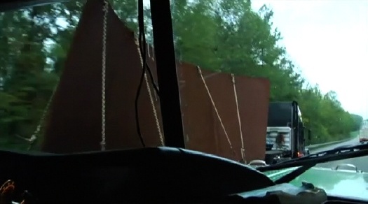
I got Moving Serra, a documentary about transporting Richard Serra’s 242-ton sculpture Sequence cross-country, from MoMA to LACMA on a fleet of flatbeds, that’s blowing my mind right now.
We need a convoy of Serra torqued spiral/ellipse collectors to load their big rigs with completion funds right now and head on over to director Tom Christie’s place, over?
Moving Serra [movingserra.org]
Lichtspiel/ Lightplay by Laslo Moholy-Nagy
That Google Street View snafu yesterday reminded me of a still from Laszlo Moholy-Nagy’s 1932 abstract//constructivist short film, Lichtspiel, or Lightplay.
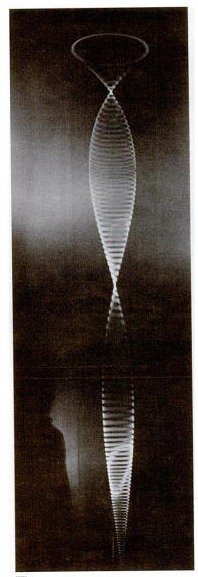
Normally, I’d say that’s the art-nerdiest possible free association in the world, but I’ve actually been meaning to write about Moholy-Nagy’s film for a while. Or more specifically, about his incredible kinetic assemblage/sculpture used to make Lichtspiel, the Light Space Modulator.
Light Space Modulator is a motorized sculpture made of glass, mirror, steel, and acrylic, and it was a crucial object–or project–for Moholy-Nagy for more than two decades. The dates generally given for its construction are 1922-30, but the artist worked on or with it until he died in 1946. Last fall, Alice Rawsthorn wrote in the Times about the tragicomic scene of the refugee artist fleeing the Nazis in the 1930s, family and Light Space Modulator in tow, and having to explain the sculpture to customs and border officials along the way. The original was given by Moholy-Nagy’s widow to the Harvard Museums, but more on that later.
According to the artist’s official chronology, Lichtspiel [full title: Lichtspiel schwarz weiss grau] was made around 1930 in Berlin, and first shown in 1932 [MoMA has a brochure, designed by the artist, for an exhibition and screening.]
According to MKZ:
Lichtspiel, schwarz-weiß-grau was originally supposed to consist of six parts, but only the last part was filmed. The first five parts were supposed to show different forms of light in set combinations: from the self-lighting match, automobile headlights, reflections, moonlight, and colored projections with prisms and mirrors to the production of the “light prop,” [i.e., the LSM]
This surviving segment/film, one of 7 extant Moholy-Nagy films, is listed with a 6-minute run time, but there are several excerpts and variations floating around. Here’s the original, I think:
The Times has a great account from 1952 of a screening of an “abstract art film” program organized by “Captain [Edward] Steichen” for the Museum of Modern Art’s “enterprising, energetic Junior Council,” which included both Lichtspiel and the early direct animation films of Len Lye.
But SFMoMA’s version is 5:17. The Minimalist Issue of Aspen Magazine, Nos. 5+6, published in 1967, includes a 1:40 excerpt on super-8 film. Fortunately for everyone without Aspen and/or an 8mm film projector, there’s Ubu.
Dali’s Pen Is
While scoping out the 1974 video art conference at MoMA, “Open Circuits, the Future of Television,” filmmaker Jose Montes Baquer decided that for some reason, Salvador Dali should be the artist he would collaborate with for his documentary. Baquer tells the story of gaining audience with Dali at the St Regis to pitch the project in an all-too-short interview with Christopher Jones for Tate, Etc. Magazine in 2007:
Then Dalí took a pen from his pocket. It was plastic and ivory coloured with a copper band at the centre. He said: “In this clean and aseptic country, I have been observing how the urinals in the luxury restrooms of this hotel have acquired an entire range of rust colours through the interaction of the uric acid on the precious metals that are astounding. For this reason, I have been regularly urinating on the brass band of this pen over the past weeks to obtain the magnificent structures that you will find with your cameras and lenses. By simply looking at the band with my own eyes, I can see Dalí on the moon, or Dalí sipping coffee on the Champs Élysées. Take this magical object, work with it, and when you have an interesting result, come see me. If the result is good, we will make a film together.”
The 2008 MoMA exhibit, “Dali and Film,” says this quote came from a letter from the artist. The resulting film, Impressions of Upper Mongolia, Hommage to Raymond Roussel, concerns the relationship between macro and microscopic, and was shown on Spanish TV in 1976. As interesting as it is, Baquer’s interview doesn’t exactly help make sense of what the film actually turned out to be. But the mentions of painting over film stills, and Vermeer, and the Dutch penchant for mapmaking as an art form, almost persuade me to put up with Dali’s pompous shenanigans to watch it.
Dali: The Great Collaborator [tate.org.uk]
Let Brillo Give You The Moon–Free!
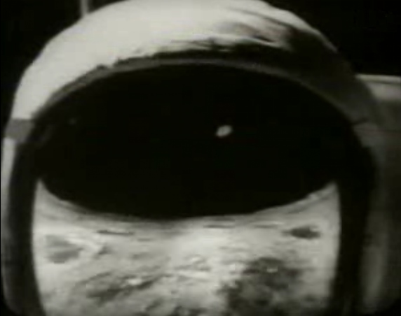
I was half-watching the German artist Ferdinand Kriwet’s Apollovision, a film & sound & video collage of the Apollo 11 moon landing as American media spectacle made, incredibly, in 1969, when I heard this:
Now you can follow the Apollo astronauts as they explore the Sea of Tranquility and the Ocean of Storms!
Brillo offers you an Official Rand McNally 18×24-inch Moon Map
Just send two labels from any Brillo product
to Brillo Moon Map Offer
Let Brillo give you the Moon–free!
Which is hilarious, except that it’s completely not. How quickly did Brillo Boxes transmute from banal, everyday product to icon of Pop Art? For those who lived through the 60s, the dissonance might have been jarring, but now, Brillo just is an art object. What was it like to see it in 1969, when Pontus Hulten was, er, figuring out what to do with all those leftover boxes? Or when the folks in Pasadena and LA were asking Andy if they could whip some up, too, would he mind? It’s for a show? What was Brillo in the culture at the moment it was making Art History?

I’m not sure it was anything, or that it really cared terribly much about Art History. As I write this post, the only Google result for “Brillo Moon Map” is from a
rather simple, beautiful ad in the August 8, 1969 mega-moon issue of LIFE magazine. It’s just one of many ads with lunar tie-ins, ads for everything from frozen foods [“Everybody who’s been to the moon eats Stouffer’s”] to frozen foods [“Congratulations Neil, Buzz and Mike. We’re just glad we could help./Frozen meals provided by O’Brien, Spotorno, Mitchell, a subsidiary of the Del Monte Corporation.”] to toothpaste [Crest: “The Astronaut Dental Care Program”].
Hulten and the folks in Toronto who exhibited actual cardboard Brillo boxes got their shows up just in time, because by 1969, Brillo had redesigned its packaging. [update: in 1967, actually.] Which meant that the 1970 Pasadena boxes were now out of sync with the product they replicated; they were historic, not copies of Brillo’s boxes anymore, or even James Harvey’s, but copies of Warhol’s Brillo Boxes.
Was there any moment where Warhol contemplated keeping them conceptually linked, maybe instead of varying the size, having the 1970 Brillo Boxes fabricated to look like Brillo’s 1970 boxes? I’d guess no, but I haven’t even heard the idea floated before. Warhol made his Brillo Boxes point in 1964, and the rest is history.
But what are the conceptual implications of the Brillo Boxes, and how did they develop? They were sculptures, symbols, objects, appropriations, readymades [at least the cardboard versions exhibited were]. If they had a conceptual element to them, though, might that affect the whole Hulten Box Affair, which I obviously can’t wrap my head around?
Watch Kriwet’s Apollovision (1969) on Ubu [ubu]
I’m Ready For My Closeup, Brother DeMille
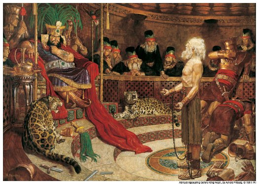
The things you learn at church. So of course I knew that the late illustrator Arnold Friberg’s dramatic paintings of scenes from the Book of Mormon, with ripped Nephites and Lamanites striding around the Promised Land, are lodged in every Mormon’s head for the last three generations. [If you don’t believe me, as you study Friberg’g painting above, go ahead and listen to this impromptu ukelele rendition of “Abinadai” by the at least somewhat LDS ska masters GOGO13, who ask the eternal question of wicked King Noah (L), “Why you got that flower pot on your head?”]
And I knew that Friberg also did the concept studies, opening titles, and some key costume designs for Cecil B. DeMille’s 1956 The Ten Commandments. What I did not know is how closely those two men–and those two over-the-top religious projects–were intertwined.
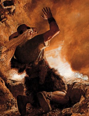
So let it be written: Brother of Jared sees the finger of the Lord, Arnold Friberg, 1951
Friberg was commissioned to make twelve BofM paintings in 1951 for the LDS Church’s children’s magazine, The Children’s Friend. Four ran in 1953 and four in 1954, but Friberg stepped away from the project for several years, after growing frustrated with doctrinal micromanaging of the images. [1]
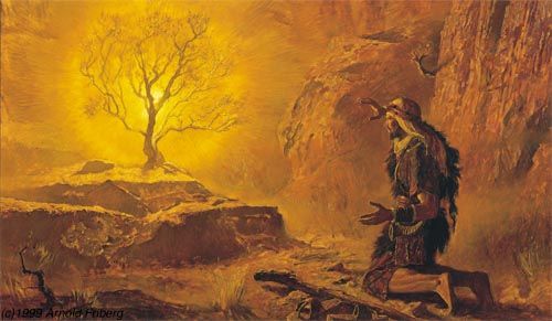
So let it be done: Moses and the Burning Bush, Arnold Friberg, 1954
It was DeMille seeing a portfolio of Friberg’s Book of Mormon lithographs in 1954 that clinched him the The Ten Commandments gig. Friberg’s illustrations were extremely close to the finished look and feel of the movie, and in the process of working on the film, Friberg and DeMille became close friends.
Which led to DeMille meeting the President of the LDS Church at the time, David O. McKay. Who invited DeMille to speak at Brigham Young University’s commencement in 1957. Which he did. He basically gave a sermon about the Ten Commandments. As part of BYU’s The Board, a community service–meets-Mechanical Turk resource, someone named Laser Jock retyped DeMille’s entire speech from one of BYU’s two surviving transcripts. It’s available on PDF. He was quite a preacher. [DeMille’s relationship with BYU was such that after his death in 1959, his extensive archive was donated to the university. It is in the Harold B. Lee Library’s Special Collections department, which seems to be almost entirely unavailable–or even unindexed–online. Amazing.]
Anyway, Friberg went back to finish the last four Book of Mormon paintings after the film, and they were published in The Children’s Friend between 1961 and 1963. But more importantly, the paintings were included in softcover copies of the actual Book of Mormon starting in 1961. Which all but put the canonical seal of approval on them, paintings essentially functioning as scripture.
There has to be several doctoral theses worth of material about the cultural and theological impacts of Friberg’s religious superheros, and on the symbiotic relationship between one of classic Hollywood’s most bombastic religious spectacles and one of America’s most unorthodox religions. Maybe there already are.
[1] Apparently, Churchs officials [whether ecclesiastical leaders of bureaucrats, I don’t know] at the time had a strong aversion to LDS artists making portraits of Christ. They had no problem with using non-LDS artists’ naturalistic representations, though. After much back and forth, Friberg’s solution was to only show Jesus as a tiny figure descending from the sky.
This reluctance eventually faded, and there are plenty of illustrations of Christ by LDS artists in use, and even more in circulation. But I distinctly remember the frisson of faith when the Church commissioned a new portrait of Christ, and the rumor mill began churning about why it was the most accurate ever, because it was based on Christ’s ID badge for the Church Office Building or whatever. nother thesis topic, perhaps.
Brigham Young University Commencement Exercises
Commencement Address: Mr. Cecil B. DeMille
Introduced by Pres. David O. McKay
May 31, 1957 [theboard.byu.edu]
Journal of BofM Studies: The Book of Mormon Art of Arnold Friberg: “Painter of Scripture” [maxwellinstitute.byu.edu]
Fog Line, by Larry Gottheim
Larry Gottheim’s 1970 short film Fog Line is just beautiful to watch. 11 minutes of fog imperceptibly but inexorably dissipating in a rural landscape.
It reminds me a bit of Tacita Dean’s Banewl, a 63-minute fixed shot of a Cornish cow pasture during a 1999 solar eclipse–only without all the action.
In 2005, the NY Film Festival hada mini-retrospective screening of Gottheim’s work, including Fog Line.
Len Lye Is Famous In New Zealand
I came across a mention of Len Lye’s spectacular-looking kinetic sculpture a couple of weeks ago, while reading 1965 coverage of the Buffalo Festival of the Arts. Sandwiched in between a photo of Robert Morris and Yvonne Rainer in a nude dancing embrace and a headless mannequin dangling on the set of a Eugene Ionesco play was an installation shot of Lye’s Zebra at the Albright-Knox: “It consists of a nine-foot rope of fiber glass which, when set in swirling motion by a motor, bends into constantly changing shapes.”
Lye’s kinetic works had been getting some traction in New York–the Govett Brewster Gallery in his home country of New Zealand begins its sculpture section with Harmonic (1959), another spinning work similar to Zebra, which was shown at MoMA in 1961. But according to his biographer Roger Horrocks, the Buffalo exhibition and the concurrent solo show at Howard Wise Gallery in Manhattan were really his first chances to show multiple pieces at once.
Thanks to some steady evangelizing, some scholarship, technological advances that help realize–or keep running–his work, Lye has become something of a posthumous hero in New Zealand. There was a retrospective in Melbourne and New Plymouth NZ last year that included refabrications of several sculptures.
But Lye’s most frictionless path to history and fame is probably not his sculptures, but his films. He was probably the earliest practitioner of direct animation, drawing and scratching carefully synchronized abstractions and imagery onto celluloid as early as 1935, when Stan Brakhage was two years old.
Lye made A Colour Box as a pre-feature advertisement for the British General Postal Office. Other of his early animations were commercials, too. I’m so glad he did them, because they are awesome, but seriously, they seem like some of the most ineffective ads imaginable.
But as art and filmmaking, holy smokes. Just try, as you are mesmerized by all the separations and compositing and abstraction and color in Rainbow Dance, to remember that Lye made this in 1936:
He also made commercials using stop-action animation and puppetry, such as the rather incredible 1935 short for Shell, The Birth of the Robot, whose tiny kinetic figures and machines look like the missing link between Alexander Calder’s Circus and Ray and Charles Eames’s Solar Do-Nothing Machine:
It didn’t occur to me until just now, watching Trade Tattoo, a 1938 GPO short in which Lye incorporates both direct animation and coloring and found footage, but the saturated, post-production colors and the collage of abstraction and photo/film realism suddenly reminds me of Gilbert & George’s distinctive visual style.
I don’t know what WWII did to the GPO Film Unit’s output, but both Gilbert and George were born during the war, in the early 40s, and only George grew up in the UK. [Gilbert was born in Italy and moved to London to study.] Perhaps there was a Lye/GPO legacy lingering around St. Martins in the 60s. Or maybe it was all lava lamps and LSD. Who knows?
All of these YouTube clips, by the way, are from user BartConway, who turns out to be an OG filmsnob of the highest order, and thank heaven for it. He seems to be getting them from the BFI’s extraordinary-looking PAL DVD collection of works by the GPO Film Unit.
On Gilbert & George
I didn’t make it the first time, of course, but I did see Gilbert & George’s reprise of “The Singing Sculpture” in 1991 at Sonnabend. It left a pretty deep impression on me in a way their photo compositions really haven’t. And there was always something about their conceptual conceit of being “living sculptures,” and not separating art and life that seemed a little precious.
But holy crap–no pun intended–have you seen these guys work? No wonder art and life aren’t separated, they have turned their entire life into the most systematic, all-encompassing, hyperefficient artmaking process I think I’ve ever seen or heard of.
I watched a 2000 interview/documentary/archive visit with them [“un film de Hans Ulrich Obrist,” seriously], and I imagined Hans Ulrich dying right there on the spot and going into archival heaven. It was that intense and organized and incredible. When Gilbert [the non-balding one] is talking, George is training his gaze straight into the camera, as if he were hammering the point home. It’s just–just watch it.
Fortunately, it sounds like the boys have finally gotten a little digitization in their process. Robert Ayers visited with them in 2007, and they now use a computer and a hi-res scanner to compose their images using the tens of thousands of photos they have taken and categorized and archived over the decades.
[One thing that I wonder about, from the movie: George holds up a model of an unidentified gallery which would house a show they’ve conceived of their entire 1977 series, Dirty Words Pictures, which to that point had never been seen together. The first person to identify the location would win “a special prize,” he said.
So how’d that turn out? Because less than two years later, the Serpentine did show the Dirty Words Pictures, but that gallery mockup doesn’t really remind me of the Serpentine.]
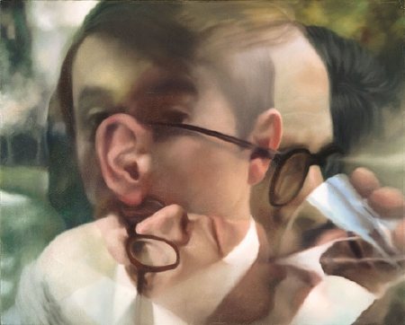
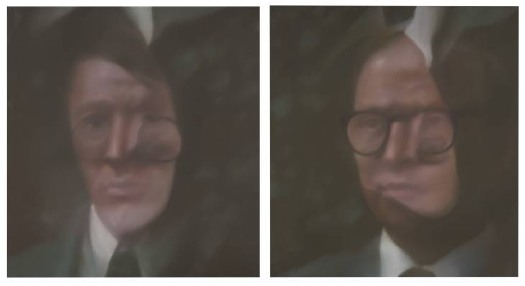
Anyway, if they weren’t interesting enough, in 1975, on the occasion of a show in Dusseldorf, they commissioned Gerhard Richter to paint their portrait. He ended up painting eight of them, using melanges and overlays of various photographs. Anthony d’Offay donated a pair to Tate Modern, where they are in the Richter Rooms. So strange, but the National Gallery of Australia’s, above, is even stranger.
The Secret Files of Gilbert & George (2000), 35min, dir. Hans-Ulrich Obrist [ubu.com]
[images: Gilbert, George, all 1975, all Gerhard Richter. Top: via Tate, above: via Gerhard-Richter.com]