
Harrier and Jaguar, Fiona Banner’s commission for Tate Britain’s Duveen Galleries opened this week, and from the making of film and interview with the artist, it looks spectacular.
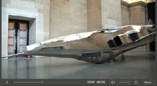
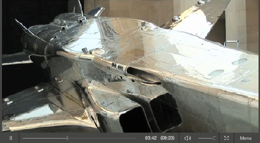
Banner has installed two decommissioned fighter jets–a BAe Sea Harrier XE695 and a SEPECAT Jaguar XZ118–in the grand neoclassical space. By altering each slightly, and by placing them in atypical, non-functional positions, the artist turned them into overwhelming, beautiful objects–sculptures–which nonetheless manage to retain all their original significance and meaning as highly advanced weapons of war.
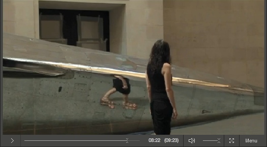
The Harrier was covered with a delicately feathered matte wash and hung, nose down, just off the floor. It barely fits inside the limestone-clad hall. The SEPECAT Jaguar was stripped down to bare metal and polished to a mirror finish. It rests upside down, on its cockpit. Did I mention it looks spectacular?
With those reflections it generates, it’s like a 3D realspace version of Google’s distorted Street View portraits.
Video | Fiona Banner Harrier and Jaguar, 9’23” [tate channel]
Duveens Commission Series | Fiona Banner 2010, through 3 Jan. 2011 [tate.org.uk]
Category: making movies
Olafur Street View
One of the simplest, best parts of Innen Stadt Außen [Inner City Out], Olafur Eliasson’s multiple public and museum projects in his adopted hometown of Berlin this year, is now online as a short film.
In what feels like the diametric opposite of Google’s Street View scanning, Olafur and his studio rigged a truck with a giant mirror and drove it around town. Part of me wants to not say what it is, but to let viewers figure it out. But the whole exhibition was promoted with photos of the truck. And I knew what it was, and I still was enthralled by every sequence and cut in the film.
Innen Stadt Aussen, from Studio Olafur Eliasson, 10’31” [vimeo via @grammar_police]
Pixel Art Minidoc By Simon Cottee
This 11-minute documentary short by Brisbane animator Simon Cottee gives a nice look at contemporary pixel art and its origins.
Unsurprisingly, game developer Jason Rohrer has the most thoughtful perspective on the idealized, ex-post-facto perception of pixels as these perfect, hard-edged squares, which he attributes in part to looking back at old low-res games on new, hi-res monitors.
Cottee et al make the connection between pixels and pointillism, but the focus on animation leaves out the influence both pixel-centric image software, like Photoshop, and pixel-related art shown in galleries. [Juan Cespedes, Cory Arcangel, Sherrie Levine, Joerg Colberg or Thomas Ruff, or even Tauba Auerbach or Gerhard Richter] Still well worth a view.
Slow Cinema vs. Art Cinema
On the occasion of Apichatpong Weerasethakul [1] winning the Palme d’Or, Frieze‘s Dan Fox has a incisive recap of the debate over Slow Cinema that erupted after Nick James’ Sight and Sound recent op-ed calling the genre out as a passive-aggressive dare to the audience to admit they’re bored.
The row among film critics and festivalgoers is as annoyingly insidery and lingo-obsessed as any art world argument. [Fox is careful to give equal time to competing terminologies. One blogger critic, Harry Tuttle, thinks Slow Cinema is pejorative, and proffers Contemporary Contemplative Cinema instead, which seems arbitrary. Might as well call it Minimalist Meditative Movies.]
Fox’s dead-on point is how insulated and blind these two systems of production and distribution–theater/festival/DVD vs gallery/installation/edition–are from each other. And this, despite the remarkable confluence of interests, strategies, and styles among filmmakers and artists on both sides of the divide:
Much as I admire Tuttle’s spirited engagement with his favoured genre of contemporary cinema, nowhere on his timeline of CCC/Slow Cinema is there anything that represents, for instance, the achievements of Structural cinema. This is curious, for if ‘plotlessness’, ‘wordlessness’, ‘slowness’ and ‘alienation’ are what he is trying to chronicle, where are Andy Warhol’s Empire, from 1964, or Michael Snow’s 1967 film Wavelength for example? Nor is there any acknowledgement of how these multiple strands of experimental cinema history have fed into the work of artists today.
Artists such as Tacita Dean, Sharon Lockhart, and Matthew Barney, for example. [On the other side of the fence, I’m not sure why no one seems to have mentioned my own personal favorite Slow Cineman, Gus Van Sant, who emptied Sundance theaters with Gerry and whose lingering, looming Elephant also won at Cannes.]
Barney has broken theatrical and festival ground with his Cremaster Cycle, of course. But I think Frieze, which has commissioned projects from Weerasethakul, has high hopes for him as a candidate for bringing the worlds of these two film traditions together. We’ll see.
Slow, Fast and Inbetween [frieze]
[1] yes, he’s in the art world pronunciation guide.
Please Go To Philoctetes Tonight And Tell Me How It Was
My buddy John Powers has been working on this insane project forlikeever: an artists commentary track–with pictures!–that runs alongside Star Wars IV. Tonight he’s presenting it at Philoctetes, and discussing it along with Colby Chamberlain and Luke duBois, who’s made a sick score.
I’ve seen pieces Star Wars and Modernism: an artists commentary emerge in pieces over the months, but tonight’s the first time a big section of it will be screened large, and in public. I’m very jealous of all those who can make it out there tonight:
Star Wars and Modernism, an artist commentary conceived and directed by artist John Powers, explores the original 1977 science fiction film as an object. Juxtaposing video with film stills and historical archives, Powers creates a compelling argument that the visual program of the blockbuster can and should be understood in terms of the art, architecture, and politics of Cold-War America. An essay by Powers published in Triple Canopy, with important editorial contributions by Colby Chamberlain, was the genesis of the project. Composer Luke DuBois created the film’s original score.
How Your Street View Panoramas Are Made
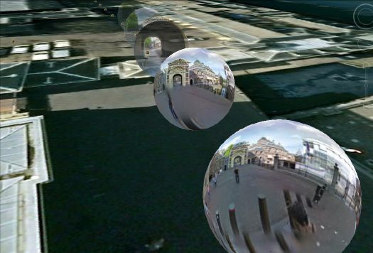
I’ve been looking into how Google Street View panoramas are made, and it’s been kind of awesome. Each equirectangular panorama is stitched together on the fly out of 21 photos.
Equirectangular projection, or plate carrée (flat square), is a technique that maps coordinates onto an evenly spaced grid of latitude and longitude, which produces significant distortions, especially along the perimeter. Like how Antarctica ends up looking bigger than the rest of the continents put together. Flickr user swilsonmc’s images of flattened out Street View panoramas show the axis of distortion quite nicely.
I think there are other distorting elements in Street View, though; it appears that each panorama is anchored to a specific set of lat/long coordinates. [The Street View data layer on Google Earth shows this beautifully by plopping these 3D pano bubbles down on its own 3D landscape. (top) It’s like simulation-within-simulation. Also, they look like inverted satelloons, only they’re projecting back their surroundings from the center, rather than reflecting from the surface. I mean, just check out the highly reflective surface of the PAGEOS global mapping satellite for a minute. Am I right? Wait, did someone say mapping?]
Anyway, the panoramas pull together the best images of that spot, which are not necessarily taken at that spot. Google’s roving cameras are shooting constantly, so there images approaching and leaving a particular panorama site. This introduces multiple POV and perspectival distortions into a single panorama. Which can result in awesome, zig-zagging thickets of tree trunks, fence posts, stanchions, and disembodied pedestrians. And which all remind us that these panoramas are not photos, but photomontages.
But wait, that’s not all! swilsonmc also created a php script that turns every flattened Street View panorama into a frame of video. The flickr video above shows the trip up the Long Beach Freeway in LA, from Seal Beach to Glendale. It reads as a continuous trip, of course, but if you watch the traffic and the clouds, the other Street View distortion–time–so obvious it’s invisible, becomes clear: there are photos taken on different days.
Roland Barthes described photography as “the presence of a thing (at a certain past moment).” The always didactic John Berger said,
Photographs bear witness to a human choice being exercised in a given situation. A photograph is a result of the photographer’s decision that it is worth recording that this particular event or this particular object has been seen
and on the intrinsic temporal content of photography, he said, “This choice is not between photographing x and y: but between photographing at x moment and not at y moment.” I think it becomes clear that in the traditional, theoretical sense, whatever Google Street View images are, they are not photography.
Roel Wouters’ Shiny Silver Balls
Suddenly silver mirrored balls are everywhere.
Music video and filmmaker Roel Wouters created the trailer for last year’s International Film Festival Breda:
A silver sphere on an endless checkerboard floor is the default for many 3D modeling applications. It can be seen as an icon for a sterile, makeable world. Reality though, is dirty and unpredictable. By recreating this icon in reality the beauty and imperfection of real life gets emphasized.
The recording was the result of 3 people controlling different parts of the installation, Roel controlled the speed of the balls, Benoit (Eurogrip) controlled the speed of the dolly and Sal focussed and zoomed the camera. It turned out to be a play were the 3 of us playing harmoniously together.
It’s awesome. Coincidentally–actually, several coincidentallies–a selection of Wouters’ work was screened just today in Den Haag, organized by a cinema club called Cinetoko. Cinetoko is a collaborative effort between Motoko, a motion and video design studio, and <>TAG, an art/tech/culture catalyst of some kind. It happens at the Zeebelt Theater, which is safely to the west of any Google Map camo or StreetView complications. [via manystuff thanks andy]
We’re All Chris Burden Now
Through The Night Softly was a 1973 performance piece-as-latenight-TV-commercial by Chris Burden. It’s a 10-second video of the artist, in a Speedo, inching on his stomach across a parking lot full of broken glass. [View it on UbuWeb.] Burden wanted to be on “real TV,” and 10 seconds after the local LA news was all he could afford at the time.
[clarification after watching it again last night: Through The Night Softly is Burden’s title for the actual performance and/or the video of it, which goes on longer than 10 seconds. TV Ad is the clip of TTNS on TV.]
More than the cringe-inducing action itself, which is closely related to other works he was making, Burden talks about the piece in terms of its context–its startling juxtaposition and inexplicability among shampoo commercials and Movies of The Week. In the EAI video compilation above, he also talks about how hard it was for the TV station to take him seriously, even though they both realized he was a “small customer.”
Well, consider that problem solved. Slate’s Seth Stevenson has a fascinating video about Google TV, which lets you buy actual TV ad time the way you buy AdWords: a few DIY clicks at a time.
Stevenson made a goofily paranoid 30-second commercial out of vintage stock footage, then spent just $1,300 to run it 54 x/wk on Fox News, where it was seen by several hundred thousand 1.4 million [!] people.
They got a thousand people to visit their website, which is a horrible conversion rate, but who cares? You could have a dozen more interesting goals and invitations to the viewer that make more sense. Or none at all. Can you imagine what the video art world could or should be doing with this? The mind reels.
Assuming Google would allow it, of course. When AdWords first came out, I regularly used it for publishing, not advertising. I’d write little haiku-like ads keyed to search terms that had no ads at all, like, at the time, Agnes Varda. [Hmm, nearly eight years later, a Google search for “agnes varda” still returns no ads.]
Anyway, it lasted until Google announced their IPO, and they instituted a new TOS for the program. It’d be interesting to see what the contours of Google TV’s commercial standards are, and how they affect content.
I suspect Chris Burden’s original ad wouldn’t fly today. But I’d love to be proved wrong. And I’d love to see these ads run, then get taped and uploaded in context to YouTube, where they could continue to reach an audience. LAXArt organized a series of artist-produced billboards around Los Angeles. And Creative Time programs video art onto giant monitors in Times Square. Where’s the public art organization curating and running 10-30 second video art on cable? What about an artist or group of artists creating programming for the format and airing it themselves? BHQF-TV, anyone? Stick a sponsor slide on the end for a couple of seconds and the piece pays for itself.
How I Ran an Ad on Fox News [slatev.com via @joygarnett]
Sehgal, Herzog, Patel, Oldenburg: Some Links I Like
A great post on language & progress, Claude Levi-Strauss & TIno Sehgal. Some of the most interesting commentary I’ve read on discerning the actual structure and contours of Sehgal’s This Progress, too. [futureofthebook.org via @briansholis]
Which makes me wonder: do the works come with NDAs? Are they secrets? Trade secrets? Can the instructions be shouted from the rooftops? Could the unwritten transmitted/purchased instructions be performed or recited publicly as entertainment, as part of a critical discussion, or in an effort of collective preservation? Are they really just a couple of lines [“Roll around kissing constantly. Every few minutes, strike a pose from a famous work of art.”] or are they more elaborate? Obviously the parties concur that there is some intellectual property right being transferred, but what is the implication for the artist–or his dealer or a collector or museum–either disseminating the instructions or refusing to do so?
Ramin Bahrani’s short film Plastic Bag tells the story of a lone plastic bag’s Odysseus-slash-V’Ger-like journey to find home and its creator. Werner Herzog stars as the plastic bag. Seriously. [via mrdanzak, thanks andrew]
Speaking of epics, Grain Edit has a wonderful interview with Sanjay Patel, the Pixar animator/illustrator/Charles Harper fan who went from self-publishing the awesomely kawaii Little Book Of Hindu Deities to creating a modernist graphic version of the Ramayana. [grainedit]
I’m liking what I can see of Eamon O’Kane’s paintings about Le Corbusier’s somewhat dickish relationship with and interventions in Eileen Gray’s architectural masterpiece, the E-1027 Villa at Roquebrunne. They’re at See Line Gallery, but the big pictures are at the LATimes. [Related: at a 2007 MoMA conference, Beatriz Colomina called Corbu’s alterations of E-1027 an architectural “rape”.]
I’ve been doing some research on early Happenings staged in Washington DC by Claes Oldenburg. More on that as it develops, of course, but there’s no need to wait on sharing this very self-amused Time Magazine account of “The Pop Art Festival” organized by the Washington Gallery of Modern Art in April 1963:
Blue Wrench.
Happenings are old stuff in the artiest alcoves of Manhattan, but of course that means nothing in Washington square. This one was prepared by Artist Claes Oldenburg, who makes those huge sailcloth hamburgers. Washington society prepared by getting itself puffed, powdered and sloshed. Little dinners were eaten intimately in Georgetown. The jolly crowd then collected at the gallery to see what was going to happen. Nearly everyone sat on campstools–White House Art Adviser Bill Walton, FAA Administrator Najeeb Halaby, Mrs. Arthur Schlesinger Jr. Those. [sic]
A member of the gallery staff announced that she had successfully achieved blue ice cream. She had mixed blue dye and vanilla ice cream with a monkey wrench. The New Frontier moved an inch forward on its stools.
This was obviously going to be some happening.
Does anyone know how Time and others [Old Media types, mostly] insert the unique tracking url into my copy&pasted quote of their article? I assume it’s to prevent/track automated scraping and republishing, but from their page code, I can’t figure out how they do it.
And lastly, I went to hear John Gerrard talk about his time/duration-intensive work at the Hirshhorn last week. He’s got a very different project going on, what with the environment, and the orbit of the sun and energy and industrialization and video game engines and what not, but it was nice to see that he’s nearly/slightly as engrossed with using Google Earth as a creative tool as I am. He pulls colors from the satellite images to create site-specific palettes for his digital landscape re-creations.
Which, whoops, come to think of it, may be problematic. Just yesterday, Stefan at Ogle Earth laid out a not-insigificant case for why it matters that–whoops–all satellite imagery, including Google’s–is color-enhanced. “It is the case that colors in satellite imagery are always false, albeit made to look realistic (just as with those pretty pictures of galaxies and planets).” [ogle earth via @felixsalmon]
Oh, Red, Green & Purple Where Art Thou?
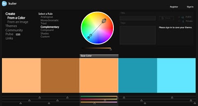
On his blog Into The Abyss, editor/filmmaker Todd Miro has an awesome, screencap-filled rant about the orange-and-tealification of Hollywood. In color theory, teal is the high-contrast opposite of flesh tone [as the palette Miro generated at kuler demonstrates] and so directors looking for an image to “pop” are jacking up the color contrast and narrowing their films’ palettes. In post.
While color adjusting has always been with us, Miro traces the problem to the Digital Intermediary, which has become the visual equivalent of AutoTune:
The Cohen brothers ushered in the new era of digital color grading with their excellent 2000 film, “Oh Brother, Where Art Thou.” This was the first feature film to be entirely scanned into a computer, a process known as “Digital Intermediary”, or DI. Once inside the computer, the colorist now had unheard of control over every element of the image. Imagine tweaking an entire movie with the tools and precision that one has with their still images using Photoshop, and you get some idea of what power was unleashed.
But was that power used for good… Nooooooooooooooo, or course it wasn’t!
As in so many other ways, so it goes with orange & teal overkill: Transformers 2 turns out to be the worst of the worst.
Teal and Orange – Hollywood, Please Stop The Madness [theabyssgazes via afc]
Wanted: Smithson’s Movie Treatment For Spiral Jetty Poster
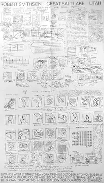
I’ve been working on a shot-for-shot remake of the Spiral Jetty film for a while, and so I’m quite familiar with the storyboard-like drawings Smithson did for it. Familiar with them as drawings, that is. He called them Movie Treatments.
It’s a little embarrassing to admit I didn’t realize Smithson had used a treatment/storyboard for the flyer/poster of the 1970 Dwan Gallery exhibition of Spiral Jetty until I read it in Kathleen Merrill Campagnolo’s essay on the Jetty and its camera imagery in the Smithsonian’s Archives of American Art Journal. But there it is:
DWAN 29 WEST 57 STREET NEW YORK OPENING OCTOBER 31 TO NOVEMBER 25
A 16 MM, 35 MINUTE COLOR AND SOUND FILM ON THE SPIRAL JETTY WILL
BE SHOWN DAILY AT 2:00 IN THE GALLERY FOR THE DURATION OF EXHIBITION.
The Dwan exhibition consisted primarily of Gianfranco Gorgoni’s large-format photos of the Jetty, eight of which were included in Kynaston McShine’s historic “Information” show at the Museum of Modern Art that summer.
Given the iconic aspects of the photos and the powerful influence of the film–not to mention the experience of visiting the Jetty itself–it’s somehow odd to think of encountering the Jetty first in terms of Smithson’s site/non-site paradigm, as a situation represented in a gallery.
It’s also interesting to note that the film only played once a day, not on a continuous loop as is often the case now. It was an event more than an installation.
Anyway, I would like you to send me one of these posters, please. If you have one you don’t need, or perhaps some extras. It need not be signed. Thank you.
Camera Angel
“Brian Palma” is a bit of a stretch, but Tarantino’s clapboard loader Geraldine Brezca is a true artist in her own right. [via]
Catching Up With Vito Acconci
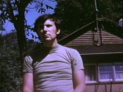
While rummaging around in Vito Acconci’s early exhibition history for traces of Kathryn Bigelow’s work [more on that in a second], I came across a set of three early, short Super 8mm films I’d never heard of: Three Attention Studies, 1969.
They’re all 3min. each, the length of a Super 8 cartridge, and made in conjunction with Peter Lupario, but it’s the last one that’s most interesting:
In Catching Up, the performer and cameraman walk side by side across a field. Sometimes the performer falls as the camera continues its pace; the performer must make an effort to catch up and return into the frame.
If that’s Lupario in the still above–and it doesn’t look like 1969 Acconci to me–these three films are notable for featuring the artist behind the camera, as the viewer, instead of in front, as the performer/subject.
These studies preceded by several months the 1970 body-related performance pieces for which Acconci became known. In a 1983 retrospective of the 8mm works at the Whitney, curator John Hanhardt said Acconci is “one of the first artists to successfully develop a significant oeuvre in the Super-8 film format.” [PDF via vasulka.org]
So this Catching Up, I’d like to see. If anyone knows where it exists digitally, I’d love to hear about it.
Now back to Bigelow. I’m beginning to think that the Acconci project that most closely matches the dates, descriptions, and details of Bigelow’s recollections is his 1973-4 Super 8 “feature,” My Word. [Of course, I haven’t seen it, even though it showed at X-Initiative last September.]
At two hours [or 90-something minutes, which may be an earlier, pre-1983 version], it required a lot of shooting. Hanhardt describes it as
composed of written statements alternating with shots of the artist in his studio and around his building. Acconci is the central protagonist whose gestures, actions, and written statements are all addressed to women–women are the other, unseen, presences in this work. The point of view of the camera can be interpreted as that of the women, silently confronting Acconci, or that of Acconci himself, mirroring his every move.
I don’t like to, but I can imagine that’s Acconci riding some kind of bondage apparatus with a large film projection behind him in the My Word frames below:
My Word was a turning point, the last time Acconci included himself on-camera in his work. If this is the one, Bigelow actually shot some, part, or all of one of Acconci’s most significant works. Too bad the Academy doesn’t have some kind of lifetime achievement in dues-paying hardship award.
Previously: Tracking down Kathryn Bigelow’s early conceptual oeuvre
In An Art Film That Time Forgot. Kathryn Bigelow IS. That Girl On Lawrence Weiner’s Sofa.
Like everyone else reading it on OSCAR NIGHT®, Andrew Hultkrans’ 1995 Artforum interview with Kathryn Bigelow gave me hope for the films-by-artists genre, if not quite from the direction people might expect. To hear a double OSCAR® winner say of film noir, “That’s how I moved from art to film, so to speak: I went through Fassbinder on my way to noir.”
ANDREW HULTKRANS: It’s quite a leap from Conceptual art to the culture industry. KATHRYN BIGELOW: It does seem like a departure. I was studying painting at the San Francisco Art Institute and one of my teachers put me up for the Whitney Program, so I went. This was ’73 or ’74, when Conceptual art really came to the fore. I did a couple of videos with Lawrence Weiner, and I worked with Art & Language, an artists, group who were critiquing the commodification of culture. So I was very influenced by them, and my concerns moved from the plastic arts to Conceptual art and a more politicized framework. And I became dissatisfied with the art world – the fact that it requires a certain amount of knowledge to appreciate abstract material.
Film, of course, does not demand this kind of knowledge. Film was this incredible social tool that required nothing of you besides twenty minutes to two hours of your time.
Wait, Lawrence Weiner videos? No, not that one.
Bigelow appeared with Sharon Haskell in Weiner’s Done To, 1974, which Alice Weiner describes as:
…simple camera frames which are silent and/or unconnected to a complex soundtrack running parellel [sic] to the images. There are brief instances where image and sound meet; however, the majority of the images are overtaken by at times symphonic, at times cacophonous soundtracks which displace the normal filmic viewing experience. The standard film format for going from frame to frame — and then and then and then — is what the film is concerned with.
E.A.I. has a fuller synopsis, and VDB has a tiny clip viewable online.
She also appeared briefly in Green as Well as Blue as Well as Red, 1976, [above, vdb clip here] where her off-camera conversation with Weiner is mixed over the shot of two women reading from a red book at a rainbow-painted table.
Bigelow is credited as an editor and production/script consultant on Weiner’s first narrative-based work,Altered To Suit, 1979 [vdb clip]. From Alice Weiner’s synopsis at EAI:
“The mise-en-scene, the whole story, takes place in one location, the artist’s studio. A delicate psychological allegory on ‘a day in the life of’ anchors the displacement of (filmic) reality and the alienation of the (players) self. Devices such as incongruity between the image and the soundtrack, odd camera angles, and plays on objective focus are integral and explicit components of the narrative.
Altered To Suit overlaps with the beginning of Bigelow’s own film work; she made her first short, The Set-Up, which she completed in 1978 while at Columbia.
Bigelow mentioned two other very early, art film-related gigs in an interview with Gavin Smith published in Jessmyn & Redmond’s 2003 anthology, The Cinema of Kathryn Bigelow: Hollywood Transgressor [seriously]: She appeared “for about five seconds” in a Richard Serra video, and she shot some B-roll for a Vito Acconci installation.
[He] needed these slogans and phrases on film loops that would play on the wall behind him during a performance piece he did at Sonnabend in a rubber bondage room he created. The job was to film these slogans. I’d never worked with a camera. I was starving to death. If I hadn’t been at the brink of economic disaster, I think I never would have had all these detours.
I haven’t been able to figure out which Acconci performance/installation Bigelow’s referring to. Acconci showed at Sonnabend in 1972, ’73, and ’75. But 1972 was Seedbed, where the artist hid under a ramp masturbating for several weeks. The 1973 performance, Recording Studio From Air Time consisted of a video feed of Acconci in an isolation chamber/ confessional for two weeks, analyzing a romantic relationship in a mirror. I haven’t found a description of the 1975 show, but MoCA curator Anne Rorimer has written that after 1974, Acconci “dismissed himself as a live presence” and began using video and audio of himself in his performances. If her description and timeline is accurate, I’m guessing this is what Bigelow filmed, and what Acconci showed in 1975.
While Googling around to identify the Richard Serra video with Bigelow’s cameo, I found Bettina Korek’s fresh post at Huffington, about Bigelow’s art career. She links to “Breaking Point: Kathryn Bigelow’s Life In Art,” an exhibition at castillo/corrales in Paris which has been on since mid-January and continues through next weekend.
The most likely possibility for the Serra video is his 1974 game show/game theory critique of TV, Prisoner’s Dilemma, in which Spaulding Gray and Leo Castelli are supposedly at risk of getting stuffed in a SoHo basement for 50 years [The video was shot at 112 Greene Street, the first home of White Columns. 16miles.com has an installation shot from White Columns’ 40th anniversary show of stills from Prisoner’s Dilemma.]
Sure enough, sometimes it still makes sense to get up and walk across the room, because Serra discusses it two interviews, with Liza Bear and Annette Michelson, in Richard Serra: Writings/Interviews.
With Michelson, he explains how the angry art world-y studio audience tore down the screen to save Castelli. And in the notes for Bear’s earlier interview, the video’s credits include: “D.A.’s Secretary: Kathy Bigelow.” So there you go.
UPDATE: BUT WAIT, THERE’S MORE! Francois from castillo/coralles emailed with some more information: “Vito Acconci, when visiting the show, mentioned [Bigelow] had collaborated on his installation ‘Pornography in the classroom’, originally conceived in 1975.”
Which should put the issue to rest, except that “PITC” doesn’t seem to fit with Bigelow’s account, either of the work she did [filming slogans and phrases], the installation/performance [bondage equipment, with video projected behind Acconci], or the venue [Sonnabend]:
“Pornography in the classroom” as it’s known today is a slideshow of images from 1970s porn magazines, projected over a single channel video monitor [originally Super8mm film] of an ascending and descending penis, which is accompanied by the artist’s voiceover [“Thar she blows!”] It was shown at Gladstone in 1998, and the Kramlichs [of the San Francisco video art-collecting Kramlichs] bought it. It’s an edition of one, though Acconci apparently retains the master slides and film. The Kramlichs donated “PITC,” along with many other of their video works, to the New Art Trust, a consortium of museums and archives.
In a fascinating-to-video-collectors article in the 2001 Journal of the American Institute of Conservation, Timothy Vitale all but says flatout that the current incarnation of “PITC” is not just artist-remastered, it is completely new media. Neither the slides nor the video show any traces of aging or reformatting. If Bigelow did, in fact, shoot footage for “PITC,” her camerawork has almost certainly been replaced.
Of course, I’d think that, given her lucid discussions of her and others’ conceptual and performance work, I don’t think Bigelow would confuse “phrases and slogans” with “bobbing penises.” My guess is she didn’t work on “PITC”. And if she did, she may not want to talk about it.
On Ken Knowlton, Bell Labs, Art & Technology
Ken Knowlton’s artistic collaborations have been less well-known that his Bell Labs colleague, Billy Kluver, who created E.A.T. Experiements with Art & Technology, with Robert Rauschenberg and who introduced Andy Warhol to Mylar. But we’ll get to that.
 In collaboration with Leon Harmon, Knowlton made some pioneering, ASCII-style artworks, including a reclining nude transformed from photograph to a printout of dot-matrix symbols, which was featured in a NY Times article in 1967 [“Art and Science Proclaim Alliance in Avant-Garde Loft,” Oct. 11, 1967].
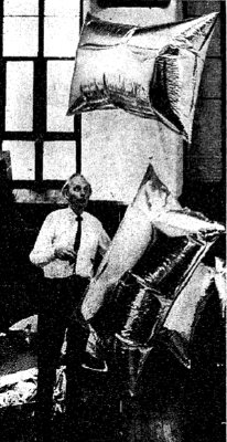
The report was about an art/technology “news conference ‘happening'” held in Rauschenberg’s loft, and attended by corporate and union leaders, and politicians, including Sen. Jacob Javits, who is shown with large, pillow-shaped Mylar balloons floating behind him in “the Chapel,” the two-story space at the back of Rauschenberg’s Lafayette St. building. [The occasion was a reorganization of E.A.T.]
They’re the same balloons Andy Warhol had used in his April 1966 installation, Silver Floations, which he’d learned about from Kluver. [Bell Labs, of course, was also the ground operator of the Mylar communications satelloons of Project Echo, which launched in 1960 and 1965.]
Anyway, 18 months later, it’s Kluver whose seen batting these balloons around, with nary a mention of Warhol to be found. Odd.
Willard Maas made an awesome short film about the show in 1966. It’s at YouTube or UbuWeb: