Collection in Transformation: installation view at MASP, São Paulo. photo: MASP via designboom
It’s been almost ten years since Adriano Pedrosa brought Lina Bo Bardi’s glass & concrete easels back to MASP in São Paulo, and I guess I thought the world would have long since filled up with photos from the back. It is literally the first thing I think about every time I see one.
Please note that this lot is displayed in a loan Venetian sixteenth-century carved and gilded cassetta frame from Arnold Wiggins & Sons, which is not being sold with the picture, but could be acquired separately. Please ask the department for further details about this and the picture’s original frame, which can be viewed on request.
Now, the Titian was stolen in 1995, and recovered at a bus stop seven years later, so maybe the frame’s seen some stuff, which is fine. The point is, though, maybe I don’t get behind enough 500-year-old paintings, but this Titian is mounted into its loaner frame with the corks from like ten bottles of wine, and I love it.
I think there is literally wine on the one on the upper right. Someone was putting in the work.
Édouard Manet Facsimile Object (M4), “Fleurs”, 2024, 22 x 13 7/8 in., dye sublimation print on high gloss aluminum, with handmade COA in India ink on Arches, signed, stamped & numbered, available until the sale at Sotheby‘s on May 15, 2024
I wish I knew how to quit you, Manet Facsimile Objects.
I thought they were done, products of the moment, the moment when we couldn’t travel, or shouldn’t, when the museums were closed, and when full-scale facsimile objects would serve as proxies, simulating the experience of being in the presence of the artwork.
an arrangement of Facsimile Objects: the OG peeking out from behind Credit Suisse Dürer Diptych
[They also each include a standing offer to exchange the original work for a certificated Facsimile Object, a liberatory gesture to help you, the new owner, to focus on yourself and your experience, and not worry for a minute over the work’s condition, state, or worth. I’m ready to exchange whenever you are; hmu.]
Édouard Manet Facsimile Object (M1) “Minnay”, 2021, a Facsimile Object of a painting that had never been seen in public, and which surfaced at auction for only 2.5 days during COVID
But now, in the midst of [gestures around to the city and the world] all this, the call has come forth, and it is impossible—for me, at least—to heed it. Andrew Russeth’s effusive invitation to visit Manet’s rapturous late still life, Vase de fleurs, roses et lilas (1882), at Sotheby’s in New York, where it is on view only until it is sold on May 15th.
Édouard Manet Facsimile Objects (M2) & (M3), 2022, based on Ann Getty’s Manets, of which “Bob” [left] turned up at the same Getty Manet show as the flowers of (M4) Fleurs. Then they were sold.
As Andrew notes, this is the only sure window of time in which to see this rare painting, which has only been exhibited three times in 50+ years. Of course, all three of those times were in 2018-2020, a generous gesture on the part of the unidentified seller. It is not at all known what the next owner will do, so we must strike while we can, and get to Sotheby’s if you can.
Édouard Manet Facsimile Object (M4) is for those who cannot, and also for those who will not buy the painting next week. Well, not everyone. If you have the means to buy this Manet and don’t, I really suggest you sit this Facsimile Object out.
There is an irrevocable bid, so the Manet will sell to someone, but if you’re thinking that no, anything beyond the $7-10 million estimate is irrational, and you, with your financial savvy, elect not to pay, do not get the ÉMFO (M4). If you think it will stand as a trophy to your sophisticated investorial victory while honoring your connoisseurship, LMAO no it won’t. If you have the means and still somehow decide not to buy this painting, I fear Facsimile Object will offer you cold comfort in your folly and a sober reckoning of your failure. Every time you look at its high-gloss aluminum finish, you’ll see yourself looking, and remember that you could have bought the Manet instead, and you didn’t. You’ll get a Facsimile Object from me—and a handmade Certificate of Authenticity—but you won’t have my sympathy. I can’t even promise you’ll get my pity.
If you actually take a run at it and lose, OTOH, I hope you have pre-ordered the Facsimile Object as FOMO insurance; because if you wait til the auction is over, it will be too late, and your regret will be doubled. For you, dear underbidder, my heart would ache, but the concept is inviolate. And of course, for the winner, a Facsimile Object is always set aside, and a trade is always on the table. Straight across, with the COA thrown in to sweeten the deal.
ceci n’est pas un Facsimile Objet: a Drouot representative simulating the experience of holding ÉMFO (M1) using Édouard Manet’s le Chien “Minnay” in February 2021.
Andrew calls this a “small picture,” but honestly, at 22×14 inches, it’s a large Facsimile Object, almost 4x the size of the previous ones. One unexpected thing about Minnay [and all subsequent FOs] was how tactile they are, how nice it feels to hold them. Until this week, I would have compared it to a luxuriously thin iPad. But whether in your hands, on a shelf, or on a wall, this will be a substantial presence, and it is, admittedly, daunting to think about.
In fact, this whole thing feels like folly. But maybe it’s just the folly we need in these darkening times, the folly of flowers, friendly gestures of fleeting beauty, which also give us a glimpse of ourselves.
Order Édouard Manet Facsimile Object (M4) “Fleurs”, with signed, stamped & numbered COA, before the Manet sells on 15 May 2024 around 8PM EST.
[15 May update: I will be offline during the sale, but to preserve the conceptual nature of the project, orders will only be accepted which arrive before the Manet lot hammers down. Thank you for your engagement.
OK, that was that, $8.5 million hammer, sorry Beijing underbidder, you may not get a Facsimile Object to assuage your loss.]
Sturtevant exhibition catalogue from the Everson Museum 1973, designed with Judson Rosebush, offset printed to look like Xerox, image: Tim Byers Art Books, c. 2019 NYABF
This is the catalogue for Sturtevant’s first and only US museum show until her 2014 MoMA retrospective. It is from 1973. The show took place at the Everson Museum in Syracuse, New York. The 104-page catalogue is offset print, but was designed to look like a sheaf of photocopies on regular 8.5 x 11 paper. Sturtevant had the concept, and Judson Rosebush helped design and execute it. While confounding the notion of copy and original, and the notion of books substituting for a seeing an exhibition, this design choice also echoes Seth Siegelaub’s 1968 conceptual exhibition in a catalogue, The Xerox Book.
“Elaine Sturtevant, grouping of 2 – hand-signed prints” is technically true, that there are two, they were printed, and someone signed them. but they are 11 x 8.5 in. pages from a book
But I don’t think people are chopping up The Xerox Book and forging Sol Lewitt’s signatures on his individual pages and trying to pass them off as actual prints. Oh. Maybe that’s only because there are so many color Lewitt catalogues they can chop up and forge signatures on and sell as actual prints.
The Everson catalogue’s all the Sturtevant there is, and it is definitely getting chopped up and turned into forged prints. I’m gonna go out on a limb and say that if Sturtevant DID chop up her own catalogues, sign individual pages, and sell them off as prints—or trade individual pages for a cup of coffee at Fanelli’s or whatever—it’d be a helluva coincidence that they all turn up at the same three scammy regional auction houses whose entire LiveAuctioneers.com presence is flooded with similarly “signed” “offset” “original prints” from dozens of other artists.
At this point I think it’s obvious that we need a photocopy facsimile of Sturtevant’s Everson catalogue, so people can see what she did, and appreciate it for what it is, not what it isn’t.
if there were a lime green python in this funerary box, what’d it look like? a speculation on a 1954 Robert Rauschenberg photo of Cy Twombly and his work in their Fulton St studio, image via RRF
In Spring 1953, after our boys got back from Morocco and Italy, Robert Rauschenberg and Cy Twombly set up a little place on Fulton Street. They spend a year making work and posing for each other. In 1954 Rauschenberg took several photos of Twombly with his paintings and sculptures, almost all of which are lost or destroyed, except for one, the one on the right, above, with the fans, Untitled (Funerary Box for a Lime Green Python).
Claudio Santambrogio emailed a funny reminder of it after seeing the Underground Projection Room For Snakes study I posted last night. So I made a little rendering of what it might be like for the python (RIP).
Sturtevant, Johns Painting With Two Balls, 1987, verso, image via Christie’s
If you were thinking we just saw Sturtevant’s Johns Painting With Two Balls at auction, you were right. Gerald Finberg bought the 1987 work in late 2019 at Phillips, and, I assume, had a couple of great years with it.
Now it’s on the rebound at Christie’s, who spice things up a bit by letting us hit it from the back. The three panel construction and the tapered cross bars are clearly visible and—presumably—like Johns’ 1960 original.
Lot 40C: Sturtevant, Johns Painting With Two Balls, 1987, 165 x 137.5 cm, in the Gerald Fineberg sale at Christie’s
The higher-res images also help make legible some of the fragments of the International Herald Tribune Sturtevant used (from April 23, 1987 at least, when the Stanley Cup was also underway) as she painted this thing in Paris[?].
Jasper Johns, Painting With Two Balls, 1960, 165 x 137.5 cm, collection of the artist, image ganked from Beach Packaging Design
The way we understand Sturtevant’s practice is that she repeated works but didn’t reproduce them, painting from the image in her mind, if not exactly “memory.” But the placement, shape, and even the layering of the brushstroke knots here makes me suspect that’s not how Two Balls went down. I think she used a color image for reference, and maybe even projected it. This is a stroke-for-stroke remake—a drip-for-drip remake, even—which feels categorically different from Sturtevant’s other projects [or at least how they’re presented and understood.]
It feels like there’s a Rauschenberg Factum reference here I can’t quite tease out. It’s not just as if two different people made Factum I and Factum II. It’s two different people made paintings with two balls, 27 years apart, and both of them were there when Rauschenberg made the Factums in the first place. But only one made this comparison possible, decades later, and that’s Sturtevant.
Yves Klein: With the Void, Full Powers, installation view at the Walker Art Center, 2011
In the 2010-11 retrospective of Yves Klein’s work organized by the Hirshhorn and the Walker Art Center, there was a wall (in DC) and a nook (in Minneapolis) filled with early, small-ish monochromes in a variety of colors that weren’t blue. They surrounded a vitrine with Klein’s amazing 1954 catalogue for an imaginary monochromes exhibition, Yves Peintures.
Yves Klein, untitled (M 109), 1955, 10×10 cm, oil on gauze on panel, being sold at Christie’s Paris
This little red square was not among them, but can you imagine if it was, looking like an emergency button in its gigantic, beveled frame?
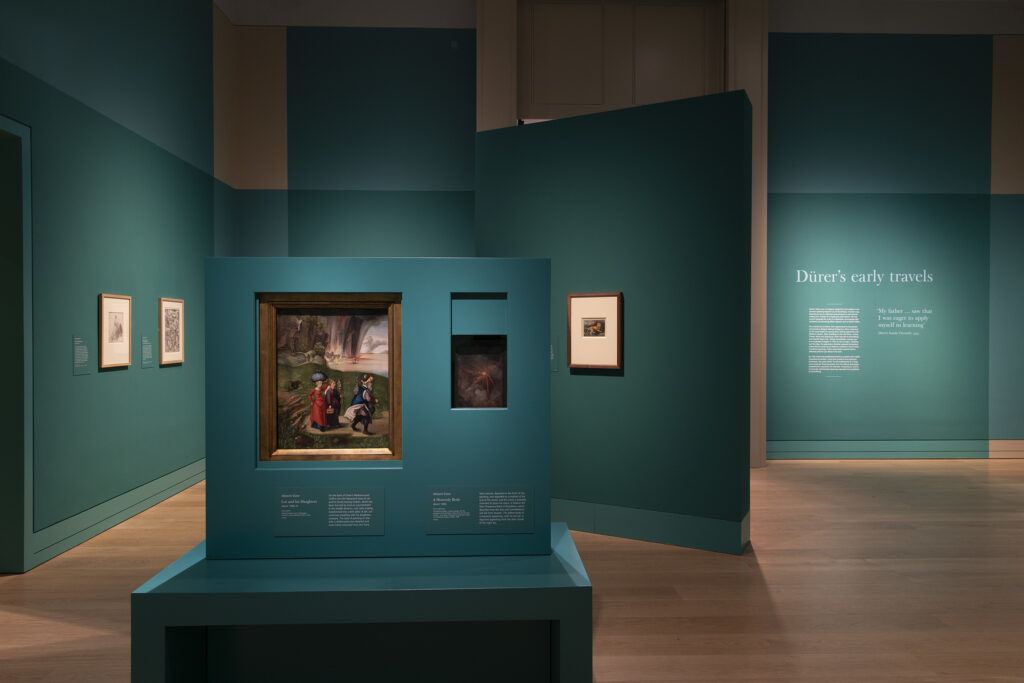
The Credit Suisse Dürer Diptych, as installed in the National Gallery in Winter 2021
No reason, but I woke up thinking about The Credit Suisse Dürer Diptych, a surprising pairing of two paintings which have ominous visions in the heavens and apocalyptic destruction raining down from the sky, beautifully painted on their reverse sides. Last year, in the midst of the Omicron surge, the National Gallery in London brought these two paintings together for a Dürer show sponsored by Credit Suisse.
Credit Suisse Dürer Diptych: Dürer Facsimile Objects (D3.38) and (D1), among others
I was reluctant to make Facsimile Objects of these paintings, but felt compelled by the concepts I’d constructed for myself and the project. It wasn’t my fault the world–or at least the museum–didn’t close to limit the spread of the pandemic.
Smooth Sailing: A certificate of authenticity for a Credit Suisse Diptych
And I don’t know when exactly, but very early on I decided not to show or promote the Certificates of Authenticity I was including. Actually, at first, it was because they didn’t yet exist when I was promoting the first FO, and I did not know how they’d turn out, or even what they’d be. Soon, though, I saw them, not just as part of the concept of a Facsmile Object, but part of the experience of owning it. Not secret, necessarily, but private, individual, and distinct from encountering the project online, where a jpg’s a picture. Some folks have since posted pics of their COAs online, or processed them with their registrars, and that is fantastic, the choice is theirs.
Anyway, for the Credit Suisse iteration, I also wanted to make the Objects distinct from the earlier versions, too. After some exploration and experimentation, I arrived at adding the Credit Suisse logo, a stylized set of sails, to the Certificate.
Looking at my janky rendition of 15th century German calligraphy reminded me that I used to know Richard Jenrette, one of the founders of the investment bank Donaldson, Lufkin, Jenrette. He’d attended the same high school as me in Raleigh, and returned to make a large donation, and I heard he collected houses. I filed that data away and decided to become an investment banker someday, whatever that was. Later on, as I was preparing to go to business school, I was introduced to him at, of all places, Christie’s. We’d cross paths occasionally at galas, art fairs, the Winter Antique Show, etc., and when he gave me a copy of his memoir, I sent him a thank you note. In the last chapter of his book about his amazing career innovating analytical models and methods to the financial industry, he also said he was very into handwriting analysis. I never saw or heard from him again after that, and I sometimes wondered if I’d been blackballed for some psychological flaw revealed in my handwritten note.
Jenrette had already retired, but in 2000 DLJ was acquired and absorbed by Credit Suisse First Boston. The brand lives on in a couple of private equity divisions, but it’s really not the same. Anyway, smooth sailing, Credit Suisse!
Untitled (worktitle), 2021, double-sided 15×20 cm print accompanying an artist’s book, ed. 30, image via mo-artgallery
I really do not going around during jubilee season looking for roadtripping pictures of the Queen to post; they come to me.
As someone who has been collecting old press photos for many, many years, I was very disappointed to see Thomas Ruff’s show of press photos at Zwirner in 2016. His approach to these prints, much-handled survivors of a quick and dirty daily newspaper publishing process, was to overlay the back annotations on the marked up front, and to print them in a giant, slick, digital format. [You can take the photographer out of Dusseldorf…]
Thomas Ruff, Untitled (worktitle), 2021, verso,
The print that accompanies a recent artists book, Untitled (worktitle), about which I can find almost no information, is different. It’s small, perhaps even original size, and it’s printed on both sides. It’s almost–can I say it?–a facsimile.
But what first caught my eye was the slightly blurry image itself, which gave me the momentary sense of envy-tinged-excitement that Ruff had snagged a press photo of an early, obscure Gerhard Richter.
Only to find out the whole book is press photos of the Queen. Oh well. Carry on, I guess.
Jasper Johns, Small Numbers in Color, 1959, 10 1/8 x 7 1/8 in., encaustic & collage on wood printing block, installed at the Philadelphia Museum of Art for Mind/Mirror, collection:the artist
I went to the Philadelphia Museum today to see the Jasper Johns exhibition before it closes. There’s a lot to like, and a few things to love. The absolute winner for me was a little painting, rarely shown, which Johns has kept for himself since making it in 1959. Small Numbers In Color is extraordinary, one of two superlative works in the gallery devoted to Johns’ use of numbers.
It’s small, around 10 x 7 inches, and painted in encaustic on wood. The catalogue raisonné (P74, btw) says the wood is “the reverse side of a printer’s block with metal type.” [Which, a block would have cast metal affixed in a permanent way. A case would hold the sorted metal type, and a frame would hold type that has been set. Even though the metal type is not listed as part of the work, it does make me wonder what it says. Or looks like.]
None of that is evident from looking at the front; all you see is a tiny riot of color with an over-all grid, and then, the shapes of individual numbers coalescing into a whole. It looks to me like it replicates the basic color composition of Numbers In Color, a large (67 x 49.5 in.) painting from 1958-59 which went into the Albright Knox Museum collection soon after it was completed. Given the CR chronology (P58 vs P74), Small Numbers is presumably a documentation, or a memorialization, of Numbers, maybe made before the large painting shipped off to Buffalo. [In Roberta Bernstein’s 1975 dissertation that was the first published catalogue of all Johns’ paintings & sculpture to that point, Numbers in Color comes first in the 1959 works list, and Small Numbers comes almost at the end.] Who knows? There is almost no discussion of the work online. Actually, Johns Friend Craig Starr might know; the last time it was exhibited publicly was at the inaugural show of his gallery, in 2004.
Jasper Johns, Figure 3 (1960), a double-sided painting, installed in a column at the Philadelphia Museum of Art’s Mind/Mirror. Collection: Yale Art Gallery
The other standout from the same gallery is even smaller. Figure 3 (P84), from 1960, is Johns’ only double-sided painting. The 9×6 painting is framed so that both sides are visible. The verso is an approximation of the front, reversed, as if it were painted on a transparent ground, not canvas. The precise-enough brushstrokes of the back make their simulating point in the same way Small Numbers echoes Numbers.
Jasper Johns, Flag (P56), 1958, silk printed flag, paraffin, in wooden frame, 2 3/4 x 3 3/4 in., via JJCR
Which is interesting, but is only a part of the fascinating intimacy of the very small artworks Johns created (creates?). The Whitney had a whole gallery of them, miniature examples of some of Johns’ most relevant motifs. In addition to the tiny silk flag encased in wax Johns made for Merce Cunningham, barely the size of a credit card, my favorite was the 3-inch encaustic Figure 2 (1959) made for Astrid and David Myers to celebrate the birth of their second child.
Jasper Johns, Figure 2, 1959, 3 x 2.75 in. encaustic on collage on canvas, originally made as a baby gift for a friend’s second kid. image via the JJCR
Besides the major concerns of Johns’ practice, these instantly recognizable works come with bonus content–like 2 for the second–and bonus context, marking the artist’s social network, his community of supporters and interlocutors. [Philadelphia has a vitrine filled with small artworks he received as gifts from Japanese contemporary artists he met while visiting in 1964. The so-called “hermit of Sharon” in fact trades art with his colleagues, and makes art for his friends.]
Part of the appeal of these works is that they exist outside the market–or at least they were created and first exchanged that way. Their miniature size is still determined by the market, though; even by the end of 1958, it would feel a bit much for someone to give a full-scale, “real” [sic] artwork, one that could be seen as having “real” market value. [Or worse, one that doesn’t, in which case, you’re assuming and asking a lot if you give a whole-ass painting to someone as a gift.] So they have to function on an emotional, personal level, as a gift, a gesture, but also as something the mind already knows–in this case, a Johns painting.
And of course, like the question, “Is it a flag or a painting of a flag?” these gift works are both gifts and works: Figure 2 has traded hands seven times and been auctioned twice since little Coco Myers turned 18.
I mean, by the museums in Germany and the UK reopened last May, and the Dürer Facsimile Objects in that first diptych were discontinued, I did bleakly anticipate their related Dürers might become unvisitable in person again. I was also naively relieved to not be in the business of selling Tastily Painted Destruction of Sodom and Gomorrah pictures. And here we are.
What I did not anticipate, however, was that at a moment when travel restrictions were returning, the National Gallery would title its new Dürer show, “The Credit Suisse Exhibition: Dürer’s Journeys.” And I definitely did not imagine that they’d promote the show using a literal diptych of verso paintings. Why, just look at A Heavenly Body[? A Heavenly Vision?], on the back of the National Gallery (London)’s own St. Jerome; and the Lot and His Daughters painted on the back of National Gallery (DC)’s Haller Madonna, together at the very center of the awkward and weirdly empty exhibition photo up top. We’ve come a long way, and yet we have not.
The thing I’m most appalled by, though, is that despite a 60% jump in COVID case levels since I started *writing* this post, to the highest levels of the entire pandemic, and 10x even New York’s current spike, it appears that the Her Majesty’s Government is dragging their feet on issuing any restrictions, for fear of what impact a negative public reaction might have on Boris Johnson’s hold on power.
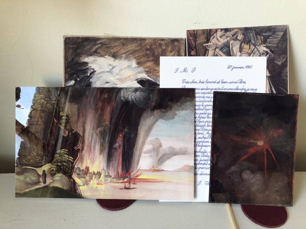
Dürer Diptych: Albrecht Dürer Facsimile Objects (D3.38) and (D1), together for the first time, thanks to the omicron variant surging into The Credit Suisse Exhibition
So while previous Facsimile Objects mitigated art encounters you couldn’t have, this new Dürer Diptych based on the National Gallery’s exhibit is meant as a hedge for an experience you shouldn’t have, at least right now. And so, The Credit Suisse Dürer Diptych: Dürer Facsimile Object (D1) A Heavenly Vision is available along with Dürer Facsimile Object (D3.38), The Destruction of Sodom and Gomorrah, a full-size detail of 38% of the original painting, conceptualized last spring when the NGA reopened, that focuses on the painterly joys of fire, brimstone, vegetation, and that brushy, little black pillar of salt that used to be Lot’s wife.
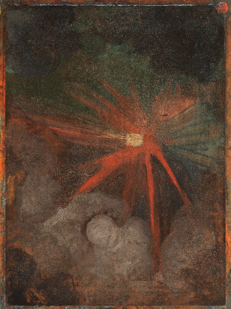
Albrecht Dürer Facsimile Object (D1), 2021, 9 x 6.75 in., dye sublimation pigment on (obv) high gloss aluminum panel, available again, only as part of The Credit Suisse Dürer Diptych
If you think about it, a fiery meteorite crashing to earth and sulfur and fire raining down from heaven go together quite nicely; the apocalyptic symmetry was surely not lost on a young Dürer who, with the year 1500 fast approaching, was already thinking about the end of the world.
Albrecht Dürer Facsimile Object (D3.38), 2021, 9 x 14.5 in., dye sublimation pigment on high gloss aluminum panel, available as part of a Dürer Diptych, or separately, while Omicron rages
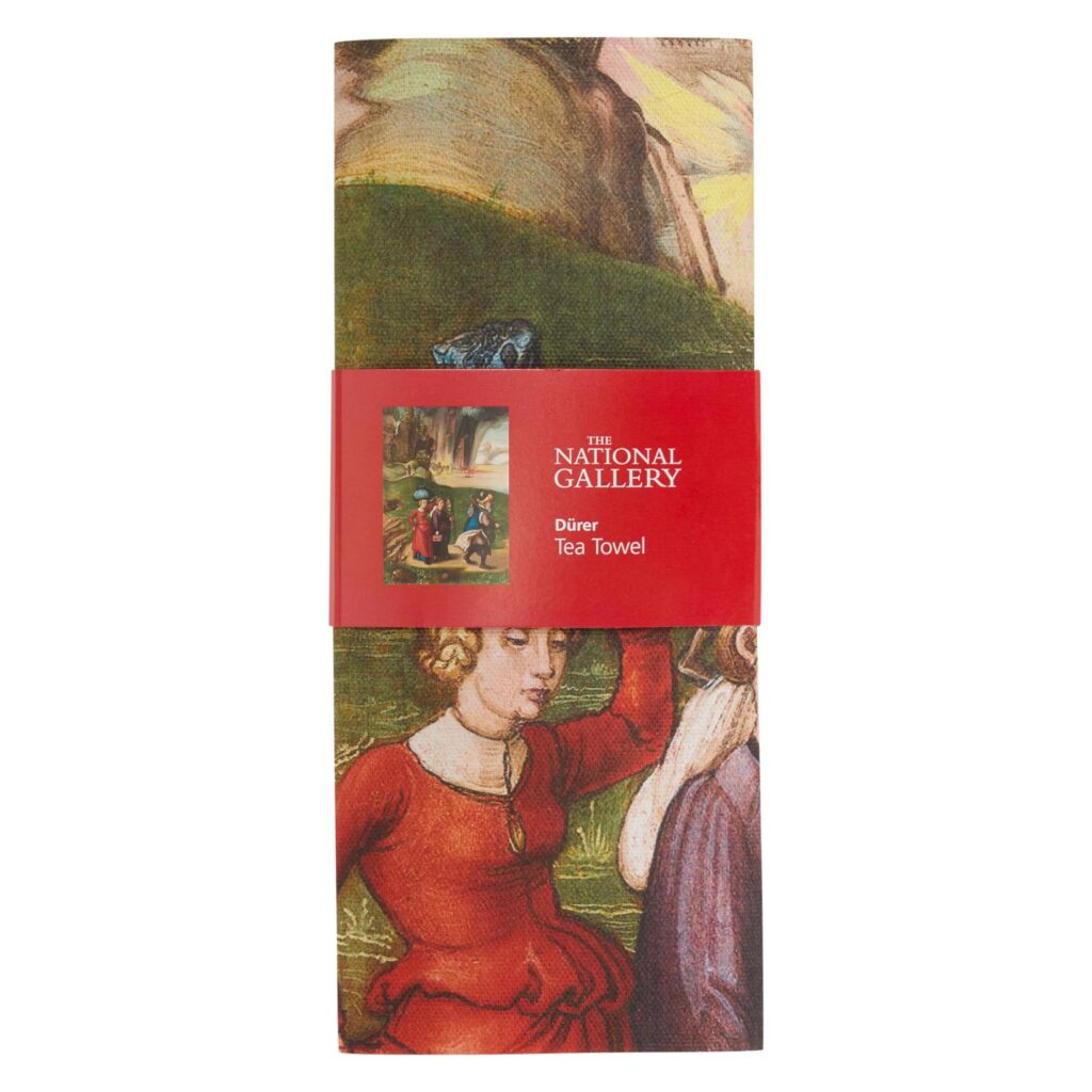
The National Gallery Dürer Tea Towel, featuring the destruction of Sodom & Gommorah, £8.95
In consideration of those who might have acquired an AD FO (D1) already, AF DO (D3.38) will be available separately. Each Facsimile Object is accompanied by a full-scale, certificate of authenticity handmade in India ink on Arches. ADFO(D1) certificates will be distinct from those produced last spring, as a treat.
If the National Gallery actually does close to slow the spread of COVID, these Facsimile Objects will be available only until it reopens, or until, like with the Vermeers, it becomes official that the show will not reopen. If the National Gallery and its partner Credit Suisse don’t do anything, and just take their couple of days off during Christmas break, I will probably end this futile folly when that becomes clear, either on January 27th, or January 2nd. What a world.
2 January UPDATE: Turns out making shiny facsimiles of paintings or parts of paintings available is not enough to defeat the omicron surge. If only I’d sent them to every house in the UK instead. Or even to every Credit Suisse client.
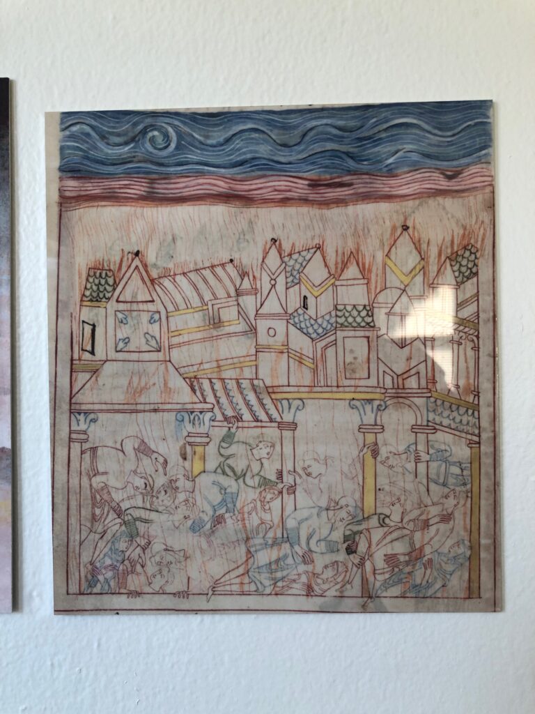
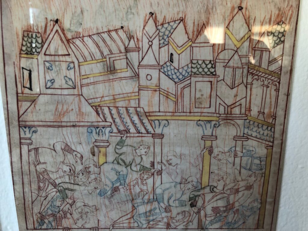
Old English Hexateuch Facsimile Object (H1), the Destruction of Sodom, 8.5 x 7.5 in., with wonky cropping
There was something beautiful and haunting and unexpected about the depiction of the destruction of Sodom from a medieval manuscript that got tweeted across my timeline the other day. Medievalist Dr. Erik Wade’s thread highlighted the blissed out, same-sex residents comforting each other, even as the city burned around them. I was also taken by the delicate line drawings, more refined than marginalia, but clearly less than fully filled in. I hesitate to say it is unfinished, though. The tangle of figures look so similar to each other, for a minute I wondered if the illuminator was tracing them.
closeup view of FO (H1)
It’s from a late 11th-century manuscript known as The Old English Hexateuch, the earliest known English translation of six books of the Old Testament (basically, the Torah plus Joshua). Cotton MS Claudius B.iv, a name derived from one of the founding collections of the British Library, includes almost 400 illuminations in various states of detail. They depict the stories of the Bible set in the contemporary Anglo-Saxon milieu the manuscript’s lay audiences would recognize immediately.
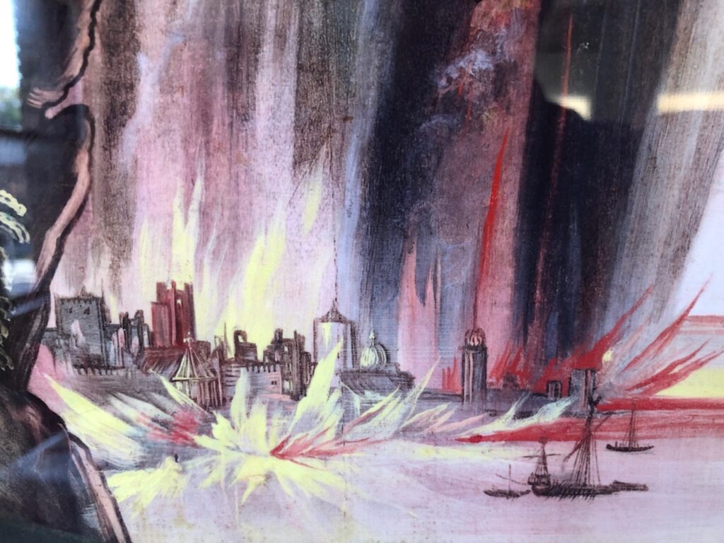
Detail from Dürer Facsimile Object (D3.38), 2021
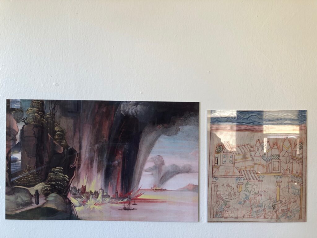
I did not plan on making a Facsimile Object of Dürer’s verso painting of the Destruction of Sodom, but the brushy allure of the flames raining down on the cities proved irresistible. Now again, I find that the delicate lines depicting the victims, and especially the sketchy flicks of flame everywhere, made me want to hold the manuscript in my hand. As this was impossible, I made another Facsimile Object. Now I have an unlikely diptych, from centuries and countries apart, of an unlikely and terrible scene.
Depressing but beautiful: Facsimile Objects of the Destruction of Sodom
Not gonna lie, they hit a little differently now, when wildfires are raging across three continents, than in May, when I made the first one. So far Facsimile Objects have engaged with the present only temporally, by marking a (lost) moment in time: a missed auction preview, a pandemic-closed museum, the sale of a painting, a surprise Summer show. But with some religionists repeating the medieval model of blaming a conflagration on the existence of gay people, this pair of Facsimile Objects connects on a content level as well.
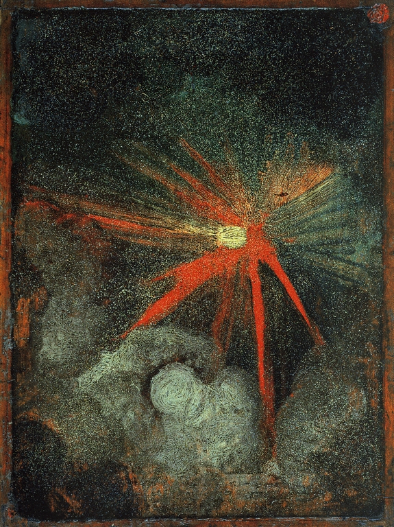
Verso: Heavenly Body, aka Cosmic Phenomenon, attributed to Albrecht Dürer, c. 1494-7, 23 x 17cm, oil on pearwood panel, collection: National Gallery, this low-res image, of the unframed panel, is via casaforte.blogspot.com, but originated on tumblr before 2013. I would really like to know the source, because the National Gallery’s image is cropped, and loses the wax seal in the upper right corner, as well as the general sense of objectness.
There are no more than two paintings by Albrecht Dürer in a public collection in the United Kingdom. One is this swirling, brushy depiction of an explosive, cosmic phenomenon on a small pearwood panel. The other, a meticulous devotional picture of St. Jerome in the wilderness, is on the other side of the same panel. The panel was only attributed to Dürer in 1957, and was acquired by the National Gallery in London in 1996.
Like all England’s museums, the National Gallery has been closed to visitors since December 2020, when a Tier 3 lockdown went into effect to reduce the transmission of the COVID-19 virus. According to current government indicators, museums will remain closed until at least May 17. So assuming it’s really by him, England’s only Dürers will remain inaccessible for at least several more weeks.
While considering whether an Albrecht Dürer Facsimile Object could offer even a partial experiential hedge during this challenging, Dürerless time, another, similar Dürer suddenly became similarly inaccessible.
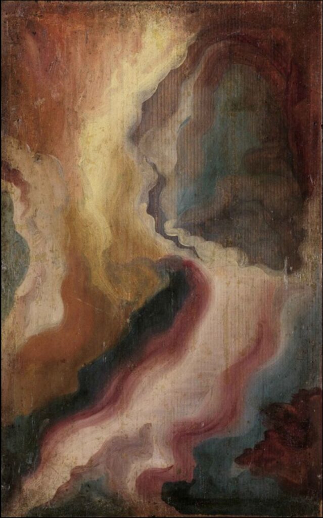
Albrecht Dürer, painting of a slice of agate, c. 1492, oil on panel, 30.1 x 18.4 cm, collection: kunsthalle-karlsruhe.de
Another small oil, c. 1492, depicts a swirling abstraction of sliced agate or other hardstone, painted with a transparency that permits the grain of the fir panel to show through. On the other side of this panel is another small devotional painting, a gold ground picture of Christ, Man of Sorrows, which was attributed to Dürer a few years before 1941, when the Nazis’ favorite art dealer Hildebrand Gurlitt sold it to the Musée des Beaux Arts in occupied Strasbourg. It subsequently crossed the Rhine, and is now at the State Kunsthalle in Karlsruhe, which was closed on March 22 when German health officials abruptly declared lockdowns to thwart a “third wave” of the pandemic. The government then changed some restrictions after a backlash, but I think the Kunsthalle is closed until at least April 18.
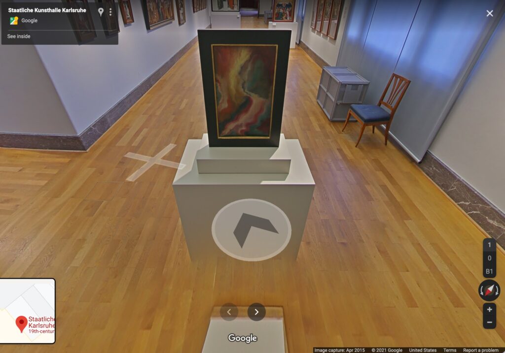
Verso: a flaming color spectacle? c.1492-3, oil on panel, 37x26cm, collection State Gallery in Karlsruhe, via Google, obv
“If a work is on Google Street View, does it even need a Facsimile Object?” is a question that came to mind. But then I wondered what would happen if these two works were decoupled from the paintings they are physically twinned with, the works they were fated to be “behind,” always understudied and overshadowed by? Facsimile Objects might hit different with this not-quite-a-pair. So let’s see.
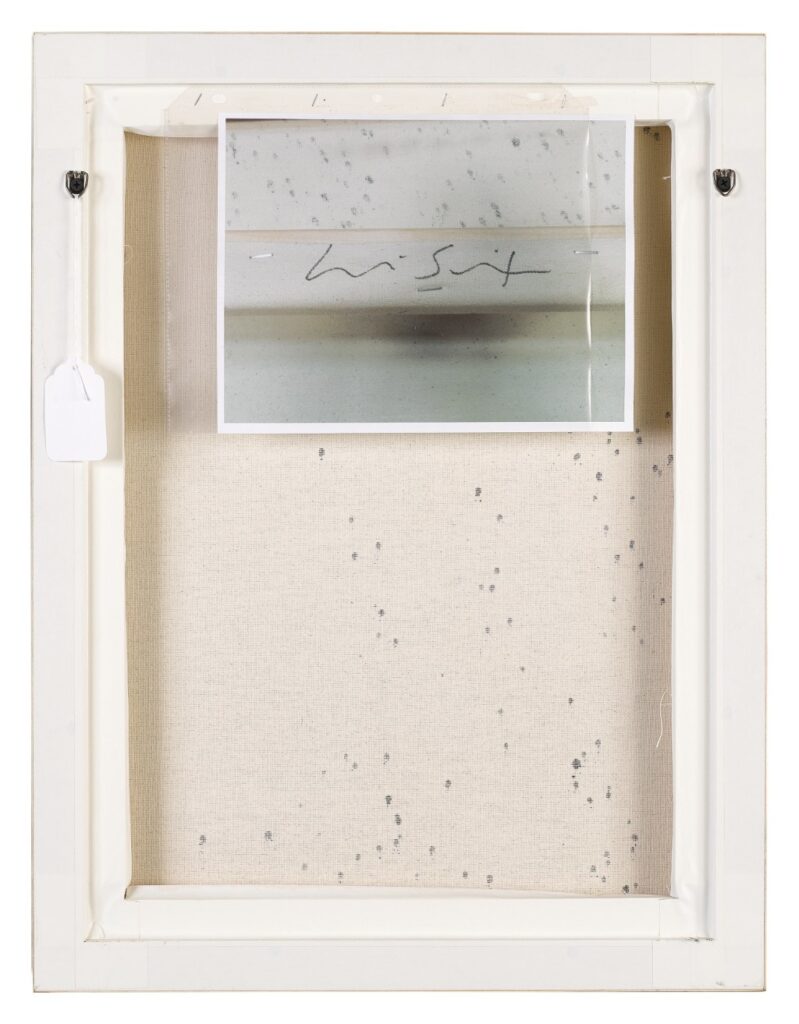
Untitled (Lucien Smith), 2020, 8×10 in. digital print in 3-hole, acid-free sleeve, ed. 1/2+2AP, installation shot via sothebys.com
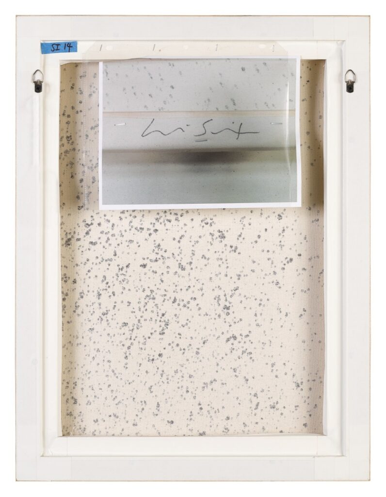
There so many things to catch the eye and tempt the paddle in Kenny Schachter’s second storage-clearing sale at Sotheby’s. One of the most interesting things to me is the veteran collector/dealer/connoisseur’s confidence in attaching shadow box-style frames and tape right over the overflap signatures of his two small (24×18 in.) Lucien Smith Rain paintings.
The next most exciting thing was seeing my newest work, Untitled (Lucien Smith), installed on the back. Believe me, the only person more surprised than me is probably Kenny.
Anyway, the photo, a detail of Smith’s signature on Reality Bites 10, 2012, is inserted in an acetate sleeve, and is an edition of two, with two APs. No. 1/2 is installed on the verso of Lot 35, Lucien Smith’s Reality Bites 10, above, and no. 2/2 is currently installed on the verso of Lot 37, Lucien Smith’s Reality Bites 9, below.
Untitled (Lucien Smith), 2020, 8×10 in. digital print in 3-hole, acid-free sleeve, ed. 2/2, + 2AP, installation image via sothebys.com
Both sales end tomorrow, December 17. The winning bidder of each of these lots is welcome to contact me for a certificate documenting their bonus acquisition, upon verification, of course. Artist proofs reside in copies of Smith’s 2012 exhibition catalogue, Small Rain Paintings. In case you miss out on the 17th.
installation view, “Tell Me What I Mean,” at To_____Bridges_____ 11 Sept – 23 Oct. 2016, image: John Garcia
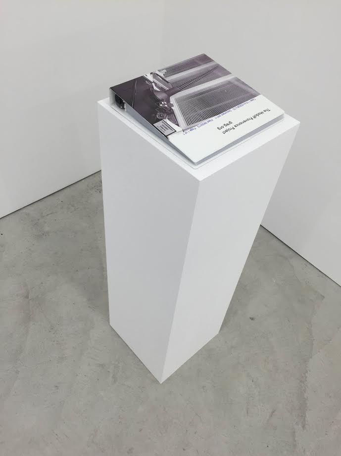
I’m psyched to announce that The Madoff Provenance Project is included in a group show, “Tell Me What I Mean,” at To_____Bridges_____ in NYC, which opened Sept 11 and runs through October 23rd, 2016. The show, curated by artist John Garcia, considers the way context and metadata affect the way an artwork is experienced and understood. study for MPP-014-KEL, 2016, recto, 12×9 in., ink, pencil, and watercolor on Arches
John was thoughtful and intriguing in his invitation to include the Madoff project, which did not have any obvious physical manifestation. But meeting that challenge, and having the work seen among an interesting group of artists, made me say, “Hell, yeah” pretty quickly. Besides me, the show includes work by Sophie Calle, Sara Cwynar, Robert Heinecken, Rose Marcus, Alex Perweiler, Peter Piller, Michael Bell-Smith, and Colin Snap. study for MPP-020-MAT, 2016, recto, 12.875 x 9.25 in., ink, pencil, and marker on Arches
Unsurprising to most, no owner of an authenticated Madoff-provenance artwork has yet agreed to have their work stamped with the “ex collectio MADF” stamp I created. So for this show I made “studies,” 1:1 facsimiles of some Madoff works, properly stamped. In their stripped down nothingness, they definitely turned out more Stephen Prina’s The Complete Paintings of Manet than Vik Muniz’ Verso.
“Tell Me What I Mean,” Installation view, The Madoff Provenance Project, 2014- , image: John Garcia
I also put together a few binders of court data and auction records, which serve as a comprehensive reference to all the artworks in the Madoff Provenance Project. I feel confident that if Mel Bochner could have had Zazzle custom print the binders for Working Drawings and Other Visible Things on Paper Not Necessarily Meant to be Viewed as Art, he totally would have.
To____Bridges_____ is a year-long project space in the Bronx run by The Still House Group. A second show of photographer Gary Perweiler’s 70s and 80s advertising images, recontextualized by his son (and TSHG member) Alex Perweiler, runs concurrently. The space is open by appointment. To_____Bridges_____ [to-bridges.info] Ex Collectio: The Bernard Madoff Provenance Project