Indie Game: The Movie: The Case Study


Lisanne Pajot and James Swirsky’s story of the making of Indie Game: The Movie is almost as awesome as the movie itself. They’ve done on an epic scale what I’d envisioned doing when I started this blog 11 years ago–and they’ve done much, much more.
And now they’re in the middle of recapping their experience making, marketing & distributing IG:TM, and the tools and platforms they used to do it.

Indie Game: The Movie (IGTM) is very much a product of our times. This film could not have been made & released the way it was five years ago, heck, not even 2-3 years ago. The film, and us, are hugely indebted to the technology, tools and evolving audience attitudes that made all this possible.

Indie Game: Case Study: Tech & Audience

A de C

judd_adec_nytimes.jpg
The first and last time I saw this truck, Donald Judd’s ranch truck, was in the early 1990s, in Marfa. I swear this logo for the ranch, Ayala de Chinati–or am I hallucinating?–used to be painted on the door of 101 Spring St.
Anyway, I’ve been looking for it again all these years because I’ve wanted to knock it off for myself, for my letterhead, if not for the door of my truck, and I couldn’t remember exactly how the letters-in-letters thing went. So I’ll get right on it.
An Artist’s Truck That’s No More Than It Needs To Be [nytimes]

‘Whites, Lancaster, Oh, US’

romney_whites_01.jpg
I realize that if I don’t mention these now, I never will. Because by this time tomorrow–or the next day–all will be right with the world again. Mitt Romney will have an abundance of time on his hands, and, most importantly, as The Awl’s annotators so ably note, White House photographer Pete Souza’s long nightmare will be over.
Here are some rather amazing photos, almost two weeks old now, yet among the most recent to be posted to Mitt Romney’s flickr stream, which is apparently the red-headed stepchild Log Cabin Republican to Instagram’s Tea Party.
They’re from a rally in, seriously, “Whites, Lancaster, OH, US,” which simultaneously creates and conquers the mashup genre of photo-geotag-as-poetry-and-political-commentary.
Cox and Linkins are right to marvel at the WTFlighting because, holy smokes, the rally is being held at what cinematographers call “the hour before Magic Hour, where everything is drenched in either horrible raking light, shadows, or lens flares.”
This is the stagecraft operation that seeks to inherit the mantle of Scott Sforza, the architect of the Mission Accomplished banner on the deck of the USS Abraham Lincoln, which aircraft carrier he turned to catch the real Magic Hour.”
romney_whites_lens.jpg
With the setting sun lighting up a few buildings behind/around them, the Romney campaign fired up their rally stage, set in the middle of the intersection of Broad and Main in Lancaster, with two giant floodlights. Which also hit the crowd. No need to estimate how many people attended–you can count every one of them. They seem to fill around half the planned space, with the oldest of the old making sure the distant bleachers don’t go to waste.
romney_whites_crowd.jpg
Here is my favorite glare, a photo I call “Idle-Class Tax Relief”:
romney_idle-class.jpg
I assume it’s a wide-angle lens or whatever, but it’s fascinating to me how disorienting the perspective is on these photos. The size of peoples’ heads. The indeterminate scale of that flag and those letters behind. And all uniformly in/slightly out of focus. Just so wild. It’ll be good to be done with it.

Photos Of Two Men Jumping At Sculptures

I really don’t know what else to call this, and there’s nothing I can think to say about it, except that I came across these two press photos, shot many years and miles apart, of men jumping up to touch a new sculpture.
The first, from 1961, shows Atlanta mayor William Hartsfield testing a mobile in the terminal of the airport that would eventually bear his name. It’s for sale here from Historic Images:
hartsfield_mobile_1961_hi.jpg
The second shows an unidentified office worker in the sunken plaza of the McGraw-Hill Building, part of the Rockefeller Center expansion finished in 1972, trying to reach the tip of Athelstan Spilhaus’s sculpture, Sun Triangle. It’s for sale here:
sun_triangle_rockctr_hi.jpg
The photo has no date, but Sun Triangle was installed in 1973, which matches those folks’ look. Better known as a scientist than as a sculptor, Spilhaus aligned the sides of Sun Triangle to align with the sun on the equinoxes and solstices. He was also the guy behind the balloon that crashed in Roswell in 1947.

‘You Need A Donation To Get In Line’

romney_storm_reutersbuzz.jpg
image: Brian Snyder/Reuters via Buzzfeed
Mitt Romney’s campaign had already printed the “Victory Rally” press passes when they hastily decided to turn an Ohio stump speech into a “storm relief event” yesterday. So Romney could be photographed receiving canned food and other supplies donated by his supporters. Which would be loaded onto a waiting Penske truck and, presumably, driven to New Jersey or wherever.
romney_storm_nyt.jpg
image of Mitt getting crosswise via Jonathan Crowley/NYT
As Buzzfeed reports, though,

the last-minute nature of the call for donations left some in the campaign concerned that they would end up with an empty truck. So the night before the event, campaign aides went to a local Wal Mart and spent $5,000 on granola bars, canned food, and diapers to put on display while they waited for donations to come in.

Those prop supplies came in handy when supporters who didn’t have something to ‘donate’ still lined up, wanting to meet their man; a campaign staffer. “Just grab something,” they were told. And they did.
I would love to find photos of the same case of Gatorade being re-donated several times.
mitt_romney_storm_relief.jpg
But it sounds like Mitt only actually worked the line for 30 minutes, so the campaign’s Walmart stash probably held up. And I guess it’s not important at what kind of shelter Mitt’s Penske truckload of storm relief props ends up, as long as Paul Ryan is on hand to restack them.
The Making of Romney’s Storm Relief Event [buzzfeed]

Sforzian Pano

Oh, Romney, Romney, Romney.
romney_big_tent.jpg
This Romney staffer’s Instragrammed collage of a Las Vegas rally has been making the rounds because, holy smokes, people, everyone knows that the Republican tent is not that big, and anyway, right now it only has one pole: just cold say and do whatever the )$#( it takes to beat the black guy.
Which, even so, should put such a baldly distorted, manipulated image on the far side of WTF. So far, in fact, that it makes me think it really has to be attributed not, for once, to their propagandistic lying, but to a glitch from an auto-pano-stitching algorithm.
I tried to find the link again, but I’ve seen the iPhone 5’s new panorama function occasionally erases moving cars. Do any non-partisan panorama people recognize this as typical of a particular app, or smartphone?
Previously and definitely related, and wow, really? “Whatever It Takes?” on 10/28/2004? Sforza now spelled with a CTRL-V

Louis Kahn’s Monument To The Six Million Jewish Martyrs

kahn_nyc_jews_memorial.jpg
I recently came across this photo of Louis Kahn’s “Monument To The Six Million Jewish Martyrs,” which, I had no idea. And it was to be built in New York City, Battery Park, to be exact, and was perhaps the last best chance for an apparently serially disastrous effort to build a Holocaust memorial in the city. Ultimately, of course, the city did get the Jewish Memorial Museum in the 1990s, in Battery Park.
There is no doubt a story to tell about the tumultuous history of that process. And I’m sure someone has already written a decisive history of how people attempted to grapple with the Shoah and Holocaust as history, and how and when those concepts took hold. Because they’re absent from the contemporary discussion of this memorial. But what really sticks with me is the story and particulars of Kahn’s memorial design, and how resonant it seems with memorials followed it.
Kahn was recommended by an Art Advisory Committee [via Philip Johnson] that had been brought in in 1966 to help the Committee to Commemorate the Six Million Jewish Martyrs solve their seemingly impossible charge: creating a suitable memorial to genocide. The NY Times’ architecture critic Ada Louise Huxtable complained that the previous designs were full of “wrenching angst” in which “the agony and the art were almost too much to bear.”
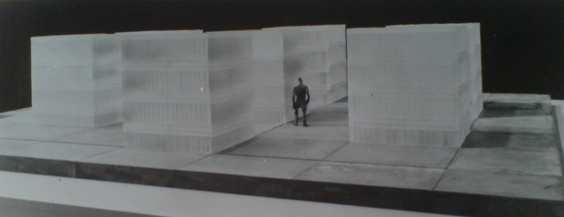
After the City Art Commission approved it, Kahn’s 6-foot model was put on impromptu display in the lobby of the Museum of Modern Art for month, from Oct-Nov. 1968. Which is when Huxtable praised as architecture and sculpture “of the highest order”:

In an age that has made a flat mockery of conventional memorial values and platitudes, Mr. Kahn’s solution is a cool, abstract, poetic, powerful and absolute statement of the unspeakable tragedy. It could rank with the great works of commemorative art in which man has attempted to capture spirit, in symbol. for the ages.

And in case you needed any more reminder that memorials are as much an expression of the time they’re created, not just the history they mark, here’s Huxtable’s final judgment:

The generation that lived through the time and events the monument proposes to commemorate will never forget them. We have that memorial seared in our souls.
The generations that are innocent of this kind of totalitarianism and ultimate tragedy will find no monument meaningful. That is one of the anachronisms of art and history in an age of violence.
This memorial could work, as art and as history, and as a lasting expression of the human spirit. In a nihilistic, value-destroying society, that is no mean artistic accomplishment.

Yow, no Summer of Love here.
Kahn’s Monument was to consist of seven 10×10 squares, 11 feet high, made entirely of elongated, cast glass brick, and arranged 2-3-2 on a 66-ft square grey granite plinth. [His original design, presented to the Committee in 1967, called for nine 12x12x15 squares in a grid. I think the switch to 6+1 was a way to Judaize and particularlize the memorial’s content.] The translucent bricks meant that the blocks would change with light, weather, and the presence and movement of people around the site. Only the center cube would be inscribed and accessible; as Kahn put it, “The one, the chapel, speaks; the other six are silent.”
I think Kahn’s 1967 proposal is at least one of the earliest, if not the first, deployments of Minimalism in a memorial context. Or maybe Post-Minimalism is more accurate, since Kahn’s evocative forms and their deliberate emotional and experiential evocations were anathema to the objective Gestaltism of orthodox Minimalism as it was being argued out at the time.
If the history of using a Minimalist formal vocabulary for intractable memorials typically began with Maya Lin’s Vietnam Memorial, then Kahn’s Monument pushes it back 15 years–to the conflict-torn heart of the Vietnam era. And though it wasn’t realized as he envisioned, Kahn’s proposal was influential. It’s the best explanation I can see for for the use of glass block in New York State’s disappointing Vietnam Veterans Memorial on Water Street in lower Manhattan. [That memorial’s plaza siting was probably also influenced by Huxtable’s unequivocal condemnation of the Battery Park site for Kahn’s memorial, an insurmountable criticism which probably doomed the design she praised so highly.] More directly, though, Kahn seems like a direct progenitor for the two most prominent Holocaust memorials built in Europe to date.
whiteread_judenplatz_memorial.jpg
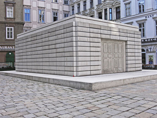
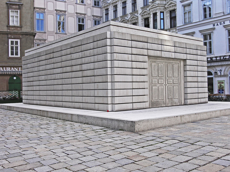
Kahn’s formal references to the silenced, the room-scale, and the bookshelf-like bands of glass brick are all echoed in Rachel Whiteread’s Judenplatz Holocaust Memorial, where a ghostly library of books the city’s murdered Jews will never write stands on a plinth in a public square in Vienna. Whiteread’s memorial has obvious precedents in her own sculptural practice, and I’ve never seen her mention Kahn as an inspiration, so it’s entirely possible that these resonances are natural and widely held, and which the artist and architect arrived at separately.
eisenman_memorial_godfrey.jpg
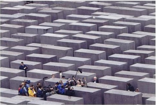
Amazing shot of Peter Eisenman at the 2004 opening of his Berlin Memorial from Mark Godfrey’s book, Abstraction and The Holocaust
I can’t believe that’s what went down, however, with Peter Eisenman and Richard Serra. From its central formal device–passages between impenetrable, figure-dwarfing blocks–to its title, Memorial to the Six MIllion Murdered Jews of Europe, Eisenman and Serra [who subsquently removed his name from the project] had to have been very familiar with Kahn’s proposal, and with the politically fraught development process that spawned it.
Oh, look, Mark Godfrey’s 2007 book Abstraction and the Holocaust has an entire chapter on Kahn’s Monument. [amazon, google books]
Anthony Vidler wrote about Kahn’s memorials [cooper.edu]
The Louis Kahn Collection at UPenn has drawings and a different model of the memorial. [upenn.edu]

We Go Now To Our Man In Donaueschingen

I’ve been listening to [relatively] a lot of La Monte Young lately, and [slightly less] Tony Conrad–which is harder to work to. And the Cage, of course, because he’s the composer this month in the kids’ school [!]. So it’s all so much that when the radiator kicked in the other day, the kid asked if that was my music.
But is there any other group who’s not so on board with the all-sound-is-music concept than classical orchestra musicians? Perhaps not. Which is a bummer.
Though I doubt a Cageian centennial revolution is the justification for the budget cuts to Southwest German Radio orchestras that have spawned several protests at the Donaueschinger Musiktage new music festival.
Like this amazing protest which New Yorker music guy Alex Ross posted on his blog. Oh, and on YouTube, he is the poster, not just the linker.

A violinist playing a continuous tritone as political protest.
Ich war ein Orchester [therestisnoise]

The Denver Art Museum In The News

I really shouldn’t do this, but there are just too many for me to hoover up by myself.
eBay seller Lexibell currently has a big stash of vintage press photos from the Denver Post that includes hundreds of pictures from and about the Denver Art Museum.
ponti_denver_duane_howell.jpg
Among the highlights, this March 1970 shot of the Museum’s highly anticipated, Gio Ponti–designed art fortress. Post staff photographer Duane Howell’s photo ran with a story that in fact, the museum folks were so excited they couldn’t wait until the building’s scheduled completion in 1971, so they were holding their gala there in April.
denver_judd_roof.jpg
Stunning Judd aluminum boxes on the roof of Ponti’s completed building in 1971. You’re only seeing this now because I bought it, obviously.
Here’s Ed Sielsky’s 1969 photo of Don Bell looking through a chromium & glass “cube” by “designer” Larry Bell:
larry_bell_denpost_1969.jpg
Several shots of Carol Walmsley [“Carol Walmsley likes her job.”]
carol_artrek.jpg
and her Colorado Artrek big rig, a museum-in-a-semi that she drove around the state, bringing exhibitions and educational programs to citizens beyond Denver.
denver_artrek_01.jpg
Which is perhaps inspired by the NEA’s 1971 project, Art Fleet, which was supposed to take masterpieces around to the people in trucks and inflatable dome pavilions. But which never happened.
Meanwhile, back in Denver, there are other party pics, including lots of shots of festive hats from the 1951 Mad Hatters Ball. This one looks postively Calder tin can Christmas Tree-esque:
denver_mad_hatters_2.jpg
denver_museum_mad_hatters.jpg
And to close it out, here’s a Jan. 1987 shot by Brian Brainerd captioned, “Celebrities ponder art at the Denver Art Museum.” And yes, that is then-museum director Richard Teitz with/near Ted McGinley with Shawn Weatherly, at a pivotal moment in their careers between Revenge of the Nerds and Married With Children and Police Academy 3 and Baywatch, respectively:
denver_museum_celebrities.jpg
And there are currently 700 more like this.

Homeless Hotspot

ryan_soup_ap.jpg
From the Washington Post report, “Charity president unhappy about Paul Ryan soup kitchen ‘photo op'”:

He added: “The photo-op they did wasn’t even accurate. He did nothing. He just came in here to get his picture taken at the dining hall.”
Ryan had stopped by the soup kitchen for about 15 minutes on his way to the airport after his Saturday morning town hall in Youngstown. By the time he arrived, the food had already been served, the patrons had left, and the hall had been cleaned.
Upon entering the soup kitchen, Ryan, his wife and three young children greeted and thanked several volunteers, then donned white aprons and offered to clean some dishes. Photographers snapped photos and TV cameras shot footage of Ryan and his family washing pots and pans that did not appear to be dirty.

Verily he hath his reward.

I’ve Got Nothing To See And I’m Seeing It

Thumbnail image for richter_2_blankets.jpg
Wendy Lesser’s essay on the installation of Gerhard Richter’s Baader Meinhof series amidst the historical paintings at Berlin’s Alte Nationalgalerie is long, but very worthwhile.
She writes about how, along with MoMA’s 15 October 18 paintings, the exhibition included Blanket [above, right], a related painting that Richter squeegeed over and renamed sometime after finishing the series in the summer of 1988:

That is the end of October 18, 1977. But in this exhibit in the Schinkelsaal, there is a final sixteenth painting, a vertical canvas the size and shape of Cell or Hanged [above, left]. It is called Blanket, and it consists largely of white paint covering a darker (but still monochrome) undersurface. The white has been thickly pulled over the entire canvas–presumably from right to left, since the upper and lower corners on the lefthand side have escaped full coverage and still remain black. There are black patches and streaks amid the rest of the white too, but we have no way of knowing what is underneath; or rather, we would have no way of knowing, except that the wall caption tells us this was once a painting of Gudrun Ensslin hanging in her cell, a near twin of Hanged. What has merely been blurred in the other paintings has here been obliterated, as if even the oblique and indefinite sight of things proved too much.

As if. Because like blurring, squeegeeing ends up being a strategy for Richter to signal this kind of judgment without actually making it. We can know, or at least presume, what is under Blanket precisely because of its blurred doppelganger.
It’s worth noting, though, that even though Blanket has been exhibited extensively over the years, including in Rob Storr’s “40 Years of Painting” retrospective in 2003, this appears to be the first time it has actually been placed directly in the context of the 18. Oktober 1977 paintings.
Richter’s Masterpiece [threepennyreview]
Previously, and very much related: Overpainted Gerhard Richter Painting

Merkel Jacket Matching System

The “The Girls Of Berlusconi” collection makes it rather NSFW, but The Spectacle of The Tragedy, Dutch designer Noortje van Eekelen‘s “visual database of the European Show and its Leading Actors is pretty amazing.
Don’t you worry none about that link above, though, because it overlays this epic Pantone Matching System-style spectrum of Angela Merkel blazers over everything, no problem.
merkel_jacket_spectacle1.jpg
It’s almost enough to make me want to make a 100-piece monochrome painting set, with the color for each piece derived from each of van Eekelen’s appropriated news photos. Or maybe it’s enough to eliminate doubling, and just do each discernible color.
Or maybe it’s a screenprint portfolio, a politicized, EU-trainwreck-inspired riff on the inspiring Kayrock Color System, which I nabbed from the NY Artist Book Fair a couple of weeks ago. A beautiful work.
The Spectacle of The Tragedy [thespectacleofthetragedy.eu via guardian, thanks peteykins]
Noortje Van Eekelen portfolio site [noortjevaneekelen.nl]
Kayrock Screenprinting [kayrockscreenprinting]

What’s Up With The Futurist Flowers?

balla_hirshhorn_artobserver.jpg
Giacomo Balla, Futurist Flowers, Hirshhorn Museum, image via artobserver
They’ve been on view at the Hirshhorn for most of the year, but it’s only in the last couple of visits that I’ve started wondering just what is up with Giacomo Balla’s Futurist Flowers?
I mean, I like them well enough; they’re even kind of great. Marinetti and Boccioni occupy a lot of the Futurist mindshare, because of iconic painting and sculpture respectively, but Balla’s no slouch. If anything, his stage sets and fashion and furniture–and these and his other sculptures–make him the populist Futurist. The trendy one. And of course, he is the one who named is daughters Elica [Propeller] and Luce [Light].
balla_fiore_nordenhake.jpg
“Il Giardini Futurista,” installation view, at Galerie Nordenhake in Berlin, 2003
So it’s not necessarily the concept behind Fiore Futurista, or the bigger project, Il Gardino Futurista, which seems to have occupied Balla’s attention for most of a decade following WWI, sort of a second wave Futurism. Which even gets its own manifesto
It’s literally these objects, these flowers, which were made, not in 1918, but in 1968, ten years after Balla’s own death. It was Balla’s daughters who authorized dealer Gaspero del Corso and his Galleria dell’Obelisco to produce painted wood editions of their father’s various Fiore Futurista designs. These were based on actual, existing sculptures, paper models left in Balla’s studio after his death, and possibly photodocumentation of lost flowers There were at least two sizes: human-scale and tabletop size, in editions of 40.
Curator Anne Ellegood told the Smithsonian Magazine that Joseph Hirshhorn–who, remember that inner hallway, had a real thing for tabletop sculpture–bought a complete set of smaller Fiori in 1969.
balla_fiore_d_grande_doyle.jpg
And I suppose you could, too. Futurist Flowers turn up for sale occasionally, though maybe not as frequently as their numbers might suggest. A big one, Fiore Grande D sort of shaped like a truffula tree, in pretty rough condition, didn’t sell at Doyle last year, even with just an $800-1200 estimate.
Which, if they’re not really valuable, and they’re not rare, then what was the point? Were Balla’s daughters operating under similar motivations as Degas’ heirs, who set about casting posthumous bronze editions of all the wax maquettes left in the studio?
My own theory is bolstered by this timeline item in the Galleria dell’Obelisco archive: “1968: Rediscovering Giacomo Balla and Futurism.”
It’s easy to forget that our art history hasn’t been static, and that there might have been a time when Futurism needed rediscovering. And it can be hard on estates when an artist swings back into critical fashion, but there’s no merch to support or engage the new attention. Just ask the Smithson people.
So maybe Balla’s Fiori were a way of not just presenting these key ideas and objects anew, but in propagating them, in getting them out there, to be shown, and seen.
balla_fiore_gavina.jpg
None of which explains Dino Gavina, though; these chrome Fiore, created as early as 1969 in editions of 400, seem like good, old-fashioned capitalism at work.

Shipping Container Expressionism


Ian Volner’s spec-heavy article in Architecture Magazine gives a nice hook to finally post about Lo-Tek’s shipping container project, the Whitney Studio.
lo-tek_whit_archmag.jpg
image: Ian Allen, no relation, via archmag
As pioneers in the medium, Ada and Giuseppe know how awful shipping containers can be as built spaces, and they are very skilled at countering the geometric claustrophobia. The diagonal slices of the window and mezzanine are somehow unexpected and obvious, and they really work nicely shoehorned all into and against Breuer’s building.
lo-tek_whit_studio_before.jpg
Which is kind of a bummer, because, where’s it going to go when the Whitney decamps for the meatpacking district? As an object, it has its own validity, but it really does get a lot from its crazy site, and that tension will be lost when it is plopped down on some trustee’s rolling lawn.

And don’t look at me to buy it: the Whitney Studio’s just one more in a series of post-museum modular houses I am not collecting. Besides, I think stacking the bedroom containers on top of the Whitney Studio would ruin its cube-y goodness.

Alexander Calder Tin Can Christmas Tree

calder_christmas_tree_soth.jpg
Please tell me I haven’t had this sitting on my computer desktop for six-plus months.
Though I can’t tell whether he was actually in or just petitioned to be in the USMC’s camouflage division during WWII, Alexander Calder’s autobiography tells about how in 1942, he was asked by a nurse friend to make small objects and toys for convalescing soldiers in a Staten Island military hospital.
One of those objects: this awesome little, 5-inch Christmas tree made from a tin can.
It sold at Sotheby’s last March for $31,250. [sothebys]