Ceci N’est Pas Un Satelloon


Géode, originally uploaded by zyber.

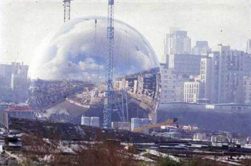
But darned if it isn’t pretty damn close. La Géode is a mirrored geodesic dome housing a hemispheric Omnimax theatre. It’s part of the Cité des Sciences et de l’Industrie, a science museum opened in 1986 in Parc la Villette, which I confess, I only knew as the site of Bernard Tschumi’s red follies. [There are a couple visible in the background here, and judging from this photo from another angle, they’re rightupthere next to the dome.]

At 34m across, Adrien Fainsilber’s stainless steel-clad Geode is the nearest approximation to the physical presence of a Project Echo satelloon that I’ve found. [Thanks to Stuart, actually, who tipped me to the recent post on extremely impressive shiny balls on deputy dog.]

geode_constr_fainsilber.JPG

Fainsilber’s site has more pictures, including the grainy-nice snap of the Geode nearing completion. and this amusing explanation:

Symbole de l’Univers, le reflet des nuages suggère la forme des continents et offre une vision immatérielle de l’environnement.
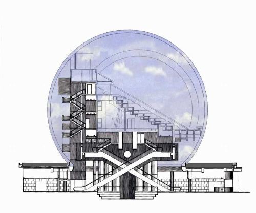
L’écran hémisphérique de 26m de diamètre de la salle de spectacle a engendré la forme sphérique de l’enveloppe.

Symbol of the Universe, the reflection of clouds suggests the form of continents, and offers an immaterial vision of the environment.
The hemispheric screen of 26m diameter in the salle de spectacle [heh] engendered the spherical form of the envelope

I love it, a loopy mix of grandiose over-symbolism and bureaucrat-pleasing rationalization. As if the shiny steel awesomeness of the dome was somehow just the unavoidable by-product of the program the humble architect received. [Qu’est ce qu’on a pu faire? C’est logique.] Sure beats the “but it’s art!” pitch that was the last straw for the suits backing the Pepsi Pavilion.

Also, it’s an amusing stick in the eye of the deconstructionist, “form before function” conceit that Tschumi and collaborator [sic] Jacques Derrida put forward for the rest of the park.

geode_interior_fainsilber.JPG

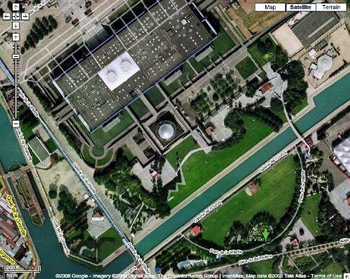
I don’t know the story of the creation of Parc de la Villette, but Tschumi sounds like the Robert Irwin to Fainsilber’s self-important Richard Meier. Looking at the landscaping, la Geode has gone from being a Symbol of the Universe to just one stop of Tschumi’s David Rockwellian Cinematic Promenade. Or to the electron on a hydrogen atom. Which, as I zoom in with the all-seeing Google Eye to watch the picnickers in the Parc, i realize is so true. What if the whole universe were just an atom under the fingernail of a giant?

parc_dela_villette_geode.jpg
extremely impressiv shiny balls [deputydog.com]
Fainsilber > Realisations > CSI [fainsilber.com]
CSI and la Geode, and guests reading Le Monde, apparently, and letting their kids run wild [google maps]
Metaphysics of Parc de la Villette [gardenvisit.com]

Angel Dust, 2000, Jeremy Blake

angel_dust_jblake.jpg
From “Jeremy Blake in Three Parts,” written by editor/curator Bennett Simpson for PS 1’s “Greater NY” show. In 2000, Blake’s 20-min. digitally animated abstraction titled Angel Dust was in both the harried, hasty “Greater NY” and the Pompidou’s “Elysian Fields”, a sublime show for which Simpson curated an incredible sound program:

I.
In the new art game, machine language is the best kind of pragmatism. Because you’ve never had so many options, your tools should work for you. There is still such an impoverished discourse around art made with “new media” that it benefits everyone to be dexterous (or at least flexible). Jeremy Blake tells me it took months to program his latest digital animation Angel Dust. I believe him. Line for line, the amount of coding, sequencing, and editing involved is staggering. As is more and more the case with art’s flirtation with technology, the hours logged and the efforts involved are right on the surface — and in a way, this is part of the point. Skill is transparent. Insofar as Angel Dust can be called abstract art, its abstraction is one of trial and error, micro-production, shortcuts, good fortune, lots of practice, lots of knowledge, and an appreciation of possibilities. I’m not only speaking about the animation’s formal qualities or its methods of production. If abstraction is now the domain of distributed and integrated systems of information, then the function of Angel Dust’s content — its seething Mondrian grid, its Burbank-rolled narrative tics, and its psychedelia — is no different from its code. Blake makes programmed art works: the what and how are symptomatic of each other.

The other two parts are after the jump. An edition of Angel Dust is coming up at auction at Phillips in a couple of weeks.

Continue readingAngel Dust, 2000, Jeremy Blake”

Solar Balloons Not Quite Satelloons

solar_balloons_inst.jpg
So I’m staring at these Solar Balloons by Coolearth Technology, caught like a deer in some headlights [actually, with this pair, maybe it’s “caught like a spring breaker in some headlights, but whatever], and I can’t figure them out.
solar_balloon_profile.jpg
Then I get it: one half of the balloon is clear; the parabolic–or parabola-like, anyway–reflector part is the inside surface of the other, opaque side of the balloon. 2-meter diameter. Not Satelloon-scale, but still, it’s good to know it’s out there.
Solar Balloons from Coolearth Technology [coolearthsolar via inhabitat]

Derek Jarman’s Blue and Travelex’s Pink

scottburnham_blue_before_after.jpg

blue_before and after, originally uploaded by scottburnham.

In 2000 curator Scott Burnham organized a projection of Derek Jarman’s last film, Blue, on the facade of the National Theatre. Visually, the film consisted of a monochrome, electric blue inspired by Yves Klein. The audio, which included readings of Jarman’s journals, was broadcast via localized, low-frequency radio.

The photo on the right was from 2007. After the successful proof of concept, the National Theatre could get down to business.

Derek Jarman’s In The Shadow Of The Sun


It’s A Longshot, originally uploaded by JPaul23.

I’ve had Derek Jarman on the brain the last couple of weeks. Isaac Julien’s spectacularly moving documentary Derek got distribution at Sundance and won awards at Berlin; Julien’s curated show of Jarman’s work opened at the Serpentine.

And I found photo accounts of a live performance of Throbbing Gristle’s live accompaniment of Jarman’s super-8 shorts, In The Shadow of The Sun, last fall in the Turbine Hall at Tate Modern. [above].

TG provided the original soundtrack in 1980-81. They played to a packed house last May as part of the Tate’s Long Weekend series of events and performances. If you liked Throbbing Gristle’s kind of assaultive ambient 80’s music, this was the kind of assaultive ambient you liked. They apparenty provided cushions, since no one who listened to TG back in the day likes to sit on cold, concrete floors anymore.

see more photos of Derek Jarman at Tate [flickr]

Derek Jarman’s Music Videos


While is ridiculously easy to soak in Derek Jarman’s work in the UK at the moment, it’s nigh impossible to find anything programmed in the US. Fortunately, one of Jarman’s most easily accessible bodies of work–music videos–is also one of his most readily available. For some reason, it’s also one of his least recognized critically. [I hope someone will prove me wrong by sending links or references to a nice article or exhibition of Jarman’s music videos.]
Cross referencing the incomplete list on Wikipedia with the partially obscured filmography in Rowland Wymer’s 2005 critical essays collection, Derek Jarman, I think I’ve come up with a complete list. Then I searched them out on YouTube. Everyone knows The Smiths and the Pet Shop Boys, but did you know Jarman directed the video for Wang Chung’s “Dance Hall Days”?

Continue reading “Derek Jarman’s Music Videos”

From A Glimpse To A Panorama

martin_clear_day_pam.jpg
If anyone’s life’s work could have at once so little and so much to show for it, it’s Agnes Martin. From Brian Droitcour for Artforum:

This brisk tour of Agnes Martin’s career–forty years in twenty drawings–is anchored by On a Clear Day, 1973, a series of prints offering thirty ways to regard the square.

In the 1970s, Martin pared down an already spare vocabulary. These prints are a glimpse of her shifting priorities, and the drawings around them protract that glimpse into a lifelong panorama.

From the gallery’s press release for the show, a little background:

In the late 1950’s Agnes Martin’s landscapes and biomorphic surrealist works transformed into abstraction and what would eventually become her signature examination of rectangular grids within a square format. Her work ranges from early tight grids to the opening up of forms to wider rectangles. Disillusioned with New York, Martin moved to New Mexico in 1967 and abandoned painting. When she resumed her work around 1974, the earlier primarily black and white palette modified to include monochromatic washes of subtle pastel colors, perhaps influenced by the New Mexico landscape. While Martin’s abstract repetitive forms have been associated with Minimalist style, she considered Minimalism impersonal and over-intellectual, preferring her work to be characterized as Abstract Expressionist due to its more personal and spiritual nature. Inspired by emerging concepts of Taoism and Zen Buddism in the 1950’s, Martin, like many of the Abstract Expressionists, sought a style that transcended the material world and spoke more of the mind and the experience of the sublime.

On A Clear Day was instrumental in Martin’s own retrospective re-evaluation of her work and was apparently a catalyst of sorts for her resumption of painting in 1974. For details, check out Lynne Cooke’s essay accompanying the Dia’s exhibition of pivotal paintings from 1974 – 1979.
Though it might be tempting, in the absence of any apparent content beyond the grids, to investigate and catalog the variations and details that were surely deliberate decisions on Martin’s part, Cooke argues that this is not what Martin was after when she began painting again:

her endeavor would not be to mobilize the viewer in a process of “looking for” but to immerse the solitary, stationary spectator in an indeterminate, luminous space, in attentive contemplation, “looking at.”

Brian Droitcour reviewing “Agnes Martin, Works On Paper” at Peter Blum Soho trough March 15 [artforum]
Peter Blum Gallery Soho [peterblumgallery]
“To The Islands, Agnes Martin Paintings, 1974-1979 [diacenter.org]
[image via portlandart.net]

Faster, Bulletin Kill Kill!

Alright, does anyone have a screenshot of the victim?
Apparently, the AP erroneously reported at 6:35EST that Bush resigned over, of all things, plagiarism. It’s like getting Capone for tax evasion.
bulletin_kill_bush_resigns.jpg
whoa, it’s 2 min, later, and it gets even more dire-sounding: “A kill is mandatory. Make certain the short headline is not published.”
Do these folks know their mic is on?
bulletin_kill_whp.jpg
BULLETIN KILL [ap/nyt]

To See This Weekend: John Powers @ Virgil deVoldere Gallery

john_powers.us.jpg
As he was working on it the last few months, my friend John Powers kept hinting that his upcoming show would have a bit of the Deathstar and a bit of the disintegrating disco ball. He’s not kidding. The Force is strong with this one.
Empire, 45-in diameter, styrofoam and anodized aluminum, at Virgil de Voldere Gallery, the Chelsea Arts Bldg on 26th st through Mar. 29 [virgilgallery.com]
John Powers’ portfolio site [johnpowers.us]

The Moon Museum

kalpakjian_moonworks-3.jpg
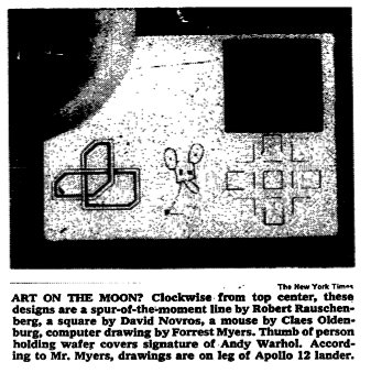
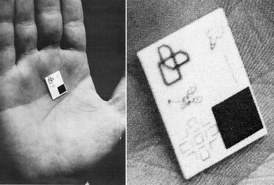
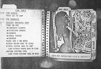
Holy ^%$&! Man Smuggles Art To The &%#$ing Moon!
In 2003, Craig Kalpakjian proposed a series of Earthworks-style drawings that would be executed on the surface of the moon, like the Nazca Lines or 60’s bad boys Michael Heizer’s and Dennis Oppenheim’s desert drawings. He called them Moonworks.
Now I find out there was already an entire Moon Museum, with drawings by six leading contemporary artists of the day: Andy Warhol, Robert Rauschenberg, David Novros, Forrest “Frosty” Myers, Claes Oldenburg, and John Chamberlain. The Moon Museum was supposedly installed on the moon in 1969 as part of the Apollo 12 mission.
I say supposedly, because NASA has no official record of it; according to Frosty Myers, the artist who initiated the project, the Moon Museum was secretly installed on a hatch on a leg of the Intrepid landing module with the help of an unnamed engineer at the Grumman Corporation after attempts to move the project forward through NASA’s official channels were unsuccessful.
Myers revealed the exhibition’s existence to the New York Times, which published the story Nov. 22, 1969, two days after the Apollo 12 crew had left the moon–and the Intrepid–and two days before they arrived back on earth. Here’s the photo from the story:
moon_museum_nyt.jpg
According to Myers, who was involved with E.A.T. on the Pepsi Pavilion project at the time, the six drawings were miniaturized and baked onto an iridium-plated ceramic wafer measuring just 3/4″ x 1/2″ x 1/40″, with the assistance of engineers at Bell Labs.
According to the Times, the artworks are, clockwise from the top center: Rauschenberg’s wavy line; Novros’ black square bisected by thin white lines [in 1969, Novros also created the incredibly rich, minimalist fresco on the second floor of Judd’s 101 Spring St]; a computer-generated drawing by Myers; a geometric mouse by Oldenburg, “the subject of a sculpture in his current show at the Museum of Modern Art” [a sculpture which is in MoMA’s permanent collection, btw]; and a template pattern by Chamberlain, “similar to one he used to produce paintings done with automobile lacquer.” Warhol’s contribution, which is obscured by the thumb above, is described as “a calligraphic squiggle made up of the initials of his signature.”
Actually, it’s a drawing of a penis. Here are some other photos by Frosty Myers, published, I believe, with a 1985 Omni Magazine article by the arts writer Phoebe Hoban. That would be the Warhol Penis there in the upper right.
MoonMuseum.jpg
As the NASA spokesman told the Times when asked about the Museum infiltration, “I don’t know about it. If we had been asked, it sounds like something we’d have very much interested in [sic]. If it is true that they’ve succeeded in doing it by some clandestine means, I hope that the work represents the best in contemporary American art.”
[emphasis added for ironic amusement, though to Myers’ credit, it turned out to be a pretty good grouping of artists to have involved.]
But is it conceivable that someone could have smuggled dirty pictures onto a mission to the moon? Actually, yes. Even if Warhol hadn’t sent that penis to the moon, Apollo 12 would still have achieved the first known incident of lunar nudity.
The back-up crew for the A12 mission surreptitiously inserted reduced photos of Playboy centerfolds into the flight crew’s fireproof plastic cuff checklists which were only discovered about 2.5 hours into their first moon walk. [if you’re at work, that first link is to nasa.gov, and the second is to playboy.com. The same scans are available at both sites, though NASA has conveniently embedded theirs in a PDF.]
Apollo12_centerfold.jpg
In addition to the six drawings, the Moon Museum also acquired a large collection of photographs; astronaut Alan Bean accidentally left several rolls of undeveloped film behind on the lunar surface. The checklists came back with the astronauts.
Related: Frosty Myers, the SoHo pioneer, had a retrospective exhibition last November-December at Friedman Benda Gallery in Chelsea. [friedmanbenda.com]
Also, he had a sitdown with my favorite crazy at The Grey Lady, design/home writer Joyce Wadler. [nyt]

No Kidding, It’s A Small World

After riding the It’s a Small World ride half a dozen times on my first trip to Disneyland, I sent off for information on how to become an Imagineer. I was seven.
Yet somehow it’s taken me until this week to realize that the treacly animatronic Mary Blair masterpiece was originally created by Walt Disney at the behest of the Pepsi-Cola Corporation, which wanted a popular pavilion for the 1964 New York World’s Fair. Disney was apparently commissioned to design four corporate pavilions that fair.
According to Billy Kluver’s long, rambling account/apologia published in the 1972 book, Pavilion, Pepsi was in talks with Disney to produce the 1970 pavilion in Osaka, too, but Disney’s budgets were orders of magnitude too high. Disney’s withdrawal in late 1968 left Pepsi with an empty pavilion to fill, and it created the opportunity for E.A.T. to get involved.
It’s a small world after all.

Joep van Lieshout: Those Who Can’t Do, Make Art

Now I’ve been a fan of Joep van Lieshout’s work for a long time, even if a lot of it’s too irreverent or too bombastically oversexualized to evangelize about regularly. [“You see, mom, he builds these room-sized uteruses with built-in bars…”]
But listening to his talk at Tate Modern last fall, it wasn’t his successes so much as his failures that stuck in my mind. The arc of the interview with curator Marcus Verhagen was the failure of AVL-Ville, Atelier Van Lieshout’s attempt to turn its Rotterdam waterfront studio complex into an independent, anarchic state, and how that flirtation with utopianism eventually led to the artist’s current dystopian fascination. The artist then explained his concept for a hyper-capitalist, sustainable, totalitarian slave city with a population of 200,000 that produces EUR7 billion in profits each year. So far so good [sic].
When it got to the Q&A, though, someone asked van Lieshout if his zero-impact utopia, with its organic urban farming, &c., was so great, why not keep developing it? He dismissed the idea, since it would involve actually running the thing, then it’d take expertise, and attention, and involvement with the bureaucracy, and anyway, who knows if it really works? [Obviously, I’m paraphrasing here.]
The gist of his reply, though, was reality’s too hard, so he’s leaving it as art.
Then when someone lobbed a generous softball of a question by describing his structures and installations as “cinematic,” van Lieshout punted again. Though he, too, conceives of his work as the sets upon which some unspecified drama unfolds, he never makes films, because he “doesn’t know how.”
I’d always thought of AVL-Ville as something of a conceit, but I had no idea how utterly dependent it was on the benign neglect of Dutch bureaucrats, and I certainly didn’t know how quickly and utterly it folded when faced with the most rudimentary challenge. And similarly, when even a clueless yahoo like me can figure out how to make a movie, expertise and technology just are not credible obstacles anymore.
Sure, art is not, by definition, the real world, but I’d always somehow considered it to be superior in its distinctiveness. And yet here was van Lieshout’s art being defined by its impractical, unproved inferiority in one case, and as the refuge for ignorance in another. We unconsciously give Art a presumption of cultural significance that, what do you know, it may not automatically deserve.
Too often, it gets considered only on its own terms, in a bubble, a world [sic] apart from the real world. It’s why the mediocrity of an artist like Mariko Mori gets taken seriously when it’s dwarfed technically and philosophically by CG and narratives of the best films and video games. Or why a piddly little spiral jetty is raised to masterpiece status while the US Army’s vast earthworks at the nearby Dugway Proving Grounds are ignored and detested. There’ll be a reckoning some day, a reality check, and a lot of art that was considered intrinsically valuable or important will end up as worthless oddities, like 19th century jewelry made from that most rare of metals at the time, aluminum.
Talking Art | Joep van Lieshout [tate.org.uk via imomus]

NYT’s Box Office Visualizer: The Ebb & Flow Of Movies

Not to get all Kottke about it, but I really like the NY Times’ infographic data visualization tool thing [is that an inexpert enough description for you?] that plots out the inflation-adjusted weekly domestic box office numbers of movies from 1986-a couple of weeks ago.
It’s fun to play with and interesting to watch in the same way the highly addictive Baby Name Wizard’s NameVoyager interface is.
Still, I think Ebb & Flow’s got some near misses in terms of usefulness. The tool’s big takeaways–that studios are relying more and more on blockbusters, that there are more films released, for much shorter runs–are best seen over the years, so a zoomout would’ve been nice. Also, a zoom in, since so many recent films are reduced to single, stubby lines.
And while I’m sure it was a decision based on the underlying value of the box office data–as provided by NYTimes Company subsidiary StudioSystems and Box Office Mojo–the details I want to click for are not a synopsis and a link to the Times’ review; it’s the box office numbers and the duration of the theatrical run for that particular film.
Also, Idiocracy isn’t in there. I wonder why, since despite Fox’s best efforts, the movie was technically released last year. [Note to self: next time I see Mike Judge, give him $20 for downloading the movie in a way that provided absolutely no financial benefit to the studio who killed it.]
The Ebb and Flow of Movies: Box Office Receipts 1986 – 2007 [nyt]