Felix Gonzalez-Torres, Café, Society

kosuth_ratti_fndn_lavoro_spine.jpg
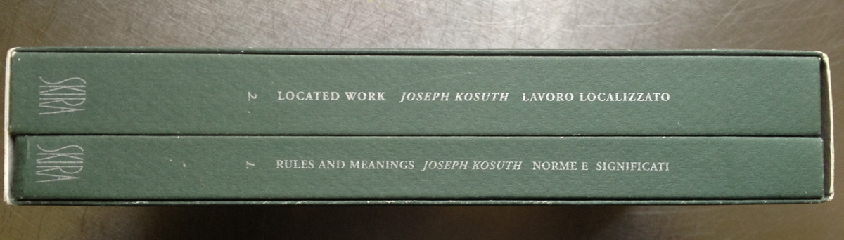
Sometimes it takes a little while to piece things together. I just opened a book for the first time which I bought in 1997: Lavoro Localizzata/Located Work, the 2-volume publication that accompanied Joseph Kosuth’s July 1995 graduate workshop for the Fondazione Antonio Ratti. Kosuth’s project was to have students write out 1-page instructions for an artwork which would be realized by another student. The resulting show was both the instructions and their realizations, and the objectives were primarily related to upsetting ideas of process and authorship. Alas, none of the instructions in the otherwise bilingual catalogue are translated, so who knows how the images relate. What interested me were the conference essays by eminences like Iwona Blazwick, Francesco Bonami and Nicholas Bourriaud, who graciously made the trek to Lake Como. They’re almost nowhere online, only in an archive here on undo.net.
Bourriaud’s quite explicit on the exhibition, not the artwork, as the relevant unit of art production. I am a bit more sanguine about this quote now that its date is fixed to 1995, and not 1997:

While interactivity has, of course, become something of a buzzword, my concept of interactivity goes beyond gadgetry such as the internet. Interactivity begins with a handshake which is, in a way, much more interesting than all the interactive technical devices on offer. As regards my interest in interactivity, I would like to give the following definition of artistic activity: the artist invents relations between people with the aid of signs, forms, actions or gestures. My first point is that I firmly believe it is difficult, nowadays, to represent reality. In a way, I think we are through with the representation of reality. These are times when we should be producing reality.

Bourriaud’s talk feels like a time capsule, just opened to reveal the important ideas and artifacts of the day, preserved untouched by editing or the passage of time:

In my opinion, the most important process to come about since the beginning of Modern Art has been the transformation of the artwork from a monument into an event. An event is something we have to share if we are ever to understand it; nobody understands an event by himself; it calls for discussion, and an attempt to establish an exchange with the participants or other viewers. Another notion worthy of note is conviviality, particularly important over the last few years. Rirkrit Tiravanija, for instance, at ‘Aperto 93’, installed an area where the viewers could partake of instant soup and noodles. Elsewhere, Angela Bulloch has worked extensively on the idea of putting people together, as has Andrea Fraser with his [sic] lectures held in museums. Felix Gonzalez-Torres, too, has insisted on the same issue with his work regarding cafés, including a recent Grenoble outing. If we look slightly further back in time, Gordon Matta-Clark set up a restaurant in 1971, Daniel Spoerri was wont to organize meals in the 60’s, and Robert Filliou and George Brecht had a shop together near Nice in the late 60’s. The point I wish to make, however, is that while conviviality or the production of relationships between people was, for artists in the 60’s and 70’s, an objective, it is now a starting point for artists.

Art as event. The freshness of instant noodles. We now know more how these have panned out. But what is this about a Felix Gonzalez-Torres café? I was drawing a blank, even though I thought I was pretty familiar with Felix’s work–and more relevant here, perhaps, with his non-work. Maybe Bourriaud’s reference was to a project that had been edited out of Felix’s body of work.
So I looked through the documentation and publications of Felix’s work. The only exhibition in Grenoble he’s listed in was “I, Myself and Others: a place to come to” a group show curated by Thierry Ollatt, the director of Le Magasin, which ran from July – Oct. 1992. The show also included Andrea Fisher, Dominique Gonzalez-Foerster, Sean Landers, Philippe Parreno, Philippe Perrin, and Joe Scanlan. The show seems to have been about the title, autobiography.
But the Gonzalez-Torres catalogue raisonné doesn’t list any works as having been shown in Grenoble. There are several go-go boy dance platforms from 1992 listed in the “Registered Non-Works” section, but none have any obvious connection to Grenoble. Seems like a dead end.
Then as I tried digging up installation shots, or any discussion of the show, I tried looking in the Magasin’s file directory:
magasin_myself_dir.jpg
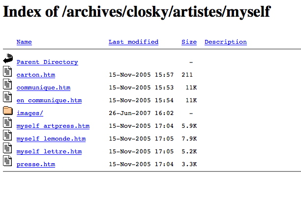
It’s a good day for random corners on servers. Here’s magasin03.jpg, an installation shot with Scanlan’s bookcases.
magasin_myself03.jpg
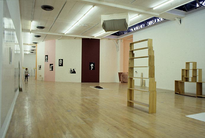
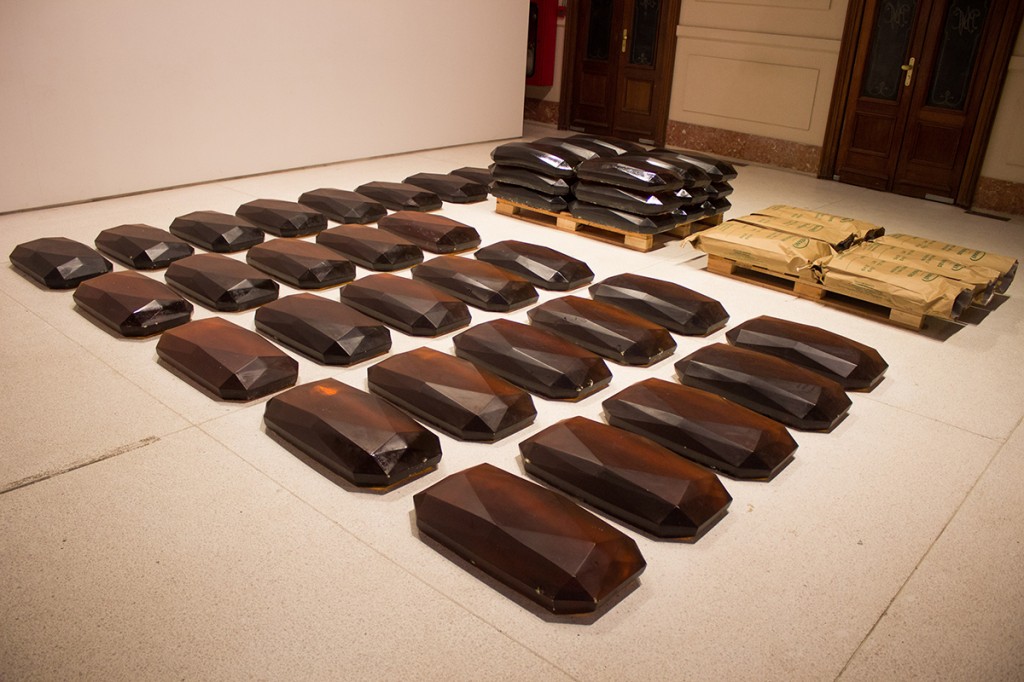
And here’s magasin02.jpg, the archival image of “Untitled” (USA Today), 1990, Felix’s third corner pour, but the first shown in a museum.
magasin_myself02.jpg
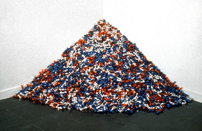
Maybe it’s better to say it’s the first mature corner candy piece. “Untitled” (Fortune Cookie Corner) and “Untitled” (A Corner of Baci) both came before it, but the former is defined by the number of unwrapped [and therefore increasingly gross] cookies, and the latter is small (ideal wt: 42lbs) and pricey to replenish. So “Untitled” (USA Today), ideal wt. 300 lbs, which was shown at the New Museum at the end of 1990, has a symbolic weight and title, and has the take-one-and-replenish dynamic figured out. It also turns out that “Untitled” (USA Today) was originally exhibited with the title “Untitled” (Mirage). The work was shown in at the same time, December 1990, in Berlin, and in 1991 in Kassel, in a two-person show with Cady Noland. [Gotta look that one up next.]
I guess what interests me is not the evidence of shapeshifting and mutability in Felix’s work, which is normal for an artist as he goes along, but which is also a specific characteristic of Felix’s work in its public and posthumous incarnations. It’s how foreign Bourriaud’s brief mention felt to me, how unrecognizable, how far from the way Felix’s work–and particularly the candy pieces–has come to be perceived and discussed. I think the conviviality thing is still valid, so maybe it’s not so far, but I just can’t imagine ever describing his work in terms of a café. Rather than frag Bourriaud, though, it makes me think how prone we are to settling into our experiences with art, and how the present inevitably overwrites not the past, but our memory of it. I know people who know what was in this show, but it never occurred to me to ask, because I never realized I didn’t know.

Resin Translation by Lucy Skaer

Lucy-Skaer-Tradução-da-Resina-2013.jpg
image: Bienal do Mercosul/Camila Cunha/indicefoto
I am so jazzed about Lucy Skaer’s Resin Translation it’s almost crazy.
I found out about Skaer’s project, realized for the 9th Mercosul Bienal in Porto Allegre, Brazil, via Prem Krishnamurthy’s top ten list for the Walker Art Center. [The The Year According To _____ Series is still ongoing, and is great, and I am stoked that the Walker folks asked me to contribute a list. More on this self-promotional point later.]
Anyway. Skaer worked with the local paper and forestry company Celulose Irani, to alter some molds used to process eucalyptus resin, which is sold in bulk for further processing and production. Instead of rectangular ingots, Skaer created a faceted mold, which resulted in several gem-shaped 25kg blocks per day entering Irani’s normal production and distribution channels. Skaer’s forms get processed like all the rest, including the ingots temporarily diverted to the exhibition.
The process kind of reminds me of an early Gabriel Orozco project, Made in Belgium, where he manipulated and altered mass-produced terra cotta roof tiles on an assembly line just before they went into the kiln. Orozco was disrupting the industrial process, usupring it to make his own fleeting artistic gestures permanent. Skaer has done just the opposite in almost every respect.
As the Bienal site put it,

By adding a degree of poetry into an assem­bly line and drawing no distinctions between product and artwork, Skaer’s project raises the question of whether art has a capacity to raise, and not solely represent or encapsulate, political and ontological relationships.

And Prem:

Skaer’s elegant insertion offers us a glimmer of other potentialities for art’s place in the contemporary world — rather than consisting of rarefied objects, art might occur in the ephemeral ruptures of everyday life, in forms surprising, slippery, and stunning.

As much as I want to have some of these beautiful objects, the best part is knowing that they will intercede briefly in life of a factory worker somewhere else in Brazil, catching his eye as he dumps another palette of resin into a tank and turns up the heat.
Lucy Skaer, Resin Tranlsation, 2013 [9bienalmercosul.art.br]
The Year According to Prem Krishnamurthy [blogs.walkerart.org]
“Harlequin Is As Harlequin Does,” Skaer’s 2012 show at Murray Guy had familiar shapes [murrayguy]
Celulose Irani also provided all the cardboard boxes to remake Tony Smith’s giant Bat Cave at Mercosul [irani.com.br]

The Maze Collection

tony_smith_maze_la_install_1.jpg
Tony Smith conceived of The Maze in 1967 for a very early show of installation art at Finch College’s townhouse gallery on the Upper East Side. The four units, two 10×7′ and two 5×7, were originally made from plywood, painted black. Grace Gleuck said the light was low, and that “a walk among these gloomy, primeval presences evokes the feeling of an endless forest.”
When I wrote about the little cardboard model of Maze in Aspen 5+6, in 2012, I did not know whether it had been shown since. That was because I just wasn’t looking hard enough. It turns out that another plywood incarnation of The Maze was shown at Paula Cooper Gallery in 1988. And last Fall, Matthew Marks installed a black steel version of Maze [no The] in his Los Angeles gallery. I’m bummed I didn’t get to visit it in person, but the photos look stunning [top].
smith_ubu_mazeGrid2.gif
The plan of the piece seems to show that the dimensions, including the inner and outer passages, and even the units themselves, were all 30 inches wide, and derived in some degree by the Finch space itself. Not sure about Paula’s incarnation, but that site-specific aspect didn’t make it into the 2013 version, which looks suitably monumental, but also clearly sculptural. And not a hint of primeval gloom.
In his statement for Aspen, curated by Brian O’Doherty, Smith actually gave permission to anyone to “reproduce the work in its original dimensions (in metal or wood).” And so I will. As The Maze Collection of functional household built-ins. It just seems like a lot of space to lose to sculpture. It’s more Zittel than Zittel, and less Jade Jagger than Jade Jagger.
tony_smith_maze_kit_desk.jpg
I see The Maze Collection as having a really sick, velvety, matte black surface. No gloss, no lacquer. As long as you make that the panels close properly, and give you that clean, solid, not-at-all-hinged-or-doored look, I think it’ll work.

‘Photography Is A Form Of Art.’

One of my main points in putting out books of documents from the Cariou v. Prince case is to pull the extraordinary language and logic and concepts of the judicial world into the discussion of art. These are worlds that don’t intersect very much, or very publicly, and that have their own highly distinct modes of discussion and analysis. So there are moments of real discovery and wonder when they are forced together.
Like this definition of photography as art, presented in a footnote [p.15] for the amicus brief filed in support of Cariou by a group of eight professional photography and licensing associations, including American Photographic Artists, and for some reason, Brooklyn freelance photographer Jeremy Sparig:

10 Photography is a form of art. Declaration of Jeremy Sparig, dated Dec. 16, 2013 (“Sparig Decl.”), at 9. As an art, it has two expressive components: 1) the empirical fact of the moment; and 2) the contextual decisions made by the photographer. Id. at 10. Together these comprise the artistic creation of a photographer. When a photograph is appropriated, the entire aesthetic creation of the original artist is taken. Minimal alteration of an appropriated photograph, does not transform the original work. Painting and photography are substantial similar aesthetic presentations. Id. at 11. (“Both photos and paintings use shape, form, color (or its absence), lines, light and dark, objects and symbols and subjects, to create a space for the production of meaning. ‘The signifying system of photography, like that of classical painting, at once depicts a scene and a gaze of the spectator, an object and a viewing subject… Through the agency of the frame the world is organized into a coherence which it actually lacks, into a parade of tableaux, a succession of decisive moments.'” Id. at Ex. 2. A photograph, minimally altered, presented as a painting must be subject to visual comparison as the basis for a “reasonable purpose” test. Otherwise, photographers have no effective remedy at law, if the appropriator can simply rationalize his presentation.

Yes, well. When you put it that way. When you put it that way, you can see how narrow this characterization of photography is within the realm of photography itself, but also have vast the gap is between the sorts of issues and concerns of this niche of photographers and those of contemporary artists who use or engage photography.

Programming The Tiananmen Big Screens

diaping_sunrise_chinafotopress_getty.jpg
image from this week, via chinafotopress/getty
The eerie photo of the sunrise on a Beijing flatscreen cutting through the smog has been making the rounds lately, but it turns out it’s nothing new. The giant screen is one of a double-sided pair installed in the very center of TIananmen Square in 2009, for the 60th anniversary of the PRC.
daping_tiananmen_bluesky_jan2013.jpg
image from the last time the Beijing smog was this bad, Jan. 2013
They flank the Monument of the People’s Heroes in the center of the Square, in line with the Great Hall of the People. From what I can tell, they’re around 42 meters long, and maybe 4-5 meters tall. They typically show tourist info from Beijing and the provinces of China–places not as smoggy as the capital–as well as party and military propaganda: Glorious provinces, beautiful Nature, happy ethnic minorities, thriving Industry They’re the updated, officialized equivalent of Kodak’s Colorama billboard in Grand Central Station, [which were 18×60 feet, and changed weekly.]
daping_beijing_therealjimbot.jpg
image via therealjimbot’s flickr stream
One amazing aspect of them is their sheer, permanent presence, in the heart of the most symbolically important space in China. Each screen is comparable in scale [except in thickness, obv] and street-level experience to Richard Serra’s Tilted Arc. Doubled.
glamorous_beijing_worcep_69189273.jpg
“The Glamorous Beijing,” image via worcep on panoramio
Of course, Serra’s work doesn’t have content or subject beyond itself, its mass, shape, and volumes, and the spatial conditions it creates. The Tiananmen Big Screens, 天安门大屏, [Tiananmen Da Ping, I think] have all this, plus the content as determined by the Party. Which can be beautiful or banal or informative or, as someone on Twitter put it, “eerie and sadistic.” They give the provinces a prominent presence in the symbolic heart of Chinese political power. Which, for all their size, or maybe because of it, the screens can’t escape their context. Or the weather.
Anyway, the screens are so prominent, I wonder if anyone’s tried to hack them as a protest. Or to turn them into a photoshop meme on weibo or wherever. I don’t have the search ability to find out just now.

looks like Marlboro Men at 1:05
What would be more interesting, though, is getting some kind of public art on there. Sort of the Beijing equivalent of the 59th Minute in Times Square. Which, am I reading this right? Does this site say that the Shun Civic Media Company Ltd books commercial space on the screens for Y240mm/year? Yes, there are 525,600 minutes in a year, but let’s imagine that just a third of them are viable. That’s still only around $225/minute. That cannot be right. On the other hand, wouldn’t be more awesome to program them at off hours? Maybe no one sees it but the security guards and phonecammers.
What would you put there? What could you put there? Would the hoops of Party approval be too hard for worthwhile content to make it through? Maybe the way to enter them is by working with a particularly sophisticated province? Maybe we should do some dry runs by projecting onto some Richard Serra sculptures in the mean time.

On Tobias Rehberger On Bridget Riley

rehberger_jfmueller_uhrenobjekt.jpg
I hadn’t heard of this before. The Art Newspaper and several German sources report that a Bridget Riley and Tobias Rehberger have come to an agreement in a plagiarism lawsuit Riley brought last year in a Berlin court.
Riley had demanded that Rehberger’s work, Uhrenobjekt/Watch Object installed in the new National Library Unter den Linden, be removed because it copied her foundational 1961 painting, Movement in Squares. Last Spring, the court denied Riley’s removal request, but ordered the Uhrenobjekt covered until the plagiarism issue was resolved.
It was, and now the work will go back on view, with a new title, Uhrenobjekt nach Movement in Squares von Bridget Riley (Watch Object after Movement in Squares by Bridget Riley). This seems pretty reasonable. I hope Riley’s cool with it. I know she’s had to deal with knockoff/transformations of her paintings by the fashion industry since the beginning. The story of MoMA’s Bill Weitz and Larry Aldrich deciding on their own it’d be awesome to make Riley-inspired dresses timed for the 1965 show, “The Responsive Eye” is a must-read. Story of her life.
So I was kind of fascinated as to what Rehberger’s original idea for his piece was. Was it actually “from” Riley’s work, or did it just happen to look like it? Wouldn’t it be weird to namecheck her if her work hadn’t been part of the process somehow? News reports don’t give any details about arguments made by either side. Most German reports from the initial phase of the suit are sympathetic to the hometown boy, like this Tage Spiegel article, and include a list of the specific differences between Riley’s and Rehberger’s Op Art grids, and lay out a random list of examples of painters borrowing and copying motifs through history. I’d say that the German interpretation of the case is that Rehberger “won.”
riley_movements_square_nmliverpool.jpg
Bridget Riley in front of Movement in Squares, 1961, image: nml
Again, though, what was his point in making this object? It can’t be that he didn’t know of Riley’s painting; he’s been soaking in Op for a long time, and Movement in Squares is Riley’s foundational Op Art work, the one she credits with setting her on her geometric, optically invigorating, abstract path. It went into the Arts Council’s collection almost immediately, and has been in tons of Riley shows and catalogues. [Amusingly enough, it takes a bit of effort to find actual pictures of the painting itself, something that doesn’t look like a pattern. This may be a feature/weakness of Op Art, it’s ready transformation into pattern and image. But never mind, here’s a 2009 photo from the National Museums, Liverpool of the artist standing in front of her painting. It’s 4×4 feet square, tempera on hardboard, a very human scale and presence.]
rehberger_staatsbiblio_side_jfmueller.jpg
Both images of the Rare Book Room of the National Library by JF Mueller, via detail.de
So turning back the clock, I found this preview of the Staatsbibliothek project from the German architecture site Detail. The optical pattern is flipped, obviously, but more than that, the physical aspect of Rehberger’s Uhrenobjekt is quite different: it’s rectangular, fit to the doorway. And it’s thick. Architectural. And it’s way up the wall, and super-shiny. The text describes it as “an interpretation of” Movement in Squares with “partly illuminated areas that show time in an unconventional way.” So yes, it’s an acknowledged interpretation whose main feature is apparently to be a reflective surface for the play of light over the day. Which is not irrelevant, because determining plagiarism vs interpretation/transformation/whatever the German equivalent of fair use is, brings the whole host of differences between the works and their context into play. And then there’s the fundamental distinction between Objekt and Bild, object and picture, and all that entails.
Agreement reached in plagiarism row between artists [TAN via @artnet]
Huh? What’s that? Die große Karo-Frage [berliner-zeitung.de]
Previously, super-related: The Trendmaking Eye

On Googling Richard Hamilton’s Maps of Palestine


I was looking around for something on Richard Hamilton this morning, when I Googled across a 2010 discussion between the artist and the human rights architect Eyal Weizman at Map Marathon, one of the Serpentine Gallery’s Marathon series. It was rather compelling for several reasons.
For one thing, their discussion of the political power of maps was frank and vivid in a way that I’m unaccustomed to in US media or art world forums. They talked specifically of Palestine & Israel, but I quickly took down two quotes that seemed very relevant to, of all things, Google:

the “double crime of colonialism is to colonize and to erase its own tracks” -Eyal Weizman paraphrasing Edward Said.
“All maps of a political kind have nothing to do with the people who occupy the territory being mapped.” -Richard Hamilton.

walking_man_pointing.jpg
These both reminded me of Google Maps’ tendency I find so eerie, of Street View cameras and car/trikes to be erased from the panoramas. It turned out at the same time of Map Marathon, I had been working on this Walking Man project, where I followed the Google Trike through The Hague, its European debut, and collected the disembodied portrait fragments of the guy–who turned out to be a Google employee–walking alongside the entire trip.
It would have seemed a bit extreme at the time, but now it feels depressingly plausible, even urgent, to consider Google and its pervasive data collection as a political force and as a surveillance agent. Whatever the benefits of Google Maps–and they are real–we are still in the dark about just how transparent our information is, and how opaque the implications of Google’s deep information structure is. And we won’t know, and we won’t have open, informed debates and political discussion of it until our entire cultural landscape has been transformed by the company. And maybe not even then.
hamilton_palestine_2.jpg
Richard Hamilton,Maps of Palestine, 2010
So this is what’s going through my head as Hamilton and Weizman discuss the artist’s contribution to the show, Maps of Palestine (2010), above. It was a pair of maps from 1947, and 2010, showing the shifts in political control between Israel and Palestine. It basically shows the impact of Israeli military retaliation in 1967 and subsequent settlement activity in occupied territory, and it appears to challenge the practicality of a two-state solution. [Indeed Weizman, upon whose groundbreaking crowdsourced mapping and analysis the newer map is based, believes only a one-state solution is feasible now, and that everyone’s just going to have to figure out how to get along. That’s a dark optimism of a sort, I guess.]
And then I start wondering, what, exactly, are these maps like? I mean, what did Hamilton actually make and show? Unsurprisingly, almost no one seemed able to talk about the maps as images or as objects; some people called them/it paintings, but nearly all the discussion was around their content and its meaning. Adrian Searle wrote about the Maps in The Guardian in the context of Hamilton’s art historical career and extensive political engagement. When a 4-map variation of Maps of Palestine was included in 4th Moscow Biennale, not only was there no image, or dimensions, the title and the very subject have been omitted. In the opening’s press announcement, director Peter Weibel stated, rather amazingly,

There will be quite a few so-called political works at the exhibition. For example, Gerhard Richter’s painting is not just a painting, it also refers to 09/11, and the piece by Richard Hamilton does not just show us a map of Israel, but it asks us questions about war.

Credit lines are a continuation of occupation by other means.
hamilton_palestine_4maps_moscow_700.jpg
Maps of Palestine, 2011, 4th Moscow Biennale
see full-size img in Al-Madani’s flickr stream

The only image I can find online of the Moscow Maps is from flickr user Al-Madani, and it’s the first to show the work as a physical object. It curls up on the lower corners: an unmounted print of some kind.
It’s only after turning up Rachel Cooke’s interview with Hamilton in advance of his Serpentine show, “Modern Moral Matters,” which coincided with the Map Marathon, that I get my answer. Cooke’s entire anecdote is kind of golden, though:

Hamilton hands me a colour copy of a piece of new work that will hang at the Serpentine. It is a political piece, and consists of two maps: one of Israel/Palestine in 1947, one of Israel/Palestine in 2010, the point being that, in the second map, Palestine has shrunk to the size of a cornflake. I hold the image in my hands, and give it the attention befitting a new work by an artist of Hamilton’s reputation. In other words, I look at it very closely, and I notice something: on these maps Israel has been spelt ‘Isreal’. Slowly, my cogs turn. Hamilton loves wordplay. One of my favourite pieces of his is a certain iconic French ashtray subtly tweaked so that it says, not “Ricard”, but “Richard”. So presumably this, too, is a pun. But what does it mean? Is-real? Hmm. This must be a comment on the country’s controversial birth. Either that, or he wishes to suggest that the Israel-Palestine conflict is a nightmare – can it be real? – from which we will one day wake up. How clever.
“So what are you up to here?” I ask. “Why have you spelled Israel like this?”
Hamilton peers first at me then at the image. “How is it spelled?” he asks. I tell him how the word should be spelled and how he has spelled it.
There is a small silence. “Oh, dear,” says Hamilton. Rita Donagh gets up from her seat and comes round to look at the image over my shoulder. “Oh, dear,” she says. The misspelling is, it seems, just that: a mistake. It’s my turn now. “Oh, dear,” I say. “I’m so … sorry.” My cheeks are hot. Hamilton looks crestfallen. Donagh looks worried. “Can you change it?” I say, thinking that Hamilton works a lot with computers these days. “Not very easily,” he says. Oh, God. On the nerve-wracking eve of his new, big show, I have just told the 88-year old father of pop art that there is a mistake in one of his prints (this one is an inkjet solvent print). Why? Why did I do this? And how on earth will our conversation recover?
After a moment of perplexity, though, Hamilton starts to laugh. “Oh, well!” he says. “I’m sure there’s some way of sorting it out. Not to worry!”

So there we have it. Inkjet print. And from the image published above, it appears they reprinted it with the correct spelling. If only all the Israeli-Palestinian mapping problems could be resolved so quickly.
Also, I wonder if these maps will turn up in Hamilton’s Tate retrospective next month. UPDATE: YES IT WILL. [thanks to Tate Modern’s curators and communications folks for the update]
Map Marathon: Richard Hamilton & Eyal Weizman – Political Plastic [vimeo]
Map Marathon – 2010 [serpentinegalleries.org]
Modern Moral Matters | Richard Hamilton [serpentinegallery.org]
Richard Hamilton: A masterclass from the father of pop art [theguardian]

On Schwendener On Richard Serra & Public Art

I’m pleased to see some actual critical response to Richard Serra’s sculptures, and Martha Schwendener is more right than wrong in her review of Serra’s latest shows at Gagosian. But this retelling of the Tilted Arc controversy is based on several faulty premises that are amply documented and refuted in the written record of the case.

It’s hard to approach Mr. Serra’s sculptures without some kind of baggage. There is, of course, the unfortunate 1989 “Tilted Arc” episode, in which that commissioned sculpture by Mr. Serra was removed from Federal Plaza in Lower Manhattan after complaints from neighbors and workers that it impinged on their use of Foley Square. In the aftermath of that fiasco, rather than fighting for the rights of artists creating public sculpture, Mr. Serra’s response was to make abstract drawings with puerile titles like “The United States Government Destroys Art” and “No Mandatory Patriotism,” both from 1989.
When exhibited at the Metropolitan Museum of Art in 2011, these drawings seemed only to iterate Mr. Serra’s myopic misunderstanding of art in the public realm. As the art historian Leo Steinberg put it, the space of Federal Plaza was Serra’s “raw material, but there are a thousand people working there, so this is not raw material but the space of their existence.”

The campaign against Tilted Arc was started by a judge in the building, and it became an ascendant conservative rally that pulled in the likes of Rudy Giuliani. Public opinion, even the opinion of the workers in the Federal Building was not opposed to the sculpture. The commission assembled to judge the work’s fate was stacked, and its recommendations went against the evidence it assembled.
What I bristle against most, I suppose, is Schwendener’s idea that Serra did not “fight for the rights of artists creating public sculpture.” That is exactly what he did when he sued the GSA to stop the removal of the work, and to declare it destroyed when it was removed. In the legal context of the time, this was, unfortunately, the most that could be done.

Of all artists, Serra has pushed the hardest for the primacy and autonomy of the artist’s vision. His take-it-or-leave-it stand is certainly annoying and abrasive to some people, but it is principled, and it is at the core of his practice, and apparently, his personality. He’s not a collaborative guy. He’s not a compromiser. He compared Robert Venturi’s plan for Pennsylvania Avenue to the Nazis. He walked out on Helmut Kohl and removed his name from the Berlin Holocaust Memorial rather than take the chancellor’s suggestions. [Schwendener mentions the memorial in her review, but ignores Serra’s involvement.] He apparently walked out on Steve Ratner when asked to pitch for a Hudson Yards public art project.

It may very well be the case that Serra is unsuited for public art and the political rigamarole that it requires. But he wasn’t poisoning the well so much as pissing on a reactionary fire that had already been lit during the Reagan Era. If such non-accommodationism is damaging to artists’ prospects for making public art, then maybe we should consider the processes by which public art comes to be. Maybe the gargantuan spatial spectacles Serra produces now really are optimized for private consumption, the single decisionmaker, the big checkwriter. But whatever Serra’s faults, the public art ecosystem in the US has rarely produced works that command such a spirited defense as Tilted Arc received back in the day.

Previously:
On those “Revenge Drawings”: Richard Serra was not pleased with the US Government
Serra interview from 1982: And I AM. An American Sculptor.
You really should have The Destruction of Tilted Arc: Documents, the 1990 compendium of material from the case [amazon]

‘A House For Art’: On Saving The Folk Art Museum

moma_dsr_art_bay_rendering.jpg
Big news, negative reactions, but very few surprises. MoMA announced today that the American Folk Art Museum building would be demolished after all, as part of an expansion & reconfiguration project connecting the current Taniguchi building to galleries in the base of the Jean Nouvel tower set to rise to the west. No one could honestly have believed that Diller Scofidio + Renfro had been brought into the controversial situation to do anything other than provide expert architectural cover for a decision that had been made long, long before.
DS+R also brought some necessary conversation changers, architectural features that would allow The Modern to proceed in a constructive, rather than a purely destructive context. Everyone and their dog has weighed in tonight on the few renderings of MoMA’s plans, so I’ll skip most of that. Except to say that Diller’s proposal for the AFAM site, an entry/gallery open to the street, and a performance space on top, neatly renders the volume of the demolished building in the negative. It’s like a ghost space of the structure that was once there. That design solution has a certain morbid integrity.
And I will note what others haven’t, that one of the changes DS+R have proposed is not just “an architecturally significant staircase,” as Jerry Saltz dismissively called it, but an extension to an architecturally significant staircase: the Museum is planning to continue the iconic Bauhaus Staircase, which connects the 2nd and 3rd floor galleries, all the way down to the Titus 1 and 2 movie theaters. As a longtime member of the Film Department’s Trustees Committee, I suppose I should know more about how this will impact the presence and experience of film at the Museum. I’ll look into it.
[Probably a disclosure, or at least a heads up: I was co-chair of the Modern’s Junior Associates for many years, and helped raise money for the 2004 capital campaign. My own association with the Museum has been long and deep and deeply rewarding, even though I’ve never had the resources to donate trajectory-changing amounts of money. I’m glad for the relationships and engagement with folks all through the Museum, and I won’t pretend that I have any juice, or inside knowledge of the Museum’s capital and construction plans.
bunshaft_travertinse_house_esto.jpg
Travertine House, 1963, Gordon Bunshaft, image: Ezra Stoller/ESTO via archnewsnow
I have purposely steered clear of the Folk Art Museum issue over the last couple of years, in part because I remember some impassioned discussions over the Museum’s sale of Gordon Bunshaft’s modernist house in East Hampton around the time Martha Stewart gutted it and flipped it to Donald Maharam. The Museum makes a clear distinction about what enters the collection, and the curatorial process by which it happens. In this regard, Bunshaft’s house, which was willed to the Museum by the architect, had the same status as the Folk Art Museum: it was an asset, not a part of the collection. And it was dealt with as an asset. Maybe someone should ask Barry Bergdoll if there was ever any discussion in the Architecture&Design Department of accessioning the Williams+Tsien building. I’m going to guess that there wasn’t. It’s an exceptional case that throws the collection out of scale. Anyway, this reality is exactly at the root of much of the disagreement with MoMA’s decision, but I believe it was internally consistent. Whatever that means for the state of the city and the urban experience of the Museum, of course, remains wide open to criticism. And now this parenthetical has veered back on topic.]
ARCH_Mauss_ESTO_FolkArtMuseum_01.jpg
AFAM images: Paul Mauss/ESTO, 2001, via architectmagazine
MoMA’s gonna do what MoMA’s gonna do, but what can be done about Williams & Tsien’s Folk Art Museum Building? It’s worthy architecture, and I think it can be saved, and it should be saved. The Folk Art Museum Building could be moved. And given MoMA’s centrality in this carefully crafted building’s destruction, I think MoMA should open itself to the possibility of facilitating the rescue.
When I say it should be moved, I obviously don’t mean entirely intact, as-is. But it could and should be dismantled, and Williams & Tsien could be enlisted to rebuild it somewhere else in town. And it should be reborn as a townhouse. Why shouldn’t it be the most spectacular new townhouse in town? I just read a ridiculous article in the American Express magazine about the race for the $100 million penthouse. What roving billionaire shopping Jean Nouvel’s MoMA Tower penthouses wouldn’t want an award-winning “bespoke” house museum instead?
williams_tsien_towhouse_e72.jpg
GSV, obv
Not coincidentally, the model for such a project would be the extra wide townhouse [above] Williams & Tsien built in 1996 on the Upper East Side for none other than Jerry Speyer, the collector/developer who is currently MoMA’s Chairman.
pj_east_64th_st.jpg
GSV, obv
Speyer’s house is 33 feet wide; the Folk Art Museum building is 40 feet wide, 85 feet tall, and 100 feet deep. Those dimensions may not work in most traditional side street townhouse environment, but it’s not impossible. There was a foundation building designed by Philip Johnson [above] on my block of East 64th Street that’s almost the same volume. And there have to be sites across the city that could accommodate it. It might even fit in better than it did in the cramped shadows of West 53rd Street.
ARCH_Mauss_ESTO_FolkArtMuseum_int_02.jpg
again, Peter Mauss/ESTO via architectmagazine
So given that the building will come down soon, the thing to do is to salvage and stockpile as much of the structure as feasible. This would begin with the cast bronze alloy facade, whose 63 panels could be saved as easily as the could be sold for scrap. Then there are key handcrafted elements and materials in the building that gave it its character: cherry railings, custom fixtures, the molded glass curtain, flooring, etc., that should not simply be scrapped in any event. I mean, there’s a Georgian bank facade in the American Wing of the Met, and in 1992 Stefan Knapp [who?]’s op arty sculptures were peeled off the facade of Alexander’s department store and sent into the design market without blinking.
alexanders_cityofdave.jpg
Stefan Knapp facade for Alexander’s, via cityofdave’s flickr stream
The other essential elements of the building–cast concrete walls, stairs, balconies, skylights, the space itself–aren’t portable, but they are recreateable. Or adaptable. The AFAM was actually a helluva piece of craftsmanship and a cramped museum. People called it a “jewelbox.” Billie Tsien called it “a house for art, not a museum.” Which, well, we see how that turned out.
Now maybe the architects get a second chance to configure a successful spatial experience inside their stylish envelope. I imagine that whoever wanted to build or buy such a place would probably collect. So with some reprogramming and rebalancing, it could once again become a house for art. MoMA would only need to let the deconstruction happen.

The People’s Guide To Paul Chan’s The People’s Guide To The Republican National Convention

paul_chan_peoples_guide_RNC_det.jpg
detail of The People’s Guide To The Republican National Convention, by Paul Chan, for Friends of William Blake
Since the NY Times has seen fit to examine the Bloomberg Administration’s rights-defying actions against protestors during the 2004 RNC Convention in New York City, I thought it’d be a good time to look at a remarkable artifact of those protests, Paul Chan & co’s The People’s Guide To The Republican National Convention. Here’s how Paul described it to the CAA Journal last Spring:

The first map I made was in 2004. It was done with a group calling itself Friends of William Blake. I drew Manhattan south of Central Park and we detailed all the events and activities in New York affiliated with the 2004 Republican National Convention. The idea was to make a free map that helped people “get in or out of the way” of the RNC. It worked–to the extent that we showed both protesters and clueless conventioneers the strip-club where the Utah Republican delegation was hosting a fundraiser, and the midtown location of the Dick Cheney gala. The map did not show directions as much as sow havoc.

There are still print copies of The People’s Map to be found, but it looks like Activist Magazine is the only place online that hosts the original PDF [pdf, 1.1mb]. I’m going to host it here in hopes that it’ll get picked up and archived around a bit.
Meanwhile, the rest of Chan’s CAA thing is about the maps in his Waiting For Godot project. Keep reading.
X jxm vlr rpb pelria ilpb vlr Paul Chan [artjournal.collegeart.org]
Mass Arrests During ’04 Convention Leave Big Bill and Lingering Mystery [nyt]
The People’s Guide To The Republican National Convention, original single sheet version, 2004, rncguide_map.pdf [greg.org]

Variations On A Charlotte Perriand Beach House

perriand_maison_vuitton_raleigh.jpg
I’m as stoked as I am nonplussed at Louis Vuitton’s over-luxed realization of Charlotte Perriand’s une petite maison au bord de l’eau (1934), which was unveiled at the Raleigh Hotel during Design Miami last month. It’s a small U-shaped shed with glass opening around a canvas-shaded deck.
As LV’s publicists explain it in designboom [small caps sic]:

the pavilion was originally conceived by perriand for an architecture competition sponsored by l’architecture d’aujourd’hui magazine – for which it won second place. she brilliantly prefigures the ease of construction and assembly, and affordability. the pavilion was built (and furnished) by louis vuitton’s inhouse architectural team in collaboration with perriand’s estate to adapt her loose sketches. the design probably would have slipped unnoticed into 20th-century architectural history where it not for julie de libran, the woman’s creative director at louis vuitton.

Mhmm. Except that Perriand’s project is mentioned and reproduced in numerous catalogues and exhibitions of the architect/designer’s work both before her death in 1999, and especially after.
And as for rescuing and realizing Perriand’s history and design, the Perriand archive hasn’t released more than a sketch, and no information about the competition, which was specifically for a weekend beach house, and no information about the variations of the design Perriand made over the years.
borddeleau_perriand_original_sketch_designboom.jpg
And in realizing the house, Vuitton doesn’t say that they changed it significantly: Perriand’s original concept was for a living space raised on stone columns and walls, with open space underneath for storage and parking. So in structure, material, and affordability, Vuitton’s sleek, hardwood construction is beautiful, but it is not an accurate representation of Perriand’s concept. When a luxury giant like LVMH comes calling, though, the estate [run by Perriand’s daughter] can be flexible. And when design shoppers hit Miami Beach, the right logo can obviate any concern about notions of history, accuracy, or context. The Perriand pavilion [sic] was for sale; it’s not clear if it sold.
kocher_frey_canvas_hse.jpg
But the entire project demands an open reinterpretation that tries to be true to Perriand’s original design–or at least to the aspects of it that don’t appeal to a fashion marketing priorities of a luxury purse manufacturer. Imagine an ultralight version built on pilotis, and realized in, say, sealed canvas, like the beach cottage Albert Frey & Lawrence Kocher built in Northport, LI in 1933-4?
openside_purple_20_abccontainers.jpg
image: abc containers (au)
Or bring it all forward. Who can look at the Vuitton Perriand House and not think of shipping containers? Two 40’s open on the side, and a 20′ in the middle, BAM.
charlotte perriand’s la maison au bord de l’eau is a louis vuitton tribute [designboom]
Louis Vuitton realises unbuilt Charlotte Perriand beach house in Miami [dezeen]