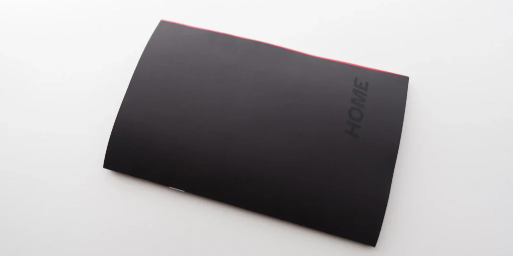
Having recently experienced a difficult displacement and resettling himself, conceptual fragrance artist and greg.org hero Chris Rusak devotes his new studio zine to the topics of home and loss. It is titled HOME, and it is a beautifully made reminder of our connection to the people we see in the terrible news of the day.
Rusak is donating all proceeds from HOME to organizations providing mutual aid to Palestinians displaced by the war in Gaza.
when I clicked through the BravinLee email announcement of the new artist carpet design by Rashid Johnson—an Anxious yet handsome rug that manages the sometimes tricky balance of artist’s credible aesthetic and conceptual rugness, and also manages to be “a meditation on race, class, identity and the essential human struggle with isolation, meaning and anxiety,”
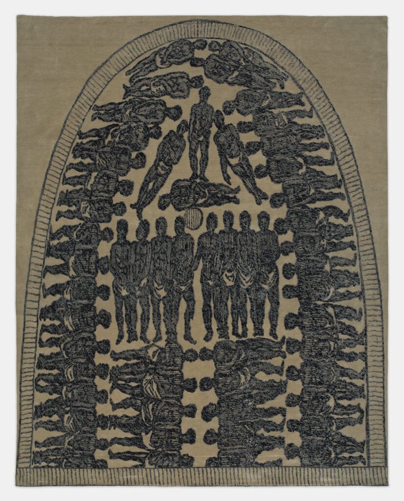
Willie Cole, Original Sin, 2024, 145 x 128 in., sustainably hand-knotted Nepalese wool and silk, in an edition of perhaps 18 and 2AP? I don’t know, from BravinLee Editions
For the 12×10 foot, hand-knotted monument that is Original Sin. Cole has gone from abstract to searing representation with the 1789 abolitionist drawing of conditions of the Middle Passage. First published by Thomas Clarkson as “Stowage of the British Slave Ship ‘Brookes’ under the Regulated Slave Trade Act of 1788,” the drawing quickly became an an abolitionist staple on both sides of the Atlantic.
The question immediately arises: do you have a space hallowed enough to put this on the floor? And I think the answer is, if you put this on the floor, you will.
Just as a rug lays a foundation for a room, offering a canvas for intricate designs and patterns to unfold, the thread of American history serves as a foundation for contemplation, weaving together the diverse threads of the nation’s past to create a complex and rich narrative. Each thread in a rug represents a different culture, event, or individual, much like the various elements that have contributed to shaping America’s identity. By examining these intricate weavings of history, one can better understand the complexities, challenges, and triumphs that have defined the American experience. The rug created by Willie Cole, entitled Original Sin, challenges the viewer to decide if the rug should be on the wall or the floor.
So I guess the question that should have arisen is, do you have a wall big enough to install a 14-foot carpet? Because if you do, you will be turning it into a Sistine Chapel of Black history and liberation, so don’t screw it up.
Taha suggests, though, that there can be hope underfoot. Walking on the carpet depicting this inhumane history “could also be interpreted as attempting to stomp out that pain, to reshape and transcend it, or to dance in jubilant celebration akin to Juneteenth, evoking the spirit of resilience and triumph over adversity or standing on the foundations of American prosperity.”
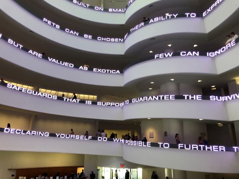
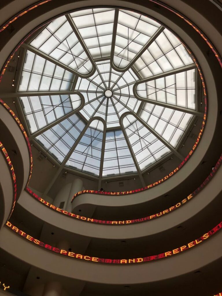
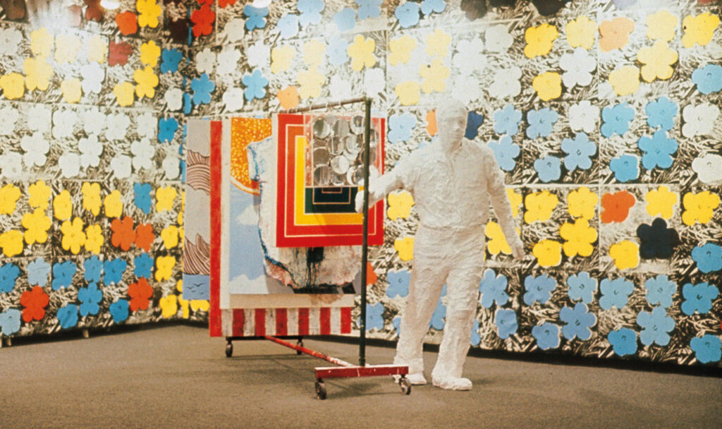
His perceptive and disheartening takedown takes it all down, but it definitely feels like nothing loses more of the plot than the giant LED scroll of Holzer’s Truisms that wraps around the rotunda:
It’s hard to tell—both from focusing on the sentence fragments that have been swirling past you, and from the ambiguously worded description of its materials—just how much of “Untitled” is generated thoughtlessly by Artificial Intelligence. Some phrases are non sequiturs, but others sound plausibly Holzerian. What would the difference be one way or the other? If it is only the seizure-inducing strobe effects that are somehow the product of an AI, how would that differ from other programmable randomized effects? Whatever form of embellishment the technology is adding to her 1989 formula, it somehow lands as much like an afterthought as a desperate grasp for relevance.
Also Jenny Holzer’s Untitled (1989/2024), with throwback font, photo via JCW
Which, I looked up video of the installation on Instagram and refuse to link to it, what a mess. But that was only after noticing the difference in Weibley’s own photos of the work [above]; Holzer’s signature work is looking its best here, and that is problematic enough. Up top the work shows a high-res white font, while above it switches to a throwback font, in lower-resolution and two colors, which approximates the older diode technology Holzer’s scrolling text pieces originated on, but on an obviously high-res screen.
Jenny Holzer, Truisms, 1977-79, 1998, 6 x 53 x 5 in., LED sign in black housing, via Sprüth Magers
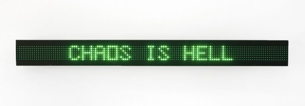
As a project Holzer’s Truisms have succeeded precisely because they exist in near-infinite formats, from wheatpaste posters to bookmarks to sushi platters to onesies to condoms. As art objects, though, the Truisms are locked aesthetically and collectibly, into a highly specific medium, which is now obsolete: the single-color, seven-diode scrolling ticker signs of the 80s and 90s.
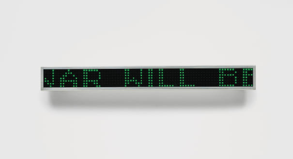
Jenny Holzer, Green Survival, 2004, 5 x 42 x 1.4 cm, LED sign in aluminum, ed. 20 from Editions Schellmann, via Phillips 2019
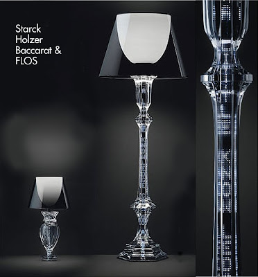
Though it wasn’t clear in 2009 when she did a Q&A with the NY Times, pegged to her retrospective at the Whitney and the launch of limited edition Truisms floor lamps and table lamps in collaboration with Flos, Baccarat Crystal, and Philippe Starck, Holzer was about to become another casualty of the pivot to video: “In For Chicago I have first-time access to a video-compatible L.E.D. array, and I’m in the process of learning how best to program this system. The presentation possibilities, including speed, motion, orientation, brightness, background, and complex double speak are novel and considerably greater than those for older strip signs.”
Protect these lamps from what I want, which is to smash them: HOOO!!! and HAAA!!! lamps, 2009, via If It’s Hip It’s Here, which also includes FLOS’s faux-Holzerian invite to the Milan lamp launch
The process does not seem to have gone well. Jenny Holzer LEDs should be, like Dan Flavin flourescents and Agnes Martin & Ellsworth Kelly paintings, on our culture’s bucket list of things to fill the rotunda of the Guggenheim with at least once. It’s too bad that it didn’t happen sooner.
[no sooner do I post this UPDATE: I check my email and find an invitation to a 2-day Guggenheim Symposium, “Compositions in Light & Language: Conservation of Jenny Holzer’s LED Artworks” at the end of the month. So at least they know.]
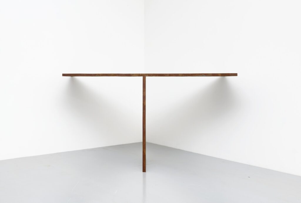
I think it’s obvious by now that any Richard Serra sculpture can be domestically scaled if you have a big enough house. But there is a category of Serras you could install pretty much wherever, and without reinforcing your floors.
It’s also weird because it felt like I’d seen it before, even though it’s barely been out of Athens. But it’s because the Dannheissers had one just like it, which Elaine gave to MoMA. Same concept, different dimensions. MoMA’s two plates are the same size, while T’s are 2:1. Either way, I’d make sure my floor is level and maybe reinforce my sheetrock. And get some certified riggers for sure.
Richard Serra’s Melnikov, 1987, installed between Felix Gonzalez-Torres’ “Untitled” (Supreme Majority) and a Ryman at MoMA’s 1997-98 Dannheisser Haul show, photo: Thomas Griesel
Did you know MoMA has twelve steel or lead Serra sculptures? TWELVE. And here we are, just window shopping one.
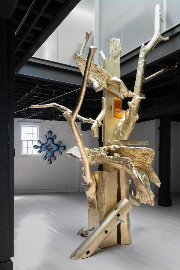
Donald Moffett’s Lot 030323 (the golden bough), 2023 installation view at von ammon co
Last fall I was caught off guard by Donald Moffett’s Lot 030323 (the golden bough), which was installed in NATURE CULT: TREMOR, a two-artist exhibition with Shaun Krupa at von ammon co in Washington DC. It stood out, literally, among new, biomorphically baroque iterations of Moffett’s more familiar paint-on-panel works. But even as I type this, I realize it was made of the same materials.
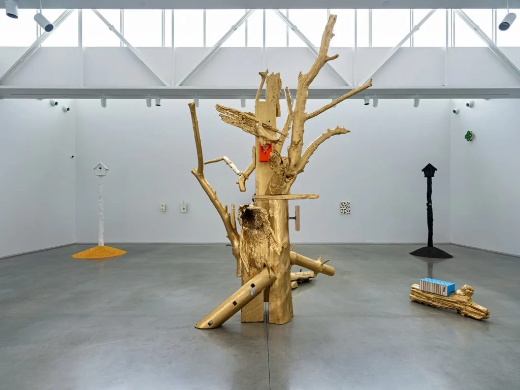
Donald Moffett NATURE CULT, SEEDED installation view of Lot 030323 (the golden bough), 2023/24 at Center for Maine Contemporary Art, 2024, image CMCA via Brooklyn Rail
Pieces of salvaged lumber and driftwood were painted gold and bolted together in a totemic simulacrum of a tree, with an art book and two of Moffett’s [other?] paintings perched among its branches. The gesture felt akin to a Rachel Harrison sculpture, but in inverse, with the found objects serving as an armature for the made ones. It also reminded me of some past works of Robert Gober, Moffett’s partner, who made plinths of painted bronze cast from styrofoam blocks collected from the North Shore of Long Island.
Lot 030323 (the golden bough), 2023/24, will be on view, with some variations and an expanded date, for one more week in Rockland, Maine, where it anchors Moffett’s show, NATURE CULT, SEEDED, at the Center for Maine Contemporary Art. The work in Maine now supports at least one different painting by Moffett—a throat-like orifice replaced by a perch-like birdhouse—and a different book, trading the 18th century botanical illustrations of Mark Catesby for the 19th century bespoke bovine portraits of Thomas Hewes Hinckley. The most substantive difference is the addition of what Brooklyn Rail reviewer Chris Crosman calls “a section” of the golden baugh: a driftwood limb that holds thirteen ex-libris copies of Jeff Goodell’s 2017 book, The Water Will Come: Rising Seas, Sinking Cities, and the Remaking of the Civilized World.
A couple of weeks ago artist Tom Burr sp0ke at Dia about his and Felix Gonzalez-Torres’ work. Now that conversation is online.
Burr was in a 1989 group show with Gonzalez-Torres, Michael Jenkins and John Lindell at Paula Allen Gallery (no relation). One piece Burr showed, Jones Beach State Park, was from a series of bulletin boards outfitted with the texts, flyers, and notices from a specific public place.
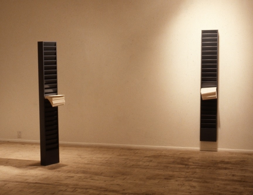
installation view of Felix Gonzalez-Torres’ [non-work and] work installed at Paula Allen Gallery, 1989. Left is White Legal; right is “Untitled” (White Legal). photo via FG-TFoundation
A few years later in his catalogue raisonné, Gonzalez-Torres adminstered a dropkick to one of his magazine racks. The one mounted on the wall, “Untitled” (White Legal), remained a work, while the freestanding rack, then known as just “White Legal,” was demoted to “non-work.”
None of this is in the talk, btw; it’s just me nerding out. And it’s my way of resisting the urge to just type out the entire conversation about Burr’s Deep Purple, whose form is a 2/3-scale reference to Tilted Arc. Choice stuff.
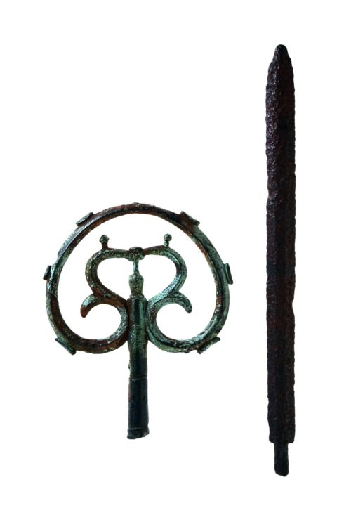
cane head and spear tip, from the late Nara or early Heian period [c. 800 CE], found at the top of Mt Tsurugi in 1907, image: toyama-bunkaisan
In 1907, Yoshitaro Shibasaki and his team successfully climbed Mount Tsurugi, which was regarded as the last unclimbed mountain in Japan. However, they found a metal cane decoration and a sword on the top of the mountain, and it turned out that someone had reached the top before them. A later scientific investigation revealed that the metal cane decoration and sword dated from the late Nara period to the early Heian period and that shugenja had climbed Mount Tsurugi more than 1,000 years ago.
Shugendō is a mountain ascetic religious practice that emerged in the 8th century in Japan, that synthesizes Shintō, Buddhism, and various local spiritual elements. Because of its integrationist nature it was banned in the Meiji era when government land surveyors found that the ascetics [shugenja] beat them to the top of Mount Tsurugi by a thousand years. [via CraigMod‘s newsletter, where he discusses missing a Shugendō retreat because of XOXO and typhoons.
The three pieces they discuss and play, by Steve Reich, Julius Eastman, and Jason Moran, are all bangers of their kind. No spoilers, but Ligon’s made work related to a Reich text piece [above]; Moran scored a Ligon film, and it turns out Ligon and Eastman will be in a two-person show at 52 Walker in January.
ARTnews is reporting that someone in England is auctioning off ten 1970s Salvador Dalí lithographs found in their Mayfair garage. The £300–£500 they’re expected to bring will not help much toward funding their retirement abroad, but they’re probably selling the garage, too.
Unmentioned in it all is how the Dalí print market is a fifty-year-old joke ever since it became known that the artist pre-signed thousands—tens of thousands, some say hundreds of thousands—of blank sheets of paper, which were then printed with whatever.
The printsellers at Artsy are too ingenuous by saying Dalí “accidentally sabotaged his print market” with the practice. Dalí’s manager eventually claimed the artist signed 350,000 sheets of blank paper. That takes discipline, time, a system. And a way to monetize it—if not, what’s even the point? And none of that sounds like an accident. Maybe Dalí just dgaf about his resale market, and why should he, when there’s paper to sign?
And that’s not even getting near the forgeries. During the last decade of his life, one of Dalí’s former printers went rogue and secretly flooded the market with unauthorized prints; he was joined by straightup forgers operating a network of mall and tourist trap galleries. So he accidentally sabotaged his market by being forged? Or easy to forge?
TBH, the only thing less interesting than Dalí’s print market is Dalí’s prints. What I low-key want to see is his blank paper. Where are some? Did any survive intact? Dalí had a multiyear durational performance of signing blank paper, and it has disappeared without a trace. Worse than that, it was defaced, dismembered, and destroyed, then diluted by a deluge of fakes. Unless there’s a forgotten ream somewhere, sitting unnoticed since the 70s in a British garage, waiting to make some auctioneer’s day.
13 sheets of “Canson-style” paper with Dalí’s signature on them, from some auction somewhere in 2023, via mutualart
Oh wait, no, it was in France, and someone’s been auctioning it off in little batches since 2022. Also, Dalí was a Hitler- and Franco-loving fascist, so never mind.
[NEXT DAY UPDATE: ok, thank you Joshua Caleb Weibley for bringing in the work of Tyler Coburn, who in 2010 showed Thumbprints and Other Takeaways, a sculpture that included a stack of blank print paper, each printed with one of the hundreds of supposedly authentic signature variants Dalí used. 10/10, no notes.]
Thanks to Jeremy Millar on Bluesky for noting the 72nd anniversary of the first public performance of John Cage’s 4’33”. David Tudor premiered the groundbreaking work in Woodstock, N.Y. on August 29th, 1952.
I recently performed it myself a couple of weeks ago, using the 4’33” app, and I posted the recording to johncage.org. It’s the first recording of the piece in Greenland, and you can listen to it here.
[update: yeah, it should be Rømer Fjord, my bad]
Actually, it’s the second recording posted from Greenland; I had made and uploaded the first recording a few minutes earlier. I was on a boat in a fjord when the wind picked up, and some tarps began clacking and thrumming in an unusual way. Rather than just take an audio snapshot, I decided to make a 4’33” recording.
The way the app works, I uploaded it without listening to it first. Playing it back, I noticed a difference, inevitable, between the stereo experience of by ears listening to the original performance, and my phone mic’s recording. But more than that, I also felt like it sounded less like an experience of opening to the sonic world around you, and more of a fixation on an unusual found sound, which, admittedly, it was.
So I set off to find a quieter [sic] place to perform Cage’s silent piece. The result, mostly wind and waves, with a few inescapable lines snapping against masts in the wind, is the one linked above. So a big 4’33” Day shoutout to John Cage, who knew that silence sounds different everywhere.
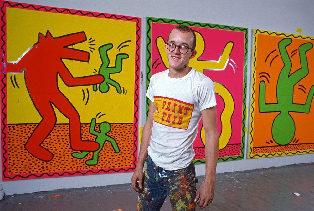
Artist Keith Haring takes a break from work in his studio making paintings for an upcoming art exhibit.
Poking around The Broad’s Keith Haring show, which is at the Walker for another week or so, led me to this photo of Haring at work. It was taken in late 1982 by Alan Tannenbaum. I feel like I’d seen images of this moment before, but this time, what caught my attention was Haring’s t-shirt.
Paint Fair, in carnival lettering with a circus tent and a frilly, scalloped, tent-like border.
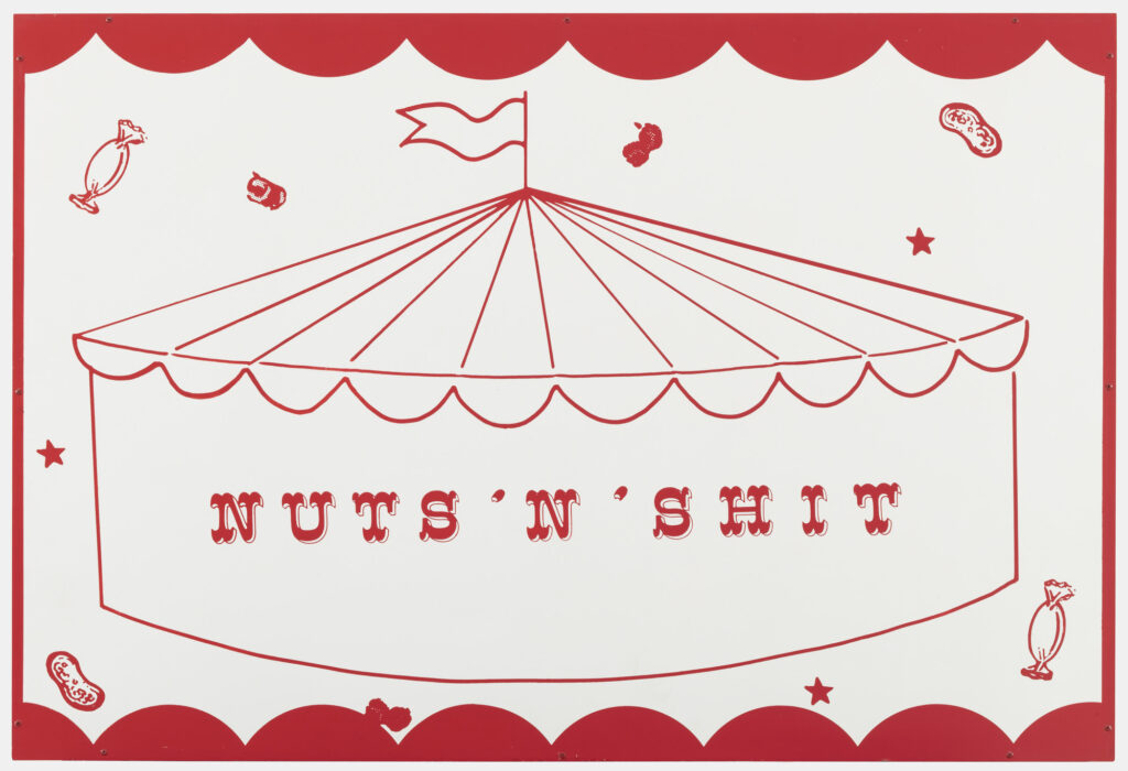
Cady Noland with Diana Balton, Nuts’N’Shit, 1990, screenprint on metal, 28 3/4 x 42 1/8 in., fabricated by Big Apple Printing, collection: MoMA
I noticed it because it looked very similar to Nuts’N’Shit, a screenprinted metal work by Cady Noland and Diana Balton. The one at MoMA [above] is listed as a screenprinted edition of one, but the one in Frankfurt was enamel, framed, and from the Brants. I will trust the artist to sort that out.
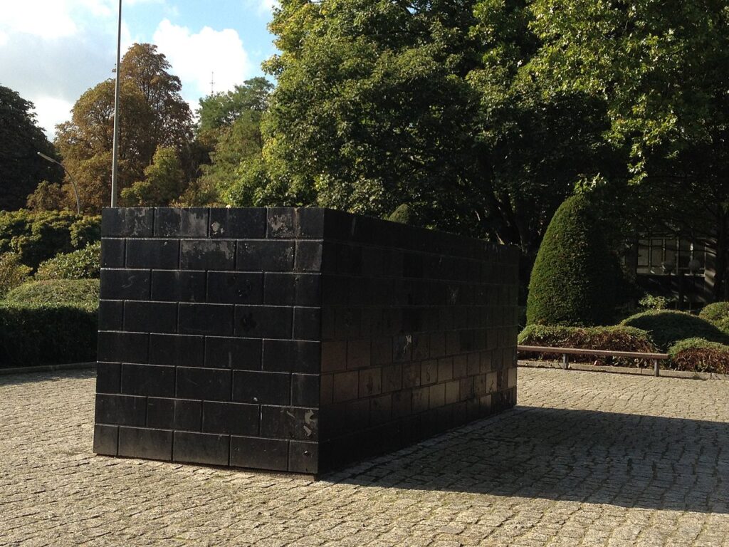
This just in from Our Correspondent In Berlin: the recent blog post about Sol LeWitt’s Black Form — Memorial to the Missing Jews (1987/89) is as incomplete as it was unexpected. Let’s go in chronological order, and from what should have been most obvious.
Sol LeWitt, Black Form – Dedicated To The Missing Jews, 1987/89, painted concrete, Hamburg, via
It is not enough to site the 1987 sculpture in the context of a Germany—actually Germanies—that had yet to address the issue of memorials or counter-memorials to the Holocaust. Or even to note—which I didn’t—that the 1989 re-creation of Black Form in Hamburg was not only larger, but happened just as the Berlin Wall was taken down. And of course, Black Form has existed in Hamburg ever since.
What most needs correcting is the context of LeWitt’s statement, “This was the only political art that I made and the only political thing about it was the title, but I thought I owed it to the Germans – and the Jews – to make one comment.” And the perception of exceptionalism it gave to the Skulptur Projekte, and the constraint it put on the political and memorializing element of LeWitt’s work.
Because that LeWitt quote was from 2000. And while it may have been true that Black Form was the only political art he made to that point, it was not the last, either for the Germans or the Jews. And those later memorials were very much related to Black Form, and not just because of their titles.
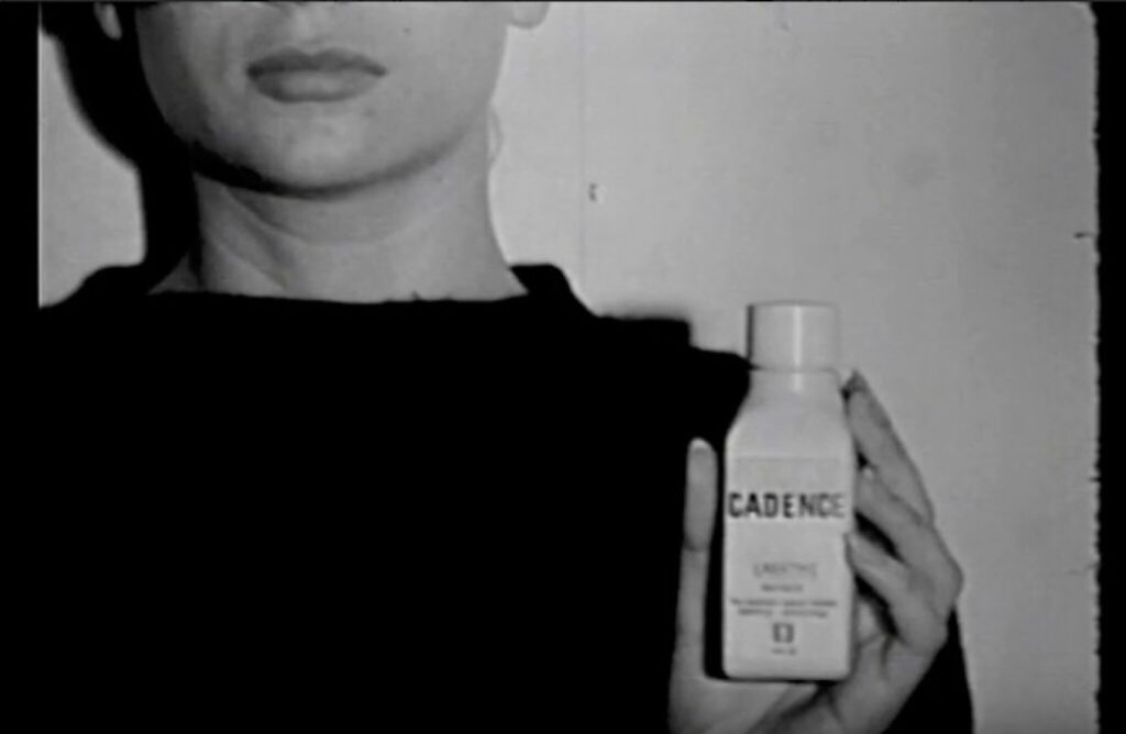
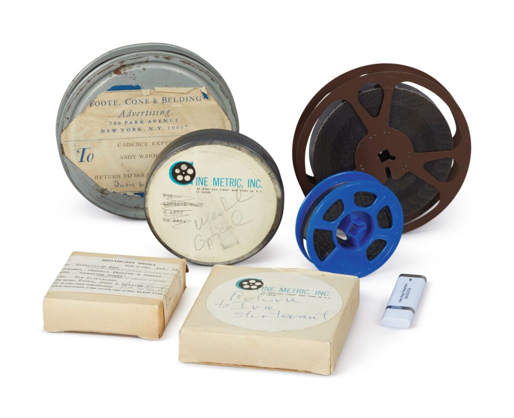
still from one of Andy Warhol’s commercials for Cadence laxative, 1965, commissioned by Ira Sturtevant and sold at Sotheby’s in 2019
We used to have a company that organized all the world’s information, and now it tells me that practically no one besides Sotheby’s themselves have mentioned that Ira Sturtevant commissioned Andy Warhol to make three commercials for Cadence laxative.
And they’re just about the only ones to note that it happened in 1965, but yet don’t note that was three years before the Schrafft’s restaurant spot that had long been considered Warhol’s first commercial.
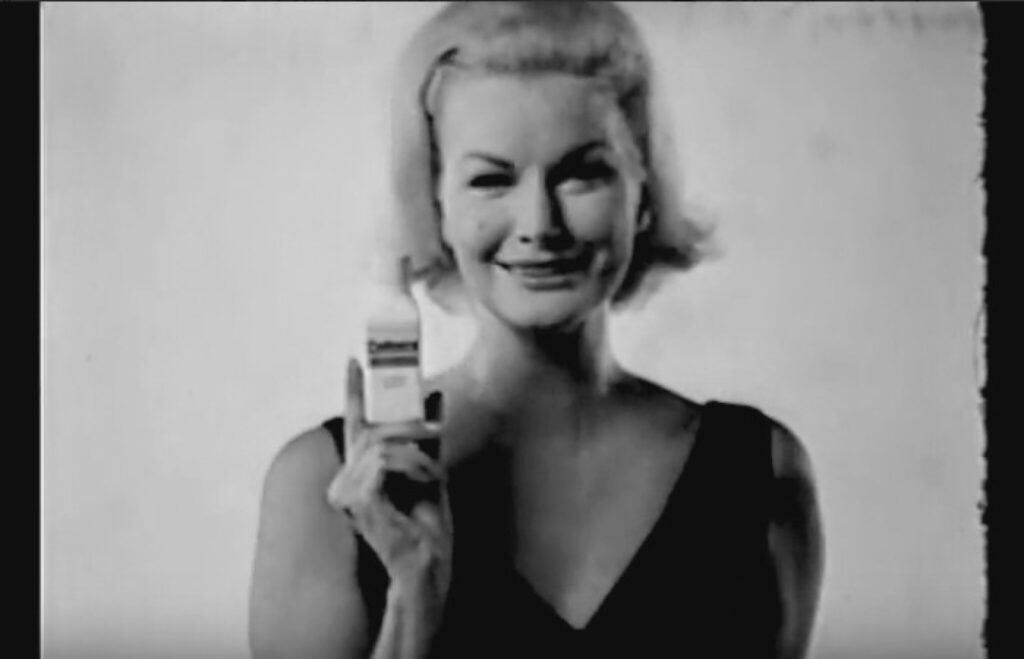
still from another of Andy Warhol’s commercials for Cadence laxative, 1965, featuring Sunny Harnett, sold at Sotheby’s in 2019
And they’re about the only ones to note the similarities between the stark commercials—a lone woman sitting on a featureless set—and Warhol’s Screen Tests, which were in full production in 1965. [Sunny Harnett, one of the models in the Cadence commercials, never sat for a Screen Test, nor, for that matter, did Ira.]
We’re told there were three Warhol Cadence laxative commercials on four reels of film
And this is remarkable why? It’s not like we have to worry the laxative commercials will disappear from the art historical discourse: the Andy Warhol Museum has the invoice, and the Whitney Museum showed them in the Warhol retrospective in 2018-19. And five minutes later Crane sold them publicly for $30,000.
But how has no one made the connection that when Ira was befriending Warhol, Johns, and Rauschenberg in the early 1960s, he was not alone, but was in the company of the first Mrs. Sturtevant, Elaine, or as she came to be known professionally, Sturtevant.
the image of Sturtevant’s October 1965 show at Bianchini Gallery, via MoMA
1965 was when Elaine borrowed Warhol’s screen for Flowers and started making her own. It was when he was asked about his screenprinting process, and he said, “I don’t know. Ask Elaine.” It was when she had her breakthrough show at Bianchini Gallery, filled with her repetitions of the works of many of her —and, one must imagine, Ira’s?—artist friends.
In their conversation published last week on the 100th anniversary of her birth, Sturtevant’s two great art historian interlocutors, Bruce Hainley and Michael Lobel, talked about how scarce confirmable details are, and how “our sense of the history and reception of Sturtevant’s art changes” only via “a slow drip of new information.” While it’s obviously not a cure, I do hope blogging about this one connection will help to pick up the cadence.
[COUPLE OF DAYS LATER UPDATE: NEVER MIND. Here is the first sentence in the section of Blake Gopnik’s near 1000-page biography of Warhol where he discusses the artist’s foray into advertising: “In the summer of 1965, Ira Sturtevant, the ad-man husband of the artist Elaine Sturtevant, had gotten Warhol working on a laxative spot.” Print will save us all, but only if we think to look. Thanks for the heads up, Blake, and the opus, obv.]
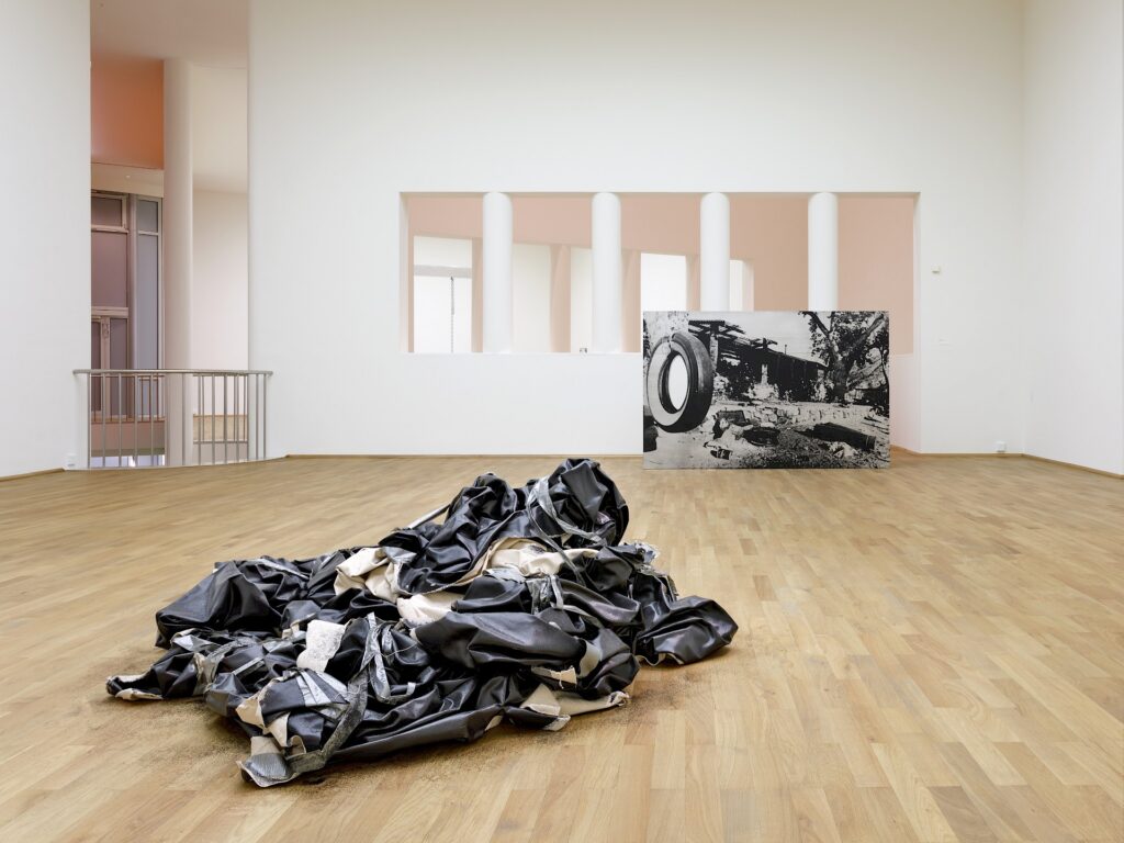
Sometimes I really am slow on the uptake. Like when it took me all this time to really look at the extensive installation views of Cady Noland’s exhibition at MMK Frankfurt. Somehow I’d just been stuck with the imageless brochure/checklist, and the works I wasn’t familiar with remained unnoticed to me, even when I should have known better.
Like Trashing Folgers (1993/94), the large landscape above, a full-bleed screenprint on aluminum of a c. 1969 wire photo of the junked up backyard from Barker Ranch, the post-murder desert hideout of Charles Manson and his “family.” It’s in the collection of FRAC Grand Large in Hauts-de-France, which is on my Lacaton Vassal bucket list, but which does not help me here.
It’s been a few weeks since I’ve listened to some podcasts, but it’s been even longer since I’ve listened to Charline von Heyl talking about her process. So yesterday I got caught up on both, with her conversation with Ben Luke on The Art Newspaper’s podcast, A Brush With…
And she is still looking at your blog.
Asked by Ben Luke if she sometimes spends more time in the studio thinking about the painting she’s working on vs. doing something to it, she replied, [Here’s a podcast link, but I cribbed the quote below from the YouTube transcript]:
Yeah that’s basically all the time. I mean it’s just I’m probably like five hours or so —not much longer, actually my attention span is not the greatest in the studio—and of that time, the actual painting time will be maybe one hour or so. So most of the time is really looking.
And it’s not just making a painting in my head; it really is also literally looking at images, you know, like opening the computer and just going through really weird old blogs, or there are fantastic painters’ Tumblr accounts which I love because it’s not about personality it’s just really about finding idiosyncratic choices.
And so I just get stimulated by that, and then I will see this one weird little orange corner that triggers desire in me, and then I want to have something similar. It doesn’t have to be that orange corner, but it has to be something that renders me excited in the same way that that did. You’re like—and it might be a conventional move or it might be something bizarre doesn’t matter. But the time in the studio is really a time of visual manufacturing.
Further on, when asked what she has pinned to her studio wall, the answer turns out to be, again, your tumblr:
The funny thing is because I am so much in this whole world of looking through images on the computer—Tumblr and all that stuff—and of course, I’m not on social media at all so I do what all those spies do: I drag the images on my desktop, and then I used to just put them into folders that have monthly dates and basically forget them and never look at them again.
And then during the pandemic, when I was working on the Botticelli remake for Matt Haimowitz, I started to actually print out every single image that I dragged, and wrote on it what it exactly was, and date-stamped it. And I have done that ever since, so I’m actually pinning those things on the walls while I’m printing them out, and they become a slow sort of reference to, you know, like a mood I’m creating, and all the synchronicities that play out in that display.
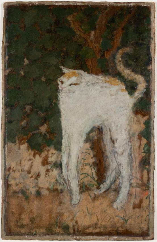
And then there are some images that I print out over and over again. I see there are certain Beuys drawings that are just really important. and I think the most beautiful thing on earth. Right there are two postcards, actually, that travel from studio to studio, and that’s probably the question you asked. One is this weird Bonnard cat from the Musée d’Orsay, this white cat that’s
BL: Oh I know it it’s wonderful.
CvH: I even painted a little frame around it I just love it so much. It has— it’s so funny and has all the tenderness in the world and all the weirdness and it’s such good painting. I mean, Bonnard and Vuillard are so important to me, too. I love them so much.
Pierre Bonnard, le Chat blanc, 1894, oil on cardboard, 519 x 335 mm, collection: musée d’orsay


