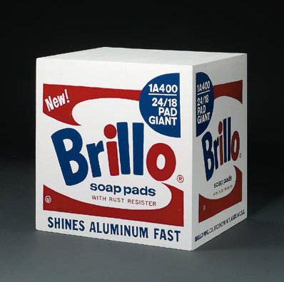
The Brillo Box formerly known as Stockholm type, and formerly known as being by Andy Warhol, sold at Christie’s in 1998.
So awesome. The Beverly Hills art dealer Robert Shapazian’s bequest to the Huntingon Museum of 10 Brillo Boxes by Andy Warhol has brought the whole tangled Brillo Box versioning and authenticity debate back into the news. As the LA Times’ Christopher Knight reports, Shapazian’s Brillo Boxes include one 1964 Stable Gallery box–and nine Pontus Hulten Boxes, made by the legendary founding director of the Moderna Museet. And the Pompidou. And MoCA.
Until this summer, those nine would have been called Stockholm Type. But following the completion of the Warhol Authentication Board’s 2+year investigation and the release of their 27-page report [Jul 19, 2010 pdf via LA Times], the 105-120 or so Stockholm Types have been split into Stockholm Types and Malmo Types.
Hulten had somewhere between 10 and 12, but not more than 15, boxes made after his 1968 Warhol exhibition at the Moderna Museet closed. He did this, he said, because Warhol told him to “make them over there.” Hulten apparently pocketed that date and authorization. When, in 1990, he had 105 Boxes fabricated in Malmo for a series of exhibitions, he referred to an “old authorization.” The only thing missing, it seems, was documentary evidence of this readymaking on Warhol’s side.
There was extensive context provided to show that fabricating works was part of Hulten’s standard practice–he had replica Tatlins and replica Duchamps made, including, even, a Large Glass, which Duchamp later signed [as a “copie conforme”]. Hulten’s texts and statements show he considered Duchamp and Warhol as readymade brothers.
Following the logic of Duchamp and taking it to another power, Hulten interpreted Warhol’s 1964 Stable Gallery box sculptures not as factured works of art, but as repeatable, ready-made objects, that were interchangeable with real Brillo Soap Pads cartons or replicas.
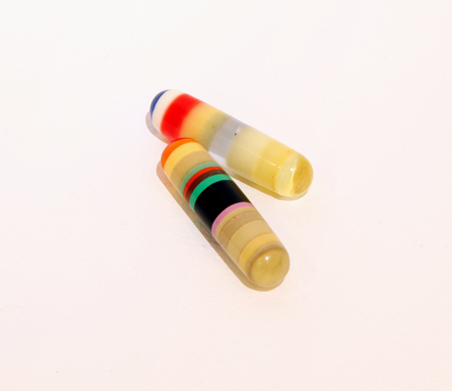
And then the Board does what authentication boards do: it examines the physical details of each type of box, distinguishing Warhols based on the traditional notion of the character of their painted surface, or facture. Stockholm types were “painted and sanded multiple times to achieve a high degree of finish before they were printed,” but Malmo types “appear to have been painted with a roller.” Stockholm types have mitered corners, but Malmo types [and Stable Gallery types, for that matter] have abutted joints. Malmo types are made with a nail gun, Stockholm types were nailed by hand. And so on.
The conceptual difference between these two approaches to Warhol’s work is fascinating, and Hulten clearly felt justified and correct in the way he had his Brillo Boxes made. The fact that Hulten’s 1968 boxes were made in 1990 seems to have been more broadly known and accepted within the Scandinavian museum and art community. But he also did not have any problem “misrepresent[ing] the works and falsif[ying] their history” to the Estate, the Board, and the Catalogue Raisonne.
And so, the Board has reclassified all Hulten boxes as “exhibition related copies” [Stockholm] and “exhibition copies” [Malmo]. Any questions?
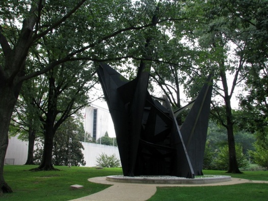
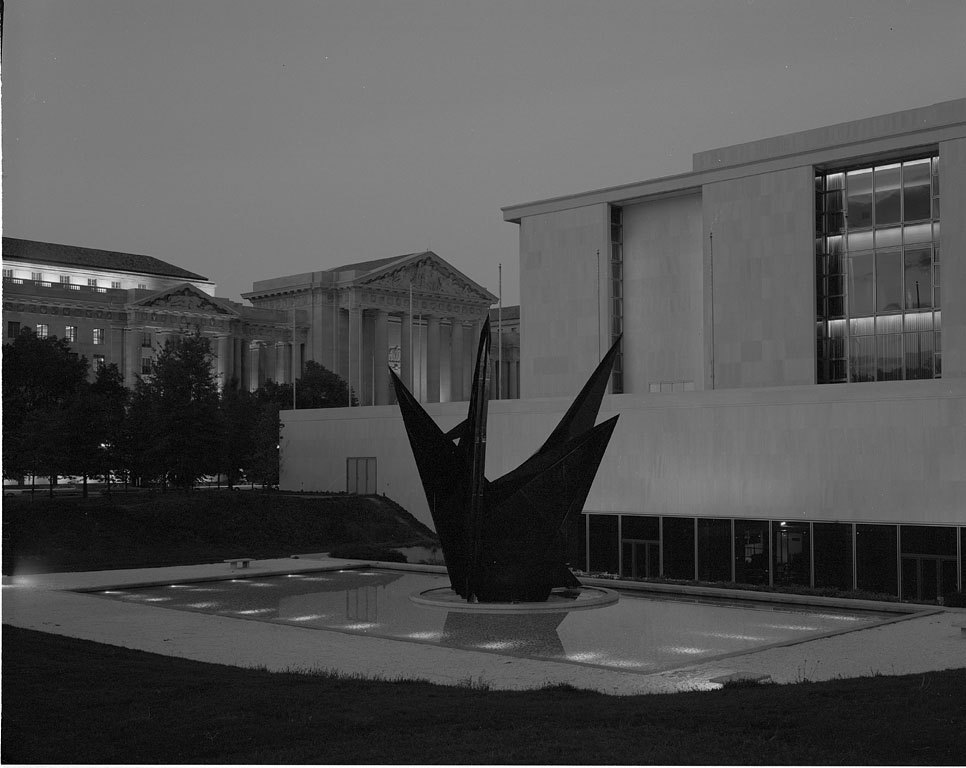
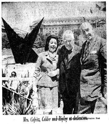
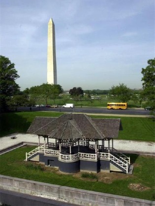 None of which seemed to slow down the Smithsonian which decided in 1983 to move the site-specific sculpture and replace it with a Victorian-era bandstand from the grounds of a Jacksonville, Illinois mental hospital. Or the Washington Fine Arts Commission which approved the move over the objections of–well, of almost no one, since Calder himself had died in 1976. The Washington Post did run an angry column by Robert Hilton Simmons, though, criticizing the trouncing of the artist’s intentions and the Museum’s claim that the sculpture’s new site, in a grove of trees on the corner of Constitution Ave & 14th Street, would “allow it to serve more fully as a focal point.”
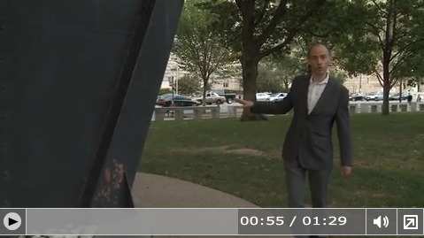
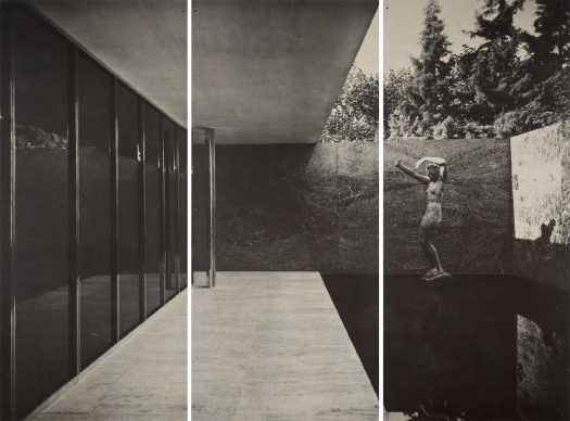
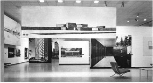
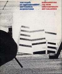 Still haven’t figured that out. But one thing leads to another, and so I’m looking at the catalogue for the last known appearance of “all” the Warhol boxes, a 1973 show organized by Maurice Tuchman titled,