
Holy smokes, the auction’s normal size, but the catalogue for Christie’s upcoming contemporary evening sale is huge. And some interesting stuff.
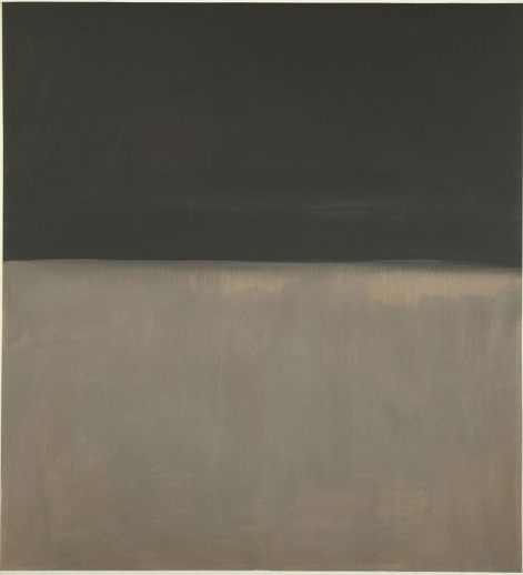
This late Rothko, Black on Gray (1969-70), for example. In his biography of the artist, Jimmy Breslin referred to this painting while saying that the series sometimes resembled “a stark lunar landscape.”
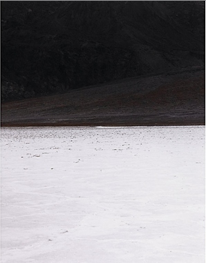
Frankly, it reminds me of a favorite, stark lunar landscape photo, an early Liz Deschenes work made in Death Valley in 1999: 280 Feet Below Sea Level. A copy of which happens to be coming up at auction soon after. With my luck, the underbidders on the Rothko are going to swoop in and bid the price way up.
Nov. 10, Lot 28: Mark Rothko, Black on Gray, est. $10 million – 15 million [christies.com]
Nov. 13, Lot 661: Liz Deschenes, 80 Feet Below Sea Level, est. $2500-3500 [ragoarts.com]
Category: art
Ansel Adams’ Japanese American Internment Camp Photos At MoMA. Shhh!
Someday this will all look and sound really coherent, I swear. But for going on, wow, 20 years, some of the most powerfully influential photos for me have been the images Ansel Adams took at Manzanar, the desert prison camp where Japanese-American families were interned at the outset of WWII. Deeply outraged that the US government would imprison its own citizens en masse, Adams set off to document the situation in 1943. In late 1944, he published a book, Born Free and Equal, which contained his text and a selection of the photos.
I spent years chasing down a copy of the book. And collecting prints from the series. And working with the Museum. And yet it was somehow only last week that I found out that in November 1944, Adams’ Manzanar photos were exhibited at the Museum of Modern Art.

Given that Adams had been asked by Edward Steichen to join his elite Naval Aviation Photography Unit, and that Adams was close with the Modern’s photography curator Beaumont Newhall and his wife, one might think that Adams’ wartime photos would have received the same prominent promotion and large-scale exhibition printing that Steichen’s Power in the Pacific show received a couple of months later.
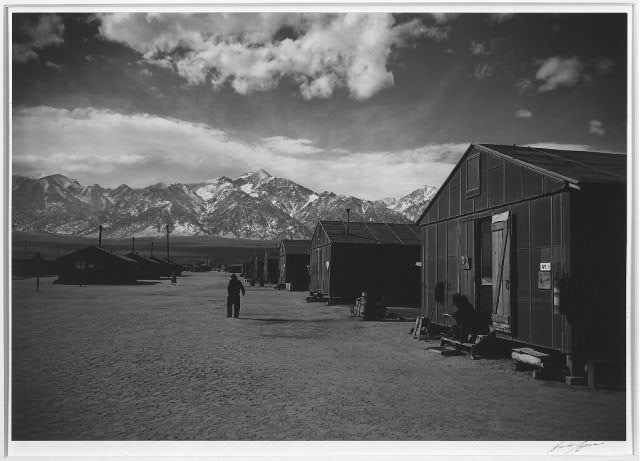
And one would be deeply and completely wrong. According to the most tepid press release in the Museum’s history,
A series of sixty-one photographs showing the life and activities at a relocation center in California form an exhibition opening in the auditorium galleries of the Museum of Modren Art Friday, November 10, under the title Manzanar: Photographs by Ansel Adams of Loyal Japanese-American Relocation Center. Mr. Adams has also written the accompanying text. The exhibition, an unusual demonstration of the use of documentary photography, will be on view through December 3.
The exhibition is described as “an activity of the Museum’s Photography Department,” and its acting curator, Nancy Newhall. Pull every string he has at the Museum, and still the best Ansel Adams can do is a three-week show in the basement.
Ansel Adams donated his Manzanar photos to the Library of Congress [loc.gov]
Previously: I Mean, Just Look How Happy They Were! [greg.org]
Related: Photomurals In Stardust Memories By Woody Allen [Not Related]
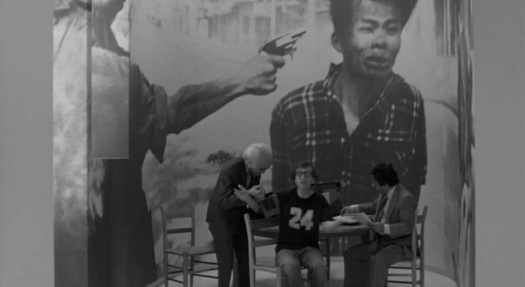
My recent photomural binge has flushed out some interesting comments and suggestions, including one from Craig about the use of a photomural as a key interior design element in Woody Allen’s 1980 film, Stardust Memories.
Allen’s character, filmmaker Sandy Bates, has wrapped the dining room of his Manhattan apartment with a photomural of Eddie Adams’s iconic 1968 AP photo from the Tet Offensive of the shooting of captured VC Nguyen Van Lem by South Vietnamese General Nguyen Ngoc Loan. [above] It was commonly understood to be a universal symbol of man’s cruelty, suffering, and inevitable mortality.
The shocking juxtaposition hadn’t worn off for Richard Woodward, who used the fleeting scene a full nine years later as the opening anecdote for a critique of art’s changing relationship with documentary photography. Titled, with the cloying question mark, “Serving up the Poor as Exotic Fare for Voyeurs?” Woodward seems to complain that the art world, which “favors big pictures and high prices” was messing it up for real [aka “documentary”] photography and serious subject matter:
Perhaps nothing in the film better conveys the twisted soul of the protagonist who, in his misguided need to project, magnify and expiate his guilt over the world’s pain, has turned a moment of unforgettable horror into a decorative mural. It’s a macabre joke about the heartless vanity that can underlie high-minded gestures; and it’s a warning about photography, which can lose any claim as a moral force after countless reproductions on the wrong kind of wall.
But then he ended with this:
Many contemporary artists, like Alfredo Jaar, Sarah Charlesworth and Louise Lawler, are making work in which the use of an image – its presentation by the news media or a museum – becomes the grounds for critical scrutiny in a context of the artist’s own devising. A persistent theme of art in the late 80’s has been the struggle to patrol and examine the use of images. At the very least, many artists seem to be saying, it is time to stop averting our eyes.
Only this turns out to be exactly what Woody Allen was doing a full decade earlier.
Whether it’s Supergraphics or Stephen Shore’s Architectural Paintings or a Bloomingdale’s furniture showroom, there has to be some context or precedent I’m missing here, otherwise Woody Allen should be figuring directly into the history of the emergence of the Pictures Generation.
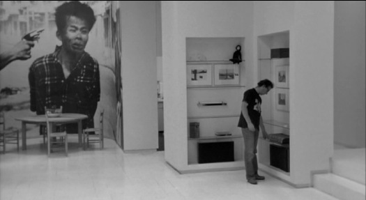
Because the heavily stylized, black & white Stardust Memories turns out to use photomurals and their relatives as crucial thematic and visual elements.
First off, Allen has said that most of the film actually takes place in his character’s head. Even his apartment, which is nominally in the film’s reality, “is really a state of mind for him. And so depending on what phase of life he’s in, you can see it reflected in the mural.”
Though Adams’s photo is often mentioned, and the stills above are common, I couldn’t find images of any of the other murals. So I just rewatched Stardust Memories [at high speed] and pulled out all the ones I could find. I’d hoped that I could find some discussion of the murals and the film’s design from production designer Mel Bourne, but so far, nothing. Bourne did several films with Allen, including Annie Hall and Manhattan, But he also did the production design for Fatal Attraction and, awesomely, the pilot for Miami Vice. Anyway, they’re all after the jump, because, maybe some people might want to skip them? Not me.
Continue reading “Related: Photomurals In Stardust Memories By Woody Allen [Not Related]”
‘No Monuments To Jesus’
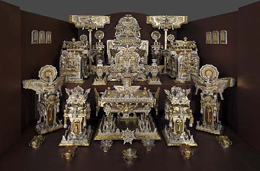
One of the most incredible works of visionary art in Washington DC is James Hampton’s The Throne of the Third Heaven of the Nation’s Millennium General Assembly. Hampton, an African American WWII veteran and janitor at the General Services Administration, built the 180+piece assemblage out of discarded furniture, cardboard, cellophane, blotter paper, and foil, in a rented DC garage. He spent at least 14 years working every night, in secret, and it was only discovered by his landlord after his death in 1964. After several uncertain years, it was donated to the Smithsonian’s Museum of American Art in 1970.
Hampton told almost no one about his work, but notes attached to the various objects seem to indicate that he was receiving visitations by angels, who directed him to construct the Throne in preparation for the Second Coming of Jesus Christ. Most of the notes, though, and his voluminous writings, as well as the contents of a looseleaf notebook titled, The Atlas of The State of Eternity, are written in Hampton’s own code, which is comprised of mixed and altered Hebrew, Greek, and Roman characters. As far as I can tell, these works have not been deciphered, nor have facsimiles been published.
update>I am happy to be corrected, especially during National Archive Month or whatever. The Archives of American Art has Hampton’s writing available on microfilm. An independent researcher of enciphered documents, Dennis Stallings, has an extensive site about decoding what he calls “Hamptonese.” And in 2004, San Jose State computer scientists Mark Stamp and Ethan Le published a statistical analysis of Hamptonese. Because it doesn’t correspond to a typical substitution code, they defer to the previous hypothesis that Hamptonese is “the written equivalent of ‘speaking in tongues.'” In other words, not their department, either.
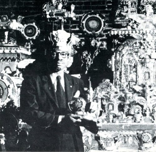
image from Naives [sic] and Visionaries, Walker Art Center, Minneapolis, 1974, via stopping off place
Hampton obviously showed someone his work, because there is a photo of him standing in front of it [above], which Michael from stopping off place posted this summer. Interestingly, those crowns were separated from The Throne in some way, and were only donated to the AAM in 2001. Perhaps there is more work–and more story–still out there somewhere.
After it was conserved, in 1976, The Throne… went on a several cities tour. Curator Lynda Roscoe Hartigan wrote an essay laying out as much of the work’s and its creator’s history as could be known at the time. Hampton, who called himself Saint James in his writing, also mentioned a Baptist minister named A.J. Tyler:
Despite Hampton’s Baptist background, he was not a member of a congregation in Washington. Believing that there is only one God, Hampton considered different religions unnecessary. An important encounter with the Reverend A. J. Taylor, a popular black minister who died in 1936, may have occurred in one of the neighborhood churches he occasionally visited. The Mount Airy Baptist Church, where Taylor served, was not far from Hampton’s boarding house, and it is possible that the Reverend inspired Hampton during a revival meeting or Sunday sermon.
Tyler was noted for having said that in Washington, the city of monuments, there were no monuments to Jesus. During his ministry, he installed an electric sign, “Monument to Jesus,” over the door of the Mount Airy Baptist Church.
Hampton may have been intrigued by the minister’s idea for a monument to Jesus; the word “monument” is entered in one of his notebooks, and numerous references to A. J. Tyler appear in the assemblage. Many pieces bear labels reading “Tyler Baptist Church,” although Tyler never preached in a church of that name. Hampton also indicated in his notebooks that Saint James was the pastor of “The Tyler Baptist Church.” Tyler may thus have been a model and an inspiration for Hampton, whose commemoration of the Reverend seems to have mingled freely with his belief in the Second Coming.
Emphasis added because, hello, “the city of monuments.”
As spectacular as Hampton’s creation is, it’s not at all clear that he himself considered it to be art. In fact, the texts he left behind almost certainly refute that categorization. These are devotional objects, grounded in his complex religious experience. With American Indian tribes, the Smithsonian has gone to great lengths to recognize and preserve the cultural and spiritual aspects of relics and artifacts; I wonder if there has ever been discussion of dealing with Hampton’s work in the same context.
James Hampton, The Throne of the Third Heaven of the Nations’ Millennium General Assembly, 1950-64 [americanart.si.edu]
So What Are You Up To Thursday Night?
While I’ve mentioned it on my Twitter feed–the 500 people who read this blog are the same 500 who follow me there, right? @CheapDrugs4U?–I should say here, too, that I have been invited by the folks at 24|7 Creative, a Facebook group sponsored by HP and Intel, to guestpost some of my favorite art, video, and video art picks on their wall.
This is in a run-up to the Big Event this Thursday, some live coverage of the [also HP and Intel-sponsored] YouTube Play blockbuster/extravaganza/show/event at the Guggenheim. So stay tuned, because while my mother did raise me to be a gracious guest, the 24|7 Creative folks are certainly not paying me enough to sway my opinions on anything.
If you haven’t decided whether or not you’ll be attending the YouTube Play gig, and your current lack of tickets is a factor in your decision, then hop on over to this comment contest, where you can win a free pair of tickets to this sure-to-be-landmark spectacle.
I tell you, though, it’s not a slam dunk. Because holy smokes, Thursday at 6:30 is the only scheduled screening so far at the Film Society at Lincoln Center for Sasha Waters Freyer’s new documentary, Chekhov for Children, which tells the incredible-sounding story of Phillip Lopate’s 1979 quest to to a Broadway staging of “Uncle Vanya” with a cast made up entirely of New York City 5th and 6th-graders. Including the filmmaker herself. :
Using incredibly rare archival video and super 8mm student-made films and videos, Chekhov for Children explores the interplay between art and life for a group of students across 30 years–including the filmmaker. It is a rare document of its time that meditates upon the reckoning that comes with middle age through the very moving lens of universal themes: first love, mentoring, and parenting.
I’m getting a little verklempt just typing about it.
¡Pasarán In! The Spanish Pavilion, Paris 1937
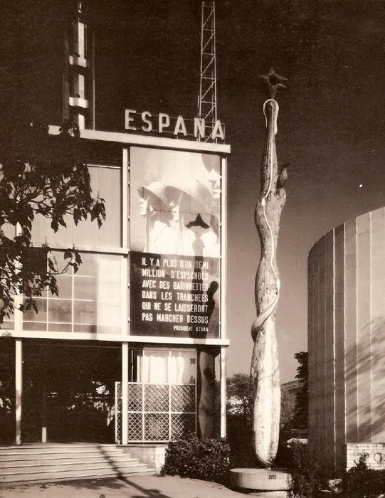
Worlds Fairs turned out to be the perfect venue for photomurals–they were catchy, usually didactic, packed a visual punch, and got the point across to the shuffling masses. And at least in the 1930s, they looked like the future.
So to a government whose future was being immediately threatened, like the Spanish Republic under siege by Franco and his fascist army, a publicity- and sympathy-generating pavilion at the 1937 Paris Expo literally seemed like a matter of survival.
José Luis Sert and Luis Lacasa designed the small, simple pavilion, which didn’t get completed in time for the opening, and which anyway, ended up being overshadowed by the bombastic, dueling pavilions of Nazi Germany and Stalinist Russia.
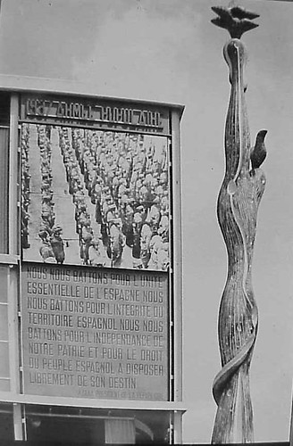
So to get attention, a huge photomural/banner of Republican loyalists was hung over the entrance. [Intriguingly, in two of the three most widely circulated photos from the Expo, including the Le Monde photo announcing the opening, the mural is cropped out or coincidentally obscured by a tree branch.] As kk_redax’s photo on flickr shows, the photomural was changed periodically:
Like breakdancing was to gangs, world’s fairs were designed as a non-violent means for competitive, conflicting nation states to jockey for supremacy. But the Spanish Civil War pushed the Republican government to a new, urgent level of pavilion-building. The war, which was fought on the ground through media, posters, photos and newspapers [and also guns and bombs], also gave birth to modern photojournalism. And the Paris Expo was the site of Spain’s immediate experiement in architecture as military polemic. And then there’s the art.
The Republican government sought to garner international support by assembling modern works by sympathetic artists that express powerful and overt political outrage, including a large painting of an upraised fist by Joan Miro . And unveiled on the ground floor was Picasso’s Guernica.
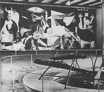
Painted in 24 days in his new Left Bank studio in the spring of 1937, Guernica‘s duotone palette reflects how Picasso and the rest of the world learned of the Nazis’ devastating saturation bombing foray: via newspaper photos and newsreels. Photography had an even more direct impact on the making of Guernica: Picasso asked his companion Dora Maar to document the painting process, and there’s a scholarly case that “the tonal variations Picasso observed in Dora’s photographs appear to have influenced the development of those in the middle stages of the painting.” Though it sets the bar pretty high for the rest, it’s not much of a stretch to call Guernica the greatest photomural of the 20th century.
But wait, that’s not all! In the Pavilion Guernica was installed next to Mercury Fountain, an abstract, kinetic sculptural tribute to the Almaden region of Spain, which at the time produced the lion’s share of the world’s mercury. Oh, the fountain was by Alexander Calder. While Guernica‘s world travels are well known, Mercury Fountain is a Calder whose relocation was both successful and imperative. It currently sits at the Fondacion Miro in Barcelona, sealed behind glass, in order to contain its toxic vapors.
Guernica, meanwhile, is now encased in glass for its own protection.
…The Spanish Pavilion [pbs.org]
A comprehensive post about El Pabellon Espanol, in Spanish [stepienybarno.es]
The Mexican Suitcase, rediscovered Spanish Civil War negatives by Capa, Chim, and Taro [icp.org]
The Enlarged Pictures Generation: Alvar Aalto’s 1939 Finnish Pavilion
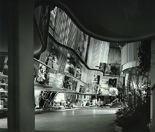
image: vintage silver gelatin print, signed, Ezra Stoller, 1939, via morehousegallery
Do turning back another chapter or two in the history of enlarged pictures, photomurals, and photomontages, where do they turn up the most [besides/before the Museum of Modern Art]? Expos and World’s Fairs. Even more than dioramas, and like the grand cyclorama paintings of earlier eras, giant photos were used by architects–in the service of governments and companies–as modernist, machine age, marketing, mass communication, and propaganda. They were basically highly credible-looking billboards.
None of which is necessarily a bad thing in itself, of course. It’s interesting to note, though, who was creating and using them, because for the most part, it was not artists.
Alvar Aalto’s Finnish Pavilion at the 1939 World’s Fair in New York turns out to have been a stunning and especially instructive example of enlarged photos integrated with modernist architecture. That’s it up top in a photo by –let’s just say I could just as easily title this whole series, “Everything I Know About Photomurals, I Learned From Ezra Stoller.”
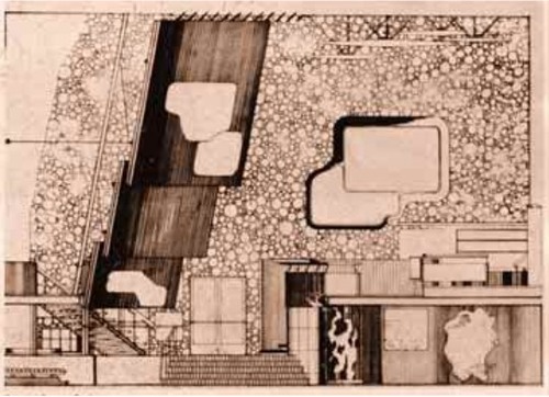
In a plain, rectangular building, Aalto wrapped a second floor exhibition space with an undulating wood-slatted wall, inset with three rows of giant photos [Aalto’s section plan above, via domus, I think] to create a dramatic, infotaining, 52-foot high atrium. A mezzanine restaurant [below] allowed for closer viewing of the photos, which showed, from top down, “Country,” “People,” and “Work,” which culminated, naturally, in the bazaar of real Finnish products underneath.
And what’s that box up there hanging dramatically off the wall, besides the key to the photomurals’ media context and appeal? It’s a projection booth. Films, presumably on the subject of Finland’s awesomeness, were projected onto the atrium wall above the exit. I can’t help but see the effectiveness and popularity of large-scale photos as inextricably driven by architects’ attempt to harness the modern media magic of the cinematic experience. And as antecedents for the now-ubiquitous, immersive projection and installation art works. Like steampunk Pipilotti Rist.
1939 Finnish Pavilion info [designboom]
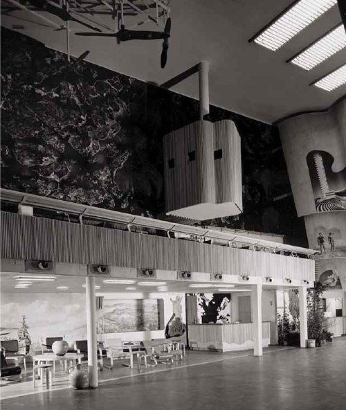
The Family Of The Family Of Man: Steichen, Miller, Rudolph, Stoller…
I’m on a bit of a photomural binge at the moment. In email, Dr. Olivier Lugon, he of the awesome article about Stephen Shore’s Signs of Life photomurals, points out two things about Edward Steichen [and, let’s give the man credit, since he’s all over and in that show, Wayne Miller, though with these brackets, where do I put the apostrophe s?] ‘s 1955 show, The Family of Man.
First the good news: The sole [?] remaining copy of the traveling version of The Family of Man was donated to Luxembourg, the country of Steichen’s birth, and it is on permanent display at Chateau Clerveaux. Except that it just closed two weeks ago for two years, for renovation and conservation. So, book your post-Maastricht2012 roadtrips to Luxembourg now!
Now the bad news, which is also good news: The installation photo I linked to purporting to be from The Family Of Man is, in fact, not. It is from a 1945 exhibition Steichen did at MoMA titled Power In The Pacific, which was designed by George Kidder Smith.
I say good news, though, because it pushes the photomural story back a decade, and it helps flesh out the context and function of enlarged photography as a mass communications, i.e., propaganda tool. Power In The Pacific was comprised of photographs taken by the Naval Aviation Photographic Unit, which was under the command of Capt. Edward Steichen, and which included Lt. Wayne Miller. Ansel Adams would have been in there, too, but he wanted to delay enlisting for a couple of months, and Steichen wouldn’t have it. Adams went on to photograph the Manzanar Japanese-American internment camp, photos of which were exhibited at MoMA in 1944. [Now those are some photomurals I’d love to see. Except, well, let’s put that in another post.]
Power in the Pacific opened in January, while Steichen was still on active duty, and traveled around the country. [I did not realize this until just now, but Steichen reported to the head of the Navy’s Bureau of Aeronautics, Rear Admiral John S. McCain, Sr. Small world.] Many of the Naval Unit photographers’ work was included in Family of Man.
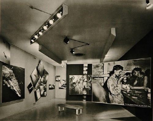
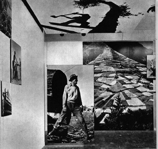
Which, I just couldn’t resist scanning in a couple of Ezra Stoller’s magnificent photos of Paul Rudolph’s installation from the original Family of Man catalogue.
photos by Homer Page, Brassai, George Silk (on ceiling)
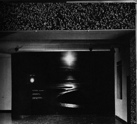
photo by Pat English used as wallpaper framing an unknown landscape.
As seen in Stoller’s photos, Rudolph’s show is an apotheosis of the enlarged photo and mural as an architectural element, a maker of spatial experience. It’s easy to say that photomurals and photomontages are architecture, or marketing, or propaganda, and not art, and it’d be true. But it’s also true that photography itself was not art at the time, either. As for photomurals and giant, painting-sized photos, they were merely the things exhibited in the Museum of Modern Art.
Stephen Shore’s Photomurals, I Mean, ‘Architectural Paintings’
that sidewalk, that exit sign, that door. installation image of Stephen Shore’s images, 1976
So yes, I’ve got a million other things to do, but thanks to this Mies thing being auctioned, and Michael Lobel’s article on photography and scale–and by implication, photography and painting, pace Chevrier’s forme tableau–I’m become slightly obsessed with the history of photomurals.
From what I can tell so far, I have the field largely [sic] to myself, but there is definitely some interesting work out there–and some interesting writing about it. And who should turn up as one of the innovators of these scale-blasting photomurals, but the master of the snapshot himself, Stephen Shore?
Just this past May, Swiss art historian Olivier Lugon published an article in Études photographiques titled, “Before the Tableau Form: Large Photographic Formats in the Exhibition Signs of Life, 1976.”
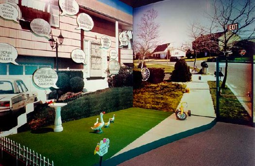
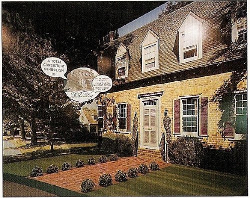
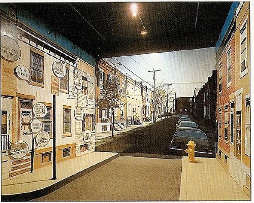
Signs of Life: Symbols In the American City was a groundbreaking and somewhat controversial show held at the Smithsonian’s Renwick Gallery as part of the US Bicentennial celebrations. Conceived in 1974 on the heels of the publication of Learning From Las Vegas by Robert Venturi, Denise Scott Brown and Steven Izenour, it was, depending on who you asked, an exultation, an examination, or an elitist excoriation of commercial and populist vernacular architecture and design. They filled the gallery with iconic roadside signs, and they created dioramas of archetypal American living rooms to give all Our Stuff the museological treatment.
And to photograph it all–and to create giant, deadpan photomurals of the American residential streetscape–Izenour selected a young photographer whose seemingly unstudied roadtrip snapshots had just been shown at the Met, Stephen Shore.
Lugon quotes Venturi & Scott Brown’s explanation of the show [I’m translating back here from French, so it’s probably off a bit]:
“The idea was to cross the model of the billboard, this image made for distant, fugitive, distracted perception of the driver, with that of the newspaper, which is a density swarming with information.” The art museum is thus invaded by two different but interdependent media regimes: the advertising billboard’s principle of rapid distraction, and the extreme informational concentration of the newspaper, two opposing models for aesthetic contemplation, where the distance of the viewer from the image is either too far or too close.
Despite working at like 100x his previous [and, for the most part, subsequent] scale, Shore’s illusionistic photo backdrops manage to capture the banality he loves. Banality in a good way, of course. I think this street is my favorite:
Maybe because he wasn’t a fetishy print guy–Shore rather famously sent all his film to Kodak to be developed, just like civilians–he readily embraced the print quality of the photomurals. Which–I love this–turned out to be paintings.
Lugon explains that the Signs Of Life photomurals were made with an expensive, state-of-the-1976-art, 4-color airbrush-like printing system from the Nippon Enlarging Color Company, which had been licensed for the US by 3M. Who marketed it to trade fairs and restaurants as Architectural Painting. With the public and art world attention from Signs of Life, 3M brought Izenour on to promote the new medium for use by artists and museums.
In 1977, Popular Science ran an article explaining how Architectural Painting technology worked. A specially prepared color negative was scanned and split into CMYK, and the quick-drying paint was applied in overlapping strips, inkjet-style, by a computer controlled, scanning sprayer. 3M technicians then touched up the finished print by hand. All in, it cost $10-25/sf.
Expensive enough to be the second largest line item on Signs of Life‘s budget, and sexy enough that Venturi et al. used it again almost immediately. For their controversial [i.e., steaming hot mess, according to Robert Hughes, who I’ll happily believe just this once] exhibition design for the Whitney’s Bicentennial blockbuster, 200 Years of American Sculpture, the architects installed a 27-foot-tall cutout photo by Shore of Hiram Powers’ iconic marble, Greek Slave, on the canopy of the museum. Ezra Stoller says it was “inspired by Caesar’s Palace,” which I’m sure was a compliment:
Once again, I start programming a bonus DVD for “The Original Copy,” Roxana Marcoci’s current show at MoMA on photography and sculpture. But I think the real story here is painting and photography.
Jean Francois Chevrier gets credit for the term forme tableau, which he used to describe the large-format photographs which began to assert a place on the wall and in the discourse that had previously been reserved for painting in the 1980s [and since]. Then Lugon mentions how Sherman, Prince, Kruger, etc. had appropriated the photography of commercialism–advertising and movies [Untitled Film Stills began in 1977]. And now here’s Shore, right there in the thick of things, making giant photos with his new-fangled, trade show backdrop printing techniques–which turn out in the end to actually be paintings. [And sculpture. And architecture.]
The kicker, though, is one of the complicating factors for why I’m finding photomurals so interesting right now. And I write this as a guy who has two of Felix Gonzalez-Torres’ Parkett billboard/photomurals because, once you install one, it’s up, it’s done, it’s gone: they managed to thwart the market. Here’s Lugon:
The photomural reveals itself to be extremely vulnerable. Its own installation, its dependence on conditions of fixation and lamination make it enormously fragil: with rare exceptions, it does not survive its exposition. It’s one of the fundamental points that distinguishes it from painting: its incapacity to become an object of collection.
When it was developed in the 19th century, photography constituted precisely a pure image for collecting: one acquired it to conserve, because it was capable of bringing all objects in the world together into a system of thesaurisation and generalized comparison, but it’s difficult to show. Small and grey, taking poorly to the wall, and with a surface that deteriorates in the light the more one views it. The grand format photos of the interwar years reversed this logic: photography became the image of exposition, but it renders it improper for collecting.
Only the forme tableau would succeed in crossing these two qualities, to make of photography an image at once for exhibiting and collecting–two criteria indispensable for accessing fine art’s economic system.
I guess I’ve gotta call Stephen Shore now and see if that’s really true, about his photomurals, I mean.
Other Barcelona Pavilion Photomural
Hah, it didn’t occur to me until I started looking into the history of photomurals, and–thanks to Michael Lobel’s great exploration of contemporary photography and scale in the new Artforum–I sucked it up and started reading Michael Fried’s new book about the new forme tableau photographic hotness, but this thing looks like that thing:
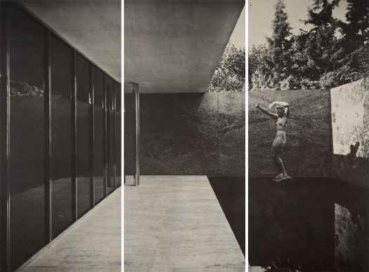
Lot 360 Mies van der Rohe, Barcelona Pavilion 1929 photomural, printed 1966, 2m x 3.5m [greg.org via lamodern]
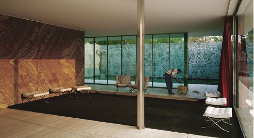
Jeff Wall, Morning Cleaning, Mies van der Rohe Foundation, Barcelona, 1999, 1.8m x 3.5m [image via tate.org.uk]
The photomural, printed by architect/curator Craig Ellwood for LACMA’s 1966 Mies van der Rohe retrospective, is, of course, of the original pavilion. Wall’s 1999 image is of the re-creation.
Imagine There’s No Made In Heaven
Christian Viveros-Faune’s ruthless smackdown of the Luxembourg & Dayan show of Jeff Koons’ porny 1990 Made In Heaven series is an acid, but necessary reminder of how economically and critically disastrous the early 1990s were for the artist. [Though I’m sure there’s a schadenfreude set who hug those Dinkins-era memories close.]
It also reminds me of a 1999 panel discussion Koons did with Rob Storr at MoMA. The occasion was the 25th anniversary of Artists Space. When asked why he had not mentioned Made in Heaven during his otherwise comprehensive conversation, Koons had said that he had repudiated the work, and that he would henceforth no longer associate himself with it. That’s always stuck with me.
He also mentioned being in a difficult and highly distressing custody battle at the time with his Italian ex-wife. So maybe the repudiation had a strategic element to it, and now that his son has moved and grown up, it’s time for takebacks.
If anyone goes to MoMA and tracks down that recording [which is not currently online], I hope they’ll tell me if I’m remembering it wrong.
UPDATE: And I may be. greg.org reader Dan emails to say that he listened to the tape yesterday at MoMA’s archive, and unless it was in part of the audience Q&A he missed, then this exchange wasn’t in it. I’ve had a distinct memory of hearing it, though, so I’ll have to figure out where that might have been. I’ve spoken with Koons several times–we used to live across the street from each other–but this series of work was not a topic I brought up with him.
Jeff Koons, Commodities Broker
So I think I had a breakthrough in figuring out the details of Jeff Koons’ Wall Street Era.
I just wrote a post about it. It is so long. So I put it below.
What I Didn’t See
The other weekend, I pigeonholed former Washington Post art critic Paul Richard after his talk, titled “What I Saw,” at the National Gallery of Art. I said that I’d been interested to hear his take on public art over his 40-year career, and he answered back, “What public art?” “I guess that was my real question,” I said.
Richard then made a quick and familiar explanation that public art is outdoor art, outdoor art is sculpture, museums in town focus on painting, and so sculpture generally and outdoor sculpture specifically is marginal[ized].
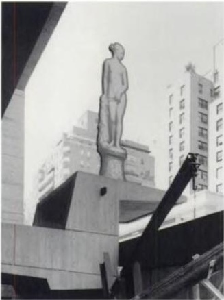
I had this exchange in my mind when I watched the Post’s current art critic Blake Gopnik effuse over his “favorite new discovery,” a massive Alexander Calder sculpture that has been sitting on one of downtown Washington’s busiest intersections for almost 30 years.
Gopnik said that in a series of Post web videos called, “The Wonders Around Us.” He opens another, featuring the chair-shaped granite sculptures of the late Scott Burton, thus: “I’m at the Sculpture Garden of the National Gallery, looking at works I don’t often look at–the ones they keep outside.”
In another video, discussing Richard Lippold’s 100-foot-tall steel starburst sculpture Ad Astra, in front of the National Air and Space Museum, he ends on what he imagines is a poignant and/or ironic note:
Amazing how you look at this thing, and you realize that almost no one but you is looking at it. Not a single head turned up to look at poor Richard Lippold’s magnum opus.
[Let’s ignore the fact that if Lippold has a magnum opus, it’s probably Orpheus and Apollo, which glitters across the atrium lobby of Avery Fisher Hall. Gopnik was going for pathos, and couldn’t very well call Ad Astra a “masterpiece” so soon after calling it a TV antenna.]
Days later, Gopnik was writing about Hirshhorn director Richard Koshalek’s proposal to renovate the museum’s sculpture garden on the Mall and add indoor exhibition space to/under it, since the current sculpture setup is “dormant,” rather than “lively,” and [anecdotally, at least] is always empty.
Which may be true, but that’s not [quite] the point. And [for once or twice] I don’t want to pick on Gopnik; in this case, I think his forthright ignoring of outdoor sculpture is probably in sync with the general population of DC. The city is stratified and carved up into ghettos for tourists and locals alike. Commuters, whether in cars or trains, on bike or on foot, rarely venture off their routes.
Outdoors, art, or sculpture in a drive-by situation quickly becomes invisible, receding into the landscape passing outside the window. But is that actually just a DC thing? I don’t think so. Is it even just a city thing? Is it even just an art thing? How quickly does something become invisible, and why? What happens to art in such a context? Has someone written about this with intelligence or insight?
Is it even just outside? We like to think that art rewards close or considered looking. But how long do most people look at most artworks in most museums? [answer: for less time than it takes to read the label next to it.] Do professional art lookers sit through every blackbox video installation they enter, or do they only watch long enough to “get it”?
When I started, I thought I was writing this about DC, its critics, its particular context, sculpture, outdoor art. See how the circle keeps expanding to include everything? Now I’m a little bummed out.
A Small Collection Of Awesome Browser Tabs
Here are some things I find I have kept open for several days or weeks, which I guess is one measure of how they are sticking with me:
Andrew Russeth’s look into the market and objects of Marcel Duchamp is pretty great. I’ve been keeping Duchamp’s practice on a low burn for several months now. One thing Andrew reminded me of, is looking through the chronology in the MoMA/PMA Duchamp retrospective catalogue. For a guy who supposedly stopped making art in like 1915 or whatever, Duchamp sure spent a lot of time over the years making, picking & packing Boites en Valises.
Oh, another thing Andrew reminds me of: how great dealer Francis Naumann’s book about Duchamp’s objects, Marcel Duchamp: The Art of Making Art in the Age of Mechanical Reproduction is.
Dan Hill’s been really busy of late, and so the time lapse has grown between the classically long, thoughtful posts on City of Sound. Which makes it even more imperative to read his recent contemplation of the ever-so-slightly undulating grid of Carrara marble on the facade of Alvar Aalto’s Finlandia concert hall in Helsinki. That guy knows how to see and think. Hil, that is. Aalto’s no slouch, either, but you know what I mean.
Perhaps in unconscious preparation for a long-overdue Terry O’Shea retrospective, Grace took a photo of the biggest La Brea tar pit from the second floor of LACMA in 2007.
Here is how the books in three galleries in a row looked Saturday. This one happens to be from Pruitt’s show Maccarone:
Which, by the way, I know I love the Monsters, but I was not ready for the Ikea paintings. They were rather engrossing. He paints over the Ikea knockoffs-on-canvas using a phenomenal amount of paint. The first one in the doorway, on the left, is full of flesh tones, and has this incredible surface, caused in part by Pruitt’s use of Saranwrap or something to smooth down the thick, undulating surface. Of course, when he removed the plastic, the paint came up in spots, forming little peaks. In other places, gaps in the paint exposed the Ikea image below, and in still others, the creases of the plastic remained. If I’m the first, I should not be the last to consider Pruitt’s Ikea paintings alongside the overpainted photographs of Gerhard Richter. Yes, that’s right. At the very least, it’s an interesting and unexpected reference.
Distinctively unawesome: UbuWeb has been knocked offline. [via eyeteeth]
Consider The Artist
Karen Green has a show of her most recent art work at the Space Art Gallery in South Pasadena. Thematically, it is similar to her show last year:
The work of making the pieces in “Latent Learning Experiments,” Ms. Green said, held her together in the year after her husband’s death. “I kept making art because I didn’t know what else to do, and that’s what I’ve always done,” she said.