From about 1956 until 1964, US aeronautics engineers and rocket scientists at the Langley Research Center developed a series of spherical satellite balloons called, awesomely enough, satelloons. Dubbed Project Echo, the 100-foot diameter aluminumized balloons were one of the inaugural projects for NASA, which was established in 1958.
In his 1995 history of NASA Langley, Space Revolution, Dr. James Hansen wrote:
The Echo balloon was perhaps the most beautiful object ever to be put into space. The big and brilliant sphere had a 31,416-square foot surface of Mylar plastic covered smoothly with a mere 4 pounds of vapor-deposited aluminum. All told, counting 30 pounds of inflating chemicals and two 11-ounce, 3/8-inch-thick radio tracking beacons (packed with 70 solar cells and 5 storage batteries), the sphere weighed only 132 pounds.
For those enamored with its aesthetics, folding the beautiful balloon into its small container for packing into the nose cone of a Thor-Delta rocket was somewhat like folding a large Rembrandt canvas into a tiny square and taking it home from an art sale in one’s wallet.
The satelloons were made from a then-new duPont plastic film called Mylar, which was micro-coated with aluminum using a then-new vacuum vaporizing technique developed by Reynolds Aluminum Co. Originally conceived as research tools to collect data on the density of the upper atmosphere, the reflective satelloons also served as proofs of concept for space-based commmunications systems.
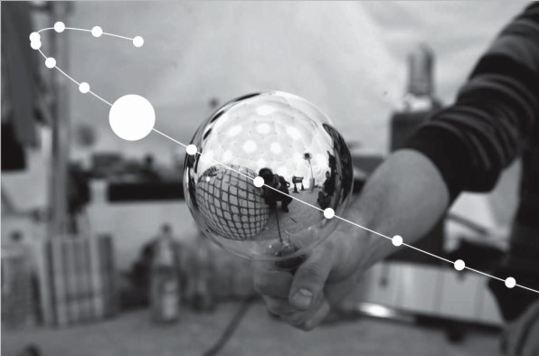
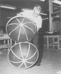
The original research proposal put forward by a Langley engineer named William J. O’Sullivan called for a 20-inch balloon, which was increased to 30 inches. These “Sub Satellites” were followed by a 12-foot diameter Beacon satelloon, the size of which was determined, not by any scientific requirements, but by the ceiling height in the Langley model fabrication room.

In the post-Sputnik euphoria of a 1958 congressional hearing at which a Beacon was inflated in the Capitol Building, O’Sullivan assured politicians that a communications satelloon “10 stories high” could be readied and launched very quickly which could be used “for worldwide radio communications and, eventually, for television, thus creating vast new fields into which the communications and electronics industries could expand to the economic and sociological benefit of mankind.” Such a large, American satellite would also be visible to the naked eyes of everyone in the free world and in the rest of the world. Just like Sputnik, only much, much bigger. It was these 100-foot satellites which were called Echo; the rocket system that would launch these giant balls into space was called Shotput.


l: nasa. r: flight spare at nasm
With this exponential increase in scale, NASA’s Project Echo team faced major engineering challenges in packing and deploying the satelloon. They eventually devised a two-piece spherical payload container laced together with fishing line and ringed by a small explosive charge, which would deploy the balloon.
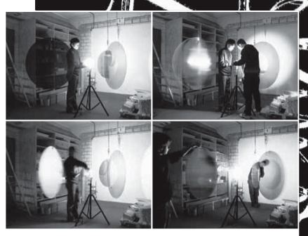
Then there was the issue of seams. At a 1959 inflation test in a disused blimp hangar in Weeksville, North Carolina, the original General Mills Echo split apart. A photo in Hansen’s book shows O’Sullivan and his colleagues sticking their heads through a gash of the collapsing balloon. The top photo is from a later 1959 test, also at Weeksville.
Folding was another major challenge. G.T. Schjeldahl, the Minnesota packaging manufacturer contracted to build the Echo satelloons after General Mills, had the adhesive question solved, but they couldn’t figure out how to fold the thing. [Founder Gilmore Schjeldahl is credited with creating the first air sickness bag in 1949. In the 1950’s, his company also made inflatable buildings known as Schjeldomes.]
After watching his wife unfold a tiny plastic rain bonnet, however, Ed Kilgore had a “Eureka moment,” which set Langley’s technicians in motion:
At Langley, Kilgore gave the hat to Austin McHatton, a talented technician in the East Model Shop, who had full-size models of its fold patterns constructed. Kilgore remembers that a “remarkable improvement in folding resulted.” The Project Echo Task Group got workmen to construct a makeshift “clean” room from two by-four wood frames covered with plastic sheeting. In this room, which was 150 feet long and located in the large airplane hangar in the West Area, a small group of Langley technicians practiced folding the balloons for hundreds of hours until they discovered just the right sequence of steps by which to neatly fold and pack the balloon. For the big Echo balloons, this method was proof-tested in the Langley 60-foot vacuum tank as well as in the Shotput flights.
The first Shotput flight occurred almost exactly 48 years ago, in the late afternoon of October 28, 1959. The launch and deployment were successful, but the Beacon exploded, most likely due to residual air left in the balloon to aid its inflation in the vacuum of space. The result was a spectacular, 10-minute light show all along the east coast of the US as “the thousands of fragments of the aluminum-covered balloon…reflected the light of the setting sun.”
To uncover the cause of any future failures, the engineers coated the inside of each satelloon with red fluorescent powder. Then they set up a 500-inch focal length camera on the beach near the launch site to document the unfurling in space. They also publicized the launches well in advance, so they could get mitigate any negative publicity of an explosion–and possibly get some credit for another light show.
Echo 1 was destroyed when its rocket failed. Echo 1A, which was commonly known as Echo 1, was successfully launched August 12, 1960. Bell Labs in Holmdel, New Jersey beamed a radio message from President Eisenhower to it on its first orbit, which was reflected back to the world:
This is President Eisenhower speaking. This is one more significant step in the United States’ program of space research and exploration being carried forward for peaceful purposes. The satellite balloon, which has reflected these words, may be used freely by any nation for similar experiments in its own interest.

To communicate with the Echo satelloons, Bell Labs built a 50-foot long horn-shaped antenna in Holmdel, which could rotate and pivot on several axes. Later, in 1964, while calibrating the antenna, Drs. Arno Penzias and Robert Wilson detected microwave background radiation, the first concrete evidence of the Big Bang theory. They were awarded the Nobel Prize in 1978.
Echo II was launched in 1964. Both Echo satelloons stayed aloft for years [until 1968 and 1969, respectively] Though not very efficient, their passive communications technology spurred on the development of active signal-transmitting communications satellites like Telstar. An Echo II was exhibited at the 1964 New York World’s Fair, and a folded backup is on display at the National Air & Space Museum.
I’ve highlighted some of the aesthetic or non-scientific elements from Hansen’s long, somewhat rambling but detailed chapter on Program Echo to make a point. Or more accurately, to pose a challenge. In the art world, thanks in no small part to Duchamp, we privilege intentionality above all; anything–even the most mundane or found object, situation, and action–is art if the artist declares it to be so. But nothing else.


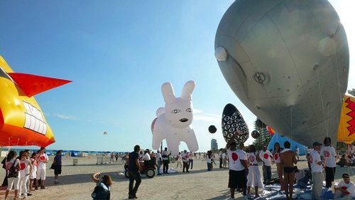
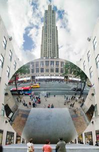
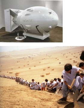
Rirkrit Tiravanija cooking curry; Anish Kapoor employing an engineering firm to build a giant tension-fabric cone or a polished steel parabolic mirror; Michael Heizer etching patterns on the desert with his motorcycle tires; Cai Guo-Qiang exploding an arc of rainbow-colored fireworks across the East River; Tom Sachs replicating Fat Man for Sony; Francis Alys contracting hundreds of laborers to move a mountain of dirt one foot to the left.
How does the remarkable historic, political, cultural, aesthetic, performative, and conceptual achievement of NASA’s Project Echo fit into the cash-and-carry art world? Or, because I’m sure NASA, et al could not care less, and it’s really the art world’s problem, how does the collectively accepted framework of the art world deal with the fantastic, innovative, creative, and life-changing realities of the world around it?
The continent-spanning light show? The largest minimalist sculpture to ever orbit the earth? The hundreds of hours spent folding balloons in a bricoleur’s clean room? The meticulously choreographed performance of folding it? The stop-action artifacts of exploding powder bombs? The emotional and political manipulations of narratives of success and failure, and the rush of collective ego-boosting as a country watches from their porches for Echo to pass overhead?
In practice, product, experience, and impact, Project Echo is every Tate Turbine Hall project, plus half the Turrells [OK, maybe not Roden Crater], plus Happenings, Minimalism, Post-Minimalism, the Wilsons, Sachs, Murakami, Rhoades, Mir, Hayakawa, deMaria, Kapoor, Semmes, Hirshhorn, Hamilton, and more rolled–or should I say folded–into one.
And yet has anyone outside the space stamp collecting community even heard of Echo 1 before Cabinet Magazine published a tiny photo of it in their current issue? I’m an art collector married to a satellite-building NASA astrophysicist, and the whole store party atmosphere of the art fair/biennial circuit’s never felt more like a giant, hermetic NetJets conspiracy than it does right now.
Frankly, I’d rather track down the remaining test models and photos of the Beacon and the Echo. By the time I need a place to install it, hopefully the art world will have caught up/on. Which is a long way of saying I won’t be at Frieze this week.
online: , Ch. 6: The Odyssey of Project Echo, SPACEFLIGHT REVOLUTION by James R. Hansen [history.nasa.gov]
not online: A Minor History of Giant Spheres, by Joshua Foer [cabinetmagazine #27]
The Inflatable Satellite [americanheritage.com]
Previously: Dugway Proving Grounds, the world’s awesomest earth art?


