1979 Star Trek, or The Thin Line Between (Punch-Drunk) Love and Hate

punch-drunk love poster

I’m watching Star Trek: The Motion Picture right now, and it’s blowing me away. It’s the first movie, the one with the original crew, the bald chick, and V’Ger, a cloud-like alien vessel with the Voyager space probe at its core. Anyway, wide swaths of the movie are a nearly psychedelic trance, which I never remembered. There’s an incredible 10+ minute abstract FX sequence of the Enterprise entering the vessel. It’s similar to Jeremy Blake’s digital work and the passages he did for Punch-Drunk Love. Or, it’s as abstract, at least. A very unexpected place for such a confluence.
Syd Mead's rendition of V'Ger

[The visual effects on STTMP were originally led by Richard Taylor, then Douglas Trumbull took over after overruns in the chaotic production’s budget. So far, I think the V’Ger sequence was John Dykstra‘s and Trumbull’s realization of Syd Mead‘s concepts. An interview with Taylor survives for now in Google’s cache: page 1, 2, 3, 4, 5 & 6. Charles Barbee wrote about lighting and shooting the V’Ger Flyover, including accounts of 10-pass in-camera composited shots and finding just the right “glare angle.” Syd Mead discusses creating V’Ger.]
While I mentioned before that elements of the Star Trek IV story inspired the latest script for the AYUAM, it turns out that several ideas from this Star Trek worked in as well. I’m not unaware that these are considered two of the lamest Star Trek films made (“The V’Ger flyby was interminable.”). Combine this with the fact that I don’t like musicals, and I find myself deeply engaged in something I should be hating, but instead, I’m loving it. Can someone explain this to me?

Liz Deschenes, artist/photographer

deschenes_beppu.jpg
Beppu, 1997, Liz Deschenes [image via artnet]

I can’t believe it’s been five years since I saw photographer Liz Deschenes’ first solo exhibition, Beppu, at Bronwyn Keenan Gallery. It’s a show that has stuck with me ever since, and not just because I go to sleep and wake up looking at photos from it (the first one I got is visible in this installation shot. It’s in the middle of the far wall, to the left of the monochromes.)

Liz Deschenes, Beppu, 1997, Bronwyn Keenan Gallery, installation shot salvaged via artnet’s archives


Listening to Deschenes talk about photography and her work was a stimulating challenge; my eye&brain had to work hard to keep up. Needless to say, I vouch for the artnet.com reviewer: “I cannot help but think that Liz Deschenes has carefully considered the entire history of color photography.” Looking at her deceptively simple, beautiful landscape photographs, her deep understanding of photography is quickly apparent; they’re spatially complex, with no easy fore-, middle-, or background.


In fact, they turn out to have a great deal to do with painting, especially the modernist’s concern with the painting’s surface, and the minimalist’s interest with color, form or object. A later, nearly all-white photo of the salt-crusted sands of Death Valley could be a Ryman, at least until you figure out that’s a rock there near the top. And of course, the print itself is so sleek and intentional there’s no mistaking it for paint or canvas. The materiality of the photographic, printing, mounting process also matters, it turns out.


Over the years, as my looking and collecting increased–and now that I’ve gotten into the imagemaking business myself, albeit in a far less accomplished way–Deschenes’ work continues to be a touchstone for me. It’s a demanding favorite of connoisseurs which I somehow stumbled upon early, and which I’ve been trying to live up to ever since.

On the influence of contemporary art on film, or Gurskyspotting

99cent_main.jpg
99 Cent, Andreas Gursky, 1999

Watching Paul Thomas Anderson and Adam Sandler discuss Punch-Drunk Love on Charlie Rose. The overly bright 99-cent store in the clip looked familiar, eerily familiar, and, sure enough, it is the same as Andreas Gursky’s photo99 Cent, down to the giant “99-cents” banners on the back wall.
Anderson also tapped Jeremy Blake to create abtracted hallucinations experienced by Adam Sandler’s character. Although Blake has become best known for his digitally animated abstractions, he is also quite fluent in film; he exhibited an illustrated screenplay, props, and digital “set” renderings in his first gallery show and has created at least one narrative animated short. [Thanks, Travelers Diagram.]
Mark Romanek used a Philip-Lorca diCorcia photo to communicate to Robin Williams his character’s situation in One Hour Photo. “This is everything in terms of warmth and connectedness that your character can never have but desperately would want.” Judging from the pronounced lighting and extremely deliberate framing of the scenes I’ve seen, diCorcia references are not just limited to mood or motive.
While you could chalk up the Bruce Weber-ish look of American History X to the general zeitgeist (If you’re shooting muscly, shirtless Aryans in 1998, whose style would you appropriate?), it’s something else when “important” but certainly not mainstream artists’ work turns up. I don’t know what that something is, though, and it’s 1:30 in the morning, so I doubt I’ll figure it out right now. I do know that we’d call the throwaway-sublime landscapes Richters, (but we were just kidding, I swear). And Jonah’s shots got called Vermeers (or Vermers, to be precise) by a woman at our hotel in Albert.

Great Minds, etc etc

santa_croce_basilica.jpg
Arnolfo di Cambio et al, Basilica di Santa Croce, 1294-1442 [img via]
As the Artforum.com discussion of Nico Israel’s Spiral Jetty travelogue turned from my smug fact-checking to the romanticisation of contemporary art, E.M. Forster’s A Room With a View popped into my head. Just as Forster’s English followed Baedekers around Italy–from this altarpiece to that fresco, from Firenze to Rome to Venice to Ravenna–a Contemporary Art Grand Tour has taken shape where Artforum pilgrims can demonstrate their faith.

judd_marfa_milled.jpg
Donald Judd, Untitled, 1982-6 [image via]

In addition to Spiral Jetty, the CAGT includes: The Rothko Chapel; Walter deMaria’s Lightning Field; Michael Heizer’s Double Negative; Donald Judd’s Chinati Foundation; James Turrell’s work-in-progress Roden Crater; the Guggenheim Bilbao; and my own heretical favorite, Richard Serra’s Afangar.
With Merchant/Ivory’s version of ARWAV firmly entrenched in my own movie worldview, I saw a vision of a hipster artist roadtrip remake. Sort of Basquiat meets Thelma & Louise, with Reese Witherspoon as Helena Bonham-Carter, Josh Hartnett as Julian Sands and Daniel Day-Lewis as, well, himself.
ANYWAY, it turns out the fashion world’s own Forster, English Vogue-er (and faux twin) Plum Sykes, may beat me to the intersection of Art & Film. Hintmag.com leaked the outline of Sykes’ book, Bergdorf Blondes (which just got picked up by Talk/Miramax Books for $625,000, not including movie rights).
The hot narratrix (calls herself “Moi”) dates, gets engaged to, and breaks up with the hot it-boy painter “Dan” (“Our heroine consoles herself that there is one thing worse than being disengaged to a person in a GAP ad, and that’s being married to someone in a GAP ad.”) [NB: Sykes dated, etc. painter/Gap ad star Dam(ian) Loeb.]; receives confidence-boosting advice as she pines for the hot LA filmmaker (“You are not superficial, you just look like you are because you wear a lot of Gucci.”) ; and hightails it home to En-ge-land, perchance to marry the Earl-next-door (“after bonking at the SoHo Grand”). Sounds pretty much like my movie idea.
Should I go ahead and develop it? Or would it be like when there were those two Dalai Lama movies out at the same time?

Placeholder: Spiral Jetty

Spiral Jetty, 2002. that's foam in the foreground and salt crystal everywhere else
Robert Smithson, Spiral Jetty.avi [1.3Mb], c. 2002


This will be the entry where I write about our trip to the Spiral Jetty and post some amusing pictures thereof. It will be enlightening and insightful, yet not without wry humor. As it reverences the work itself, it will impress you and amaze you (in a quiet way) with our vision, dedication, and lack of condescension, and it will make you want to make the pilgrimage yourself. Ideally, it will ease your decision to keep an eye on me and my own artistic production.
(And by the way, I watched part of Glitter yesterday on HBO7 or whatever. It’s not nearly as good bad as I’d been led to believe. It was mostly just bad bad. Although a harshly critical eye could find some painful-to-acknowledge similarities between Mariah Carey’s inability to act and my own. I fear this aside will negate any benefit I could have derived from posting further about the Spiral Jetty. Maybe we’d all be better off reading my last entry or the critical comments I made on Artforum’s message boards.)

On not knowing what’s in it when you open something

This witty, informative page [via Anil Dash] about the miracle of 40-foot shipping containers reminded me of this great piece by Darren Almond in September 2000 at Matthew Marks, a shipping container with a giant digital clock in its side, synched to GMT via GPS. I remember the opening, on the 15th; the container had barely arrived, and the link wasn’t working, so time (or the clock, anyway) stood still. And it was swelteringly hot; people would dart into the steamy gallery to check out the piece, then return to the ersatz street party, hoping for the slightest breeze.
The irreverent science fair tone of Cockeyed.com was endearing (a guy named Rob seem to be the main author), and after several long flights (where I cemented my disdain for rolling luggage, especially for kids, where it seems insidious), I blithely clicked on “Carry-on luggage,” half expecting to find out who invented the offending suitcase. Instead, I found two lists, with photos: items the author felt should be banned from carry-on luggage, and items he felt should be permitted. He compiled them just two days shy of the anniversary of Darren’s opening. Rob’s concludes his analysis like this:

In addition to the items I recommend leaving in your checked luggage, I also recommend reacting violently to hijackers. Attack before the second sentence leaves the terrorist’s mouth. Do not wait. Do not wait for people to be herded into a corner. Attack. Climb on top of the seats. Do not allow yourself to be penned in. Women and men should attack. Kids should attack.
Your acts may get you killed, in fact the entire aircraft may plummet to the earth, killing everyone on board. This is better than allowing the plane to slip into a madman’s hands.
Things have changed.

I… This Artbyte article talks about Almond’s show, and his work’s allusions to stellar navigation during the voyage from London to New York. Then this sentence grabbed my eye: “Stih and Schnock are known for antimemorials, or nonmonuments, an idea which latches on to the inevitable change of time and context as our most fundamental reality.” Wary of grand architectural gestures, Renata Stih and Frieder Schnock proposed a “Memorial to the Murdered Jews of Europe” for Berlin where visitors at the Brandenburg Gate climbed onto buses marked Auschwitz, Buchenwald, Bergen-Belsen, thereby recapitulating the first leg of the death camp victims’ journey. “The traditional concept of a monument only encourages people to contemplate a hulking stone building and an abstracted past; nonmonuments instead create the memorial as process. Rather than distance the viewer, Bus Stop invites participation in that process…” I’ll revisit this, obviously.
2009 update: seems that Artbyte’s site has disappeared. I’m reproducing the article, “Voyeurschism” by Carly Berwick, from the Mar/Apr 2001 issue, below [via e-Xplo]:

The bus moves slowly east, away from the galleries, cafés, and shops that have sprung up along the streets of Williamsburg’s north side, now a trendy artist and working-class enclave. Ten minutes into the quiet trip–there is no narration–a symphony of groans, clangs, and syncopated twitters, mixed live by two sound artists, issues from the back of the vehicle. The tour meanders past car-part lots, warehouses, and 24-hour delis to its promised land: blocks and blocks of waste-management treatment facilities serving New York City.
For four weekends this winter, the Dencity Bus Tour made its pilgrimages through the city’s trash and raw sewage. The ride, says Rene Gabri, one of the three artists who conceived and produced the tour, was meant “to interrogate the format of the tour itself, which relies on verbal information that is often incorrect anyway.” His collaborators, Erin McGonigle and Heimo Lattner, produced the live soundtrack, largely made up of samples taken from the industrial area itself.
According to Gabri, the tour evokes what wireless gadgetry promises to provide: “Moving through space, yet having a constant stream of information.” But all tours do that, or at least they try. Unique to Dencity is the detachment and illusory sense of privacy encouraged by the atmospheric music and darkness. On the bus that night, one couple made out, another gossiped, while others stared out the windows. Without the unifying element of a tour guide to produce a sense of community, Dencity has hit on, perhaps accidentally, a lonely vision of a supposedly hyperconnected world where each person has electronic access to all varieties of data, anytime, anywhere.
The Dencity bus tour and several other art expeditions have recently been making the metaphor of mobility material. Mobility as lifestyle has become ever more common in the past half-dozen years as portable electronic inventions allow us to roam further, with greater frequency, for both work and play. At the same time, global tourism has taken hold as a major wage-earning sector for some and a regular pastime for others. Nomad-themed art plays with these two dominants of contemporary life: the international, wireless culture of businesspersons, artists, entrepreneurs, and writers shuttling between Los Angeles, London, and Lagos; and the booming tourist culture that at times seems infected with a case of “scopophilia,” as Gabri puts it‹pleasure in looking, particularly at others.
The Center for Land Use Interpretation (CLUI) in Culver City, CA, has also offered a series of on-the-road looks at waste-related scenery. The combination artists’ collective/rock-collecting club launched a self-guided tour in 1995 with their project “Suggested Photo Spot.” The “picture spot” was invented by Kodak, says CLUI director Matt Coolidge, “in order to put their logo up in national parks.” CLUI’s minimalist signs suggest tourists stop and notice more than the area’s inherent beauty.
The project planted 50 signs across the country, from the Trojan Recreation Area and Nuclear Power Plant in St. Helens, Oregon, to the Kodak Waste Water Treatment Plant in Rochester, New York, where CLUI’s sign informs visitors that “Kodak’s industrial waste water is treated at this plant in the beautiful Genesee River” and that “local lore has it that film can be developed in this water.” The satire offers pointed instructions to look beyond the “beautiful river” into its history within the landscape, both corporate and natural. Like many of CLUI’s projects, “Suggested Photo Spot” transcends the limits of representational art to bring viewers to the actual site of confrontation, where myths of business and government neutrality, even beneficence, toward the environment are readily exposed.
Most recently, CLUI contributed to the Museum of Contemporary Art in Los Angeles’ Flight Patterns show, taking museum visitors on a bus two hours inland to their Desert Research Station. The Flight Patterns tours involved an official guide (although visitors could drive to the staffed station on their own), who pointed out land uses of the region, from the freeway to Fontana’s steel industry. “We’re talking about erosion, flood control, industrial development,” says Coolidge. “Heading out into the desert, we try to read the physical vestiges of contemporary history on the landscape.” CLUI’s bus ride was more didactic than Dencity’s, but, says Coolidge, they didn’t “spoon feed” people. “It’s important to initiate an interpretative process,” he says. Additional CLUI tours have been “taken to ridiculous extremes,” says Coolidge. “We’ve taken tours that cover over 500 miles in a day and kind of wear people out. It’s kind of an adventure, an odyssey.”
The voyeurism of the tourist on these buses, traveling past unglamorous, often desolate areas, can turn self-reflective. As the Dencity bus passes through neighborhoods where nearly as many people live as tons of waste are transferred on a daily basis, “you feel suddenly uninvited,” says Erin McGonigle, the sound artist who recorded most of the samples for the electronic mix. “We were cautious about fetishizing the spaces,” says Gabri. “There’s a lot of power being able to be in this bus. Mobility is a privilege, people pay for it.”
Of course, the inverse of the empowered, self-propelled tourist is the refugee, the person involuntarily displaced. Gabri himself is originally from Iran; his family fled the country during the 1979 revolution.
A bus project directly addressing the difference between choosing to move and having to move was proposed by artists Renata Stih and Frieder Schnock in 1995 for Berlin’s Holocaust Memorial Competition. Bus Stop: The Non-Monument engendered controversy even though it was never produced. In the proposal, buses would pull up to the vast, empty space under the Brandenburg Gate in the center of Berlin. There, a waiting hall would offer digitally displayed histories of the destinations, the names of which would also flicker across the buses: Auschwitz, Buchenwald, Bergen-Belsen, the death camps of Nazi Germany. A requirement for the competition was the inclusion of the official project name, which was “The Memorial to the Murdered Jews of Europe.” As Schnock has pointed out, placing this phrase on the buses would make it a memorial in perpetual motion. In effect, tourists would replicate the constant state of transit that the Jews endured during the Holocaust, as they either fled the Nazis or were shipped to camps. Although their proposal placed 11th out of 528 in the memorial competition (with Peter Eisenman’s “real” monument chosen for construction), it was a public favorite. In 1996, the artists published a 128-page bus timetable that listed the sites that could be reached on current public transportation.
Stih and Schnock are known for antimemorials, or nonmonuments, an idea which latches on to the inevitable change of time and context as our most fundamental reality. Many have argued these structures don’t remember events but bury them in myth. Writers and artists in Germany, still sensitive to the memory of Albert Speer and the Nazi fixation with grand gestures, are particularly aware of the loaded meaning colossal monuments can contain. The traditional concept of a monument only encourages people to contemplate a hulking stone building and an abstracted past; nonmonuments instead create the memorial as process. Rather than distance the viewer, Bus Stop invites participation in that process which, like the Dencity bus tour or CLUI’s ride to the desert, makes travel and the passage of time essential to the art. Tracking the hours, minutes, and seconds in a world where the pace of change seems to compress time itself is the theme of Darren Almond’s Mean Time (2000), a shipping container with a digital display continually ticking off Greenwich Mean Time. The artist rode with the container, linked to a Global Tracking Satellite, from London to New York for his show at Matthew Marks Gallery last fall, documenting the journey with photographs, as well as drawings of the night sky. Almond’s drawings allude to an older tradition of triangulating distance at sea by observing the sun and stars; after the 18th century, longitude was determined by calculating the time difference relative to Greenwich. Only in the past few years have mariners been able to rely on GPS. While Almond’s outsized clock mechanically ticked off the time in England, he was honoring an ancient system of navigation, by taking notations on the sky.
Also journeying to New York City in a freight container was the art collective etoy, best known for the “Toy War” waged when an American online toy store tried to take the European art group’s domain name. The etoy.TANK, one of four bright orange containers sent for a spring show at Postmasters Gallery, is “the office, studio, hotel, storage, and webserver at the same time,” according to the group’s Agent Zai. Members of the group, spread across Switzerland, Germany, and California, reside in these “walk-in webservers” when participating in exhibitions. While the tank provides a physical manifestation of the group’s nomadic nature, the website hosts etoy. TIMEZONE, an online Twilight Zone where minutes count 100 UNIX seconds and a midday time embargo halts the clock for an etoy hour. “TIMEZONE,” writes the group, “is the solution to the insanity of the continuous physical travelling through international time zones, for time shifts in international markets and to the problem of getting older.” Through the eyes of artists like etoy, Dencity, CLUI, and Almond, nomadism today is as much about keeping up with a vision of ourselves and the time we’re constantly losing as it once was about tracking basic things‹food, weather, water‹across the land.
One need not be a member of etoy, however, to travel with attention to one’s creature comforts. With the global traveler in mind, New York’s OPENOFFICE and Denmark’s cOPENhagenOFFICE / Tanja Jordan created the NorthousEastWest (NhEW). The NhEW is a portable dwelling unit, custom-designed for around $7,000, that makes almost as much sense in crowded Manhattan as on the cold expanses of Greenland, where it got its inspiration from Inuit dwellings. Made of an aluminum frame, wood base, aluminum and plastic paneling, with a sealskin rug optional, the entire house can be packed up quickly into a crate. Inside her NhEW, the mobile citizen is at home in the world, no longer a tourist moving through someone else’s garbage-strewn, contaminated community.

On Robert Smithson, film, and finding the way

The Spiral Jetty is back. Although it was submerged when we checked in July, my college senior sister said it was visible from the hill above it when she took a first date out to see it a couple of weeks ago (talk about a litmus test; it’s a 3+ hour drive one way, half on rutty dirt paths.) Sure enough, the SL Tribune has an article about it (Thanks, Artforum.) Read Smithson’s own comments on making the Jetty here.
Underwater or not, Geocachers have logged Spiral Jetty; it’s not surprising, given its off-the-mapquest.com obscurity, limited-but-not-prohibitive access, and non-mainstream nature. Geocaching would suit Smithson fine, I think:

After a point, measurable steps…descend from logic to the “surd state.” The rationality of a grid on a map sinks into what it is supposed to define. Logical purity suddenly finds itself in a bog, and welcomes the unexpected event…The flowing mass of rock and earth of the Spiral Jetty could be trapped by a grid of segments, but the segments would exist only in the mind or on paper. Of course, it is also possible to translate the mental spiral into a three-dimensional succession of measured lengths that would involve areas, volumes, masses, moments, pressures, forces, stresses, and strains; but in the Spiral Jetty the surd takes over and leads one into a world that cannot be expressed by number or rationality.

Geocaching examines the gap between the natural and the rational worlds, too, coming at if from the grid side. Spiral Jetty is locatable in grids, of course, including USGS satellite photos and via latitude/longitude coordinates, translated from GPS orbital data. But for geocachers, getting there is more than half the fun; the rush comes from “mapping” the “distance” between the two worlds.
Back in New York, Smithson sat down with friends to make his film about the Jetty.

Film strips hung from the cutter’s rack, bits and pieces of Utah, outtakes overexposed and underexposed, masses of impenetrable material. The sun, the spiral, the salt buried in lengths of footage… And the movie editor bending over such a chaos of “takes” resembles a paleontologist sorting out glimpses of a world not yet together, a land that has yet to come to completion, a span of time unfinished, a spaceless limbo on some spiral reels…[Editor Bob] Fiore pulled lengths of film out of the movieola with the grace of a Neanderthal pulling intestines from a slaughtered mammoth. Outside his 13th Street loft window one expected to see Pleistocene faunas, glacial uplifts, living fossils, and other prehistoric wonders. Like two cavemen we plotted how to get to the Spiral Jetty from New York City.

Smithson uses the road, going forward and backward (in time as well as place) to tie his film together. “The disjunction operating between reality and film drives one into a sense of cosmic rupture. Nevertheless, all the improbabilities would accommodate themselves to my cinematic universe.”
When I went to Spiral Jetty in 1994 (it’s first reappearance in 24 years), I was overwhelmed by how different experiencing the work in person (glistening salt crystals, cotton candy pink water, and that drive…) was from seeing it in pictures (aerial B&W on the last page of the art history text). Now it seems that that was the point. Mapping the distance between two worlds is what filmmaking’s all about.

Praise for Artforum.com and blurbs re Richard Serra

Let me offer unqualified praise for the editorial acuity of Artforum’s links recommendations.
Two quotes from Calvin Tomkins’ good Richard Serra article in the New Yorker:

According to Richard Serra:
Abstraction gives you something different (from figuration). It puts the spectator in a different relationship to his emotions. I think abstraction has been able to deliver an aspect of human experience that figuration has not–and it’s still in its infancy. Abstract art has been going on for a century, which is nothing.
About Richard Serra’s usually high degree of professionalism and realistic approach to commission negotiations (from his longtime European dealer, Alexander von Berswordt): When he calls someone a motherf***er, that doesn’t help, of course. But he rarely does that without a reason.

Gabriel Orozco at Documenta 11

Contrary to one writer’s opinion, Gabriel Orozco is a Mexican who can make pottery. After seeing Peter Schjeldahl’s misguided critique of Orozco’s work at Documenta 11 cited on ArtKrush to support an even broad(er)side on the state of contemporary art, I have to call bulls*** [Sorry, Mom.] on the whole thing.
Orozco’s Documenta 11 installation, Cazuelas (Beginnings), is comprised of “thrown” clay bowls. While the clay was still wet, Orozco threw smaller balls of clay into the bowls, where they were embedded like embryos in a uterine wall. The artist left deep fingermarks on the rims of some bowls, traces of where he lifted or deformed the “finished” product. Regarding this work, Schjeldahl claims Orozco’s “lively formal ideas are blunted by the artist’s rudimentary skills.” Zooming out, this supposed failure, then, “makes the point that in today’s convulsive world everyone must learn new things. I was obliged to include myself: a New York art critic who left Kassel feeling uncomfortably marginalized.” Well, if you’re marginalized, please don’t blame it on Gabriel Orozco, whose work is, in fact, the exact opposite of “blunted,” “rudimentary,” and a “first effort.” Beginnings extends ideas and techniques Orozco has been working with for over ten years: the transformation of the humblest material by the touch, gesture, or glance of the artist.
At frenchculture.org is an image of My Hands are My Heart, a 1991 work where Orozco cradles a transformed ball of clay in his hands. Here is an image of Made in Belgium, which was shown in Orozco’s seminal 1993 exhibit at Galerie Chantal Crousel (which also included La DS, his famously altered Citroen). Just before these roof tiles entered the kiln, Orozco grabbed and distorted them, leaving his gesture (and even his fingerprints) on the clay. And in 1999, he showed Pinched, seductive aluminum forms cast from heavily kneaded clay. Orozco’s work at Documenta is more a culmination than a first effort, and his skills are anything but rudimentary; they’ve been honed in the public eye for at least eleven years. So if you’re looking to throw something at contemporary art, don’t take aim at Gabriel Orozco; you’ll wind up hitting yourself.

At the Hirshhorn Museum yesterday

At the Hirshhorn Museum yesterday (originally to see the Ernesto Neto installaion before it closed), I kind of fixated on the work of Anne Truitt, which is in the “Minimalism and its Legacy” installation on the lower floor.
I wasn’t familiar with Truitt’s work, but a quick Google search shows an embarrassingly long and distinguished career (embarrassing for me not to know about it, that is). Go ahead, try it. Truitt was a central figure (along with Judd and Andre, but “championed,” for better or worse, by Clement Greenberg) in the emergence of Minimalist art in the 60’s. Yet unlike the canonical Minimalists, her work never sought the complete elimination of content. It seems obvious to me (although no shows seem to have been done to examine it) that the surge of artists using minimalist vocabulary (Felix Gonzalez-Torres, Robert Gober and Ellen Gallagher are among the most obvious) to biographical, emotional and political effect can relate directly to Truitt’s work. (One of Truitt’s earliest sculptures was–and wasn’t, of course–a section of picket fence, which suggests Gober’s various playpen/crib sculptures.)
Surprisingly, Truitt’s still alive and cranking away (although from the tone of this interview in Artforum, “cranking” isn’t the steely-yet-genteel artist’s style) right here in Washington, DC. And looking at the consistency of her more recent work, she continues to pursue her interests, while being somewhat inexplicably underappreciated by the current art world/market. [Here is Daybook: The Journey of an Artist, Truitt’s well-reviewed diaries. Buy it. I did.]
Oh, the Neto piece is great, btw. I’d seen a couple of less successful ones lately and wondered if he’s been in a slump, but the strong sculptural quality of this one was really nice. Since it was rice and styrofoam, it didn’t smell, but it did have so many visual references to genitalia (think mons, orifices, and billygoats moving away from you, not the “wombs” the brochure delicately alluded to) that an arts funding crisis would’ve broken out if conservatives didn’t feel oh-so-comfortable with their grip on this town right now.

Stopped off in Philadelphia for

Stopped off in Philadelphia for a couple of hours to see the big Barnett Newman exhibition at the Philadelphia Museum. One thing I hadn’t known before was Newman’s (and his other artist friends’) battle with the relevance of painting in the wake of WWII. In a 1966 WNET documentary interview, Newman said how there was no sense painting in the early 40’s, since the world was coming to an end. And in the late 40’s, with global-scale destruction and atom bombs, painting didn’t seem particularly relevant, either. The solution? Newman set to painting the most profound subjects he could, Creation, Genesis, the Universe, the Void. These led to his breakthrough works, the “Onement” series that contained fully realized versions of “zips” (although he didn’t call them that until later).
Also interesting: seeing the chronological development of his work and mapping it to public and critical acceptance. His first two (or three?) gallery shows (in 1950-1) were basically failures; he supposedly stopped painting for four years; yet his work entered the MoMA collection by 1959. By the Sixties, though, his harder-edged work–produced during a period of great acclaim–seems a little synthetic and dry. There’s some inverse correlation going on here.
Anyway, the show’s great, and it’s up until July 7th, then goes to the Tate Modern in London in September. [Buy the exhibition catalog from Amazon.]

How Conceptual Art is like a Renaissance Tapestry

In The New Republic, Jed Perl wrote an impressive review of an even more impressive exhibition, “Tapestry in the Renaissance” at the Metropolitan Museum, which I saw last weekend. After a detailed, compelling, history-filled analysis, Perl surprisingly (and effectively) contrasts this “alternative medium” (ie., tapestry) to the current crop of “alternative media” that are generally displacing painting in current art (or curatorial) practice.. For me, though, something else stuck after seeing these unknown–or at least, wildly under-appreciated–masterpieces.

Continue reading “How Conceptual Art is like a Renaissance Tapestry”

Director’s Headshot

One of the reasons I’d delayed submitting to some festivals was (of all things) my lack of a “director’s photo (B/W),” which some festivals require. Last week, Roe Ethridge, a friend and artist whose work I’ve collected for three-plus years, took some photos of me. In the pinch, I scanned in a Polaroid and printed it out for the submission packets, but there are real prints on the way.

Roe works as a photographer for a huge pile of magazines. While the photos he took with Julian Laverdiere to develop the Towers of Light/Tribute in Light may be more widely seen, his extremely smart style shows through much better in the photo he took of Andrew W.K., which is everywhere, including on the cover of I Get Wet, and on T-shirts.

As if that weren’t enough, he’s got a show of his work at Andrew Kreps Gallery which got great reviews in Artforum, The New Yorker [note: time sensitive link], and The Village Voice[inexplicably, there’s no link to their picks].

As if that weren’t enough, the show’s selling like crazy. I even got smoked when I was too slow to commit to a photo; the last one sold to the Mexican billionaire collector (you know the guy). Check it out until June 01.

I was on a panel

I was on a panel today at -scope, an art fair held here in NYC this weekend. Hoping to follow in the tradition of the Gramercy International Art Fair, which began in the mid 90’s by filling the rooms of the seedy-but-cool Gramercy Hotel with young galleries from here and there, -scope put galleries into three floors of the Gershwin Hotel and scheduled a bunch of ancillary events: a benefit, a concert or something, and “Collector’s Day,” (aka Mothers’ Day). Here are some of my views on collecting art, from a wall text of an exhibition I curated 18 months ago.

It was fine. A panel discussion is one of those tricky events where something a self-absorbed person deludes himself into believing (that, of course people want to hear him hold forth on whatever enters his head) veers dangerously close to reality (people do come to hear him say something; it’s not a panel of mimes or monks, after all.). But too much self-deprecation aside, it went pretty well, I think. people only began to flee after an 1.3 hours or so, a respectable amount of attention to pay. So kudos to Bill, who organized and moderated, who probably collects more than I do, and who was easily dissuaded from holding an “art collector’s game show” (his first idea). [Click here to become a contestant on Jeopardy!]

Janet Cardiff at P.S. 1

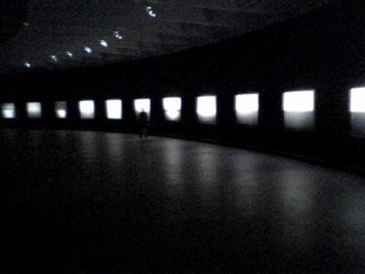
Janet Cardiff at P.S. 1 MoMA: It’s rare when a work of art has the power to transform, transport so completely. Forty-part motet is such a work. 40 speakers are arranged in an ellipse in the gallery, each playing an individually recorded member of a choir. The unaccompanied choir sings a work in Latin by Thomas Tallis, a 16th century English composer. [see this National Gallery of Canada link for a more detailed description.]

You move among the speakers, pausing in front of one, trying to hear two or three at once, then move into the center to hear them all. The wall text describes the artist’s interest in the role of the individual, the impression of the collective, and the individual’s ability to succeed as part of a whole.

Does this adequately explain why every person who entered the gallery became transfixed, practically held captive once they figured out how the piece worked? Or why nearly every single person there looked like their thoughts were a million miles away? Or why almost everyone was caught wiping tears away? I don’t think so.

Cardiff’s work creates a simultaneous, visceral feeling of both presence and absence. The members of the choir are right in front of us; we hear them, sense them, move among them. But they’re not. They’re gone. And the work, by its nature, lets us know that they’re not there. In this city, at this time (the show opened on October 14), a work that aspired to one level of impact has achieved something almost unimaginably transcendent.