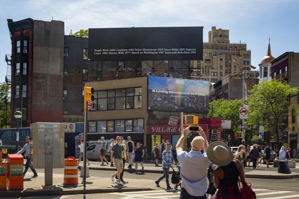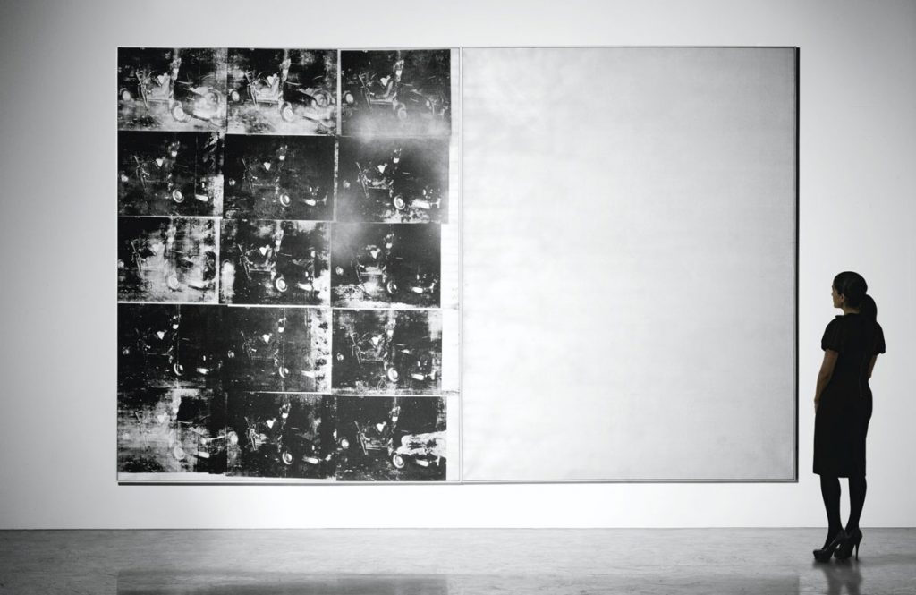
For the 30th anniversary of its original installation and the 50th anniversary of the Stonewall Rebellion, Public Art Fund reinstalled Felix Gonzalez-Torres’ first billboard work, “Untitled” (1989) at its original site facing Sheridan Square in the West Village. Until today, the Guggenheim also exhibited “Untitled” (1991), a stack sculpture made from 161 unsold prints originally made to support the Public Art Fund project.
This edition of Better Read is the text of the billboard, plus the artist’s statement.
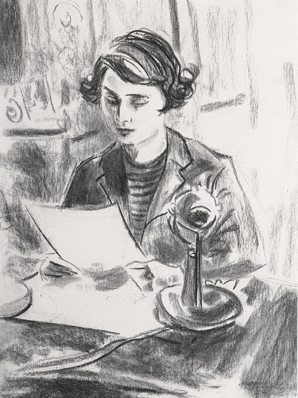
A friend and colleague recently said I had a very soothing voice, I should do a podcast, and I couldn’t tell if that meant I was talking too much, or being too dadsplainy, or perhaps he was right? I generally trust his judgment, but the reason I created a podcast read by a robot is because I could not get past the annoyance all audio performers apparently deal with, of hearing a recording of one’s own voice.
Anyway, I joked that I’d make an ASMR art video, ASMRt, and the name was so damn catchy, I knew at that moment I had to do it. But what to say? What to read? Yesterday the perfect text fell from heaven [actually, Contemporary Art Daily]: the press release for Josh Smith’s first New York show since leaving Luhring Augustine for David Zwirner.
One thing led to another, and now here is a recording of me laconically reading press releases for fifteen Josh Smith solo shows between 2007 an 2019. It was recorded on June 11, 2019 an iPhone in two conference rooms at the Cleveland Park branch of the DC Public Library. Text sources are linked below. My first regret will probably be hosting this mp3 myself. My second will probably be not releasing this as an album.
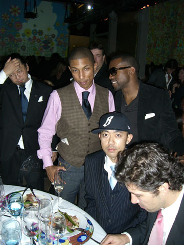
Before Tico Mugrabi, Emmanuel Perrotin, Per Skarstedt, and Francesco Bonami, there was Nigo. Nigo tagged KAWS. Nigo collabo’d with KAWS. Nigo collected KAWS. Nigo commissioned KAWS. And now Nigo has sold KAWS. Some of them. At a Sotheby’s auction in Hong Kong named after himself.
These texts by Virgil Abloh and W. David Marx are from the print catalogue for the auction, NIGOLDENEYE®. [Nigo also started putting a registered trademark sign after his name.]
The texts seem relevant only because the main KAWS painting sold for $14.7 million, and because they articulate with unabashed uncriticality the ultimate ambition of art as a tool of capital.
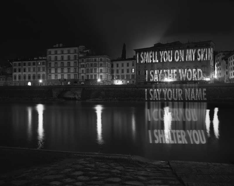
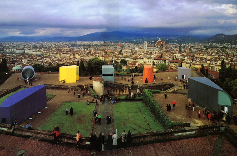
Jenny Holzer made her first xenon projection in 1996 as part of a collaboration with Helmut Lang for the Biennale di Firenze. As Lang would describe it, the text, Arno, was projected from a canoe club across the river onto the facade of a brothel. [The 19th/20th c. Palazzo Bargagli held the offices of Corierre della Serra, at least. That’s all I’ve found.]
In 1998 Jenny Holzer told Joan Simon that the text for Arno originated in a music video for Red, Hot + Dance, which was a 1992 AIDS/HIV fundraiser concert/album. Mark Pellington, the MTV producer/director she mentioned, had done an MTV segment on Holzer, but he was also involved in producing U2’s ZOO TV, which had a video wall full of Truism-like texts that kind of pissed Holzer off. Anyway, there are no Arno-esque texts in the Red, Hot video.
“The texts involve all the reasons to be naked or clothed — from sex to humiliation and murder,” said co-curator Ingrid Sischy to Amy Spindler. The Florence projection only ran for a few days in September, during the opening of the Biennale–and Pitti–but the text remained as LED columns in a Lucky Charms marshmallowy pavilion by Arata Isozaki, which was also where visitors could experience the fragrance Lang and Holzer developed together, that smelled, as they said often, like cigarettes, starch, and sperm.
[The six other pairings of artists & designers were: Tony Cragg & Karl Lagerfeld (lmao); Roy Lichtenstein & Gianni Versace; Julian Schnabel & Azzedine Alaia (which wut?); Mario Merz & Jil Sander (which, same, wtf); Oliver Herring & Rei Kawakubo (hmm); and Damien Hirst & Miuccia Prada (chef kissing fingers emoji).]
Holzer adapted the Arno text again for her 1998 nine-LED column permanent installation at the Guggenheim Bilbao. Catalan excerpts of it are also engraved in two large benches there now.
As we all know by now, a scrolling LED is a helluva way to take in a text, so it was interesting when Helmut Lang posted an image of the complete [English] text for Holzer’s Arno to Instagram last night. It turns out embedding it in a stream of emoji-filled comments read by a computer is also a helluva way to take in a text, but here we are.
This installment of Better Read is the first to derive from an Instagram post. A few days ago Gavin Brown posted a picture of a text from what looks like a brochure or handout for his first show of Elizabeth Peyton’s work. The text was by Douglas Blau, and the show was mostly drawings, and in a room at the Chelsea Hotel, because that’s how people rolled in in November 1993.
In 2018, meanwhile, we apparently number our computerized readings of art-related texts slightly out of order. But there is an episode 25 in my drafts, and maybe two episode 22s, so this could be right or wrong or wrong in the other direction. Fortunately, it probably doesn’t matter, since if anyone does anything, it’ll just be to click through to Gavin’s Insta and read the damn thing yourself.
The artist Elizabeth “Betty” Stokes di Robilant was interviewed by Christie’s in May 2013. Stokes was a longtime friend of Cy Twombly. Their story and relationship and collaboration, and her later erasure from Twombly’s official story, is discussed in Chalk, a biography of Cy Twombly by Joshua Rivkin, which was published in October 2018. Rivkin quotes the interview by Robert Brown, which was published on the occasion of the sale of a painted bronze cast of a 1966 [or 1956, or 1959, or 1980 or 1981, or 1990] sculpture Twombly gave to dee Robilant for her 10th wedding anniversary. Twombly later reworked and cast the sculpture in 1990 in an edition of five. Di Robilant’s three children each got one; she got one, and Twombly got one. Ed. 1 of 5 was sold at Christie’s London on June 25th, 2013, for GBP 1.63 million.
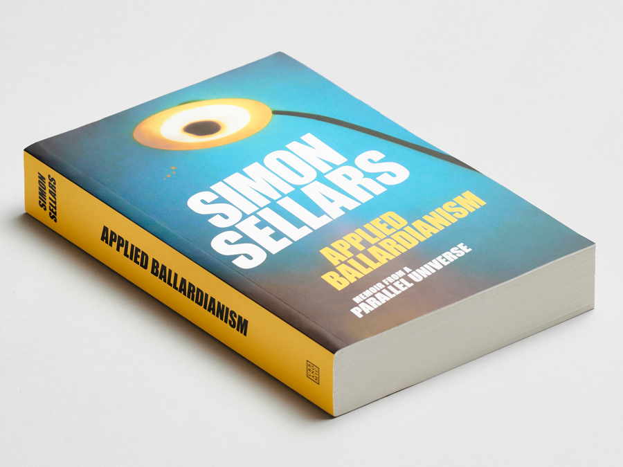
This, the 23rd installment of Better Read, texts that are better read aloud by a computer, was inspired by a @ballardian tweet. It is the table of contents of Simon Sellars’ new sort-of-a-novel-sort-of-a-memoir, Applied Ballardianism, which is out this month from Urbanomic. As I type that out, I fear I transcribed it as Urbanomics. Fortunately, probably no one will listen to this. I should’ve kept my trap shut. [update: I did not.]
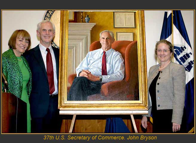
As Artnet reported last week, in the wake of the unprecedented popularity of the National Portrait Gallery’s new portraits of the Obamas, Donald Trump signed a law banning the use of federal funds for painted portraits of government officials and employees. As the Obamas’ portraits were funded with private donations, the law would have no effect.
The text in this edition is the law, S.188, first sponsored by Sen. Bill Cassidy, Republican of Louisiana, who took issue with the commissioning of a $22,400 portrait of an Obama-era cabinet official who stepped down before the portrait was even finished to recover from a severe car accident.
It bans federal funds being used “for the painting of a portrait of an officer or employee of the Federal Government,” and then goes on to specify the Executive and Legislative organizations to which the law applies. There is no specific mention of the law’s applying to the Judicial branch of the federal government, or to unmentioned independent entities like the Smithsonian, NASA, the Consumer Financial Protection Bureau, or the Federal Reserve Bank, just to name four that come to mind. But perhaps the ban on any Federal employee is broad enough.
The implications for this law are as yet unknown. Perhaps it will lead to an expansion of photography-based portraiture, including, hypothetically, portraits by artists that rival the expense of paintings. Perhaps artists will create official paintings that are somehow not technically portraits, or at least not representational. Scott Pruitt could be depicted by a painted picture of the $25,000 concrete phone booth he had installed in his EPA office, for example. Or Ryan Zinke could be included as a small but still recognizable figure dwarfed by the active face of a giant, publicly subsidized coal stripmine.
Perhaps artists will paint the portrait for free with purchase of a frame, or a $31,000 office dining set, or a $125,000 door. Perhaps lobbyists, corporations, or others who wish to ingratiate themselves with a government official will donate their extravagantly expensive portraits, or commission them from the official’s dabbling wife. Perhaps painters will donate the portrait to an auction gala for a fake charity run by the president’s family and held at the president’s hotel, and the subject will need to bid his own portrait to a sufficiently high amount that he can keep his cabinet job another year. Or perhaps George W. Bush will paint them all.
In writing yesterday’s post, I realized I’ve come back to Ellsworth Kelly’s “Notes of 1969” before.
What strikes me now, besides the quote I used for yesterday’s title, was this:
Everywhere I looked, everything I saw became something to be made, and it had to be exactly as it was, with nothing added. It was a new freedom; there was no longer the need to compose. The subject was there already made, and I could take from everything. It all belonged to me: a glass roof of a factory with its broken and patched panels, lines on a road map, a corner of a Braque painting, paper fragments in the street. It was all the same: anything goes.
This installment of Better Read is the text of the found net artwork, Embroidery Trouble Shooting Page, which was repeated as untitled (etsg) in 2015.
When I first found the page, I marveled at its beautiful folly, and dreamed of printing it as a book. Then of using it as an abstract painting composition generator. Then I accepted responsibility to publish and preserve it after its original code changed. And since then, I’ve explored the possibilities and process for printing it as a single, giant page. I expect it would fill a wall. If you have any thoughts or tips for capturing a rendered webpage as a single image, I hope you’ll get in touch. Download better_read_017_etsg_20171018.mp3 [mp3, 5:35, 2.7mb, via greg.org]
Previously: Untitled (Embroidery Trouble Shooting Guide) untitled (etsg), 2015 [etsg.greg.org]
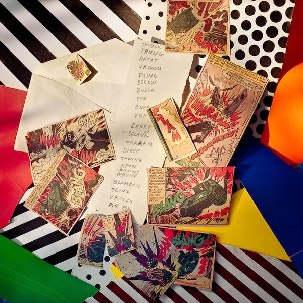
Laurie Lambrecht, Explosion, Slam, photo composition of Roy Lichtenstein’s Hand Written Word List and comic book clipping source material, made in the artist’s studio between 1990 and 1992. image via lensculture
Why did Roy Lichtenstein make word lists is not really my question. How did Roy Lichtenstein’s word lists end up in the list of his artworks catalogued by the Lichtenstein Foundation?
Both lists date from 1990. The first Handwritten Word List, feels like it fits right in. It appears to be a compilation, or a selection, of the onomatopoetic word graphics Lichtenstein famously adapted from comic books for his paintings. This list appears in at least two pictures taken between 1990 and 1992 by Laurie Lambrecht, a photographer who worked as an assistant to Lichtenstein in his studio. In the composition above, titled Explosion, Slam, it is surrounded by comics clippings. Her account of this time, inventorying Lichtenstein’s studio in preparation for his 1993 Guggenheim retrospective, mentions Polaroids, “bulging notebooks,” and a “scrapbook full of ‘Crying Girls,'” none of which apparently made the leap from archive to corpus that these lists did.
The second, Typed Word List, are all adjectives “of praise,” in an alphabetical order. Did he create it for a work? A series? A lecture? Would he consult the list when artist friends asked his opinion about their show? I mean, you could probably get away with it on the phone, but it could get awkward to use such a prompt in person. [“What’d you think?” (Pulls out list.) “Neato.”]
Or maybe he came up with the list after a heated conversation with Richard Serra, who was like, “You can’t have the verbs, Roy, they’re mine!” And Roy was like, “Fine!”
In any case, they’re both pretty beat up, well-used, and have no discernible aesthetic embellishment. I won’t say they’re not aesthetic, because they are what they are. Download Better_Read_016_Roy_Lichtenstein_Word_Lists.mp3 [2:25, 1.3mb, greg.org] Hand Written Word List, 1990 [imageduplicator.com] Typed Word List, 1990 [imageduplicator.com] Inside Roy Lichtenstein’s Studio, photos by Laurie Lambrecht [lensculture]
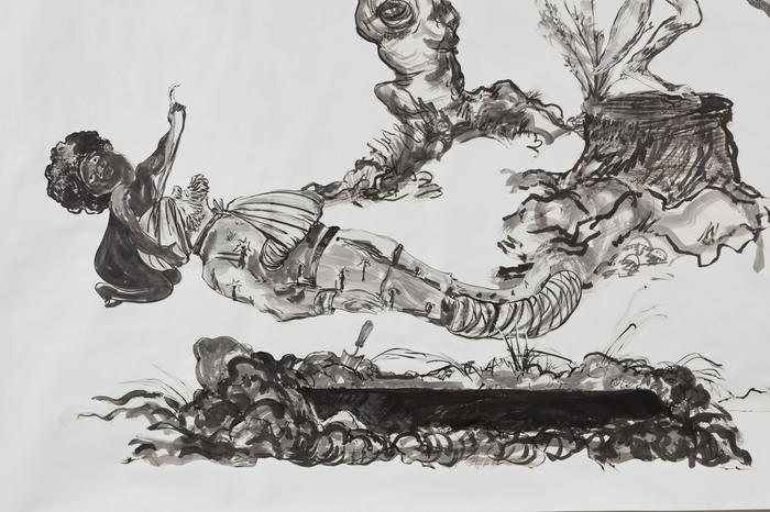
Kara Walker, Detail of U.S.A. Idioms, 2017, image via sikkema jenkins & co
It feels unusual to feature a current text on Better Read, but then, these are unusual times.
It strikes me that Kara Walker’s artist’s statement for her current show at Sikkema Jenkins & Co. has not been considered in an expanded context. An artist’s statement, in a press release, is already fighting with two critical hands behind its back. Yet the press release is actually the artist’s title for her show. The impetus for writing any of this is presumably well understood, but here, the specific circumstances of Walker’s work, her practice, and the shitshow of a world we’re living in right now should, I believe, upend our complacent expectations.
I myself found it too easy to make quick judgments about these texts and their implications when I saw the ad for Walker’s show in Artforum, which contained the show’s title, which I’d previously ignored, because I’d taken it for a glib press release. I let the order of reception, my own subjectivity, influence my judgment, in ways that I might not have noticed without further, in-depth consideration. And yet Walker had anticipated it all. Download Better_Read_015_Kara_Walker_20170914.mp3 [6:57, 3.3mb, via greg.org] Kara Walker exhibition page [sikkemajenkinsco.com] Sikkema Jenkins’ press release with Kara Walker’s texts [pdf, sikkemajenkinsco.com]
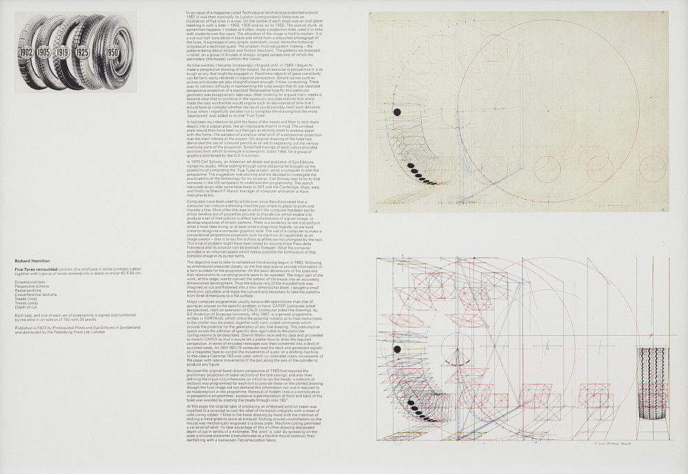
Richard Hamilton invitation with 1951 Technique et Architecture illustration used for Five Tyres – abandoned (1964) and Five Tyres remoulded (1972)
Sometimes I hit a wall while writing, and retyping someone else’s text helps get me going again.
So here is another installment of Better Read, a series of mp3 files from greg.org in which an interesting, under-known, or hard-to-find art-related text is read by a computer.
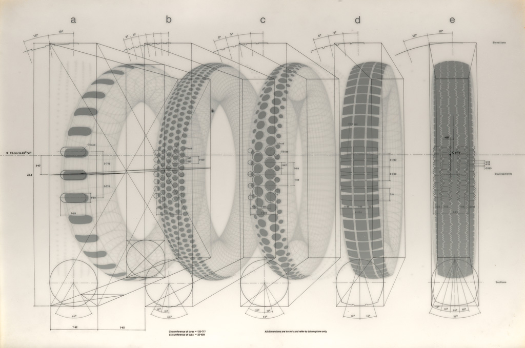
This text by Richard Hamilton accompanies Five Tyres remoulded, 1972 relief and print edition created with Carl Solway and EYE Editions. Hamilton describes his attempt to replicate by hand a complicated photo illustration he’d clipped from a trade magazine. The image was from the 50s, the project began and was abandoned in 1963, then reinitiated in 1970 with the help of a computer. Besides the obviously interesting insights onto his own process, Hamilton’s text resonates with the history of early Pop, conceptual art, and even appropriation, as well as the inter-relation of art and technology.
Unless you had the portfolio itself, the text was only available in print in Studio International (1972, vol. 183, p. 276). Images of a first draft of the text were also included in a 2014 blog post by Carl Solway about his correspondence with Hamilton. So I’m sure having a computer-generated voice recording of it expands its availability tremendously.
Richard Hamilton, Dimensional Data, screen print on mylar, 60x85cm, from Five Tyres remoulded (1972), via swann
[2022 UPDATE: In September and October 2022, Galerie Buchholz included a Five Tyres remoulded portfolio in an exhibition of Hamilton’s work. The single text included in this work differs from the longer, two-part version from Solway’s archive. An image of the portfolio version is below.]
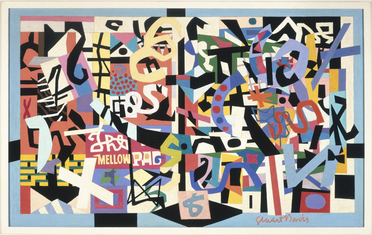
The Mellow Pad, 1945-51, by Stuart Davis, co-founder of the American Artists Congress in 1936, image: whitney.org
This edition of Better Read features a speech delivered by Michigan Republican congressman George Donderos on the House floor on Tuesday August 16, 1949 titled, “Modern Art Shackled To Communism.” I came across quotes and excerpts from this speech while researching the American Artists Congress, the group that brought Picasso’s Guernica to the United States for a fundraising tour in 1938.
Dondero made several fiery speeches against modern art during this, the McCarthy era, repeatedly accusing modernism and all its subsidiary “isms” of being a vile foreign-led Communist plot to destroy American art and values.
Near as I can tell, this is the first time Dondero’s complete speech has been available outside the Congressional Record, which turns out to be a lot harder to get ahold of than I expected. I am currently preparing a compilation of all Dondero’s art-related speeches, and the responses they engendered from the accused, the threatened, and even, surprisingly, the nominally allied. Because even I have a hard time listening to a robot for 26 minutes, the complete text of Dondero’s speech is included after the jump. Download Better_Read_013_Dondero_Communist_Shackles_20170417.mp3 [26:49, 39mb, mp3 via dropbox greg.org]
Reading a Dan Graham interview transcript about magazine articles as artworks, and contemplating the [so far] failed campaign for Giant Meteor ’16, I thought of Mel Bochner’s and Robert Smithson’s In The Domain Of The Great Bear, published in the Fall 1966 issue of Art Voices. This edition of Better Read is two excerpts from that work, which I imagined as a diptych.
PDF scans of In The Domain Of The Great Bear can be found in various places online [pdf]. The version I like is on Mel Bochner’s own website [pdf], because it preserves the appearance of the work as originally published. Bochner spoke about Domain at a 2005 Smithson symposium at the Whitney Museum. I was at that symposium, but the New York-centric historian who said visiting the Spiral Jetty site doesn’t matter, the film is enough, and Nancy Holt’s nonchalant comments about adding more rocks to the Jetty have obliterated all other memories of that day. Fortunately the talk was later adapted as “Secrets of the Domes” and published in the September 2006 issue of Artforum. serendipitous update: I happened across the John Wilmdering Symposium at the NGA from last Fall, where art historian Justin Wolff talked about Rockwell Kent’s End of the World lithographs, which were made for Life Magazine. For a story, though, about a very popular program at the then-new Hayden Planetarium, where scientists would speculate on the many ways the earth could be destroyed. So this was not just Smithson; it was a Hayden thing. Great [End] Times. [oh, spoiler alert?] Download Better_Read_012_Bochner_Smithson_Domain.mp3 [9:36, mp3, 13.8mb, via dropbox greg.org]