
In anticipation of Creative Time Summit II–it’s October 9-10, just a few weeks away!–I’ve been watching some of the talks from last fall’s Summit, organized by Nato Thompson held at the NY Public Library. [For an overview, check out Frieze’s write-up of the quick-fire speechifying marathon.] Like the Oscars, speeches are cut off right on time by pleasant music. It can be kind of harsh [sorry, Thomas Hirschhorn and guy from Chicago’s Temporary Services making his big, final pitch for help] but rules are rules.
So far, I’ve found the longer [20m vs 7m] keynote speeches to be the most fascinating. From the super-low viewer numbers to date, the fan club is pretty small. Anyway, watch these and pass them around:
Teddy Cruz, the Tijuana/San Diego architectural investigation guy has the single most intense 6:30 min talk I think I’ve ever seen. Almost makes up for not being able to see his slides.
Art historian Morris Dickstein’s keynote about Evans, Steinbeck, Astaire, and art of the Depression was interesting and timely, easily the most wrongly underappreciated, too:
Okwui Enwezor’s talk was smart and incisive, unsurprisingly, and made me wish he’d talked longer–and about more than a single documentary photo used by Alfredo Jaar.
But by far the best, the most moving, the one that got my head nodding and made me want to write things down for later, was Sharon Hayes’ reminiscence of moving to New York in 1991, smack into the middle of a teeming downtown art/activist community dealing with the AIDS crisis. It was gripping, and made me remember how important, vital, art can be, not for the the objects it generates, but for the effect it has on people, singularly and together, at a moment and in a place.
Creative Time New York YouTube Channel [youtube]
Category: interviews
Dali’s Pen Is
While scoping out the 1974 video art conference at MoMA, “Open Circuits, the Future of Television,” filmmaker Jose Montes Baquer decided that for some reason, Salvador Dali should be the artist he would collaborate with for his documentary. Baquer tells the story of gaining audience with Dali at the St Regis to pitch the project in an all-too-short interview with Christopher Jones for Tate, Etc. Magazine in 2007:
Then Dalí took a pen from his pocket. It was plastic and ivory coloured with a copper band at the centre. He said: “In this clean and aseptic country, I have been observing how the urinals in the luxury restrooms of this hotel have acquired an entire range of rust colours through the interaction of the uric acid on the precious metals that are astounding. For this reason, I have been regularly urinating on the brass band of this pen over the past weeks to obtain the magnificent structures that you will find with your cameras and lenses. By simply looking at the band with my own eyes, I can see Dalí on the moon, or Dalí sipping coffee on the Champs Élysées. Take this magical object, work with it, and when you have an interesting result, come see me. If the result is good, we will make a film together.”
The 2008 MoMA exhibit, “Dali and Film,” says this quote came from a letter from the artist. The resulting film, Impressions of Upper Mongolia, Hommage to Raymond Roussel, concerns the relationship between macro and microscopic, and was shown on Spanish TV in 1976. As interesting as it is, Baquer’s interview doesn’t exactly help make sense of what the film actually turned out to be. But the mentions of painting over film stills, and Vermeer, and the Dutch penchant for mapmaking as an art form, almost persuade me to put up with Dali’s pompous shenanigans to watch it.
Dali: The Great Collaborator [tate.org.uk]
On Gilbert & George
I didn’t make it the first time, of course, but I did see Gilbert & George’s reprise of “The Singing Sculpture” in 1991 at Sonnabend. It left a pretty deep impression on me in a way their photo compositions really haven’t. And there was always something about their conceptual conceit of being “living sculptures,” and not separating art and life that seemed a little precious.
But holy crap–no pun intended–have you seen these guys work? No wonder art and life aren’t separated, they have turned their entire life into the most systematic, all-encompassing, hyperefficient artmaking process I think I’ve ever seen or heard of.
I watched a 2000 interview/documentary/archive visit with them [“un film de Hans Ulrich Obrist,” seriously], and I imagined Hans Ulrich dying right there on the spot and going into archival heaven. It was that intense and organized and incredible. When Gilbert [the non-balding one] is talking, George is training his gaze straight into the camera, as if he were hammering the point home. It’s just–just watch it.
Fortunately, it sounds like the boys have finally gotten a little digitization in their process. Robert Ayers visited with them in 2007, and they now use a computer and a hi-res scanner to compose their images using the tens of thousands of photos they have taken and categorized and archived over the decades.
[One thing that I wonder about, from the movie: George holds up a model of an unidentified gallery which would house a show they’ve conceived of their entire 1977 series, Dirty Words Pictures, which to that point had never been seen together. The first person to identify the location would win “a special prize,” he said.
So how’d that turn out? Because less than two years later, the Serpentine did show the Dirty Words Pictures, but that gallery mockup doesn’t really remind me of the Serpentine.]
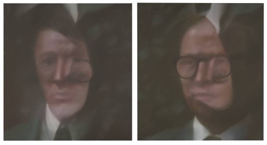
Anyway, if they weren’t interesting enough, in 1975, on the occasion of a show in Dusseldorf, they commissioned Gerhard Richter to paint their portrait. He ended up painting eight of them, using melanges and overlays of various photographs. Anthony d’Offay donated a pair to Tate Modern, where they are in the Richter Rooms. So strange, but the National Gallery of Australia’s, above, is even stranger.
The Secret Files of Gilbert & George (2000), 35min, dir. Hans-Ulrich Obrist [ubu.com]
[images: Gilbert, George, all 1975, all Gerhard Richter. Top: via Tate, above: via Gerhard-Richter.com]
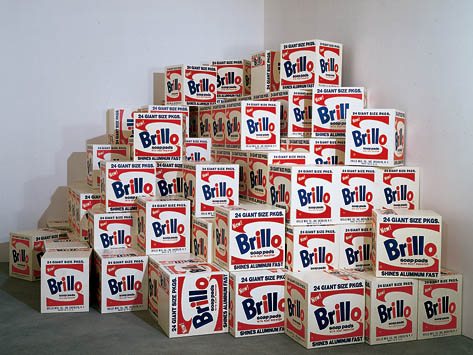
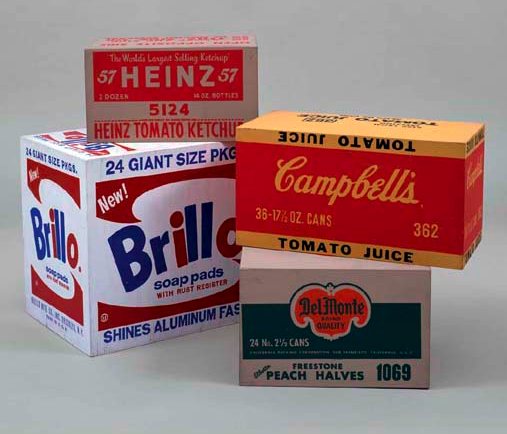
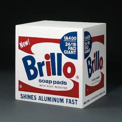
The International Symposium for Andy Warhol’s Brillo Boxes
The Moment has a Q&A with Mike Bidlo, whose work, Not Warhol (Brillo Boxes, 1964), 2005 is currently on view in the Lever House lobby:
Did you ever meet him [Warhol] more formally?
Yes, at a party at Jean-Michel Basquiat’s loft. There was a big group of people there, but I knew he knew who I was. It was a little awkward.
What about Gerard Malanga?
I was with him on a Brillo Box symposium in Nuremberg, Germany [in 1999] with Arthur Danto and others. He might come to the opening. To me he’s the expert.
Malanga is the expert because he, along with Billy Name, did much of the fabrication of those first Stable Gallery Brillo Boxes in 1964. But everyone knows that story. What I want to know about is this “Brillo Box Symposium.”
According to a footnote at warholstars.org, The International Symposium for Andy Warhol’s Brillo Boxes was held “under the auspices of the Akademie der Bildenden Kunste in Nuernberg, Friday, 19 November 1999.” Danto presumably discussed his 1998 paper, “The End of Art,” which took Brillo Boxes as the inflection point of a 3,000-year art historical cycle or something.
Malanga’s paper titled, “How we made the Brillo Boxes,” was reprinted in his 2002 book, Archiving Warhol. It provides the most familiar accounts of Malanga, Billy Name, and Warhol painting, turning, screening, and turning all seven varieties of the box sculptures in the first couple of months of 1964. [Four Stable Gallery boxes sold at Christie’s in 2006 for $973,000.]
But the 1964 Brillo Boxes aren’t the only ones Warhol made. Or Bidlo. Or–well, hold on. Back to The Moment:
If your Brillo Boxes shouldn’t be considered a simple substitute for the originals, what should New Yorkers be looking for?
There are so many more layers. When you start peeling back the layers you see that Warhol did all these different versions himself. There’s the Stockholm version, there’s the Pasadena, the original Stable gallery version. So really it’s about learning about the different providences [provenances? -ed.] of the piece, the situations that they were made for.
The image above is from the Tate Magazine, of Not Warhol (Brillo Boxes, 1969), 1991, and is Bidlo’s replica of the 100 boxes Warhol authorized the Pasadena Museum to fabricate in 1969-70 [LACMA was allowed to refabricate 100 Kellogg’s boxes. Warhol donated both sets of boxes to the respective museums.]
And before that, there were the 100 boxes Warhol authorized Pontus Hulten and the Moderna Museet to make in Sweden for the 1968 show organized by Kasper Koenig. Or was it 500? Or was that 500 actual cardboard Brillo Boxes bought from the company and 100 wooden ones to fill in? Or 10?
Until 2007, everyone thought they kind of knew. Or they didn’t think much about it. Then some Swedish investigative journalists from Expressen reported that no wooden boxes were ever exhibited in 1968, only cardboard.
And the 94 1968 “Stockholm Type” Brillo Boxes which passed the Warhol Authentication Board’s test, and were accepted into the 2004 catalogue raisonne, were actually part of a batch of 105 boxes Hulten fabricated in 1990, three years after the artist’s death, in Malmo, Sweden. And that Hulten represented them as 1968 works in shows in St Petersburg and Copenhagen that year. And that he sold at least 40 of them in 1994 as 1968 works. [Does that include this group of 10?] And that he gave six of them to the Moderna Museet in 1995 as 1968 works.
Yow. “Provenance: Acquired directly from the artist by Pontus Hulten, Stockholm” – Christie’s, 1998.
The Authentication Board hastily examined the Stockholm Type boxes and issued a letter to owners, saying there were two types of Stockholm Box, one of which might actually have been made in 1968 or so. Maybe there are 10 of those. But there are no documents so far authorizing either those 10, or the 105 Hulten made, only the Stable Gallery and the Pasadena boxes, that’s it. So far. And yet they fully accepted the Stockholm Boxes, no sweat. At this point, the only thing the Warhol Foundation people are saying is that they had nothing to do with this mess.
But what in the world was Pontus Hulten thinking? I mean, come on, the guy’s a modern art museum demigod who founded the Moderna Museet, the Pompidou, and MoCA. It’s not like he really could have just thought, “What the hell, I’ll order me up 100 Brillo Boxes and start showing, selling, and donating them as if they’re from 1968.” Could he?
Did Hulten get authorization from Warhol in 1968, then not really use it [all], and just assume it was still valid? ArtNews quotes an unidentified source as saying that Hulten fabricated his 1990 boxes at the Malmo Konsthall with the help of its director [and Hulten’s friend] Björn Springfeldt. Surely he could characterize how he and Hulten talked about the motives and assumptions for the production. [Factcheck: ArtNews says Springfeldt was director of Malmo Konsthall in 1990 when these boxes were fabricated. Actually, he had quit in 1989, to become director of Moderna Museet. He succeeded Olle Granath, who had succeeded Hulten, and who had been a co-curator of the Warhol show, and who was directly involved in its installation. He also owns three Stockholm Style Brillo Boxes he says were made in 1968. If there’s anyone in the Swedish museum world not directly implicated in this story, would you please raise your hand?]
How different is Hulten’s situation from, say, Giuseppe Panza’s later controversies over authorization and remote fabrication of work by artists like Judd, Flavin, Andre, and Nauman? Does this Brillo Boxes question dovetail with the emergence of artists’ certificates and minimalist-style, no-artist’s-touch production? Are there other examples lurking out there where artists phoned a piece in, then didn’t actually get involved–or even see–the final product? I’m going to guess yes.
If ever there were a time for another Brillo Box Symposium, it’s right now.
“Andy Warhol’s famous Brillo Boxes,” from the Frankfurter Allgemeine Zeitung, August 2007 [myandywarhol.eu]
2007 Authentication Board letter explaining the history and production of Warhol’s box sculptures [zimblo.com]
Nice hustle, Art News: “The Brillo Box Scandal,” Nov. 2009 [artnews.com, link updated to archive.org Sept. 2016]
Decommission Commission: Harrier And Jaguar By Fiona Banner
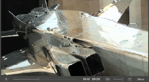
Harrier and Jaguar, Fiona Banner’s commission for Tate Britain’s Duveen Galleries opened this week, and from the making of film and interview with the artist, it looks spectacular.
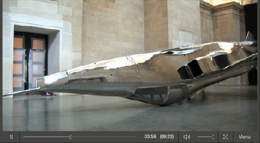
Banner has installed two decommissioned fighter jets–a BAe Sea Harrier XE695 and a SEPECAT Jaguar XZ118–in the grand neoclassical space. By altering each slightly, and by placing them in atypical, non-functional positions, the artist turned them into overwhelming, beautiful objects–sculptures–which nonetheless manage to retain all their original significance and meaning as highly advanced weapons of war.
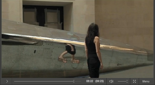
The Harrier was covered with a delicately feathered matte wash and hung, nose down, just off the floor. It barely fits inside the limestone-clad hall. The SEPECAT Jaguar was stripped down to bare metal and polished to a mirror finish. It rests upside down, on its cockpit. Did I mention it looks spectacular?
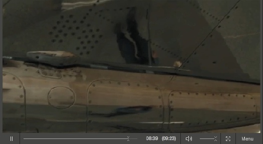
With those reflections it generates, it’s like a 3D realspace version of Google’s distorted Street View portraits.
Video | Fiona Banner Harrier and Jaguar, 9’23” [tate channel]
Duveens Commission Series | Fiona Banner 2010, through 3 Jan. 2011 [tate.org.uk]
‘Waking Up, It Was The First Thing I Saw’
Thanks to Paul Schmelzer at Eyeteeth for pointing to Bob Nickas’s great 1999 interview with Maurizio Cattelan. Good times.
I really wanted to focus on his experience with painting, so this excerpt starts kind of in the middle of the story of Maurizio not having enough time to do a show at de Appel in Amsterdam, so he breaks into the Galerie Bloom, steals everything in it, and exhibits it instead:
BOB: Whose work did you take?
MAURIZIO: Actually we took everything from the gallery …
BOB: Like the fax machine and all the stuff in the office?
MAURIZIO: Everything. We rented a van, and just filled it up.
BOB: This was in Amsterdam?
MAURIZIO: Yes, at de Appel. They wanted me to do a piece in a week. But I’m not used to working so quickly. So I thought the best way to get something that fast was to take the work of someone else.
BOB: That’s a new take on the readymade. [indeed, the show was called “Another F___ing Readmade” -ed.]
MAURIZIO: Well, when you don’t know what to do …
BOB: But didn’t the people at de Appel ask, “Where did all this stuff come from?”
MAURIZIO: The story finished quickly, because the police came and there were problems …
BOB: Were you arrested?
MAURIZIO: No. This is why I did the piece in Holland.
BOB: [laughs] Imagine doing that in New York.
MAURIZIO: It took a while for everyone to calm down, but then we became very good friends and they even asked me to do a show with them.
BOB: But that’s your ultimate punishment — you had to figure something out for another show.
MAURIZIO: Yeah, it’s true.
BOB: Crime doesn’t pay.
MAURIZIO: But I can tell you about the worst punishment I received. Once, I was talking with a collector, and he said, “I really would like to have a painting made by you.” And I thought, “Yes, let’s take this opportunity for once to see how difficult it would be to make a painting.” So I said, “Send me a canvas and some colors and I’ll do it.” He said, “Whatever you want to do, it’s fine for me.” A week later, I received a white canvas — that’s probably still in my apartment — and it was the most horrible nightmare for a year. It was there every morning. Waking up, it was the first thing I saw. After a year, I gave up.
Maurizio Cattelan with Bob Nickas, 1999 [indexmagazine.com]
Muybridge Had A Posse
Now before we get too far, let me state for the record that so long as there’s no thievery or lying involved, but appropriate credit or consideration is, I got no problem at all with a man who takes another man’s photograph, tweaks it a bit, and re-presents it as his own.
That said, I am blown away by the awesomeness of Tyler Green’s investigative interview with photography curator Weston Naef that questions the attributions of many early photographs in the Eadweard Muybridge retrospective at the Corcoran.
Naef has a pretty compelling, I’d almost say irrefutable, argument that before 1872, Muybridge published many photographs under his name [or his brand, really, since the questions arise about the period from 1866-1872, when Muybridge worked under the name Helios Studio] which were actually taken by others, including his friend and frequent business counterpart, the great Carleton Watkins.
Green and Naef cite specific examples of Muybridge photos slotting right into the missing slots in Watkins’ photo sequences. There are even cases where the shots are identical.
The implications for the Corcoran’s show–the first Muybridge retrospective ever–and the history of photography are pretty significant. Which doesn’t necessarily take away from the exhibition or the catalogue, though Philip Brookman’s account of Muybridge’s career will certainly come in for revision.
I saw the show on opening day, and it is fantastic, an incredible accomplishment, and a wealth of wonderful photographs and stereographs. It was the show and the catalogue that catalyzed Naef’s preliminary research, and the whole thing opens a very interesting window on the development of photography in the US, and especially in California, in the 19th century. There’s much more research and analysis and discovery to be had here. And it’ll be interesting to see how the show changes on its next incarnations at Tate Britain and SFMOMA.
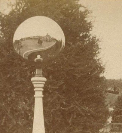
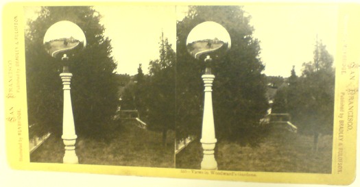
But I know what you’re all thinking: what does this mean for me? And by me, I do mean me, not you. Well, it means that now I don’t know who made one of my favorite oddball images from the Corcoran show, a stereograph from Woodward Gardens, an early zoo/amusement park in San Francisco. It shows a slightly generic garden scene, but the focus is on a mirrored garden ornament–in which the photographer’s own self-portrait is visible. That thing looks so much like a vanguard satellite, or a satelloon mockup, I am powerless before it. And now I find out it might not be Muybridge at all.
The intro to the 3-part interview: The Newest Eadweard Muybridge Mystery [modern art notes]
Looks like they picked the wrong week to name their otherwise awesome exhibition catalogue: Helios: Eadweard Muybridge in a Time of Change [amazon]
The Corcoran show runs through July 18. [corcoran.org]
note: detail of the mirrored garden orb from UC Berkeley’s Bancroft Library, via Calisphere [thanks for that, too, Tyler]
HowTo: Make A Vija Celmins Night Sky Painting
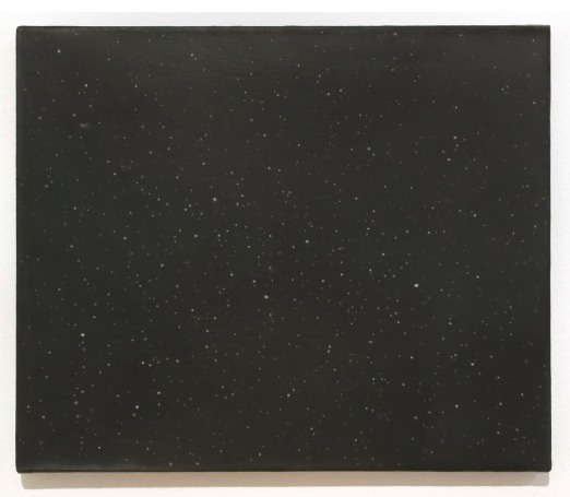
The Brooklyn Rail’s Phong Bui interviewed Vija Celmins about her show at David McKee Gallery
Brooklyn Rail: About the night sky paintings, I always wanted to ask you, with all of the subtleties of gray tones embedded in the white stars and the black sky, how do you build up the surface while controlling the balance of tones?
Vija Celmins: Well, the rather boring technique is this: what I do is I first draw in a pattern that breaks the surface, and then I draw the different sizes of circles for the stars. Next, with a small sable brush, I apply a tiny drop of liquid rubber; it hardens and I build up to a desirable thickness. I then paint different layers of ivory blacks that have been mixed with burnt umber, ultramarine blue, and sometimes with a bit of white. And I use alkyd, which takes about two days to dry, and once it’s dry, I then take off the little rubber bumps, which create those little holes with various kinds of white, which is mixed with a little bit of cerulean blue, and sometimes with raw umber or yellow ochre.
Rail: What kind of white?
Celmins: A combination of titanium and zinc white. And I keep filling those holes until they come up to the same level as the black surface.
Rail: That’s intense.
Celmins: And I often sand it a little, so that the whole surface is totally uniform, flat, and has very tight skin.
It’s the perfect balance between boring and intense that makes her paintings such marvels.
Vija Celmins with Phong Bui [brooklynrail.org via two coats of paint]
image: Dark Galaxy, at David McKee Gallery through June 25 [mckeegallery.com]
Pour Copie Conforme
After bagging on Blake Gopnik’s comments on Marcel Duchamp playing the buyers of his readymades for fools, I started looking more closely at Duchamp’s actual statements and working process. It’s so easy to consider him as just a source of ideas, and to forget that in fact, he expended a great deal of effort and time on the creation of objects.
On the other hand, that dude would sign just about anything that wasn’t nailed down. Including readymades that were really made, or found, or bought, by others. All over the place. The only thing that stopped him, it seems, was Arturo Schwartz, who insisted Duchamp stop signing stuff to protect the value of the 1964 readymade editions.
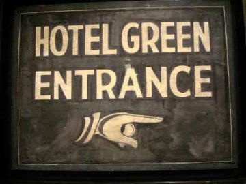
One example: when the late photographer, painter, and avant garde filmmaker Dennis Hopper met Duchamp on the day of the opening of his 1963 retrospective in Pasadena, he grabbed a sign from the Hotel Green, where Duchamp was staying, and asked him to sign it. And he totally did.
Another, from Francis Naumann’s incredible practice history, Marcel Duchamp: The Art of Making Art In The Age Of Mechanical Reproduction, which I picked up at the suggestion of John Powers [Naumann’s gallery was the site of that fantastic Duchamp chess show last year.]:
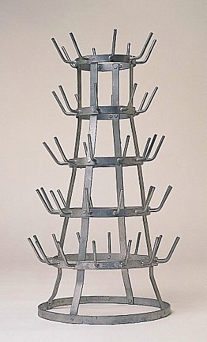
During the time of the Pasadena exhibition, Duchamp was invited to attend a breakfast in his honor at the home of Betty Asher, an important collector of contemporary art who lived in West Los Angeles. Among the thirty or more guests she invited, one of them, Irving Blum, then owner of the Ferus Gallery in Los Angeles, asked Duchamp if he would consider signing a bottle rack he had found and purchased from a local thrift shop. Just in case the artist agreed, Blum brought the item along with him to the breakfast. When Blum asked, Duchamp responded: “Gladly,” whereupon Blum retrieved the work from the trunk of his car and Duchamp signed it on the bottom rung, adding the usual inscription, “pour copie conforme,” and the date: “1963-14”. When Blum was in the process of returning this treasured artifact to the trunk of his car, Richard Hamilton reportedly rushed out of the Asher house and quipped: “You are, of course, aware of the fact, Mr. Blum, that in order to devalue his work, Duchamp signs everything.” [p.235, emphasis added for the awesome parts]
Indeed, and one of the last things he signed was the replica of Bicycle Wheel which Hamilton had made, and had asked Duchamp to sign the next time he passed through London. [Blum donated his Bottle Rack, below, to the Norton Simon Museum in 1968 after Duchamp’s death.]
And Pontus Hulten told how Duchamp said the Modernamuseet could save money by making a bunch of readymade replicas for a show instead of shipping them: “Duchamp later signed everything. He loved the idea that an artwork could be repeated. He hated ‘original’ artworks with prices to match.” [p.213]
Which is making me nod and laugh out loud right now as I sit here, with a pile of pens, signing my name over and over and over on the stack of certificates for the edition I’m doing with 20×200.com, which is going to be announced very soon. Stay tuned.
A Spy In The State Department
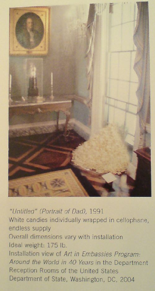
No, not Michael Whitney Straight. Felix Gonzalez-Torres, in a 1995 interview with Rob Storr:
There’s a great quote by the director of the Christian Coalition, who said that he wanted to be a spy. “I want to be invisible,” he said, “I do guerilla warfare, I paint my face and travel at night. You don’t know until election night.” This is good! This is brilliant! Here the Left we should stop wearing the fucked-up T-shirts that say “Vegetarian Now.” No, go to a meeting and infiltrate and then once you are inside, try to have an effect. I want to be a spy, too. I do want to be the one who resembles something else.
Thanks to the de la Cruzes, Felix got his chance. They must have loaned his 1991 candy pour, Untitled (Portrait of Dad) to the State Department’s Art in Embassies Program at some point, because it was also included in an AIEP 40th anniversary exhibition in 2004, which was installed in the Diplomatic Reception Rooms. Sitting on a sheet of plastic, and with a little label perched next to it. Classy.
Around the World in 40 Years: ART in Embassies Program Celebrates its 40th Anniversary [state.gov]
[image from Felix Gonzalez-Torres anthology, 2006, ed. Julie Ault, p. 84]
On Photographs, Stars, Abstract Images, Reality
More from Giuseppe Panza’s 1985 Archives of American Art Oral Histories interview with Christopher Knight, this time on Panza’s preference for abstraction:
But I believe that the modern science reveal to our knowledge a world which is far above the possibility of our eyes to see. Our eyes have limit in having perception of reality. But knowledge is going well above this limit. For this reason we don’t need anymore to use images which our eyes can perceive. Because the world which we can know through our intellect, through our knowledge, is wider than the image coming through our eyes. If you look at the microscope, anything which is around us, you see an abstract image. If you look to photographs of stars, they are abstract images. For this reason, abstraction is a closer image of the real which is above around us. It’s a tool more efficient to inform us about reality.
This especially stuck out because it resonates so well with my idea to re-create one of the most extraordinary photographic achievements in history, the National Geographic Society-Palomar Observatory Sky Survey, a 10-year mission to create an atlas of the universe [actually, those detectable objects in the slice of sky visible from the Northern Hemisphere]. The NGS-POSS produced a grid of 935 pairs of photographs of the night sky, which were printed and distributed to universities around the world [country?]
Scientifically, they are completely obsolete; paper prints of the glass negatives turned out to be a poor research medium. And subsequent surveys have had orders of magnitude greater resolution.

So the only justification I can see for their continued existence is as an art object; they certainly are beautiful. Printing another set would underscore their both their obsolescence and their beauty, and the ambitious folly of such scientific endeavors, which later artists such as Bernd and Hilla Becher would only begin to hint at in their work
‘It’s An Inducement To Memory’
Giuseppe Panza di Biumo, interviewed by Christopher Knight in 1985 for the Archives of American Art:
DR. PANZA: Well, the connection between Abstract Expressionism and Pop Art was made through Rauschenberg, because if you look at Rauschenberg, you see also the sign of the painting. We don’t see only the collage, also the object, the real object. And for this reason, it was natural for me to arrive at the Pop Art. However, when the Rauschenbergs came into my house there was some people which was very interested, but very few, but some was very fascinated by the work by Rothko and Kline, and Tapies, and to see this kind of art so different, so vulgar, made with the objects which are really found by upsetting the container of the trash, was a scandal for these people. [Laughs.] But I felt a great interest in the work by Rauschenberg because I see from the nature of this details, a relationship to something which happened in his past. It’s an inducement to memory, the work of Rauschenberg. Are all the ties made with the connection to something real, which is fading away, because it’s a fact which happened in the distant past when perhaps the artist was young. The quality of this material, which became old because are perishable materials. The paper, the wood, the objects add this kind of distance to the memory, making the object stronger because is alive in the memory. Because it’s a matter of fact, but something which we have strong experience in the distant past, is by the memory in some way changed, became more beautiful, because lose reality and get more ideal reality. This process is very strong in the work of Rauschenberg, especially in the ones made in the fifties.
Just working my way through. Panza’s English doesn’t skim very well, but his descriptions of James Turrell installations are fantastic, some of the clearest I’ve ever read. For example, this account of a 1973 visit to a room in the artist’s house, which I confess, I’ve never heard of–is it a reference to the Main and Hill Studio installations in 1968-70 mentioned in Turrell’s bio?:
DR. PANZA: In Santa Monica, in his house, there was another room which was completely dark. This room was nearby a street corner, with lights in the middle of the street. One side of the room was overlooking a small road with a little track. The other side was looking at the main street with many cars passing through. And there was a lamps of public light nearby; there was some small houses nearby. And Turrell, at the end wall of this room, made holes which was possible to open and to close in different positions of the wall. Opening the hole was facing the streetlight, it was possible to have inside the room only the light coming from the red, the green and the yellow light, leaving [off] the light of the street.
MR. KNIGHT: Of the streetlight?
DR. PANZA: Yes, the streetlight. And the room was filled of, for some minutes, of a beautiful red light. And after, the yellow one. And after, the green one.
MR. KNIGHT: And it would change.
DR. PANZA: And closing this wall but opening another one, it was possible to see only the light projections of the cars which was passing fast in the main street. And this light was coming inside the room like a lightning, filling the room with very strong light, but for a very short time. And afterward disappear; the room became again dark. Opening another hole, it was possible to see only the car coming from the small street, and for some minutes the room was completely dark, but after, some small dim light was coming into the room stronger and stronger. This light had shape, and this shape was going around the room when the car was turning in the main street. And there was a completely different feeling of the light. And opening another one, it was possible to have only the light coming from the far away public light from the street, not the one nearby the house, but one very far. And this light was very dim, but was filling, in a very peaceful way, the room. It looks like the moonlight. It was giving the same kind of emotion, because was visible only the shadow of the objects inside. There was a confused notion of the volume of the space. The room was looking very much larger, almost endless, because there was almost no shadow, a very faint shadow. Everything inside the room was looking like having lost material quality, gaining some kind of ideal entity, which was no more earthly, but heavenly. Something very strange, very metaphysical. And there was a series of this experiences which was very beautiful, made in a very simple way, showing the quality of many kind of light.
This use of only found light, it’s like those seemingly pop/superficial pieces that use reflected light from TVs showing cartoons, like in the Mondrian Hotel’s elevator lobbies, crossed with a quintessentially Los Angeles mockup of the timeless/profundity of Roden Crater. Someone please tell me this still exists.
update: haha, of course not. It turns out it’s the building that used to be called the Mendota Hotel, and the works are his seminal, site-specific, Happening-like Mendota Stoppages. I’d always read Mendota as a studio, not a house [though it was, in fact, both.] Of course it is now a Starbucks.
Ken Price & Josef Albers At Brooke Alexander
Roberta Smith loves loves loves the Ken Price/Josef Albers show at Brooke Alexander. I all but stumbled across it a couple of weeks ago after finding Brooke’s interview with Price (PDF), and I have to agree. It is incredibly fresh.
Its overarching theme is that abstraction is reality-based, distilled from lived experience, and actualized through highly personal approaches to process and materials. It’s a lesson in life as much as art.
Albers’ paintings and especially the prints, are additive, while Price’s method is subtractive: he builds up layers of paint, then sands it down.
‘Marina Abramovic Is A Total Stone Cold Diva.’
Ivan Lozano’s post about Marina Abramovic, Joan Jonas, Tino Seghal, and the conservation of performance art is absolutely fantastic. [It’s built off the Performance Workshop Klaus Biesenbach held a couple of weeks ago, which was written up by Carol Kino in the NY Times.]
The idea of a single orthodox means of retroactively preserving or documenting or re-performing or whatever early performance art strikes me as unreasonable; I like the idea that artists can decide if and how they want their work to live on, whether if it’s as a score, video documentation, ephemera, or in Seghal’s case, unwritten verbal transmission.
Lozano hits the nail on the head with his awesome characterization of Abramovic [above]. And kudos to her for making a strong play for preserving her own work and for influencing the present and future of the medium. But one thing about her stone cold divadom that he doesn’t mention that came immediately to mind was her establishment of the Marina Abramovic Institute, which is charged with the preservation of performance art.
It reminds me of the Eric Carle Musem of Children’s Book Illustration, another ostensibly comprehensive history-writing institution which was founded by a practitioner–who wasn’t waiting for history to decide his place in the history books.
In An Art Film That Time Forgot. Kathryn Bigelow IS. That Girl On Lawrence Weiner’s Sofa.
Like everyone else reading it on OSCAR NIGHT®, Andrew Hultkrans’ 1995 Artforum interview with Kathryn Bigelow gave me hope for the films-by-artists genre, if not quite from the direction people might expect. To hear a double OSCAR® winner say of film noir, “That’s how I moved from art to film, so to speak: I went through Fassbinder on my way to noir.”
ANDREW HULTKRANS: It’s quite a leap from Conceptual art to the culture industry. KATHRYN BIGELOW: It does seem like a departure. I was studying painting at the San Francisco Art Institute and one of my teachers put me up for the Whitney Program, so I went. This was ’73 or ’74, when Conceptual art really came to the fore. I did a couple of videos with Lawrence Weiner, and I worked with Art & Language, an artists, group who were critiquing the commodification of culture. So I was very influenced by them, and my concerns moved from the plastic arts to Conceptual art and a more politicized framework. And I became dissatisfied with the art world – the fact that it requires a certain amount of knowledge to appreciate abstract material.
Film, of course, does not demand this kind of knowledge. Film was this incredible social tool that required nothing of you besides twenty minutes to two hours of your time.
Wait, Lawrence Weiner videos? No, not that one.
Bigelow appeared with Sharon Haskell in Weiner’s Done To, 1974, which Alice Weiner describes as:
…simple camera frames which are silent and/or unconnected to a complex soundtrack running parellel [sic] to the images. There are brief instances where image and sound meet; however, the majority of the images are overtaken by at times symphonic, at times cacophonous soundtracks which displace the normal filmic viewing experience. The standard film format for going from frame to frame — and then and then and then — is what the film is concerned with.
E.A.I. has a fuller synopsis, and VDB has a tiny clip viewable online.
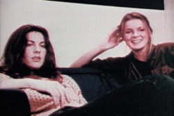
She also appeared briefly in Green as Well as Blue as Well as Red, 1976, [above, vdb clip here] where her off-camera conversation with Weiner is mixed over the shot of two women reading from a red book at a rainbow-painted table.
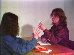
Bigelow is credited as an editor and production/script consultant on Weiner’s first narrative-based work,Altered To Suit, 1979 [vdb clip]. From Alice Weiner’s synopsis at EAI:
“The mise-en-scene, the whole story, takes place in one location, the artist’s studio. A delicate psychological allegory on ‘a day in the life of’ anchors the displacement of (filmic) reality and the alienation of the (players) self. Devices such as incongruity between the image and the soundtrack, odd camera angles, and plays on objective focus are integral and explicit components of the narrative.
Altered To Suit overlaps with the beginning of Bigelow’s own film work; she made her first short, The Set-Up, which she completed in 1978 while at Columbia.
Bigelow mentioned two other very early, art film-related gigs in an interview with Gavin Smith published in Jessmyn & Redmond’s 2003 anthology, The Cinema of Kathryn Bigelow: Hollywood Transgressor [seriously]: She appeared “for about five seconds” in a Richard Serra video, and she shot some B-roll for a Vito Acconci installation.
[He] needed these slogans and phrases on film loops that would play on the wall behind him during a performance piece he did at Sonnabend in a rubber bondage room he created. The job was to film these slogans. I’d never worked with a camera. I was starving to death. If I hadn’t been at the brink of economic disaster, I think I never would have had all these detours.
I haven’t been able to figure out which Acconci performance/installation Bigelow’s referring to. Acconci showed at Sonnabend in 1972, ’73, and ’75. But 1972 was Seedbed, where the artist hid under a ramp masturbating for several weeks. The 1973 performance, Recording Studio From Air Time consisted of a video feed of Acconci in an isolation chamber/ confessional for two weeks, analyzing a romantic relationship in a mirror. I haven’t found a description of the 1975 show, but MoCA curator Anne Rorimer has written that after 1974, Acconci “dismissed himself as a live presence” and began using video and audio of himself in his performances. If her description and timeline is accurate, I’m guessing this is what Bigelow filmed, and what Acconci showed in 1975.
While Googling around to identify the Richard Serra video with Bigelow’s cameo, I found Bettina Korek’s fresh post at Huffington, about Bigelow’s art career. She links to “Breaking Point: Kathryn Bigelow’s Life In Art,” an exhibition at castillo/corrales in Paris which has been on since mid-January and continues through next weekend.
The most likely possibility for the Serra video is his 1974 game show/game theory critique of TV, Prisoner’s Dilemma, in which Spaulding Gray and Leo Castelli are supposedly at risk of getting stuffed in a SoHo basement for 50 years [The video was shot at 112 Greene Street, the first home of White Columns. 16miles.com has an installation shot from White Columns’ 40th anniversary show of stills from Prisoner’s Dilemma.]
Sure enough, sometimes it still makes sense to get up and walk across the room, because Serra discusses it two interviews, with Liza Bear and Annette Michelson, in Richard Serra: Writings/Interviews.
With Michelson, he explains how the angry art world-y studio audience tore down the screen to save Castelli. And in the notes for Bear’s earlier interview, the video’s credits include: “D.A.’s Secretary: Kathy Bigelow.” So there you go.
UPDATE: BUT WAIT, THERE’S MORE! Francois from castillo/coralles emailed with some more information: “Vito Acconci, when visiting the show, mentioned [Bigelow] had collaborated on his installation ‘Pornography in the classroom’, originally conceived in 1975.”
Which should put the issue to rest, except that “PITC” doesn’t seem to fit with Bigelow’s account, either of the work she did [filming slogans and phrases], the installation/performance [bondage equipment, with video projected behind Acconci], or the venue [Sonnabend]:
“Pornography in the classroom” as it’s known today is a slideshow of images from 1970s porn magazines, projected over a single channel video monitor [originally Super8mm film] of an ascending and descending penis, which is accompanied by the artist’s voiceover [“Thar she blows!”] It was shown at Gladstone in 1998, and the Kramlichs [of the San Francisco video art-collecting Kramlichs] bought it. It’s an edition of one, though Acconci apparently retains the master slides and film. The Kramlichs donated “PITC,” along with many other of their video works, to the New Art Trust, a consortium of museums and archives.
In a fascinating-to-video-collectors article in the 2001 Journal of the American Institute of Conservation, Timothy Vitale all but says flatout that the current incarnation of “PITC” is not just artist-remastered, it is completely new media. Neither the slides nor the video show any traces of aging or reformatting. If Bigelow did, in fact, shoot footage for “PITC,” her camerawork has almost certainly been replaced.
Of course, I’d think that, given her lucid discussions of her and others’ conceptual and performance work, I don’t think Bigelow would confuse “phrases and slogans” with “bobbing penises.” My guess is she didn’t work on “PITC”. And if she did, she may not want to talk about it.