
Something Holland Cotter wrote today made me really think: “Short Circuit is a sweet reminder of Rauschenberg’s collegial generosity; he believed in art making as a communal endeavor, and acted on that belief.”
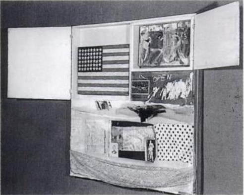
Collegial generosity is certainly one way to look at it. Because Rauschenberg had exhibited in the Stable Gallery’s Second and Third Annuals, he was supposed to be able to select artists to show in the Fourth Annual. For whatever reason, though, in 1955 Eleanor Ward decided only Stable alumni would be allowed in that year, and so Rauschenberg’s picks–Short CircuitJasper Johns, Ray Johnson, Stan VanDerBeek, and Susan Weil–were rejected.
And so the story goes that Rauschenberg smuggled them into the show anyway, as elements in his own combine painting. [It’s not clear why VanDerBeek’s work wasn’t included; Cotter says he didn’t get a piece finished in time, but I’ve also read that VanDerBeek declined the combine invite.]
Rauschenberg invited the artists to, as Walter Hopps put it, “collaborate in his piece.” A generous gesture, to be sure, but also a complicated one.
Short Circuit triggers a whole host of questions that I find the quite interesting: What is the status and relationship of the artworks Rauschenberg incorporated into his combine-painting? Do they still function as autonomous works? If so, why? Are they substantively different from the other cultural detritus he used–newspapers, postcards, fabric, objects? If not, why not?
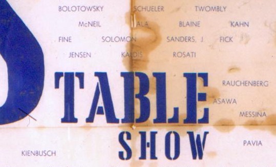
In the bluntest sense, these questions are answered by the invitation for the show, which mentions none of Rauschenberg’s three collaborators:
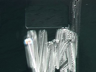
Rauschenberg’s generous inclusion of his ex-wife’s painting, his friend’s collage, and his partner’s iconic flag painting–oh, wait, that’s right, this was the first flag painting of Johns ever to be exhibited, and it was as an element of another artist’s work–and behind a door to boot. Did anyone in 1955 even know that Jasper Johns’ Flag wasn’t Robert Rauschenberg’s flag?
The story of Johns’ promethean debut at Castelli Gallery in 1958 is well known. In this 1969 telling of it to Paul Cumming, Castelli visits Rauschenberg’s studio in 1957, and then they pop down to Johns’ studio, which is full of targets and flags, and Castelli offers him a show on the spot. Which makes the cover of Art News and changes the New York art world overnight. But check this out:
Jasper Johns was a real discovery in a certain sense because, although he existed, not many people knew about him. I saw him for the first time in a show at the Jewish Museum. That was in March of 1957, and that was the Green Target that the Modern has now. I saw that green painting. It didn’t, of course, appear as a target to me at all. It was a green painting. I didn’t know that he was doing targets. Well, going around and seeing the familiar painters of that time…. It was a show that had been organized by Meyer Schapiro and other people. There was Rauschenberg and Joan Mitchell, and, oh, all that younger generation. Well, I came across that green painting, and it made a tremendous impression on me right away. I looked at the name. The name didn’t mean anything to me. It seemed almost like an invented name–Jasper Johns.
[Emphasis added on the parts where, holy crap, two years after exhibiting Short Circuit, there’s still a question whether “Jasper Johns” exists.]
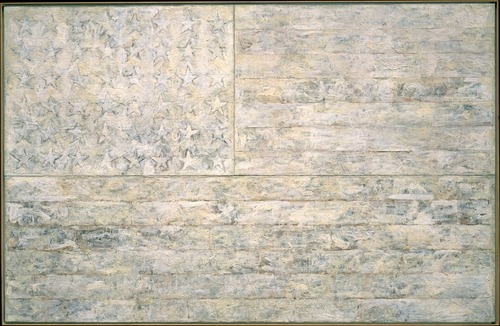
Johns had shown flags at Bonwit Teller [including White Flag, which he eventually gave to the Met], where he and Rauschenberg dressed windows under the commercial pseudonym Matson Jones. Except for a drawing in a group show, Johns only exhibited a flag painting under his own name in 1957, in a group show at Castelli a few weeks after their fateful studio visit.
Rauschenberg’s Short Circuit–and Johns’ first and most immediately important paintings of flags and targets–were created when the two artists were closest, and when Johns was essentially unknown. When the flag was stolen from Short Circuit, both artists were famous, and their split was so acrimonious, they were not speaking to each other.
These relationships and collaborations, these formative histories of the New York art world, and these contestations of autonomy, authorship, sourcing and appropriation all seem to converge on Short Circuit. And it makes me wonder, again in the bluntest terms, whose flag was it, and who was it stolen from?
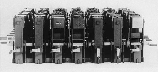
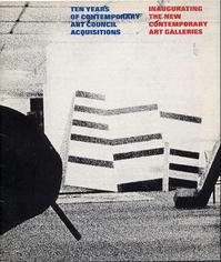 Still haven’t figured that out. But one thing leads to another, and so I’m looking at the catalogue for the last known appearance of “all” the Warhol boxes, a 1973 show organized by Maurice Tuchman titled,
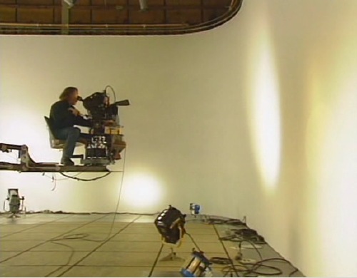
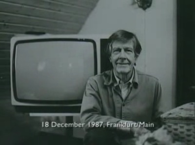
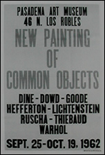 First museum shows for
 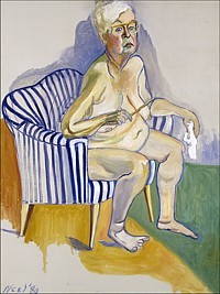 I watched the documentary Alice Neel last night, made in 2007 by the late artist’s grandson Andrew Neel. It’s pretty good, definitely worth a watch. Documentaries by family members come with a whole set of conflicts and challenges baked in, but Neel succeeds, I think, at identifying the craters and unexploded mines as he maps out the family’s emotional landscape.
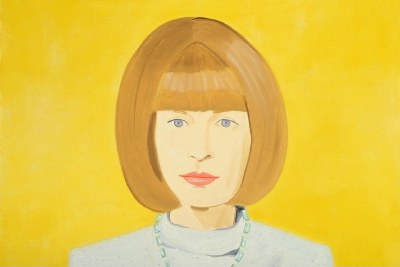