The Five Most Ridiculous Things About The Richard Prince Copyright Decision

prince_canal_zone_2008_orig.jpg
Paddy and her commenters have already done a pretty good job sorting through the decision in the Cariou vs. Prince & Gagosian case, and there are other folks out there with far more expertise and time than I who are also weighing in.
And while I still think this case is really troublesome for the whole fair use ecosystem as it applies to the art world–or more specifically, to artistic practice–that effect may not be lasting or widespread. Fair use and transformative work are still messy, ambiguous principles, almost by design, and artists are gonna do what artists have to do. And really, Judge Batts’ decision is so poorly constructed, and ignores or misconstrues so many basic facts of the case, that it can’t hold up to the inevitable, coming scrutiny, much less serve as any kind of practical impact going forward.
Still, it’s so awful, I can’t let it go without calling out a few of the most egregious passages, arguments, and errors. So here goes.
1) Cariou’s Photos Are Copyrighted. NO $#%ing DUH.
This is the first section of Judge Batts’ decision, and it has gotten a lot of media mention from the skimming crowd, even though it seems utterly and entirely irrelevant to anything at all. [p.10]:

Cariou’s ownership of a valid copyright in the Photos is undisputed. However, Defendants assert that Cariou’s Photos are mere compilations of facts concerning Rastafarians and the Jamaican landscape, arranged with minimum creativity in a manner typical of their genre, and that the Photos are therefore not protectable as a matter of law, despite Plaintiff’s extensive testimony about the creative choices he made in taking, processing, developing, and selecting them.
Unfortunately for Defendants, it has been a matter of settled law for well over one hundred years that creative photographs are worthy of copyright protection, even when they depict real people and natural environments.

I have looked, and I cannot find any documents where Defendants actually made this ridiculous claim that Cariou’s photos–arty, black & white, published in a book–are not copyrightable. It’s like the stupidest tumblr excuse ever [I found this image on the Internet, so it must be public domain!], not the argument the copyright lawyer for the most powerful art dealer in the world would make. Why is this even in here?
prince_ganja_tour_61-1.jpg
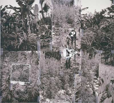
Look, the closest argument/evidence I could find is an exhibit [Doc. 61-1] rounding up dozens of Google Image searches for Rastas and Jamaican jungles and ganja tours, but that was to counter Cariou’s inference that the only way to take pictures of Rastas is to do what he did, and live with them for ten years. [Which, according to his deposition, it turns out he didn’t do, But whatever.]
Wow, is it really 12:30? I’ve gotta get some sleep. OK, we’re back. And what follows is, by any measure, too long.

Continue reading “The Five Most Ridiculous Things About The Richard Prince Copyright Decision”

Richard Prince’s Spiritual America

prince_spiritual_america_iv.jpg
Holy smokes, Richard Prince, Patrick Cariou, Larry Gagosian, Judge Batts, Bob Marley, Richard Serra [! I know, right?], Brooke Shields, $18 million in artwork, the fate of appropriation, the implosion of the gallery system, copyright apocalypse, there’s so much mayhem to discuss, where to start?
Let me cut to the chase here, and focus on the single most important takeaway of the Cariou v. Prince & Gagosian Canal Zone case: he won’t be suing me.
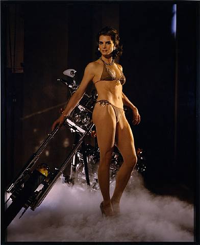
During a deposition, Cariou’s lawyer Daniel Brooks asks Prince about his 2005 work Spiritual America IV [above], for which he appropriated Sante d’Orazio’s photo of an adult Brooke Shields re-staging the 1975 Gary Gross photo of a 10-year-old Shields which Prince rephotographed and showed in 1983, in a temporary storefront gallery he rented on the Lower East Side and called Spiritual America:

Continue reading “Richard Prince’s Spiritual America”

Where To Make A Steichen-Style Photomural: Compo Photocolor

popsci_photomurals_compo.jpg
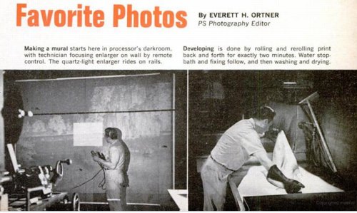
While trying to find out where and how to make a photomural, or at least how they used to make them, I found this slightly ridiculous 1966 Popular Science article about making photomurals in your very own home. And how you basically shouldn’t do it, but instead just mark up a negative and send it off to a photo enlarger somewhere.
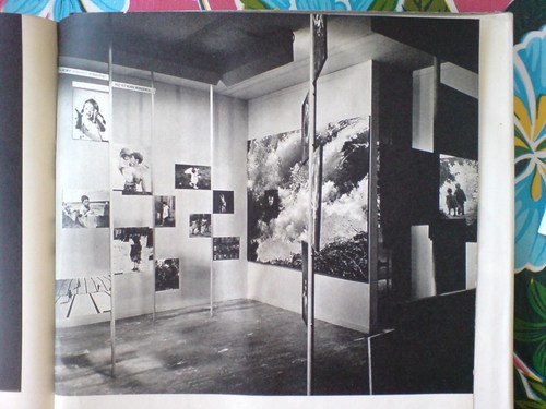
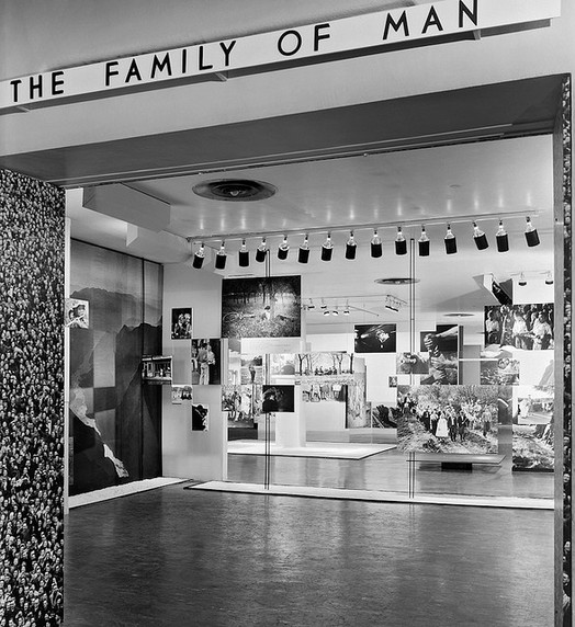
Someplace like–hey-o!–the outfit mentioned in a caption, “Compo Photo Color, 220 W. 42nd St., NYC, specialists in murals and exhibition prints who did famous ‘Family of Man’ photo show.” And so it comes pretty much full circle, back to the most famous photomural exhibition of all.
So who is Compo Photo Color? Or was. Immediately available references are pretty scarce, but Compo seems to have been in business from the 1950s until the early-to-mid 1970s. Its principals were a German immigrant photographer Richard J. Schuler and Ernest Pile, and it was eventually consolidated into Wometco Photo Services, a division of the Miami-based movie theater owner. But back to the apparent heyday, in the 50s.
family_of_man_1_stoller.jpg
In a 2001 interview, photographer Wayne Miller, who was Steichen’s assistant and co-curator on Family of Man, and who contributed the most images to the show, talked about working with Compo on the prints:

Riess: About Gene Smith, can I ask you to repeat the story that I lost last time about asking Gene Smith for a print of that image in The Family of Man?
Miller: Oh yes. In The Family of Man, after we had made our final selections of what pictures we wanted to have in the exhibition we asked some local photographers if they’d like to make the print for us, or would they give us the negative and we ll have the print made by Compo Photocolor in New York. Actually we wanted Compo Photocolor to make all of them so the prints would have a commonality, and they would match the other prints quality-wise. And they were very good technicians.
But in this case, because of Gene, he wanted to make the prints, he didn t feel anybody could make the print as well as he could. And he invariably spent not only hours, but days in the darkroom. In fact, in a Life story he would disappear in the darkroom and return, and you almost– here he was seemingly weeks or months afterwards, with a beard and other things, and with the final prints. And it would drive the Life people mad.
smith_family_man_garden.jpg
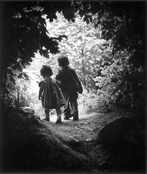
In this case, we had a print that I’d found in the Life morgue of what he [Smith] called “A Walk in Paradise Garden,” something like that, of two children walking out from underneath this frame of bushes. A nice picture, and we wanted to use it at the end of the exhibition. It was going to be about, maybe 30″ x 40″.
I told Gene we wanted to do this and asked him if he’d like to make the print, and yes, he
certainly wanted to make the print. So I arranged for him to get the necessary paper and
chemicals to do this, because his wife Carmen said, “Don t give Gene the money for it, because he’ll spend it on other things.” So after he told me what he wanted, I did get the materials for him. And I gave him a deadline, knowing that he was often not able to meet a deadline, of about three weeks early. So he took this material.
Now the print we had that I’d gotten out of the files had been handled a great deal and it had some cracks in it. It was dog-eared, and it wasn’t a fine print at this point. So at the same time I gave these materials to Gene I sent the print from the Life files over to Compo Photocolor and asked them to make a copy of it, make a negative, and make a print to size. Just so we wouldn t get stuck in case he didn’t come up with the print. Later, when he did do it, we could always replace it. And sure enough, the deadline came and went and we had to put this copy print up on the wall. Because Gene hadn t shown up with his.
A couple of weeks later Gene shows up with these photographs rolled up under his arm. We went up to the museum exhibition space in the morning because the museum didn t open to the public until noon. And I took this print that we had down off the wall, and he unrolled his prints. He had half a dozen of them there, different qualities, and he laid them out beside this print. I was worried about this because I know how he struggles and works so hard on it. He will darken this or lighten that, and he ll use ferro cyanide to bleach little bits. And the delicacies with which he treats a print are just great, they re very great. So I was interested in seeing how it would work.
family_of_man_install_gard.jpg
He laid his out, and he stood back there and looked at these prints. And he walked around a little bit and looked at them some more. Finally, he said, “You know, I think the print you have on the wall is the best one. Let s use that one.” [laughter] So he rolled his up and went along.
That I think points out the fact, I believe, that when you make a photograph, a print of a
photograph of larger than normal size, it picks up a new quality other than one of maybe an 11″x14″ or something. But one like this, maybe 30″x40″, it has a new quality to it.

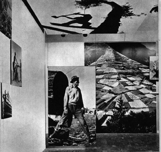
You know, it didn’t occur to me at all until just now, but Paul Rudolph designed the installation for Steichen’s Family of Man, which was photographed by Ezra Stoller, in January 1955,
family_of_man_entr_inst.jpg
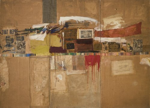
the same year Robert Rauschenberg was collaging photos into such giant combines as Rebus. Hmm.
rebus_moma.jpg

On War-Era Murals

Thumbnail image for moma_rd_victory3.jpg
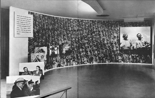
The question or theme or whatever hadn’t crystallized for me, but when Tyler linked to the previous two posts about Lt. Comm. Edward Steichen’s wartime propaganda exhibitions at the Museum of Modern Art, he noted that “there’s a lot of art historical work yet to be done on the impact World War II had on art and artists.”
It’s an interesting way to consider my fascination with the aesthetics and paradoxes of photomurals: their apparent historic status as something other than artwork, much like the photographic medium they’re derive from; their powerful scale, which creates a certain kind of all-encompassing viewing experience that is typically associated only with the later works of revolutionary “high art,” namely the Abstract Expressionists; and of course, the abstract and modernist aspects of the images themselves.
I’m not ready to go beyond the grand theory of “this looks like that,” but I keep seeing and finding resonances between photomurals, which were born in the Depression and came of age during WWII, and some of the major developments of postwar art.
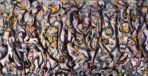
PollockMural1943UIMA.jpg
Mural, Jackson Pollock, 1943, collection: UIMA
I mean, I’m re-reading Tyler’s interview with Pepe Karmel about Jackson Pollock’s Mural [above], which was painted in 1943, and there are moments where I can’t help thinking about the 15- and 40-foot images in Steichen’s 1942 Road To Victory show:

It’s an important painting for Jackson Pollock because it’s the moment that announces his future as a painter of large, mural-scale paintings that become environments, and furthermore paintings that are in this distinct, all-over style that changes people’s idea of what a painting might be.

It’s like Barnett Newman’s Vir Heroicus Sublimis or Pollock’s own Number 1, 1950. You have to be there. You have to be standing in front of it and feel it filling up your field of vision and feel it wrapping around you and feel yourself falling into the field of the painting. If you don’t have that experience first-hand, you won’t get the feeling of the painting.

MAN: You talked about how important the painting was in terms of Pollock’s oeuvre. Can you detail why it’s so important to what came next in American and modern and contemporary art?
PK: The next step is off the wall and out into space. In contemporary art that deals with installation as an art form, which comes out of those paintings in 1950 and that comes out of this painting in 1943. It just doesn’t get more historic than this.
It’s truly a kind of unrecognized monument of American art.

Which isn’t to say that Pollock was referencing or even influenced by photomurals, just that both Herbert Bayer’s installation of Steichen’s photos and Pollock’s first epic-scale painting create an overwhelming spatial experience.
Photomurals were out-and-proud propaganda which had connections to filmmaking and the cinematic screen and to world’s fairs, [See Alvar Aalto’s Finnish Pavilion at the 1939 World’s Fair and the Japanese pavilion at the Golden Gate Expo that same year].
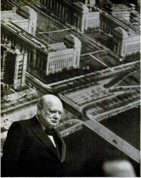
churchill_photomural_life49.jpg
Which is one of just a handful of references to photomurals in LIFE magazine’s archives. In a moment of greg.org confluence, LIFE’s most prominent depictions of photomurals are not in museums or world’s fairs, but in political rallies–they are the ur-Sforzian backgrounds. For example, In 1949, FDR Jr. has a giant wall of smiling children behind him at a UAW convention. A chorus line of garment workers kick in front of a selection of “union heroes.” And when he spoke in Boston in 1949, Winston Churchill stood in front of an aerial photomural of the MIT campus [above] which reportedly “confused [the] television audience.”

Art Poster

Honestly, I don’t know why I didn’t see it before. The answer‘s staring me right in the face. And I was so close with the Serra, too.
richter_annunciation_1_5996.jpg
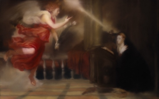
Annunciation After Titian, 343-1, 1973, Gerhard Richter [image via g-r]
This morning I just cracked open my Richter Bible, and started reading a 1974 interview of the bemused Richter by an insistent Gislind Nabakowski, who pressed the artist for his reasons for implicating himself in the “hackneyed language of symbols” of “the power of the hypocritical Renaissance,” and “sexual domination,” of the painting he’d recently copied, Titian’s Annunciation:

With regard to your approach to painting, you seem willing to encumber yourself with the concept of traditional symbolism, but you don’t illustrate it; you seem to be searching for your own symbolic references. Can you elaborate on this ‘illustrative realism’? Does it represent what the painter sees, or does it reveal his ‘reflections on what he has seen’ i.e., are his paintings platforms for the production of reality?
It certainly doesn’t show what one sees, because everyone sees something different, and what one sees isn’t a painting; it can only remind us of a painting. But, on the other hand, I don’t accept the principal difference between ‘pure’ pictures that only represent themselves and others that just illustrate something. If you take Ryman, Palermo or Marden, for example, in a away their paintings are also illusionistic, and you can only just identify the actual paint or the material if you have the eyes of a paint salesman.
Why did you paint over Titian’s motif and dissolve it?
Oh, I’m sure I didn’t initially plan it that way; I wanted to trace him as precisely as possible, maybe because I wanted to own such a beautiful Titian… [laughs].
That can’t be true. Not even the very first painting is a copy; you intended something else.
Sure. I only copied it from a postcard and not from the original as such. Although I must say that it is indeed possible to reproduce a painting from a postcard that is almost as beautiful as the original. Those few little details that would have been different really don’t matter–but that’s another issue.

Maybe for Richter.
Because when it comes to posters, what do people want to see more than beautiful works of art? The art poster has developed into a genre all its own. A genre and, as every museum shop, dorm quad, and Upper West Side laundry room can attest, a market.
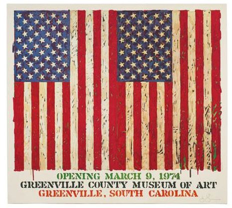
Here is a poster I saw yesterday, Lot 270: Jasper Johns Flag I, which LA Modern is auctioning next month, with a description, “Poster based on the print,” a signature [!], a provenance, and an estimate of $1000-1500:
johns_flag_poster_lama.jpg
We demand a lot from our art posters. Posters signal our tastes and aesthetic identifications even more purely than the originals, which, by their scarcity, can only be possessed by a few, and thus can’t escape the aura of investment. Posters can also embody a history. You were there in Greenville in 1974, and Jasper signed your poster. That’s how it could look, anyway. We like our posters to faithfully approximate the experience and presence of the original.
And they must also have a significant, authentic presence–poster qua poster–of their own. Which can limit the works available to those that best fit the poster format. So you can blow up Matisse Jazz cutouts, or shrink a Rothko.
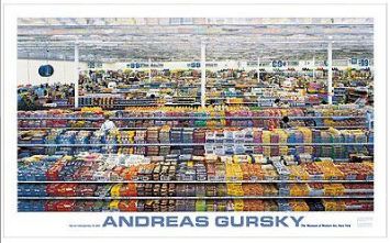
moma_gursky_poster_99c.jpg
Gursky: 99 Cent, $24.95 [via momastore.org]
Like this powerful work,” Gursky: 99 Cent, a “MoMA Favorite” which pushes up against the dimensional limits of the poster medium [56″ x 34″] just as Gursky’s 207x337cm original tested the most advanced photo printing technology of its day [1999].
But that, as Richter says, is another issue. Just as you can paint a beautiful painting from a postcard, you could use a photo, tiled and transferred to silkscreens at life-size, then taped and folded into a box, to provide the authentic, transformative experience of being in the presence of the original. Assuming you open the box, that is. And that you have enough wallspace. Or maybe that’s what museums and exhibition copies are for. And your copy stays MIB.
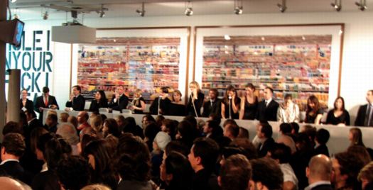
So what’d work at that scale? Gursky, of course. But if you’re gonna do Gursky, do the 99 Cent II Diptychon, which unfurls to a positively Bus-like 207 x 682 cm:
gursky_99cii_cityreview.jpg
99 Cent II Diptychon, 2001, at Philips de Pury in 2006 [image via thecityreview]
Or:

Continue reading “Art Poster”

‘It’s The First Time In History All These Four Artists Are Gathered Together.’


I cannot believe this has under 1,000 views. I’m only about 8:00 into this YouTube video, and already, Viktor Pinchuk is my hero. While anyone with a yacht or a palazzo could assemble a tranche of the art world powerful on the Grand Canal, only Pinchuk’s inspiring artistic vision can bring them all to Kiev. Well, I’m pretty sure it’s his vision they’re coming for.
Come for the vision, stay for the historic chance to have Jeff Koons, Damien Hirst, Andreas Gursky, and Takashi Murakami together on stage, answering incisive questions from Ryan Seacrest’s Ukrainian doppelganger. And the pitch for free Prada.
Ah, yes, I just got to the end: “Thank you to the thousands, the hundreds of thousands watching online!” It Gets Better!
Cinthia Marcelle receives Main Prize on FGAP Award Ceremony [ThePinchukArtCentre’s YouTube channel, via Gavin Brown’s GBlogÉ, pronounced like the French, Blo-ZHAY]

Richter’s Balls, Regrets

So I’m reading along in my new copy of Gerhard Richter: Writings 1961-2007–which is pretty awesome, and which does appear to supersede the artist’s previous collected writings, The Daily Practice of Painting, which is good to know, but really, what to do with all this information?–and I come across this discussion of glass and mirrors and readymades in a 1993 interview with Hans Ulrich Obrist, and I’m like, holy crap!

When did you first use mirrors?
In 1981, I think, for the Kunsthalle in Dusseldorf. Before that I designed a mirror room for Kasper Koenig’s Westkunst show, but it was never built. All that exists is the design–four mirrors for one room.
The Steel Balls were also declared to be mirrors
It’s strange about those Steel Balls, because I once said that a ball was the most ridiculous sculpture that I could imagine.
If one makes it oneself.
Perhaps even as an object, because a sphere has this idiotic perfection. I don’t know why I now like it.

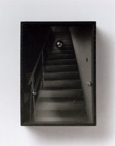
Richter’s mirror Steel Balls? Whew, never mind, they turn out–I think–to be Kugelobjekt, 1970, these odd, little postcard-sized objects, three steel ball bearings suspended in plexiglass in a shadowboxed photo of a staircase.
richter_steel_balls_1970.jpg
Kugelobjekt I, 1970, image: gerhard-richter.com
And anyway, on the next page, Richter explains how all the work on the dimensions and framing and installation of 4 Panes of Glass meant it’s “not a readymade, any more than Duchamp’s Large Glass is,” when he goes,

At one point I nearly bought a readymade. It was a motor-driven clown doll, about 1.5 metres tall, which stood up and then collapsed into itself. It cost over 600 DM at that time, and I couldn’t afford it. Sometimes I regret not having bought that clown.
You would have exhibited it just like that, as an uncorrected readymade?
Just like that. There are just a few rare cases when one regrets not having done a thing, and that’s one of them. Otherwise, I would have forgotten it long ago.

And I’m like, the clown! the clown! I swear, I’d written about it before, but I can’t find it anywhere. And then I realize I’d written about it for the NY Times in 2005.
Previous most ridiculous sculptures I could imagine: The International Prototype Kilogram or Le Grand K, and the Avogadro Project
UPDATE:, uh, no. Richter has more balls than I thought.

Goodbye Janette Laverrière

I’d say, “Adieu” or “Au revoir,” but Janette Laverrière was as fierce an atheist as she was a communist, designer, and artist. So I’ll just say I’m slow and sad to learn that Laverrière died last month at the age of, what, 101?
laverriere_rockers_rago.jpg
I first learned of Laverrière’s work way too late, too; I saw some wrought iron furniture she’d designed in the 1930s at auction about six years ago. She was a remarkable, politically committed designer in an antagonistic, elitist French decorating world, where men and the richest clients set the agenda.
laverriere_commune.jpg
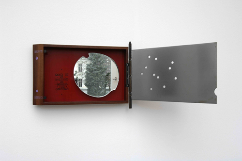
La commune (hommage à Louise Michel), 2001
The 2001 work, La commune (hommage à Louise Michel), includes a cherry-shaped mirror fragment in a rosewood box, with an iron lid peppered with what appear to be bullet holes.
As Laverriere plumbs history for her references, history is catching up, slowly, with her legacy. In 2008, the Iranian artist Nairy Baghramian collaborated with Laverrière on a very subtle exhibition at the 5th Berlin Biennial, where Laverrière’s sculptures were installed in Baghramian’s carefully calibrated architectural space. Baghramanian also included Laverriere’s mirrored sculptural works in a 2008 exhibition at the Kunstverein in Aachen.
Laverrière discussed the switch from design to sculpture in a 2009 interview with Vivian Rehberg in Frieze:

VR Is there a link between utility and uselessness?
JL Of course. It’s useful to have useless things.
VR Precisely – I agree.
JL So, I started anew by thinking about the oldest thing I could remember being inspired by. When I was 17, I really loved Jean Cocteau; I read a lot of his works. In 1989, I wanted to pay homage to him on the centenary of his birthday. So there I was in bed, thinking: I am not going to do anything useful anymore, I do not want to, I cannot, so I will do useless things. All of sudden, a new world opened up for me

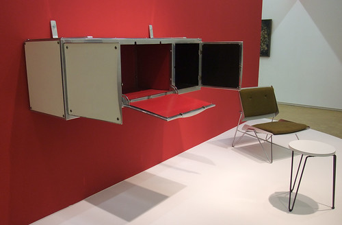
And the Pompidou has acquired an interesting piece from 1952, a suspended secretary, made from steel and Formica, which is currently on view in Elles, an exhibition of work in the collection by female artists.
Centre Pompidou /// Univers Industriel /// Janette Laverrière
Secretaire suspendue, 1952, image via batir au feminin’s flickr
Bhagramian’s obituary for Laverriere [frieze.com]
Rooms No One Lives In, Katarina Burin’s review of the Biennial show [thehighlights.org]
Use Value | Laverriere talks to Frieze [frieze.com]
short video: Portraits de Femmes Artistes – Janette Laverriere [ina.fr]

Which Flag Story? Which One Do You Know?

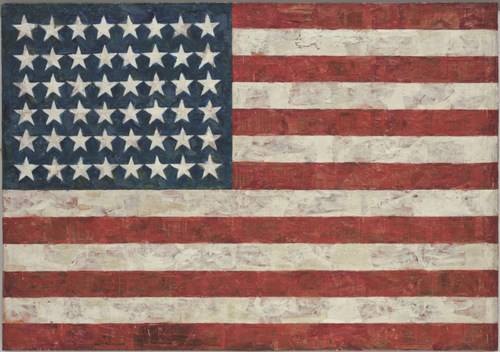
johns_flag_moma.jpg
Flag, 1954-55, via moma
The creation myth for Jasper Johns’ Flag is well-known, and well-told. Like Leo Castelli’s story of discovering Johns’ groundbreaking oeuvre, fully formed, while he and Rauschenberg were raiding the icebox, and how Johns’ first show in 1958 got on magazine covers, sold out to MoMA, destroyed Abstract Expressionism and ushered in Pop Art. MoMA’s wall text for Flag [which Alfred H. Barr had Philip Johnson purchase from that show] begins:

“One night I dreamed that I painted a large American flag,” Johns said, “and the next morning I got up and I went out and bought the materials to begin it.”

It came in a dream. It’s a protean story, quintessentially American, slightly romantic, and beyond the reach of anyone but [Freudians, Jungians, and] the artist himself. And that’s the key: because unfalsifiable is not the same thing as definitive, or even true.
In the opening of her 1975 dissertation, published in 1985 as Jasper Johns’ Paintings and Sculptures, 1954-1974, Roberta Bernstein takes a researcher’s step back:

When asked about the sources of Flag, 1954-55, Johns answers that he dreamt one night of painting a large American flag and then proceeded to do so. He has said this several times and will offer no other explanation for the appearance of this remarkable painting.

In the footnotes, Bernstein cites Alan R. Solomon’s catalogue for Johns’ 1964 Jewish Museum show, as well as several personal retellings.
But check out this transcript of Solomon interviewing Johns in 1966 for National Educational Television’s USA Artists Series. Then tell me if it doesn’t sound like there could be another story–or several–for the origin of the flags?

Continue reading “Which Flag Story? Which One Do You Know?”

Yves Klein, Ex-Voto Ex-Monastero

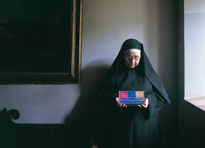
klein_ex-voto_cascia.jpg
Sister Andreina holding Yves Klein’s ex-voto for Santa Rita di Cascia in 1999, photo: David Bordes
I get the sense that in the contemporary art world, an artist’s religiosity or spirituality is often perceived as an obstacle, an eccentricity to be indulged when they’re around, but to be politely ignored in serious discussion. That goes for John McCracken, Anne Truitt, Marina Abramovic, a bunch of others, I’m sure, and the one who made me think of it just now: Yves Klein. When the artist’s widow Rotraut Klein-Moquay spoke at the Hirshhorn Museum’s retrospective last spring, it was clear that she was operating on a different, more spiritually attuned plane than the show’s clearly uncomfortable curator, Kerry Brougher. [Though watching Brougher, his co-curator Philippe Vergne, and the Klein Archive’s David Moquay at the Walker a few months later, exasperated interruption may be the only way to get a word in edgewise with the rambling Moquays.]
Anyway, Vergne takes it all in stride. In an interview with the Walker’s Julie Caniglia, he tells about securing the loan of one of the most interesting and unusual pieces in the retrospective, a 1961 ex-voto which Klein left at the monastery of Santa Rita di Cascia. It’s like a little retrospective in a box, a boite en valise.

Julie Caniglia
Speaking of striving, you literally went out of your way so that Ex-Voto would be a part of the exhibition. Can you talk about how this loan was carried out?
Vergne
Klein made an extraordinary gesture with this artwork and that’s reflected in how it’s treated by the monastery. I don’t think the Mother Superior would have allowed it to leave the convent without a meeting with one of the exhibition organizers. She was basically saying to us curators, “If you really want this work of art, you’re going to have to come and tell me why. It cannot be treated as one more object. You’re not going to just send a loan form, you’re going to have to come and sweat a little bit because this object is extremely important.”
On the other hand, she was kind enough to meet me at a cloistered convent in Rome so I wouldn’t have to make the long drive to her convent at Cascia. We were in a little room accessible to visitors, but divided wall-to-wall by a table: one side for guests and the other for nuns. They brought me coffee and cookies. Through a translator, we entered this conversation talking about Klein’s work and how important it was to have the Ex-Voto in the exhibition. Then we read the entire loan document word for word, all of the details about insurance and transport, everything. It was really like a ritual. Then we had a conversation about immaterial sensibility.
I also got to tell her a story about the well-known Leap into the Void photo–how the house that Klein leapt from outside Paris later became a church dedicated to Saint Rita, through absolutely no relationship with Klein. I thought this was extraordinary, but she said, “No, it’s normal.” I thought she meant for Klein, but she said, “No, for him,” pointing her finger to the sky.
Before I met with the Mother Superior I got to see a part of the convent closed off to the public where some absolutely gorgeous 13th-century frescoes were being restored. That, too, became part of the Yves Klein exhibition for me. I see it as an example of Klein’s immaterial sensibility: I am made of all these little layers of experience, which came together in the making of the exhibition.

Saint Rita is known as the patron saint of lost causes, and was a favorite object of Klein’s devotion and ritualistic interest. He apparently made the ex-voto while experiencing something like painter’s block, and he left it during one of several pilgrimages to Cascia. It was only discovered in 1980, during a renovation at the monastery following an earthquake. It was included in the Centre Pompidou’s 2006 retrospective, but it will return to Cascia after the Klein exhibition closes at the Walker this weekend. Pilgrims, your time is running out.
Yves Klein and the patron saint of lost causes [walkerart.org, thanks to Matt at RO/LU]

‘The Excess of Unimportant Information’

Though to a guy making something called Atlas in his spare time it still probably feels pretty empty and limited, Gerhard Richter’s website is pretty expansive. Via Twitter, we learn that his web elves have just added a quotes section, most of which is taken from Gerhard Richter: Text. Writing, Interviews and Letters 1961-2007 (2009), the UK edition of the artist’s second collection of writings, both of which were edited by Hans Ulrich Obrist.
I was about to bit the bullet and buy the expensive, out-of-print The Daily Practice of Painting: Writings 1962-1993 when the new edition came out, and I’ve hesitated, waiting to see how or if the two volumes overlap. So far, I’ve seen nothing; I guess I’ll have to pigeonhole Hans-Ulrich at the next global 24-hr art lecture marathon.
Meanwhile, I went ahead and bought Gerhard Richter: Writings 1961 – 2007, the US edition, so I’m just a couple of days away from seeing whether this awesome quote about blurring from 1964-5 [!] is, in fact, on page 33:

I blur things to make everything equally important and equally unimportant. I blur things so that they do not look artistic or craftsmanlike but technological, smooth and perfect. I blur things to make all the parts a closer fit. Perhaps I also blur out the excess of unimportant information.

Les Ballons de Léon Gimpel

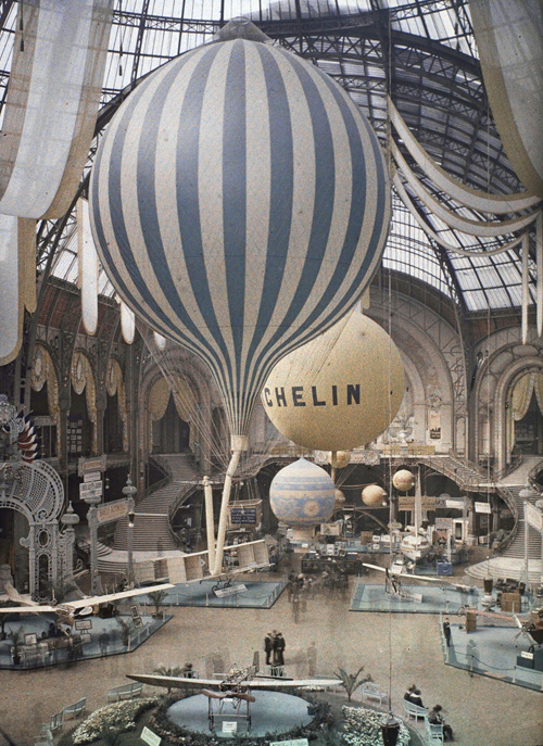
Last week in my interview with Mike Maizels for Pinkline Project, I’d mentioned how the Grand Palais in Paris would be an acceptable art venue for exhibiting my satelloon project. Not only was the grand nave one of the few spaces in the art world that could accommodate a 100-foot diameter inflated aluminum sphere; but historically, it was the site of major, early air shows, and it has held giant balloons before.
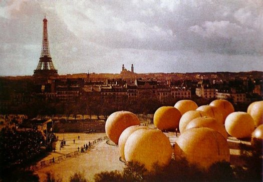
As new greg.org reader Erik points out in this awesome color [!] photograph, which was taken in 1909 by Léon Gimpel.
gimpel_grand_palais_airshow09.jpg
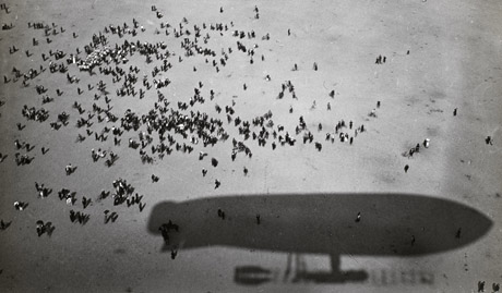
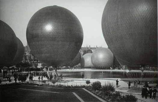
I didn’t know Gimpel, but the Musee d’Orsay says I should be as familiar with his work as with his Belle Epoque confreres Lartigue and Atget. They staged a retrospective of Gimpel’s pioneering photography in 2008. Apparently, he experimented with distorting mirrors, perspectival compositions, and color photography. He published the first color news photo, using the Lumieres’ autochrome technology [the same as above] just days after they introduced it. And though I can’t find examples of it yet, his aerial photography sounds pretty sweet:
gimpel_airship.jpg
gimpel_ballons_color.jpg

From 1909 onwards L’Illustration commissioned photo reports directly from Gimpel. He stood out from other photojournalists by producing unusual images. At the first major air show, held at Béthény in August 1909, he went up in an airship and so was able to photograph the progress of the aircraft, not from the ground like the other photographers, but from the sky. So, thanks to Gimpel, readers of the magazine had a stunning view of the pioneers of aviation.
From this date, the photographer started to exploit this bird’s eye view in order to set himself apart from other reporters and to seduce the press.

gimpel_ballons_jardin.jpg
[update: found some via fantomatik]
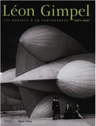
Fortunately, there’s a catalogue. Unfortunately, it doesn’t look to be readily available in the US. Judging from the cover, though, I could probably ask Ricci Albenda to lend me his copy.
gimpel_catalogue_cov.jpg
Léon Gimpel (1873-1948), Les audaces d’un photographe [musee-dorsay.fr via ck/ck, the equally awesome tumblr of Swedish designer Claes Källarsson, thanks Erik]
More Gimpel images: La guerre des Ballons de Leon Gimpel [fantomatik]

Untitled (Portrait of Ross in LA)

felix_ross_la_pour.jpg
Untitled (Portrait of Ross in L.A.), 1991

RB Before I knew you I saw something… You know what I’m going to say?
FGT I dedicated a piece to Ross.
RB Exactly. I thought, this is so sweet, I want to meet him. He dedicated this thing to me and I don’t even know him. (laughter) It put me in the best mood. And then someone said to me, “You idiot, why would he dedicate something to you? It’s his boyfriend.”

-Ross Bleckner interviewing Felix Gonzalez-Torres in the Spring 1995 issue of Bomb Magazine. This is about as funny as Ross gets. He really is as foolish as Felix is thoughtful. Well worth a read.
Bonus: did you know that by Fall 1994, after five solo shows and with his retrospective set to open at the Guggenheim, Felix had never had a review in the New York Times? [I just checked, and the closest was a paragraph in a cranky 1990 survey of Minimalist revival by Roberta Smith. She called his stacks “almost laughable.”]

Johns, Merce, Duchamp: Walkaround Time

johns_walkaround_wac.jpg
image: walkerart.org
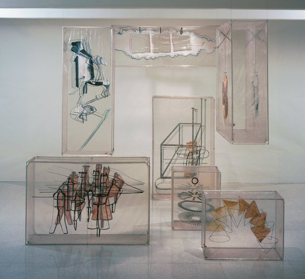
Welcome to one of the oldest tabs in my browser: the inflatable balloon set for Merce Cunningham’s 1968 piece, Walkaround Time, which is based on Marcel Duchamp’s Large Glass, which was made by the company’s artistic director at the time, Jasper Johns.
I’d backed into the pieces–seven cubes of silkscreen-and-paint on clear vinyl, reinforced with aluminum frames–a few months ago, and realized I’d seen them–and not thought much about them–at the opening of the newly expanded Walker Art Center in 2005.
Which I now regret, but which makes Merce’s title resonate a little more. Cunningham dancer and longtime collaborator Carolyn Brown explains that Walkaround Time was a reference to a particular kind of purposeless movement taken from ancient computer history, when “programmers walked about while waiting for their giant room-sized computers to complete their work.” It’s just taken me this long to appreciate–or even to see–the work. And for some great additional links to appear.
I can already tell this is going to go long.
03/2012 UPDATE: Unfortunately, none other than former MCDC stage manager Lew Lloyd informs me that the term “balloon” is not really accurate; they were transparent vinyl boxes fit onto armatures, which could be broken down for travel. Given my noted satelloon bias, I will still think of them as balloons in my heart. For the rest of you, though, remember: not balloons. [end update]

Continue reading “Johns, Merce, Duchamp: Walkaround Time”