
Robert Rauschenberg’s massive 1970 silk screen edition, Currents sure is hard to miss. And not just because it’s 18 meters long.
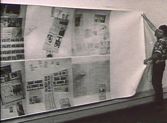
MoMA’s copy from the edition [of just six] has been wrapped around the corner of the second floor galleries for a while now. Which may have helped coax Peter Freeman into bringing out another of the screenprints last week for Art Basel.
But it’s also at the end of the Rauschenberg’s segment in Emile de Antonio’s documentary, Painters Painting [above], which I rewatched recently. Bob unfurls it with a slightly soused, earnestly glib voiceover about how, even though there’s so much information packed into a daily newspaper, most people don’t read it. But if someone spends $15,000 on the info, the artist can get him to pay attention. Or at least not wrap the fish in it and throw it out.
Which is ironic, I guess, because I’ve found that the size and visual uniformity has caused me to stroll by Currents without ever even slowing down. I register it as reworked newspaper content, on a giant roll, just like the real newspaper itself–but I don’t slow down to look closely. I mean, really, at that scale, how much of my time does Rauschenberg really think he’s gonna get?
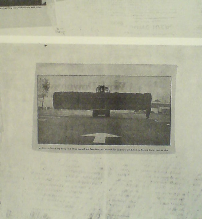
So maybe it was because I’d just run into Richard Serra moments before in the atrium, or because I came at the work head-on this time, instead of from the side. But I’d never noticed, for example, that there is a news photo of a frontloader bringing a massive fir tree trunk to the Pasadena Art Museum for Serra’s 1970 work, Sawing: Base Plate Template (Twelve Fir Trees)
Above it and to the right, I’d swear that row of tract houses is a Dan Graham photo.
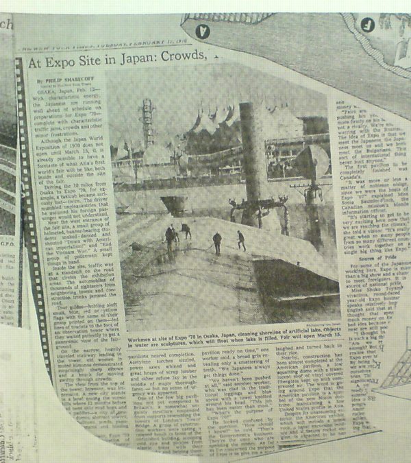
And hey, there’s a story about construction progress on Expo 70 in Osaka, where E.A.T., the collaborative Rauschenberg founded with Billy Kluver, was creating the Pepsi Pavilion, and where Rauschenberg was still thinking he’d show his own work, a plexiglass cubeful of bubbling drillers’ mud called Mud-Muse, which he’d developed with Teledyne for LACMA’s Art & Technology show and the US Pavilion.
If I can spot these now-obvious contemporary art references in Currents, what else must be lurking in there? Was incorporating other artists’ images Rauschenberg’s way of tipping his hat to artists and work he liked, or was he assimilating and subsuming it in his own, sprawling scroll? Was he engaging in a dialogue with the Conceptual and post-minimalist kids coming up or putting them in their place? Or trying to put himself in theirs?
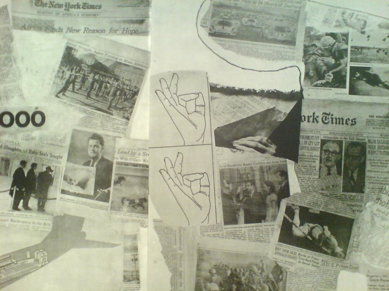
The most intriguing references now, though, turn out to be a little trickier. There are multiple instances of diagrams showing hands throwing the OK sign which remind me of nothing so much as the sign language woodblocks used in the prints at Jasper Johns’ latest show at Marks.
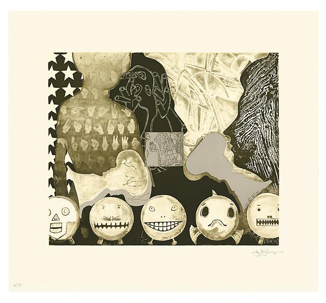
Shrinky Dink 4, 2011, intaglio print, image via
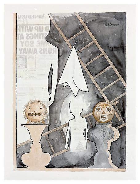
I remember thinking immediately of Rauschenberg when I saw the mirrored newspaper transfer appearing in the upper left of this Johns drawing, Untitled, 2010.
Rauschenberg began using the technique in the mid-60s, and it’s all over Currents. Remind me again how long MoMA’s had their print on view?
Category: interviews
Weight, Weight, Don’t Tell Me
On October 4th, 1994, at an artist panel discussion for MoMA’s Cy Twombly retrospective, Richard Serra made an offhand comment about how “The last century of art has been based on a misreading of Cezanne.”
To a young, impressionable student/fanboi still putting his contemporary art world view together, this was a shock. Because it was Serra, and because I still assumed there was some right art historical “answer” to be gotten to, and because Serra didn’t bother to say how everybody got it wrong, it lodged in my brain for years.
And so it was that at some point a couple of years later, when I met him at a party, I asked him what he’d meant. Of course, he didn’t remember what he’d said, or the context, so he gamely tried to float a couple of possible theories, but nothing that matched the seeming conviction with which I’d remembered him saying it. So I tried to forget about it.
And I thought I had, at least until just now, when I was reading Serra’s discussion with Gary Garrels in the Richard Serra: Drawing catalogue. They were talking about the “jump” in Serra’s work after 1989 in terms of Cezanne:
GG: Those double-panel drawings, rather than dealing with a wall or with a room or a space, deal with internal relationships.
RS: They are masses in relation to one another. They’re not about composition or figure-ground; they emphasize the comparison of different weights in juxtaposition.
GG: So this, to me, is again another jump.
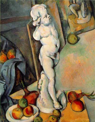
RS: For me they have more to do with Cezanne than with Malevich. I wasn’t looking at Cezanne when I conceived them, but in retrospect, I see a clear connection in the way they deal with weight and mass in relation to shape. They’re the opposite of the floating shapes of Constructivism and Malevich, referred to in drawings like Heir
The comparison of the diptychs with Cezanne may be a stretch, but no one else comes to mind who deals so physically with mass and weight. No one talks about the weight of Cezanne, but there’s a manifestation of weight there that’s not in Picasso, not in Matisse, barely in anyone who follows. Cezanne is obviously interested in gravity and in the relation of weight to plane. Take Still Life with Plaster Cupid [ca. 1894], in the Courtauld, where he punches a hole in the space, and you think the apples and onions are going to roll off the table. The only thing holding them in place is their weight. They have the weight of cannonballs.
So the answer, then, is C) gravity.
But then, literally, as I’m typing this in from the book, it’s 41:00 into the recording of the panel, right where Serra says it:
I think Twombly has a big range– a big range of evocation. I think that’s what he does. He doesn’t present an image; he evokes a sensuality, and it’s unlike anything in post–I think. I’d have to go back to someone like Baziotes, maybe–there’s nothing in the American brain like that. Americans are much–maybe Brice. Americans are much more heavy-handed, much more flat-footed, much more aggressive.
This is the opposite of Cezanne. And the whole inheritance of the New York School kind of goes Cezanne; Cubism; into Abstract Expressionism; Pop Art pretty much hangs things back on a grid; the grid comes back up again in Minimalism. That seems to me all an extension of a certain kind of classicisim and aggression and a standardization coming out of Cezanne, a misreading of Cezanne, albeit. And Twombly takes the opposite attack. It’s very lyrical. And very open. And very…delicate.
Brice Marden: Yeah, I think it’s really great that he left town. [crowd laughs]
OK, then. I seem to have misunderstood the question. The correct answer is actually D) Serra likes to think in terms of major historical frameworks. I’m glad that’s all cleared up.
Charline Von Heyl Is Reading Your Blog
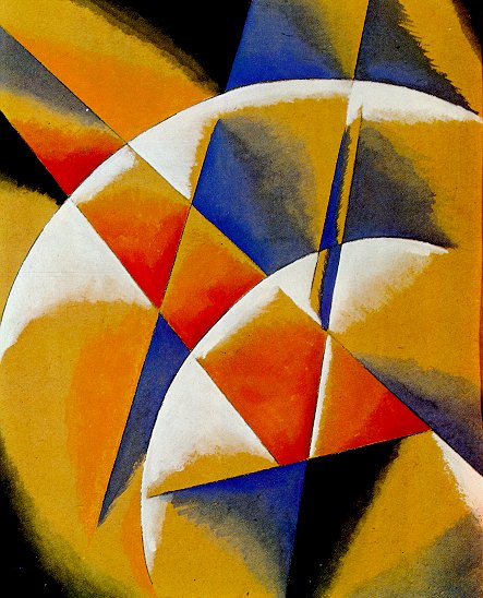
Von Heyl-bait: Spatial Force Construction, 1921, Lyubov Popova
A couple of weeks ago Charline von Heyl made a refreshingly badass presentation on painting at the Hammer Museum. [It was organized by UCLA’s art department.] The tenor was quite different, it quickly became one of my favorite artist talks since Thomas Houseago’s Public Art Fund lecture at the New School last year.
Von Heyl talks a lot about her sources and tactics, including design, folk and indigenous art, and overlooked and bad [Bad?] painting. Rather than narrating a trajectory for her work, or elaborating on her technique, she focuses on how she looks, and on how central that is to what she does eventually turn out.
So obviously, this from the q&a:
I find the idea of time in painting super-interesting in every respect, you know, the speed of the brush, the way the backwards/forwards thing goes, the time of the paradox, which is probably my idea of irony, the material thing that switches things around.
And so all those things really feed into each other, and the time of looking is constantly feeding into it, constantly. And it’s really–one of the first things I do when I go to the studio is to get different books and check different things out.
And for me, the whole blog thing is a godsend. If I put in one of my favorite paintings, some weird Popova painting or something like that, and go to images and blog, there’s a kindred soul, you know, somebody who has the same taste. And from there, you find other blogs because he’s going to go somewhere, And I think books have been so important for me, but now, blogs, painters’ blogs are, I mean, there are a lot of people who are super smart when it comes to looking, and it’s really fun to look at it. I use that a lot, too.
A follow-up question asked what blogs she looks at, and she balked; she can’t name her favorite books, either, she said, because she doesn’t know the titles. It’s a result of being immersed in “this community of images.” So it makes sense that the one blog she did manage to namecheck is Bibliodyssey. [She also said she does read Notes on Looking, too.] From Dennis Lim’s brief Q&A with Gus Van Sant at Cannes, where Restless is [finally?] debuting: We did silent takes of almost every scene so we could maybe use them in the editing. Terry Malick apparently shoots silent takes so he can mold what he wants out of the scenes. But with our takes we actually created a silent version because we had enough material and we realized we could — maybe it’ll be on the DVD. Everything is there except the dialogue — all the sounds and music, and you hear all the footsteps, but there’s nobody talking and no lips moving. They’re the same scenes, but it has the distance of not being dialogue-driven. It’s the exact same love story but it plays like a different movie. It’s funny, because Gerry and Elephant only have like 10 pages of dialogue between them anyway. Then please email me if you haven’t already. I’ve seen a million and one lawn ornaments without ever noticing any connection to satelloons. And then I saw this odd ball self-portrait of Edwaerd Muybridge last spring at the Corcoran [detail below], and I”m like, big shiny Victorian garden balls and satelloons! Thomas Lawson’s 2010 interview with Andrea Bowers is like five kinds of great. It concerns the works in her show at Susan Vielmetter in Los Angeles, “The Political Landscape.” Bowers’ story of making a video piece about activist and Bush-era public land auction-saboteur Tim deChristoph has some nice critiques of the Earth Art Boys. And it’s surprising how surprising so many of the reactions were to her immigration- and border-related drawings. AB: Yes, it’s a hundred-foot drawing. A Story about Civil Disobedience and Landscape: Interview with Andrea Bowers [eastofborneo.org] What is the point of books if you’re just going to store them out of sight? This LACMA interview with Vija Celmins about her show there of early work is just great. [The show itself is great, too; it was first at the Menil.] I started going through my photographs and newspaper clippings that I had collected -images of Second World War planes, a nuclear explosion at Bikini Atoll, an airship – and I made drawings of those. Reading that, and thinking of the Menil/LACMA show, my being reminded of Joy Garnett’s paintings doesn’t seem that far afield after all. Rail: Guston also loved Morandi, whom I know you admire, and Morandi’s most admired painter was Chardin. But you know where THE Celmins interview is? In a book. Chuck Close interviewed Celmins, at Bill Bartman’s behest, and A.R.T. Press published it in 1992. I think I may even have that somewhere. I certainly thought about buying that etching of Saturn often enough. Gotta track that down. Italics in original: Nan Rosenthal: Does the color gray carry for you a suggestion of ambiguity? From the q&a in Jasper Johns Gray You know what, in my six days as a published author, out there flogging his book, I find myself thinking, again, of Cervantes and Don Quixote. I mean, I it really feels like I’m living in the Quixotian name I gave my film production company, First Sally. I could go on and on, to the point I stop debating whether I’m Quixote or Cervantes, and begin wondering whether I’m Pierre Menard or Borges. I assume all authors go through this. If anything, I would rather have it both ways: the book and the blog; the lavish endeavor of the lovingly prepared new edition and the take-out convenience of the virtual text. And I humbly announce that the future of both art and literature is here. Now if you’ll excuse me, I have to get to work on my book trailer. Thanks for the support and feedback on the Canal Zone Richard Prince YES RASTA: Selected Court Documents &c., &c. book. [updated link info below] What with all this Prince in my head, I start seeing and reading and remembering things in relation to the Canal Zone case. For instance: I feel that I like to get as much fact into my work and reduce the amount of speculation. I believe there’s too much–I like an artwork where that when you see something, like a cowboy or a girlfriend, I mean these are, in fact, true. Batts decided that this meant Prince appropriated Patrick Cariou’s photos because he was trying to convey the same “core truths” about Rastafarianism as Cariou. But it actually made me think of a quote from Greg Foster-Rice’s essay in his just-released anthology, Reframing the New Topographics, where he discussed the influential early 70s photography show in terms of systems theory, and in particular the system of photography itself: Photographs, in other words, are distinct from other forms of representation in that their connoted messages are built upon a widely held belief in the medium’s denotative status as an almost perfect copy of the real. I have to say, I really hated Canal Zone when I first saw it, but the more I study and think about it, I’m coming around. In one sense. Prince was making paintings about photography, and about the different expectations of truth and subjectivity, fact and fiction, each medium embodies. Which is nice. Perhaps the key joke for the retrospective is one that appeared in several different paintings: ‘Man walking out of a house of questionable repute, muttered to himself, “Man, that’s what I call a business … you got it, you sell it, you still got it”.’ A museum is, after all, a house meant to settle questions of repute. And this particular museum exhibition was, among other things, a comment on Prince’s clearly impressive ‘business’. Like the one described in the joke, this industry depends on a seemingly magical economy: the slippery way that things that aren’t exactly objects – such as images and sex – get valued. Prince is a connoisseur of such economies. For better or worse, no matter how much he’s sold, he’s still got it. That is just awesome.
UCLA Department of Art Lectures: Charline von Heyl [hammer.ucla.edu, thx
Author Posted on Categories art, inspiration, interviews
Shh, Don’t Speak.
Previously: Gus Van Sant’s go-to guy, the greg.org 2003 interview with producer Dany WolfRichard Prince Deposition Book All Grown Up
“THE WITNESS: This could be a cool book.”
– Richard Prince Deposition Transcript, p. 328
Dude, Richard Prince just blurbed my book.
Between the lawyers on both sides of Cariou vs. Prince et al, about 275 pages of the transcript of Richard Prince’s 7-hour deposition had been made public as footnotes to various briefs and memos, but there were 101 pages left out.
In the weeks since I compiled the excerpts and exhibits into a book, I’ve been trying to track down the complete transcript. Now I have it, and you can too. After trying multiple sources for obtaining it, a sympathetic party close to the case pointed me to an apparently inadvertent, unmarked exhibit appended to a late court filing, which included the entire 378-page transcript instead of the customary snippets.
 And so I have revised Canal Zone Richard Prince YES RASTA to includ the entire interview, in order, with a handy timestamped topical index, even, and with some additional rounds of legal memos, that give a fuller sense of the give and take that led up to Judge Batts’ royal smackdown of Prince’s transformative use claims.
In addition, to accommodate wholesale requests, I’ve switched printers, so the new, revised edition has slightly smaller page facsimiles, but it is also printed on higher-grade paper. It looks pretty slick.
Because of the additional quality and page count bumps, the cost went up a bit, to $17.99, but it’s still a pretty sweet deal, I think. You can buy Canal Zone Richard Prince YES RASTA directly from Createspace.com, an Amazon print-on-demand subsidiary, of if you like, you can also order it from Amazon. If you’re dying to see it in person first, both Printed Matter and Specific Object have greg.org-stamped copies available.
For folks who have already purchased the book, either in print or electronic format, don’t worry, I’ve got you covered. I made an Appendix which contains all the missing transcript pages, and I’ve been mailing out printed and PDF copies to people who’ve contacted me. Whenever the printed copies run out, I’ll be happy to keep the appendix available via PDF.
Because it really does have some interesting stuff in it, like the quote at the top of the page, which was Prince’s reaction to the exhibit showing the side-by-side comparisons of the Patrick Cariou’s YES RASTA images and the Prince Canal Zone paintings they ended up in. [Obviously, that exhibit is included in the book.]
Now that the whole deposition story can be told, I think I’ll go through and pull out some highlights to share here: some great exchanges, useful insights, or straight-up WTF moments. If you have any favorites, definitely pass them along. And enjoy! The damages hearing is scheduled for May 6, tomorrow!
Buy Canal Zone Richard Prince YES RASTA: Selected Court Documents from Cariou v. Prince et al from Createspace or Amazon.
The book is also available at Printed Matter and Specific Object, both in New York and online.Did You Buy A Copy Of The Richard Prince Deposition Book?
greg at greg dot org
Electronic or print, either one. Because I have something for you.Witch Balls And Gazing Balls
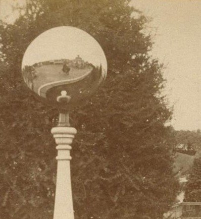
Actually, I see it was the other way around: Muybridge was in May, and tricky photographs using mirrored balls that happened to be satellites was in March.
Anyway, that’s when I realize I have no idea what they’re actually called, or how to find them, because they’re called something besides “those+glass+lawn+balls” or whatever. And so I start trying to figure out when I might accidentally run into our neighbor who has one, so I can ask.
Then last fall, on a trip to Amsterdam, we were walking through the antique scientific instrument district, we went into Staetshuys Antiquairs, which had some incredible and odd-looking globes and orreries in the window. And there on the edge of the mezzanine:
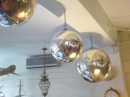
Big [and small] shiny balls. Thick-looking, silvered glass globes, but hanging on chains, not sitting on grass. Staetshuys’s Stephan Meulendijks explained that they are called witch balls, and they served to deflect evil spirits from the windows of your house in 18th century England. Most witch balls I see discussed online, though, seem to date from the late 19th and early 20th century.
Wikipedia’s entry for witch balls shows hand-sized globes, but a couple at Staetshuys measured at least 30-40cm. [Actually, the one pictured, from the V&A, which was originally “acquired as a ‘Witches ball,'” and is now labeled a “bauble,” is “almost certainly a Christmas tree decoration.”
Anyway, the garden variety, are known as gazing balls, which is pretty close to a satelloon after all.Andrea Bowers On The Political Landscape
But I can’t not post a bit of the discussion of the centerpiece of the show. Titled No Olvidado – Not Forgotten, the 10-foot-high, 23-panel mural/drawing contains the names of several thousand people known to have died crossing the Mexican-US border:
TL: And it is set up as a memorial, it’s a very grand piece. Let’s talk about it. Since it is monumental, it presumably required a different way of working?
AB: Right. I worked with a graphic designer and several assistants. It resulted from a conversation with an activist, Enrique Morones. He founded an organization called Border Angels. They started off in I think ’86, providing water and blankets to people crossing the border.
TL: And many die in the attempt–are they killed out there in the desert, or do they die from exposure and thirst?
AB: It’s both, but in many cases nobody knows. A lot of people die from dehydration or temperature, but there are also people who are killed. So Enrique collects names of anyone who dies migrating from Mexico to America. He actually has about ten thousand names. He finally admitted that the group of names he provided to me, a list of four or five thousand, is only up to the year 2000.
I’ve always been making memorials in one way or another, but memorials that I thought would never be made, or memorials that were kind of impossible to make. I’m fascinated by the Vietnam Memorial in DC, and how listing names functions in general. An important part of what I do concerns this documentary-type collection of information. Robert Irwin’s Black Plane
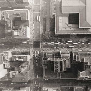
Andrew Russeth has a great post about the making of Robert Irwin’s Black Plane. As part of the Whitney’s 1977 survey of the artist’s work, Irwin had the museum staff paint the intersection of 42nd St & Fifth Avenue, a certain heart of the city, with blacktop sealer. The image above is an aerial photo from the Chinati Foundation newsletter, 2001, which accompanied an interview of Irwin by Marianne Stockebrand.
It, along with the date of the Chinati publication, December 2001, reminds me of a proposal for the rebuilding of the World Trade Center site that Ellsworth Kelly made in October. In early 2003, after seeing an aerial photo of the site in the Times, Kelly painted a green trapezoid as a stand-in for the large grass mound he envisioned, and sent his collage to Herbert Muschamp. The artist also noted that other artists he’d spoken to, including Joel Shapiro and John Baldessari, also thought that nothing should be rebuilt on the WTC site.
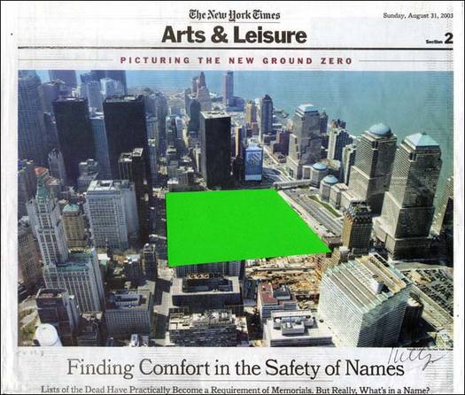
Muschamp arranged for Kelly’s collage to be donated to the Whitney.Source Material
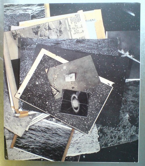
I mean, just look at the back cover of A.R.T. Press’s 1992 interview of Vija Celmins by Chuck Close. If only I’d had this book somewhere besides my storage unit all these years, I might’ve realized sooner that what I’ve been doing, basically, is reconstructing the pile of photos on Vija Celmin’s desk.Some Vija Celmins Interviews
No sooner did I watch it, than Celmins’ name came up in the Jasper Johns Gray catalogue. And I decided that what’s needed is more Vija Celmins interviews.
And that’s when I realized that my expectation that there weren’t enough Celmins interviews was based on my reading of her work as so quiet and self-contained. In fact, Celmins herself is quite open, and gives lots of great, thoughtful interviews.
Here’s another from 2008, the Carnegie International:
Art21 did one, of course, but this clip’s only a minute long.
Simon Grant did a pretty long career-related interview with Celmins for Tate in 2007, which used the Pompidou’s drawings retrospective as its hook.
Anyway.
Phong Bui’s 2010 interview is classic Brooklyn Rail: deep and specific on history and the work. Ah, see? Here’s the word I was looking for, the one that threw me off of Celmins’ interview path:
Celmins: I like Chardin, too.
Rail: Especially the late Chardins, depicting the modest interiors, which include kitchen maids in moments of reflection. They were generally painted with muted lighting and therefore created a quiet ambiance, which also is reinforced by the subdued color scheme. The series that made the depiction.
Celmins: You know that muteness exists in Vermeer, Chardin, and Morandi. I don’t know who else you would say, in contemporary art. Would you say Ryman? It’s hard to say.
Rail: It’d be hard to talk about silence or quietude.Quote Of The Day
Jasper Johns: Everything carries for me a suggestion of ambiguity.The Sun Never Sets On Your Richard Prince Depositions Shopping Cart
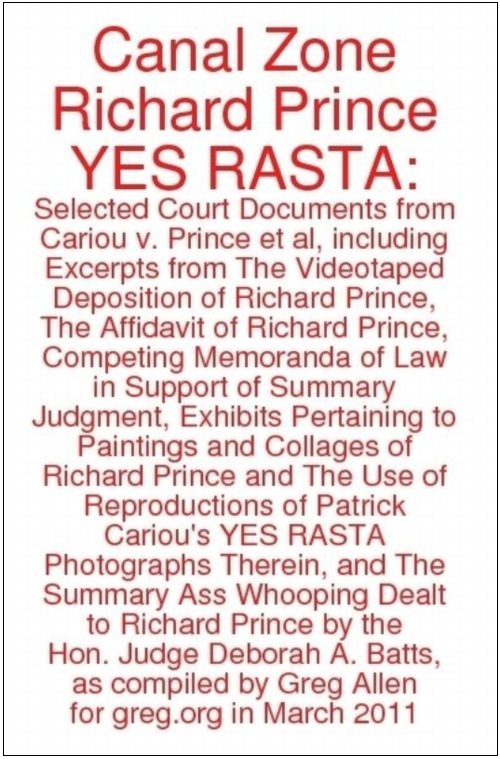
The cover on the paperback edition of Canal Zone Richard Prince Yes Rasta: Selected Court Documents, &c., &c., 290 pages, $16.99
And so as I was reading Jonathan Gharraie’s post in The Paris Review, I couldn’t help but but note all the striking similarities between Canal Zone Richard Prince Yes Rasta: Selected Court Documents, &c., &c., my critically considered selection of Richard Prince’s deposition transcripts and legal filings, and Cervantes’ work. I mean just think about it:
Canal Zone Richard Prince Yes Rasta: Selected Court Documents, &c., &c. in hardcover, 290 pages, $24.99 [updated link, see below]
More info on Canal Zone Richard Prince Yes Rasta in the original post.
See a couple of sample spreads from the electronic edition.
Anyway, Gharraie sums up nicely the digital future where artisanal books still thrive in a tablet world:
APR 2011 UPDATE: The hardcover is temporarily unavailable, but there is a new, expanded softcover edition, which now contains Prince’s entire deposition transcript, an additional 101 pages, plus other key legal documents. Also, it’s from a new, nicer printer.Canal Zone Richard Prince YES RASTA: Sample Spreads
Some folks who ordered the electronic version–the first to get the compilation in their hands, since the print editions take a few days to arrive–have emailed wondering where “the rest” of Richard Prince’s deposition transcript is, because there are gaps and missing pages.
That’s exactly right, and it’s why I decided to make this thing in the first place. As far as I can tell, the entire 378-page transcript of the 7-hour deposition was not entered into the court record, only the excerpts that pertained to quotes or points referenced in the two sides’ various legal motions. As I was reading those scattered snippets in various places in the court record, I realized it would be more useful to have a single compilation of all Prince’s testimony. And it’d be easier if it was in order. So I took apart the pdfs and sorted the pages, then interlaced the other exhibits [i.e., images from Cariou’s book and Prince’s show and catalogue] as they came up in the course of testimony.
Here are a couple of sample spreads taken from my original [sic, heh] pdf. There are about 250 of these transcript pages in total, four per printed/pdf page.
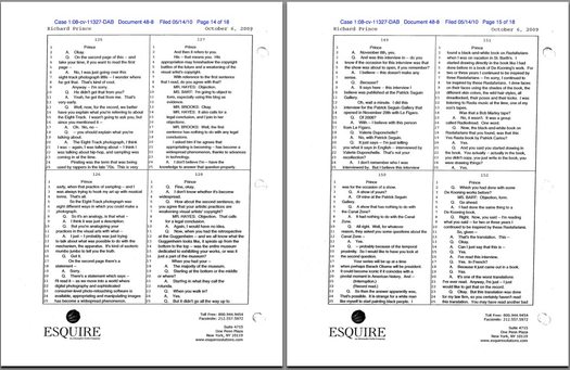
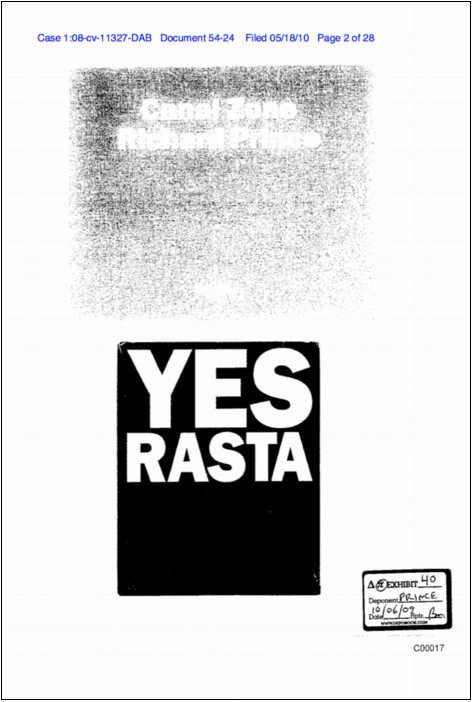
pp. 125-8, 149-152
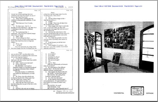
pp. 178-181 and Exhibit 15, installation shot at the Eden Rock Hotel, St. Barth’s
APR 2011 UPDATE: Here is the link to buy the new, expanded edition, which includes Prince’s entire deposition transcript–an additional 101 pages–plus other key legal documents. It’s a new printer, and the finish of the book is nicer, I think.Richard Prince Decision? You’re Soaking In It!
In conjuring up a meaning for Richard Prince’s Canal Zone work that fit the crime she was convicting him of, Judge Batts cited part of a 1978 essay on Appropriation Prince wrote, which he was asked about in his deposition. 1978!
Then there’s the kicker from Steven Stern’s review of Spiritual America: The Guggenheim Retrospective in Frieze:
And last but certainly not least, is Pablo Picasso, who Prince cited repeatedly as a model and an inspiration for his work. This quote is from an awesomely forthright talk Frances Stark gave at Mandrake Bar in LA in December 2009 as part of the Contra Mundum series. Ro/Lu, you’re off the hook, but the rest of you out there, are in deep trouble for not telling me about the published version of Contra Mundum I-VII. I’m the big man, need the info. Anyway, Picasso:
“But of what use is it to say what we do when everybody can see it if he wants to?”