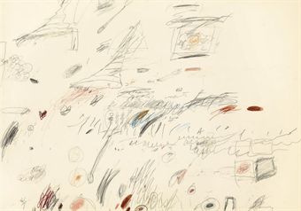
Ivan Lozano’s post about Marina Abramovic, Joan Jonas, Tino Seghal, and the conservation of performance art is absolutely fantastic. [It’s built off the Performance Workshop Klaus Biesenbach held a couple of weeks ago, which was written up by Carol Kino in the NY Times.]
The idea of a single orthodox means of retroactively preserving or documenting or re-performing or whatever early performance art strikes me as unreasonable; I like the idea that artists can decide if and how they want their work to live on, whether if it’s as a score, video documentation, ephemera, or in Seghal’s case, unwritten verbal transmission.
Lozano hits the nail on the head with his awesome characterization of Abramovic [above]. And kudos to her for making a strong play for preserving her own work and for influencing the present and future of the medium. But one thing about her stone cold divadom that he doesn’t mention that came immediately to mind was her establishment of the Marina Abramovic Institute, which is charged with the preservation of performance art.
It reminds me of the Eric Carle Musem of Children’s Book Illustration, another ostensibly comprehensive history-writing institution which was founded by a practitioner–who wasn’t waiting for history to decide his place in the history books.
Category: writing
And Who Was Writing Those Ian Wilson Invoices?
I’m slightly fascinated with the talk-based artwork of Ian Wilson. The last couple of weeks, I’d been working on a Conceptualism-related proposal, and so I had out my catalogue for Ann Goldstein and Anne Rorimer’s awesome, formative [for me, anyway] 1995 MoCA show, Reconsidering the Object of Art: 1965-1975.
Fifteen years, and I think I’d never read the entry on Ian Wilson. Maybe it’s info fatigue by the time I’d get to the W’s, or maybe the blank page where the images usually go just registered as a section divider?
Anyway, Rorimer discusses Wilson’s “search for an art in which no evidence of physicality would intrude.” His work evolved from the instigation of casual conversations about “time” to a less subject-centered, “Oral Communication.”
Whereas his Time work stemmed from his understanding that a word might represent a concept, Oral Communication grew out of his realization that the Time project principally concerned the process of communication. The designation Oral Communication, he decided, more pertinent served to characterize an endeavor whose ultimate subject and object, he once stated, “is speech itself,” or “art spoken.”
Maybe it’s the institutional vs commercial context, but while Rorimer mentions Wilson’s dutiful contributions to checklists and catalogues for shows he was invited to participate in–even the invitation card for a newly configured work for a group, a 1972 Discussion at John Weber Gallery–there is no acknowledgment of the other, seemingly crucial evidence/remnant/ instantiation of Wilson’s work: his invoices and receipts.
And Andrew Russeth just emailed me this awesome anecdote he reported from a Performa 09 panel discussion last fall:
No matter how difficult or intangible the work, of course, most agreed that artists or their dealers will eventually find a way to sell it, leaving the museum to work out some of the details later. [Soon-to-be-announced incoming MoCA director Jeffrey] Deitch recounted that, as a gallery assistant at John Weber Gallery in the mid-1970s, he once typed the words “There was a discussion” on a piece of paper as a record that collector Count Giuseppe Panza had talked to artist Ian Wilson, who abandoned sculpture to make art only by talking. He then made out an invoice for $1,000.
Maybe if MoCA ever reissues the Reconsidering The Object catalogue, they will add a correction.
Deitch Defends Dakis Joannou Show at the New Museum [artinfo]
What Is Progress, And The Paper [Of] Record
Can I just suggest that, when you buy an article from the New York Times Archive, you go ahead and buy a 10-pack? In addition to supporting your local paper in their time of financial distress and dire need [ahem], you can use the other nine articles for exploring whatever random people, thing, or history crosses your mind?
Which is how I found Roy Bongartz’ Sunday arts feature from August 11, 1974: “Question: How Do You Buy A Work of Art Like This?/ Answer: With A Check”
The piece could’ve been read straight in one of Powhida and Dalton’s #class sessions. Burden, Beuys, LeWitt, Acconci, de Maria, Bochner, Ray Johnson, Ian Wilson:
…these artists, all of them young “conceptualists,” had decided to lift their work clear out of the category of investment property. By shifting the emphasis of their work to the pure thought and by refusing to offer any saleable object, they were mounting a deliberate attack on the traditional business of art. The artists’ intention was to leave the dealer with nothing to sell, the collector with nothing to buy, and the museum with nothing to squirrel away.
[turn page, see continuing headline, “Buying Conceptual Art – Photos, Sets of Directions, Receipts”]
…The secret is that there is always something to sell.
Artists need to eat. Collectors want to buy. Ronald Feldman “authenticates” Burden’s gunshot wound with a check. And voila! These rebels’ most cunning attempts to escape or destroy the art market have been thwarted before brunch. We can now move on to the crossword.
But beyond the apparent news-worthy novelty of certificates, documentation, and instruction-based work, and the vastly divergent view now of some of the namechecked artists–Ryman and Sandback have a conceptualist collectible object problem?–you know what the funniest thing about the past is? It’s the little differences:
That as long as the instructions [which sell “for as much as $8,000”] are followed, “it doesn’t matter at all whether it’s you, Sol LeWitt or your Uncle Elmer who does the marking.”
That dealer/wife Mrs. John (Susan) Gibson is aghast at an invitation “from a Washington DC gallery” to show Robert Cumming’s text & photo-based work–wait for it!
–in the photography section! Mrs. Gibson insisted Cumming’s work go into the fine arts section because he was not showing photographs, but conceptual art. The reply was, well, we hope this is what photography will become. “Too late,” said Mrs. Gibson. “This is what fine art has become.” It was a standoff–no show for Cumming.
And then there’s the eerie familiarity of Ian Wilson, “a kind of extremist even in SoHo, [who] simply comes in and talks. This is all that he does, and he’s made a career of it.”
The quote is from Sonnabend director Ealan Wingate:
“Here the art becomes so abstracted there is no object whatever. Yet in a way there is always an object because an idea can be a subject. [hey, wait– -ed.] There is, also, always the piece of paper, the bill of sale, which says you bought it.”
And then comes Bongartz’ explanation of the paper gauntlet Wilson threw down across the ages to Tino Seghal:
You can commission Wilson to do a piece; for example, he may come to your house and talk with you about Plato for a while. The two of you might discuss, say, the subject of unreality, and that would be it–and you’d get your receipt.
For all the fun of digging through the Times’ archive on my own coin, it’s not all eye-opening, perspective-correcting or knee-slapping blog fodder. Even at $1.50, you sometimes click through to a dud, but overall, it still feels like money well spent. And not just because seeing vintage discussion of an under-remembered predecessor should at least cast a critical shadow on the current hype over Seghal’s artistic innovations.
There’s an extra, bonus level of irony, though, in paying to read a 36-year-old Times article about artists successfully selling nothing–and then in worrying that I’m quoting and recapping it too much, thereby damaging the damaged Times’ economic position, or at least earning me the wrath of the copytheft maximalists.
But, oh, look, here’s the whole article for free online. Apparently, the Times repackaged a bunch of arts coverage in 1978 as a topic-based anthology. Which was scanned into Google Books. Of course, it’s formatted differently, probably from a different edition of the paper. So it doesn’t have the $1.50 PDF version’s awesome illustration of Wilson’s work:
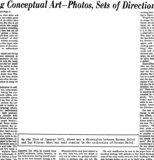
The secret is that there is always something to sell.
Henri Matisse, Photographer
Jeffrey Weiss’s Artforum article on the implications of forensic analysis of paintings has me stoked to see “Radical Invention,” Stephanie d’Alessandro and John Elderfield’s incredible-sounding exhibition of experimental Matisse in the 1910s.
Weiss calls out the potential trap of uncritically trusting or reading too much into previously unavailable x-ray analysis: seeing every technical detail of a painting’s construction and material “compels us to take process for truth,” and to “conclude that the temporality of change itself represents the very content of the work.” It’s not what it is, or even what we see, that matters, but the making of.
“Radical Invention” carefully argues for the importance of Matisse’s modernist use of series, which complements Weiss’s own study of how Matisse used photography:
Much later, beginning in 1935…Matisse–or his studio assistant and model Lydia Delectorskaya–photographed works in progress with a handheld Kodak, producing a proliferation of images, sometimes as many as twenty or more so-called etats (states) of a single painting or drawing. The small photos, which were often pasted together onto sheets of gridded notepaper, are startling, especially to the degree that they conjure a sense of system. In any case, they radically formalize Matisse’s methodology, and we might go so far as to speculate that, by this time, Matisse was painting states for the camera. The fact that he permitted these photographs to be published and that he even showed some of them–enlarged and framed–together with the final painting in a gallery setting surely also suggests such a thing. This is to argue…that the photographs came not just ot record the artist’s working method but to motivate it–or, better, that they served to stage process as both developmental and iterative.
This just blows my mind a little bit. I’ve always thought of Matisse as somehow an age and an artist apart from the development of photographic modernism; but in fact, he was living right in the middle of it. Why wouldn’t he use it? Now where are these photos?
STATE OF THE ART: MATISSE UNDER EXAMINATION, Jeffrey Weiss, Artforum, March 2010
On Etienne-Jules Marey And The Photographic Depiction Of Time
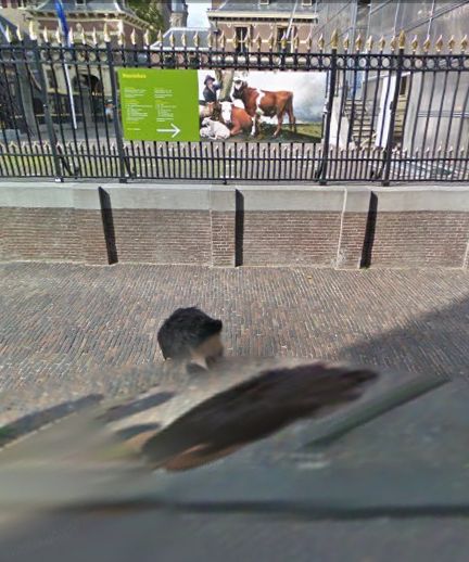
I’ve been thinking about this image from Google Street View, the one of the Mauritshuis which contains two distorted images of the guy’s head. As that elongated lower head shows, Google’s image knitting algorithm apparently combined two photos of the guy, two photos separated by a couple of seconds and/or feet.
It’s like an automated cubism, or futurism, I thought, the photography of multiple simultaneous perspectives, or of motion. Which led me to the work of Etienne-Jules Marey, the pioneering 19th century French physiologist and chronophotographer.
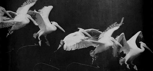
Marey used photography and early cinematography to study motion, and he developed a chronophotography gun which printed multiple exposures on a single surface. Like this pelican landing:
I found a couple of eerily relevant Marey quotes from the excellent compilation by GregP [no relation] on Interfacial Effects, a research-lookin’ blog about art and temporality:
“Marey made it possible for the avant-garde to become receptive to new values: instead of escape into the past, the unreal or the dream, there was the double cult of machines and their propulsion […]” (148) inspiring Giacomo Balla & Luigi Russolo, Marinetti, and ultimately Duchamp (1912 Nude Decending a Staircase)
– Etienne-Jules Marey : a passion for the trace, François Dagognet
“artists who wished to give form to the new experience of time Bergson so articulately voiced were drawn to Marey’s pictures. They were an irresistible and particularly fecund visual source. For artists the attraction of the photographs lay in one important particular: they were the first images to effectively rupture the perspectival code that had dominated painting since the Renaissance. Marey’s pictures depicted chronological succession within a single frame. Chronophotography provided a language for representing simultaneity – what was popularly understood to be Bergson’s idea of time.”
– Picturing time: the work of Etienne-Jules Marey, Marta Braun [google books]
Many of Marey’s studies have been digitized by the BIUM at the University of Paris and are available online.
Some Writings On Giacometti & Looking
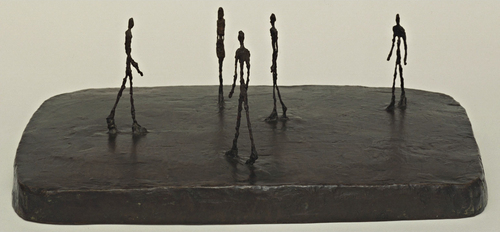
These are mostly for me, just kind of gathered here without order or comment for the moment. I’ve been thinking about Alberto Giacometti lately, and his sculptural, spatial pursuit of that moment when a figure comes into view.
Arthur C Danto in The Nation 2001 about Sartre in 1948 on Giacometti:
Sartre says something even more striking about Giacometti’s figures. “The moment I see them, they appear in my field of vision the way an idea appears in my mind.” This is a way of explaining the somewhat ghostly feeling of his figures, as if they were persons whose bodies had been all but erased. Giacometti was legendary for destroying his work–his studio floor would be found littered with broken plaster in the morning, after undoing a night’s work. I think this was the result of an impossible effort to eliminate whatever gave them the solidity that belonged to their material condition as sculpture.
Rosalind Krauss in Artforum 2001 quoting Sartre in 1948 on Giacometti:
“Giacometti,” Sartre wrote, “has restored an imaginary and indivisible space to statues. He was the first to take it into his head to sculpt man as he appears, that is to say, from a distance.” And because this is man as he is perceived, it is fitting that these sculptures should all be vertical, since Sartre equates perception with walking, traversing space, doing things, just as he links imagining with the body’s repose. If one dreams lying down–as in the sculptor’s earlier, Surrealist, s leeping women–one perceives standing up.
Michael Kimmelman in NYT 2001 on Giacometti’s MoMA retrospective:
In the 1940’s and 50’s, when he made extremely thin heads, flattened on both sides like pancakes, Giacometti talked about the effect of looking at somebody straight on, then from the side. He was rejecting the Cubist idea that it was possible to keep different views of the same person in sight at the same time. ”If I look at you from the front, I forget the profile,” he said. ”If I look at you in profile, I forget the front view.” Which is precisely what happens: if we move 30 degrees left or right off-center of these heads, the face becomes a profile. Back six inches, the profile disappears. If we move: the work is about our distance from the figures, our position vis-a-vis the heads or striding men or standing women.
Kimmelman in the NYT 1996 reviewing David Sylvester’s incredible book, Looking at Giacometti:
The issue for Giacometti became the pursuit of what he called likeness. Roughly, it had to do with trying to represent the real experience of seeing, apart from artistic conventions: on the simplest level, conveying the actual swimmy sense of distance and engulfing space when viewing figures across, say, a broad street, or conversely, the vertiginous foreshortening you get when standing face to face with someone. Likeness also had to do with something less tangible but still real: the intense sensation of the shared gaze between living artist and living model. Mr. Sylvester contrasts Giacometti with Matisse in this respect. “The Matisse sculptures present a figure seen whole and entire now, in an instant of time, in any instant of time, meaning outside time,” he writes. “The Giacometti sculptures seem to present figures as they are perceived while time passes.”
I’ve GOT to get Sylvester’s book out of storage this weekend. That, and Herbert Matter’s photobook of Giacometti’s sculptures. I have my Bonnefoy, of course, which is beautiful to look at, but nearly impossible to read. Just, wow, what is going on there?
image: City Square, 1948, via moma.org
On Reading Auras
As you can guess from the mentions of Sherrie Levine, I’ve been studying the issues around copying and reproducing and originality and authorship. And whenever you do that, Walter Benjamin comes up, specifically his concept of aura.
Basically, it’s what an original work of art has that a reproduction doesn’t. Except when it does. It’s what declines or disappears in the process of mechanical reproduction–especially in the cinematic process, which interested Benjamin greatly–but then it comes back sometimes. Somehow.
Just in case quoting or arguing Benjamin at length is tedious or pretentious to the Twitterized reader, I’m putting a few quotes and sources after the jump, for my own reference later. They are:
Sherrie Levine
John Perrault
Samuel Weber
Grant Wythoff
Miriam Brantu Hansen
Uncle Rudi, Is That You?
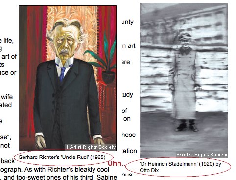
Who are the freaks and nerds who call out picayune corrections in newspaper articles? Me, for one.
On a New York Times piece I did once, I changed an entire line during the copyediting process. The piece was much, much better for it, I think, but I got chewed out afterward because, apparently, it required several people staying late to re-layout a whole page, which delayed the closing of the section.
As penance, I’ve been pretty fastidious ever since about quickly slipping the Times’ web editors little corrections–usually of peoples’ names, ex the kind of things that might cause unnecessary embarrassment–for Arts stories. [Oy, in one pseudo-liveblog post from Miami Art Basel, the correspondent misspelled basically every name she dropped. And no, it was not Linda Yablonsky; she is an exquisite name dropper.]
Anyway, last weekend, the Financial Times mentioned the new Gerhard Richter biography in Jackie Wullschlager’s survey of books on German painting. Their whole point was about how loaded Richter’s blurred portraits of his family were, such as Uncle Rudi.
The FT transposed the captions with the Richter and a portrait by Otto Dix. When I tried to do my typical one-click correction, I was surprised to find that the FT doesn’t appear to even publish an address for corrections. Or for reaching the editors.
Setting aside the whole implication that the very idea of being corrected didn’t cross their minds, the whole FT website contact interface turns out to be oriented to subscribers/users and the support of the paid consumption experience.
As such, it has taken a week for me to receive an automated reply, and now my comment had been forwarded to the appropriate department. As the fresh screenshots show, the error remains.
The Scale Of The Warhol Foundation’s Criminality Will Blow Our Minds
 The ever-unfolding scandal of the Andy Warhol Authentication Board and the Warhol Foundation’s apparently massively criminal machinations is just mind-boggling.
Richard Dorment wrote in the New York Review of Book last fall about veteran London dealer Anthony d’Offay’s run-in with the Board over a Red Self Portrait, an early (1964-5) silkscreen work which was signed and dated by Warhol, and inscribed, “to Bruno B,” as in Bruno Bischoffberger, his longtime European dealer. A painting which Warhol chose for the cover of his first catalogue raisonne, published in 1970. Which included the painting.
And despite all this, the Authentication Board declared the painting was not authentic. Anyway, the Book Review has now run a series of letters and replies and followups including corroborations from Paul Alexander, new accusations by Warhol Foundation chairman Joel Wachs, and fierce rebuttal by Dorment.
It seems that, after the d’Offay/Bruno B rejection, the Board set to work contacting owners of other Red Self Portrait paintings with the intention of proactively deauthenticating them. And now at least one owner has filed an anti-trust suit against the Foundation and the Board, charging conspiracy and fraud. [The Foundation controls and sells several thousand works by Warhol easily worth several billion dollars on the street.]
Anyway, it’s all there for the reading, but the most devastating piece in my mind is the letter by Rainer Crone, the German art historian who collaborated with Warhol to publish that first catalogue raisonne. First off, it’s just a great story, well told, and a strong, firsthand argument for Warhol’s significance. Crone addresses the evolution of the mechanical reproduction techniques and Warhol’s awareness of its implications for the idea of authorship. [He also describes silkscreening as, “in the end, a fusion of painting and photography,” which is so obvious, I’d never thought of it that way before.] The ending is unequivocal:
When, in 1986, Warhol came to London for his show at Anthony d’Offay’s gallery, he signed in d’Offay’s presence one copy of my 1970 book in two places: one signature was across the dust jacket, which reproduces the “Bruno B” Red Self Portrait eight times. The other was on the book’s half-title page. It is important to realize that Warhol and myself–as I described above–together chose the “Bruno B” Red Self Portrait for the cover of the book. Warhol’s signature across the “Bruno B” image on the dust jacket gives further unequivocal evidence that Warhol still in 1986 not only was authenticating the work itself, but remained proud of the painting, as well as of my early catalogue raisonné (then sixteen years in print), which had proved so many times before to be a very reliable source.
It is hard to believe that Warhol would have signed my book and the image of the “Bruno B” Red Self Portrait if there had been the slightest doubt in his mind that it was not “his work.” The combination of the dedication on the back of the painting with the choice of that image for the cover of the catalogue raisonné, together with his endorsement sixteen years later of the image by signing across it, leave no room whatever for any doubt as to the authenticity of the work and the artist’s intention.
To deny a painting chosen by the artist for the cover of his first scholarly publication when that work is signed and inscribed to the artist’s longtime dealer is an act of folly and gross misjudgment. Art scholarship does not consist of the theories constructed after the artist’s death by those who never knew him. Its bedrock is the body of work that the artist authenticated–beyond a shadow of doubt–in his lifetime.
Will the Warhol Foundation’s financial leverage in the art world help it blunt or silence any real discussion of its practices? Do Warhol collectors or Foundation grant recipients–or applicants, for that matter–feel it best to just shut up and let it pass? Does pointing to this reporting mean I’ll never need to stress about finding the time to apply for another Arts Writers Grant?
What Andy Warhol Really Did [nybooks.com via @harrislieberman]
Previously, from almost exactly 4 years ago: BBC documentary on Richard Eckstract’s denied Red Self Portrait [image reproduced above]
[2022 update: reader, it did not blow any minds.]
On Drop Shadows And Diagrammatic Abstraction
I swear, I didn’t plan to go all Errol Morris and do three posts about one photo in one catalogue about one artwork. So look at this other photograph!
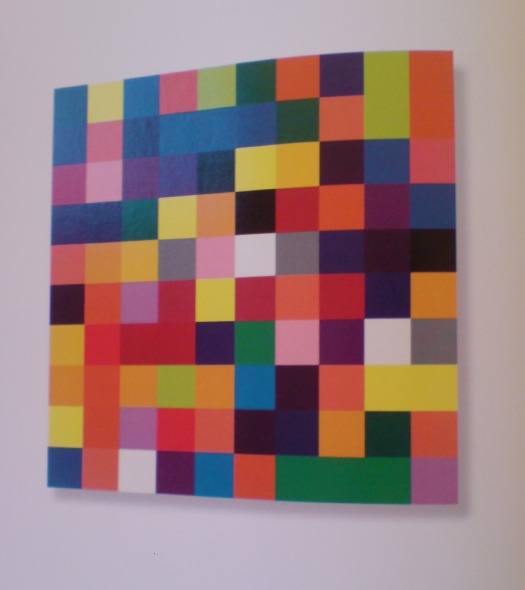
The second thing you notice–first if you just crack it open, second if you start from the front–in the Serpentine Gallery’s Gerhard Richter | 4900 Colours is what I bought it for: page after page of reproductions of the panels in all eleven possible configurations. The Serpentine’s own Version II comes first, with large, 2×2 assemblies shown, one per page.
With drop shadows. Seriously. Drop shadows. Are these photographs? Part of me wants to think that photos in a Richter book would all be taken under such perfectly identical lighting that it creates exactly identical shadows. But I am doubtful.
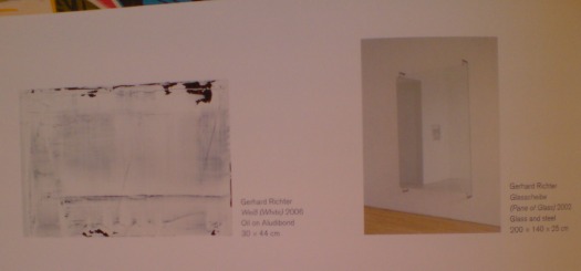
There is one squeegee painting reproduced, but it has no shadow, or frame, or any indication of three dimensionality. And it’s pretty obvious that all the other Versions of 4900 Colours are illustrated, not by photos, but computer graphics–diagrams. Does this matter? And if it doesn’t, what does it mean to simulate three dimensionality with dropshadows?
Buchloh, whatchagot?
The Diagram
A diagram is not a painting. It’s as simple as that…I can make a painting from a diagram, but can you? – Frank Stella [ed note: this is from an apparently cantankerous 1964 radio interview with Judd, included in Gregory Battcock’s “Minimal Art: A Critical Anthology.”]
…the diagram contributed a dissenting voice to the heroic chorus of abstraction, recognizing the degree to which the painter and the spectator as perceptual and desiring subjects are always already contained in systems of spatio-temporal quantification, control, and statistical registration.
Mhmm. I like this idea of diagrammatic abstraction and how it is an overlooked underdog. But could that just be my own subjective anti-subjectivity talking? Maybe I agree because I happen to have found my own “schemata of statistical data collection” to use as my “necessary and primary matrices determining a pictorial/compositional order”?
Also, I don’t see how Richter’s “low-tech colour production [could] subvert the new digital spectacularisation of colour [8]” while he simultaneously publishes more-perfect-than-real digital simulacra of his work, augmented with Adobe Illustrator’s systems of simulated tempo-spatiality.

I take issue with this. I also realize that I’m putting Buchloh on the hook directly and Richter, too, by implication, for tiny, seemingly peripheral-to-picayune issues I have with the catalogue that fall well within the scope of book design. But they transform the book from a documentation to a blueprint, a schematic. Which is fine. But drop shadows?
And anyway, why should any spectator’s seemingly arbitrary perceptual minutiae take a back seat to Buchloh’s, or anyone else’s?
Do my questions really and truly seem less germane than this spectacular footnote to the digital spectacularisation of colour–I mean, wow. Just wow–and tell me what is going on here?
[8] It is certainly not accidental at all that at the time of the writing of this essay, a new electronic device operates on the site of an advertisement for eBay Europe. Under the imperative appellation ‘CHOOSE YOUR COLOUR’ a field of randomly ordered colour chips appears, very much in the manner of one of Richter’s earlier colour chip paintings. The site’s digitally vibrating colour squares appeal to spectators to find precisely ‘their colour’, i.e., to comply with an order to suture their desire (performed on the computer’s touch pad) and to yet another commodity to be acquired.
A banner ad on eBay Europe! What does Benjamin Buchloh buy–or sell?!–on eBay Europe? It is certainly not accidental at all!
Meanwhile, the commodity that is 4900 Colours, 2007, was acquired by La Collection de La Fondation Louis Vuitton pour la creation. I don’t think I’ve enjoyed reading an exhibition catalogue this much in fifteen years.
Gerhard Richter: 4900 Colours
On The Existence Of Duchamp
I finally picked up a copy of the exhibition catalogue for the 1973-4 Duchamp retrospective organized by the Philadelphia Museum and the Museum of Modern Art. Here is the end of Hilton Kramer’s non-review of the show for the New York Times:
Miss d’Harnoncourt and Mr. McShine have, I must say, done a brilliant job in assembling the visual evidence and in marshaling an elaborate elucidation of its alleged meanings (in a massive volume of essays not yet published). To understand the history of modern art in any comprehensive way, one must see this exhibition, and to grasp the nature of the ideology that has dominated an important part of that history one must read the essays brought together in this forthcoming volume. But one must be prepared to examine a cadaver, and to read through a literature that assumes with absolute confidence that the subject is immortal. One must be prepared, on other words, for the greatest Duchampian joke of all.
I’m starting to think, I must say, that Hilton Kramer did not much care for Marcel Duchamp.
The Eternal Sunshine Of Souren Melikian’s Spotless Mind
I was going to call it a guilty pleasure, but entering Souren Melikian’s reality distortion field every weekend is clearly a vice.
Melikian covers the art world for the International Herald Tribune–which, for him, begins and ends at the auction house–and his byline always sits atop the upper right-hand corner of the NYTimes.com Arts page.
Though his topics are tied to the vagaries of the sales calendar–one week it’s Chinese jades in London, another contemporary art, this week it was Old Masters and French landscapes in New York–Melikian’s soaring optimism is untethered by context, history, inconvenient facts, or actual reporting. While he may actually attend some of the sales he covers–he may have his own desk at Drouot, for all I know–he could just as easily be writing about flipping through the Christie’s catalogue. The Pat Kiernan Reads The Morning Papers To You of the art world.
Whatever his technique, though, and no matter how poor Melikian’s subject is always, always the same: the booming market is full of connoisseurs, ready to throw caution to the wind in pursuit of an ever-dwindling inventory of masterpieces. Here’s the setup for today’s column, titled “Old Masters Set Off Intense Bidding”:
Buyers pounced on Old Master paintings this week with a determination that has not been witnessed at auction in a long time.
Two reasons combined to account for what felt at times like a rage to buy. The gloom induced by the recession is slowly receding and awareness that supplies are drying up is spreading fast.
That’s wonderful! Except that the next sentence–and most of the rest of the sales Melikian recounts–completely belie that upbeat thesis. Here’s the next sentence:
The scarcity of goods was actually made painfully obvious at Christie’s on Wednesday. The need to fill their catalogues with a minimum number of lots had apparently persuaded the departmental heads to accept too many second division works and to estimate them at levels more appropriate for gems.
Oh, you mean no good works, unrealistic estimates, and half the lots failing to sell. As for those pouncing bidders: “A single $6 million bid came in and the auctioneer wisely knocked down the Goltzius…” and “Where one might have expected competition to break out, only one hand went up.”
You can literally click on any of his articles and find a hilarious gem, but here are a couple of choice Melikian Musings from last fall’s contemporary sales, which, we were told, “revealed for the first time a deep interest in works on paper”:
The auction market is booming and, when it comes to contemporary art, it is charging on at an accelerated pace, as it did before the financial turmoil broke out in the autumn of 2008.
This week, those attending Christie’s and Sotheby’s evening sessions traditionally reserved for the most important works might have briefly thought that there never was a recession. No awareness of it appeared to linger in the bidders’ minds as they ran up paintings, drawings and sundry three-dimensional works to three times the estimate, or more…
Other large prices paid for works on paper confirmed that a new pattern was emerging. A typical exercise in random scribbling by Cy Twombly made $722,500, nearly double the high estimate. The sketch does not markedly differ from the nascent bouts of creativity of 4-year-olds expressing pencil in hand their joie de vivre. Interestingly, this similarity to early childhood artistic endeavor has no bearing on the price. Visual aesthetics are clearly not among the primary considerations driving contemporary art buyers.
Contemporary art loves you too, Souren. In my mind, I picture Melikian at a Paris salesroom, indistinguishable, in his double-breasted suit, combover, and excruciatingly coordinated tie-and-pocket-square combination, from the affectedly elegant antiquities dealers he’s chatting up. In other words, he embodies the International Herald Tribune of a certain age, the age before the Times gutted it, when the paper still mattered, when it served as the primary news source and the paper of record for a well-heeled, English-speaking, international touristocratic diaspora. No matter how bleak the news from a couple of days ago was, I’m sure Melikian’s perennially sunny shopping outlook held equal appeal for the Tribune’s antique-hunting readers and its antique-peddling advertisers.
So sure, I read him for the pointless outrage, but I also read him for the nostalgia. Just as they aren’t making any new Old Masters, they sure as hell aren’t making any new Souren Melikians.
A Still More Glorious Daybreak Awaits

I’ve been telling people in person all about Lucy Raven’s multimedia tour of Daybreak, Utah since it came out last fall; it’s way past time that I mention it here. Daybreak is a massive real estate development strategy disguised as an advanced, master-planned, Community of The Future. It’s Kennecott Copper’s parent company’s venture to maximize the value of tens of thousands of acres of land they’ve accumulated–and as often as not, filled or flooded or contaminated with the remnants of their century-old, open-pit mining operation–on the southwest side of the Salt Lake Valley. It’s a 70-year plan to build a 100,000 acre suburb.
Or it was. Or is. Or was. Raven’s text, photos, and interviews at Triple Canopy caught this industrial-scale city planning operation last year, just after the real estate market went off a cliff. To overextend the metaphor, Daybreak is lying on the ground, twitching, and not quite realizing what happened to it.
Anyway, the part I love to quote is Kennecott Land’s Myranda Baxter explaining Daybreak’s “village centers”, warmed over New Urbanist retail offerings for “all your basic daily needs”:
In other words, there’ll be a medium-sized grocery store, all your mom-and-pop restaurants and little cafes, bakeries, dry cleaner, hair dresser–but on a small. scale. There are offices above the shopping areas, and the parking, as you’ll notice, very little parking on the streets, because it’s all tucked. behind the buildings. So it becomes a very pedestrian-friendly area and not a strip mall.
One funny incident was, the last time the commercial director came here he said, “I love all the people you send my way, who are interested in opening businesses, however. If there are any more tanning salons–[laughs]–I have about 30 tanning salons that want to open a business here, and I don’t need any more applications.”
Daybreak, by Lucy Raven, Issue 7 [canopycanopycanopy.com]
‘The Art Game In Washington’
Recently I’ve been researching the postwar history of contemporary art and architecture in Washington DC. This article sounds like it could have been written last week:
The Art Game in Washington
Amid a growing art boom, local artists feel they are being overshadowed by national museums, budget-conscious curators, overly commercial gallery owners and a public that all too willingly listens to critics.
by Bob Arnebeck, The Washington Post Magazine, Sept. 17, 1978.
Lookin’ For Love In All Wrong Places
Last night on very short notice, I went to “Running for Cover(age), A panel discussion on arts criticism in the DC area,” organized by the Washington Project for the Arts. Here are the impetus and content of the discussion in a nutshell:
The Rubells have a Morris Lapidus-designed hotel in SW DC that they’ve been working to turn from ghetto-sketchy-by-the-freeway to edgy-hip.
A few years back, they bought a Dan Steinhilber sculpture at the WPA benefit auction, and he became suddenly/locally famous.
This year, the WPA asked Mera Rubell to select artists for its auction.
Instead of guaranteeing a big auction haul and a little more glamour by importing art world hotness, she decided to find work by visiting DMV [DC, Virginia, Maryland, it always confuses me] artist studios en masse.
The WPA received 200 applications. For studio visits. To donate art to a benefit.
[Slightly less dramatic pause/update: Adam from WPA emailed to clarify that donor artists receive half the proceeds of the work sold at the benefit auction, so it’s not a straight-up, NY-style call for donations. Duly noted.]

