Holland Cotter’s Revanchism

alighiero_boetti_mappa.jpg
I understand the back to basics theme that Holland Cotter’s working with in his Chelsea walkaround. But I’m baffled by the retrograde sniping about authorship in his non-review of Alighiero e Boetti’s maps:

Gladstone on West 21st Street has pulled together a mini-retrospective of “Mappa” or “Map” pieces by — or at least associated with — the Italian artist Alighiero e Boetti. He did the prototype in 1969 when he hand-colored a printed world map, filling in each country with an image of its flag. Two years later, in Afghanistan, he commissioned local women to embroider the same image, and renewed the commissions, which chart the reshaping of national borders over a quarter of a century, until his death in 1994. The show is most striking for questions it raises about collaboration versus exploitation, though there’s no question that as an exercise in global consciousness the series was ahead of its day.

Did Zwirner’s show of fluorescent lights “associated with” Flavin raise striking questions “about collaboration versus exploitation,” too? Or does he get a pass for deciding to leave the union labels on his factory-made fixtures?
Seriously, NY Times, why not just save a buck and republish Hilton Kramer’s reviews of the original shows?

No Redwoods Were Harmed In The Making Of That Serra?

In 1969, Allen Ruppersberg created Al’s Cafe, a detailed, functioning facsimile of an archetypal diner, which was to operate/perform one night a week. Allan McCollum, who was making work in Los Angeles at the time, wrote about Ruppersberg and Al’s Cafe in a 2001 catalogue essay:

I would like to explain a little of why this piece was so significant in L.A. in 1969. “Site” works and “performance” pieces were proliferating at the time; in 1970, for instance, Richard Serra would create an outdoors-brought-indoors installation at the Pasadena Art Museum, in which three immense California redwood logs were leant upon a fourth, and their cantilevered ends were sawn off and allowed to crash to the floor. The aftermath of this action created an enormously dramatic display, and the project was much talked about. Elsewhere, a number of artists of these years were crowding into their cars and heading out to the deserts to work with natural processes, the results of which were often brought back from such alternative, poststudio locales to wind up in the same clean white gallery spaces that the artists seemed to have abandoned so pointedly. Robert Smithson had worked to point out the dialectical relations between the “nonsites” of the urban galleries and the peripheral “sites” of marginalized geographic territories: slag heaps, rock piles, dry lakes, landfills. He and others who followed took to the Midwestern plains and the Western deserts, executing projects in the middle of nowhere, and bringing back aerial photographs, sketches, documentation, and truckloads of residues and samples from these relatively exotic, empty regions of the American map to display in the populated cities. A new vocabulary was building, and an exploration of how our culture’s richness and complexity have always been framed and defined by our fantasies of the sophistication of our urban centers, and the purity of their showplaces and shrines, in relation to nature’s marginalized and boundless emptiness.
A dilemma was beautifully revealed by these pioneering artists–and clearly spelled out for the younger artists–and the question (“naturally”) arose: isn’t our idea of nature just another idea? Another concept? Another cultural artifact? Does moving out of our urban habitats to make art really accomplish anything beyond promoting a further alienation, a further fiction, another kind of imperialism, a new imaginary idea of purity? It was within this growing discourse that Al’s Cafe offered to sell a “JOHN MUIR SALAD (BOTANY SPECIAL),” or “GRASS PATCH WITH FIVE ROCK VARIETIES SERVED WITH SEED PACKETS ON THE SIDE.” In Al’s Cafe, Ruppersberg answered the growing mannerisms of Earth art with a slyly symbolic display of nature as always mediated, always already determined by the culture that processes it–both literally and figuratively–for its own use. He presented nature as a commodity for consumption, without the pretense of any pure “natural” vision.

I really planned to just quote the Serra description [emphasis added]. I’d heard references to the work before, but never to the process and content of the piece. Which means, I guess, I’ve never seen the catalogue for Serra’s one-man Pasadena show, which documented the making of the work, which was titled: Sawing: Base Plate Template (Twelve Fir Trees). Also, I don’t think they were redwoods.
serra_pasadena_1970.jpg
Smithson himself had installed a Non-site, Dead Tree, which consisted of just one tree, in the Dusseldorf Kunsthalle in 1969. Joe Amrhein and Brian Conley’s 2000 re-creation of Dead Tree in Pierogi 2000 was a classic. [Here’s a Frieze review by David Greene.] What’s been written–or exhibited–about these two guys’ early history together?

What I Looked At Today [Until My Eyes Glazed Over] – Goethe

I don’t know who Bruce MacEvoy is, but his is the most exhaustive series of comparative analyses of various theories of color theory I’ve found. [aha. A web guy/artist who sold YHOO better than I did.]
As I debate in my mind whether to order paint colors for my Dutch Landscape paintings or to mix them myself, I find once again that painting, which I thought I knew something about, has deep historical, theoretical, and practical tranches which I’d never seriously considered.
Anyway, here’s a tiny bit of MacEvoy’s discussion of Zur Farberlehre (1810), the monumental, idiosyncratic, combative, and too-obscure treatise/polemic on color that consumed Johann Wolfgang von Goethe for nearly two decades:

goethe_color_magnet_handprint.jpg
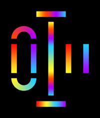
This approach is exemplified in the watercolor Color Magnet (right), painted after a long evening discussion about the “polarity” of color with the poet Friedrich Schiller. The short vertical bars (far right) represent primordial yellow and blue refraction fringes (discussed below); the curved bars (at left), which are drawn to resemble the curve of iron filings across the opposing poles of two magnets, show the mixtures that result when “attracting” fringes are overlapped to produce the “union” mixture green (below) and the “deepening” extraspectral mixture purpur (above). These combinations produce Newton’s spectrum (horizontal bar, center bottom) and the extraspectral purples (horizontal bar, center top). Linking all mixtures together end to end, just as bar magnets can be linked at their opposite poles, produces the central vertical bar, the circumference of the hue circle, with the light emitting colors of sun and sky at the center. There is an almost mystical simplemindedness in this pursuit of patterns, resemblances and associations, but it is the essence of the Goethean approach to color.
Unfortunately, Goethe’s ambitious project has been rendered incoherent both by the deleted sections and by the English translation title: Farbenlehre simply means “chromatics,” with no “theory” implied (just as Sprachlehre means “grammar” and not “theory of speech”). Given Goethe’s sensitivity to language, it is not irrelevant to note that the root meaning of lehre is “lesson,” “teaching” or “learning from experience”. In the same way that a grammar of language simply describes the patterns in how we speak, Goethe wanted to develop a holistic “grammar” of color that describes how color behaves. He was looking for patterns in color experience — not for a theory of colors extracted from physical experiments. This makes his book an important precursor to German phenomenology. All these complexities have disappeared from the truncated English version of the book.

And then there’s this bit from further down, which seems to sidle up to the edge, to so speak, of these discrete polygons of algorithmic color I will paint:

Next, in what he motivates as a pedagogical move, Goethe illustrates the “primordial” shadowing or distorting of images with the colors produced by a prism. These illustrate what is probably the central analogy of his book: that color, to the extent it has an external, physical origin, results in the blending of edges or boundaries between dark and light; edges are both the essential element of an image and the primordial cause of color appearance:
“[When viewed through a prism], we have found all unbroken surfaces, large or small, to be colourless, yet at the outlines or boundaries [edges], where the surface is relieved upon a darker or lighter object, we observe a coloured appearance. Outline, as well as surface, is necessary to constitute a figure or circumscribed object. We therefore express the leading fact thus: circumscribed objects must be displaced by refraction in order to exhibit an appearance of colour.” (¶197-198)

Not that Goethe was at all correct, of course. [Or as MacEvoy puts it, “Even when charitably summarized, Goethe’s theory of color is incomplete, inconsistent and incomprehensible.”] But it’s still kind of fascinating.

From The Richfield Reaper

Greg Knauss’s mention of the ancient web and an obituary spurred me to back up a little piece of my own hard drive that is the web. From Rootsweb/Ancestry.com’s republished obituaries from Piute County, UT, is by great uncle’s obituary, from the Nov. 9, 1944 issue of the Richfield Reaper:

St. Sgt. Lark Allen, 27, son of Mr. and Mrs. Chester Allen of Antimony, was reported killed in action on October 9, somewhere in Germany.
He had been wounded July 16 and released September 5 and sent back into active duty and had been overseas two years.
St. Sgt. Allen had taken part in the African invasion, the campaign in Sicily and in France. He entered the service July 7, 1941.
He has been awarded the bronze star and the purple heart was sent to his parents after he was wounded.
He was born in Circleville and attended the schools there. After graduating from the Circleville high school he attended the B.A.C. at Cedar City.
Surviving besides his parents of Antimony are the following brothers and sisters: Mrs. Dot Hall, Richfield; Miss Joye Allen, Logan; Champ Allen, Marysvale, Wayne Allen, Camp Pendelton, California and Calvert Allen, Richfield.
Memorial services will be held Sunday afternoon at 2 p.m. in the Antimony ward chapel.
(Richfield Reaper, 9 November 1944)

My dad was born just a couple of months after his uncle was killed. His parents named him Lark.

Holden Caulfield, Curator

From the Observer profile of Massimiliano Gioni:

Growing up outside Milan in a town he likened to Newark, Mr. Gioni found himself drawn to art precisely because there were no adults talking to him about it. “It didn’t belong to the school or the teachers,” he said. “It was mine.”
When he was 14, he started reading the Futurists and the Dadaists–he can still recite by heart Tristan Tzara’s Manifesto of Mister Antipyrine–and listening to Sonic Youth, Fugazi, and Dinosaur Jr. He also started looking at the pictures in Artforum and Flash Art, and loving what he saw “because it was so strange.”

And from Stranger art critic Jen Graves’ review of “Parenthesis,” a new show at Western Bridge in Seattle:

But when I first read Tristan Tzara’s 1918 Dada manifesto in college, as a kid still angry over my parents’ messy divorce and the messy new relationships that followed, I was moved by Tzara’s childlike claim that “every product of disgust that is capable of becoming a negation of the family is dada.” If the family, like art, could not be a strong, safe nest, then it had to be abolished; it’s less painful to do away with families than to watch them fail. (Dada was always from the perspective of a disillusioned child.)

Either we’re in a neo-Dadaist moment right now, or Tzara’s Manifestos are the Catcher in the Rye of the art world. [via jason]

The Sentence As Earthwork

Not that it doesn’t sound fascinating, but a diagram of this sentence would be as big as the Lightning Field itself:

In this lecture Chris Taylor will present Land Arts of the American West as a work that makes other works through a field program that investigates the intersection of geomorphology and human construction beginning with the land and extending through the complex social and ecological processes that produce contemporary landscapes.

From the description of “Measures of Time, Travel, and Space: exploring Land Arts of the American West,” presented last April at Yale. [land arts via tyler]

Much Is Published, But Little Printed

From Henry David Thoreau’s Walden, quoted by Mark Noonan in the Columbia Journal of American Studies

But while we are confined to books, though the most select and classic, and read only particular written languages, which are themselves but dialects and provincial, we are in danger of forgetting the language which all things and events speak without metaphor, which alone is copious and standard. Much is published, but little printed. The rays which stream through the shutter will be no longer remembered when the shutter is wholly removed. No method nor discipline can supersede the necessity of being forever on the alert. What is a course of history, or philosophy, or poetry, no matter how well selected, or the best society, or the most admirable routine of life, compared with the discipline of looking always at what is to be seen? Will you be a reader, a student merely, or a seer?

rays_stream_through_shutter.jpg
For a long time we had construction on our street. The crew would store their portable signs in such a way that, on many mornings, they would reflect a rainbow in our window and across our living room ceiling. The kid took on the job of spotting them, which led to her taking pictures of them. This is one of the earliest examples. I suspect the memory of the rays will far outlast our shutters which, frankly, are nothing special and which I can’t wait to remove.

On The Public-Sculpture Gravy Train

It’s got shiny spheres, and science re-creations, and DC artists and quotes from curator and museum director friends. But it’s been a few weeks now, and the only thing I can say about Blake Gopnik’s mind-numbing/blowing article on Jim Sanborn is that this passage on public art is pretty damn funny:

The fame of the CIA commission “funded me for all the years since,” Sanborn says. It put him on the public-sculpture gravy train. He stopped living in his scruffy studio building in Northeast Washington (it’s where he met his wife, Jae Ko, a well-known local sculptor), bought a house in Georgetown, designed a home in the Shenandoahs and continued to fund his more “serious” art, such as “Atomic Time.”
But lately, the commissions have dried up. Today’s selection panels, he complains, go for “decorative embellishments.”

Damn those panels. If only noted art historian/author Dan Brown would write a book about Washington, he could include another mention of Sanborn’s work.
??!!??: Sparking Interest Within the Sphere of Art | ‘Physics’ May Be Most Substantive D.C. Piece in Half-Century [washingtonpost via man]

And The Company That’ll Bring It To You: AT&T

Maybe it’s just me who figured at the time, everyone was caught up in the giddy, optimistic hype of the World’s Fair. I guess I hadn’t counted on E.B. White. His nonplussed review of the 1939 New York World’s Fair is included in Essays of E.B. White. Here’s the best part [of the fair, that is. The whole essay’s a short, pleasant read]:

Another gay spot, to my surprise, was the American Telephone & Telegraph Exhibit. It took the old Telephone Company to put on the best show of all. To anyone who draws a lucky number, the company grants the privilege of making a long-distance call. This call can be to any point in the United States, and the bystanders have the exquisite privilege of listening in through earphones and of laughing unashamed. To understand the full wonder of this, you must reflect that there are millions of people who have never either made or received a long-distance call, and that when Eddie Pancha, a waiter in a restaurant in El Paso, Texas, hears the magic words “New York is calling…go ahead, please,” he is transfixed in holy dread and excitement. I listened for two hours and ten minutes to this show, and I’d be there this minute if I were capable of standing up. I had the good luck to be listening at the earphone when a little boy named David Wagstaff won the toss and put in a call to his father in Springfield, Mass., what a good time he was having at the World’s Fair. David walked resolutely to the glass booth before the assembled kibitzers and in a tiny, timid voice gave the operator his call, his little new cloth hat set all nicely on his head. But his father wasn’t there, and david was suddenly confronted with the necessity of telling his story to a man named Mr. Henry, who happened to answer the phone and who, pn hearing little David Wagstaff’s voice calling from New York, must surely have thought that David’s mother had been run down in the BMT and that David was doing the manly thing.
“Yes, David,” he said, tensely.
“Tell my father this, began Dvid, slowly, carefully, determined to go through with the halcyon experience of winning a lucky call at the largest fair the world had yet produced.
“Yes, David.”
“We got on the train, and…and…had a nice trip, and at New Haven, when they were taking off the car and putting another car on, it was awfully funny because the car gave a great–big–BUMP!”
Then followed David’s three minute appreciation of the World of Tomorrow and the Citadel of Light, phrased in the crumbling remnants of speech that little boys are left with when a lot of people are watching, and when their thoughts begin to run down, and when Perispheres begin to swim mistily in time. Mr. Henry–the invisible and infinitely surprised Mr. Henry–maintained a respectful and indulgent silence. I don’t know what he was thinking, but I would swap the Helicline for a copy of his attempted transcription of David’s message to his father.

“The World of Tomorrow” was originally published in May 1939 in The New Yorker.

Now I Feel Twice As Useless About My Shirtboards

talese_shirtboard.jpg
Gay Talese writes everything everyday on shirtboards

INTERVIEWER
Do you use notebooks when you are reporting?
TALESE
I don’t use notebooks. I use shirt boards.
INTERVIEWER
You mean the cardboard from dry-cleaned shirts?
TALESE
Exactly. I cut the shirt board into four parts and I cut the corners into round edges, so that they can fit in my pocket. I also use full shirt boards when I’m writing my outlines. I’ve been doing this since the fifties.
INTERVIEWER
So all day long you’re writing your observations on shirt boards?
TALESE
Yes, and at night I type out my notes. It is a kind of journal. But not only my notes–also my observations.
INTERVIEWER
What do you mean by observations?

–including the outline for the Greatest Magazine Article Ever?
rauschenberg_shirtboard1.jpgRobert Rauschenberg developed his abstract/pop collage techniques on shirt boards, while traveling to Italy and Morocco with Cy Twombly in 1951-3. The pair [couple?] of young artists fresh from Black Mountain College were traveling on Twombly’s grant money, which meant Rauschenberg had next to nothing to buy art materials with.
So he collaged cheap prints, newspaper, feathers, drawings, and random stuff onto the shirtboards from their laundry in an irreverent twist of his teacher Josef Albers’ technique.
In 1990, just as Walter Hopps’ incredible show, “Robert Rauschenberg the Early 1950s” was preparing to debut at the Menil, the artist collaborated with Styria Studio to produce meticulous replicas of 28 of the shirtboard works in an edition of 65.
Within the first five minutes of walking into the Menil for the first time, I met Cy Twombly standing in front of his chalkboard painting in the lobby. He had just completed his interview for Hopps’ catalogue. Needless to say, I made it back to Houston for the opening, and then saw the show multiple times at the Guggenheim SoHo.
Beyond instilling a deep appreciation for Rauschenberg’s interest in abstraction and conceptualism both, that show changed the way I look at shirtboards forever. Not that I’ve ever done anything about it, of course, just that it hits a nerve. What’s worse about Gay Talese: he lives in my old neighborhood, so we might even share a shirt laundry.
a nice discussion of the Shirtboard works [icallitoranges]

On Memorial Day, Remembering

David Kurtz, writing on Talking Points Memo about finding the grave of Corporal Pearl B. Wilkerson, who was killed in action in April 1945, just before the European war ended:

But what lingers for me about Wilkerson is how Memorial Day — for all the somber remembrances and displays of military hardware — is a small strike against the inevitable forgetting. Poor Wilkerson got a head start on being forgotten: buried in a now-churchless cemetery with headstones knocked over and steadily sinking into the ground, near a briefly prosperous village of Irish immigrants that was long past its prime when Wilkerson died and will eventually be a nameless crossroads. His is the same fate as that of the overwhelming majority of men who ever fought and died for their clan, tribe or country. Today we acknowledge how much we’ve forgotten by paying homage to what we have managed to remember.

Kurtz is right, of course, but it’s worth remembering [sic] that forgotten and buried–if buried at all–in an unknown, even unmarked grave has been the standard fate throughout history of those killed in war. Remembering and memorializing individual soldiers is a modern, i.e., 20th century, i.e., post-WWI practice.
Lutyens’ triumphal arch tower at Thiepval was one of the first attempts to recognize all the British soldiers who died at the Somme; their names cover every available surface of the arch. From the WWI innovation of dog tags to identify the dead to our current ability to match DNA from the tiniest fragment of a fallen soldier’s body, technology has rendered the idea of an unknown soldier obsolete. Perhaps it is time to switch to the Tomb of The Unremembered Soldier instead.
Gone and Largely Forgotten [tpm]

The Ur-Grey Gardens

I discovered the Maysles brothers’ 1975 documentary Grey Gardens in my first semester of busines school. My marketing professor showed us Salesman, and it floored me, leaving me to track down the rest of the Maysles’ work.
So I can’t believe that it’s taken me this long to finally read Gail Sheehy’s 1972 New York article on Grey Gardens and the Edie Beales. I wish I’d found it when I was living in East Hampton; would’ve made those winter nights that much crazier.
scan: The Secret of Grey Gardens, by Gail Sheehy [grey gardens news (!!) via choire]

High Five To The Warhol Foundation Arts Writers

Awesome, I just read through the announcement of the 2008 Arts Writers Grant recipients, and I have to give a huge shoutout to Paddy Johnson whose Art Fag City is one of the first two blogs to be recognized by Creative Capital and the Warhol Foundation [the other is Guerrilla Glass, a “post-glass art” blog project by Anjali Srinivasan and Yuka Otani.]
The Arts Writers program has danced around the new media for three grant cycles now, but this is the first time their solicitation explicitly mentioned blogs. Needless to say, it’s about time, and Paddy’s project is highly deserving and should lend the Arts Writers program some nice publicity and online cred.
Which is ironic, since the reason I applied for a grant last cycle was to leverage CC’s and the Warhol Foundation’s credibility for what would otherwise have to be seen as a cockamamie scheme. I had proposed a blog about the art history of satelloons. The idea was to consider NASA’s Project Echo inflatable satellites–instantly obsolete but spectacularly beautiful mylar spheres which were visible to the naked eye–as an exhibition, a propagandistic and aesthetic exercise akin to the US government’s better-known Cold War-era promotion of Abstract Expressionism abroad.
That would give me the impetus to research and document the development and history of the satelloons from primary source material. But it would also be a stepping-off point to explore the history of art and politics in the Space Age, Pop and Minimalist contexts; the history of art and technology collaborations, including the artists who worked with Bell Labs, a key Project Echo participant. [I especially wanted to see if I could trace the use of mylar balloons from Project Echo through Bell Labs’ black box to Andy Warhol.] By looking at scientifically driven production from an art world vantage point, the satelloon blog would question the defining premises of art, especially intentionality and the aesthetic experience of the viewer. It’s all stuff I will probably pursue here with slightly less urgency over the next year or so.
Just as it was reassuring to see Paddy’s excellent writing recognized, it made me feel slightly less marginal that at least two other grant recipients have projects that resonate with my satelloon idea, if not quite overlap. Art historian Douglas Kahn was awarded a grant for Arts of the Spectrum: In the Nature of Electromagnetism, a book about an intriguing vein of art&science interplay. And Annette Leddy, from the Getty Institute, is writing an article on Robert Watts’ “Space Age Home,” an artist in the 1960’s who apparently “extensively re-imagined the home, its furnishings, and its gardens in terms of an ironic Space Age aesthetic.” No idea, but it sounds like the future to me. Or at least the history of the future.
see the full list of Arts Writer grant recipients and their projects [artswriters.org]

Art & Fear by Bayles & Orland

Whether it’s right or not, this book sounds fantastic:

Making art provides uncomfortably accurate feedback about the gap that inevitably exists between what you intended to do, and what you did. In fact, if artmaking did not tell you (the maker) so enormously much about yourself, then making art that matters to you would be impossible. To all viewers but yourself, what matters is the product; the finished artwork. To you, and you alone, what matters is the process: the experience of shaping that artwork.

Art & Fear, by Peter Bayles and Ted Orland [via kottke and kk]