The Hirshhorn Is A Special Venue In Search Of Events

DAY AFTER UPDATE: Whoa, well, then. The Hirshhorn board split and Koshalek announced his resignation by year-end. What a way to go.
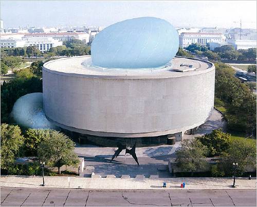
While designer Liz Diller made her politico-architectural case for The Hirshhorn Bubble in her 2012 TED talk, the Museum’s own justification for the project has been unclear and uncompelling.
Explanations center on making the Hirshhorn “an agent for cultural diplomacy.” In February director Richard Koshalek told Kriston Capps, “This institution should be the leader in terms of setting arts and cultural dialogue. Cultural policy is set in Washington, D.C.” This is debatable enough, as both mission and content.
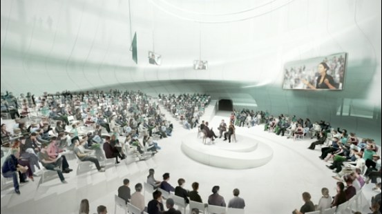
The programming that’s always discussed, though, a “Center for Creative Dialogue,” involves conferences and discussions created by the Council on Foreign Relations and outside staff, not the Hirshhorn itself, or even the Smithsonian. Critics of the Bubble vision like Tyler Green note this disconnect, and that the Museum doesn’t need a bubble to host such policy-flavored forums and events; they could do it right now, in the existing auditorium. And in fact, they did just that last Fall, where a capacity crowd watched TV journalist Judy Woodruff moderate a panel on “Art and Social Change” during to the Ai Weiwei exhibition.
No, The Bubble is a thing apart, apparently, from the programming that would inhabit it. Its absurdist form on this symbolic site, and the transgressive gesture towards Gordon Bunshaft’s concrete donut, are meant to be self-justifying. Capps calls it “a public art stunt,” and the Washington Post suggests it could “break DC from stagnation.” It’s starchitecture as spectacle and a catalyst for attention and, eventually, one hopes, the holy grail of Washington existence: relevance.
Meanwhile, it’s amazing that until Capps’ reconsideration of the project last winter in the City Paper, there was no mention of what would be, for lack of a better term, the business model: The Bubble would be a for-hire event space.

Koshalek swears the Inflatable will engage the Hirshhorn’s curators, too. When the Bubble is inflated, part of its programming will correspond with whatever’s lining the gallery walls of the museum. The rest of the timeshare will go to whichever universities, think tanks, and corporations rent it out–a money-making proposition for the Hirshhorn which could lead to exclusive uses not quite in keeping with Diller’s civic scheme. (And certainly not with the museum’s artistic mission.)

Continue reading “The Hirshhorn Is A Special Venue In Search Of Events”

Big Swingin’ D[iller]

hirshhorn_dsr_balloon.jpg
The Hirshhorn’s board is scheduled to vote on whether to proceed with The Bubble, the most prominent initiative of director Richard Koshalek since he arrived at the museum in 2009.
Even though The Bubble was the subject of one of my all-time favorite posts, I have not written much about it since. I have reservations about it, but I have only wished the museum’s success, and so have been willing to give the current regime the benefit of the doubt as they pursue their vision.
But that has been a vague slog, and far from a sure thing. It’s remarkable that the board which hired Koshalek is apparently reluctant to support his efforts to do what they presumably hired him for: raising the profile of the Hirshhorn, and raising money for the Hirshhorn and its exhibitions, acquisitions, and educational programs.
Maybe that is because there are persistent and unaddressed issues with The Bubble and its ostensible purpose. It is true that Koshalek’s stated vision for The Bubble–to host some kind of cross-disciplinary cultural forum, with content generated not by the Museum, or even the Smithsonian, but by the Council on Foreign Relations–still comes across as squishy and alarmingly unconcerned with actual art and artists. That disconnect is even more inexplicable for being unnecessary.
About The Bubble itself, though: I didn’t care much either way before, but after watching Liz Diller’s TED talk from March 2012, I am really starting to sour on Diller Scofidio + Renfro’s design and their entire approach. Titled “A Giant Bubble for Debate,” Diller’s speech is the rare, unmediated, extended discussion of The Bubble by a principal. As such, it’s worth a closer read.

For Diller and her client, who wants to take advantage of the Museum’s unique and symbolic site “at the seat of power in America,” the National Mall, “the question is, ‘Is it possible, ultimately, for art to insert itself into the dialogue of national and world affairs?’ and ‘Could the Museum be an agent of cultural diplomacy?'” Technically that’s two questions, which not only are not answered, but which beg more questions–insert itself to what end, and agent for whom?
diller_bubble_TED.jpg
“I blush whenever I show this,” says Diller of the slide above, to laughter. “It is yours to interpret.” Wait, what? So I guess she interprets this insertion into the Hirshhorn’s hole as a phallus? Or given the material, I guess it could be a sex toy, or a condom? Or at least some flavor of kink, given the “study of some bondage techniques” that went into the tension cable design on the next slide?
Diller continues: “We were asked by the bureaucracy at the Mall, ‘How long would it take to install?’ And we said, ‘The first erection will take one week.'” And if it lasts longer than that, I guess, call your architect.
diller_panel_TED.jpg
Diller shows the interior space of The Bubble in use, with renderings of a panel discussion in the round; a spotlit performer; a movie screening; and a Barbara Kruger-style text projection. In every instance, the activity is the same: an audience sits and watches something happen. This “breath of democracy” turns out to be just more entertainment and spectacle. And this purportedly transgressive, iconoclastic structure does absolutely nothing to change or challenge the programs of the Mall’s museums Diller just criticized, or by extension, the structures of power she pretends to subvert.
Diller’s claim that her structure, built to house extravagantly ticketed events like TED, the WEF, and CFR fora, will somehow embody “the ideals of participatory democracy” is obviously nothing but hot air.
Which is still just part of the problem, seeing as how the ideals The Bubble is embodying are those of pay-to-play capitalism. More on that in the next post.

Booya

obama_umbrellas_yhoo.jpg
As soon as I saw these images of Marines called in to hold umbrellas over Presidents Obama and Erdogan yesterday, I laughed imagining how the Booya! diaspora of military fanbois from the previous administration would take it.
And right on cue, they declared a scandal, because male Marines do not hold umbrellas. Which, honestly.
This round goes to Obama on points. [images uncredited somehow on booyahoo! it’s like the first step of their tumblr acquisition is to stop crediting image sources]

WNYC FOIA NJT

wnyc_njt_foia_1.jpg
A months-long investigation by WNYC and New Jersey Public Radio into New Jersey Transit’s preparedness and response to Sandy last fall has produced at least one beautiful result.
wnyc_njt_foia_2.jpg
The “New Jersey Rail Operations Hurricane Plan” was provided by the state agency in response to two separate Freedom Of Information Requests from WNYC and The Record.
wnyc_njt_foia_3.jpg
The three-and-one-quarter-page plan was deemed exempt from FOIA and redacted completely. I don’t think it diminishes the content in any way, nor our understanding of what happened to NJ Transit and its facilities and operations during the storm. In fact, it feels to me like it explains quite a lot.
wnyc_njt_foia_4.jpg
I will add it to this series of monochromes. I feel a book coming on. Information wants to be free!
How NJ Transit Failed Sandy’s Test [wnyc.org]
Previously: EPIC FOIA DHS

The Lightning Room

I just saw this blog post float by on Twitter, and the title immediately made me think of Random International’s Rain Room, which, of course, just opened at MoMA as part of Expo1.
Rain-Room-600.jpg
It also answered the question I’d never asked until that moment: what if Walter de Maria’s Earth Room and Lightning Field ever hooked up and had a kid?
Rain Room,” according to MoMAPS1, “consists of a field of falling water that visitors may walk through and experience how it might feel to control the rain.” Which is amazing, because on Saturday afternoon, I was sitting in my car in Chelsea as this intense downpour passed by and pummeled everyone on the street.
Gallery walkers would huddle under the High Line until it proved too tall and useless against the windswept rain, and they’d have to evacuate to a nearby street scaffold. People also ducked into the nearest gallery, even if it was one you never go into.
The storm warning announcement just a few minutes earlier on the radio had warned of “quarter-sized hail”, so I parked under the High Line to protect my windshield and paint job.
But the WNYC storm warning also included something I’d never heard before: a warning to get inside because you could be struck by lightning. Which, honestly. What are the odds? Except that when you are in the middle of a weather event like that, it does feel like your odds get immediately, exponentially better. Or worse, I guess, depending. And for people standing on a railroad in the sky, they get worse still. Statistics and logic are overwhelmed, or at least put to the test, by physical experience and emotion.
lightning_room_kh_bern.jpg
And so The Lightning Room. It is an empty gallery where lightning bolts are occasionally generated. And none of this van Graaf generator, hair-stand-on-end science fair lightning, either: it has to be real, kill-you-dead-or-at-least-fry-your-eyebrows-and-your-sense-of-smell lightning.
To enter it, you have to sit through a briefing or a safety film, some kind of orientation about the deadly risks posed by possible lightning strike, and then you sign a thick waiver absolving the institution of any liability or responsibility. Maybe they sell you life insurance policies on the spot, with part of the proceeds supporting the museum. Contingent planned giving.
If you had certificates for the people who went in, or even stickers, it could be too much incentive for idiots to try it, so you really can’t offer anything. And of course, most people who do go into The Lightning Room are not going to get hit. Nothing’ll happen at all. The point has to be, though, that something could. As Maggie Millner said in that otherwise unrelated blog post mentioned up top, “An empty space is a space full of potential.”
If art can be a giddy dance room offering the technologically mediated illusion that we can control the weather, it can also be a room with a potentially deadly menace where the only control we have is over whether we engage it.
Related: John Perreault’s review of Voids: A Retrospective, an exhibition at the Pompidou and Kunsthalle Bern [above] in 2009 [artopia]

CZRPYR2 Is A Thing

Wow, the first shipment of Canal Zone Richard Prince YES RASTA 2: The Appeals Decision & The Appendix arrived, and they actually look very nice.
czrpyr2_shipped_cover.jpg
Which is good.
czrpyr2_spread_01.jpg
Because people are writing about it. And buying it. And it would be kind of awkward if it sucked.
Your Thievin’ Art: At play in the field of fair use [artnews]
Not yet in stores: Buy Canal Zone Richard Prince YES RASTA 2: The Appeals Decision & The Appendix direct, $12.99 [createspace]

‘SO MANY VISUAL COMPUTATIONS’

rauschenberg_trophyi_merce.jpg
Trophy I (for Merce Cunningham) (1959), collection: Kunsthaus Zurich
Robert Rauschenberg incorporated objects and materials he found on the street to make his early combines. Trophy I (for Merce Cunningham) (1959), for example, includes a beat up sign, poster fragments, and scraps of wood.
rauschenberg_cardboard.jpg
Volon (Cardboard), 1971, is my favorite among many [image via]
In the early 70s, Rauschenberg made a series of works out of used, altered, or dismantled cardboard boxes. He created editions with Gemini G.E.L. that meticulously simulated used cardboard, which he called Cardbirds. The Menil showed these Cardboards and related works, many of which had remained in the artist’s collection, in 2007.
hammons_blizzaaard_bey.jpg
David Hammons, Bliz-aard Ball Sale, 1983, photo: Dawoud Bey, via group a ok
In early 1983, David Hammons laid out several dozen snowballs on an Indian blanket and sold them, priced according to size, alongside the junk merchants and fences of Astor Place. Dawoud Bey came along to document the event, which, everyone seems to have reproduced the one shot over and over ever since. Here is a different angle that shows more of the work’s original context. It’s not clear that Hammons got any takers, or what happened to the snowballs and other materials from the piece.
Orozco_Island_within_island.jpg
via wnyc’s feature tied to Orozco’s 2009 MoMA retrospective
Before his 1998 show at Marian Goodman Gallery, “The Free Market is Anti-Democratic,” Gabriel Orozco had already been making artworks from shit he found on the street for several years. Mostly, he’d find or make a work, and then just take a picture of it. Like Island within an island, 1993 [above]
orozco_penkse_work_mg_dask.jpg
Penske Work Project installation shot, Marian Goodman Gallery, 1998-99
For the Penske Work Project, he rented a truck and drove around Manhattan, pulling things out of dumpsters and assembling them into a sculpture on the street just long enough to take a Polaroid. Then he’d throw the stuff in the truck and drive off. The photos served as instructions for reassembling the pieces in the gallery.
orozco_penske_cd_tube_saltz.jpg
Here is Penske Work Project: CD Tube, 1998, a length of scrap pipe and a stack of CD jewelboxes, from Jerry Saltz’s review of the show. 1998-99 was a very tenuous time for digital imaging, it turns out. Our web history does not age well.
All of this was in my mind last night when I caught up with @therealhennessy’s tweets about making a sculpture on the street and trying to sell it via Instagram. He started out straight, with a found object.

instagram_sculpture_henrock_1.jpg

Then he did something to it.

instagram_sculpture_henrock_2.jpg

Continue reading “‘SO MANY VISUAL COMPUTATIONS’”

A Guerrilla Reading, A Gallery Talk


On Friday March 22, I went to see Kenneth Goldsmith reading Richard Prince’s The Catcher In The Rye in front of a Prince rephotography piece in MoMA’s 2nd Floor galleries. I’d been bummed to have missed Goldsmith’s talk on Wednesday night [granted, I had an opening of my own, but still] so I wanted to make sure I didn’t miss this most appropriate event. When he saw my tweets about it, KG graciously offered to reserve a ticket for me, a gesture which set a certain expectation in my mind of guest lists, seats, or crowd control.
Even as I asked at the desk for the ticket, though, my sense began to change. I suspected, and was right, that this was not a ticketed gig, or even a gallery talk-style crowd with a limited number of slots which, if you didn’t get one, you could shadow and eavesdrop on anyway. The ticket was for getting into the Museum. Which, of all things and all places, I did not need a comp for MoMA.

Continue reading “A Guerrilla Reading, A Gallery Talk”

You Can Buy The Liston Range Rear Light

liston_rear_range_gsa_1.jpg
I know the US Government is selling off lighthouses all the time, but the Liston Range Rear Light in Delaware strikes me as exceptional.
It is a 120-ft tall, braced iron tube built in 1876 that sits, unusually for a light house, three miles inland from the mouth of the Delaware River. It stands on around half an acre of land. It’s a few miles south of 95; I think that’s the exit where the Denny’s is. There’s a 100sf building at the base that’s included, but the adjacent keeper’s house and assistant keeper’s house were sold quite some time ago. The cylindrical tower is lined with wood, and the steel spiral staircase has five landings, in case you need to rest on the way up.
liston_rear_range_gsa_2.jpg
As a range light, it is twinned with a front light which is lower and closer to the water’s edge. Ships navigate by aligning the two lights in a range light.
liston_fresnel_loc.jpg
The Liston Range Rear Light still contains its 2nd-order Fresnel lens, which is unusual.
It is now being sold by the US Coast Guard. The current bid is $10,000. I repeat, $10,000.
One catch, and it’s a big one, is that the Coast Guard retains title to the Fresnel lens unless and until it decides it doesn’t need to be in the range light aid to navigation business anymore. At which point, it may decide to give the lens to the lighthouse’s owner. Who must agree “to display the Fresnel Lens if and when it is discontinued in accordance with the standards set forth in the Guidelines on the Care and Maintenance of Historic Classical Fresnel Lenses.”
It’s a bummer about the Fresnel Lens, but until I can get my hands on one of those late 19th century War Dept. Gettysburg observation towers, this range light might have to do.
Liston Light Tower [gsaauctions.gov]
Liston Rear Range, DE [lighthousefriends.com, bottom image of Fresnel Lens, LOC via LHF]
Liston Rear Range Light [wikipedia]

Introducing CZRPYR2: The Appeal + The Appendix

czrpyr2_cover_1.jpg
So I did this.
I am very pleased to announce the latest title from greg.org, Canal Zone Richard Prince YES RASTA 2: The Appeals Court Decision in Cariou v. Prince, et al., Also The Court’s Complete Illustrated Appendix. It is available now.
It would have been available sooner. It really should have been available sooner. I got it all together by the end of the day the Appeals Court decision came down, but there was seemingly endless futzing and back & forth with the digital publisher about proofing and formatting, etc. So sorry for the delay.
czrpyr_cover_thumb.jpg
CZRPYR2 is a follow-on and indispensable primary source companion to Canal Zone Richard Prince YES RASTA, [above, available here], which contains the full transcript of Richard Prince’s incredible 7-hour deposition, as well as many key filings and exhibits from the first phase of Cariou v. Prince.
czrpyr2_spread_d.jpg
I wondered what you wondered: why not just add the Appeals Court decision to the original book? And if CZRPYR2 was only the decision itself, I might have done just that. Or not bothered with it at all. But then I found the beautiful Appendix the Court created for the decision, and I realized it deserved a permanent place in the history of the case, a book of its own.
Following on Patrick Cariou & friend’s own slapdash effort, the Appeals court produced a high-quality, carefully cross-referenced catalogue of each use of Cariou’s YES RASTA images in Prince’s Canal Zone paintings. This indexing was the basis of the judges’ Solomonic decision to divide the Canal Zone series into 25 non-infringing works, and 5 infringing?-who-knows-let’s-look-again works. Where applicable, the Court added highlights to Cariou’s images, arguably creating yet another transformative work. And submitting it into the public record.
For this 142-page volume, I integrated the Court’s collections of Prince & Cariou images, to facilitate painting-by-painting review of Prince’s appropriations. And I annotated them for easier referencing. But otherwise the Court’s primary documents are preserved, with an eye to posterity, as they were prepared,
CZRPYR2 is in this way a salute to the Court’s own transformative, creative spirit.
Buy Canal Zone Richard Prince YES RASTA 2: The Appeals Court Decision in Cariou v. Prince, et al., Also The Court’s Complete Illustrated Appendix (142 pages, b&w, 6×9-in.) for $12.99 [createspace]
Buy Canal Zone Richard Prince YES RASTA: Selected Court Documents from Cariou v. Prince, et al for $17.99 [they can ship together, but I’ll probably only sell 2-vol. sets in person. Maybe on a blanket next to Central Park.]

On The Restoration Of 101 Spring Street

judd_constr_permits.jpg
I don’t know how they knew, but I was asked to write about ARO’s restoration of 101 Spring Street for Architect Magazine. I’ve been a huge fan of Donald Judd’s architecture since I first visited his spaces almost 20 years ago, so I was somewhere between concerned, wary, and freaking out over what was going to happen to the artist’s works.
So I attended the Judd Foundation‘s preview last week [EXCLUSIVE GREG.ORG IMAGES ABOVE, BELOW]. Basically what happened was, after 19 years of life-consuming effort and stress, a shit-ton of money, and a near-fanatical approach to conservation, 101 Spring Street is done and saved. [Well, technically, it’s almost done. Like 99% done.]
judd_wifi.png
The second biggest surprise was ARO’s absolutely amazing transformation of the subterranean levels at 101 Spring into the beautiful, light-filled offices of the Judd Foundation. I’d been in the basement once before, way back when, and it was a dingy, dark, leaky mess. Now the original 19th century sidewalk vaults and floorlights [below] work and look fantastic. Even as they go to extraordinary lengths to preserve their dad’s spaces, Judd’s kids also managed to create something for themselves as well.
juddfndn_floorlights_.jpg
Meanwhile, I tried to write about Judd in the empiricist style of Judd. It turned out to be very difficult. And if no one noticed or said anything about it, Ima guess that I was only partly successful at it. Still, a very nice thing to write about.
101 Spring Street by Donald Judd (and ARO) [architectmagazine]
The Judd Foundation will start guided visits of 101 Spring Street in June 2013. [juddfoundation.org]

Borderline

durer_agnes_border.jpg
It still feels a little precious and Slate-pitchy to say it, but two of my favorite things about the National Gallery’s extraordinary exhibition of Albrecht Dürer drawings from the Albertina are the mats and the paper.
And I say that fully admitting that both times in the show, Dürer’s works leave me feeling like I chose the wrong Renaissance (Southern) for my art history degree in college. The power and presence and detail of seeing Dürer’s marks in person and in depth is something that slideshow seminars can’t approach.
And these particular aspects of the works that caught my attention are also those that go undiscussed, or get ignored or cropped out of reproductions, catalogues, too, including the NGA’s. So it’s been hard to follow up on my own, or to find reference images. And the NGA’s restrictions on taking photos of 500-year-old artworks hasn’t helped.
I posted a bit about Dürer’s prepared paper already. My favorite is the blue wash, which was apparently an attempt to replicate the color of the unique blue rag paper the artist found on his trip to Venice.
In Hyperallergic Weekend, Thomas Micchelli made the superclose observation that these papers behave differently; ink marks made on painted/prepared paper sit more crisply on the surface, while those on carta azzurra, whose color is infused, soak in and soften a bit. I will have to go back and look now.
durer_skull_violet.jpg
But I guess the intriguing thing for me is imagining Dürer basically painting a monochrome, which he then happens to draw on. I know, it’s a bit perverse. But it’s also something he did over and over. The Albertina’s online collection database includes examples of many other colors that Dürer used over the years: red-brown, grey, green, brown, blue over pink, even violet. Like on this study of a skull from 1521 (Albertina Inv. 3175).
The skull also shows a bit of the ink border that someone, at some point, seems to have drawn around the Albertina’s works. A few dark works, like the grauviolet ones, have wide, thinly brushed borders, but most have a single pen line. These are not often reproduced, but they are visible in the Albertina’s online database. They seem to echo the border of etchings, Dürer’s most renowned medium. They’re also just the beginning.
The Albertina drawings all have additional, concentric lines drawn on the mounts and mats, like little frames. Some are decorated, or hashed, but most are just plain. Still, it’s that they exist, the remnant of someone’s decision to augment the works of one of the Renaissance’s greatest artists for public display.
durer_turf.jpg
Until Micchelli’s Hyperallergic piece, the only image I could find was the top, from a restoration report for Agnes Mine, Dürer’s portrait of his fiancee. But check out the drawn frame on two of Durer’s most celebrated works: The Great Piece of Turf. Then notice those decorations on the frame around Left Wing of a Blue Roller.
durer_wing_blue_roller.jpg
Between the background washes and these inked frames, I started imagining an entirely monochrome, abstract version of the Dürer show; sort of a Stephen Prina-style The Complete Works on Paper of Albrecht Dürer. As soon as I can track down any more info on just how Dürer prepared his paper, I’ll try one out.
Dürer in DC: Some Observations on the Great Observer [hyperallergic]

Albrecht Dürer: Master Drawings, Watercolors, and Prints from the Albertina runs through June 9, 2013
[nga.gov]
Abertina Sammlungenonline [albertina.at]

The $72,000 Question

gemini_artforum_ad1.jpg
One recent night I, like you, perhaps, was flipping through a new issue of Artforum, and I saw this ad from Gemini G.E.L., the pioneering LA print foundry, for Honeymoon, a new edition by the late Franz West.
I am a longtime admirer of both Gemini and West, and particularly of West’s multiples, of which this was the first–and alas, probably the last–he would produce with Gemini. Also, how interesting that it’s being advertised in the making by these two women.
So I decided to check it out on Gemini’s website. Which is really a webshop, with a shopping cart, etc., for all their available works.
And there it is, Honeymoon, 39 inches in diameter, but only 1/4 inch thick? The one in the ad looks thicker. Papier-mache, though, is classic West. [The first works of his I saw in person were in a MoMA Projects show in, wow, 1997 (above). So long ago, but more recent than it feels. There were painted papier-mache rock-like sculptures on pedestals and furniture. I was really mystified, but then I came around to it pretty quickly.]
FranzWest_MoMA_projects.jpg
Honeymoon was “Projected,” Gemini said, as a “series of 28 unique works.” Unique, yet strangely anonymous, impersonal, and abject: a papier-mache pulp moon, that’s it. But still kind of interesting. I mean, there is so little there there, but even so, there’s something there. It’s a material minimalism, an economy. I could feel myself getting a little wistful staring at this moon, thinking of West’s life and work, ended too soon.
And I thought, I really needed to buy this Franz West, right then and there. So I did. I put it in my shopping cart, paid, and got my email confirmation. Total price: $36, plus free shipping.

Continue reading “The $72,000 Question”

Richard Prince’s Canal Zone Paintings: Now With 83% Less Infringiness!

Thumbnail image for czrpyr_exhib_40.jpg
Word is definitely out, but it’s nice to see that copyright insanity has taken a step back for now.
The US Appeals Court largely reversed the earlier court ruling against Richard Prince, finding that the US District Court erred in finding his Canal Zone series paintings infringed the copyrights of Patrick Cariou. Specifically, they said that Judge Deborah Batts used the wrong standard in determining infringement and rejecting fair use.
canal_zone_collage_rprince.jpg
The Appeals Court judges declared that at least 25 of Prince’s paintings made obvious transformative use of Cariou’s photos. And after laying out a fairly expansive criteria for fair use, it ordered the court to re-review the other five Canal Zone works for infringiness. [That list includes Graduation (inaccurately reproduced below), Meditation (with the dude on the donkey), Charlie Company, Canal Zone (2008), and Canal Zone (2007) (above, which is actually collage, paint on book pages fixed onto a board, which was not in the Gagosian show or the catalogue; it was only shown in St. Barth’s. So why is it even covered by US law? Was it even made in the US? Is it even in the US? Is it impounded with the rest of the Canal Zone works? If so, WHY?]
In addition to citing previously unmentioned quotes from Richard Prince’s own deposition, the judges said that Prince’s intentions, or the unstated lack thereof, were not necessarily required to decide if something is fair use. Fair use can be in the eye of the beholder, specifically the “reasonable observer.” This seems both obvious, and slightly amazing to me. It also jibes pretty well with the amicus brief filed in the appeal by the Warhol Foundation.
It also means that fair use is not dependent solely on an artist making an explicit case for it. If Prince’s refusal to articulate a Koons-scale structure of critique and commentary is not required to appropriate something into your artwork, that would fortify a fair use defense. Rather than discuss art on the law’s terms, Prince has pulled the law toward considering art on its own terms.
cariou_prince_artinfo_wtf.jpg
Another fascinating aspect of the decision–and by fascinating, I mean obvious and totally in agreement with me–is the court’s emphasis on the changes in size, format, and process between Cariou’s book pages and Prince’s giant inkjet/collage/paintings. [cf this discussion of scale recently] The court went so far as to create its own reference work, similar to the distorted exhibit Cariou entered, but clearer, documenting each painting and the Cariou images and fragments used in it. It’s really nice, and would be very handy for anyone wishing to make their own Canal Zone paintings. Ahem.
yes_rasta_hair_p59.jpg
Study for Untitled (After YES RASTA, p. 59), 2013
Anyway, there is more to come, including possibly a new round of evidence and testimony about Cariou’s photos and their appearance and alteration in Prince’s work. Or perhaps someone’ll try to settle. Cariou’s lawyer’s on contingency, I believe, and 40% of nothing is nothing. So who knows how this thing ends. After more than two years since the first cluster)($#%k of a decision, though, today’s gotta be something of a relief for Team Prince.
Here, btw, is a roundup of previous Cariou v. Prince posts, including readings, reviews, and info about the book I made, Canal Zone Richard Prince YES RASTA: Selected Court Documents from Cariou v. Prince, which contains the transcript from Prince’s amazing 7-hour deposition in the case:
Early days of THE BOOK:
the five most ridiculous things about the Richard Prince copyright decision
The Richard Prince decision? You’re soaking in it!
Richard Prince’s Spiritual America
Size Matters?
Actual found blurb: “THE WITNESS: This could be a cool book.”
Introducing: Canal Zone Richard Prince YES RASTA: The Book
More documents from the case, like:
The Movie Pitch that started Canal Zone: “The Movie is called ‘Eden Rock'”
The great Amicus brief filed by the Warhol Foundation
Some CZRPYR reviews and events:
Canal Zone YES RASTA &c. reviewed in The Brooklyn Rail
HOLY SMOKES REVIEW at the Poetry Foundation by Kenneth Goldsmith, which is really humbling and amazing
Apr 2012: CZRPYR included in “Canceled,” curated by Lauren van Haaften-Schick, at the Center for Book Arts
Sept 2012: Audio & coverage of a Printed Matter talk with Joy Garnett and Chris Habib where we actually discussed and looked at Prince’s paintings, which almost never happens.
Looking a bit at the amazing language of depositions, in relation to the live staging of the deposition we did for AFC.
A great discussion of a a WTF image: Virginia Rutledge and Penelope Umbrico talking copies
Buy Canal Zone Richard Prince YES RASTA: Selected Court Documents from Cariou v. Prince online, or in person at Printed Matter.