
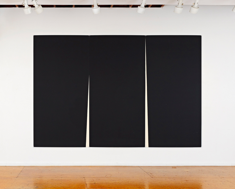
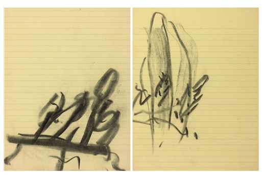
Double Rift I, 2012, by Richard Serra, published in an edition of 12 by Gemini GEL
When we last visited the Gemini GEL webstore, I couldn’t help but gape in awe atRichard Serra’s massive, new etchings, a series known as Rift. There are at least four Rift-related works, diptychs and triptychs, plus a related single plate print, Mandala, all released within the last year or so. Each section is made with a full 48×94-inch copper plate. The crucial gaps in between each section remind me of the Weights and Measures drawings Serra made in 1989, several of which were reunited in 2011 for Serra’s drawings retrospective.
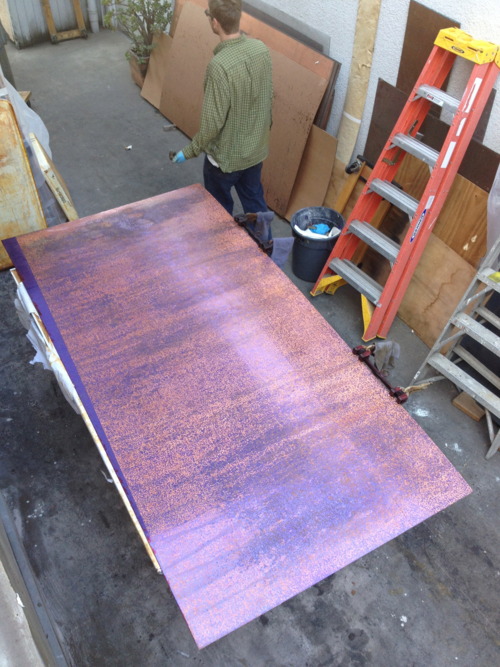
Rift etching plate in process, Gemini GEL, image: xavierfumat.tumblr.com
Anyway, the indie printing foundry Gottlund Verlag points to a couple of posts on a quiet tumblr called Richard Serra at Gemini GEL, which shows the making of the Rift plates and proofs. It’s pretty crazy stuff.
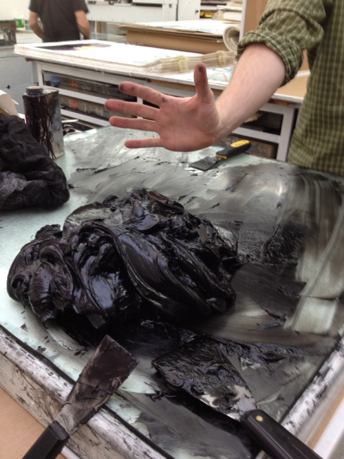
“10-12 pounds” of strained, modified etching ink, Gemini GEL
Things Happening At Gemini
Proofing triptychs
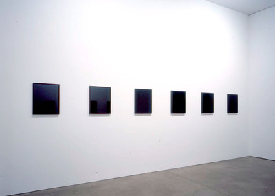
What Do We Know About Sherrie Levine’s Black Mirrors?
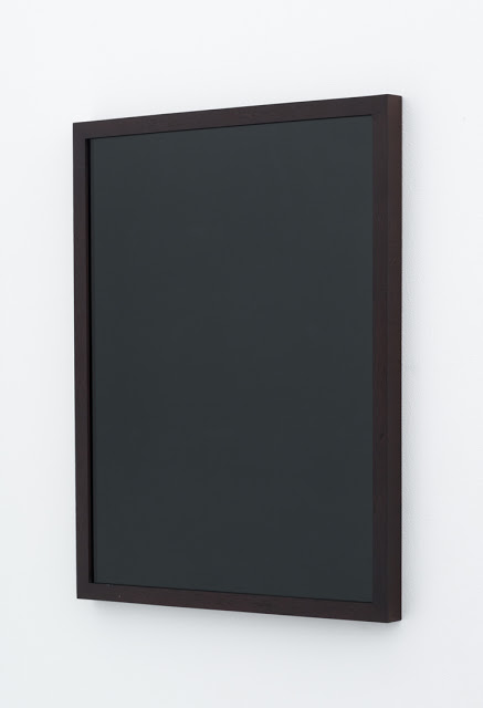
So Joshua Abelow posted this yesterday, Black Mirror, 2004, by Sherrie Levine. It was included in a group show that just closed at Joe Sheftel, Paint Hotel. But that doesn’t really shed any light on this particular work. Paint Hotel’s announcement opens with an Yves Alain Bois quote from Painting: The Task of Mourning and Joan Didion, and it
seeks to destabilize fixed theoretical and genealogical narratives. The point is not to be anti-theory, but rather to allow for an immediate experience.
Which, is part of my question. Because I can sure appreciate an immediate experience of Black Mirror; it’s an elegant, ambiguous object, a 16×20 black-painted sheet of glass in a sleek mahogany frame. As an autonomous object, it makes its own case. But of course, it didn’t just appear out of nowhere; it’s a Sherrie Levine, and we’re paying attention to it, or it’s entering this particular context, because it’s a Levine. And that’s what I wonder about. Why, and what?
installation view via paula cooper gallery
The readily available discussion of Black Mirror seems to be thin-to-nonexistent. There were originally twelve identical black mirrors exhibited at Paula Cooper in late 2004. The show was titled “Mourning Mirrors.” Here’s what we know:
Here, as with much of her sculpture, Levine’s interest lies foremost with the physical presence of the object and the sensual quality of the materials used. The mirrors’ dark gleam has the elegiac feel of funerary or memorial sculpture. With their frame and color, as well as their status as generic objects, the mirrors also maintain an ambiguous relationship to both monochromatic painting and the readymade.
For years, Levine’s work has raised critical questions about authenticity, the function of tradition and the relation of reproduction to original, questions central to artmaking today. Of her work, she says: “I try to make art which celebrates doubt and uncertainty. Which provokes answers but doesn’t give them. Which withholds absolute meaning by incorporating parasite meanings. Which suspends meaning while perpetually dispatching you toward interpretation, urging you beyond dogmatism, beyond doctrine, beyond ideology, beyond authority.”
So Levine’s interest here is in the physical presence of the generic object, which, sure, but the entire second paragraph feels unrelated, or unsupported by these objects.
I don’t mean to imply that I don’t like them; I do. And I like Richter’s mirrors and backpainted glass works, too. And any host of other artists who use mirrors and monochromes and readymades and paintings and originals and, just consider my buttons pushed. But I still don’t get it.
I mean, I guess Levine’s gotta make something. And she’s gotta show something. And this is what it is. But then we are looking at this thing because it’s a Levine, because of the brand, and the practice, and the history, not for the “generic object” itself. Let’s be real here. Paula showed this work because she believes in Levine and supports her in her practice, wherever it leads, and she trusts her.
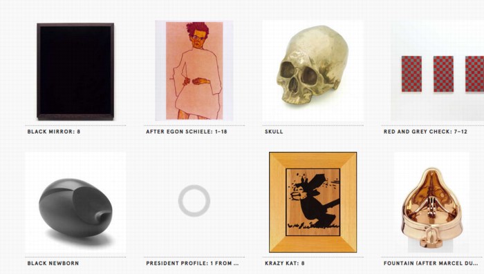
just a few of the Levines at the Walker
And the Walker Art Center accepts Paula’s gift of a Black Mirror straight out of the show and into their collection because all of the above, plus they have made an institutional decision to collect Levine’s work in depth, including buying a bunch of work in 2002. So it’s a sign of a good relationship, if not a thank you, or a free gift with purchase.
Black Mirror makes the most sense to me in this context, of an artist’s work, over time, and the relationships and dialogues that form, and move from show to show and work to work.
And someone squeaked out a sale of a Black Mirror last year at Phillips for $60,000, a final bid of $48,000 against a too-hopeful estimate of $70-90,000, because, well, that’s a bit of a mystery to me. Phillips’ catalogue text is the only other text I’ve found online besides the “Mourning Mirrors” press release, which it quotes, and then muddles and contradicts completely:
The reflective surface exudes the elegiac severity of a funerary or memorial sculpture. The rich brown frame surrounding the sleek and cold glass lends the work the status of a generic object and maintains a relationship to both painting and the readymade.
…
Black Mirror: 4, 2004, appears disarmingly simple, yet there is something naughty lurking behind its smooth and lustrous surface. A mirror is intended to reflect the world around it; however, upon peering into Black Mirror: 4, 2004, a sense of mischief and secrecy pervades. The world appears not in its picture-perfect state, but doused in black ink, void of color, clarity, and precision. But instead of leaving its audience with a sense of impending doom, it is out of this precise bleakness that a gleeful mischief prevails.
Yes, gleeful mischief. Because what Debbie Downer’s gonna pay $90,000 for cold, funerary, generic, mournful, bleakness? This looks more like the auction house’s reflection than Levine’s.
Anyway, the point is, I love duality, and I kiss ambiguity’s feet. And I am always glad to be confounded and challenged to wrestle with contradictory notions in my head. But for some reason I’m really having trouble with Levine’s Black Mirror purporting to be a generic object when it’s really/also a branded good.
G8 Pop-Up Prison

Here I am thinking that 12 years into this blogging thing, there’s really no reason to keep shipping containers as their own category anymore, when BAM, up pops a sweet, containerized pop-up prison for G8 protestors in Ireland.
You may remember, or maybe you don’t, that in 2002 Camp Delta, the prison annex to Camp X-Ray at Guantanamo, was quickly built from shipping containers to handle the influx of prisoners from the GWOT.
If there’s a difference between the GTMO container cells and the Irish ones, it’s that the G8 cells are reportedly highly temporary, and that the police are promising that protestors will be arrested, processed, charged, and properly incarcerated in record time, just “a matter of hours.” Europe. It really is the little differences.
G8: Courts ‘can deal with 260 protest arrests a day’ [bbc]
Man With A Pano Camera
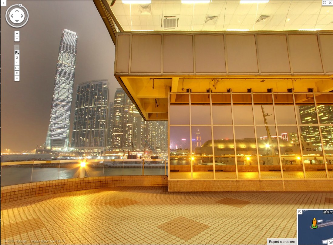
Yesterday @MattBucher noticed this uncommon night-time imagery on Google Street View of Victoria Harbour in Hong Kong. It’s the promenade on top of the China Ferry Terminal, on the west side of Tsim Sha Tsui in Kowloon.
As I do, I immediately began looking for Street View’s evidence of itself: the distortions where panoramas are stitched together, and the traces of the photographers who make it. It’s information Google is apparently just as interested in eliminating. The promenade includes three mirrored buildings, but every pano is perfectly sited to exclude the Google cameraman. Whether selfies are considered distracting, extraneous, or just undesirable, Google is trying not to photobomb itself.
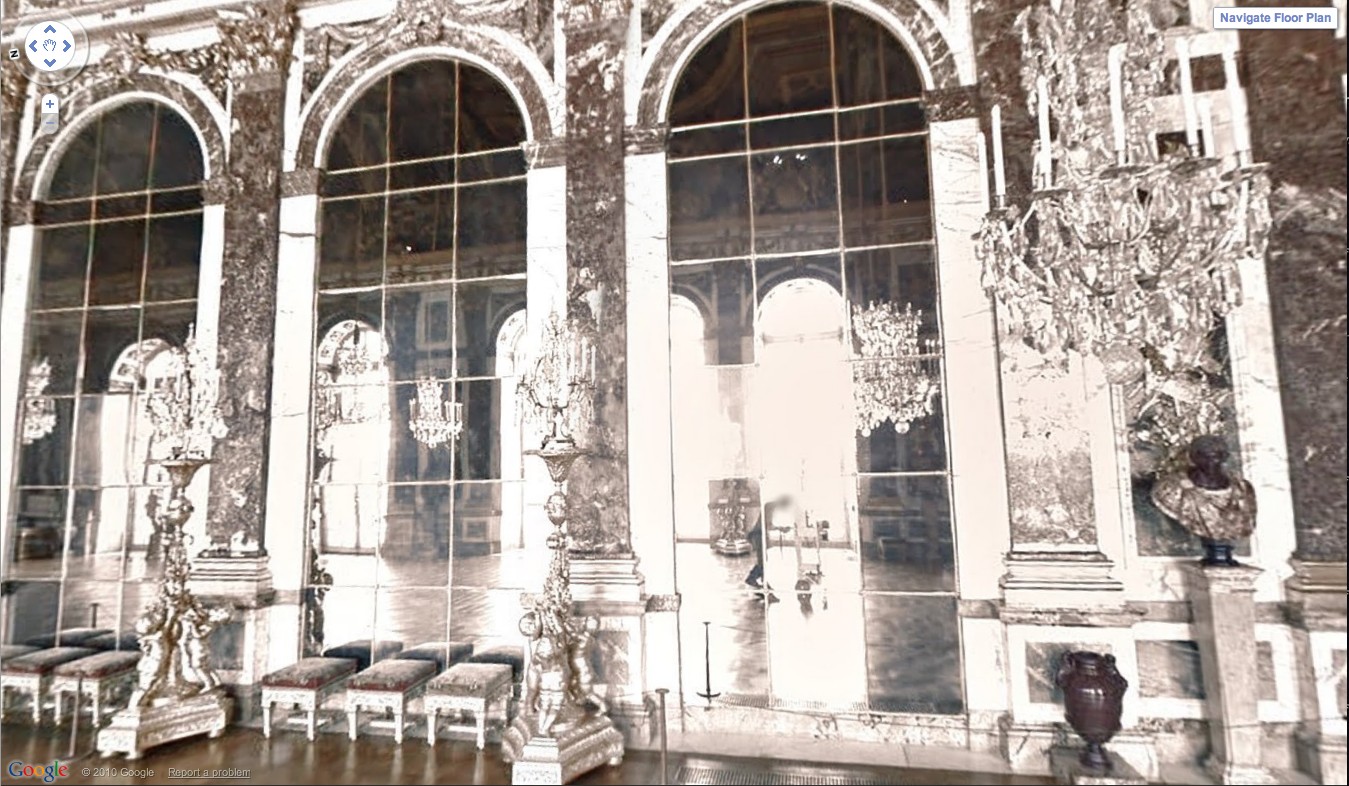
At least not anymore. Remember back in 2011 when the Google Art Project launched, and we got a little glimpse of the camera operator pushing his cart carefully through the Hall of Mirrors at Versailles? That feature has been eliminated.
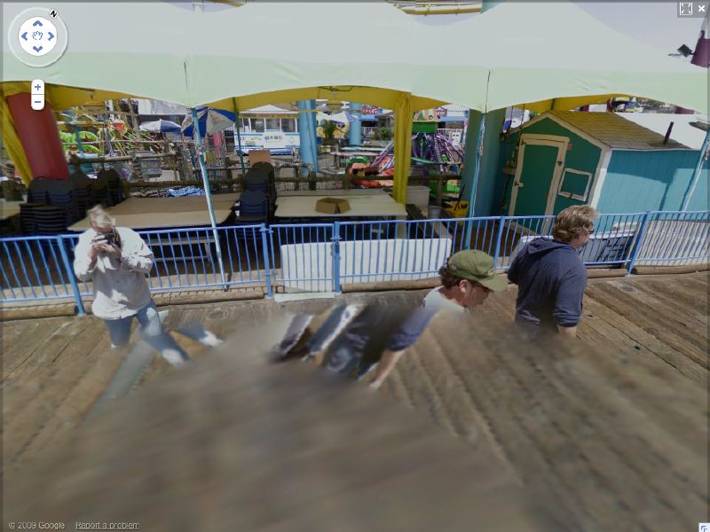
And when Google Trike was first tested four years ago on the Santa Monica Pier, its handlers not only appeared on camera repeatedly [including one pano, since removed, where they posed as civilians and flashed the peace sign], it also attracted attention.
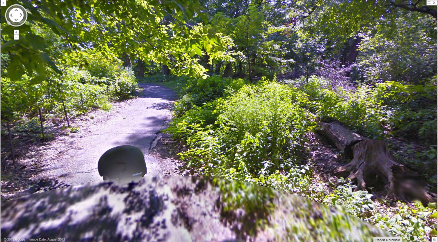
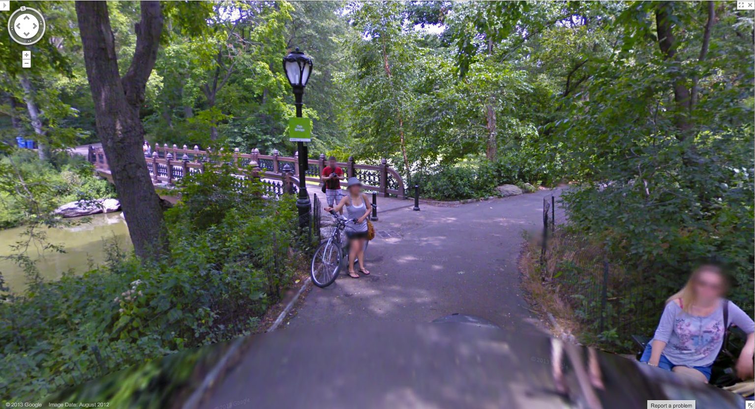
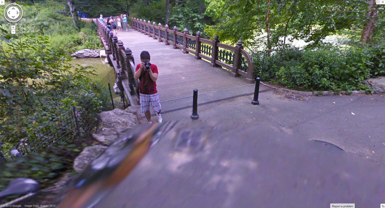
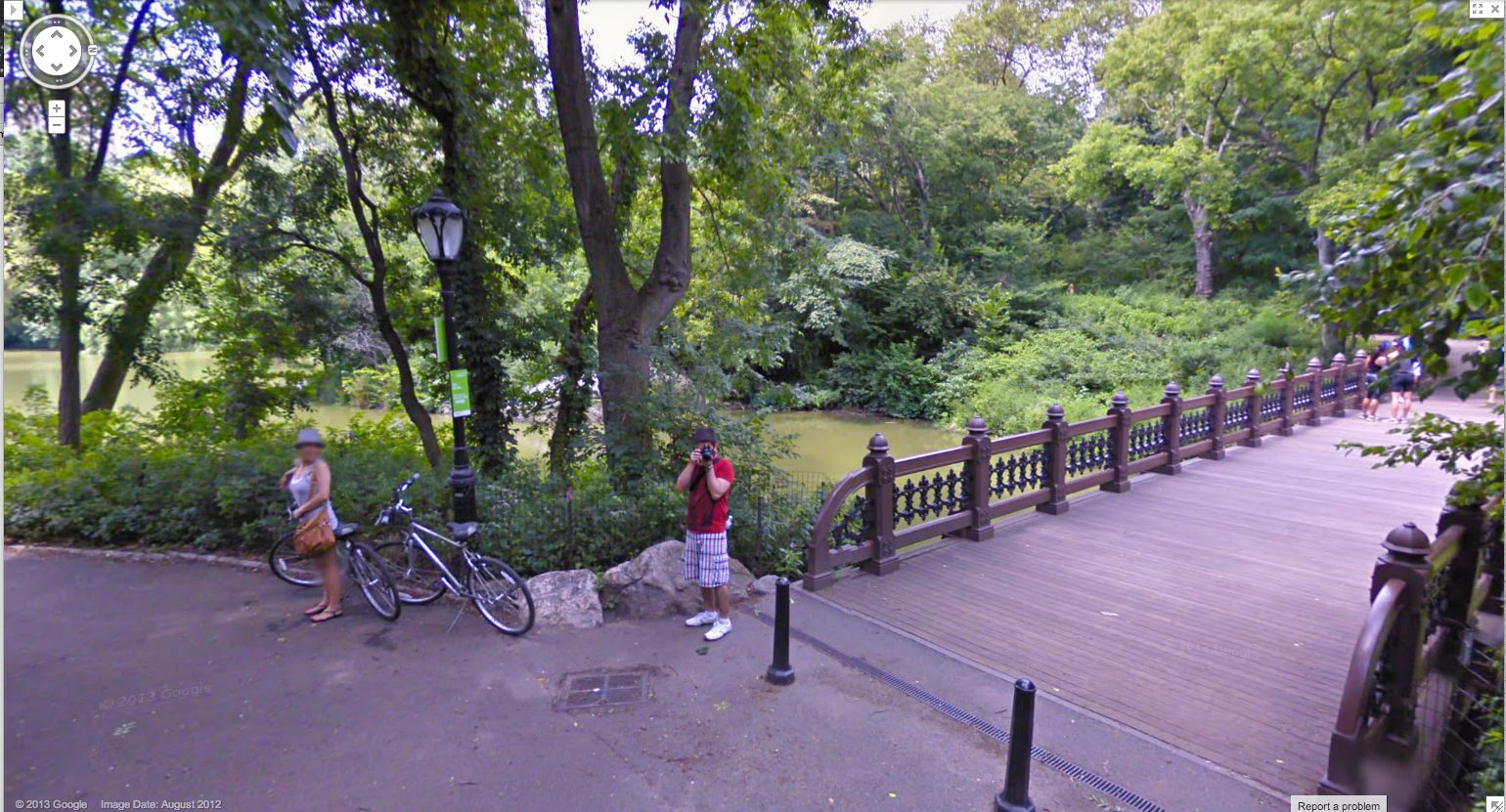
As recently as last summer, this was still the case. Here are some screencaps from a Google Trike expedition in Central Park, which someone linked to just last week. [here’s an Engadget story.] I couldn’t see any evidence of an attendant, like the guy I dubbed Walking Man, who appeared in almost every pano of the Google Trike’s first European outing, scanning the Binnenhof, the Dutch Parliament, in the Summer of 2009. But there were the occasional shots of the back of the Trike driver’s head.
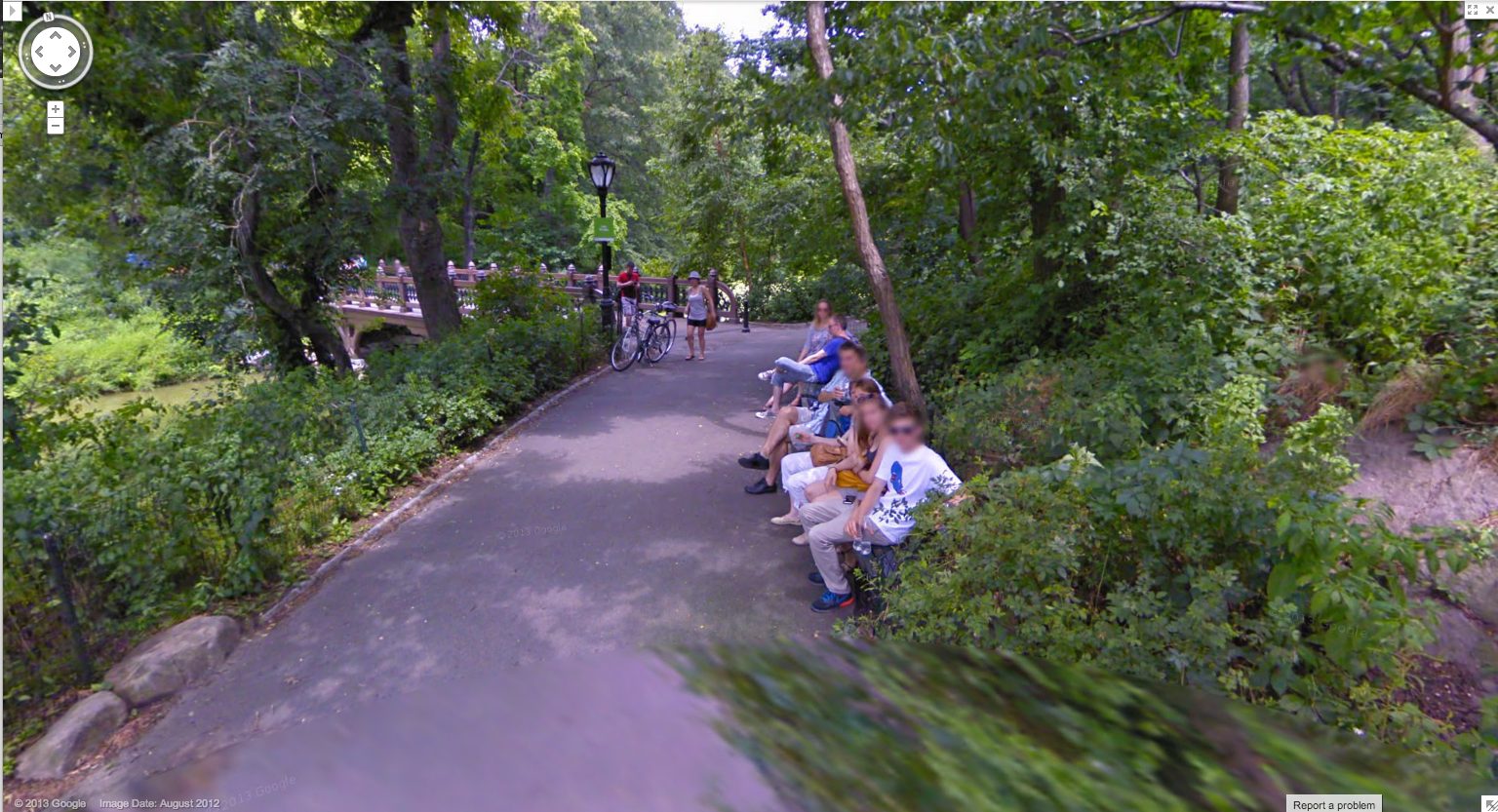
I love this sequence, partly because it’s an actual moment in time, a person–the driver–moving through space. It’s a narrative, and a narrative of its own making. And that upsets the usual assumptions of Street View, in which the user internalizes the camera’s eye as his own.
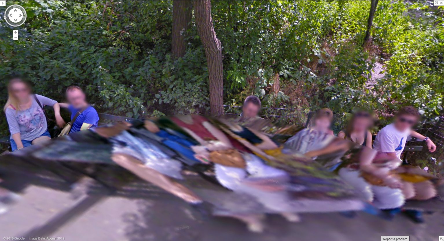
Plus, I just like the cubistic pano distortion aesthetic. I’ve grown accustomed to GSV’s blurred face.
And as you can see here, the Google Trike and the camera are a recognizable feature now. A tourist attraction, even. That gets covered in the local news.
These people have probably been waiting months to see if/when their pictures show up on Street View.
Yes, well, that’s how Google used to do things. Those days may be numbered, and these images may soon be out of date, totally 2012. These Hong Kong panos were taken in April 2013, just weeks ago, and now they’re live. Not only has the processing time been shortened, but the stitching quality has improved significantly. There is a new Street View aesthetic, and it is the ghost. We have become the blur. Google Spirit View.
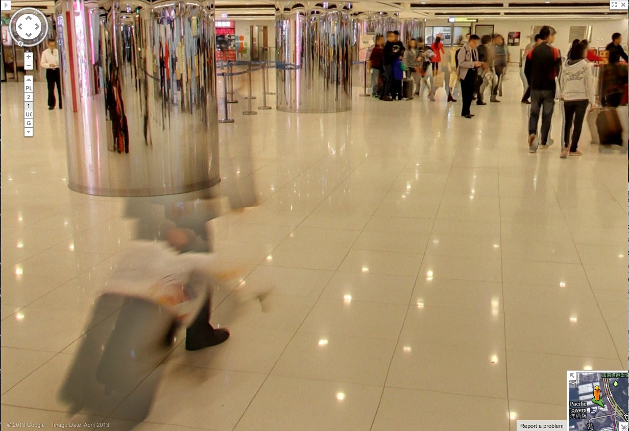
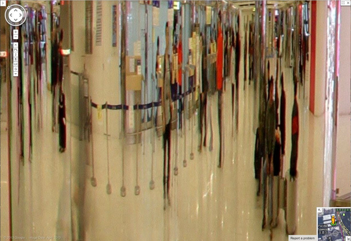
Check out this guy and his wheelie, almost gone. Also, it should be mentioned, these are interior panos, Google Art Project Everywhere. The Hall of Mirrors of the 21st century is a panoptic Kowloon ferry terminal/outlet mall with an LED grid reflected in the polished stone floor.
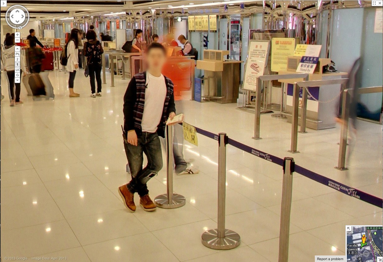
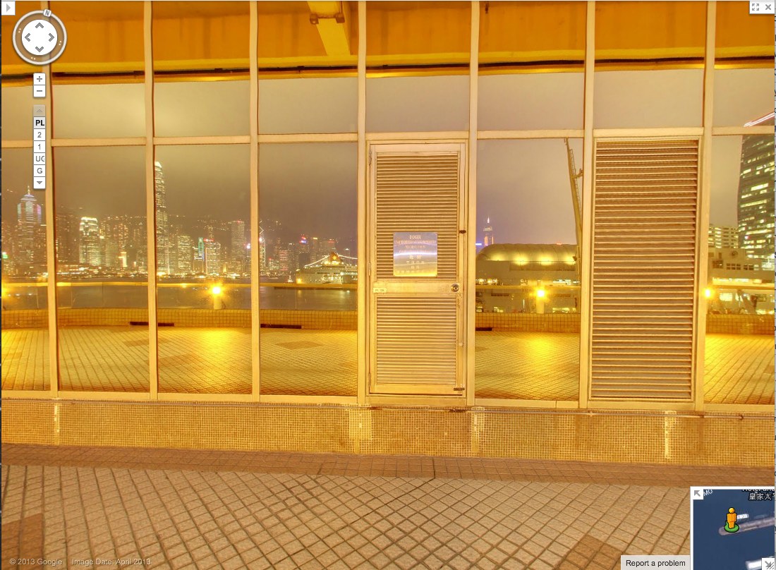
So compare the classic GSV civilian, face blurred, with the guy behind him–see him there, in his ASICS? His red jacket is just a haze through which the camera now neatly interprets the check-in counter further back.
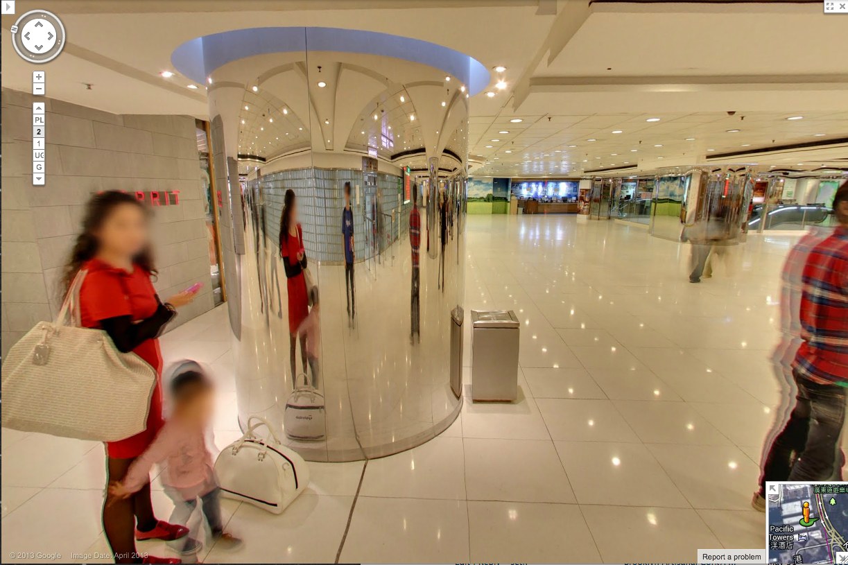
Spin around 180-degrees in this 1st floor pano, and the guy in red shows up more clearly reflected in the mirrored column. And in the mirror we also see someone who wasn’t there: the guy in the center, with the grey t-shirt and backpack. With a faint tripod visible in front of him. This is the Google Cameraman. His camera is the small black box above his head. Static but portable. [I love these attenuated, Giacometti-esque figures, btw. So first instant of perception.]
And here’s another one, from a less crowded shot on the 2nd floor. First admire the nice blur motion on the guy to the right. Then note the guy who doesn’t show up in the pano, except in reflection.
His superthin tripod does seem to have attracted the attention of the mom on the left, but no one else. They’re looking at each other as he shoots. His blue T-shirt says elgooG.
Is there a Street View equivalent of Moore’s Law? Because Google’s scanning setup is getting smaller, lighter, and more invisible, and their data turnaround time is dropping. It is now easy to see the convergence of Google Street View and Google Glass, where all the Google-powered devices we wear, carry, and use relay information back to the Server in real time. We will be Google Drones surveilling ourselves and each other within a few years, and most people won’t even notice it.
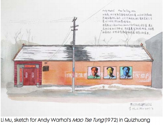
Shanzhai Van Abbemuseum By Li Mu
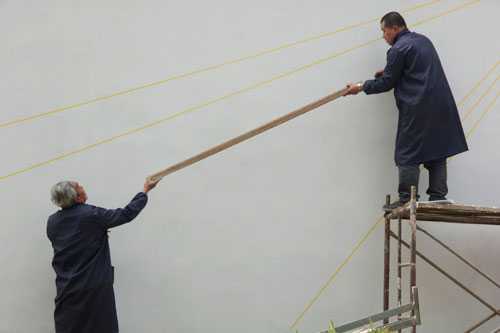
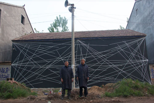
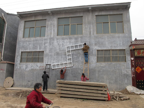
Suzhou-based artist Li Mu has established a public library and installed a collection of contemporary artworks from the Van Abbemuseum in Qiuzhuang, the small village in Jiangsu Province where he was born. Qiuzhuang Project: A dispersed museum project includes works by Sol Lewitt, Richard Long, Andy Warhol, Carl Andre, Dan Flavin, Ulay & Marina Abramovic, Daniel Buren, and John Kormeling. With the exception of the video pieces, all the artworks in Qiuzhuang Project have been or are being fabricated on-site.
Here are Mu and an associate creating one of two of Lewitt wall paintings [images via iamlimu.org]:
Earlier this year, after the library was up and running, Mu began fabricating copies of Lewitt’s Untitled (Wall Structure) (1972) and distributing them to villagers, mirroring FREE SOL LEWITT, a 2010 project by SUPERFLEX, which sent full-size Lewitt copies home with museumgoers in Eindhoven. It’s not clear whether the Qiuzhuang Lewitts are considered Lewitts, SUPERFLEXES, or Mus, but they look fantastic:
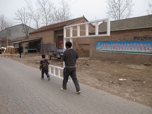
And that points to a complicated question. The Shanzhai (山寨) in the title usually implies a knockoff, a cheap or poorly made copy, ingenious perhaps, but an inferior or even illicit substitute for an authentic original. But none of that really applies to the art being made or shown here. From the Western or art-savvy perspective, at least, it’s the context that’s 山寨, not the work, specifically, the incongruity of seeing iconic contemporary artworks in this rural Chinese village setting. Which is pretty much the exact inverse of the project’s primary audience, the residents of Qiuzhuang.
I wonder what the impact of the project will be? The library, we’re told, will be permanent. But will Qiuzhuang experience an influx of art-related tourism for the show? How will that go? Or if not, what will that mean?
Is there a visitor guide? A map? Will the grocery store be thrilled, annoyed, or disappointed by daytrippers coming to see Ulay & Ambramovic’s bow & arrow video? How much of the contemporary art/culture/ museum/ economic development paradigm is actually being transplanted here? Will speculators descend on the town and try to buy up the Lewitt/SUPERFLEX/Mu sculptures? Will Mu be able to exhibit Mao paintings that were censored when they were by technically by Warhol?
The Van Abbemuseum is one of the more sophisticated institutions when it comes to engaging such questions. And Li Mu seems fairly well-attuned to the subtleties of both his art and his hometown. It will be interesting to see what unfolds as the Qiuzhuang Project continues.
I Am Li Mu [iamlimu.org]
ArtHub Asia is a sponsor of the Qiuzhuang Project [arthubasia.org]
The Van Abbemuseum seems not yet to have a permanent page for the Qiuzhuang Project [vanabbemuseum.nl]
Previously: Fau Sol Mio: FREE SOL LEWITT by SUPERFLEX
Ghetto Erased De Kooning Drawing
[See the note about Ghetto vs Shanzhai at the bottom of this post.]
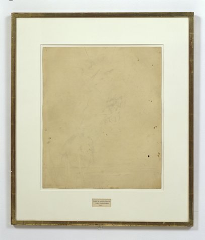
I’ve explored and written quite a bit about Erased de Kooning Drawing by Robert Rauschenberg & Jasper Johns. And I started to wonder if anyone else had ever erased one, too. If so, who and when, and if not, why?
Was it really a gesture that only needed to–or only could be–done once? Yes, there’s an audacity to Rauschenberg’s gesture, but the work is also, rather definitively, not a destructive act. Rauschenberg correctly saw erasing as an affirmative markmaking technique, one that de Kooning himself used quite skillfully.
So why not do it again?
I think the obvious explanation is that one more erased de Kooning drawing in the world would mean one less de Kooning drawing in the world, and that’s a seen as a problem. De Kooning’s pre-eminent stature as an artist, combined with his being dead, the finite number of works by his hand, the urge to preserve them, the conservation imperative of not making any irreversible alterations to an artwork–and of course, the economic folly of it, it just don’t add up.
On the other hand, it would offer an invaluable insight into Rauschenberg’s own experience and process in erasing de Kooning. Remember how he said it took him a month and a whole bag of erasers or whatever? Now we could find out.
Because Christie’s just posted an online-only auction of de Kooning works on paper collected over two decades by his longtime physician and friend Dr Henry Vogel. There are 33 works in the online Vogel sale, and some of them are nice, and even interesting. Let’s also say that there are several works available whose artistic character, historic importance, and sales estimates completely upend the calculations that have prevented a restaging of Rauschenberg’s act. They are highly erasable de Kooning drawings.
Lot 10, a diptych, is the first of nine drawings in what me might call de Kooning’s Notepad Series, which juxtapose his expressive markmaking with the rigorous geometry of lined paper:
He drew on everything from bags to grocery receipts, but it was paper–smooth, permanent and hard–that he favored most. Any kind of paper could suffice, even the torn out pages of a notebook, like with these two pieces.
The current bid is $2,600, with an estimate of $4-6,000. [update: sold for $3,250]
Christies’ specialist hints at the mysteries locked into Lot 11, above:
De Kooning often used the female figure as a starting point to explore abstraction, obsessively and tentatively probing the boundaries between the two forms. In drawings like this, only the faintist hint of the female form emerges–and even that is open to interpretation.
The starting bid will be $1,000 against an estimate of $2-3,000. [update: sold for $2,750]
But the most promising candidate for erasure may be Lot 12 (starting bid, $1,500, est. $3-5,000, [update: sold for $1,875], which not only features images that de Kooning himself crossed out–a double negation!–but which has not only been seen, but commented upon by John Elderfield himself:
“There’s one of these yellow pad sheets where he seems to have drawn a lot of forms and crossed them out,” said John Elderfield, a [sic] former curator at MoMA, describing this piece. “And it’s hard to quite know what he’s up to. […] But with de Kooning, there always is something.”
Just like a palimpsest, there always is something.
Which highlights another major difference between Rauschenberg’s Erased de Kooning Drawing and this, for lack of a better term, Ghetto Erased de Kooning Drawing: you could buy it. Rauschenberg held onto his for decades, until he sold it with a group of foundational, early work, to SFMOMA. But if having an authentic, erased de Kooning drawing of your very own is something you’ve always drramed of, well, the auction ends June 19th. Drop me a line. We’ll make it happen.
Willem de Kooning Works on Paper from the Estate of Dr. Henry Vogel, online auction ends June 19 [christies.com]
[NOTE: Though the use was more common at the time, I grew uncomfortable with the racist origins and implications of the colloquial use of “ghetto” for these works. I changed it to “shanzhai,” a Cantonese term which originally described unabashed counterfeit consumer goods; this usage has since shifted toward a hackier, scrappy innovation, but for these works, the original meaning pertains. I have kept the original uses of ghetto rather than delete them to acknowledge the blinkered social context I was also complicit in.]
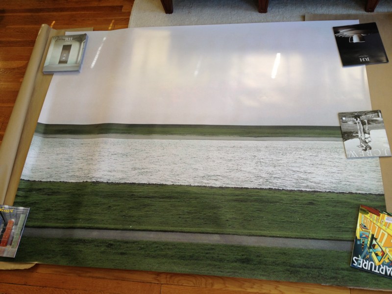
Unrolling: Ghetto Gursky Rhein
[See the note about Ghetto vs Shanzhai at the bottom of the post.]
When I undertook this Ghetto Gursky experiment last week, immediacy felt important: to use just the best image I could find online rather than scanning a catalogue, for example. And printing with the quickest, point&clickiest online service I could find. The constraints would then be the focus: the “accuracy” and veracity of the image that circulates freely [approximated here by resolution]; and the ability to instantly print large-format photos in the dimensions that were once so startling and rare, they were only available to, well, Gurskys.
Literally, though, no sooner did I place my order than I realized this generated complications. Printing at 5×6 feet, the rough dimensions of Gursky’s Rhein (1996), is actually beyond the capacity of most instant printers, at least those of the vanilla consumer variety. [It’s trivial to print a vinyl banner at that size, though, but this wasn’ what I wanted.]
Which is all a long way of saying that the Ghetto Gursky test print just arrived today. It turns out that my immediate vendor choice meant it was printed in California and groundshipped. But it came rolled nicely in a large tube, and it made it perfectly intact. So that’s all good.
First impression: ghetto fabulous. Turns out high-production photography has an uncanny valley effect, too. It’s on thick photo paper, with a nice finish. The colors are true [to the JPG I used, anyway]. Standing in front of/over it, the similarity to a Gursky is surprising.
Looking closely, though, yields its expected rewards, just the way Hito Steyerl likes it: “resolutely compromised: blurred, amateurish, and full of artifacts.” Without algorithmic smoothing or some kind of image-massaging resolution upgrade, there are pink, pixellated passages in the sky [above].
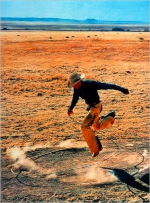
And there are a couple of greyish digital artifacts floating in the grass as well. I was going to say that the Ghetto Rhein does not have any of the crisp focus of Gursky’s original, but I don’t actually know that to be true. I haven’t stood up close with Rhein lately, but I’m not so sure that mid-90s C-prints actually have the grainless clarity I see/imagine in my memory. As with Prince’s Untitled (Cowboy) and the life-sized Untitled (300×404) print, I’d really like to see them side by side.
But the other issue, which popped up immediately, by which point it was too late, is mounting. There was no obvious, immediate, self-serve online place for facemounting a print that size on plexi. So now it’s up to me to track someplace down, and get it done. At which point, I’ll be schlepping a 5×6 print around. And soon enough, it’ll be basically 6×7 framed. And then it gets a crate, and then it’ll need a Sprinter van, and then it’s practically a Gursky, alike in every way except its street value.
[NOTE: Though the use was more common at the time, I grew uncomfortable with the racist origins and implications of the colloquial use of “ghetto” for these works. I changed it to “shanzhai,” a Cantonese term which originally described unabashed counterfeit consumer goods; this usage has since shifted toward a hackier, scrappy innovation, but for these works, the original meaning pertains. I have kept the original uses of ghetto rather than delete them to acknowledge the blinkered social context I was also complicit in.]
Attr. To The Cowboys Milking Master
Speaking of Cady Noland,
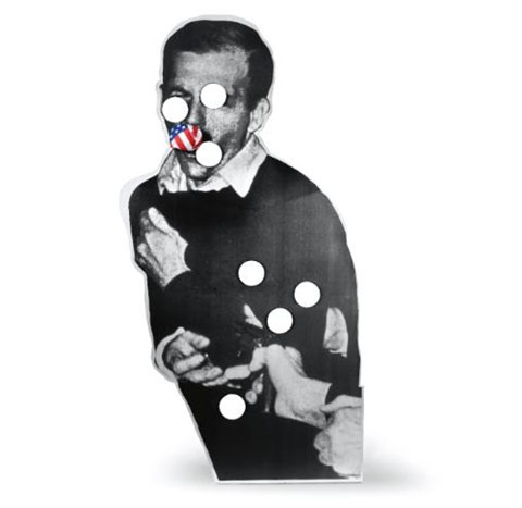
I’m kind of fascinated by the recently decided set of lawsuits surrounding the withdrawal of Noland’s 1990 work, Cowboys Milking, from a Sotheby’s contemporary day sale in November 2011. Noland had disowned the work under the Visual Arts Rights Act.
When the first suits were filed by the artwork’s consignor, dealer Marc Jancou, against both Sotheby’s and the artist herself, it was not quite clear what the problem had been, though Jancou was clear in his public sentiment that he’d been hurt, to the tune of $6 million, and distraught for 20 million more dollars. It came out in a flurry of countersuits that Noland considered the work damaged, but that was in dispute, too.
But as is often the case, a dive into the filings and documents proves both informative and entertaining. [As a NY state, not federal, court case, all the documents are available for free online. Just search the NY State Unified Courts e-filing System as a guest for Index no. 650316/2012. Don’t think of the endless stream of unlabeled, repeat documents as a slog, but as a legal literary fugue.]
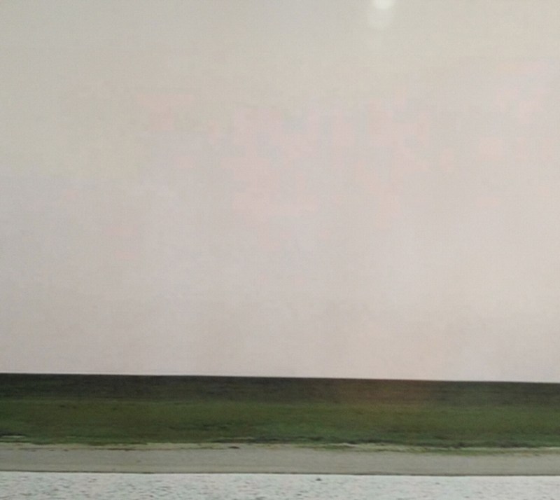
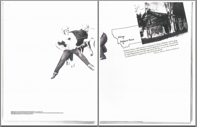
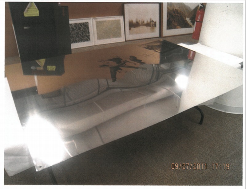
Basically, in April 2011 Jancou [who, btw, I know, and have bought work from in the past] bought back Cowboys Milking from a collector he’d sold it to earlier. Then he turned around and consigned it to Sotheby’s for their Fall sale. It was featured very prominently in the catalogue, and its estimate was $250-350,000. [Jancou’s invoice was submitted as evidence; he paid just over $100,000 for it. He even got a $1,000 knocked off, apparently to cover some conservation work the piece needed. Which turns out to be the central issue.]
Cowboys Milking is a unique silkscreen on a very thin, highly polished sheet of aluminum 4-ft high and 6-ft wide. Holes are drilled into each corner for hanging. The scale of the image and the material make reproductions of it difficult, disorienting, or misleading. [Sotheby’s 2-page spread, above, summarily crops the image to hide a nail hole.] This intake documentation image by Sotheby’s gives the best sense of what it actually is:
When the works went on public view [there were two other Nolands, including Oozewald and Bloody Mess, both 1989, in the November evening sale] the artist went to Sotheby’s to inspect them, and via her attorney, promptly instructed the auction house to withdraw Cowboys Milking, because it “differed materially” from its original state. Federal and NY state law both grant an artist the right to disown an altered, damaged or mutilated work, and to prevent her name from being associated with it, and that’s just what happened, right before the sale.
Sotheby’s condition report declared the work to be “in very good condition overall,” with “light evidence of wear” in the corners and “a crimp in the upper right corner and another to the lower left corner.” They didn’t yet know that these were the result of conservation efforts by the Noland expert Jancou had engaged, who had found the 1/16-in. thick mirrored aluminum to be an unforgiving material. When she saw them, Noland deemed the repairs unacceptable. And ultimately, that was that. As the final arbiter of her work, and the work that’s traded under her name, if Noland rejected it, it really didn’t matter that Jancou or Sotheby’s or even the conservator thought that the wear on the edges was fine, or normal. It was a dealbreaker.
Detail from Sotheby’s intake inspection, a crimp, apparently.
When Jancou found out, he was pissed, though in those early days, the dispute linked the work’s condition to its “authenticity.” In an extraordinary email to his Sotheby’s rep, he wrote,
this is not serious!
why does an auction house ask the advise [sic] of an artist that has no gallery representation and has a biased and radical approach to the art market?
Which prompted internal Sotheby’s email discussion:
Got it. I would say that when the artist, through her lawyer, has questioned the authenticity of works and has threatened to go public with her grievances that we have to take it seriously Would he prefer if we are forced to withdraw it due to potential authenticity issues? Or reading about it in artforum that its [sic] damaged to the point she no longer considers it her work?
By the time he filed his suit, and after Oozewald had sold for a world record $6.6 million and his work hadn’t, Jancou called out the auction house and the artist for inconsistent treatment. Cowboys Milking got pulled for just a couple of insignificant dings, he argued, while Oozewald was cleared to sell, even though it was missing its base. But, which, no.
Oozewald, 1989, ed. of 4, image sotheby’s via artnet
For the other two works for sale, Noland insisted the auctioneers certify that every item in Bloody Mess was accounted for and scattered in its precise spot; and that they include a notice that Oozewald had a mismatched base, and that the artist would provide the buyer with a properly fabricated replacement. These conditions met, the artist permitted these works to be sold using her name. This is not biased or radical market behavior.
Though you’ve gotta admit, it does seem kind of harsh. Was it really necessary to completely disown the work? Noland’s responses to both Sotheby’s and to Jancou’s lawsuit reveal there was more to the story. Turns out the previous owner of Cowboys Milking had already tried to sell it–through Christie’s–and Noland had already inspected it, and deemed it too different and damaged, and had insisted on its withdrawal. Jancou’s purchase came just days after this unpublicized rejection by the artist. Sotheby’s basically accused Jancou of covering up this rejection when he brought the work for sale, a charge the dealer strenuously denied.
[I have no direct knowledge myself, but it’d seem to me that if he really had not been told about the Christie’s rejection, Jancou would have a very solid claim against the work’s owner, and the ronin curator who put the deal together. Yet he’s apparently let these guys off the hook. It makes one wonder. But anyway.]
From Noland’s perspective, it’s all the same. The work she already officially disassociated herself from pops right back up, whack-a-mole-style, a few months later, with evidence of an unsatisfying restoration.
In exerting her prerogative under the Visual Artists Rights Act, Noland’s lawyers sought to prevent anyone, but, seemingly, especially Jancou the work’s current owner, from associating the artist’s name with it in any way, especially in his efforts to sell it. Paradoxically, the legal response also puts any question of the work’s “authenticity” to rest, because in order to assert VARA rights, Noland needed to first authoritatively claim sole authorship of the work.
I’m really going on too long now, but besides the textual and soap operatic elements of the lawsuits themselves, I am now fascinated by the implications of Noland’s affirmative negation of Cowboys Milking, both for the real world/art world it inhabits, and for the object which, for two-plus decades, had been an artwork.
Did anyone who bought, sold, handled, or saw Cowboys Milking over the years expect that its status was dependent on perfectly preserving and protecting its corners and surface? Such care is certainly possible, and art works typically get it in relation to their rarity and fragility, but most of all, to their value. It costs much more and takes much more effort to care for a fragile work, especially of this scale. This luxury commodity decorating your home, which had been cool and edgy, now becomes a burden, if not a menace, threatening to erase your entire investment in it unless you change your life around it. It becomes an instrument of control, infiltrating some of America’s finest homes, and operated remotely by the artist herself.
People talk about Cady Noland’s abandonment of the art world and art making, but this Sotheby’s case shows exactly the opposite: she only has rejected Jancou’s expectations of “gallery representation” and production- & sales-driven discourse, in order to operate entirely on her own terms. She remains highly involved in the presentation of her work, and as the objects she made travel around the world, she engages with them anew, creating new meaning and context.
With the Cowboys Milking decision, every Noland artwork has been imbued with the ominous potential of its own demise. Where they once dreamed of cashing in on their 90s prescience, every owner of a Noland is now reflecting on that time they bumped it with a vacuum, or wishing they’d sprung for the good crate after all. Am I the only one who could totally imagine such an encounter being in total harmony with the bleak degradation and dystopian decline that Noland’s work was ostensibly, originally “about”? By introducing this precarity through the sacrifice of Cowboys Milking, Noland has updated her artworks’ operating system for 2011.
But what of this particular 4×6′ aluminum sheet? What’s to become of it? If an artwork is whatever an artist says it is, then Noland has created the opposite. This is an object an artist has definitively declared is not art. That seems kind of amazing. By testifying to her creation of it, and then disassociating herself from it completely, Noland and Cowboys Milking are now inseparable. Through this rejection, Noland seems to have succeeded in making the holy grail of 1960s/70s artist idealism: a work that cannot be consumed and commodified by the evil market.
Or did she? Is dissociation really the end? Discussing her use of different metals with Michele Cone, Noland once said, “The coolness might infer dissociation, but the mirror effect in some places is to draw you back in after the dissociation.”
Oozewald and Publyck recreated for Cady Noland Approximately
In 2006, Triple Candie staged a controversial retrospective of unauthorized copies of Noland sculptures based on published images and descriptions. None was for sale. But with the disposition of this lawsuit, the exact opposite now seems possible: couldn’t Cowboys Milking remain in the market the way Old Masters do, without attribution? As the work of, say, School Of SoHo, or The Cowboys Milking Master [Mistress]. No one would ever need to claim Noland was connected to the work–thanks to the lawsuit, everyone would already know.
Or maybe Jancou could just keep it, live with it, enjoy it in the comfort of his own home, a beautiful, shiny reminder of the importance of buying art for love, not as an investment. And when guests ask who made it, he can smile and demur, “If you don’t know, I can’t tell you.”
This Scaffolding Has No Title Yet
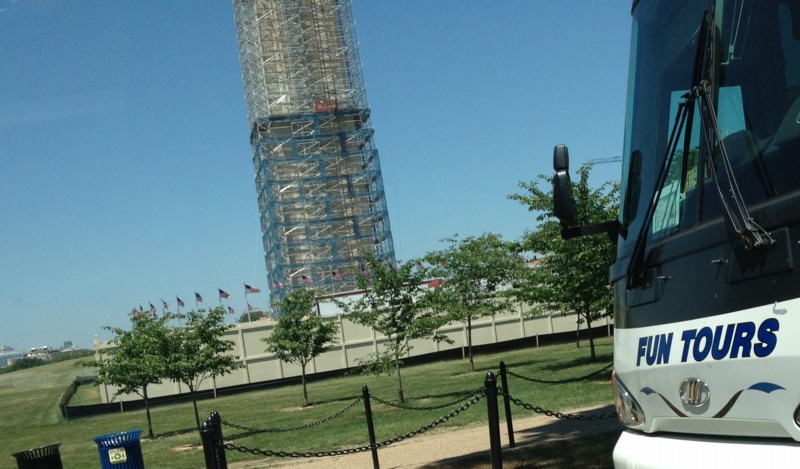
Here’s a shot I took today of the scaffolding around the Washington Monument for its post-earthquake restoration.
Every time I go by I think how awesome it would be, and until I hear or see otherwise, I’ll just keep hoping and assuming it’s the case that, instead of Michael Graves’ tired, pomo cartoon scrim, the National Park Service is actually encasing it Budweiser cans, installing a massive adaptation of the 1989 work, This Piece Has No Title Yet, by DC’s own Cady Noland.
What? I’m sure Don and Mera could totally make it happen!
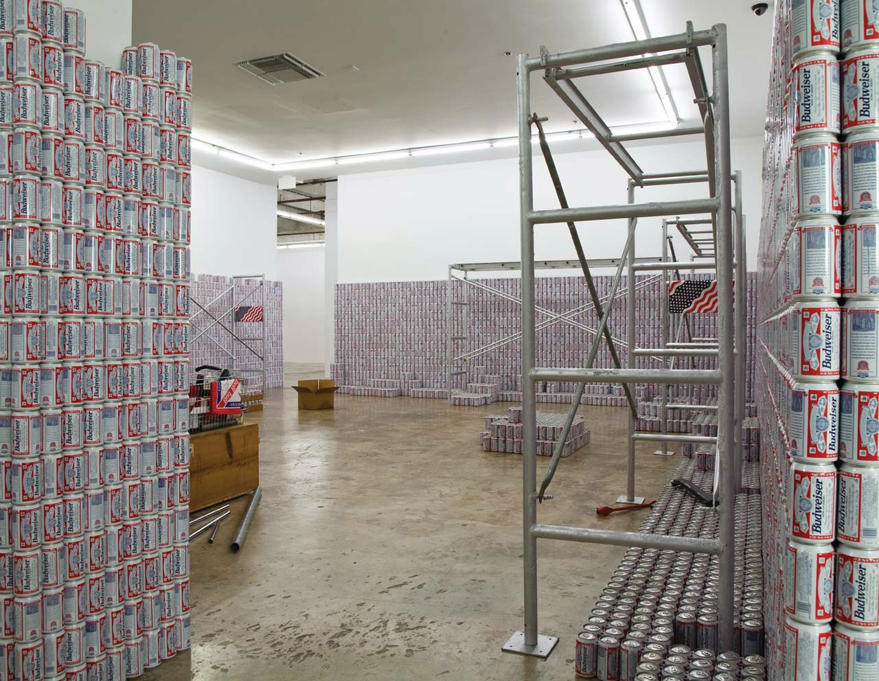
This Piece Has No Title Yet, 1989, Dimensions variable, you guys! [rfc.museum]
Gursky, Ohne Titel XI
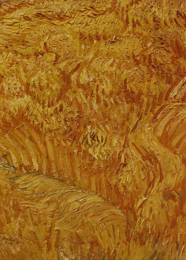
The artist blew up the passages by a factor of at least twenty; the paintings’ materiality comes into focus as the surface images lose resolution, further abstracting already cropped and isolated images. That is to say, we can hardly tell what these paintings are “of.”
This diffusion into abstraction seems to operate as a metaphor for the materiality of the photograph, the way that photographic images reveal either grain, in straight photography, or pixels, in digital photography, when sufficiently enlarged.
Katy Siegel, Artforum, 2001, on Gursky’s Untitled XI, 1999, a photo of a detail of a Van Gogh painting, printed at 2.7 x 2m.
Ghetto Gursky
[NOTE: Though the use was more common at the time, I grew uncomfortable with the racist origins and implications of the colloquial use of “ghetto” for these works. I changed it to “shanzhai,” a Cantonese term which originally described unabashed counterfeit consumer goods; this usage has since shifted toward a hackier, scrappy innovation, but for these works, the original meaning pertains. I have kept the original uses of ghetto rather than delete them to acknowledge the blinkered social context I was also complicit in.]
Seeing Brent’s tweet of a Taylor Swift photo yesterday made me finally move on an idea that’s been percolating for several years: the Ghetto Gursky.
The new Gursky. RT @taylorswift13: Dallas. Thank you for a memory I’ll replay in my mind on rainy days. https://twitter.com/taylorswift13/status/338877935069036544
— Brent Burket (@HeartAsArena) May 27, 2013
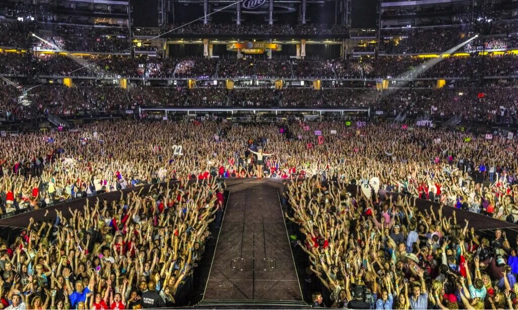
The Swift-as-Gursky image is key, in a way. I had kind of a falling out with Gursky’s work in November 2001, when he was shooting Madonna’s concert tour (in LA, on Sept. 13) instead of what I felt he should be shooting: the wreckage of the World Trade Center.
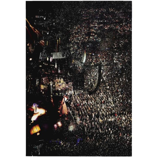
Madonna I, 2001, ed. of 2
I’d been morally invested in Gursky’s work [I was not alone at the time] and its presentation as a critique of the globalizing forces and systems in the world, and I’d wanted to see his take on what seemed like the most pressing reality of the moment:
From the first week after the bombings, when I was in full CNN burnout, I wanted writers’ and artists’ perspectives, not Paula Zahn’s. The scale of the debris, the nature of the target, even in wire service photographs, it called for Gursky’s perspective to make some sense of it, perhaps.
Because I realized even then it was an idealistic and presumptuous view of art, and it was based on no actual knowledge of Gursky’s practice of artmaking. But it distanced me from the work, and germinated the seeds of skepticism that had been planted at the end of Peter Galassi’s 2001 MoMA retrospective.
The last gallery of that exhibition featured ever more massive prints, with ever less subtle Photoshop manipulations, culminating in a collage of disembodied CEOs and boards of directors floating against an abstract background. I remember thinking at the time how awful it was, and wondering where Gursky was heading–and whether Galassi had any qualms about showing the stuff.
Gursky has certainly made much better work since, but it stuck with me then how closely linked the impact of his work is to the state of the technological art and the means of production at any given moment. He was a Becher alum interested in exploring the latest developments in large-format photo printing and digital manipulation. The effect and experience of this can be stunning, but it can also be a trap. When you’re selling spectacle and production and wall presence, you have to keep up with the Struths, as well as the dozens of other artists who figure out where the 5-foot wide printers are. And the 8-foot. So there’s that.
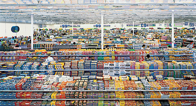
99 Cent “Like Warhol, Gursky has succeeded in seducing his viewers with his product.” –Phillips de Pury, Nov. 2006
And then a few years later, while working on a story for the Times, a collector offhandedly mentioned a market for Gursky exhibition prints. Which kind of surprised me. Because now there was a tension between the arbitrariness and fiction of the photographic work’s edition size, and the physical reality of these giant, expensively produced, museum-grade [obviously] objects. And the tension played itself out in, or was really only a problem for, the market, where at that moment, Gurskys at auction were the most expensive photos in the world.
Which is right when I was chatting with another collector in Miami, as we toured the family’s house during an ancillary Art Basel event. Introduced to her as a fellow collector with an interest in photography, she asked, “Do you collect Gursky?” And suddenly Gursky was stripped bare, transformed into [or revealed as, depending on your cynicism] a pure commodity, the apparently socially acceptable way of straight up asking someone their net worth. And of demonstrating your own.
Untitled (300×404), 2009, published in 2010 by 20×200
In 2009, when I printed up copies of Untitled (300×404) using a small JPG of a Richard Prince Cowboy photo, I was interested to see what the difference was between his real, appropriated artwork and the digital image we were “allowed” to access by copyright [and gallery/institutional exercise of control].
The 20×200 editions of Untitled (300×404) got me thinking about how art discourse and the market handle [or don’t] issues of authenticity and copying, where the value lies, and where the attention is directed. And the extent to which money, class, rarity, and luxury color our experience of art, even when we claim self-awareness and critical resistance, and even if the artist seeks to thwart such influences in the reception of her work.
And I thought on the existence of quasi-illicit, out-of-edition Gurskys infiltrating the market in a don’t ask, don’t tell way, ably performing their functions as markers of capital and luxury objects. And how it was acceptable to ask if you collected Gurskys, and even when you started, but not to ask how much you paid, or how big a discount you got, or what number this here Gursky was in the edition.
And I wondered how close you could get to the experience of standing in front of a Gursky, the encounter with the artwork, the image and scale and finish and physicality of the object itself. What would happen to the rest of the experience? Could a Gursky ever generate a genuinely critical encounter of the system that has spawned it, from within that system?
And that’s where the idea of the Ghetto Gursky came from: a full-scale recreation of the Gursky Experience, made with publicly available imagery and publicly available production technology. Which, by the way, has become widespread, if not commonplace, in the decades since Gursky began using it.
What would such a commonly produced object do to the socioeconomic aura of the originals? If a Gursky were a sign of significant wealth and sanctioned taste, what would a Ghetto Gursky be a sign of? Clueless and failed aspiration–the contemporary art equivalent of putting an elaborate copy of Michelangelo’s David by the pool? We can call this the outcome the Carlos Slim. Or would it be a way to show off the modesty of one’s means? The Art Basel cheer of absolutely no one, “Hey, I have five thousand dollars!”
The polarization of the art market is such that a Ghetto Gursky has less justification for existing, and less likelihood of being sold, than a real Gursky. Which seems ridiculous. So I decided to go ahead and make one and see what it’s like.
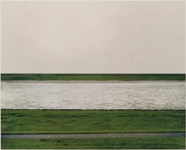
Rhein, 1996, blown up 4x from a thumbnail for effect
I’ve ordered a full-size print of Gursky’s 1996 photo Rhein, which is being made using the largest jpg version of the image I was able to find online. Then I’ll have it mounted on Perspex and framed, just like his original. This is not Rhein II (1999), which is like 2×3.5m long, and is currently the most expensive photo sold at auction. [An edition of Rhein did just sell at Phillips a couple of weeks ago for $1.9 million, which is not nothing, but still.]
Rhein is only around 5×6 feet, big when it was made, but now, not really, which is kind of the point. It’s also a more manageable size to experiment with. It will fit on my wall and in my car and in my storage. Katy Siegel wrote in 2001 that “Gursky’s motivation is the masterwork, the valorization of the fetishized object of high art.” A Ghetto Gursky will invariably be as heavy and large and unwieldy and difficult to transport, store, and hang as a real one, which only contributes to its implausibility. Which is kind of the point.
On Hilma Af Klint
In the era marked by the discovery things like electromagnetic waves, radio, and x-rays, invisible realities beyond visual perception, Hilma af Klint sought to depict the higher/spiritual/imperceptible world in paintings, drawings, and writings that she largely hid from public/male view during her life. It all seems like the future, though, by which I mean the present. It’s uncanny.
Anyway, here’s a documentary where curator Iris Müller-Westermann talks [in Swedish] about the work and practice of Hilma af Klint. The retrospective she organized at the Moderna Museet closed today. It will be in Berlin in June and Malaga in October. [via and a half]
Vintage Duchamp Animated GIF
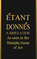
Artist TimK made this animated GIF simulation of viewing Marcel Duchamp’s Étant Donnés some time before January 1998, which was when the Internet Archive crawled his Duchamp webpages for the first time.
That site is long gone, but TimK now has marcelduchamp.org.
Gerrit Rietveld Chair Crate
Not sure how I never considered this, but I suddenly came across a couple of strong connections between Enzo Mari’s autoprogettazione furniture and Gerrit Rietveld.
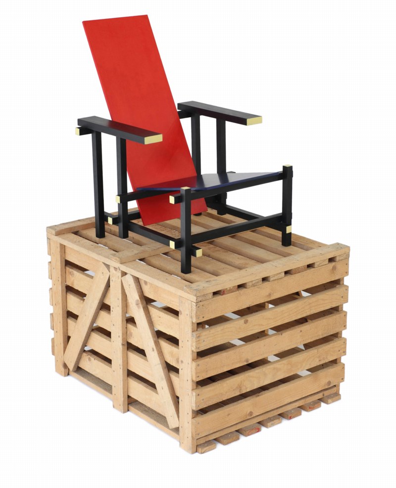
For one, check out the crate that this 1965 version of Rietveld’s Red Blue chair came in; this one’s from Galerie VIVID in Rotterdam. I’ve never seen this before. Maybe that’s just how they used to make crates in the 60s. But it sure looks like the underside of my Enzo Mari X IKEA table, the EFFE model.
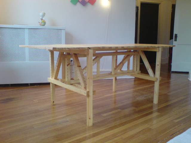
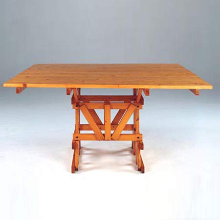
It looks even more like the structure of the Tavolo Quadrato, the square autoprogettazione table.
Then there’s Rietveld’s 1923 Military Table, designed for the Catholic Military Home in Utrecht, and in and out of production ever since. This unfinished Oregon pine example’s from the 60s, and was in Marseille, via 1stdibs. [I have never paid much attention to Rietveld’s Military Table, but suddenly it is looking pretty sweet.

The top is fixed onto these cross braces. It’s a solution that Mari eventually used as well. The crosspieces are not in the original autoprogettazione plans, but they did turn up in the kit of precut parts that were sold under the Metamobile name in the early 70s.
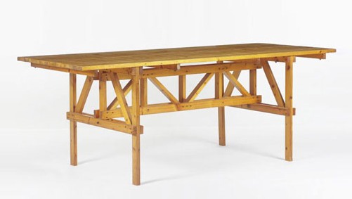
Even though Rietveld’s autonomous approach to furniture is an obvious precedent for Mari’s; and I knew from hands-on experience that the autoprogettazione designs have a lot more “design” than their basic function requires; I guess I never imagined that Mari would make overt references to what had come before.
Previously:
The making of an Enzo Mari dining table
Enzo Mari X IKEA Mashup Recap
Larry Rivers Lamp, Olafur Eliasson Extension Cord

So I’ve decided to make me a lamp like this Larry Rivers lamp Frank O’Hara had in his loft in the mid-60s.
Which means I’ve been trying to map out the number and types of sockets and adapters up there. And I’ve begun poking around for parts. At first, I was going to rework a vintage, industrial-style floor lamp, but those aren’t turning up with anything like the frequency I need. And the current crop of adaptable floor lamps are actually pretty unappealing, too. Really, they just make no sense here.
So to stay closer to Rivers’ approach, I think I’ll just build up a lamp from galvanized steel pipe. [I saw Colin Powell puttering around the hardware store yesterday, btw, the hardware store that had no such plumbing parts at all, just PVC, which, no thanks.]
Rather than a fuse-blowing heater made with 14 incandescent bulbs, I figure I’ll make a little constellation of incandescents, CFCs, and LEDs, in a range of whites. And as for the wiring and cord, well. I am really jonesing over this:

It’s an extension cable, from Olafur Eliasson Studio, released in 2004 as a limited edition with the title, 10 Meter Cable For All Colours. Which, I know, is just nuts. But still. There have been more than a few works like this from Olafur, where very modest functional objects are produced for internal use, which are recouped or spun off as an edition. It is a model that works for him, and the demand is there, so.
Technically, though, for this project, it’s not what I need. And I wouldn’t cut up an Olafur cable to rework it into my thing anyway. I just mention it here because the world is an amazing place.
Previously: Frank O’Hara’s and Alfred Leslie’s Larry Rivers’ Lamp
Previously and amazing and related: Lindsey Adelman’s autoprogettazione-style, You Make It chandelier